“So, are you on Instagram?”
Years ago, knee deep at a networking event, you probably wouldn’t expect to field questions about your presence on a photo sharing app... But, it’s 2021. Instagram? Well, now it’s as synonymous as a business card.
Yes, Instagram (or “Insta”, thank you fellow millennials) rapidly became an essential online social media tool for artists, influencers, travellers, bloggers, dog lovers, creators, and business owners - just to name a few.
It’s simple aesthetic-centric delivery communicates your vibe and keeps your audience updated with an ever rotating collection of images, videos and 24 hr stories that connect you with the world - and all the people who want to peer into your brand.
Before you can start sharing a glimpse into your company, your services, or your lifestyle, you’ll want to make sure your account won’t look like that really lazy attempt at scrapbooking your Aunt Carol did last minute from your awkward prom photos.
We caught up with a handful of incredible and successful Instagrammers and Digital Marketing Specialists to dive deep on the best way to launch your own account, and how to maintain it to grow followers that will stay loyal to your brand.
Instagram expert Kat Walters of @katwalters knows how important it is to visually connect your brand to your customers, and dedicates her creative energy to coaching others with a free Instagram class to achieve success with the app.
“You want to be clear about who your customer is, because you want to create an Instagram account that will appeal to them, and draw them into your world,” she suggests.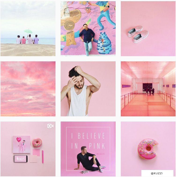 “You want an account that they will look at and say YES, this is so for me, I belong here.”
Personal Stylist, Sydney Lester from @chicstripes thinks of Instagram as a powerful tool for your brand, too. “You can set a vibe, create a tone, and use captions to bring value in a crowded market. This social media platform should be used as a marketing tool to support your business and give your community a clear call to action,” she says.
Of course messaging and captions are very important to your audience, but the visual aspects of your account are what resonate first. You don’t want to just dump any old images into your Instagram and hope your accompanying messaging and content will reach them, Kat explains.
“People will just not bother to read your captions if the images you’re using don’t look good. They will just scroll on past.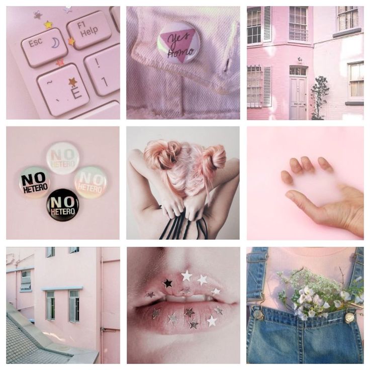 If your images and account looks great, well THEN your followers will read what you have to say.”
The first big thing to decide for your Instagram account - before you start fretting about hashtags and more advanced engagement - is a basic color scheme or color palette. This helps make your stockpile of images and videos look like one curated collection, rather than a jumbled hoard of disconnected moments.
Marisel Salazar, whose wildly popular Instagram account @breadbutternyc focuses on food and NYC lifestyle, uses consistent colors (her favourites) to stand out.
“I gravitate towards blues, greens, whites and slate,” she reveals, adding, “But that doesn't mean warmer colors don't make an appearance! Warm colors can actually make the feed pop when peppered in here and there.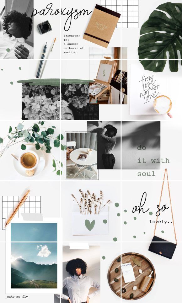 ”
”
Similar lighting conditions can really mean a lot too, according to Toronto lifestyle blogger, Joelle Anello of @lapetitenoob. Her pink-centric account goes beyond just hues - there are other important considerations for her ideal aesthetic.
“I make sure to have a similar color palette in all of my photos,” she says, “But as well, I take all of my shots in similar lighting conditions.”
So, you’ve chosen your colors, you’re being consistent with your lighting - now you can really start making an impact by limiting yourself to key filters, too.
“Using the same apps and filters to edit all of your photos is important,” Joelle explains. This is good advice, as 18% of all Instagram posts use a filter.
The most liked and most used filter in the world is Claredon - it highlights and brightens while adding subtle depth and saturation to any photo. Juno, Gingham, and Lark trail as close second choices. Don’t feel tied down by these champion filters though - you might stumble on the next great aesthetic by experimenting!
In the same sense that you want to have a consistent color scheme, you also need to choose a theme to focus on. A theme is also more than just a subject matter - it can also involve staying true to certain composition guidelines.
This will help you to develop your audience, nurture hashtags, and it also helps you stay on track and build followers.
Joelle, having carved out a niche for herself with a lifestyle theme that encompasses fashion, travel, and everything in between, has her own philosophy. “Develop a theme early on and be consistent with it no matter what.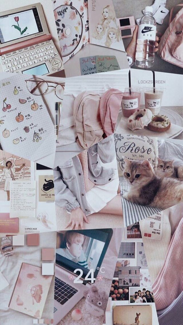 Consistency can be difficult, especially when starting to work with brands who may have their own vision for sponsored content.”
Choosing something you’re passionate about is important - maybe you want to share a sneak peek into the life of parenting, motorcycle restoration, raw food, or the excitement of chasing UFO’s - whatever speaks to you.
Ryan O’Connor, Co Founder of One Tribe Apparel learned quickly that a theme doesn’t have to be restrictive. “We've experimented with our @onetribeapparel Instagram feed a lot,” he admitted, “And now we don’t limit ourselves to photos that directly promote our products, but rather those that fit with our boho aesthetic.“
One Tribe Apparel doesn’t have a strict color theme like some accounts, he explained. “We try to stick to an outdoor nature aesthetic that vibes well with our colorful products, and the love of travel and yoga shared by our online community.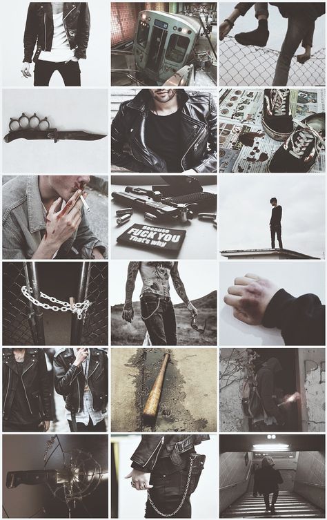 ”
”
Sometimes you'll need to help your theme along while you’re taking your pictures. “There’s a lot of fussing around,” Marisel admits. “I always carry a couple of consistent accessories on my person to liven up any shot.“
Of course, when establishing a brand on Instagram, you need to consider a lot more than your individual photos - you need to think of how each image will look in the grid as well.
Lee Esposito from Digital PR firm Lee Esposito Associates thinks Instagram is about the ‘big picture’. “Remember that an Instagram feed is a mixture of images relating to one another, which means it incorporates individual images, as well as a grid of image thumbnails. It should tell a story,” he says.
Marisel agrees, but sees her feed as a giant puzzle, with a specific flow. “I tend to alternate between overhead shots and straight on vertical angles,” she explains.
“I always play around with what shots will come in a specific sequence to make sure everything is fluid,” adding that she likes to use the photo album on her phone to arrange images - which is a pretty cool hack!
There are lots of apps available that can also do the trick. “To keep your Instagram feed looking fab, work in rows of 3 using the Planoly app,” Kat recommends. (Planoly is free and lets you drag and drop the layout of up to 30 posts per month.)
“You can check that they are going to look good, and keep your feed design on track. Once you have your next 3 ready to go you can start to post them knowing that your feed will stay gorgeous,” she says.
Splitting photos into tiles for Instagram can also make a really big impact. You may have already seen the really neat spreads, where a single image takes up 6 or even 9 tiles on your grid, to make it look like one gigantic image.
You don’t have to do this manually anymore, thanks to apps like Pic Splitter, Tile Pic, or Instagrid. If you choose this approach, remember that you will throw your whole look ‘out of whack’ if you don’t plan ahead to post to maintain their alignment. Planning ahead isn't just about what you'll post but about when you'll post too.
Furthermore, you need to think beyond the grid when you’re planning this kind of layout, according to Zellie Freidnman, Social Media Manager at Power Digital Marketing. “You want to make sure each tile is a visually engaging photo that is unique enough to stand on its own outside of the grid,” she says.
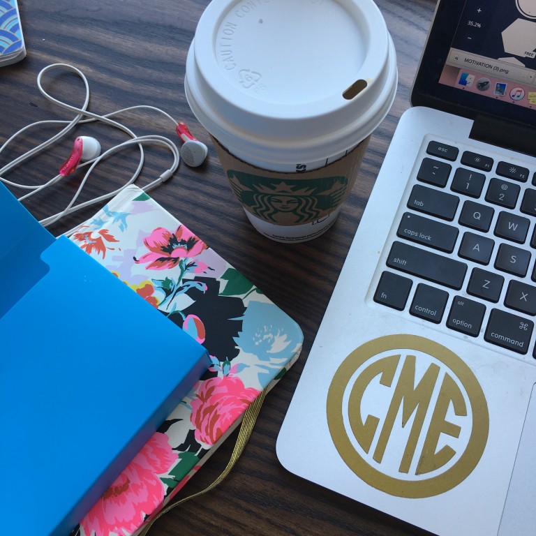
Taking professional looking pictures with your smartphone is not only possible, but a fairly common practice, but that doesn’t mean you can cut out the most important step - the editing process.
Once in a while you’ll have a lucky moment, when your picture turns out “just right” on your phone and you can post it straight to Instagram, but that’s the exception, not the rule. The good news is, there have been a ton of apps created to help you edit and hack the perfect look for your images.
You can also get creative and create composite images - they are imaginative and very attention grabbing when someone is scrolling through images.
Kat, like many Instagram experts, knows that when it comes to your pictures “lots of little improvements add up to a BIG difference.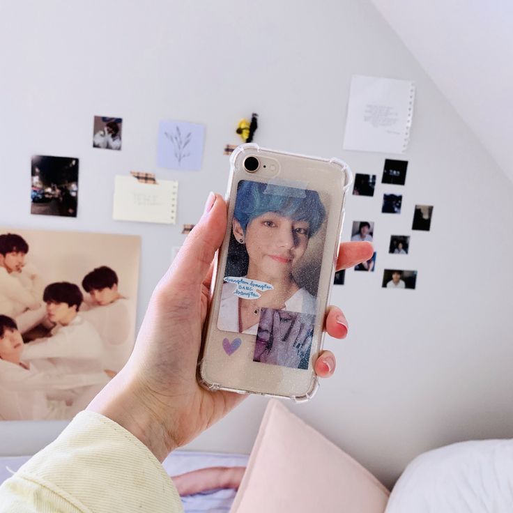 ” She edits her photos before she even considers opening her Instagram app. “My fav app for this is A Color Story,” she shares. “There is always something you can do to improve your pics, even if it’s just lightening it up a bit.”
Marisel is a fan of spot editing. “I personally don't use any filters,” she says, “I like to individually spot edit my images on Instagram using Snapseed. I favor high contrast images, so I like to bump down ambiance to create starker photos that stand out.”
Taking a page out of the Snapchat book, Instagram became interactive with the launch of “Stories” in 2016. Instagrammers (and Snapchat lovers) rejoiced!
“You should be using Instagram Stories as an ongoing "highlight" reel of your behind the scenes day-to-day client interactions,” explains Sydney, “To showcase your unique personality and work style.
Self-professed foodie and blogger, Krysten Dornik of @KrystensKitchen agrees. “Instagram stories really helped me grow my Instagram account over the last year,” adding that she takes advantage of new tools available in the app.
“Using the ‘poll’ feature, the ‘swipe up’ option for links to your other content, and tagging companies to let them know you are talking about them are some of the easy ways to improve your marketing on Instagram.”
She also keeps up on the new features that Instagram introduces throughout the year, like highlights.
“Now you can choose a few things you would like to ‘highlight’ on your page from your instagram story,” she bubbles. “Right now, I am highlighting a giveaway and a new recipe on my blog!”
Food blogger Julia Nickerson of @SavoryTooth has some old school advice to growing followers - using actionable hashtags.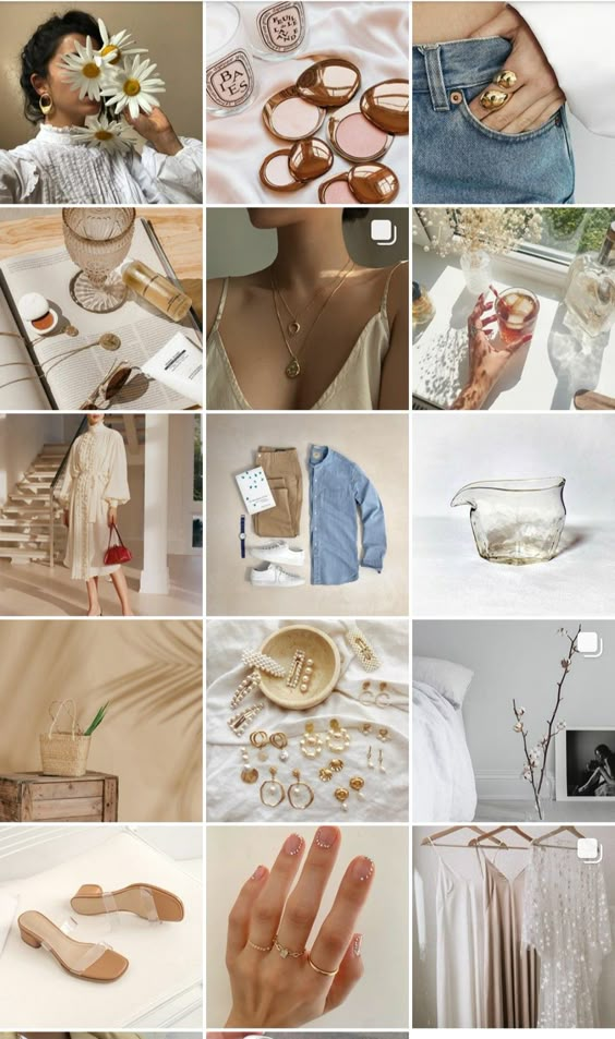 “My advice,” she shares, “Is that to drive engagement on your Instagram post, you should interact with posts using the same hashtags.”
She recommends regularly visiting posts from hashtags you currently use to leave comments and engage with the online communities associated with them. “Do this before and after publishing your post,” she advises. “This kind of activity tells the algorithm that you are active in that hashtag.”
If you pull all of these elements together, you’ll end up with a branded Instagram account that hits all the right chords online.
Take it from Kat: “Having an Instagram feed that looks like a mish mash will confuse your followers - BUT when you create a consistent theme that expresses your brand ‘soul essence’ it means that in just 3 seconds your followers are clear about your message and brand.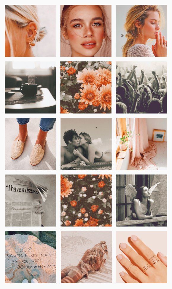 It will create an instant deep connection with someone that is a fit for you. That’s how powerful it is.”
Well said. So, are you on Instagram?
Your Instagram account integrates seamlessly with your Pagecloud website! Grow your followers online today.
Did you know you can create a free link page to add to your social bios? Create a more engaging experience for your followers with a custom page for all your website, social media, shopping links, and more! For a step by step guide on how to create your free link page, check out this blog post!
If you want to get new Instagram followers, having a beautiful and cohesive Instagram aesthetic is the key to turning visitors into followers.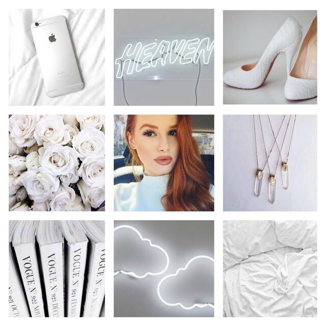
Having a curated Instagram aesthetic is one of the best ways to grow your account, build a following and show off your brand’s unique style and tone.
And the good news is, you don’t need pro photography skills or expensive editing software to really nail your aesthetic.
Why is a Cohesive Instagram Aesthetic So Important?You might be thinking: why is creating a cohesive Instagram aesthetic so important?
Your Instagram aesthetic is one of the best ways to get more followers and grow your account. And this year, creating a cohesive Instagram aesthetic is more important than ever!
More and more people are turning to Instagram to search for their favorite businesses. That means, your Instagram profile is now just as important as your website’s homepage.
Your Instagram feed is the first thing a visitor sees when they land on a new profile, so it’s important you make a good impression. When a visitor lands on your profile and knows exactly what they can expect to see on your feed, they’re much more likely to hit that “follow” button.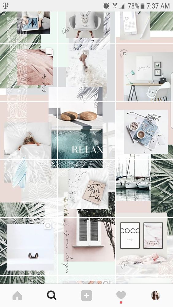
The first thing you’ll want to do is decide on the Instagram aesthetic you want for your profile. A great way to get started is just by looking for inspiration.
What do some of your favorite feeds look like? Are they bright and airy? Dark and moody? Do they follow some sort of pattern?
Taking the time to think about these things while you’re browsing your favorite profiles will help you decide what “aesthetic” will best represent you and your brand.
You’ll also want to consider what types of photos you’ll be posting. For example, even if you prefer a light and bright feed, if you live somewhere like Seattle, it may be a hard look for you to achieve.
Make sure you consider what and where you’ll be shooting, as this will be what you can maintain consistently. And consistency is really key when you’re creating your aesthetic and should be considered above all else!
Another way to help you determine what look you’d like to create on your feed is by creating a mood board.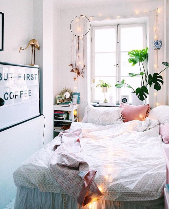
There’s a ton of different programs and apps, like Pinterest, that you can use to create a mood board. Creating a mood board is a really great way to help you get your creativity flowing and guide you in deciding what you want your feed to look like.
When you’re creating your mood board, make sure to include a mix of colors, textures, patterns, and quotes to help you better visualize what your Instagram feed should look like.
Once you’ve created your mood board, take a step back and decide what words come to mind? Your mood board should be a visual representation of what you want your Instagram brand to encompass.
And once you have a clear picture in your head of what you’d like your photos and Instagram feed to look like, it will make the editing process a cinch!
Ready to create your own Instagram aesthetic? Create a free account today and start planning and designing your Instagram feed with Later’s drag & drop visual planner!
Creating an Instagram Aesthetic Step #2: Editing Your Photos For Your Instagram FeedThe best way to create a cohesive Instagram aesthetic is during the editing process.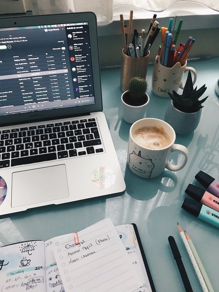 Choosing the same filter, set of filters or editing “rules”, will help you keep your photos looking consistent and “fit” together.
If you ’re looking to give your photos a more professional look, Lightroom is by far one of the most powerful photo editing tools out there, especially because you can use ready-made Lightroom presets!
Lightroom presets are one-click photo editing tools that can dramatically speed up your workflow and give your Instagram photos a professional look.
Using Lightroom presets on your mobile device can give your Instagram feed a serious upgrade and help you create high-quality Instagram Stories content (which we’ll talk about in step #4!).
While mastering Adobe Lightroom on desktop takes time and practice, using Lightroom presets on the mobile app is a quick and easy way to take your Instagram photos to the next level.
Since many presets are offered in “packs” or collections, you can choose from a selection of filters for each of your photos while still maintaining a cohesive look on your Instagram feed.
This year, many popular Instagrammers have even released their own preset collections, making it easy for you to achieve the same look and feel as your favorite influencers!
There’s really no one-size-fits-all filter, so it’s really important you play around, and figure out what filter is the best fit for your photo. Try find a “set” of filters or presets that all have the same look or feel to help you maintain that consistent aesthetic on every photo you’re posting.
Creating an Instagram Aesthetic #3: Create Balance on Your Instagram FeedAfter you’ve edited your Instagram photos, you’re going to want to think about how they’ll look next to each other. It’s important to create “balance” on your feed, and make sure it’s not too busy or cluttered. You want to make sure it’s easy for new eyes to move throughout your feed without interruption.
The goal here is to create a depth of field, similar to what you learn if you’ve ever taken a photography class.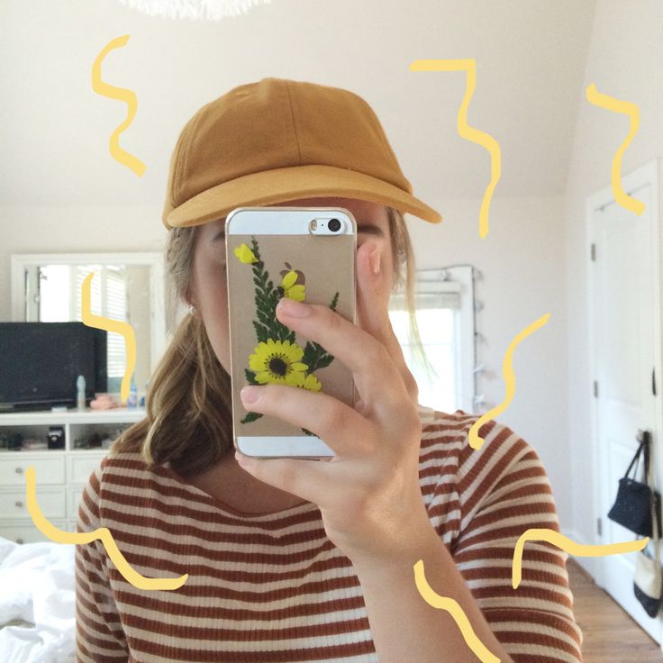 A great way to do this is by placing more busy photos next to clean or minimal photos to break things up a bit.
If you’re a business selling products on your Instagram feed, you can do this by mixing up your product shots, with some user-generated content post, lifestyle photos or any other different types of content you plan to publish.
If you haven’t already, it’s really time for you to start thinking in “grid-terms”. This will help you achieve a nice “balanced” look on your Instagram feed and help you create that killer aesthetic.
Creating an Instagram Aesthetic #4: Maintaining Your Aesthetic in Your Instagram StoriesPreviously, when you’d hear about an Instagram aesthetic, most people would just think about their feed, but now that’s all changed!
When crafting your Instagram aesthetic, you’ll also want to make sure you’re thinking about your Instagram Stories.
Creating cohesive Instagram Stories are a great way to build your brand and keep your followers coming back for more. This can be as simple as using the same Instagram “font” all the time, or using your brand colors when using text or drawing tools.
While Instagram Stories continues to grow in popularity, brands are taking stories as seriously as their regular Instagram posts by creating highly designed stories that stand out on Instagram and stop people from swiping past your story.
You might notice brands and businesses like @oakandfort, taking the design and style of their website (like logo, font, color palette, and tone) and applying it to their Instagram Stories design.
If you want to create gorgeous Instagram Stories consistently, try using Instagram Stories templates!
Instagram Stories templates have really been growing in popularity this year, with businesses and influencers creating their own branded stories that have a really uniform color, tone, style, and format.
There are also heaps of apps like Canva and Unfold that can help you create beautiful and cohesive Instagram Stories with their ready-made templates.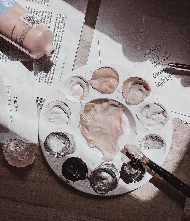
Instagram Stories templates are a great starting point for creating your stories, and Later has created 19 free templates that you can try out that are completely customizable to suit your brand’s aesthetic!
Designing templates for Instagram Stories make it easy to create stories from your phone or computer, and ensures that everyone on your team can create on-brand content.
Generally, Instagram Stories templates are pre-made layouts with graphics, text, or animations that you can edit to fit each new story.
By using the same (or similar) templates for your Instagram Stories, you can create cohesive, on-brand stories that align with your business as a whole.
If your Instagram Stories design and style don’t match the aesthetic of your profile page, you’re going to be missing the chance to introduce your brand to new audiences and leave a lasting first impression.
Creating an Instagram Aesthetic Step #5: Scheduling Your Cohesive Instagram FeedPlanning out your content in advance is really what’s going to make or break your Instagram aesthetic.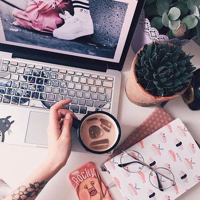 You don’t just want to focus on how you’re editing your photos, but start considering what they look like next to each other, and what’s beside, below or on top of your new posts!
The best way to pre-plan your feed and make sure everything’s flowing together is by using a visual planner like Later.
Later’s visual Instagram planner shows you exactly what your Instagram feed would look like — and it’s seriously a game changer. The visual planner lets you easily rearrange or swap out photos to find that perfect balance for your Instagram feed.
Scheduling out your posts ahead of time doesn’t just help you maintain a consistent aesthetic, but it also helps you to post regularly, which is also really important when you’re trying to get more followers.
Again, new visitors on your profile are much more likely to convert into followers when they know exactly what they can expect from your feed, and your Instagram Stories.
And that’s our five easy steps to creating a killer Instagram aesthetic covered! By having consistent elements across your website, Instagram posts, and stories, your brand will have the chance to really unify your aesthetic and style from every single angle.
And now that you’ve learned exactly how to create and curate an Instagram aesthetic for your brand, you’re ready to design, execute and show off your very own beautifully-crafted Instagram profile!
It takes some planning, but once you’ve created an Instagram aesthetic that really wows, your Instagram account will go from strength to strength!
Ready to create your own Instagram aesthetic? Design, curate, and plan your feed using a free Instagram marketing platform like Later!
AllNewsTrainingArticles
Beautiful photos are not enough to create an effective Instagram account. We need an expressive and aesthetic visualization of the brand, a harmonious feed of publications and a well-thought-out marketing strategy in this social network. The origins of all this lie in the uniqueness of the brand and its character. Hubspot has put together 5 top tips on how to make your Instagram account aesthetically pleasing and provided examples of successful brands.
Define exactly what a brand is – what are its main goals and principles. What is the brand tone and core values? Is he perky and playful, or does he inspire adventurous deeds? Maybe he is bold and fearless?
When Instagram posts reflect a company's image, it helps to maintain a consistent brand experience. Posts with random content create a confusing feeling and break the familiar image.
Know your target audience and their tastes. Your account is primarily used to find clients. Accordingly, publications should be attractive to your target audience. Find out what your customers care about the product and what they pay the most attention to. What artistic styles are more acceptable to them.
Create a compelling story with every photo.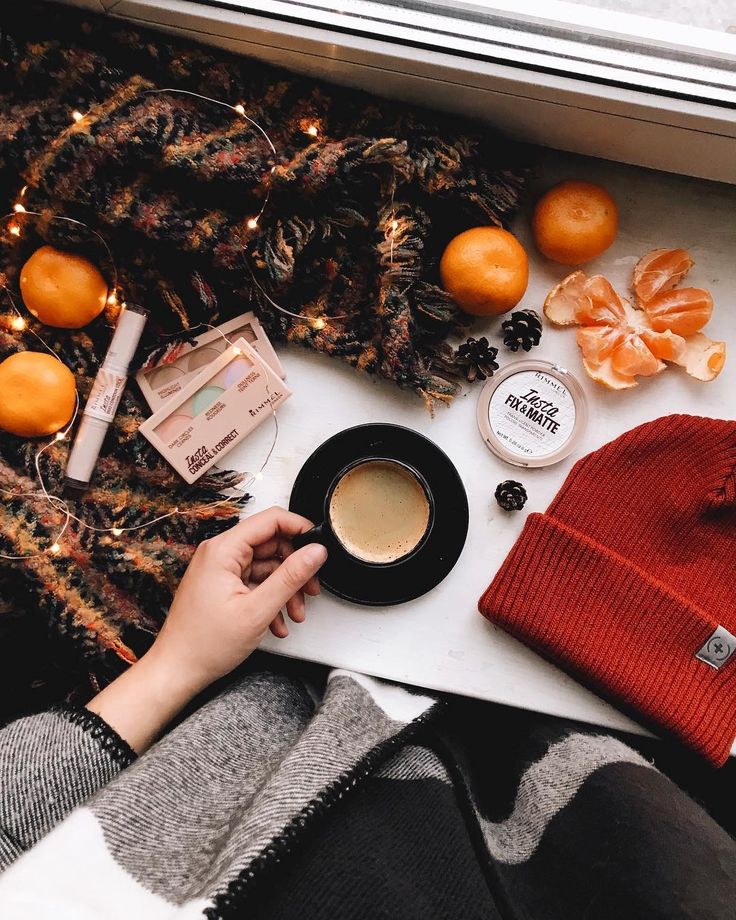 The more truthful and interesting your story is, the less it will seem to customers that the purpose of the publication is a sale. Any story about something will build an emotional connection with the company. They will make your content more interesting for customers. This will help build brand loyalty.
Pick a color palette and choose a filter. Sharing color and filtering across posts can help create a sense of consistency in your feed. To combine posts and make the feed look more harmonious, use the same 2-4 filters for posts. For example, vintage style looks interesting, bright colors - think about what suits your brand the most. You can remove the color from the photo or make a bright white background. The brand should have its own color palette of 3-4 color combinations, and they will be repeated in posts.
Create content that reflects the main principles of the brand. Capture detailed shots or eye-catching flat designs to show your product in a new light.
Also use user-generated content to help build brand trust. And one more thing: plan posts in advance and come up with a branded hashtag.
We've also written about tools to help your Instagram post stand out.
@tacobell 1.3 million followers: the brand's publications reflect a variety of bright colors and a fast-paced lifestyle. The main audience is millennials. The brand focused on fun and authenticity.
@vitruvi 67.7 thousand followers: The company produces essential oils. They have a soothing Instagram feed. They apply 1-2 filters, post unpretentious images and show the life of ordinary women. The brand associates its product with a clean and healthy lifestyle .
@meganhess_official 377 thousand followers: Megan Hess is an illustrator. Her work is related to fashion. Her illustrations are in demand and aesthetic.
@gopro 15. 9 million followers. GoPro photos show what it means to capture life with adventure through the lens of their product. Their posts show many unique moments. They will make you go out and capture your own adventures.
@oldnavy 2 million followers. Old Navy is a clothing retail company. She knows how to sell clothes by season and skillfully uses this on Instagram. In summer, their photos are bright yellow and they create the right mood. They also have an original color strategy – a gradual transition from yellow to blue in a series of posts.
3. A unifying object/idea
Instagram is an ideal platform for promoting blogs and businesses whose product needs to be demonstrated visually.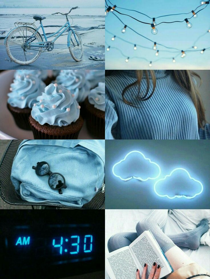 Here the picture is primary, and it is also important that all of them look harmonious on the page.
If you are still indiscriminately applying filters in search of your style, read the article. You will receive 3 fundamental tips on how to make your profile attractive on your own, without any investment.
The combination of colors is important when decorating in principle. You can ignore it, but even in the wardrobe everyone has clothes in basic shades and those that suit or like. In painting, make-up, floristry, colors must also be “weighted”, otherwise it will turn out to be a complete bad taste.
2. Identical filters
3. Uniting object/idea
Followme photos have become very popular on the Internet. Or photos / drawings / embroideries that are superimposed on the real picture and, as it were, complement it. Or a photo of a traveling hedgehog, or a toy character. Such stories, though simple in appearance, are interesting to watch. The most important thing is that you can come up with your own unique feature and implement it in any business.
Conclusion
Use these design guidelines, add associative captions (possibly right on the picture), throw up interesting content, get your subscribers used to dialogue right away and you won't have to spend extra money and time warming up your audience. She will be ready to buy and give feedback. Good luck!
Do you want to introduce the latest Western marketing, sales and social promotion features into your business? Register for the 3-day online training "Internet Business Trends 2018", there will be no repetitions >>>
Here are some practical tips to make your profile attractive and active.
We have already described in detail how to design Stories and sell with them. Recall how the covers of Highlights (eternal Stories) should look so that the profile looks harmonious.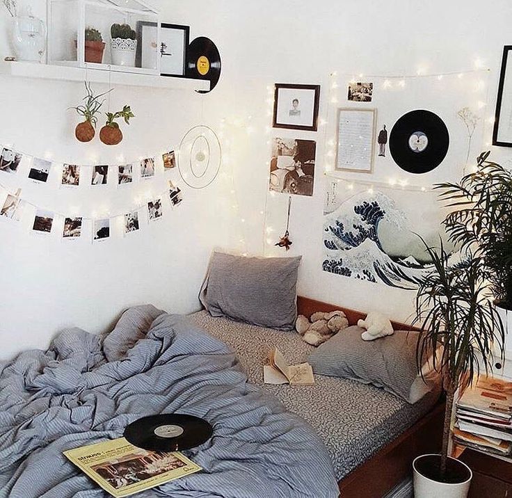
It's good when Highlights are combined in style with the main profile photo
You can set your own cover for each folder. Consider trends when you do this.
Naturalness, collages, photographs without filters, or vice versa, bright and unusual are in fashion
But anti-trends - boring illustrations are no longer relevant current clients. And all because unpleasant content scares away, and not everyone wants to see such posts in their feed. Therefore, it is better to hide such content in the carousel behind a beautiful cover.
content
 0.3 Exploring why we love it all Millennium Pop Culture: How We Started Thinking in Tweets
due potential or current clients. And all because unpleasant content scares away, and not everyone wants to see such posts in their feed. Therefore, it is better to hide such content in the carousel behind a beautiful cover.
Unaesthetic content tends to get the least amount of engagement (likes, comments, and saves), which affects engagement and reach.
Start with an idea. Even if it’s hard to decide, and “taking pictures of everything that surrounds me” seems like the best way out, focus on a specific topic. Culinary blogs, profiles about proper nutrition, about dancing, about clothes, make-up - yes, Instagram already has it all.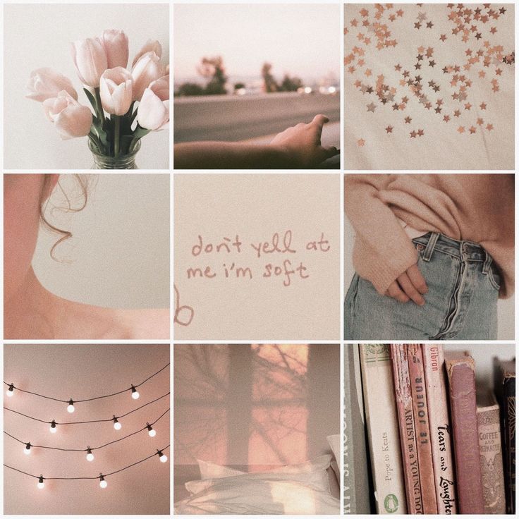 But you will do it your way. And people don't collect a list of subscriptions based on the principle "I already subscribed to a food blog, so I don't need another one."
Anyone can broadcast on Instagram. After the end, it will be available, like stories, 24 hours.
To start the broadcast, go to the news feed, click on your avatar (just like when creating Stories). Select the option "Live" in the horizontal menu below. Now by clicking "Start" you will be able to broadcast live on Instagram.
Warn subscribers about the broadcast in advance: make an announcement in a post or story. Pick a time when your audience is online. To do this, analyze the social network account in Popsters. On the chart "Activity / Days of the week" and "Activity / Time of day" you will find the most successful days and times for live broadcasts.
Wait for a larger audience, don't jump right into the main topic of the broadcast.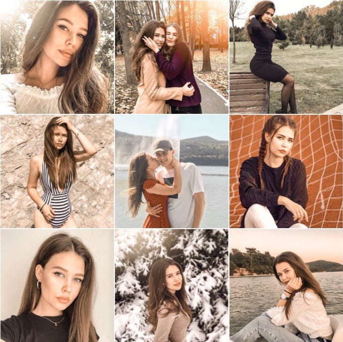 But at the same time, you can’t lose the audience who have already arrived: figure out in advance what will take the waiting time. Tell stories about the topic of the broadcast or arrange an interactive one: answer subscribers' questions or, conversely, ask them about something.
Use this idea to encourage your followers to view all the photos in your carousel. They will be interested to see how one part of the image flows into another.
If you're increasing saturation and contrast in a photo, it's time to switch gears. It is the soft, muted tones that attract Instagram users in 2019. Like film-like photos, this palette has a vintage feel. This color trend is especially relevant for fashion and beauty brands.
Hey Jude vintage shop feed example:
Photographs in such a subdued palette create a calm, relaxing atmosphere. It's a soothing break for tired eyes.
If you love the softness of film-effect photos, but want your photos to remain crisp and polished, this trend is for you.
Using pastel colors is easy: just use the Color Picker tool in Instagram Stories.
MIANN SCANLAN - @miannscanlan
LONI JANE - @lonijane
Loni is probably one of the healthiest and most harmonious Instagram users - all thanks to her raw food diet and exquisite vegan nutrition (yes, yes). At a minimum, you will get a lot of aesthetic pleasure, as a maximum, you will head for a healthy lifestyle.
JESSICA STEIN — @tuulavintage
Named after the Finnish word for wind (“tuula”), this Instagram embodies wanderlust, and is a kind of window through which we can admire the endless beauty of this world. Stylish Jessica herself, like the wind, is here today and there tomorrow, and always surrounded by flowers. Handsomely. Marvelous.
NATIONAL GEOGRAPHIC TRAVEL — @natgeotravel
Planet Earth in all its splendor.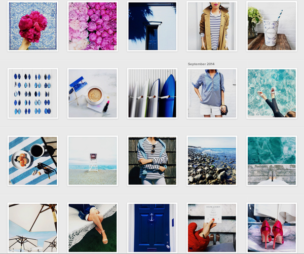
VALERIE- @biggalyoga
Valerie proves to us once again that everyone who practices yoga is damn good at it. Her Instagram is about yoga for beginners, self-love and the endless pursuit of self-improvement. Valerie did it and so can you.
JORDAN FERNAY - @ohhappyday
A wonderful account with hundreds of creative DIY ideas ( DIY - Do It Yourself, i.e. "do it yourself"). If after viewing the profile it will be difficult for you to resist the desire to quickly glue or color something, then we can assume that the guys coped with the minimum task.
HAMISH BLAKE — @hamishblakeshotz were. Funny grimaces, funny costumes and touching love of a father for his son for those who appreciate such things.
MIANN SCANLAN — @miannscanlan
Sea, quiet beaches and more sea. To everyone who appreciates the beauty of nature and seeks harmony with the world, Mianne sends quiet life-affirming vibrations through her photographs.
APARTMENT THERAPY — @apartmenttherapy
To prevent everyday life from merging into one gray stream, it is worth periodically updating the environment. Perhaps the best place to start is at home. Apartment Therapy has tons of ideas on how to do this and where to start, so subscribe yourself or send your moms here so they can realize their inner creator.
DAVID FRANKEL — @gkstories
Another account about tasty and healthy food, now from farms. You can talk about it endlessly, but it's better to go to the page once and see with your own eyes all this green splendor.
If you find a mistake, please highlight the text and press Ctrl+Enter .
An Instagram profile header that clearly describes what the user is doing can be considered a good bio.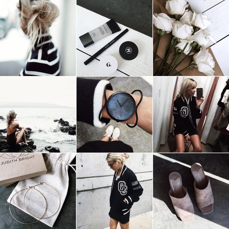 You can indicate your field of activity, interests, achievements and hobbies. For example, your Instagram description might look something like this: “love fitness + dog owner + founder of company X.”
Before you get a finished description for Instagram, you need to understand what a good bio consists of. This will help you use ready-made ideas for designing your Instagram profile header, improving them and creating your own bio.
So what makes a good description of yourself on Instagram? The answer can contain any of the following elements:
1. Informative
An Instagram profile header that clearly describes what the user is doing can be considered a good bio. You can indicate your field of activity, interests, achievements and hobbies. For example, your Instagram description might look something like this: “love fitness + dog owner + founder of company X.”
If you are an influencer, you can also include other important information such as brand collaborations, upcoming events you attend, recent announcements you promote, etc.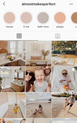
2. Witty
Witty Instagram caps tend to be one of the most successful and popular types of BIOs. Showing how smart you are without being offensive is a great way to impress people.
However, it's better to be original because people don't always appreciate borrowed phrases. Use of puns, clever quotes, wordplay, etc. this is a great way to create a witty Instagram profile design.
3. Sense of humor
Humor always works when it comes to impressing users on Instagram. The lines between wit and humor often overlap, so you can create a Bio that combines the two to impress your audience. Think of an interesting fact about yourself and find a way to describe it with humor. Even if you can't come up with an original joke, you can always use one of the ideas in this post.
Musician Diplo took a hilarious approach to writing his Instagram bio and simply referred to himself as an "Instagram model".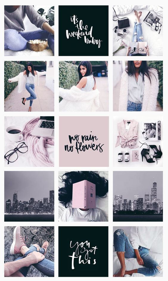 Anyone who knows him can find humor in this short and simple phrase.
4. Call to Action
Some Instagram bios are more call to action than entertain, but that doesn't mean they're less good.
You can be an entrepreneur or a professional. In this case, you just need a call to action and inspiring profile description. You can write an inspirational quote or phrase that reflects your experience without being overly intrusive.
5. Easy to Read
You can use any of these approaches to create your Instagram profile header. The best choice is one that expresses your personality. But no matter which approach you choose, your Instagram description should be easy to read. People who view your profile should be able to instantly understand what you do and who you are. You must be sure that no one misses any important detail in your BIO.
The best way to achieve this is to keep the BIO simple and short. You can use bulleted lists to include more information while still being readable. You can also use different characters to separate parts of the list, or add emoji.
To do this, take a screenshot of your profile and upload it to the application. The program will do the rest. Having found out which colors prevail in your Instagram account, start creating a cover.
The harmonious design of Instagram not only attracts attention, but also makes the profile more harmonious and professional.
First of all, "Relevant" is a section of the Instagram account where already published stories are posted. Many users are used to sharing life moments, impressions and emotions in Instagram Stories.
Unfortunately, stories disappear after 24 hours. And I want as many people as possible to see them. And just in this case, Instagram Highlights will help us. Collections of pinned stories are displayed under the header of the bio account.
The finished piece will be copied and pasted into the post.
Stories have a very weak text editor by default. Apparently, because this function was originally conceived for creating video content, i.e. a lot of text there is simply useless. What can be done:
If you don’t have enough standard text settings for stories, you can use social media post builders like Canva and Crello. Or buy ready-made templates for Photoshop, After Effects and Premiere Pro and customize them to your liking.
Beautifully designed texts on Instagram attract the attention of followers and increase engagement. In addition to decorating texts in the body of the post, you can also add text to the photo itself or to the story using third-party services.