Have you scrolled through Instagram before and seen brands and businesses using a big photo grid on their feeds and ever wondered how you can re-create it? Well, don’t worry. The team at Sked is showing you a step-by-step guide to transforming your Instagram feed with the big grid layout.
There are so many different ways you can make a grid picture on your Instagram feed from creating it yourself on Canva or downloading apps from the app store, there’s never been an easier way to get creative with your Instagram content.
Plus, if you’re looking to make a statement, launch a new product or announce an exciting rebrand, using a big grid is a must on Instagram.
Ready to learn how to do it? Let’s dive in!
Contents
What is a big photo grid on Instagram?A big grid post on Instagram takes one big picture and turns it into various split images. When you post a giant square image on Instagram you’re taking multiple tiles and turning them into an interconnected image for your Instagram feed.
Using a big photo grid on your Instagram feed is a great way to get creative with your Instagram account and increase engagement by spicing up your feed from the traditional square grid and making your brand or business stand out from the rest.
What are the benefits of creating a big grid on Instagram?On Instagram, there are endless ways to get creative and showcase your brand personality. While the app might be moving towards video content and embracing Instagram Reels with open arms, Instagram is a social network built on photo sharing.
One of the best ways to make a statement and grab your followers’ attention is by using the big grid approach. Not convinced? Here are three powerful benefits to using the big grid and why you should invest the time and effort in creating one for your own feed.
 So, why share just one image or post to announce a massive milestone? With a big grid approach, you can share numerous Instagram squares and related posts at once to make your content and brand unforgettable to your audience.
There are so many ways to create an Instagram grid layout – depending if you want to do it yourself or use a photo editing or grid maker app (although sometimes you might have to pay to use the split image feature).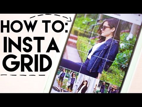
But, don’t worry, the team at Sked have done some digging and found the easiest, free ways to great a big grid on your Instagram feed. If you’re looking for the most effective strategies and best apps to take your Instagram content to the next level, you’ve got the right place.
Here are the three top iPhone apps to help you splice up your images and bring your photosplit dreams to life.
1. CanvaCanva is such a great graphic design tool for all social media content – but did you know you can create the big photo grid effect in just a few easy steps?
On this handy web application, you can upload your own images or use stock photography and graphics to create your big grid image.
Ready for a step-by-step tutorial to create your big grid through Canva? Follow along:
You can use many apps to make a grid post app, but the Grid Post App is one of the most popular (and free) tools! Plus, it’s available on ios and android devices, tool.
Ready to get creating? Here is a quick guide to using the Grid Post App to bring your big grid design to life:
Grids is another cool app that easily allows you to split images and make various types of grid posts on Instagram.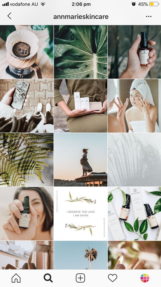
The best part is – they have a bunch of templates you can choose from to make your life a little easier. There are some templates and features only available with the paid version, but you can still use the grid feature with the free one.
Want to learn how to use the Grids app? Follow along with our handy guide:
Of course, there are other ways you can do this with other apps and even using Photoshop – but if you’re looking for a quick and easy way to achieve the Instagram grid layout these are your best bets.
Tip: Since the Instagram grid layout will use close-up individual posts of a bigger image, you’ll want to make sure you’re using a high-resolution image to get the best effect!
Types of Instagram grid layoutsNow that you know how to achieve the Instagram grid layout let’s run through different engaging ways you can start incorporating the big Instagram grid into your Instagram feed.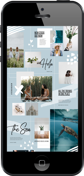
Here are two of the most engaging, innovative ways to use the big grid layout on your Insta feed.
Photo gridIf you follow the brand moon you’ll know they have an aesthetic Instagram feed that showcases a lot of influencer marketing. They even incorporated a photo grid when they first launched and announced their partnership with Kendall Jenner.
This photo grid is a tried and tested way to announce a big piece of news on your Instagram feed and ensures your audience are as pumped as you are about this big moment!
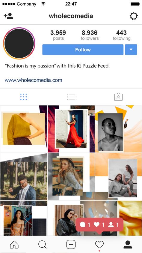
Puzzle gridUsing the puzzle grid is a creative way to make your Instagram feed more engaging and stand out. It’s also a great way to show off your design skills and show your audience you’ve put in a lot of effort to make Instagram content.
You can easily achieve this on Canva yourself or select some templates from their suite.
If you’re ready to take your social content to the next level, a puzzle grid is a must-try strategy!
When should you use the Instagram grid layout?Although you probably won’t want a big grid in your Instagram feed all the time (because sometimes it can make it difficult for people to clearly see your posts) there are some great times to utilise the big grid templates.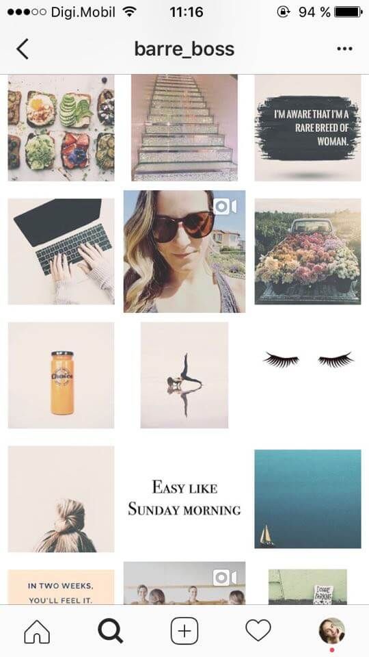
Let’s run through some great scenarios you can utilise the big grid layout to increase engagement and create some buzz for your Instagram profile.
Launching your brand’s channelWhen you’re first launching a brand you want to stand out from the crowd and make people interested in what you have to offer. Well, there’s no better way to do this than using a big grid layout on your Instagram feed.
It’s a great way to start teasing what’s in store or online without giving too much away so people are invested and want to check back on your Instagram profile.
Sharing a product launchLaunching a new product is an exciting part of every brand and small business. It’s a time to show your creativity and start teasing on your Instagram profile so people get excited about what products you’re offering.
You might want to try out the puzzle grid layout with interconnecting shapes and colour schemes that match your brand identity with split images of your new products.
Another great way to make use of the big photo grid layout on Instagram is announcing your re-brand. Interconnecting lines, shapes, colours and images to showcase your new brand identity is a creative and easy way to show off your new logo, colour scheme and brand fonts.
If you’re thinking about incorporating the big Instagram grid layout into your Instagram profile there’s no better way to do it than with a handy social media scheduling and planning tool like Sked Social.
Since there are a bunch of images you’re going to need to post you can make life easier and schedule your posts one after the other using Sked’s Instagram scheduling feature.
You can also plan out how the images will look on your Instagram feed with Sked’s Visual Instagram Planner feature so you’re Instagram grid is looking perfect.
Sked Social is your go-to social media management system, with a one-stop shop for scheduling, social media analytics, and monitoring! Try our 7-day free trial and take your social media management game to the next level.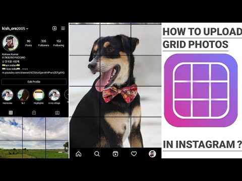
Alexandra | May 11, 2021
Splitting a photo can make your Instagram feed look more unique, very quickly.
And it doesn’t have to be complicated. It can be as simple as splitting a photo in 2 pieces. Your grid will look more aesthetic instantly.
You can use Preview app to split images. It’s super easy and fast to do. And you have a lot of different grid options.
I’m going to show you:
Let’s start!
Preview has an Image Splitter tool within the app.
Here is how to split a photo with Preview:

Your picture will be split into pieces.
Each individual post will appear into your Preview grid.
Click here to use it
You can auto-post to Instagram, or you can post manually.
To post manually:
Done.
Tip: Post individual images in the right order. Start posting from the bottom right corner of your screen and move your way left, and up.
Here are 3 useful features in Preview.
If your posts are not in the right order, you can move them.
You have 2 options:
 Prepare the captions for your posts.
Want to write a caption?
Press on “Find Captions” if you want caption ideas.
Press on “Find Hashtags” to find hashtags.
Caption tip: Want your followers to know that the post is part of a bigger picture? Annotate the image. For example, if you split your big picture into 3 images, you can write “1/3” or “1 out of 3” in the caption of the first image you share.
Want to post later?
Press on “Schedule Post”.
You can choose to:
Now that you know how to use the Instagram Grid Splitter, let’s look at creative Instagram grid ideas.
Let’s look at 5 grid ideas.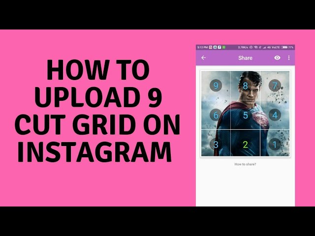
Split a photo in 9 parts, to create a square.
Ideal to create a suspense, photo reveal, product reveal, new campaign launch, or the launch a new Instagram page.
Want to split photos vertically? You can split the photo in 2 or 3 posts.
Recommended for a simple and unique feed.
Split a photo into 3 pictures in a row (horizontal). You can also choose to split in 2 pictures in a row.
Mix different grids to create your own unique feed. For example, I used 3 different grid splits for the feed below: “Square“, “1 column” and “2 Columns“
And now, my personal favorite way to use the image splitter tool: to create a Puzzle Feed.
Use the last two grid options in Preview to split your image into 12 or 15 smaller posts.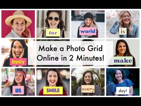
Why 12 or 15 posts? Because it’s the perfect number of posts to create a full screen seamless feed effect.
In seconds, Preview will split your images into smaller posts.
Here are Puzzle Feed ideas with 5 rows:
Tip: Make your big image the perfect size. This way each individual image will be high quality.
There are more image splitting options in Preview.
So have fun splitting your photos to create your own unique feed!
Let me know if you have any questions about this feature!
More tips:
Click here to use it
16 609 views
The best Instagrammers know how to properly schedule posts that create a great Instagram grid on their profile.
Why your Instagram grid is so important
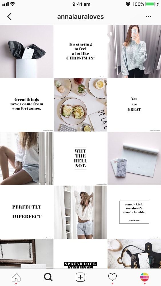
When someone first follows you or goes to your profile to check out your content, your grid is an opportunity to showcase your vibe or brand. nine0003
The grid gives you a bird's eye view of the user's post history. This is your first impression of their ... work: a brief introduction to their personal or professional brand at a glance.
So:
Stick to the color combination
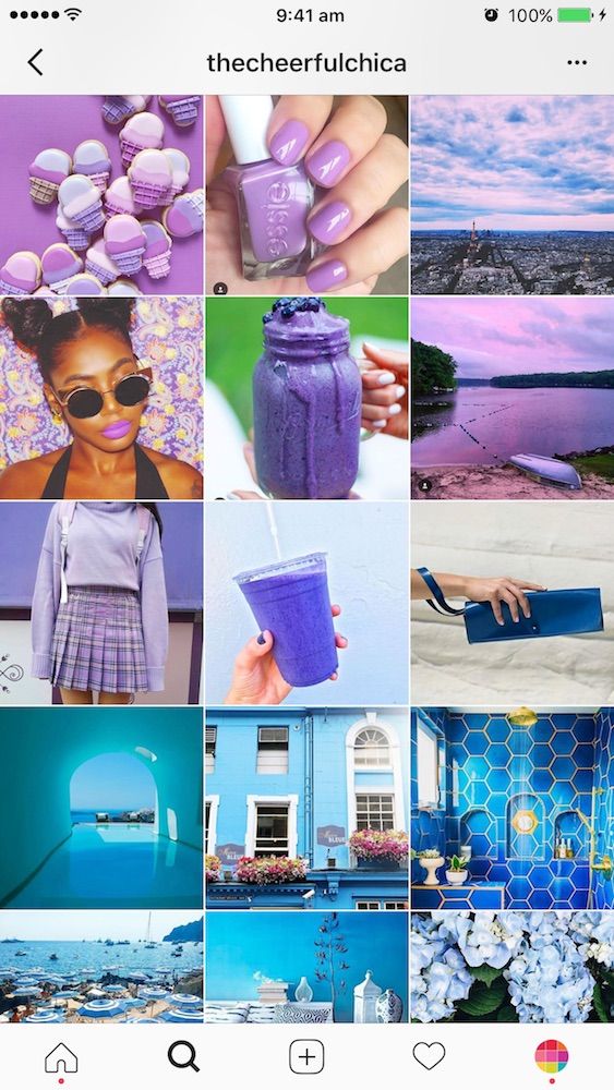
This is probably the most common grid style. Choose a color palette (pink and grey?) or a specific tone (high contrast neon?) for each photo. When viewed together, your gallery will appear as a matching set, even if the content of your photos differs.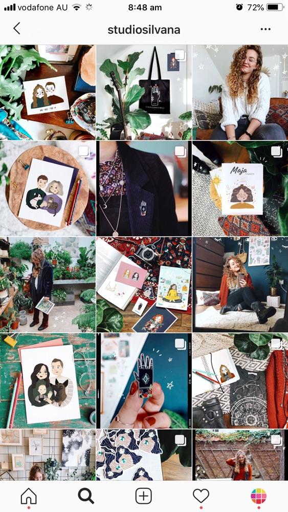 nine0003
Create a checkerboard effect
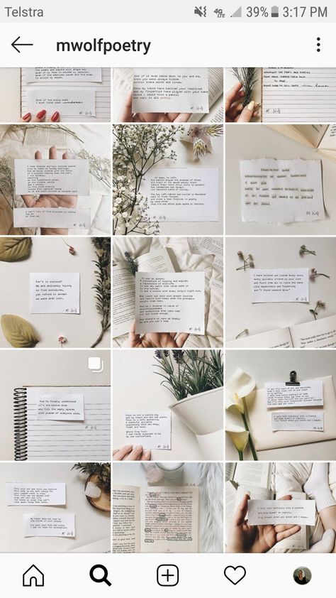
By changing the style of your published photo, you can easily create a checkerboard look on your grid. Try interlacing text quotes with a photo, or mixing close-up shots with landscape photos. You can also switch between two different colors.
Line by line design
Combining images in each row by theme or color can have a big impact. For example, use a different background color for each palette in your grid. nine0003
Create a vertical column
Dividing the grid into squares to form a vertical center image is a great way to combine graphic branding and photos on your profile.
Turn your grid into a rainbow
You'll need patience and great color sense to create this look. The goal is to post one saturated color regularly... and then gradually move on to the next shade of the rainbow with your next rows of posts. nine0003
Embrace the border
Creating a consistent look is as easy as applying a border to all your images.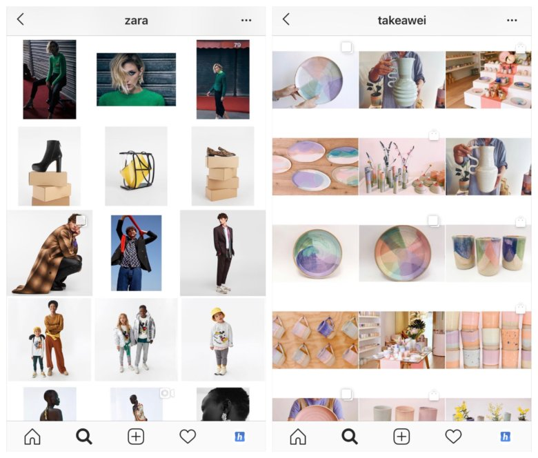 The free Whitagram app is one option to quickly apply this edit, with borders and backgrounds in a wide variety of hues.
Turn your messages into a puzzle
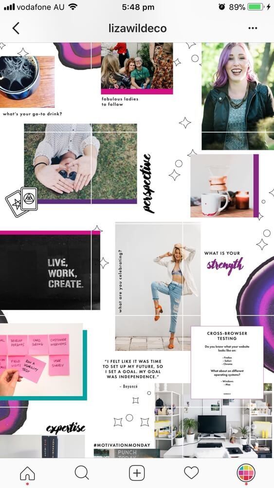
This layout is difficult to implement on a day to day basis, but for a large ad or campaign, or for launching a new account, the puzzle grid certainly makes a big difference. nine0003
Puzzle grid creates one large interconnected image from all the squares. Individually, these messages probably look like nonsense. But taken together, this is a work of art.
Tips for planning a great Instagram grid layout
1. Preview
Before posting:
You can mock it up in photo editing software or use the Hootsuite app integration, which lets you preview the layout before it runs. Right now it's only for personal accounts, but soon there will be a business account function. (The program is in English but with a very simple interface)
2. Be consistent
Building a great Instagram grid means sticking to a plan. One custom photo of the wrong color, the wrong filter, or the wrong order can ruin your whole look.
3. Make sure it matches your brand.
October 27, 2017 Web services
Turning your Instagram* into a work of art is easy. It is enough to evenly cut the photo you have taken. nine0003
Look at what @micahnotfound or @c.syresmith are doing with their accounts. You can do the same.
You can cut a photo into equal parts in any graphics editor such as Photoshop or GIMP. Just open the photo in the editor, divide it into equal square parts and save each part as a separate file.
From the View menu, choose Show → Grid. Go to the Edit menu and open Preferences → Guides, Grid and Slices.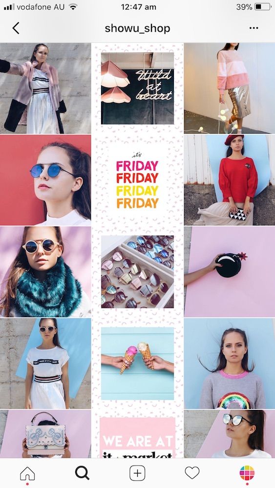
You can divide the image into parts depending on the panorama you want to create. Just enter the desired value in the "Internal division by" field.
Now that your image is divided into parts, select and copy the desired fragments into separate files.
Go to the View menu and enable the Show Grid and Snap to Grid options. Then click on "Image", select "Adjust Grid" and split the image into parts. nine0003
Select parts of the image one by one, copy and save to separate files using "File" → "Create" → "From Clipboard". Use the hotkeys Ctrl + C and Shift + Ctrl + V to speed up the process.
Divide a photo into equal parts using web services such as Griddrawingtool.com and Imgonline.com. It's faster and easier.
When the image is cut, you can start uploading. Just remember to upload the bottom right piece of the photo first and the top left piece last. nine0003
There are many mobile apps that create and upload mosaics to Instagram*.