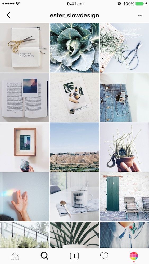
Sometimes it’s nice to take a break from endlessly scrolling through your feed — and endlessly scroll through someone’s individual Instagram page instead.
Welcome to The Grid.
Lined up neat rows of three, each Instagram post suddenly is part of a bigger picture. A peek into a user’s soul… or at least their content strategy.
And Instagram power users know just how to work this viewpoint to their advantage, with artfully planned posts that, together, create a gorgeous Instagram grid layout.
If you haven’t thought about what your own rows of squares add up to, it’s about time. Here’s all you need to know about building an attention-grabbing Instagram grid to grow your following and engagement.
Why your Instagram grid layout matters
7 creative ways to design an Instagram grid layout
5 tips for planning a gorgeous Instagram grid layout
Bonus: Get 5 free, customizable Instagram carousel templates and start creating beautifully designed content for your feed now.
When someone follows you for the first time, or navigates to your profile to check out your content, your grid is an opportunity to showcase your vibe or brand.
The grid gives you a birds-eye view of a user’s posting history. This is your first impression of their, uh, body of work: an introduction at a glance to their personal or professional brand at a glance.
For individual users, creating a beautiful grid may not matter — sure, color coding your posts could be a fun personal challenge, but if you’re just on the ‘gram to connect with friends, not amass an audience, branding likely isn’t too important.
But for brands, creatives or influencers, consistency and style are critical… particularly if your account is focused on aesthetics or lifestyle.
After all, your grid is a quick and easy way to get your message across. Plus, anyone viewing your profile is thinking about following you. This is your chance to show exactly what you offer.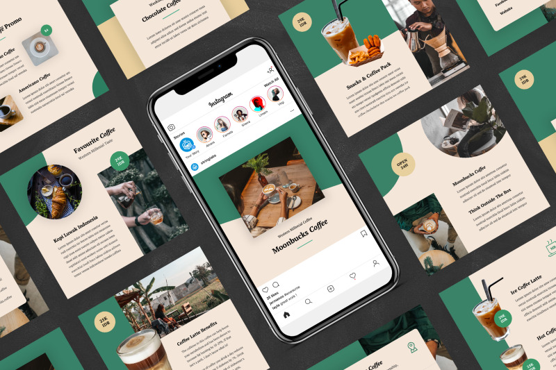
Are you avant-garde, or on trend? Will your content soothe, or bring the drama? Is your brand consistent, or chaotic? One look at a grid, and they’ll get the (sorry not sorry) picture.
Great grids start with a vision, so we’ve scoured the depths of Instagram to dig up some of the slickest styles to inspire your own look.
Commit to a color comboThis is probably the most common grid style going — not that I’m calling anyone lazy (don’t @ me!), but it really doesn’t get much easier.
Pick a color palette (pinks and greys?) or a certain tone (high contrast neons?) to feature in every photo. Viewed together, your gallery will look like a matching set, even if the content of your pics vary. Home and lifestyle influencer
@the.orange.home exclusively features photos with bright, white backgrounds with earth-tone accents. It’s a vibe.
In case your home or office isn’t decorated like an Insta-ready backdrop, one easy way to make sure your photos all speak the same visual language is simply to use the same filter for every photo to help create a consistent tone.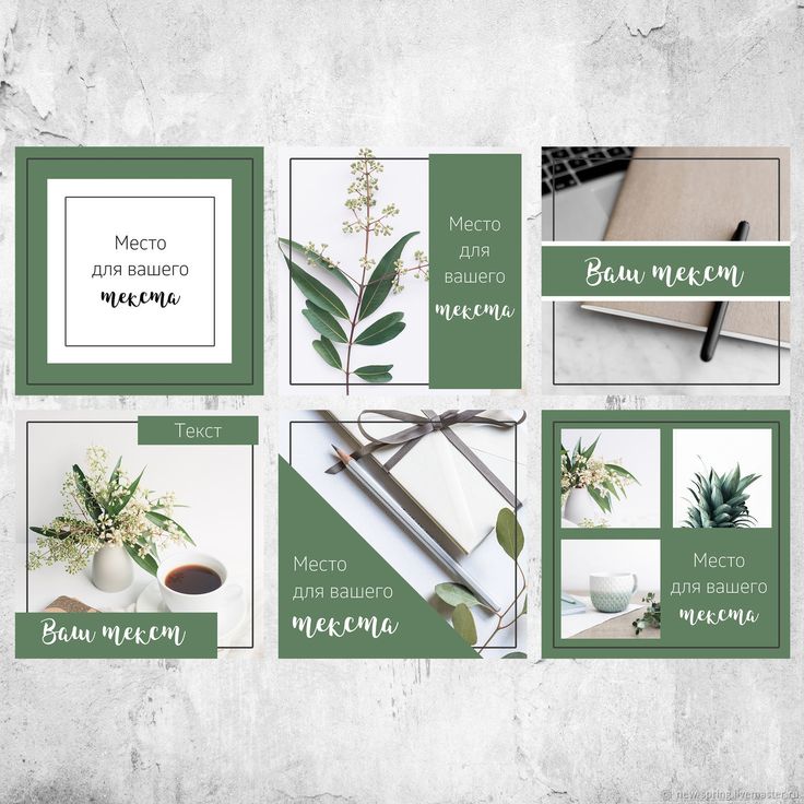
A variation on this theme? Using a standard filter or color palette, but also working in an “accent” color or filter every few posts, too. Maybe your feed is mostly dreamy, sepia-toned boho fantasy, but every few rows, we see a vibrant pop of forest green. Woo! You’re playing with fire!
Create a checkerboard effectBy alternating the style of photo you post, you’ll easily create a checkerboard look on your grid. Try alternating text quotes with photography, or mixing close-up shots with landscape photos. Going back and forth with two distinct colors can work, too.
Some adorable inspo for you: here, parenting resource @solidstarts alternates between photos of snacking babies and how-to graphics.
Hot tip: if you’re using text-based posts, keep the background color or fonts consistent to really make the pattern clear. Check and mate.
(Need a little help on the graphic design front? There are tons of great tools and templates out there to create visuals that pop.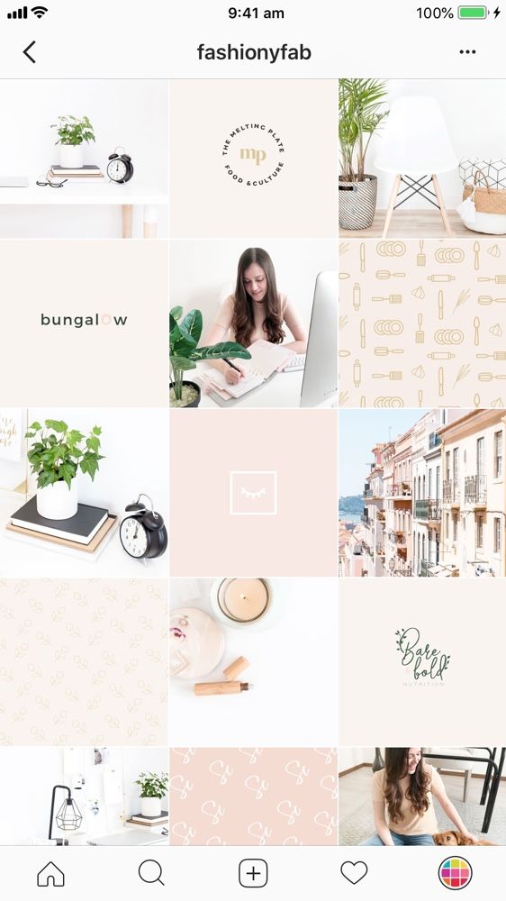 )
)
Think outside the box… and inside the, um, row. Uniting the images on each row by theme or color can create a powerful impact.
PR firm @ninepointagency, for example, goes with a different background color for each palette on their grid.
The trick for this one, of course, is that you have to post three images at a time, or the alignment will be off.
If you’re bold enough to experiment with panoramic images for one of your rows — a trio of photos that add up to one long, horizontal image, you daredevil, you, — many users post the same caption for each one to make it clear they’re three parts of a whole, like photographer @gregorygiepel did with his architectural shots.
Create a vertical columnBreaking up the grid with squares that create a vertical, central image is a great way to mix graphic branding elements and photography together on your profile.
Vancouver’s @communitybreathwork uses both a vertical and a horizontal connected image in this part of their grid — but the images can technically all still stand alone. (Or… lay down alone?)
You need both patience and a great color sense to pull this look off. The goal is to post regularly in one saturated color… and then slowly transition to the next shade in the rainbow with your next rows of posts.
To truly get the full effect of drag queen @ilonaverley’s rainbow ‘gram grid, you’ll need to scroll for yourself, but here’s a screenshot of her transition from green to yellow.
Embrace the borderCreating a consistent look can be as simple as applying a border to all of your images.
Stylist @her.styling uses white square borders on all of her images, but you could create a signature look with any range of colors. The free Whitagram app is one option to quickly apply this edit, with borders and backdrops in all sorts of different shades.
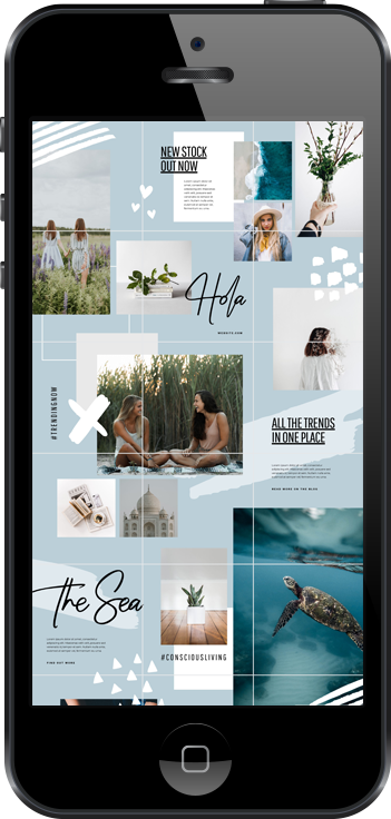
Turn your posts into a puzzleThis layout is a tricky one to pull off on a day-to-day basis, but for a big announcement or campaign, or to launch a new account, a puzzle grid certainly packs a punch.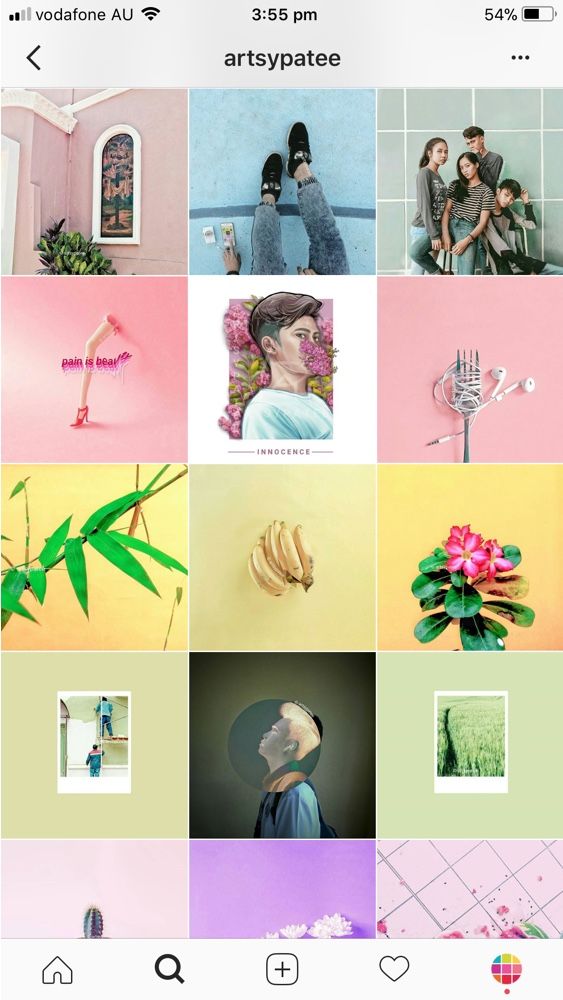
A puzzle grid creates one big, interconnected image out of all the squares. Individually, these posts probably look like nonsense. But viewed together, it’s a work of art.
Give commercial photographer @nelsonmouellic a round of applause for this visual feat, will ya?
Of course, none of these sleek grids happen by accident. You gotta grind for that grid! Here are some things to keep in mind as you’re planning out the big picture.
1. Preview firstBefore you post it: map it.
You could mock it up in photo-editing software, or use Hootsuite’s app integration that lets you preview your layout before it goes live. Right now, it’s for personal accounts only, but business account functionality is coming soon.
Bonus: Get 5 free, customizable Instagram carousel templates and start creating beautifully designed content for your feed now.
Get the templates now!
Create an Instagram grid layout of up to nine images, and then schedule them to go up in the exact right order via the Hootsuite dashboard.
2. Keep it consistentCreating a great Instagram grid means sticking to a plan. One off-beat photo in the wrong color, the wrong filter, or in the wrong order can throw your whole look out of whack.
Just imagine if luxury goods company @shopcadine tossed in a picture of a #kitchenfail to their muted, earth-tone, carefully curated collection of photos. Instant chaos!
3. Make sure it matches your brandUltimately, the goal of a grid isn’t just to impress your friends with your dedication to using a particular Lightroom preset filter. It’s to build a unified look for your brand.
So, if you’re a recruiting firm for high-level executives, like @mrinetwork for instance, having a playful rainbow grid might not quite fit the professional and serious tone you’re going for. A monochromatic, text-based series of posts, on the other hand…
In case you haven’t figured it out yet: Instagram is a visual medium… and it’s hard to put together a great grid unless the individual pictures also are great.
Luckily, there are tons of great photo editing tools out there, as well as expert advice around every corner… for example, our guides to taking great Instagram photos and staying on top of the hottest Instagram trends.
5. Schedule your posts in advanceKeep your gorgeous grid active and updated with the help of a scheduling tool that allows you to drop just the right filtered pic (or three) at just the right time. Hootsuite’s dashboard, for example, makes it easy to prep your best photos at your convenience. Get that grid going!
Of course, creating a great grid is just one way to capture attention on the ‘gram. For more marketing tips and tricks to take your account to the next level, check out our ultimate guide to Instagram marketing here.
Grow your Instagram presence using Hootsuite. From a single dashboard you can schedule and publish posts and Stories directly to Instagram, engage your audience, measure performance, and run all your other social media profiles. Try it free today.
Get Started
Grow on Instagram
Easily create, analyze, and schedule Instagram posts, Stories, and Reels with Hootsuite. Save time and get results.
Free 30-Day Trial
I am sure you already know that Instagram design is just as important as the content you share.
It is the first impression that any user of this social network will have as soon as they land on your profile.
And considering that Instagram has over 1.074 billion users, any detail you can use to differentiate yourself from your competition is key to success.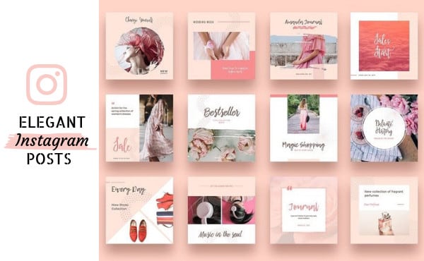
Have you already convinced yourself that you need to take care of the design of your Instagram account? If so, follow us on this adventure to create your design strategy.
Let’s start from the beginning… your Instagram feed! What is the Instagram feed?
The first impression is crucial to success on Instagram. In the same way, a well-arranged feed can attract new followers to your community. A careless feed can ruin users’ experience and make them flee in terror.
In short, creating a design strategy on Instagram will allow you to:
✅ Increase your community of followers, strengthening the commitment of those who already follow you and attracting new users.
✅ Improve your brand image by having quality content with a beautiful and worth visiting Instagram feed.
There are several ways to get a perfect feed: follow current trends, establish a color pattern, use a consistent style throughout the feed, etc.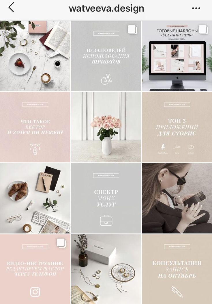
In fact, among the trends, there is a current feed style that is very popular in multiple Instagram accounts: The puzzle feed.
It is an elegant style that arouses users’ curiosity since it manages to form a complete image with all the photos you have uploaded to your feed.
It takes a lot of organization and planning to create this style, so everything is in the right place.
How to create a puzzle feed
To get the most out of your Instagram feed, we propose several designs that are trending in 2021.
Apply them to your personal profile, your business profile or your personal brand.
Here a wide range of possibilities opens, you can place the posts of your profile so that they have a different layout: vertical, horizontal, checkerboard or puzzle grid.
Here we will explain these four different layouts so you can decide which one you like the most or matches your brand image.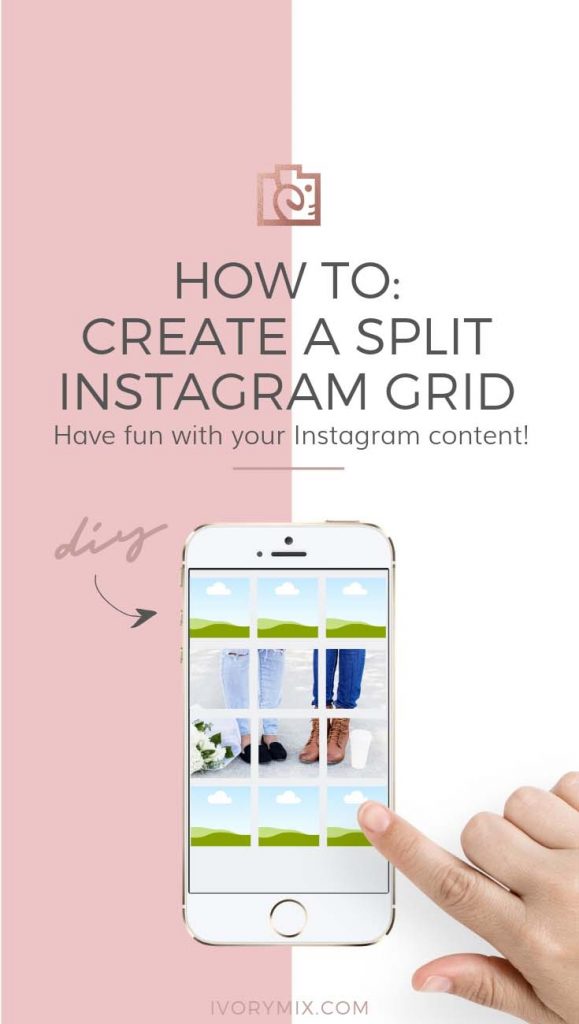
This is a classic design to use on your Instagram feed.
Checkerboard design in which two different types of posts always coexist in an alternate way. That is, when you publish the first type of design, the next post will be the other design and so on.
It is useful because you have several combinations and when you enter the feed you discover at a glance the type of post that interests you.
Example checkerboard layout
Tara Wagner’s profile combines two types of posts in her checkerboard-style feed. She combines and alternates a publication with text with other publications with photos in which she is the protagonist with different backgrounds and shapes.
With this style, the distribution of the publications is done in horizontal format.
Each row contains three photos belonging to a specific theme or topic. It is useful to have the same content published in three different posts instead of sharing a carousel where you need to click on the post to see all the information.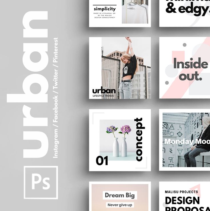
Also, it is a great resource to tell a story in three acts. Remember that we read from left to right, think carefully about how you are going to distribute your publications to follow a proper order.
Example horizontal style
The “Personaljournalapp” user groups his content in horizontal rows. There is always a space dedicated to quotes and then another section with three photographs of an artistic nature.
✅ Vertical styleThe style of this design is similar to the horizontal format, but vertically. The same rule of uploading three different photo styles is met, forming three columns covering different topics.
This facilitates the search to find content at glance.
Example vertical style
Cocó Constans’ profile perfectly represents this vertical style for the Instagram feed. In each column there is a type of content easily differentiated at a glance.
Each column is for a specific topic and style: quotes, recipes and physical exercises.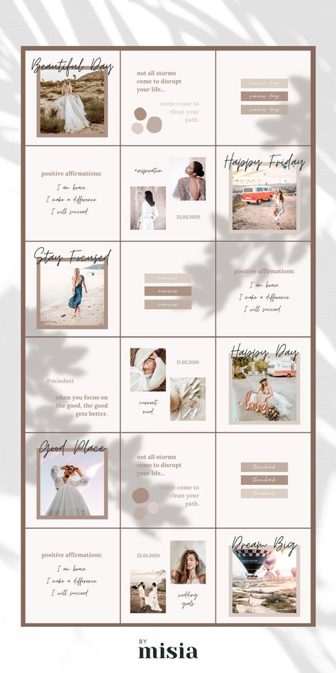
A real challenge and a great result when you have multiple posts on your Instagram feed.
This style consists of using different horizontal and vertical lines to form a complete image. That is, the image that you would upload in a single post, you divide it into several publications.
In this way, when entering the feed they see a great image formed in different publications.
The challenge here is being able to divide each image perfectly so that it looks good.
TRICK
If design tools are not your thing, you can use apps like Griddy to build this puzzle effect.
Despite the fact that the process is more complicated than the rest of the designs, you will love the result.
Example puzzle style
The user PetitFit_Team uses this style with the first nine publications on the feed that make up a full image.
As you can see, there is a wonderful harmony between the nine images that have a great impact.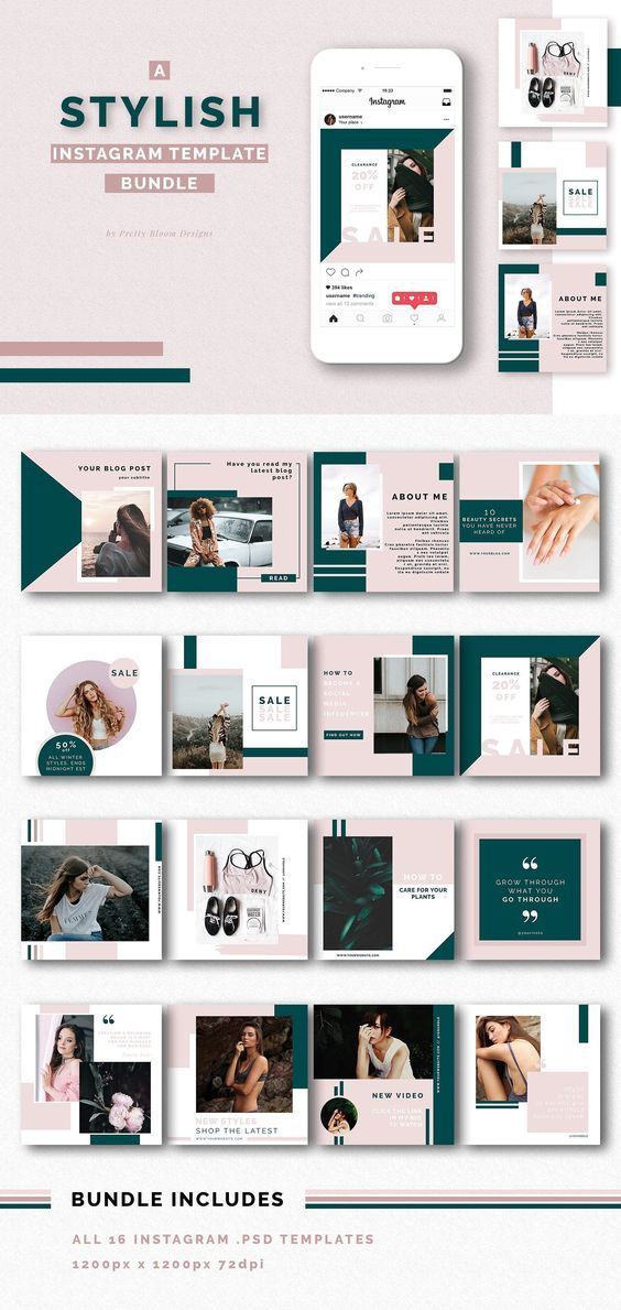 Also, in each publication you can add a different copy.
This type of feed layout is related to that of posts. Several profiles choose to reduce the size of the published photo in exchange for adding borders to the image.
In this way you can get a clean and minimalist feed because the photos are more separated than usual.
The result is a calm feeling, where each image stands out on its own. It is a clear and risky bet, because the moment you start with that style you must maintain it.
What kinds of designs can you find?
Although you can add any color to the images, the most common is white. This color helps to highlight the post and helps the user to focus on the image.
It is useful for a feed full of bold colors or even black and white. Depending on the thickness of the borders, you will get more distance between the publications.
In this type of design you can use a horizontal or vertical style, depending on the arrangement of the photo.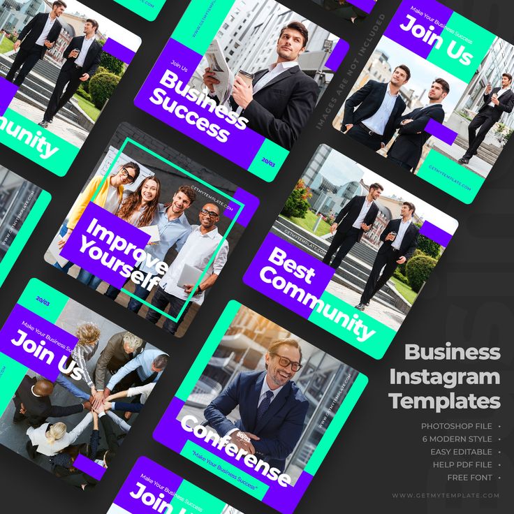 Also, you can combine both styles.
Example of colored borders
Lady.Austin’s profile is a clear example of this type of feed. Always use white for the borders and combine both horizontal and vertical styles depending on the type of photo.
As you can see, she uses a wide thickness that reduces the size of the photo so if you want to see it better you will have to click on the image, which will increase the chances of getting a like or comment.
Other alternatives to give your Instagram feed a personalized style is to set a pattern with colors or filters, always maintaining consistency in the publications.
These options combine perfectly with the rest of the feed styles, both in checkerboard grids and photos with borders.
Here are some examples that you can put into practice.
A common resource for users is to use three dominant colors throughout their feed. You can use a single color or more than one.
In any case, the idea is that these dominant colors appear in all the posts of your feed.
Example feed with primary colors
In Hailey’s profile (@dreaming_outloud) three colors predominate: green, orange and brown. They appear in all the posts.
The result is a colorful but harmonious feed thanks to the use of the same colors consistently.
As with the dominant colors section, an alternative for your feed is to always keep a design using the same filter in all your publications.
In this way the same aesthetic is maintained and it transmits harmony.
Example of dominant filter
The user AngelMagiccc applies the same filter for all her photographs. Far from having a monotonous experience, the chosen filter allows you to see a homogeneous aesthetic throughout the feed.
In addition, she combines the filter with a dominant color, such as the red of the sky and the dark tones in the silhouettes.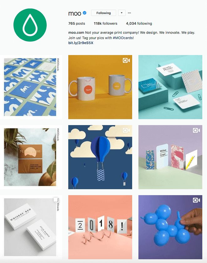
If you have an online store, this type of feed is one of the most popular to highlight the products you sell.
The objective is to highlight the product and make it attractive to the user. The protagonist here is the product photo.
Example of minimalist style
MiinCosmetics is a clear example of a minimalist design to highlight the importance of the product.
In her feed, there is also room for a checkerboard style, dominant colors such as pink and the minimalist atmosphere itself.
This Instagram design aims to convey joy. To achieve a lively and cheerful Instagram profile, bright colors are a great option. It brings a wide variety of options in contrast to dominant colors.
In general, it is a style used in food recipe profiles. The dishes themselves are responsible for giving color to any post, in addition to awakening the user’s appetite.
Example of the use of vibrant colors
Amina, the user behind the ‘Arabfruitdaily’ profile, uses the same dark background for all of her food posts allowing the recipe to stand out above the rest.
In each post the color of the food plays its role, achieving a feed full of vivid colors. You will want to start cooking all the delicious recipes!
The entire wall belongs to one color and its various shades. Most of these profiles play with whites, blacks and greys.
For instance, if you opt for the color pink, this color will appear throughout the feed, but playing with the shades of it: lighter pink closer to white, a darker pink tone.
Example of Monochromatic Style
Photographer Gabriel Blaze opts on his Instagram profile to play with black and white, to get a spectacular “photo album”.
It’s another monochromatic style option if a specific color doesn’t quite convince you.
Another example of color is Victoria’s profile, where she plays with the color pink and its different shades in all her publications.
What you find is a recognizable feed at a glance, as well as photographs that you will only find on her profile.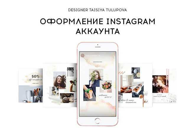
These are our design proposals for your Instagram feed to attract new users and strengthen your community.
However, remember that you need more than a good design on Instagram. The content is equally important since this is what will help to maintain your community and encourage followers to keep checking your publications.
“Graphic design is not what you see, but what you have to make other people see” (Edgar Degas)
You probably wonder how to move those “pieces” of the puzzle without deleting images or archiving some, considering that Instagram does not allow you to freely change or move the posts.
Can you imagine having a preview of your Instagram profile before publishing a post?
With Metricool’s Instagram Feed Preview, you can see your profile feed with the posts you schedule from the platform before they are actually posted.
Try Instagram Feed Preview with Metricool!
✅ If you want to assemble your puzzle feed and are unsure if the images are correctly arranged, you do not have to upload the image and check it from the Instagram app.
With this Metricool feature, you can preview it and change something that doesn’t look right in the image.
Do you want to know everything about the Instagram feed preview?
Instagram Feed Preview
If creativity is not your thing, don’t worry because here, we have prepared a list of various tools to improve the design of your Instagram profile and have an ideal feed: photo editing, video editing, and even templates for Instagram Stories.
The good thing about Instagram, and the Internet in general, is that you can learn from other profiles and gather post ideas that can help you create a content strategy and have an attractive feed.
Where do you get these ideas from? 👇🏻
Instagram photo ideas to inspire you
Filters and effects on Instagram are an excellent opportunity to give your content a different and personal touch: learn how to search filters on Instagram to find the ideal one.
Of course, you have to be careful about adding them to your post. Make sure you use filters that combine well or opt for a dominant filter that maintains that harmony in the Instagram feed.
Filters are also available for stories. In this case, the use is different because this content lasts 24 hours.
However, you can maintain the same style for your stories or the same filter that allows users to identify your content and profile the moment they see it. Take care of the design if you upload many stories and keep highlighted stories in your feed: Remember that you can add a cover for each highlight story on your profile.
This Instagram design option is not entirely related to your feed because it is not seen at first glance since you have to enter the post to check it.
However, it is still an essential element of your design and serves to identify your profile.
Why use different font styles on Instagram?
▶️ ️ To highlight posts: Create key posts by playing with emojis, fonts, hashtags.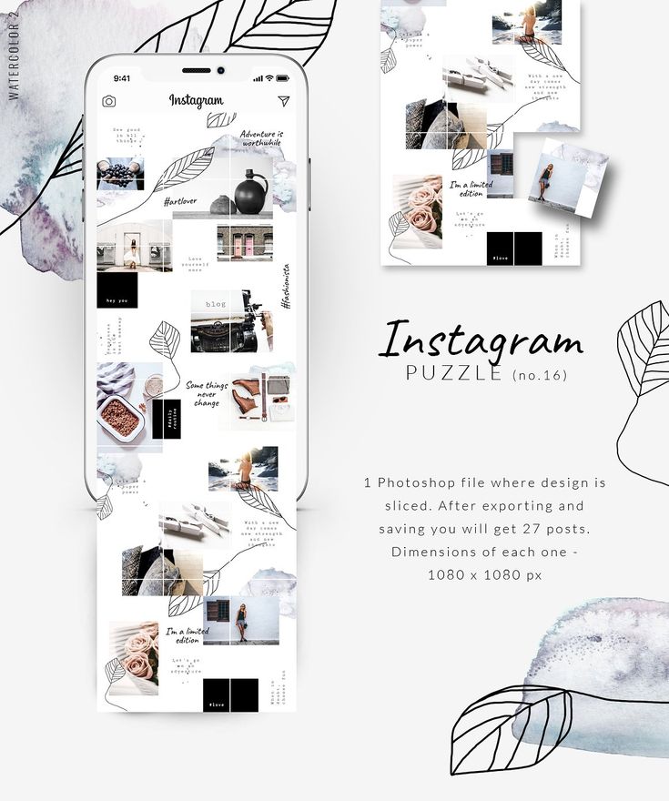
▶️ ️ To be different from your competition: stand out from other brands in your field through typography. They will identify you instantly.
▶️ ️ To emphasize some of the copy: an offer, a discount, holidays, any excuse is good to use different fonts on Instagram.
Pages to change fonts on Instagram
The possibilities of this social platform in terms of design surprise you every time you upload some content to the platform.
In stories, one of the options to maintain an attractive design is to change the background color: it allows you to play with your creativity and design the content as you wish to create personalized stories.
How to take advantage of this option in your Instagram design?
How to change the background color of your Instagram stories
And if that’s not enough, there are a large number of applications on the Internet to edit your stories . Give your personal touch to your stories so your community can identify your style instantly.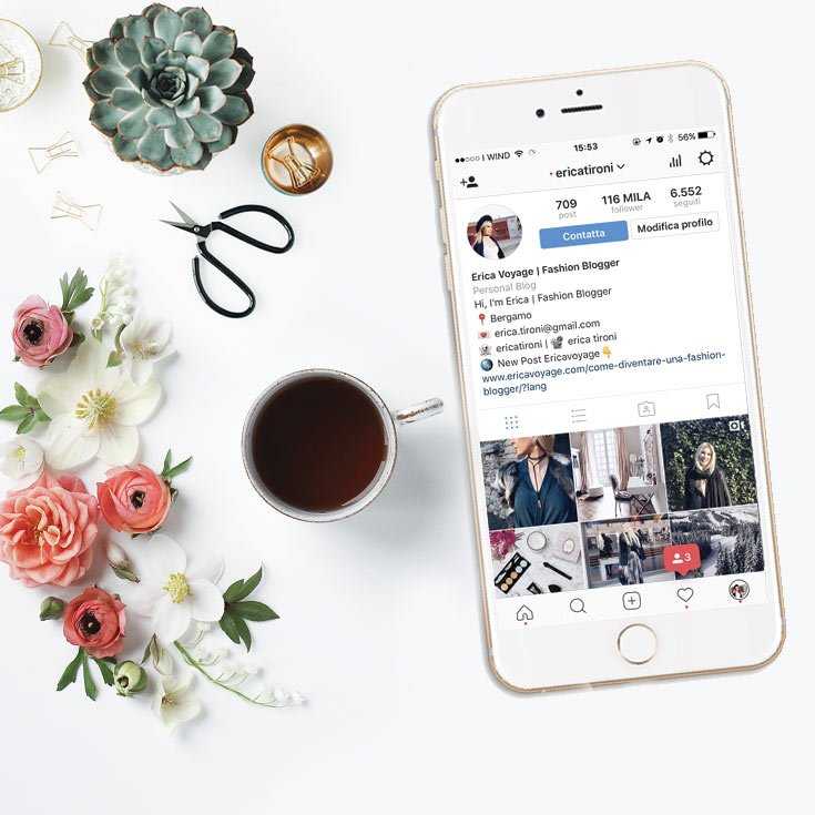
Apps to design Instagram Stories
If videos are one of your great content assets on Instagram, with the online or app tools out there you can get a lot out of it.
Some of them are free and some of them are also free but incorporate features for premium members.
You just have to choose which one you want and create customized videos for your account: Splice, Quick app, Horizon, InShot… variety to create your video content and succeed on Instagram.
Video-editing Apps for Instagram
Have you already prepared your strategy to create a perfect design on Instagram?
Any questions? We read you in the comments. 👇🏻
👇🏻
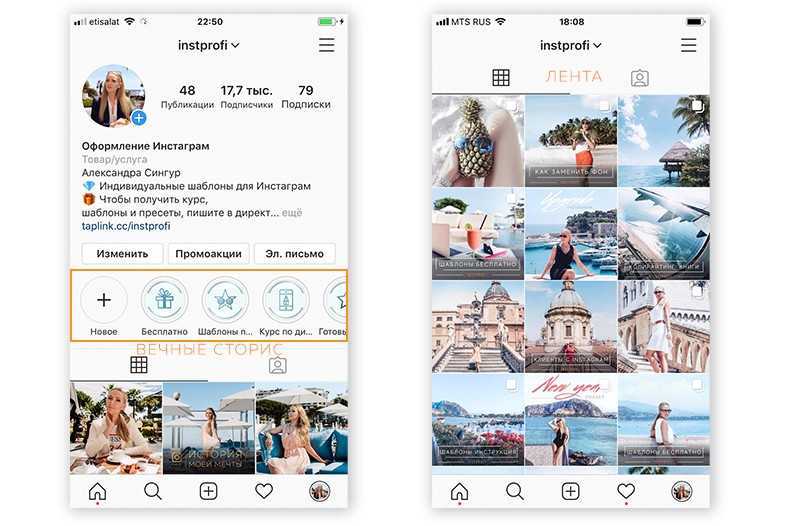
Choose a nickname, avatar, make a description, buttons and "Eternal Stories".
Valeria Svirskaya
founder of InShow agency, commercial writer
The head of the InShow content marketing agency and commercial writer Valeria Svirskaya talks about the basic principles of creating a profile on Instagram. The product belongs to an organization recognized as extremist in the Russian Federation, which will help you quickly find your profile in search and convert a client into a buyer. nine0003
As a basis, we took the account @primacandle on Instagram. The product belongs to an organization recognized as extremist in the Russian Federation, which is maintained by our agency. It is designed according to all the rules described in the article.
The best thing you can do for the promoted brand is to come up with a simple and understandable nickname that both the student and his grandmother will write down by ear. In this matter, the main rule is not to complicate things. Usually, the user enters a new nickname no more than 2-3 times, if the required account is not found, he easily switches to another brand. nine0003
Avoid:
How Apple does social media - detailed analysis with examples of good design of profiles on Instagram *
by InstagramThe product belongs to an organization recognized as extremist in the territory of the Russian Federation. is the same as letters, so @rr_r and @ppr are two different accounts and the user will get confused.  When entering this nickname, the user will first see the @apple and @applemusic accounts, and then everything else.
 A simple nickname that repeats the name of the brand. Easy to remember, no unnecessary characters and numbersGetting it right
- Use words that are simple and clear and easy to write down by ear.
- If there are 2-3 words in the profile name, write the nickname without dots and underscores. But better - cut it down to one word.
- Try to come up with a name that does not repeat well-known brands. nine0029
- Ideally, if the nickname is short and easy to remember, for example, @ohmylook, @tsvetnoy and @idocvm.
Connect Instagram* in Amplifer and publish photos, videos and carousels directly through your computer. Get recommendations for the best time and track post statistics. 7 days free
Cheat sheet for social media with platform recommendations
An avatar is the face of your brand and can be seen in the general feed, Stories, comments, and profile.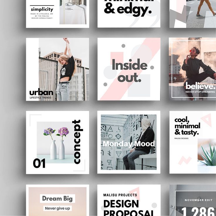 A weighty reason to look good and become recognizable. Tips for photos in
 Instagram will help you make an avatar. The product belongs to an organization recognized as extremist in the territory of the Russian Federation. Let's say you produce handmade bears and want to put a product photo on an avatar. The worst thing you can think of is to shoot a bear on an old smartphone in the evening under artificial yellow light. And such examples on Instagram The product belongs to an organization recognized as extremist on the territory of the Russian Federation. nine0025 is too much.
 Customize logo for
 InstagramThe product belongs to an organization recognized as extremist on the territory of the Russian Federation.. The avatar shows a color, high-quality photo of the owner of the Primacandle brand with the product. It immediately gives the impression that the account is maintained by Natalia herself, this inspires confidence among new subscribersHow to do it right
- If you have an online store or a brand, put a large logo on the avatar. Subscribers react more actively to photos with faces, but if you are not the face of your business, it is better to show the logo. A high-quality logo inspires more trust in the brand even before the moment of purchase. nine0029
- If you are an entrepreneur or freelancer, put the best portrait on your avatar. The photo must be of high quality, with an open face. High-quality does not mean studio and made on an expensive camera, now it is easy to take a great photo on a smartphone. Choose a sunny day, find a white wall, clean your smartphone camera and take dozens of photos, you will surely like one of them.
- Be sure to adapt the logo for the avatar. The brand name should be clearly visible, for this it is better to choose a sans-serif font, so it will be better read, and the font and background colors should be contrasting. If you have a logo in pastel colors, come up with a black and white version or a monogram specifically for
InstagramThe product belongs to an organization recognized as extremist on the territory of the Russian Federation..- Choose real photos for your avatar, no stock images. Users have learned to identify falsehood and such an avatar can play against you.
Account name - 30 characters. This information is indexed by the search InstagramThe product belongs to an organization recognized as extremist in the territory of the Russian Federation. Therefore, fill in carefully. Indicate the city and keywords, for example, "cakes Moscow" if you are a confectioner from Moscow. There is no need to duplicate the brand name if it is indicated in the nickname.
Account description - 150 characters. It's kind of a price tag. At first glance, the client must understand whether he needs you or can move on. In the description, include all the key information about the brand:
How to use emoji in social networks - Amplifer's guide
Emoji . In profile descriptions, we use emoji to structure the text, highlight keywords, and grab attention. Users InstagramThe product belongs to an organization recognized as extremist in the territory of the Russian Federation. are already accustomed to the fact that emoji with an envelope indicate mail, and a handset - a mobile number. This makes it easier to grab attention and quickly find the most important thing.
Unusual font . In some profiles, you can see non-standard text in the account description. This is a good way to draw the user's attention to the most important thing. You can make such a test at sprezzkeyboard. com. nine0003
Additional text in account description . If 150 characters is not enough for you, there is an easy way to add information in the profile description. To do this, you must have a connected business profile. Go to Settings (Options) → Edit profile (Edit profile) → section Company information (Business information) → Contact options (Contact options) → Address (Address). In field City (City/town) enter your city, and in field Address (Street Address) - missing text.
Instagram analytics guideThe product belongs to an organization recognized as extremist in the Russian Federation. — detailed analysis
Active buttons . Business accounts have active buttons Call , letter , text and How to get to if the owner has added a phone number, email address and location. On the one hand, this is the instant inclusion of the user. On the other hand, not everyone notices the buttons, because they merge with the background of the application, and in the desktop version they are not displayed at all. Therefore, duplicate important information in the account description. nine0003 In the mobile application
 InstagramProduct belongs to an organization recognized as extremist in the territory of the Russian Federation. buttons for call, mail and location are active These buttons are not available in the browser
Link in the description . When you add an active link, make sure that it leads to the actual page. For example, if you have an online store, then put a link not to the main one, but immediately to hot commodity items. If the emphasis is on the blog, then indicate the link to the last article. Sometimes, instead of a link to a website, you can see a link generated by mssg.me, linktr.ee, or a similar service. nine0003 This is what the link looks like in the profile description
Such services make simple landing pages where you can specify several ways of communication. For example, WhatsApp, Viber, Telegram and website. This is convenient, but often users do not respond to unfamiliar and incomprehensible links and simply do not follow them. Therefore, add a call to click on the link in the description.
Try Amplifer to post to Instagram* directly from your computer, without notifications, receive analytics reports and recommendations on the best time to post
How beautiful it is to lead InstagramThe product belongs to an organization recognized as extremist in the Russian Federation. company — column of the founder of "Periodiki Press" Varvara Vedeneeva
Recently InstagramProduct belongs to an organization recognized as extremist in the Russian Federation. added Highlights - collections of "Stories" that are displayed under the profile description. This feature is not available to all profiles, but “eternal stories” are actively used abroad.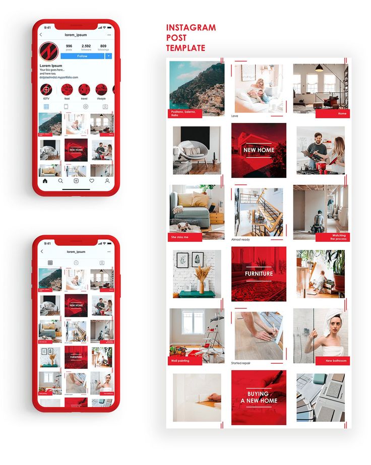 The most popular format is thematic icons with a description of a service or product. nine0003
We added candle-making videos to Eternal Stories, but this format didn't really go well: such posts got only 2,000 views more than regular Stories. We left them, but moved promotions and sweepstakes to the first positions.
Announcement of the action for Valentine's Day InstagramThe product belongs to an organization recognized as extremist in the territory of the Russian Federation.. InstagramThe product belongs to an organization recognized as extremist in the Russian Federation, so add keywords (your city, what you do)  If you use the "call", "send email", "send sms" and "get directions" buttons, duplicate this data with text in the description. nine0029
 Register and connect Instagram* to Amplifer to schedule posts with text, photos and videos directly from your computer. Track post statistics and get recommendations for the best time to post
Share
* The activities of the Meta organization are recognized as extremist and banned on the territory of the Russian Federation
We tell you how to properly design a page on Instagram. We will discuss the name, profile description, profile picture and design trends.
Account name is the nickname by which users in the social network will search for you. It is always in English. And it can even be generated in various services.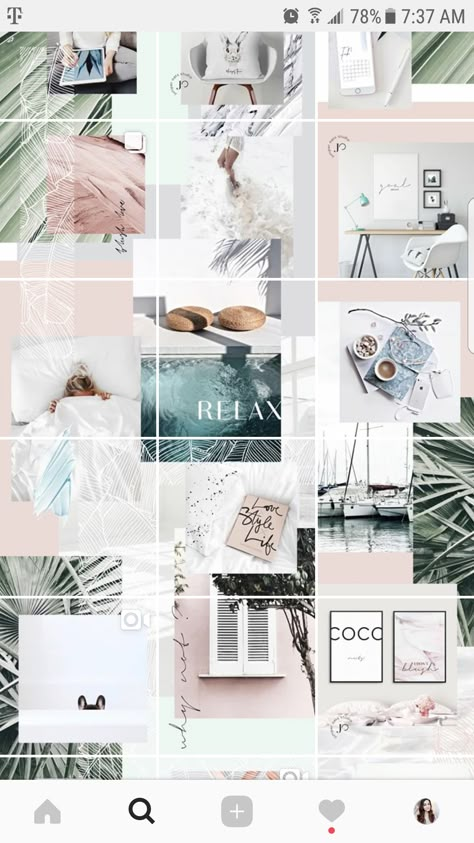
It can be abstract: related to your field, personal characteristics, hobbies. For example, @lady_text, @krasiviye_blondin, etc. Or emphasize your personal brand and be in the first/last name format. For example, @gulia.konk, @ivavanivanov. nine0003
The maximum number of characters is 30. If you enter a nickname that already exists, the social network will not allow you to register such a name. In addition to letters, you can add:
To make it easy to find you on Instagram, we recommend:
Also remember that your nickname is the username you will use to log in. You can change it once every 2 weeks.
The profile photo is the same photo that is visible in the small circle. And here it is important that your face in this photo can be seen. This is your personal page, so the photo must be of you.
From the tips:
Examples of avatars for bloggers Alexandra Mitroshina, Larisa Parfentyeva, Katya Kornilova (from left to right)
+ Tips for creating a content plan. The article contains relevant ideas for posts in an expert, personal and business account, as well as talks about the content plan and content matrix. nine0003
The account description is your Instagram passport. True, you draw it up not as officially as a document. In social networks, on the contrary, an easy and understandable style is appreciated.
In the profile description you must write:
If you have your own hashtag, you can also add it to the description. Previously, almost all bloggers highlighted points with emoticons. Now the majority writes the text either without division into paragraphs, or without emoticons. But both are in trend.
Old design options
New design options
Content let's now talk about how to formalize the covers of fixed storis. Otherwise, they are also called highlights or actual stories. They do not disappear after 24 hours, and the archive is saved there. nine0003
All stories are divided by topic into different groups. Each one needs its own cover. If earlier they used logos, icons, now the cover trend is different.
1. Simply select the photos of . Live, real. At the same time, it is good if the colors are combined with the shades of the tape.
2. Use the single color . No icons or text. In this case, the shades should be similar or matching palette.
3. Pick up unusual pictures that are rarely seen anywhere .
4. Use boho style . Its bases are: natural shades (often yellow, beige and brown) and ethno-details.
5. Add typography - "magazine style" . Main elements: various fonts (no more than 3), their unusual design, for example, in a circle.
What stories should be fixed in highlights? In fact, there are no rules in this matter. Just remember that these stories are in addition to the profile description. It should be clear who you are, what you do, what is important to you in life. Therefore, in highlights you can fix:
There are only a few rules you need to remember to make your ribbon harmonious. nine0003
1. Select 3-4 basic shades to be used in your profile. These colors will be the most: texture, scenery, your clothes, details, etc. Try to choose shades that combine with each other, for example, natural ones.
2. Try to match the hues in adjacent photographs . These can be top and bottom photos, through one and adjacent frames.