Social Media Design Tips & Blogs
By Benjamin Chacon
•
Updated on January 23, 2020
•
3 minute read
The new Instagram Layout feature is a game-changer for those who like to get creative with collages on Instagram Stories. Here's everything you need to know:
Published January 23, 2020
If you love collages you’ll love the new Instagram Layout mode for stories!
Announced in December, the feature is a game-changer for those who like to get creative with collages on Instagram Stories.
Collages were one of the hottest Instagram design trends of 2019, but until now, they had to be made outside of the Instagram app.
But that’s all changed now! Here’s everything you need to know about Layout, Instagram’s new collage-maker for stories:
How to Use the New Instagram Layout ModeWhen you open Instagram Stories’ Layout mode (you’ll find it at the bottom of your camera, next to other modes like Boomerang and Superzoom), you’ll be prompted to snap a number of photos or you can upload them directly from your camera roll (6 total).
You can also tap the layout you like best from the center of the screen (there are several layout options available to pick from):
Once you’re happy, tap the checkmark button and proceed to add any other design elements, like text, tags, filters, emojis, drawings, GIFs, and more.
And that’s it! Now you can either share your layout or save it to your camera roll for later.
Check out our post on the top apps to create collages for Instagram!
Why You Should be Posting Instagram CollagesA lot of popular Instagram trends start with influencers, and collages are no different.
But while collages were super popular in 2019 (a trend that’s set to continue in 2020), there was no way to create them in the Instagram app – you had to use a separate app to create them.
This wasn’t necessarily a bad thing. In fact, it led to a bunch of cool collaborations between brands and collage apps, like when Tommy Hilfiger partnered with Unfold to release their own collage templates:
Or when Revolve collaborated with the StoryLuxe app to create special collage templates for Coachella:
This clearly hasn’t gone unnoticed by Instagram. The new Layout mode makes it so much easier for brands (and regular users) to jump on the trend and share their own collages on Instagram Stories!
Strike a pose. And another pose. And then another. 📸
With Layout, you can now capture and share multiple photos in your story — a new, creative way to express yourself. Check it out! pic.twitter.com/j02aYOjsoO
— Instagram (@instagram) December 17, 2019
What do you think of the new Instagram Layout mode? Will you be sharing collages on Instagram Stories in 2020?
Love it or hate it, less us know in the comments!
Like to stay on top of all the latest trends? Subscribe to Later’s email newsletter for all the latest Instagram news, tips, and more!
About the Author
Benjamin is a Content Marketing Strategist and recent transplant from Toronto. You can follow his day-to-day on Instagram @benjaminchacs.
Category Social Media Design Tips & Blogs
•
12 min read
By Jillian Warren
Category Social Media Design Tips & Blogs
•
4 min read
By Amanda Demeku
Category Social Media Design Tips & Blogs
•
2 min read
By Jillian Warren
© 2023 Later. All Rights Reserved.
Instagram has recently launched a new standalone collage app called Layout. With this free app you can create a wide range of photo collage styles using up to nine different images from your iPhone. You can then save them to your Camera Roll or share on Instagram, however, you don’t need an Instagram account to use this app. In this article you’ll discover just what Layout has to offer for creating great photo collages on your iPhone.
The Layout app has been developed for one purpose, and that’s to create photo collages from your iPhone photos. Layout isn’t filled to the brim with features and gimmicks. It does just what it’s designed to do, and it does it very well.
To be honest, I’ve never been much of a fan of creating photo collages as they always seem a bit gimmicky to me. However, the simple user interface of Layout makes the process much easier than most other collage apps, and the quality of the results is fantastic.
If you’re going to keep only one photo collage app on your iPhone, and you don’t need all sorts of fancy shapes and frames offered by other such apps, then Instagram’s new Layout app is a top contender for that spot.
Layout is free to download from the App Store. Even though it’s been developed by Instagram and has built-in functionality to share collages directly to your Instagram feed, Layout is a standalone app so you can download and use it even if you don’t have an Instagram account.
So let’s take a look at the features of Layout and show you how to create a collage from your iPhone photos.
When you open Layout, you’re immediately given the option to start selecting photos from your Camera Roll. You can sort your photos by three different options shown along the bottom of the screen.
“All” gives you access to your entire Camera Roll. “Faces” filters your Camera Roll to only display images containing human faces. This, in particular, is a very cool feature to have for quickly locating photos of people.
Finally, the “Recent” option limits the display to only those photos that you’ve selected in Layout before (whether you’ve ultimately used them or not).
As you start selecting photos, suggested custom layouts are displayed along the top of the screen. By sliding the bar between the top and bottom sections of the screen, you can adjust the size of the layout previews at the top.
You can also scroll the sample layouts left or right to see even more options. After selecting up to nine photos, choose the custom layout at the top of the screen that is closest to the look/style that you want.
You’ll then be taken to the Edit screen to further refine your collage, which we’ll take a look at shortly.
A fun feature offered by Layout is called Photo Booth. Instead of selecting photos from your Camera Roll, Photo Booth takes a series of up to four photos using the iPhone’s front camera. The number of shots is adjustable by tapping on the number in the lower-right corner of the screen.
Since it uses the lower resolution front-facing camera in your iPhone, Photo Booth certainly isn’t meant for serious iPhone photography, but it’s fun to use with friends and family.
Once you’ve selected your photos and a basic layout, you can make all sorts of custom changes in the Edit screen. You can rearrange photos by simply dragging them from one cell to another.
You can then adjust the size of a photo by dragging one of the highlighted sides of the blue box that appears after tapping on the photo.
Please note that adjusting the size of one photo may affect the sizes of the surrounding photos as the overall layout grid adjusts in relation to the size of the specific image that you’re resizing. You can also adjust the crop of each photo by dragging it around within the grid space it occupies.
You can use the “Replace” feature at the bottom of the screen to swap individual photos in the layout for different ones from your Camera Roll without having to go back to the initial selection screen.
You can also use the Mirror and Flip tools to reverse the orientation of specific images in your layout grid. Simply tap on a photo to select it, then tap one or both of the Mirror and Flip tools to change it. This can be a handy feature to help balance the feel of the images in your layout grid.
Once you’ve designed your collage to your liking, simply tap the Save button in the upper-right corner to save the image directly to your Camera Roll.
After doing this, you’re then presented with additional options to share your collage to Instagram (naturally), Facebook, and other options including via text message, email, etc.
As you can see, Layout is very easy to use and produces great results with a clean and simple design. There are no gimmicky borders, overlays or layouts which makes a nice change from other collage apps. I would definitely recommend it for creating collages, even if you don’t use Instagram.
Every day your advertisement fights for the attention of the audience with hundreds of banners. An error in creating a layout threatens to drain the advertising budget and lack of sales. Employees of the MAER marketing department, using examples, analyze how a layout should be in order to attract the attention of the target audience and not remain in the zone of banner blindness.
10 702 views
What are layouts
There are two main platforms for displaying ads on Instagram: the post feed and stories.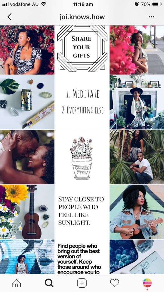
The dimensions of the layouts must comply with the requirements of the sites: for the feed - the aspect ratio of the banner is 1:1 or 4:5, for stories - 9:16.
Before you create an advertising banner layout, determine what goal you are pursuing: to collect leads, contacts, lead to a subscription or to a purchase. Based on the goal, think over the concept, advertising, visual design and offer (proposal). What to look for when creating a layout, we analyze further. nine0003
Visual
1. Attractive picture
The first thing that catches the audience is the picture. To collect traffic and attract leads, design your layout according to the “stop traffic” principle. Every day a person interacts with a huge amount of content, and he develops the so-called "banner blindness". He automatically flips through the same type of advertising, without delving into the essence.
Your task is to create a creative where the user stops scrolling and asks himself the question: “What is this?” If a person has such a question, he will take a closer look at the picture, read the text and, perhaps, follow the link. nine0003
Sometimes it's appropriate to use annoying, weird or even "trash" ads. Yes, it happens that it works better than the one that you just like. If the user is annoyed by something, then the effect “What is this?” already reached.
When developing a layout, you cannot adhere to the criteria "like" - "dislike", "beautiful" - "ugly". Often even targetologists cannot say in advance which creative will “shoot”. It is necessary to test creatives and analyze the results. Study the reaction of the audience and see where you hit the target. nine0003
2. Correct associations
Create a clear message in your creative so that the audience immediately understands what to associate your business with. For example, if you are advertising a restaurant, the mockup might include a high-quality photo of the interior or appetizing food.
3. Relevance to the target audience
This is necessary so that there are not only views and clicks, but also sales.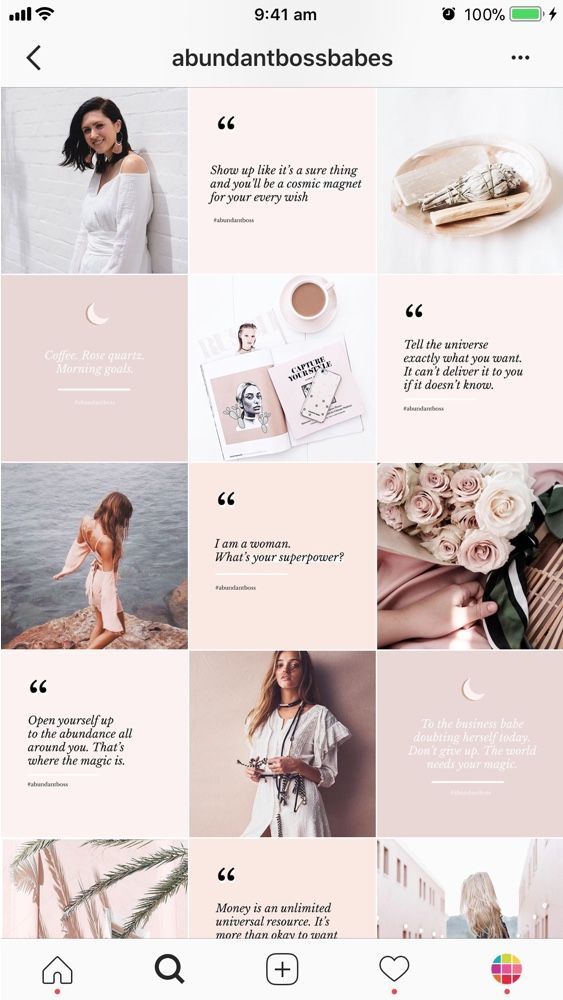 Imagine that you own a women's clothing store. The layout shows a sexy girl in a skimpy outfit and an indistinct offer. It is likely that men who are attracted to the girl’s appearance will click on the creative more. And this is not your target audience. The bottom line is that there are clicks on the banner, but there are no purchases. nine0003
4. Trends
Be careful with trends and hype. Trends tend to come and go. This is a temporary phenomenon. Yesterday the screaming cat was popular, today - "The Squid Game".
The danger of using trending "chips" is that they attract the attention of the audience for a short time. When everyone uses them, they become ineffective - people get tired and stop paying attention to them.
In addition, not all popular memes and hype topics will suit your business. The main thing is to introduce trend elements consciously and be able to stop in time. nine0003
5. Readable text
The number of characters is not important.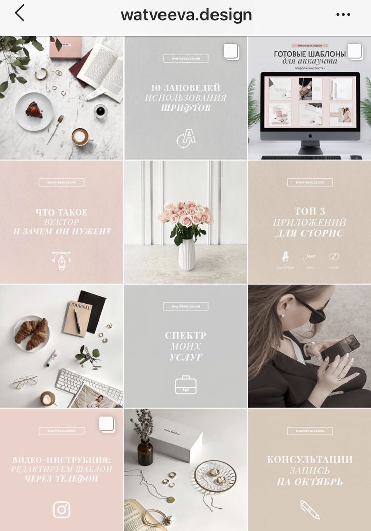 The main thing is that the user does not strain to read what is written. And for stories, it is important that the entire text can be read in a short time. The slide is shown for 15 seconds, and not all users will pinch the screen with their finger to finish reading your offer.
Be careful with the choice of font so that the reader's eyes are not dazzled and out of focus.
Must:
1. Don't talk only about yourself
Do not write in the offer the words: “we want”, “we can”, “we will do”, “we will show”, “we will teach”. It should be clear from the offer that a person can solve his problem with the help of your product or service, and why he needs to do it with you. nine0003
If you create a creative just to “light up” your brand, this is image advertising. This is more suitable for well-known brands. If you don’t have a name for the audience yet, it’s better to run both product and image advertising in parallel.
What can work for recognition:
Famous brands: “just add water” - Invite, “you deserve it” (affordable luxury) - L’Oréal, holiday and fun - Coca-Cola. nine0003
2. Do not abuse discounts
Advertising a sale is a good move only if you want to sell an illiquid product or attract an audience to a one-time promotion.
In targeted advertising, discounts work, but keep in mind that an audience that buys from you for the first time and at a discount is unlikely to buy at full price. Most often, such an audience cannot be motivated to repeat purchases at the full price. This means that you will lose profit. nine0003
3. Don't write a price without deciding on the objectives of the advertisement
If your task is to bring as many people interested in the product into the sales funnel as possible, and your sales managers know how to work with the “expensive” objection, make an “upsell” and bring the client to a higher check, then it’s better not to write the price in the offer . So managers will have the opportunity to work out objections with each client and increase the margin of the transaction.
If the task is to get target customers who are willing to pay a specific price, then you can and even need to indicate the cost in order to “cut off” the audience that is not ready to buy goods at your price. nine0003
Call to action
Call to action is an obligatory part of advertising. It prompts the user to subscribe, follow the link, register. You should not expect that a potential client will figure out what exactly needs to be done. Tell him.
If you don't say what to do, there's a good chance you'll miss the user. Without a call, only someone who is very attentive and who understands that he really needs your product will perform the target action. And the task of the marketer is to attract all the target leads who have a similar problem and who want to solve it. nine0003
And a few more tips
1. Always think about what image an advertising creative creates and what associations it evokes in people. Your advertisement can be creative, bright, with a clear offer. But if it does not match the image of the company, you risk attracting an untargeted audience and cause distrust among potential customers. This is especially true when your product or service involves risks or health. nine0003
2. Let the layout rest for some time before launching the advertisement. Perhaps, looking with a fresh eye, you will notice flaws in the visual or errors in the text.
3. Check how the layout looks on different devices. The creative should be well viewed both from a laptop and from a small smartphone.
4. Don't chase coverage. Reachable and viral creatives can lead to the wrong audience, and you will have to turn off the advertising campaign.
You already know what you're designing for. This will be an advertising poster, creative for Instagram*, a banner for a website or an image for targeted advertising on VKontakte (underline the one you need or enter your own option). Perhaps even picked up pictures from the Internet. And what to do next?
Which composition is better: asymmetric or central
Air and fields: how not to make a layout-vinaigrette
Hierarchy of elements according to the principle of a sales funnel nine0003
Hierarchy of distances: highlight the key
Working with text: what font and color to choose?
Making a layout in Canva - a simple tool for non-designers
Instead of output
Look at these posters. You have definitely seen these: they attract attention with a large graphic image, and some text is written on the side. These layouts have asymmetric composition .
Asymmetrical Composition Poster Examples
And here is another example, such you also saw. In this layout, all elements are stretched in the center. This is a poster with a central composition, and it has two problems.
On a layout with a central composition, all the elements seem to line up along one string nine0003
Problem number one is smeared air in the layout. The empty space has broken into pieces and it is not clear where to look.
Elements on the layout turned out to be indistinct, looks like a blur from a distance, no accents
If we were able to collect pieces of air into one whole, we would be able to place accents on the layout and break information into blocks. The breakdown into blocks is needed so as not to scare the reader away with the amount of information. Imagine that you need to feed an elephant to someone. Do you suggest eating it whole at once or in pieces? nine0003
Film poster designers are great at working with air. But such an amount of air is aerobatics. Don't overdo it.
Movie posters. The air sets the accents, and our eye immediately falls on the central element
You have also seen reverse examples, when there is little air in the layout. In an elevator, for example.
Air in the layout is an important element
The second problem is the rhythm of reading is lost. It just so happens that we all read from left to right, and when the text has a torn left edge, our eyes quickly get tired again and again looking for the beginning of the next line.
If the left edge of the text is torn, the eyes have to jump from the end of the line to a new location each time
How to get rid of these problems? Move the text to the left and align it to the edge, and move the image to the right. The text gets an easy-to-read left edge, and graphics, which are usually complex in shape, fit perfectly into the free space on the right. nine0003
Asymmetrical composition: text left, picture right
In the event that the picture on the layout is rectangular in shape, then it can be placed on the left. Along its smooth edge, the text also aligns well.
Rectangular graphics - left, text - right
In addition to asymmetry, we need margins. Margins are construction lines that elements from the layout do not go beyond. Elements that are further from the layout's borders receive emphasis. A simple example: look at two photos of a business lunch. In which dishes does the food attract more attention? nine0003
Plates with a wide rim create space around the dish, thus making it stand out. Content gets scope and value
Keep margins the same size at the top, bottom, and sides. You can make different fields, but leave it to professional designers.
Margins form 4 strong points on the layout - these are the corners. We are drawn to look into every corner. Therefore, logos, contacts, QR codes are traditionally placed in these places. nine0003
Keep margins, use angles for important information
Determine what is most important in your layout. Everything cannot be the main thing at once. As in sales, you don’t talk to every person you meet for an hour about your product, do you? So here: you need to attract the attention of the viewer and hold it all over the layout. The construction begins with a graphic dominant - a large and noticeable point that will attract attention. We place it on the right (remember about the asymmetry). Place the text on the left. nine0003
Each element on the layout has its own level of importance. From the first to the last, a person studying advertising goes like a sales funnel. Visual hierarchy is created through contrasts. There are several types of them, and the simplest one is the contrast of scales: we make the element of the 1st level of importance the largest, the element of the last level - the smallest in size.
We select hierarchy levels as funnel stages. First, draw attention with a large graphic element. Then a headline that arouses interest or, if you like. We intrigue a person, force him to read the information to the end. A good way to do this is to touch the pain of our target audience, which we will solve. Then we will give additional arguments in favor of our proposal, and at the end we will add a call-to-action, a call to action - call, write, come and buy. nine0003
Stages of the hierarchy on the advertising layout
Let's look at the example of deposit advertising. Our attention is drawn to a photo from a celebrity. The second thing we see is the essence of the offer - the condition on the interest rate, which is of interest. Next, our eyes move to the description of the situation: "Quick loan for your scenario!". If you are interested and you have a scenario for what you will spend this money on, you look further and see contacts - the bank's website. nine0003
An example of a visual funnel in an ad
Let's talk about how to work with text and place accents.
Our entire layout consists of distances , which regulate the amount of air and the bond between the elements. More distance - more air and weaker connection, and vice versa. This works for both graphics and text. Several pieces of text are collected in block . Collecting text into a block is a good way to reduce the number of levels of hierarchy in a layout.
Pieces of text can be combined into one block
All distances on the same level must be the same. Between two letters - the smallest distance on the layout, and always the same. Between two words in the text - the distance is larger, but also always equal. Between lines, between heading and subheading - similarly. nine0003
Now about fonts. Font is a set of characters united by one style and composition. Typeface is a family of fonts in different styles and sizes. You have come across styles in any text editor:
Example of typeface, fonts and styles
11 simple rules on how to make a layout without blunders:
 They look better, are easier to read and do not litter the text.
Do you need working layouts for selling contextual advertising? Tell our directing team about your project and they will design layouts and run a profitable advertising campaign.
Canva is a handy online advertising layout service with a lot of free features. If you're not a designer, Canva simplifies the layout process by automating some of the processes and a large set of ready-made solutions and templates. nine0003
Watch a short video tutorial on how to make a simple advertising layout in 5 minutes.
See also How to create a cover for a VKontakte group in Canva
Now you have enough knowledge and tools to make a working layout for any advertising purpose.