Tech
Achieve the esthetic of your dreams.
by Syeda Khaula Saad and Siena Gagliano
Updated:
Originally Published:
Westend61/Westend61/Getty Images
If you're a budding Instagram influencer or just want to have an Instagram aesthetic that you love, planning your Instagram grid is super important. And I'm not just talking about figuring out when to post or how often. Do the colors go together well? Are filters consistent? Is there a theme? All of these are essential to your "perfect" feed. It can be hard to figure that out if you post pictures as you take them, but apps that let you preview your Instagram grid before posting a photo can help.
We all know finding the perfect Instagram aesthetic is an art. If you look at accounts of famous bloggers like Tara Milk Tea, Amra Olvević Reyes, and Asiyami Gold, you'll see that on top of making sure each of their individual pictures looks incredible, they clearly pay attention to how their Instagram grid layout looks as a whole. Whether this means utilizing the color wheel to keep your Instagram grid colorful or giving all of your pictures the same dulled-out filter, the choice is up to you. But this type of feed doesn't just come out of guessing which photo will look the best next to your last post. No — you need the help of a professional. And in this case, the professional is an app.
An Instagram feed planning app is a great idea for those who are trying to increase either A) followers or B) engagement on their account. There are other ways of increasing followers, and therefore engagement levels, like investing time in making creative Instagram stories, sharing live videos, or creating an Instagram Reel.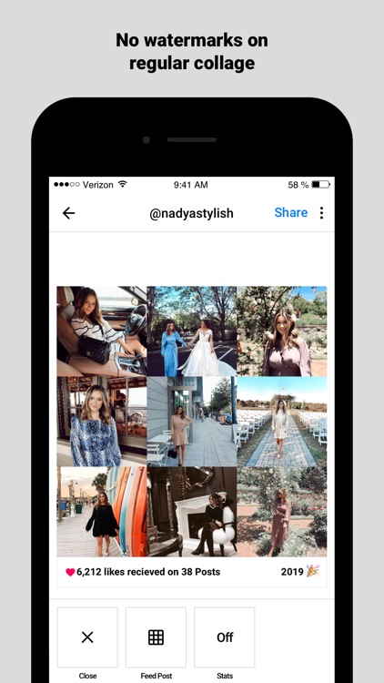 However, the aesthetically pleasing Instagram feed may be the most important, and surest way to reach your goals, quicker.
When users view your Instagram account, the first thing they notice is the feed. And although it has recently become a trend to have an almost “imperfect” feed in the recent months, it’s still a good idea to plan out what you’re going to post, for aesthetic purposes, of course. Curating your feed doesn’t have to be hard, and these apps make it easy for anyone to have their feed looking influencer-esque in no time.
Sometimes people don’t want to log their credentials into a third-party app, and that’s totally OK. If you’re one of those people, consider opting for the infamous “Finsta” account. And if you don’t know by now, a Finsta is essentially a “fake Instagram.” The premise is simple: You can use this account as a private Instagram for you and your closest friends or use it as a planning device to see what pictures will look good on your real feed — the choice is up to you!
But in the case that you do, here are seven Instagram grid apps that will help you achieve the Instagram aesthetic of your dreams.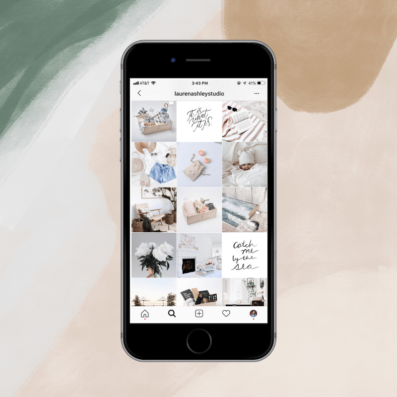
UNUM is a simple Instagram photo grid app that lets you build a feed based off of your last 20 Instagram posts. I use this app myself and have to say I love the fact that it lets you swap around pictures to see what might look better and edit the same pictures right there in the app. Unum also allows you to save caption drafts, set up timers to remind you to post, and even see what your feed would look like if you deleted pictures you already posted.
Feedle just might be your ultimate one-stop-shop for Instagram feed editing. The app features analytics and insights, influencer research, a follower tracker, unlimited grid space, and so many more options to help you make sure your Instagram feed is reaching its full potential. And with a 5-star rating, you know you're in for a quality app.
Planoly is a pretty well-rounded option for Instagram photo grid apps. Aside from the usual, it also comes with a desktop options that lets you use the tools right from your computer. What's really cool about this app is that it really takes the planning to the next level with other features like the ability to email a grid draft to others to preview and an analytics tool that lets you see which of your photos has the most likes and comments. Plus, the app gives users great advice about making their feed look its best.
If you're looking for a simple, easy-to-use, and super fast app to plan your feed in, it's Feedr. Feedr cuts out all the extra tools and extravagances and lets you simply see what your feed would look like if you were to post certain photos. Because the app doesn't let you edit photos, you're going to have to bring your finished edits to the app before trying them out.
Preview is a pretty straight-forward app that gives you the ability to edit your photos in-app. It also lets you work with all the posts you have on your Instagram, in order to really get an idea for your aesthetic.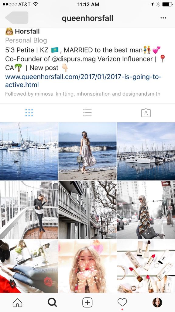 Plus, there's a really cool feature where you can upload pictures from your Dropbox.
Mosaic is an editor app that really goes in-depth when it comes to designing your feed. Aside from seeing what your feed will look like before posting it, the app lets you apply "smart filters" to your photos which are done by analyzing them and then using "smart algorithms" to create the most aesthetically-pleasing Instagram feed. Specific themes you might want to apply to your photos will cost you a few bucks, but if you're super dedicated to making your Instagram have a specific look, you might not mind.
Plann is a great photo grid app if you're looking for simplicity and quickness. As other grid apps, it lets you draft up potential captions and figure out what times you might want to post potential pictures. It also lets you save the list of hashtags you might want to include on your posts. But unlike other apps, you can't edit your potential posts on the app.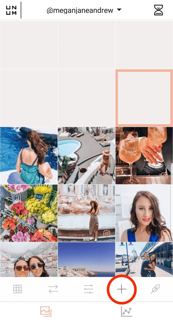 If you want to see what a finished product of your Instagram will actually look like, you'll have to edit your pictures beforehand. But that's totally fine, considering you probably have countless photo editor apps already.
Planning the "perfect" Instagram can be a lots of work, but with the help of these apps, it becomes way more fun.
This article was originally published on
EVERYTHING Instagram you need in ONE app.
Free UNLIMITED Posts, Reels, Insta Stories, rearrange posts, edit, auto-post, best Instagram hashtags, caption ideas, analytics, repost, and more.
What are you waiting for?
Used by +14 million Instagrammers, content creators and business owners.
Preview is the ultimate Instagram feed planner app.
Plan your:
• Photos
• Videos
• Carousels
• Insta Stories
• Reels
• IGTVs
What’s inside:
• Drag and Drop
• UNLIMITED Grid Space (for free)
• Analytics and Insights
• Amazing filters
• Editing Tools
• REPOST photos, videos, albums, Reels, IGTVs
• Split images
• Set video covers
• Schedule & Auto-post
• Caption Finder
• Hashtag Finder
• Hashtag Analytics
• Team Features and Permissions
• DESKTOP version
• Multi Device
• Backup
• NO INSTAGRAM login required
Instagram like a PRO.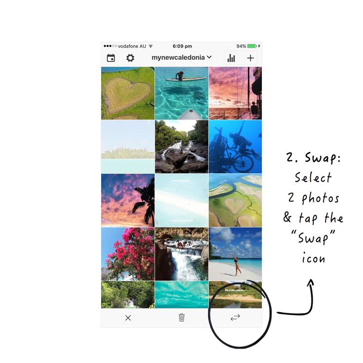
Preview is your visual planner for Instagram. Predict what your feed will look like before you post anything on Instagram. It has all the features you need in one app. No more switching between multiple apps.
UNLIMITED GRID SPACE (for free)
Add as many photos and videos as you want in your Preview. Your creativity doesn’t have a limit!
REARRANGE POSTS
Use the drag & drop to arrange your Instagram posts. Design your own unique theme. Color coordinate. Predict how your feed will look like. Or simply plan your content in advance.
INSTA STORY PLANNER
Plan your Insta Stories and organise them perfectly with swipe up links.
REELS + IGTV PLANNER
Plan your Reels and IGTV videos. Change the covers to see if it fits your grid.
ANALYTICS & INSIGHTS
Track your performance. See your Top Posts, best times to post, followers growth, clicks to your link in bio, best hashtags, and more.
AMAZING FILTERS
Design your own unique and amazing feed that reflects your personality or brand.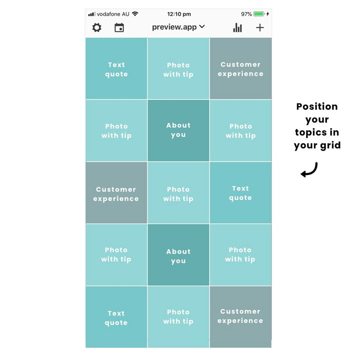 Preview comes with beautiful filter packs and unique filters.
Find filters similar to vsco. Or choose a theme pack.
REPOST
Curate and share other Instagrammers’ posts.
PERFECT YOUR CAPTIONS
Write your captions in advance and perfect them. Save your hashtag groups within the app and add them to new posts at a press of a button.
CAPTION IDEAS
Personal and business captions for the entire year. Including caption prompts, quotes, puns and questions to ask your followers to boost your engagement and get more comments - naturally.
FIND THE BEST HASHTAGS
Hashtag research done for you. Search for the best Instagram hashtags to grow your account. Search by category, country, city and Instagram community.
SCHEDULE & AUTO-POST
Plan your feed in advance and schedule it so you don't have to think about it. Preview has been officially approved by Instagram to auto-post for you.
AMAZING EDITING TOOLS
All the basics are in Preview: contrast, saturation, exposure, etc.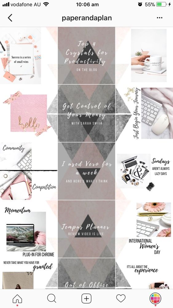 ..
..
And your favorites too: free whitening tool, blemish remover, meme maker & much more.
MANAGE UNLIMITED ACCOUNTS
Manage as many Instagram accounts as you want and easily switch between them.
PLAN YOUR FEED WITH YOUR TEAM
Give access to your Preview feed to your team by sharing (or not sharing) your Instagram password. One plan = unlimited team members.
NO INSTAGRAM LOGIN/ACCOUNT REQUIRED
You don’t need an Instagram account to use Preview.
Have fun creating!
The Preview Team
@preview.app
Terms of Use: https://thepreviewapp.com/terms-of-service/
15484 views
The best Instagrammers know how to properly schedule posts that create a great Instagram grid on their profile.
Why your Instagram grid is so important
When someone first follows you or goes to your profile to check out your content, your grid is an opportunity to showcase your vibe or brand.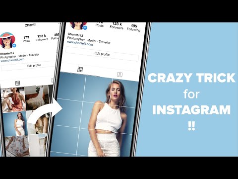
The grid gives you a bird's eye view of the user's post history. This is your first impression of their ... work: a brief introduction to their personal or professional brand at a glance.
So:
Stick to the color combination
This is probably the most common grid style. Choose a color palette (pink and grey?) or a specific tone (high contrast neon?) for each photo. When viewed together, your gallery will appear as a matching set, even if the content of your photos differs.
Create a checkerboard effect
By changing the style of your published photo, you can easily create a checkerboard look on your grid. Try interlacing text quotes with a photo, or mixing close-up shots with landscape photos. You can also switch between two different colors.
Line by line design
Combining images in each row by theme or color can have a big impact. For example, use a different background color for each palette in your grid.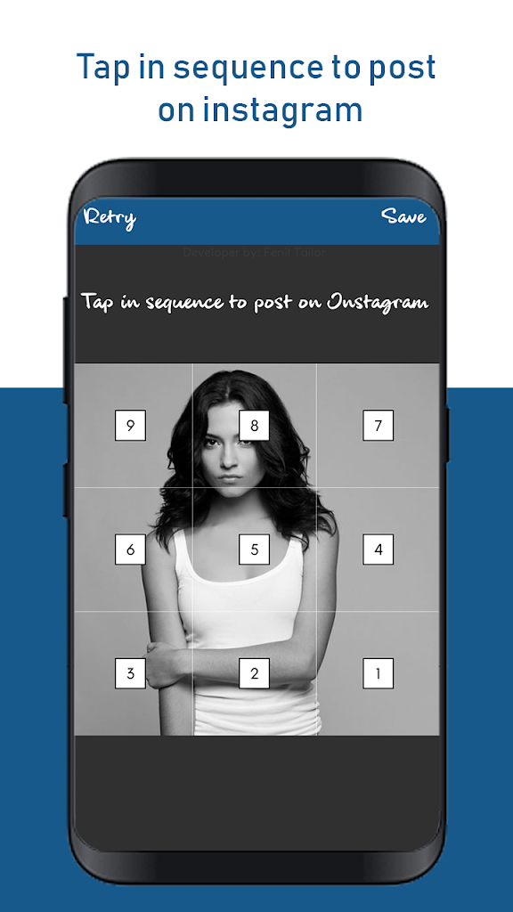
Create a vertical column
Dividing the grid into squares to form a vertical center image is a great way to combine graphic branding and photos on your profile.
Turn your grid into a rainbow
You'll need patience and great color sense to create this look. The goal is to post one saturated color regularly... and then gradually move on to the next shade of the rainbow with your next rows of posts.
Embrace the border
Creating a consistent look is as easy as applying a border to all your images. The free Whitagram app is one option to quickly apply this edit, with borders and backgrounds in a wide variety of hues.
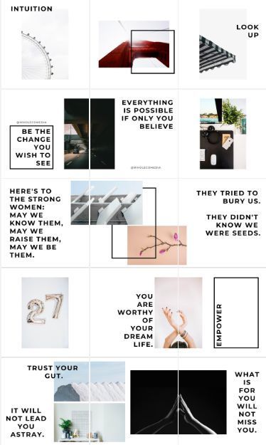
Turn your messages into a puzzle
This layout is difficult to implement on a day to day basis, but for a large ad or campaign, or for launching a new account, the puzzle grid certainly makes a big difference.
Puzzle grid creates one large interconnected image from all the squares.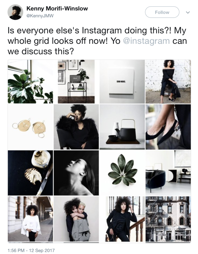 Individually, these messages probably look like nonsense. But taken together, this is a work of art.
Tips for planning a great Instagram grid layout
1. Preview
Before posting:
You can mock it up in photo editing software or use the Hootsuite app integration, which lets you preview the layout before it runs. Right now it's only for personal accounts, but soon there will be a business account function. (The program is in English but with a very simple interface)
2. Be consistent
Building a great Instagram grid means sticking to a plan. One custom photo of the wrong color, the wrong filter, or the wrong order can ruin your whole look.
3. Make sure it matches your brand.
Back in 2010, Instagram was just a social network where people posted photos of food, cats, and selfies. Today it is a powerful marketing tool with a billion monthly users and dozens of features that engage the audience and help increase its loyalty.
We all love to receive information through visual channels. In recent years, Instagram has become the most important and convenient visual relay.
According to statistics, 72% of Instagram users are actively shopping online, and many brands are ready to work hard to win the audience at the very moment of scrolling the feed. Bright and catchy account designs help grab attention and grow followers, who – quite possibly – will one day transform into consumers of the brand.
Want to share this success by turning your account into an addictive aesthetic treat? Then your Instagram page should look like that. But how can this be achieved?
In this article, we've collected cool Instagram grid designs. Many brands and bloggers are actively using these approaches - they are well aware that bright visual solutions in Instagram content bring pleasant bonuses in the form of thousands of new followers.
Showcasing seven of the most popular grid options for stylish Instagram pages. Get inspired and adopt techniques for your personal account or brand page. Who knows, maybe these ideas will push you to a grand redesign.
Here's some good news for you :
You don't have to be a professional designer to create an Instagram feed that everyone will appreciate. Just follow these steps:
Let's first understand what a grid is.
This is a feed of visuals that you post on your Instagram page to showcase your business or yourself as clearly as possible.
Surely you already understood that a good feed needs something more than just some nice posts and good filters. Because page:
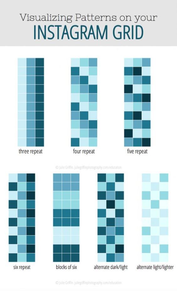
Instagram has a ton of amazing accounts, and the coolest of them all use the 7 grid types we're going to cover in a moment.
This is the easiest to repeat. Use the same filter and stick to the same color combinations to keep your account neat and consistent. If the brand has corporate colors, feel free to use them - the audience will recognize you and distinguish you from the crowd by them.
Hannah Rose
 But it's important that the colors match the tone of voice you, as a brand, use to speak to your audience. Like it or not, the psychology of color still plays a role.
 Horizontal, vertical, diagonal - an Instagram account that has lines always looks stylish and unbanal. Many Instagrammers use this approach in grid design, but you need to be very careful here: skip the post and the page architecture will immediately break.
Any Instagram grid row can be turned into a storytelling element. Such a grid - where the "air" posts go under each other - resembles the page of a magazine or book.
This approach helps focus users on a particular element. Frames are needed for emphasis and contrast - and, of course, with them the grid looks more collected and solid.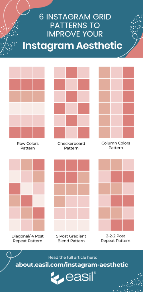
In VistaCreate, you can choose frames and lines in different colors or shapes - or make an image with white edges. If you use frames in the same style for Insta-posts, the grid will turn out neater and “slenderer”.
Combine photos and graphics to create a grid of images that looks like a chessboard. For the grid to look stylish, the graphics need to visually resonate.
The most popular approach with this solution is to combine photos and quotes. But don't limit yourself to just this content: include icons, pictures, emoji, screenshots of articles. Trust your inspiration or content plan.
One filter and one color theme is fine, but prim. What if you add color and energy to your Instagram account? This grid is called the rainbow grid, and it looks like that: as the page scrolls, the shades flow from red to orange, from orange to yellow, from yellow to green, and so on.
Yes, making rainbow meshes is more difficult than creating everything we talked about above. Here you need to change filters and settings approximately every 6-9 photos and clearly monitor the smoothness of the color transition. But it's worth it.
Each picture in this grid is valuable in itself, but they are all superimposed on one more, overall picture. And she gives additional meaning. The hardest part of this approach is to cut the background image from the photo so carefully that they don’t lose any quality or meaning, otherwise users simply won’t click.
This grid resembles a puzzle - it seems to be assembled from different elements, but at the same time they are all organized into an interesting whole composition (or a poster, whichever you prefer). This is the perfect solution if you want to showcase your website or blog on Instagram.
Instagram collages are one of the hottest marketing trends in 2019. They work well if you need to grab the user's attention and smoothly guide them across the page - in fact, this is visual storytelling. There are many tools on the web that help implement this approach - cut and stitch backgrounds, pictures and stories.
Instagram has millions of users, and doing something to stand out in this sea of content is no easy task.