“So, are you on Instagram?”
Years ago, knee deep at a networking event, you probably wouldn’t expect to field questions about your presence on a photo sharing app... But, it’s 2021. Instagram? Well, now it’s as synonymous as a business card.
Yes, Instagram (or “Insta”, thank you fellow millennials) rapidly became an essential online social media tool for artists, influencers, travellers, bloggers, dog lovers, creators, and business owners - just to name a few.
It’s simple aesthetic-centric delivery communicates your vibe and keeps your audience updated with an ever rotating collection of images, videos and 24 hr stories that connect you with the world - and all the people who want to peer into your brand.
Before you can start sharing a glimpse into your company, your services, or your lifestyle, you’ll want to make sure your account won’t look like that really lazy attempt at scrapbooking your Aunt Carol did last minute from your awkward prom photos.
We caught up with a handful of incredible and successful Instagrammers and Digital Marketing Specialists to dive deep on the best way to launch your own account, and how to maintain it to grow followers that will stay loyal to your brand.
Instagram expert Kat Walters of @katwalters knows how important it is to visually connect your brand to your customers, and dedicates her creative energy to coaching others with a free Instagram class to achieve success with the app.
“You want to be clear about who your customer is, because you want to create an Instagram account that will appeal to them, and draw them into your world,” she suggests. “You want an account that they will look at and say YES, this is so for me, I belong here.”
Personal Stylist, Sydney Lester from @chicstripes thinks of Instagram as a powerful tool for your brand, too. “You can set a vibe, create a tone, and use captions to bring value in a crowded market. This social media platform should be used as a marketing tool to support your business and give your community a clear call to action,” she says.
Of course messaging and captions are very important to your audience, but the visual aspects of your account are what resonate first. You don’t want to just dump any old images into your Instagram and hope your accompanying messaging and content will reach them, Kat explains.
“People will just not bother to read your captions if the images you’re using don’t look good. They will just scroll on past.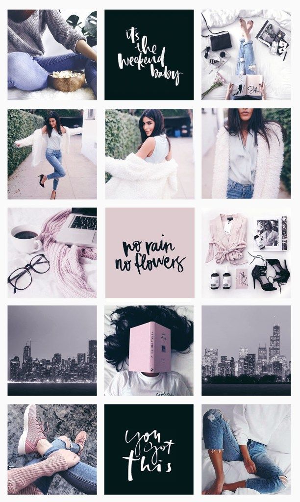 If your images and account looks great, well THEN your followers will read what you have to say.”
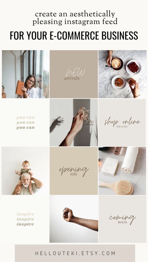
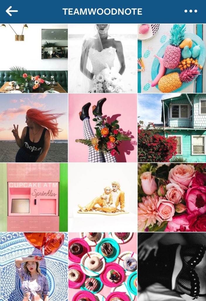
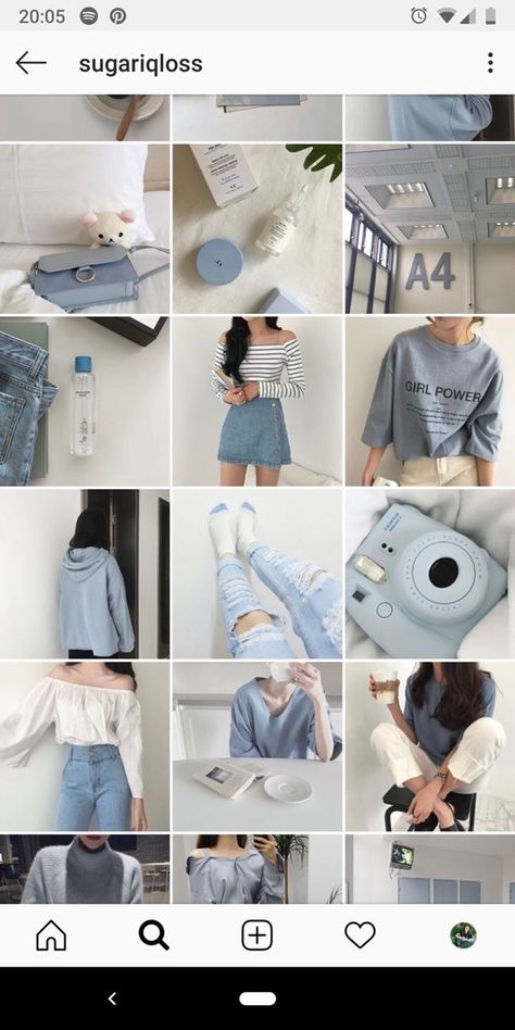
The first big thing to decide for your Instagram account - before you start fretting about hashtags and more advanced engagement - is a basic color scheme or color palette. This helps make your stockpile of images and videos look like one curated collection, rather than a jumbled hoard of disconnected moments.
Marisel Salazar, whose wildly popular Instagram account @breadbutternyc focuses on food and NYC lifestyle, uses consistent colors (her favourites) to stand out.
“I gravitate towards blues, greens, whites and slate,” she reveals, adding, “But that doesn't mean warmer colors don't make an appearance! Warm colors can actually make the feed pop when peppered in here and there. ”
”
Similar lighting conditions can really mean a lot too, according to Toronto lifestyle blogger, Joelle Anello of @lapetitenoob. Her pink-centric account goes beyond just hues - there are other important considerations for her ideal aesthetic.
“I make sure to have a similar color palette in all of my photos,” she says, “But as well, I take all of my shots in similar lighting conditions.”
So, you’ve chosen your colors, you’re being consistent with your lighting - now you can really start making an impact by limiting yourself to key filters, too.
“Using the same apps and filters to edit all of your photos is important,” Joelle explains. This is good advice, as 18% of all Instagram posts use a filter.
The most liked and most used filter in the world is Claredon - it highlights and brightens while adding subtle depth and saturation to any photo. Juno, Gingham, and Lark trail as close second choices. Don’t feel tied down by these champion filters though - you might stumble on the next great aesthetic by experimenting!
In the same sense that you want to have a consistent color scheme, you also need to choose a theme to focus on. A theme is also more than just a subject matter - it can also involve staying true to certain composition guidelines.
This will help you to develop your audience, nurture hashtags, and it also helps you stay on track and build followers.
Joelle, having carved out a niche for herself with a lifestyle theme that encompasses fashion, travel, and everything in between, has her own philosophy. “Develop a theme early on and be consistent with it no matter what.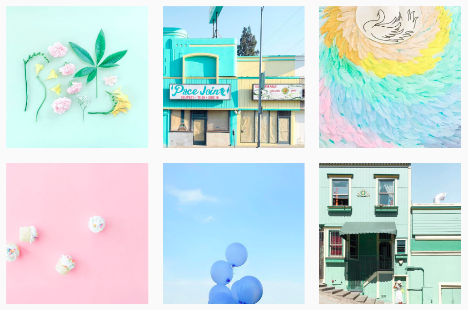 Consistency can be difficult, especially when starting to work with brands who may have their own vision for sponsored content.”
Choosing something you’re passionate about is important - maybe you want to share a sneak peek into the life of parenting, motorcycle restoration, raw food, or the excitement of chasing UFO’s - whatever speaks to you.
Ryan O’Connor, Co Founder of One Tribe Apparel learned quickly that a theme doesn’t have to be restrictive. “We've experimented with our @onetribeapparel Instagram feed a lot,” he admitted, “And now we don’t limit ourselves to photos that directly promote our products, but rather those that fit with our boho aesthetic.“
One Tribe Apparel doesn’t have a strict color theme like some accounts, he explained. “We try to stick to an outdoor nature aesthetic that vibes well with our colorful products, and the love of travel and yoga shared by our online community.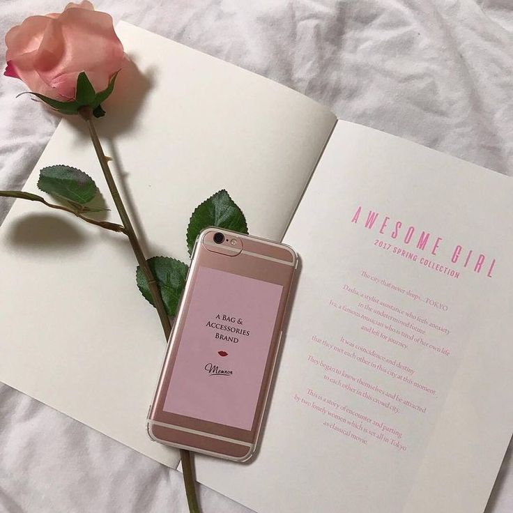 ”
”
Sometimes you'll need to help your theme along while you’re taking your pictures. “There’s a lot of fussing around,” Marisel admits. “I always carry a couple of consistent accessories on my person to liven up any shot.“
Of course, when establishing a brand on Instagram, you need to consider a lot more than your individual photos - you need to think of how each image will look in the grid as well.
Lee Esposito from Digital PR firm Lee Esposito Associates thinks Instagram is about the ‘big picture’. “Remember that an Instagram feed is a mixture of images relating to one another, which means it incorporates individual images, as well as a grid of image thumbnails. It should tell a story,” he says.
Marisel agrees, but sees her feed as a giant puzzle, with a specific flow.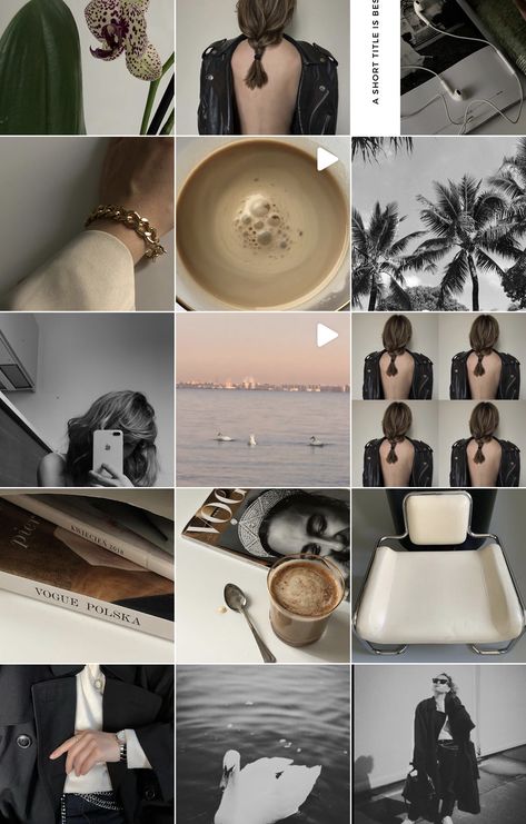 “I tend to alternate between overhead shots and straight on vertical angles,” she explains.
“I always play around with what shots will come in a specific sequence to make sure everything is fluid,” adding that she likes to use the photo album on her phone to arrange images - which is a pretty cool hack!
There are lots of apps available that can also do the trick. “To keep your Instagram feed looking fab, work in rows of 3 using the Planoly app,” Kat recommends. (Planoly is free and lets you drag and drop the layout of up to 30 posts per month.)
“You can check that they are going to look good, and keep your feed design on track. Once you have your next 3 ready to go you can start to post them knowing that your feed will stay gorgeous,” she says.
Splitting photos into tiles for Instagram can also make a really big impact.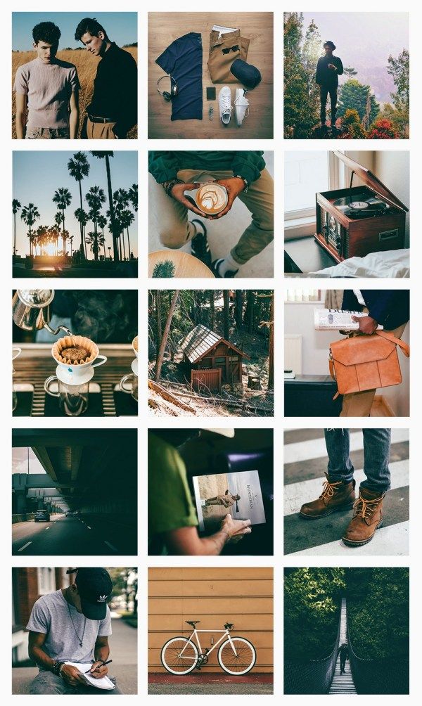 You may have already seen the really neat spreads, where a single image takes up 6 or even 9 tiles on your grid, to make it look like one gigantic image.
You don’t have to do this manually anymore, thanks to apps like Pic Splitter, Tile Pic, or Instagrid. If you choose this approach, remember that you will throw your whole look ‘out of whack’ if you don’t plan ahead to post to maintain their alignment. Planning ahead isn't just about what you'll post but about when you'll post too.
Furthermore, you need to think beyond the grid when you’re planning this kind of layout, according to Zellie Freidnman, Social Media Manager at Power Digital Marketing. “You want to make sure each tile is a visually engaging photo that is unique enough to stand on its own outside of the grid,” she says.
Taking professional looking pictures with your smartphone is not only possible, but a fairly common practice, but that doesn’t mean you can cut out the most important step - the editing process.
Once in a while you’ll have a lucky moment, when your picture turns out “just right” on your phone and you can post it straight to Instagram, but that’s the exception, not the rule. The good news is, there have been a ton of apps created to help you edit and hack the perfect look for your images.
You can also get creative and create composite images - they are imaginative and very attention grabbing when someone is scrolling through images.
Kat, like many Instagram experts, knows that when it comes to your pictures “lots of little improvements add up to a BIG difference. ” She edits her photos before she even considers opening her Instagram app. “My fav app for this is A Color Story,” she shares. “There is always something you can do to improve your pics, even if it’s just lightening it up a bit.”
Marisel is a fan of spot editing. “I personally don't use any filters,” she says, “I like to individually spot edit my images on Instagram using Snapseed. I favor high contrast images, so I like to bump down ambiance to create starker photos that stand out.”
Taking a page out of the Snapchat book, Instagram became interactive with the launch of “Stories” in 2016. Instagrammers (and Snapchat lovers) rejoiced!
“You should be using Instagram Stories as an ongoing "highlight" reel of your behind the scenes day-to-day client interactions,” explains Sydney, “To showcase your unique personality and work style.
Self-professed foodie and blogger, Krysten Dornik of @KrystensKitchen agrees. “Instagram stories really helped me grow my Instagram account over the last year,” adding that she takes advantage of new tools available in the app.
“Using the ‘poll’ feature, the ‘swipe up’ option for links to your other content, and tagging companies to let them know you are talking about them are some of the easy ways to improve your marketing on Instagram.”
She also keeps up on the new features that Instagram introduces throughout the year, like highlights.
“Now you can choose a few things you would like to ‘highlight’ on your page from your instagram story,” she bubbles. “Right now, I am highlighting a giveaway and a new recipe on my blog!”
Food blogger Julia Nickerson of @SavoryTooth has some old school advice to growing followers - using actionable hashtags.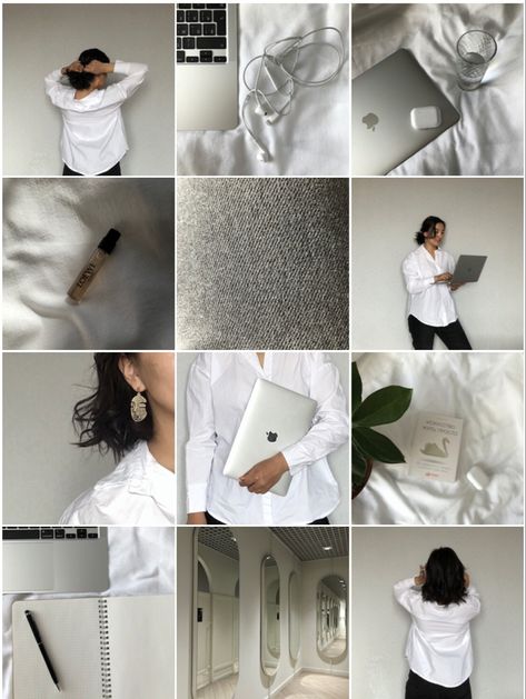 “My advice,” she shares, “Is that to drive engagement on your Instagram post, you should interact with posts using the same hashtags.”
She recommends regularly visiting posts from hashtags you currently use to leave comments and engage with the online communities associated with them. “Do this before and after publishing your post,” she advises. “This kind of activity tells the algorithm that you are active in that hashtag.”
If you pull all of these elements together, you’ll end up with a branded Instagram account that hits all the right chords online.
Take it from Kat: “Having an Instagram feed that looks like a mish mash will confuse your followers - BUT when you create a consistent theme that expresses your brand ‘soul essence’ it means that in just 3 seconds your followers are clear about your message and brand.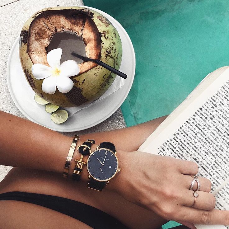 It will create an instant deep connection with someone that is a fit for you. That’s how powerful it is.”
Well said. So, are you on Instagram?
Your Instagram account integrates seamlessly with your Pagecloud website! Grow your followers online today.
Did you know you can create a free link page to add to your social bios? Create a more engaging experience for your followers with a custom page for all your website, social media, shopping links, and more! For a step by step guide on how to create your free link page, check out this blog post!
Nowadays, Instagram is often someone's initial contact with a brand, and nearly half of its users shop on the platform each week.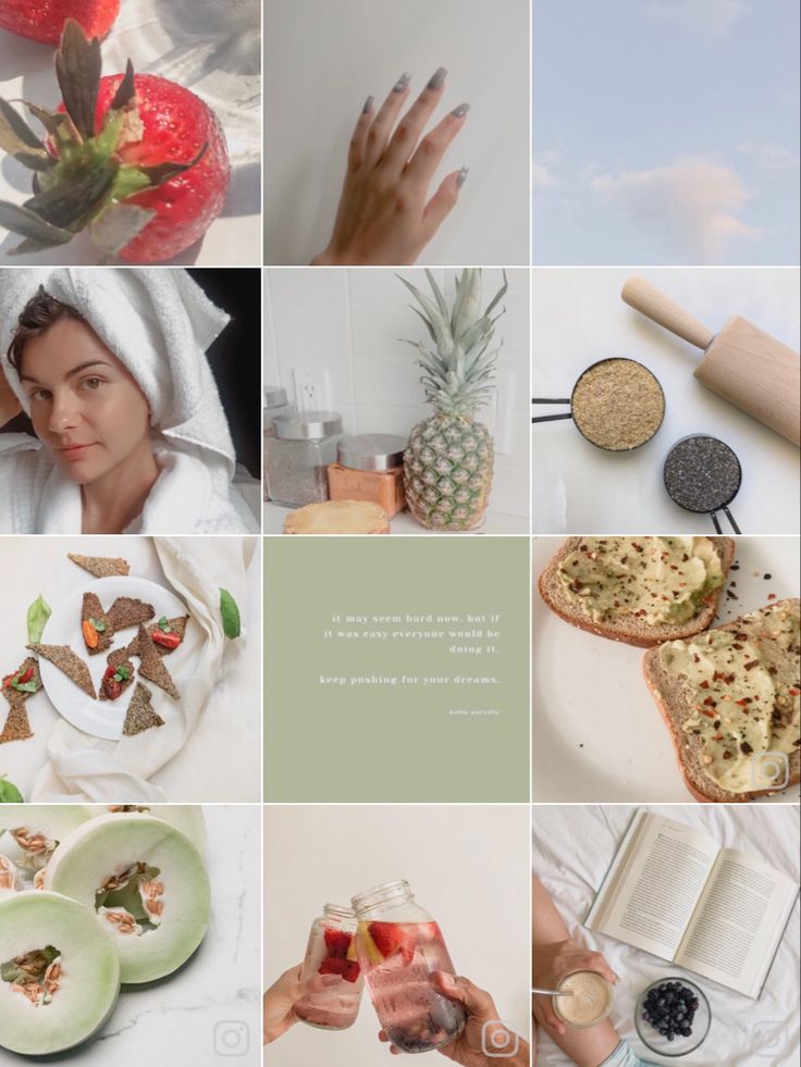 If it's the entryway for half of your potential sales, don't you want your profile to look clean and inviting?
Taking the time to create an engaging Instagram feed aesthetic is one of the most effective ways to persuade someone to follow your business's Instagram account or peruse your posts. You only have one chance to make a good first impression — so it's critical that you put effort into your Instagram feed.
Finding the perfect place to start is tough — where do you find inspiration? What color scheme should you use? How do you organize your posts so they look like a unit?
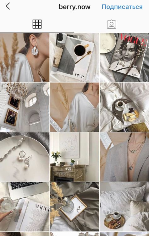
We know you enjoy learning by example, so we've compiled the answers to all of these questions in a list of stunning Instagram themes. We hope these inspire your own feed's transformation. But beware, these feeds are so desirable, you'll have a hard time choosing just one.
An instagram theme is a visual aesthetic created by individuals and brands to achieve a cohesive look on their Instagram feeds.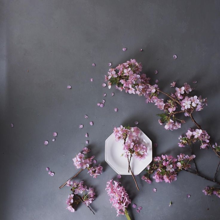 Instagram themes help social media managers curate different types of content into a digital motif that brings a balanced feel to the profile.
Creating a theme on your own requires a keen eye for detail. When you’re editing several posts a week that follow the same theme, you’ll want to have a design tool handy to make that workflow easier. Pre-set filters, color palettes, and graphic elements are just a few of the features these tools use, but if you have a sophisticated theme to maintain, a few of these tools include advanced features like video editing and layout previews. Here are our top five favorite tools to use when editing photos for an Instagram theme.
Creators look to VSCO when they want to achieve the most unique photo edits. This app is one of the top-ranked photo editing tools among photographers because it includes advanced editing features without needing to pull out all the stops in Photoshop.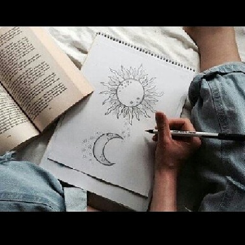 If you’re in a hurry and want to create an Instagram theme quickly, use one of the 200+ VSCO presets including name-brand designs by Kodak, Agfa, and Ilford. If you’ll be including video as part of your content lineup on Instagram, you can use the same presets from the images so every square of content blends seamlessly into the next no matter what format it’s in.
FaceTune2 is a powerful photo editing app that can be downloaded on the App Store or Google Play. The free version of the app includes all the basic editing features like brightness, lighting, cropping, and filters. The pro version gives you more detailed control over retouching and background editing. For video snippets, use FaceTune Video to make detailed adjustments right from your mobile device — you’ll just need to download the app separately for that capability. If you’re starting to test whether an Instagram theme is right for your brand, FaceTune2 is an affordable tool worth trying.
 Canva
CanvaYou know Canva as a user-friendly and free option to create graphics, but it can be a powerful photo editing tool to curate your Instagram theme. For more abstract themes that mix imagery with graphic art, you can add shapes, textures, and text to your images. Using the photo editor, you can import your image and adjust the levels, add filters, and apply unique effects to give each piece of content a look that’s unique to your brand.
Image Source
Have you ever used Adobe Illustrator to create interesting overlays and tints for images? You can do the same thing to develop your Instagram theme. Traditionally, Adobe Illustrator is the go-to tool to create vectors and logos, but this software has some pretty handy features for creating photo filters and designs. Moreover, you can layout your artboards in an Instagram-style grid to see exactly how each image will appear in your feed.
Photoshop is the most well-known photo editing software, and it works especially well for creating Instagram themes. If you have the capacity to pull out all the stops and tweak every detail, Photoshop will get the job done. Not only are the editing, filter, and adjustment options virtually limitless, Photoshop is great for batch processing the same edits across several images in a matter of seconds. You’ll also optimize your workflow by using photoshop to edit the composition, alter the background, and remove any unwanted components of an image without switching to another editing software to add your filter. With Photoshop, you have complete control over your theme which means you won’t have to worry about your profile looking exactly like someone else’s.
 Transition
If you aren’t set on one specific Instagram theme, consider the transition theme. With this aesthetic, you can experiment with merging colors every couple of images. For example, you could start with a black theme and include beige accents in every image. From there, gradually introduce the next color, in this case, blue. Eventually, you’ll find that your Instagram feed will seamlessly transition between the colors you choose which keeps things interesting without straying from a cohesive look and feel.
Image Source
A polished black and white theme is a good choice to evoke a sense of sophistication. The lack of color draws you into the photo's main subject and suggests a timeless element to your business. @Lisedesmet's black and white feed, for instance, focuses the user’s gaze on the image's subject, like the black sneakers or white balloon.
Image Source
If your company's brand is meant to imply playfulness or fun, there's probably no better way than to create a feed full of bright colors. Bright colors are attention-grabbing and lighthearted, which could be ideal for attracting a younger audience. @Aww.sam's feed, for instance, showcases someone who doesn't take herself too seriously.
Image Source
For an artsier edge, consider taking a minimalist approach to your feed, like @emwng does. The images are inviting and slightly whimsical in their simplicity, and cultivate feelings of serenity and stability. The pup pics only add wholesomeness to this minimalist theme. Plus, minimalist feeds are less distracting by nature, so it can be easier to get a true sense of the brand from the feed alone, without clicking on individual posts.
Image Source
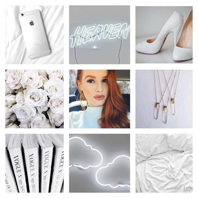
One of the easiest ways to pick a theme for your feed is to choose one color and stick to it — this can help steer your creative direction, and looks clean and cohesive from afar. It's particularly appealing if you choose an aesthetically pleasing and calm color, like the soft pink used in the popular hashtag #blackwomeninpink.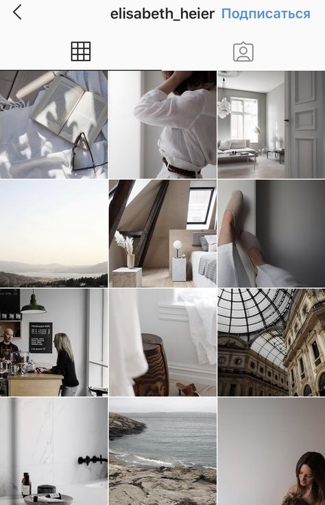
Image Source
If you're interested in creating a highly cohesive feed but don't want to stick to the one-color theme, consider trying two. Two colors can help your feed look organized and clean — plus, if you choose branded colors, it can help you create cohesion between your other social media sites the website itself. I recommend choosing two contrasting colors for a punchy look like the one shown in @Dreaming_outloud’s profile.
Image Source
Similar to the one-color idea, it might be useful to choose one color palette for your feed, like @creativekipi's use of pastels. Pastels, in particular, often used for Easter eggs or cupcake decorations, appear childlike and cheerful. Plus, they're captivating and unexpected.
Image Source
As evident from @mustdoflorida's feed (and username), it's possible to focus your feed on one singular object or idea — like beach-related objects and activities in Florida. If you're aiming to showcase your creativity or photography skills, it could be compelling to create a feed where each post follows one theme.
Image Source
Creating a puzzle out of your feed is complicated and takes some planning, but can reap big rewards in terms of uniqueness and engaging an audience. @Juniperoats’ posts, for instance, make the most sense when you look at it from the feed, rather than individual posts. It's hard not to be both impressed and enthralled by the final result, and if you post puzzle piece pictures individually, you can evoke serious curiosity from your followers.
Image Source
Displaying everyday items and activities from unexpected angles is sure to draw attention to your Instagram feed. Similar to the way lines create a theme, angles use direction to create interest. Taking an image of different subjects from similar angles can unite even the most uncommon photos into a consistent theme.
Image Source
A picture is worth a thousand words, but how many pictures is a well-designed quote worth? Confident Woman Co. breaks the rules of Instagram that say images should have a face in them to get the best engagement. Not so with this Instagram theme.
The bright colors and highlighted text make this layout aesthetically pleasing both in the Instagram grid format and as a one-off post on the feed. Even within this strict text-only theme, there’s still room to break up the monotony with a type-treated font and textured background like the last image does in the middle row.
Image Source
If you're not a big fan of horizontal or vertical lines, you might try a checkerboard theme. Similar to horizontal lines, this theme allows you to alternate between content and images or colors as seen in @thefemalehustlers’ feed.
Image Source
While it is a bit jarring to have black or white borders outlining every image, it definitely sets your feed apart from everyone else's.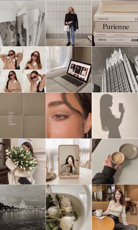 @Beautifulandyummy, for instance, uses black borders to draw attention to her images, and the finished feed looks both polished and sophisticated. This theme will likely be more successful if you're aiming to sell fashion products or want to evoke an edgier feel for your brand.
Image Source
If you prefer uniformity, you'll probably like this Instagram theme, which focuses on using the same filter (or set of filters) for every post. From close up, this doesn't make much difference on your images, but from afar, it definitely makes the feed appear more cohesive. @marianna_hewitt, for example, is able to make her posts of hair, drinks, and fashion seem more refined and professional, simply by using the same filter for all her posts.
Image Source
If your primary goal with Instagram is to showcase your products, you might want a Flatlay theme. Flatlay is an effective way to tell a story simply by arranging objects in an image a certain way and makes it easier to direct viewers' attention to a product.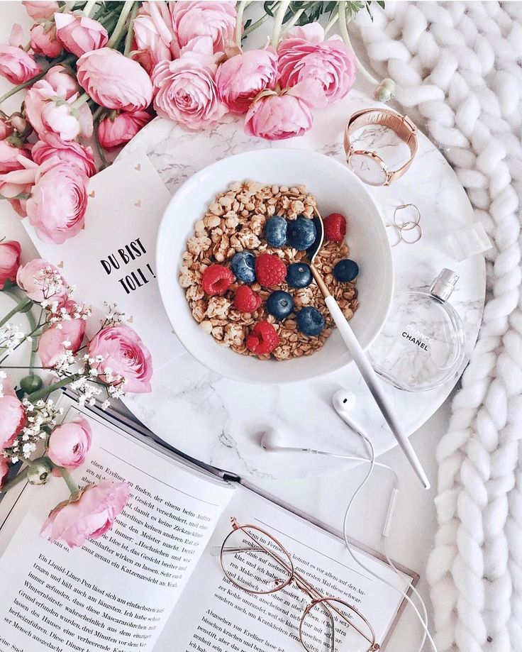 As seen in @thedailyedited's feed, a flatlay theme looks fresh and modern.
Image Source
If it aligns with your brand, vintage is a creative and striking aesthetic that looks both artsy and laid-back. And, while "vintage" might sound a little bit vague, it's easy to conjure. Simply try a filter like Slumber or Aden (built into Instagram), or play around with a third-party editing tool to find a soft, hazy filter that makes your photos look like they were taken from an old polaroid camera.
Image Source
In @girleatworld's Instagram account, you can count on one thing to remain consistent throughout her feed: she's always holding up food in her hand. This type of repetition looks clean and engaging, and as a follower, it means I always recognize one of her posts as I'm scrolling through my own feed. Consider how you might evoke similar repetition in your own posts to create a brand image all your own.
Image Source
 Mix-and-match Horizontal and Vertical Borders
While this admittedly requires some planning, the resulting feed is incredibly eye-catching and unique. Simply use the Preview app and choose two different white borders, Vela and Sole, to alternate between horizontal and vertical borders. The resulting feed will look spaced out and clean.
Image Source
If you're a writer or content creator, you might consider creating an entire feed of quotes, like @thegoodquote feed, which showcases quotes on different mediums, ranging from paperback books to Tweets. Consider typing your quotes and changing up the color of the background, or handwriting your quotes and placing them near interesting objects like flowers or a coffee mug.
Image Source
@JackHarding's nature photos are nothing short of spectacular, and he highlights their beauty by filtering with a dark overtone. To do this, consider desaturating your content and using filters with cooler colors, like greens and blues, rather than warm ones.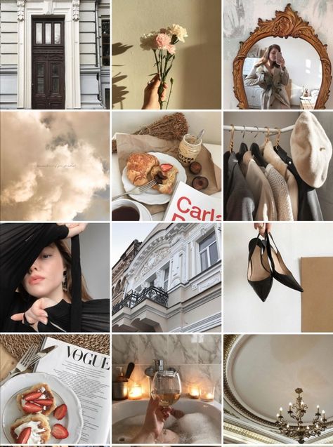 The resulting feed looks clean, sleek, and professional.
Image Source
One way to introduce color into your feed? Try creating a rainbow by slowly progressing your posts through the colors of the rainbow, starting at red and ending at purple (and then, starting all over again). The resulting feed is stunning.
Image Source
Most people on Instagram stick to photos and filters, so to stand out, you might consider adding drawings or cartoon doodles on top of (or replacing) regular photo posts. This is a good idea if you're an artist or a web designer and want to draw attention to your artistic abilities — plus, it's sure to get a smile from your followers, like these adorable doodles shown below by @josie.doodles.
Image Source
Similar elements in your photos can create an enticing Instagram theme. In this example by The Container Store Custom Closets, the theme uses shelves or clothes in each image to visually bring the feed together.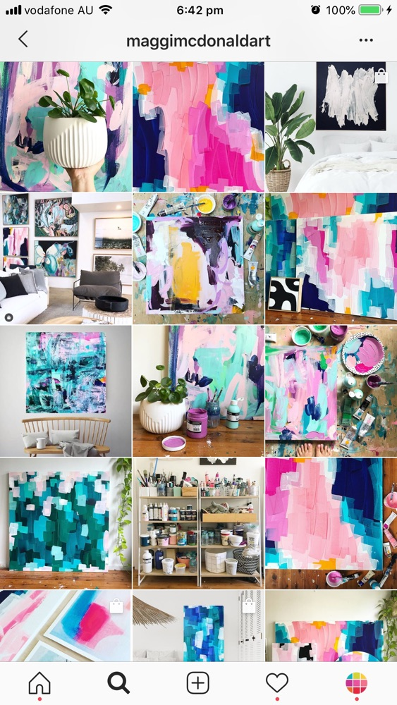 Rather than each photo appearing as a separate room, they all combine to create a smooth layout that displays The Container Store’s products in a way that feels natural to the viewer.
Image Source
Something about this Instagram feed feels different, doesn’t it? Aside from the content focusing on skyscrapers, the lines of the buildings in each image turn this layout into a unique theme. If your brand isn’t in the business of building skyscrapers, you can still implement a theme like this by looking for straight or curved lines in the photos your capture. The key to creating crisp lines from the subjects in your photos is to snap them in great lighting and find symmetry in the image wherever possible.
Image Source
If your brand does well with aligning photography with content, you might consider organizing your posts in a thoughtful way — for instance, creating either horizontal or vertical lines, with your rows alternating between colors, text, or even subject distance.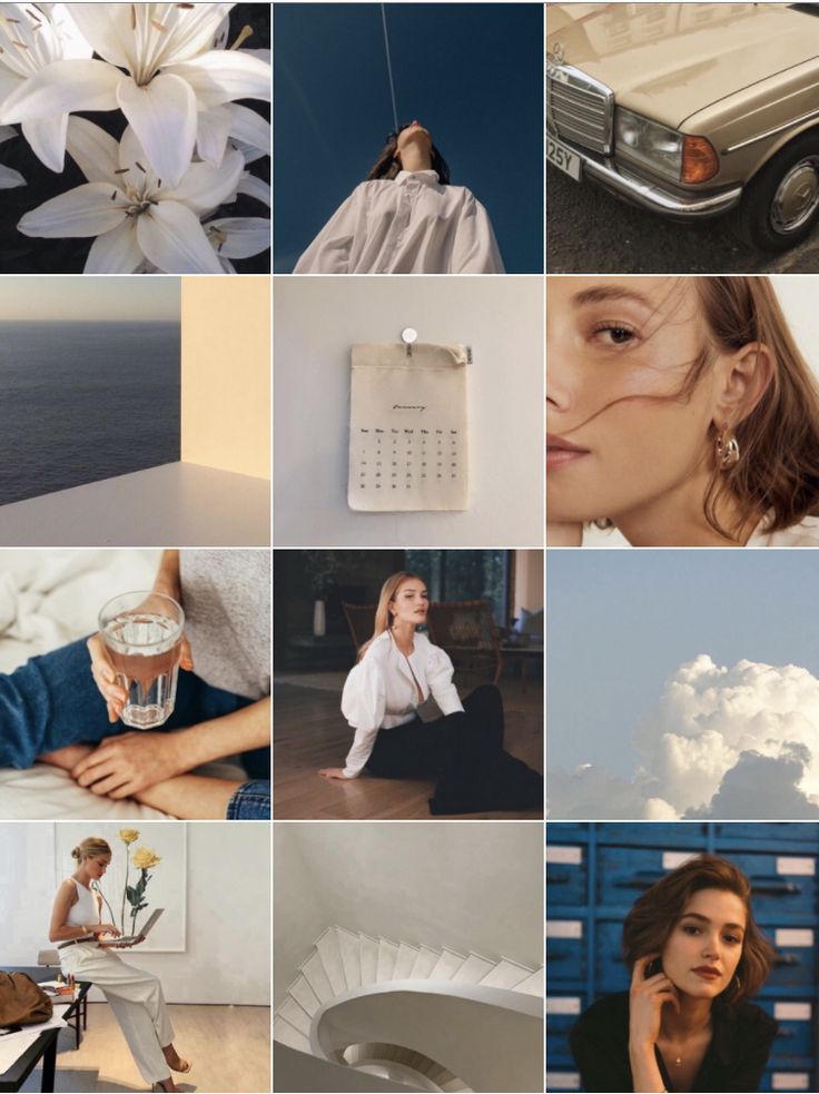 @mariahb.makeup employs this tactic, and her feed looks clean and intriguing as a result.
Image Source
One major factor of any Instagram theme is consistency. For instance, you wouldn't want to regularly change your theme from black-and-white to rainbow — this could confuse your followers and damage your brand image. Of course, a complete company rebrand might require you to shift your Instagram strategy, but for the most part, you want to stay consistent with the types of visual content you post on Instagram.
For this reason, you'll need to choose a color palette to adhere to when creating an Instagram theme. Perhaps you choose to use brand colors. HubSpot's Instagram, for instance, primarily uses blues, oranges, and teal, three colors prominently displayed on HubSpot's website and products.
Alternatively, maybe you choose one of the themes listed above, such as black-and-white. Whatever the case, to create an Instagram theme, it's critical you stick to a few colors throughout all of your content.
As noted above, consistency is a critical element in any Instagram theme, so you'll want to find your favorite one or two filters and use them for each of your posts. You can use Instagram's built-in filters, or try an editing app like VSCO or Snapseed. Alternatively, if you're going for a minimalist look, you might skip filters entirely and simply use a few editing features, like contrast and exposure.
Whatever you choose, though, you'll want to continue to edit each of your posts similarly to create a cohesive feed.
It's vital that you plan your Instagram posts ahead of time for a few different reasons, including ensuring you post a good variety of content and that you post it during a good time of day.
Additionally, when creating an Instagram theme, you'll need to plan posts in advance to figure out how they fit together — like puzzle pieces, your individual pieces of content need to reinforce your theme as a whole. To plan posts far in advance and visualize how they reinforce your theme, you'll want to use a visual Instagram planner like Later or Planoly. Best of all, you can use these apps to preview your feed and ensure your theme is looking the way you want it to look before you press "Publish" on any of your posts.
In middle school, I often liked to change my "look" — one day I aimed for preppy, and the next I chose a more athletic look. Of course, as I got older, I began to understand what style I could stick with for the long haul and started shopping for clothes that fit my authentic style so I wasn't constantly purchasing new clothes and getting sick of them a few weeks later.
Similarly, you don't want to choose an Instagram theme you can't live with for a long time. Your Instagram theme should be an accurate reflection of your brand, and if it isn't, it probably won't last. Just because rainbow colors sound interesting at the get-go doesn't mean it's a good fit for your company's social media aesthetic as a whole.
When in doubt, choose a more simple theme that provides you the opportunity to get creative and experiment without straying too far off-theme.
When you start an Instagram theme, there are so many options to choose from. Filters, colors, styles, angles — the choices are endless. But it’s important to keep in mind that these things won’t make your theme stand out. The content is still the star of the show. If the images aren’t balanced on the feed, your theme will look like a photo dump that happens to have the same filter on it.
To curate the perfect Instagram theme, choose what photos you plan to post before choosing a theme. I highly recommend laying these photos out in a nine-square grid as well so you can see how the photos blend together.
Sure, no one is going to see the captions of your Instagram photos when they’re looking at your theme in the grid-view, but they will see them when you post each photo individually. There will be times when an image you post may be of something abstract, like the corner of a building, an empty suitcase, or a pair of sunglasses. On their own, these things might not be so interesting, but a thoughtful caption that ties the image to your overall theme can help keep your followers engaged when they might otherwise check out and keep scrolling past your profile.
If you’re having a bit of writer’s block, check out these 201 Instagram captions for every type of post.
Earlier, we talked about choosing a theme that you can commit to for the long haul. But there’s an exception to that rule — color transitions. Some of the best themes aren’t based on a specific color at all. Rather than using the same color palette throughout the Instagram feed, you can have colors blend into one another with each photo. This way, you can include a larger variety of photos without limiting yourself to specific hues.
Instagram marketing is more than numbers. As the most visual social media platform today, what you post and how it looks directly affects engagement, followers, and how your brand shows up online. A cohesive Instagram theme can help your brand convey a value proposition, promote a product, or execute a campaign. Colors and filters make beautiful themes, but there are several additional ways to stop your followers mid-scroll with a fun, unified aesthetic.
Editor's note: This post was originally published in August 2018 and has been updated for comprehensiveness.
Topics: Instagram Marketing
The article may contain information about the social networks Instagram and Facebook, owned by the Meta corporation, which is recognized as extremist in the Russian Federation and banned. Articles about these social networks or mentioning them are for informational purposes only. We strongly recommend that you promote your business on VKontakte and Odnoklassniki.
Liked? Share!
Read LaterScreen time statistics on my smartphone consistently show that I spend 24-27 hours a week on social media. And when preparing this article, the time increased to almost 48 hours a week! FORTY-EIGHT HOURS, CARL! Two days left my life in the virtual world. As our blog editor said: “After this, readers simply have to like this article.” :D
And now without the lyrics: I present to your attention 50 Instagram profiles where you can get inspiration to improve your account.
All presented profiles are not a model and an ideal to which one should mindlessly strive! Moreover, some of the profiles have a lame text feed, some have “Actual”, and others have BIO. So we just look at the beautiful pictures and, as usual, make ours even better.
P.S. Carefully! There is a share of subjective evaluation! For those who do not accept other people's opinions, we recommend drinking valerian extract before reading.
@magnitkrd
Of course, Instagram's biggest asset is its own style. Let it be strange, let it be “not for everyone”, let someone wrinkle at the sight of a visual... But true connoisseurs and like-minded people will roll their eyes with pleasure. Just look at what beauty "Magnit" creates!
@pyshechnaya1958
The same can be said about the profile of the same puffy one. There are few photos, but a lot of pleasure. It has its own identity, just as there is a sexual connotation. By the way, not so long ago they wrote about the "sex" trigger in advertising, you can look here. But if you decide to make your profile sexy, be careful: Instagram doesn’t take even hints of eroticism with a bang.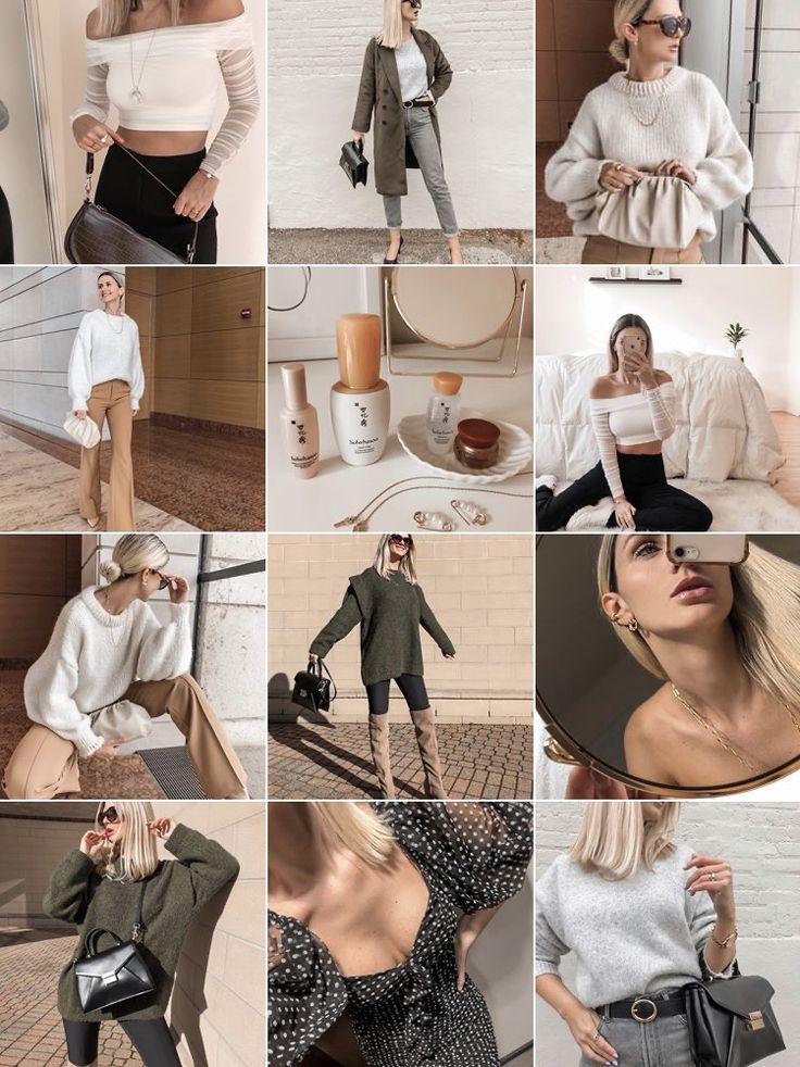 Which is a little sad, because these hints are very aesthetic and appropriate.
@inspiration_decorstudio
Mosaic puzzle - call it what you want. The essence will not change - this technique attracts attention, whatever one may say, especially if it is used more than once in the profile. Take a look at this account, at the beginning it has several mosaics and all with green accents. There is definitely something in this. =) But when using a mosaic, keep in mind that not all subscribers love it, because it is very strange to see 6-9 incomprehensible fragments in a row in your feed.
@bibliiteka_club_official
We continue talking about mosaics. If desired, with the help of fragments, you can arrange an insta-lander. Everything is clear from the name: this is an ordinary landing page transferred to the Instagram profile. =) Why is such a thing needed? For example, if you don’t have a website and it’s hard for you to maintain social networks on an ongoing basis. We create an insta-landing, pour advertising there, voila, you can find out all the information about your company in one click.
@japan.papa
Another example of how snippets can be used in an Instagram profile. We take an advertising banner, cut it, lay it out. Done, you are amazing! The main thing is that banners should be informative and be combined with each other.
@adverteam_studio
I know, I know, we are already tired of mosaics, I promise that we will finish them soon. =) Showcase your product or service in one post? No, they didn't. Let's go to 9-ty, as, for example, a branding agency did when they showed their design development for a client company. Looks damn cool and convenient for potential customers. When they get to your profile, they can get acquainted with examples of your work in a convenient and original format.
@ilfioredecor
By the way, if you didn’t know or didn’t think about it: photos in the puzzle can be cut not only across the entire width of the Instagram tile by 3, 6 or 9fragments. You can, for example, use only two vertical squares in the mosaic, as was done in this account.
@___aromagia___
Any SMM specialist, if he sees catalog photos on a white background in your profile, will start screaming heart-rendingly. Of course, depending on how it's all implemented and blah blah, but most often it looks ugly. What to do if there are no ideas? Alternatively, the white background can be replaced with silver or any other more interesting color. It will come out much prettier.
@jean_baby_shop
Another similar example, suitable for you if you find it difficult to crop products and transfer them to another background. You can lay out products on the same background and add thematic props. In total, you get the same catalog, only more Instagrammable.
@artberi_rings
And yes, you can lay out the goods not only on the photo background. The images in this profile are not intricate - just decorations for the box. But it looks very neat and aesthetic: both catalog and instagram. =)
@babygramhouse
Another variation of the catalog. This is just in case the white background cannot be cut down with an ax. Make the same substrates for each photo, they will save the situation.
@juvelarto_store
And this is how you can arrange a non-catalogue catalog. Stock up on fabrics, substrates, paper and combine backgrounds of different textures and colors. And do not forget about the props so that the product does not look "naked".
@island_soul_jewelry
And, of course, you can always demonstrate your product on models. The main thing is to repeat like a mantra: you need excellent photo quality, the same lighting and a single filter. Oh, yes... Also an interesting framing, the ability to be creative. In general, from experience I will say that for such cases it is better to hire a professional photographer, they have an eye for successful shots.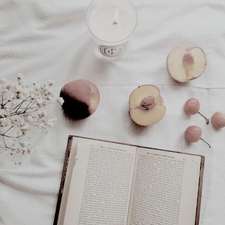
@sushi_holl_
From personal observation: if you look at many, many profiles on Instagram in a row (as I did for this article), the eyes will be more attracted to accounts where black prevails. Why? Because there are far fewer of them. It just so happened that the Instagram audience loves everything light and glamorous, ignoring the charm of restrained, even a little gloomy photos. So there is a double-edged sword here: dark profiles stand out from the competitive ones, but not the entire audience will fall into ecstasy from their beauty. As they say, not everyone will understand.
@plekhanova_studio
One black-black profile contained black-black photographs taken with a black-black camera. =) I am almost 100% sure that if not all, then most of the photos in this profile are made by myself. Again, everything here is gloomy, although the theme of the beauty salon is conducive to "pink in rhinestones. " Going to the "dark side" adds to the expensiveness of the profile, and unique shots add ... um ... uniqueness. In general, this example of Instagram is very successful, definitely worthy of attention.
@black
And this is for those who continue to claim that the mood color black is allowed only for Creed and Kirkorov, but for self-respecting profiles on Instagram. Look at this account with a sea of followers and amazing engagement! So black for Instagram is very viable. Proven!
@write__for_you
Let's continue to develop the theme of profiles "not for everyone". Here everything is done in black and white, and this is again an amateur, they say, gloomy and depressing. By no means! For my taste, it looks very stylish and stands out against the background of sugary profiles.
@vrn_mart_design
Definitely against black? You can choose white. The abundance of "air" in the profile also attracts attention and does not look boring.
@pinocchioosteria
Well, what are we all about black and black?! Let's add colors and lights! Now I will disgrace the whole village, but I can’t figure out how to indicate in a couple of words what is attractive in this profile. =D There are overlapping colors here, I'll assume that one filter is used. In general, different color and light photos miraculously form a harmonious and bright profile. As for me, this is the most difficult thing to achieve, but the result is excellent - a beautiful Instagram that you want to subscribe to.
@biancazapatka
And now the brightness is at maximum! I am sharing with you one of my favorite profiles. Do not look at an empty stomach! Each photo is like a work of art, each has a lot of color, a lot of design elements. But all colors echo and the abundance of everything coexists in harmony.
@sushi__panda__
Golden mean. When you want to use classic black and white, but also bright colors. Just add a bright accent to the bw, for example, red. Ready! You are gorgeous!
@yam_yam_irk
A little more about food and professional unique shots. Showcase products in catalog format? Can! But it's too easy. =) What if you organize a photo shoot?.. Remember that unique pictures with an idea will be a hundred times more valuable than catalog ones. But they will also cost you more energy.
@mir_matematika
This is a math tutor profile. The photo tile itself is a simple “checkerboard” where identically designed photos go through one publication. The trick here is to style the profile to fit your theme. For example, geometric shapes and mathematical icons have been added to this account: this does not require a lot of fuss, but makes the profile much more attractive. So feel free to take it into service, the main thing is not to overload.
@delfin_mkala
We continue the conversation about styling to fit your theme. Here the design is almost “too much”, there are many tricks, bright elements, contrasting colors. But! The topic itself allows such a search, everything related to goods and services for children can go a little beyond. In this example of a beautiful profile, we pay attention to stylization: ducks, lifebuoys - all this reinforces the theme of the children's pool.
But these are not all tricks. Meet the endless feed on Instagram! Its essence is that the image or icon smoothly transitions from one publication to another. The endless tape has both admirers and haters. Where is the negative? It's simple: for many, due to the fact that all the photos in the profile are combined, it is difficult to catch the eye on something. In my opinion, here the endless feed is implemented very neatly and does not turn publications into mush.
@bs_bomond
Here we see an element of an endless ribbon - the line smoothly flows from one photo to another. Attracts attention, but does not distract from the main photos. As a result, we get a non-trivial and beautiful profile on Instagram.
@kidscare.official
Here we also see small infinite elements. Plus, there is compliance with the color scheme of the substrates: blue and pink. Why do such things? They help out a lot when there is no way to combine the photos themselves: they can differ in color, lighting, design. Then endless elements and backgrounds help merge diverse photos into one style. Immediately there is uniformity, which is so important for publications.
@the_barbershop_group
Here is another profile with an infinite element. The best option when you want to add raisins, but you don’t want to spend a lot of effort. We take one detail and run it through the entire profile. Done, you are amazing!
@mantin.home
A moment of subjective opinion.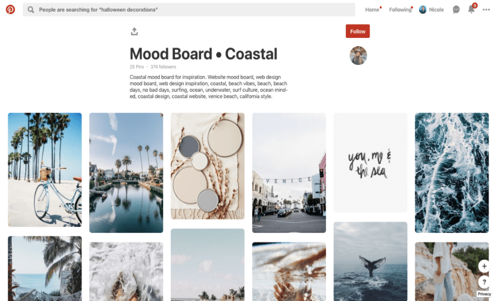 I really like the checkerboard on Instagram profiles, by the way, I already talked about it in this article. In my opinion, this is one of the most convenient and pleasant formats for perception. If the templates for checkers are also made in a stylish way, then they are generally delicious. As a rule, informational posts are drawn up with a checker, which is +90 points for convenience.
@grid_moscow
Did you think we would end the conversation about checkers so quickly? =D See Instagram example for a car service. Here we do not see dirt, spare parts lying around and car mechanics covered in fuel oil. Accuracy adds, firstly, a checker, and secondly, the thoughtfulness of the pictures themselves.
@avealalat
Maam, can we talk about checker? =D In general, in short: such a trick can be implemented not only with the help of the same template, but also with the help of inscriptions on the photo. The main thing is that the text is readable, of course.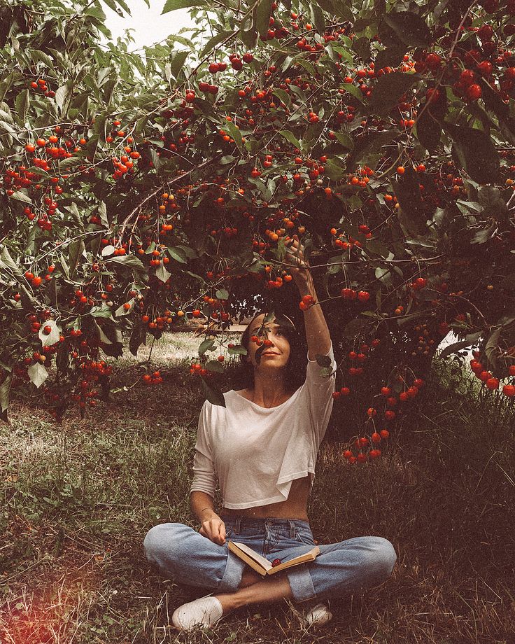 And if you also choose a cool font, you will definitely get a couple of points to the beauty of your profile on Instagram.
@repetitor_math_online
Olya, calm down with your checker! Not! =D There is one more thing. Patterns for checkers may not always be 100% the same. If you keep the color scheme, but change some elements, it will be even cooler. So you can individually make your own template for each checkers post, or at least make 4+ different templates. It will turn out very nice and somehow more “wow, how the person got confused!”.
@pelmenya_irk
Potentially Delicious Content – Aesthetic food images immediately start salivating! The profile is made in dark colors, which makes it stylish and status, and most importantly, nothing distracts from food photos.
@wedress_studio
A simple solution to add aesthetics - frames! The same white frames, as in this example, add to the air profile, allow you to focus on the picture and, of course, add zest.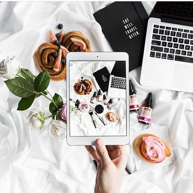 So beauty is not always the invention of the bicycle.
@prazdnik138
Don't like the same frames? Business, do something different! It will also turn out very nice.
@chistyydomeco.belka
We will slowly move on to talking about templates with you. Now drawing an individual or buying a standard template is a very popular thing in the field of Instagram. You get a template - insert your photos - you're done! If you wish, you can make up the photo yourself, for example, in the Canva application. By the way, we already talked about it earlier in the article.
In this example, we see a color template where the whole design is based on 3 colors: blue, gray and white. As a rule, the prevailing colors are chosen based on the company logo.
@say.yes.agency
Another example of templates with multiple colors and designs. Remember that the more different elements you have and the more they are active in the feed, the more difficult it is to combine them.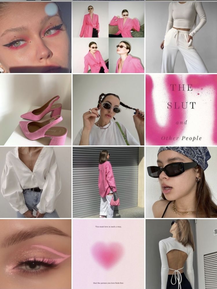 So advice to you: be sure to use the tile designer on Instagram. For example, the UNUM application. It reproduces the social network tiles, which gives you the opportunity to know in advance how certain pictures will look next to each other. You can learn even more useful applications in one of our articles.
@atami_jap
By the way, for some topics, color extravaganza is not only acceptable, but also desirable. For example, Korean cosmetics, baby products, dry pools. Here, the color play on the verge of a foul is quite harmonious. But again, everything depends on your taste: not everyone manages to catch the balance between extravagance and outright trash.
@nats_auto
And you can get by with just one color in templates. Look, blue has been added to the profile: both in the main tile and in the covers for Topical. And everything went from the company logo. And as a result, we have a uniform profile, in which, by the way, there is also a lot of "air" due to the abundance of white. Watch how you can beautifully present a topic that is difficult for Instagram, as, for example, this car service did.
@pigmalion_salon_krasoty
There are templates a little more complicated, where not just uniform colors are used, but colored backgrounds or substrates, as in this example.
@ylettravel
Do not underestimate the work with captions on the photo - they help the user immediately grab what he is interested in. You can simply put an inscription on the photo, or you can, as here, use templates. By the way, pay attention to a common trick - to place similar photos in one line vertically.
@goodgarden_studio
Since we’ve already touched on the subject of post layout, posts with the same or very similar design can be placed in one line vertically, horizontally, or you can come up with your own order and post photos even as a snake, even as a spiral, at least .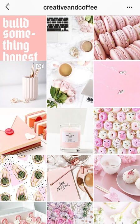 .. at least as, in general . =) What is enough for your imagination.
@gcc_irk38
In almost every article I say that banal stock photos are bad for your Instagram. But there are also exceptions. We take a cartoon stock, add a template, put inscriptions - it turns out very well! So, if you have time to select hand-drawn pictures on your subject or there is a designer in slavery who can be exploited, feel free to experiment with drawings.
@jp_clubbust
Continuing the theme of drawings, look how cute these painted busts are! They are in some info posts, on the avatar, on the covers of Actual. Yes, there is no super-originality in this, but the profile is remembered thanks to bright pictures. Plus, there are elements of an endless ribbon and work with white frames. I definitely approve! =)
@sidorova.koza.brand
Now I will embarrass myself again, because I don’t know how to describe this profile. Strange, even surreal in places... You have to muster up the courage and go beyond the limits of normality in order to start maintaining an account in a similar vein. Think you can't do it right? Photo stocks to help you. There are a lot of oddities there, you will definitely find something for yourself, I give a tooth. =) And I also give a link to an article where free photo stocks are collected.
@seizetheimpress
If using content on photo stocks is too easy for you, and you are eager to create and get up, you can take unique pictures in a similar vein, as the owners of this profile do. The guys are strange, but cool, bravo!
@keti_spain
Sometimes your merchandise can inspire you with ideas for an interesting presentation of photographs. How can you beautifully serve dolls? You can just take a picture of them on a photophone, or you can ... arrange a trip around the city for them! The very idea of humanizing dolls is not new, but with a stylish implementation, it all looks cool.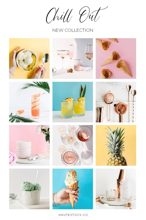 Although a little creepy in places.
@timandtimicecream
When writing this article, it is not always possible to maintain objectivity, so I introduce you to the profile that fell in love with me at first sight. Something from pop art, something from minimalism... Personally, I am delighted! I definitely advise you to look through the account, pumping in a combination of bright colors is guaranteed to you!
@42coffeeshop
This is my article, I do what I want until the editor sees it. =D Therefore, I show another profile on Instagram, which is similar to the previous one. Again, bright colors, mouth-watering photos, party-like, modernity. A little more and I will perform an ode to these profiles! In the meantime, I'm singing, you run into these accounts to soak up the beauty.
@alexandriaslens
Oh, we have a good charge of inspiration and practical advice! At least I really hope so. And therefore - at the end of the article, dessert. =) A profile of a talented photographer whose pictures you want to look at, and look at, and look at. Let's discard all the problems: a drop in activity on Instagram, an unwritten content plan... Just enjoy.
@service1ps
Well, now we have reached the promised figure of 50! Although I put the profile to the end, it takes first place in my heart. Yes, yes, this is the Instagram account of our 1PS Service! We try to please you with beauty and usefulness 2-3 times a week: we talk about useful things with metaphors and jokes, select images with trepidation. And, of course, do not forget to spoil you with gifts: subscribe to our profile, repost any post in your stories and get a 5% discount on any Service service. The commercial break is over! =)
Yes, there was no need for anything. =D Of course, if you are not concerned about the successful promotion of your profile, it is useful to see what others are doing, analyze their chips, think about how this or that stylistic move is implemented.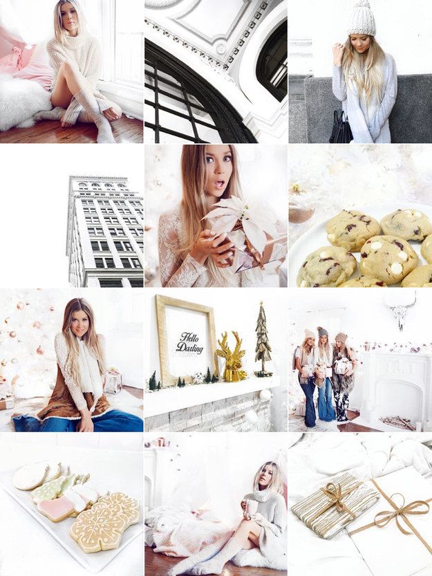 All this encourages improvement. So don't forget to periodically raid Instagram.
In the end, I want to share with you my observations:
 In it, we told you how to objectively evaluate your account.
 If you don’t have the time and energy to shovel mountains of profiles, analyze something there, for this you have us. We will evaluate your competitors and tell you how to improve your account. Learn more about Instagram promotion here.
Would you like to be consulted in detail? Our Support Department specialists are so cool that they will tell you about social networks just as well as real SMM specialists.
Write to [email protected] and find out how to start working on your account.
# SMM # promotion in social networks # content ideas # social networks
© 1PS.RU
We are sorry that we did not meet your expectations ((
You might like other blog articles.
39 pers. rated, average rating 4.9
7% discount on promoting your business
Discount on any of our services, which will help you save a little or bring a little more customers for the same money. Activate so you don't get lost.
Activate
Comments for the site Cackl e
We design VKontakte Goods: how to get sales directly on the social network#SMM#vKontakte#groups in social networksShop directly in the VKontakte community with a basket, an order form, a CRM system for their processing, as well as with connected delivery and payment. Reality? Yes, and for a long time! All you need to do is to properly format the "Products" section. The article tells how to do it.
A Little Hypanem: 20 Examples of Commercial Content Going Viral#SMM#social media groups#social media promotionSubscribers flow like a river to you, while you make almost no effort. Do you want the same? You don't need to sell your soul to anyone, don't worry. Just give your content a high viral reach. See who has already done it and learn from their example.
6 friends Mail.ru Group: how to set up advertising using myTarget on 6 sites at once#SMM#social media promotion#Internet advertising What if I want to go everywhere? Is it possible? You will be surprised, but yes! After all, there is an advertising platform myTarget from Mail.ru Group, which, as if by magic, will allow you to launch ads on 6 different resources at once. Instagram and FB are not on the list, but there are VK and Odnoklassniki. And in this article, instructions on how to set up the process. Use on health. :)
All popular articles ”
menu
Content
 1 Color scheme for a profile
 Not only celebrities and business account holders want to have a beautiful Instagram profile, but also ordinary users.
Please note that the article will not be about how to beautifully process photos for Instagram, but about how to add style and elegance to your account and properly design it.
Each user is trying to stand out from the crowd, so individuality is important. In business accounts and online stores, the originality of the presentation is also important. Let's figure out how to make a beautiful profile on Instagram.
Instagram account avatar must have a common style with the visual design of the feed. The image must be of the same color scheme as the ribbon. If the color palette of the ribbon changes, then the avatar is also updated.
Try to stick to a common style when changing your profile picture. So that even when changing the avatar, it is clear at first glance that this is your account.
You can also make an avatar with special effects or create an art avatar for Instagram.
In the Instagram description “about yourself”, you need to fit in 150 characters and try to hook the user. Write briefly and preferably in your native language. Describe what the blog will be about, who you are or what you do.
Give brief information so that a stranger, looking at you, immediately understands what is being written here. If you have your own hashtag, add it to your bio. This will help you create a beautiful and understandable account.
Fonts that can be applied to the Instagram profile bio.
Geotags and hashtags can easily find you, so add them to every post. Don't add overly popular Instagram hashtags, it won't do you any good. Come up with your own hashtags to quickly find your Instagram account or a specific post.
An example of using a unique hashtag on Instagram.
If the text below the post spans all characters, add the hashtags separately in the comments below the post, because placement does not affect promotion.
Share stories under posts, you can write about anything. The main thing is to be interesting to others. No need to make out a photo empty or with incomprehensible emoticons.
The profile should be interesting not only for its beautiful design, but also for its history. This increases engagement and has a positive effect on the Instagram algorithm.
Not all users view your Instagram Stories in 24 hours, so add them to Feature. Constantly update this section, but try not to litter your account.
Design the entire Highlights section in a certain style by adding icons with captions.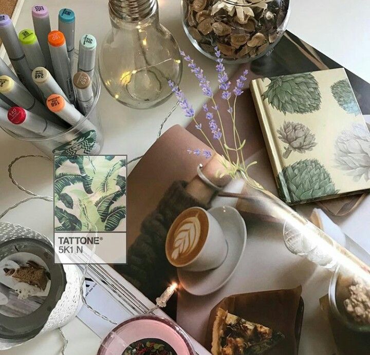 It all depends on how you manage your account.
Consistency is not always good, so in order to make a beautiful Instagram, constantly draw inspiration. Keep up with the times and change if the world around you changes.
So, let's move on to the most important aspect of a beautiful Instagram - visual content!
Visual is the key to blog success. Profile photos, its atmosphere and mood are the first thing a user can hook a subscriber (client) with.
The standard user's feed looks like a photo album that is intended for girlfriends, or worse, mom's girlfriends. The main mistake of photographs is the lack of detail of the “Instagram frame”: there is no emphasis on details, an incomprehensible background and no color correction.
Instagram account requires a lot of time and design approach. Your style must be recognizable. Therefore, it is worth considering the following details.
Think of a uniform style in which color you would like to design your account.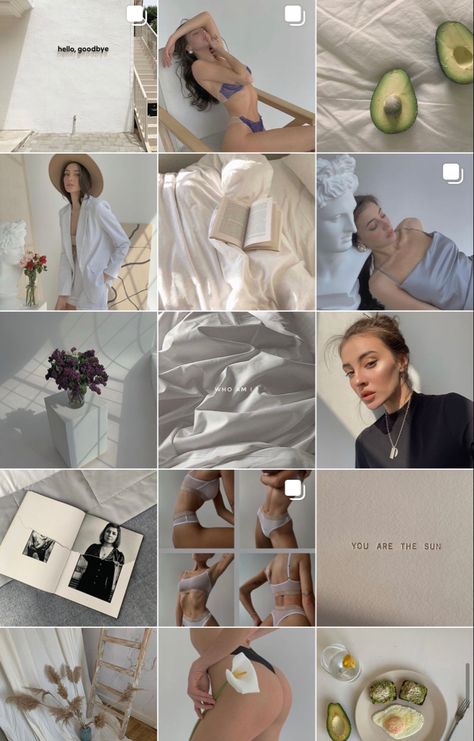 Perhaps the color scheme will change with time and seasons, or you still prefer constancy in this matter.
Examples of visual design in the same style.
This is a selection of different variations of the effects and method of posting photos: checkerboard effects, changing photo margins, working with frames for Instagram, placing photos in a grid. This approach allows each rubric to give its own shade and stand out from the competition.
Posting scheme "Chessboard".
This is necessary to give Instagram a single thoughtful style. Using the same filters over and over will help keep this design consistent, as if you edit your photos by hand, it will be difficult to achieve a consistent color palette and the original idea.
We figured out how to submit content, but where do you get ideas for beautiful photos on Instagram?
 View other people's materials and ideas. If you want to take certain photos with some item, then search pinterest or weheartit for this word (for example, a red scarf).
  ).
). Seasonal flatlay accessories.