Nowadays, Instagram is often someone's initial contact with a brand, and nearly half of its users shop on the platform each week. If it's the entryway for half of your potential sales, don't you want your profile to look clean and inviting?
Taking the time to create an engaging Instagram feed aesthetic is one of the most effective ways to persuade someone to follow your business's Instagram account or peruse your posts. You only have one chance to make a good first impression — so it's critical that you put effort into your Instagram feed.
Finding the perfect place to start is tough — where do you find inspiration? What color scheme should you use? How do you organize your posts so they look like a unit?
We know you enjoy learning by example, so we've compiled the answers to all of these questions in a list of stunning Instagram themes. We hope these inspire your own feed's transformation. But beware, these feeds are so desirable, you'll have a hard time choosing just one.
An instagram theme is a visual aesthetic created by individuals and brands to achieve a cohesive look on their Instagram feeds. Instagram themes help social media managers curate different types of content into a digital motif that brings a balanced feel to the profile.
Creating a theme on your own requires a keen eye for detail. When you’re editing several posts a week that follow the same theme, you’ll want to have a design tool handy to make that workflow easier. Pre-set filters, color palettes, and graphic elements are just a few of the features these tools use, but if you have a sophisticated theme to maintain, a few of these tools include advanced features like video editing and layout previews. Here are our top five favorite tools to use when editing photos for an Instagram theme.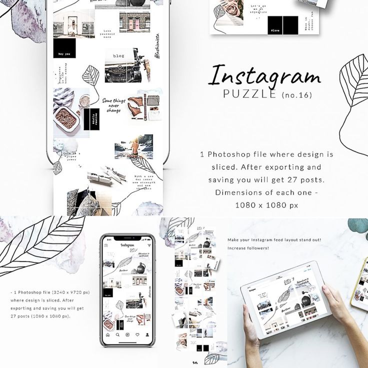
Creators look to VSCO when they want to achieve the most unique photo edits. This app is one of the top-ranked photo editing tools among photographers because it includes advanced editing features without needing to pull out all the stops in Photoshop. If you’re in a hurry and want to create an Instagram theme quickly, use one of the 200+ VSCO presets including name-brand designs by Kodak, Agfa, and Ilford. If you’ll be including video as part of your content lineup on Instagram, you can use the same presets from the images so every square of content blends seamlessly into the next no matter what format it’s in.
FaceTune2 is a powerful photo editing app that can be downloaded on the App Store or Google Play. The free version of the app includes all the basic editing features like brightness, lighting, cropping, and filters. The pro version gives you more detailed control over retouching and background editing. For video snippets, use FaceTune Video to make detailed adjustments right from your mobile device — you’ll just need to download the app separately for that capability. If you’re starting to test whether an Instagram theme is right for your brand, FaceTune2 is an affordable tool worth trying.
You know Canva as a user-friendly and free option to create graphics, but it can be a powerful photo editing tool to curate your Instagram theme. For more abstract themes that mix imagery with graphic art, you can add shapes, textures, and text to your images. Using the photo editor, you can import your image and adjust the levels, add filters, and apply unique effects to give each piece of content a look that’s unique to your brand.
Image Source
Have you ever used Adobe Illustrator to create interesting overlays and tints for images? You can do the same thing to develop your Instagram theme. Traditionally, Adobe Illustrator is the go-to tool to create vectors and logos, but this software has some pretty handy features for creating photo filters and designs. Moreover, you can layout your artboards in an Instagram-style grid to see exactly how each image will appear in your feed.
Photoshop is the most well-known photo editing software, and it works especially well for creating Instagram themes. If you have the capacity to pull out all the stops and tweak every detail, Photoshop will get the job done. Not only are the editing, filter, and adjustment options virtually limitless, Photoshop is great for batch processing the same edits across several images in a matter of seconds. You’ll also optimize your workflow by using photoshop to edit the composition, alter the background, and remove any unwanted components of an image without switching to another editing software to add your filter. With Photoshop, you have complete control over your theme which means you won’t have to worry about your profile looking exactly like someone else’s.
 Transition
If you aren’t set on one specific Instagram theme, consider the transition theme. With this aesthetic, you can experiment with merging colors every couple of images. For example, you could start with a black theme and include beige accents in every image. From there, gradually introduce the next color, in this case, blue. Eventually, you’ll find that your Instagram feed will seamlessly transition between the colors you choose which keeps things interesting without straying from a cohesive look and feel.
Image Source
A polished black and white theme is a good choice to evoke a sense of sophistication. The lack of color draws you into the photo's main subject and suggests a timeless element to your business. @Lisedesmet's black and white feed, for instance, focuses the user’s gaze on the image's subject, like the black sneakers or white balloon.
Image Source
If your company's brand is meant to imply playfulness or fun, there's probably no better way than to create a feed full of bright colors.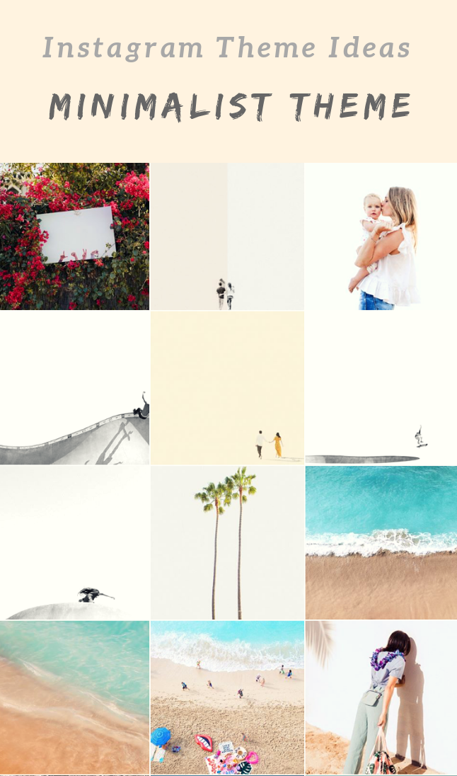 Bright colors are attention-grabbing and lighthearted, which could be ideal for attracting a younger audience. @Aww.sam's feed, for instance, showcases someone who doesn't take herself too seriously.
Image Source
For an artsier edge, consider taking a minimalist approach to your feed, like @emwng does. The images are inviting and slightly whimsical in their simplicity, and cultivate feelings of serenity and stability. The pup pics only add wholesomeness to this minimalist theme. Plus, minimalist feeds are less distracting by nature, so it can be easier to get a true sense of the brand from the feed alone, without clicking on individual posts.
Image Source
One of the easiest ways to pick a theme for your feed is to choose one color and stick to it — this can help steer your creative direction, and looks clean and cohesive from afar. It's particularly appealing if you choose an aesthetically pleasing and calm color, like the soft pink used in the popular hashtag #blackwomeninpink.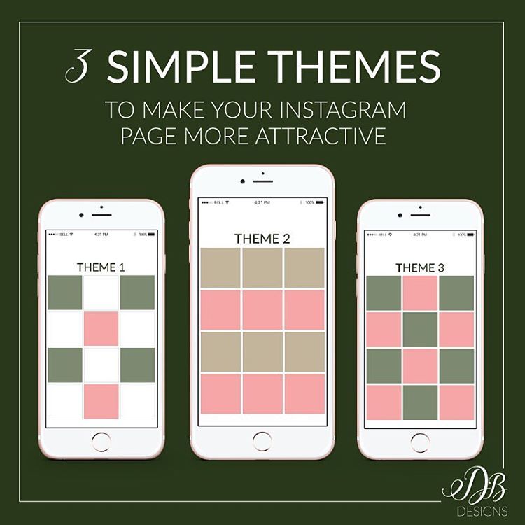
Image Source
If you're interested in creating a highly cohesive feed but don't want to stick to the one-color theme, consider trying two. Two colors can help your feed look organized and clean — plus, if you choose branded colors, it can help you create cohesion between your other social media sites the website itself. I recommend choosing two contrasting colors for a punchy look like the one shown in @Dreaming_outloud’s profile.
Image Source
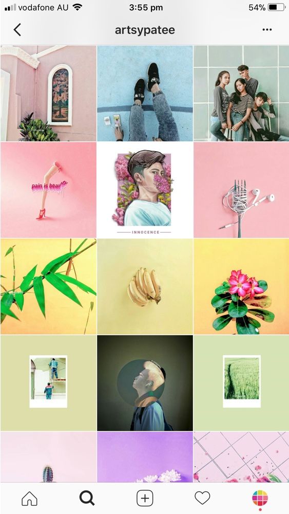
Similar to the one-color idea, it might be useful to choose one color palette for your feed, like @creativekipi's use of pastels. Pastels, in particular, often used for Easter eggs or cupcake decorations, appear childlike and cheerful. Plus, they're captivating and unexpected.
Image Source
As evident from @mustdoflorida's feed (and username), it's possible to focus your feed on one singular object or idea — like beach-related objects and activities in Florida.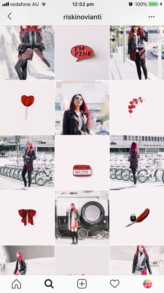 If you're aiming to showcase your creativity or photography skills, it could be compelling to create a feed where each post follows one theme.
Image Source
Creating a puzzle out of your feed is complicated and takes some planning, but can reap big rewards in terms of uniqueness and engaging an audience. @Juniperoats’ posts, for instance, make the most sense when you look at it from the feed, rather than individual posts. It's hard not to be both impressed and enthralled by the final result, and if you post puzzle piece pictures individually, you can evoke serious curiosity from your followers.
Image Source
Displaying everyday items and activities from unexpected angles is sure to draw attention to your Instagram feed. Similar to the way lines create a theme, angles use direction to create interest. Taking an image of different subjects from similar angles can unite even the most uncommon photos into a consistent theme.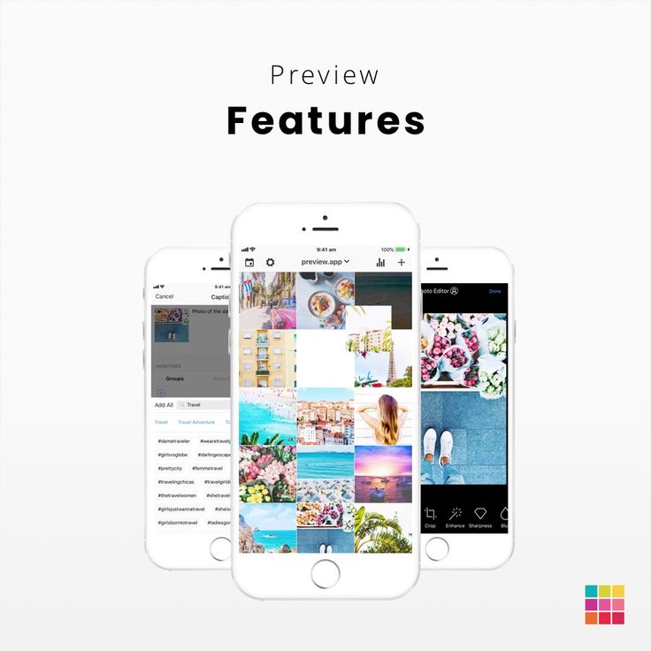
Image Source
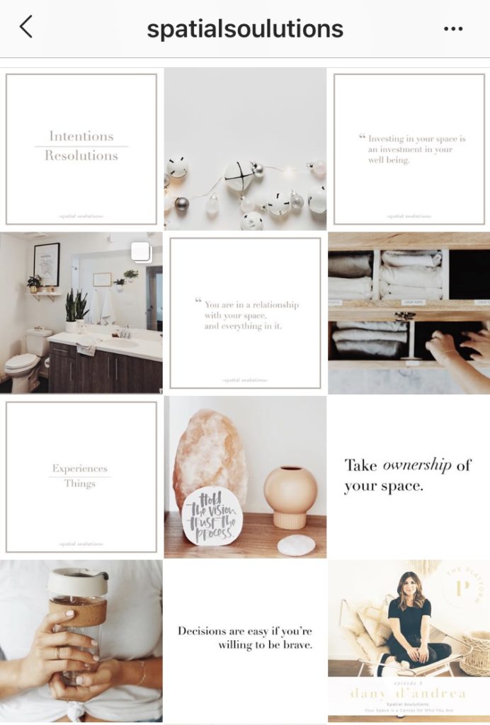
A picture is worth a thousand words, but how many pictures is a well-designed quote worth? Confident Woman Co. breaks the rules of Instagram that say images should have a face in them to get the best engagement. Not so with this Instagram theme.
The bright colors and highlighted text make this layout aesthetically pleasing both in the Instagram grid format and as a one-off post on the feed. Even within this strict text-only theme, there’s still room to break up the monotony with a type-treated font and textured background like the last image does in the middle row.
Image Source
If you're not a big fan of horizontal or vertical lines, you might try a checkerboard theme. Similar to horizontal lines, this theme allows you to alternate between content and images or colors as seen in @thefemalehustlers’ feed.
Image Source
While it is a bit jarring to have black or white borders outlining every image, it definitely sets your feed apart from everyone else's.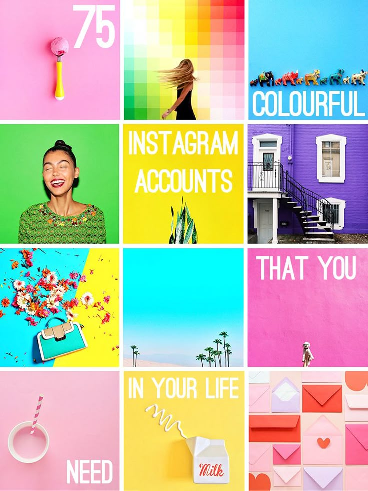 @Beautifulandyummy, for instance, uses black borders to draw attention to her images, and the finished feed looks both polished and sophisticated. This theme will likely be more successful if you're aiming to sell fashion products or want to evoke an edgier feel for your brand.
Image Source
If you prefer uniformity, you'll probably like this Instagram theme, which focuses on using the same filter (or set of filters) for every post. From close up, this doesn't make much difference on your images, but from afar, it definitely makes the feed appear more cohesive. @marianna_hewitt, for example, is able to make her posts of hair, drinks, and fashion seem more refined and professional, simply by using the same filter for all her posts.
Image Source
If your primary goal with Instagram is to showcase your products, you might want a Flatlay theme. Flatlay is an effective way to tell a story simply by arranging objects in an image a certain way and makes it easier to direct viewers' attention to a product. As seen in @thedailyedited's feed, a flatlay theme looks fresh and modern.
Image Source
If it aligns with your brand, vintage is a creative and striking aesthetic that looks both artsy and laid-back. And, while "vintage" might sound a little bit vague, it's easy to conjure. Simply try a filter like Slumber or Aden (built into Instagram), or play around with a third-party editing tool to find a soft, hazy filter that makes your photos look like they were taken from an old polaroid camera.
Image Source
In @girleatworld's Instagram account, you can count on one thing to remain consistent throughout her feed: she's always holding up food in her hand. This type of repetition looks clean and engaging, and as a follower, it means I always recognize one of her posts as I'm scrolling through my own feed. Consider how you might evoke similar repetition in your own posts to create a brand image all your own.
Image Source
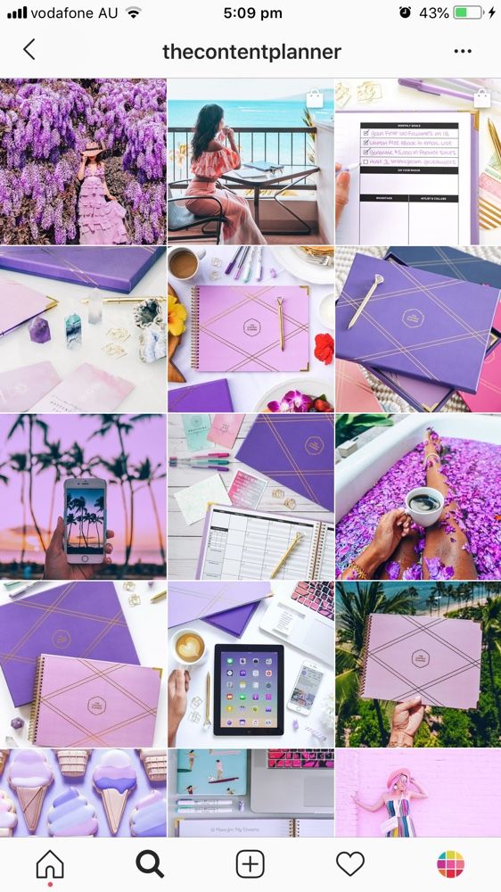 Mix-and-match Horizontal and Vertical Borders
While this admittedly requires some planning, the resulting feed is incredibly eye-catching and unique. Simply use the Preview app and choose two different white borders, Vela and Sole, to alternate between horizontal and vertical borders. The resulting feed will look spaced out and clean.
Image Source
If you're a writer or content creator, you might consider creating an entire feed of quotes, like @thegoodquote feed, which showcases quotes on different mediums, ranging from paperback books to Tweets. Consider typing your quotes and changing up the color of the background, or handwriting your quotes and placing them near interesting objects like flowers or a coffee mug.
Image Source
@JackHarding's nature photos are nothing short of spectacular, and he highlights their beauty by filtering with a dark overtone. To do this, consider desaturating your content and using filters with cooler colors, like greens and blues, rather than warm ones.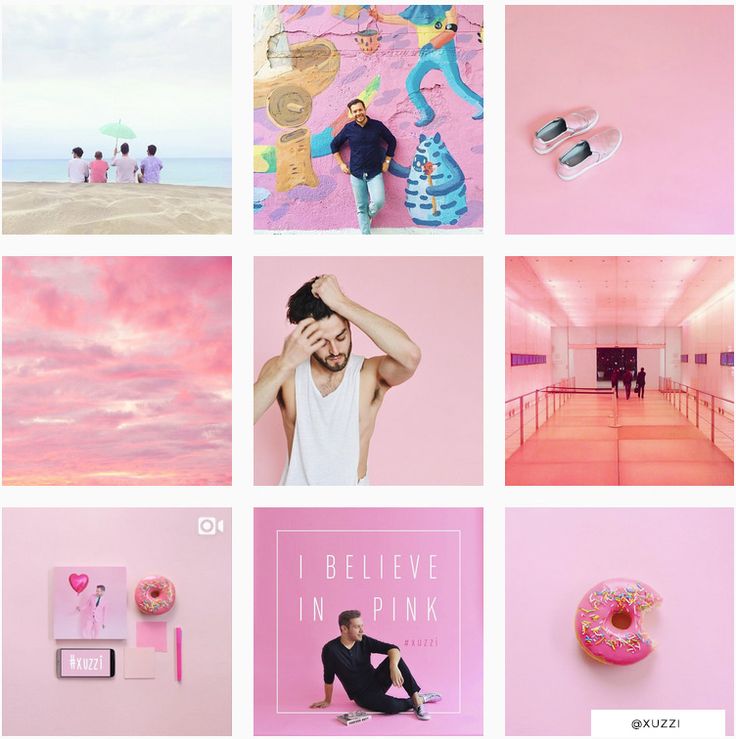 The resulting feed looks clean, sleek, and professional.
Image Source
One way to introduce color into your feed? Try creating a rainbow by slowly progressing your posts through the colors of the rainbow, starting at red and ending at purple (and then, starting all over again). The resulting feed is stunning.
Image Source
Most people on Instagram stick to photos and filters, so to stand out, you might consider adding drawings or cartoon doodles on top of (or replacing) regular photo posts. This is a good idea if you're an artist or a web designer and want to draw attention to your artistic abilities — plus, it's sure to get a smile from your followers, like these adorable doodles shown below by @josie.doodles.
Image Source
Similar elements in your photos can create an enticing Instagram theme. In this example by The Container Store Custom Closets, the theme uses shelves or clothes in each image to visually bring the feed together.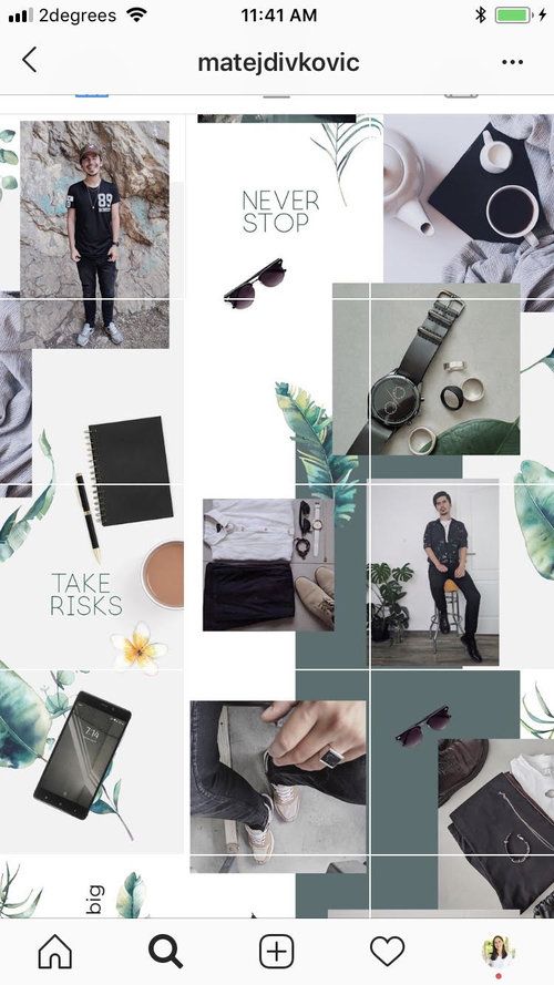 Rather than each photo appearing as a separate room, they all combine to create a smooth layout that displays The Container Store’s products in a way that feels natural to the viewer.
Image Source
Something about this Instagram feed feels different, doesn’t it? Aside from the content focusing on skyscrapers, the lines of the buildings in each image turn this layout into a unique theme. If your brand isn’t in the business of building skyscrapers, you can still implement a theme like this by looking for straight or curved lines in the photos your capture. The key to creating crisp lines from the subjects in your photos is to snap them in great lighting and find symmetry in the image wherever possible.
Image Source
If your brand does well with aligning photography with content, you might consider organizing your posts in a thoughtful way — for instance, creating either horizontal or vertical lines, with your rows alternating between colors, text, or even subject distance.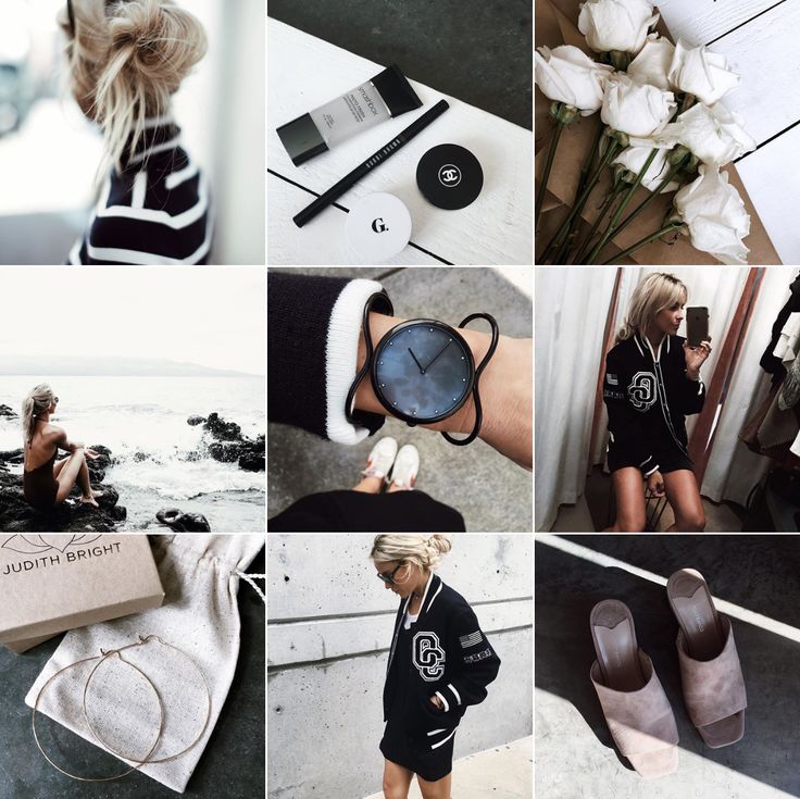 @mariahb.makeup employs this tactic, and her feed looks clean and intriguing as a result.
Image Source
One major factor of any Instagram theme is consistency. For instance, you wouldn't want to regularly change your theme from black-and-white to rainbow — this could confuse your followers and damage your brand image. Of course, a complete company rebrand might require you to shift your Instagram strategy, but for the most part, you want to stay consistent with the types of visual content you post on Instagram.
For this reason, you'll need to choose a color palette to adhere to when creating an Instagram theme. Perhaps you choose to use brand colors. HubSpot's Instagram, for instance, primarily uses blues, oranges, and teal, three colors prominently displayed on HubSpot's website and products.
Alternatively, maybe you choose one of the themes listed above, such as black-and-white.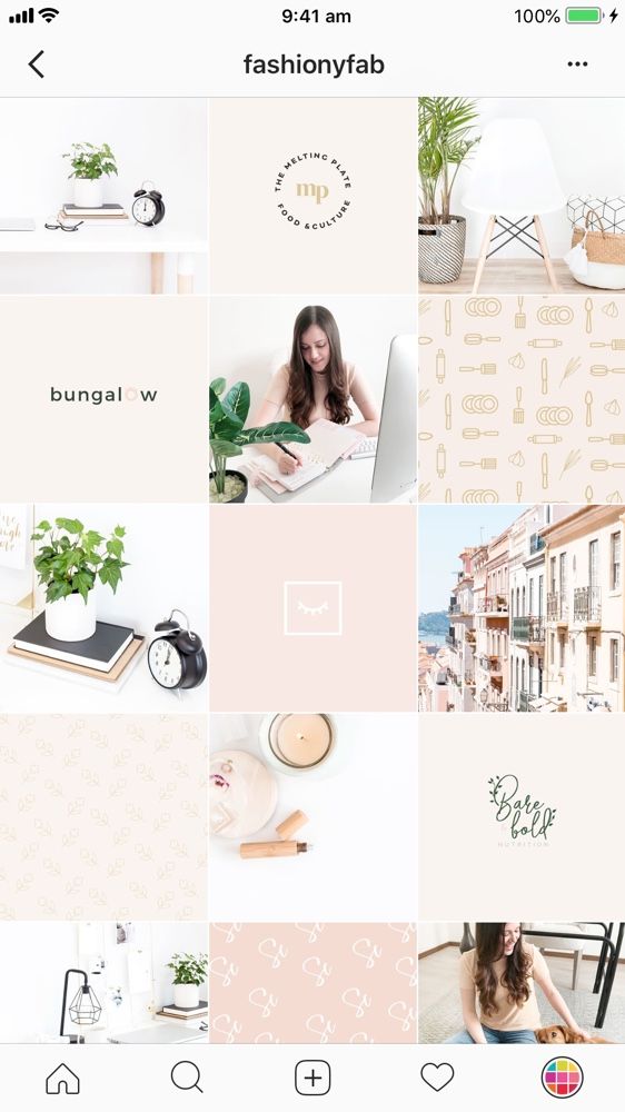 Whatever the case, to create an Instagram theme, it's critical you stick to a few colors throughout all of your content.
As noted above, consistency is a critical element in any Instagram theme, so you'll want to find your favorite one or two filters and use them for each of your posts. You can use Instagram's built-in filters, or try an editing app like VSCO or Snapseed. Alternatively, if you're going for a minimalist look, you might skip filters entirely and simply use a few editing features, like contrast and exposure.
Whatever you choose, though, you'll want to continue to edit each of your posts similarly to create a cohesive feed.
It's vital that you plan your Instagram posts ahead of time for a few different reasons, including ensuring you post a good variety of content and that you post it during a good time of day.
Additionally, when creating an Instagram theme, you'll need to plan posts in advance to figure out how they fit together — like puzzle pieces, your individual pieces of content need to reinforce your theme as a whole.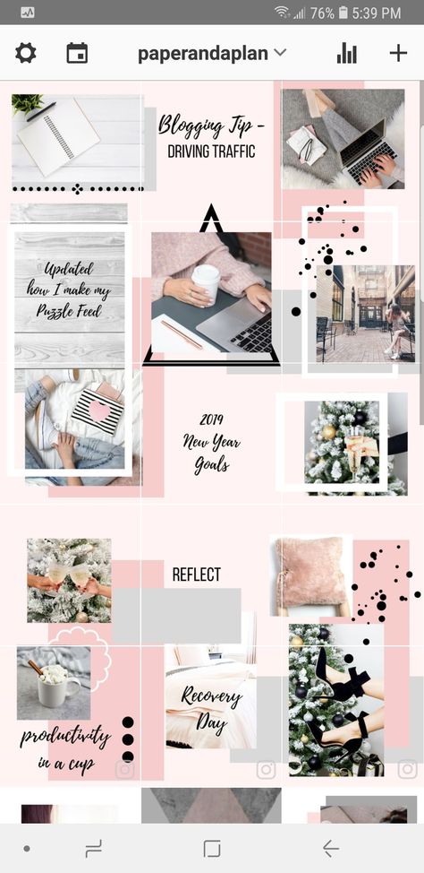 To plan posts far in advance and visualize how they reinforce your theme, you'll want to use a visual Instagram planner like Later or Planoly. Best of all, you can use these apps to preview your feed and ensure your theme is looking the way you want it to look before you press "Publish" on any of your posts.
In middle school, I often liked to change my "look" — one day I aimed for preppy, and the next I chose a more athletic look. Of course, as I got older, I began to understand what style I could stick with for the long haul and started shopping for clothes that fit my authentic style so I wasn't constantly purchasing new clothes and getting sick of them a few weeks later.
Similarly, you don't want to choose an Instagram theme you can't live with for a long time. Your Instagram theme should be an accurate reflection of your brand, and if it isn't, it probably won't last. Just because rainbow colors sound interesting at the get-go doesn't mean it's a good fit for your company's social media aesthetic as a whole.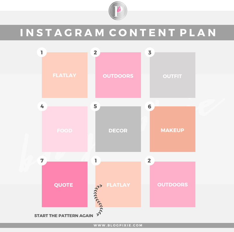
When in doubt, choose a more simple theme that provides you the opportunity to get creative and experiment without straying too far off-theme.
When you start an Instagram theme, there are so many options to choose from. Filters, colors, styles, angles — the choices are endless. But it’s important to keep in mind that these things won’t make your theme stand out. The content is still the star of the show. If the images aren’t balanced on the feed, your theme will look like a photo dump that happens to have the same filter on it.
To curate the perfect Instagram theme, choose what photos you plan to post before choosing a theme. I highly recommend laying these photos out in a nine-square grid as well so you can see how the photos blend together.
Sure, no one is going to see the captions of your Instagram photos when they’re looking at your theme in the grid-view, but they will see them when you post each photo individually.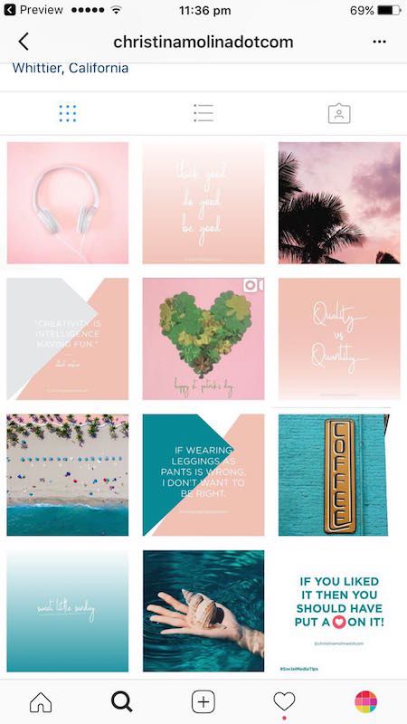 There will be times when an image you post may be of something abstract, like the corner of a building, an empty suitcase, or a pair of sunglasses. On their own, these things might not be so interesting, but a thoughtful caption that ties the image to your overall theme can help keep your followers engaged when they might otherwise check out and keep scrolling past your profile.
If you’re having a bit of writer’s block, check out these 201 Instagram captions for every type of post.
Earlier, we talked about choosing a theme that you can commit to for the long haul. But there’s an exception to that rule — color transitions. Some of the best themes aren’t based on a specific color at all. Rather than using the same color palette throughout the Instagram feed, you can have colors blend into one another with each photo. This way, you can include a larger variety of photos without limiting yourself to specific hues.
Instagram marketing is more than numbers. As the most visual social media platform today, what you post and how it looks directly affects engagement, followers, and how your brand shows up online. A cohesive Instagram theme can help your brand convey a value proposition, promote a product, or execute a campaign. Colors and filters make beautiful themes, but there are several additional ways to stop your followers mid-scroll with a fun, unified aesthetic.
Editor's note: This post was originally published in August 2018 and has been updated for comprehensiveness.
If you want to stand out on Instagram, a creative and consistent theme is the way to go! I didn’t begin to see traffic pick up on my account until I started sticking with a theme, and my follower growth just kept climbing.
Many top Instagrammers have developed their own style of visually pleasing imagery that just begs you to click “follow”. So, how can you do the same? Here are some tips!
The first thing you should think about is the overall colour scheme you’d like to work with.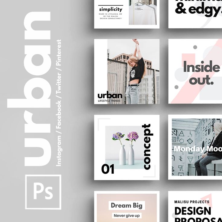 This is probably one of the most important aspects of creating your own unique Instagram theme because colour sets the tone for your whole feed.
With the Wonder Forest Instagram feed, I wanted to keep things fresh, bright, and airy, so white was the way to go. There are so many awesome users who have adopted their own colour schemes ranging from whites to pastel tones to bright and bold colours.
Check out @wearecaribou‘s white and neutral theme, @earlymorningheart‘s use of gloomy tones, @xuzzi‘s constant use of pink which has deemed him “Mr. Pink”, or @cestmaria‘s ongoing pastel theme.
If you’re thinking about shooting a lot of in-studio type photos, keeping your background colours or tones consistent will be key.
For my own feed, I use white backgrounds ranging from pure white table tops, to bed sheets, to vinyl white patterned backdrops. @minimaliving does this well, as does @thepinkdiary and @runnerkimhall.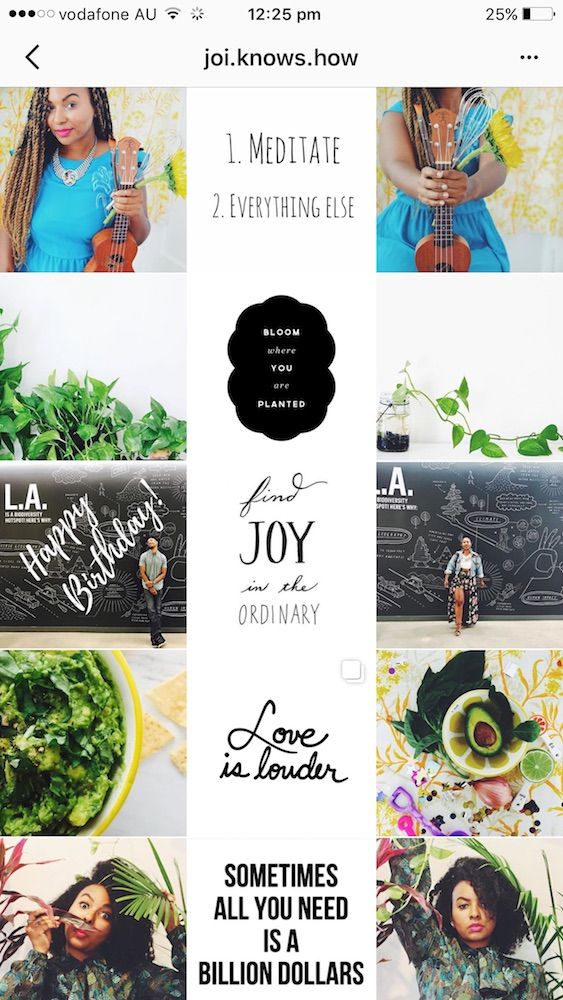
The type of photos you create should also be consistent and convey a particular theme. With my own photos, I like to showcase my creative lifestyle by staging photos and throwing in shots of projects I’m working on at the moment.
@emilyrosehannon does an awesome job as a fashion Instagram influencer, consistently sharing outfit photos with a white theme and rarely ever showing her face. Her “phone-in-face” photo style in that white framed mirror has become a signature.
@helloemilie uses a similar technique with her travel photos and consistently wears a hat with her back facing the camera whenever she makes an appearance in a dreamy looking landscape.
Choose what will be your “thing”. The characteristic that sets you apart from other accounts and is easy to replicate often.
Lighting can have a big impact on the look of your photos and feed. If you’re using studio lights, try to always use studio lights.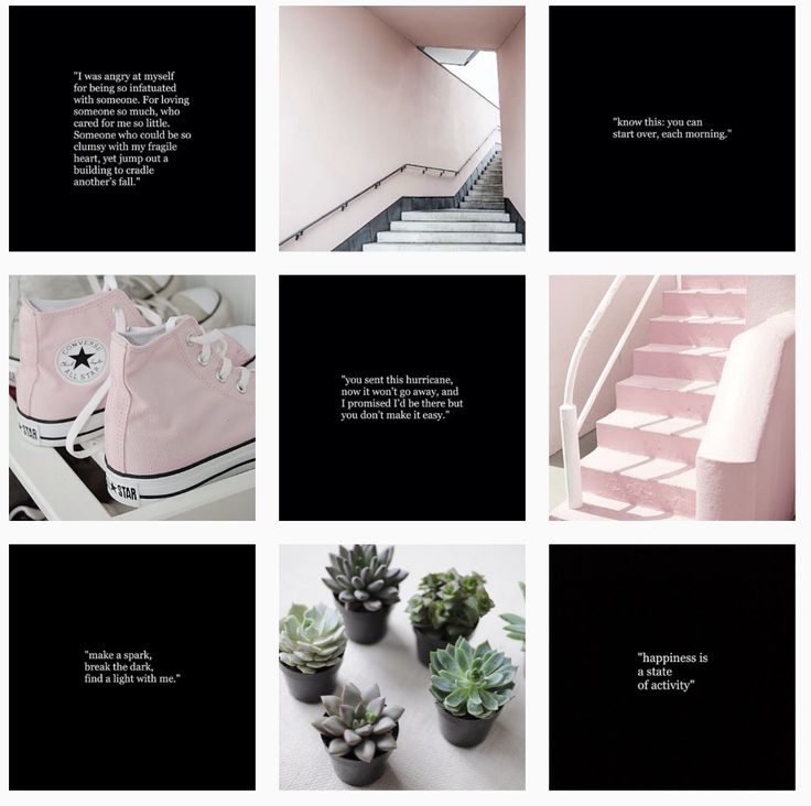
If you’re using window light or natural light, try taking your photos at the same time each day. @kpunkka does this amazingly with his nature photography, often shooting in the early morning light.
There is a ton of editing software and apps available to complete your look. You can use Lightroom or Photoshop on your computer, or download some apps… my personal favourites being Lightroom Mobile and Snapseed.
I recommend playing around with the settings and filters to achieve a look that you like and one that would be easy to replicate on all of your future photos.
You can also download or purchase some Lightroom presets that work on the mobile app version and apply them to all of your photos for that cohesive look.
With your chosen editing program, experiment with different techniques to develop your own “signature style”.
This should be a sequence that you can apply to all of your photos rather easily once you map it out. With my own photos, I consistently bump up all of the whites and brightness, tone down the saturation a bit, and lighten up any shadows before sharpening things slightly. I also throw on a favourite filter/Lightroom preset so all photos have the same tones.
There may be a predefined filter that speaks to you, so try those as well!
@fenrirbrooklyn‘s photos have a slight faded and desaturated look to them which represents his style. @kylefinndempsey‘s shots are edited with a gloomy tone and almost vintage appearance.
Wherever or whatever you decide to shoot, decide if it suits the overall vibe of your theme first, or see if there is some way that you can make it match.
Props come in handy when trying to tell a bit of a story, and choosing some in your selected colour palette is a good idea.
I’m always on the look out for new props I can use in new photos! If you’re on location, find certain elements of that location that could make for a great theme-matching photo.
Finally, keep in mind that you don’t always have to share every single photo you take.
When creating a consistent Instagram theme, quality is better over quantity! Share only those photos that mesh with your feed well and you’ll be well on your way to creating a stunning profile!
You might also like this post: How to create a visual dream strategy for Instagram or these 5 ideas for telling your brand story on Instagram.
Happy snapping!
Last Updated on
Sharing is caring!
Do you want to create a cool design for your account's Instagram feed yourself? Remember how just a few days ago (or even yesterday?) you were bored at your desk, lazily scrolling through your Instagram for inspiration, and then suddenly this image appeared on the screen, you clicked, got to the page and saw: one of the most beautiful Instagram designs In my life.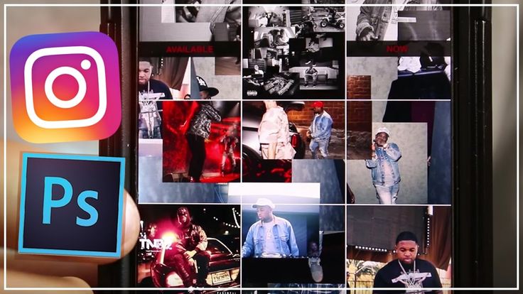 To be honest, it was perfect. The color palette was flawless, the balance between the pictures was flawless, the content itself was original and very high quality. nine0003
Here you are.
At your desk, scrolling through Instagram, scratching your head, trying to figure out what you need to do to create your own Instagram theme like this.
I understand you.
Building a consistent Instagram theme for your account is a hard nut to crack. And yet, it is very important that any brand that is in the field of view of the company Insta, get exposure.
Contents
Just look at these stats0003
This data shows that more and more consumers are turning to Instagram instead of Google when they research and buy products. And just like the goal of your website is to keep visitors from bouncing, the goal of your Instagram page is to get visitors to stay, impress them with your general post, and make them want to hit the follow button. nine0003
That's why it's so important to have a consistent Instagram theme and a complete Instagram profile with a biography. The truth is that those who already follow you never rate your feed as a whole again. This is your future, the potential followers who see your feed in the first place and decide, based on its appearance and the impression it creates, whether they should follow you.
In other words, updating the information, improving the look and designing your own authentic Instagram theme that immediately represents your brand is not just an option, it's a must. nine0003
The good part is that you don't have to be a super skilled photographer to be able to design an awesome ribbon. All you need to do is follow the 5 simple Instagram design rules that I will cover in this article today.
In this article you will learn:
Sounds good? Then let's dive in!
Before you start taking photos, editing photos and posting them to the news feed, you will need to do a little homework.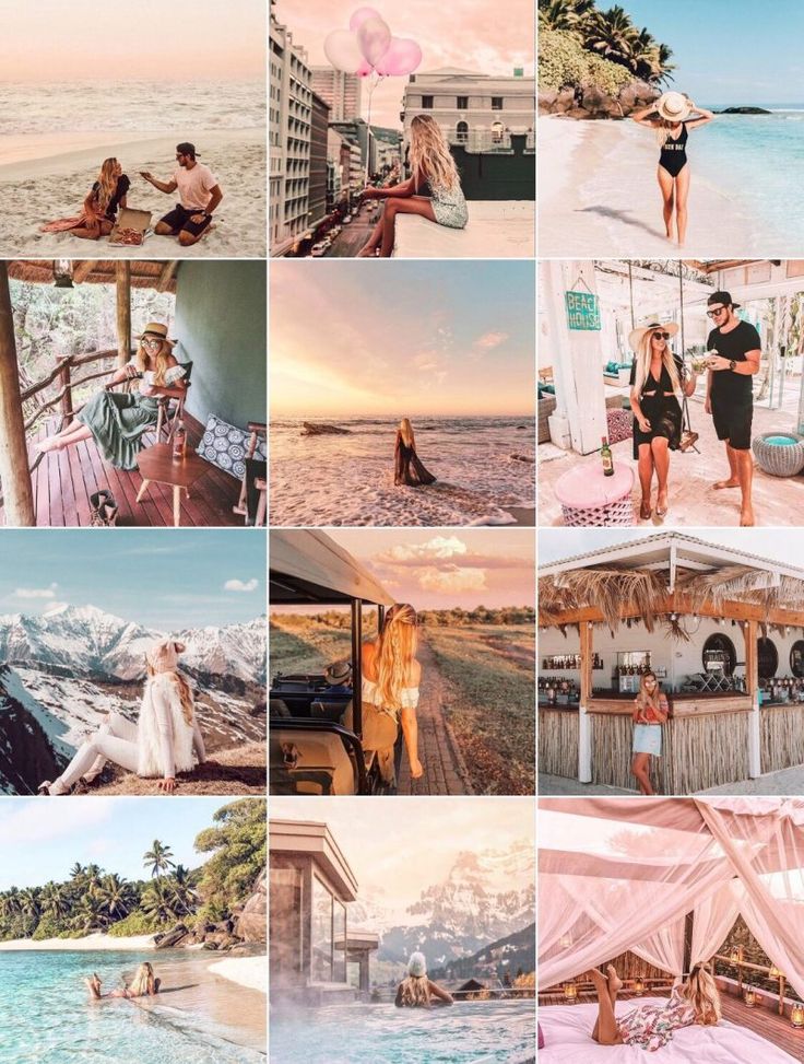
Your Instagram theme should reflect what makes sense for your business and align with your business goals. What do you need to sell and promote? Is this a range of products? Or certain services? nine0003
Memories of why you are actually on Instagram and what you hope to achieve will define your content.
Because it's not about how you edit, it's about what you publish.
Let me reiterate so that it stays with you: it's not about how you edit, it's about what you publish.
It doesn't matter if you apply the same filter over and over to all your posts, trying to create that "consistent feed look" everyone is talking about. If your real content sucks, you just can't create that unforgettable Instagram profile. nine0003
So Instagram styling starts with deciding what content you want to create and what should be the main focus of your profile.
In order to make this decision, you can look at what has already worked well for you and what posts your followers interact with the most.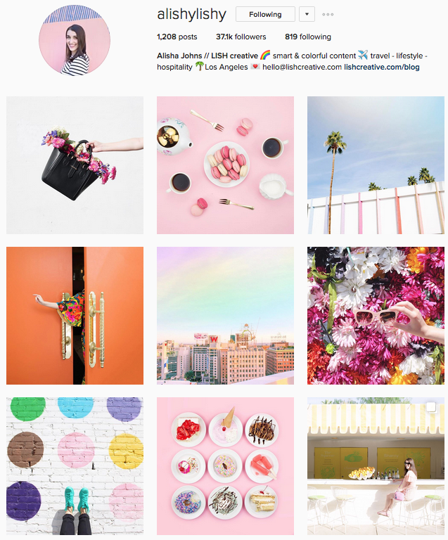 According to National Geographic, for example, their followers are most interested in posts about animals, especially if it's a close-up. In contrast, they are much less likely to work with photographs of people, especially if it is a distant shot. nine0003
National Geographic's social media team seem to understand this very well, as when you look at their feed as a whole, they tend to have more animals than people.
Build an Instagram theme based on posts that have proven to work. There are two ways to define these positions.
Use various Instagram analytics services to obtain information.
Matt Benfield, an Instagram influencer with over 50,000 followers, shares the same advice, but also reminds us to keep quality in mind. Regarding his own Instagram artwork, he says:
Matt Benfield
nine0002 “There's a lot to be done to decide what to post on any given day. As you can see from my channel, all my posts have me in them. The fact is that this is where my highest activity lies, as opposed to filming food or other types of lifestyle. But above all, no matter what post I posted, quality is the name of the game. If I have a photo shoot and I don't get quality shots from it, I'm not going to post them just like that. Even if I don't post on Instagram for a few days because I'm trying to get the perfect shot, it's worth it. Quality is always more important to me than quantity!” nine0127
Creating quality Instagram content is the first step to creating quality Instagram design.
If you can't figure out your best Instagram story posts (let's say you're new to Instagram, or you've been posting a little inconsistently), experiment first. Create content, use different formats (photos, galleries, videos) and different types of content (people, nature, products, etc. ) to see which one is right for you. nine0003
Another important thing to keep in mind is getting creative with what you post. Marco Medic, a well-known Instagram lifestyle blogger, says one of the key ways to create a killer feed is to take a different approach to everyday situations. Think outside the box - create something new, even if you shoot an ordinary product in an ordinary place:
Marko Medic
“I always try to push myself to create something that you don’t see in all other sources, and also try to bring the “artistic self” to the outside world”
In summary, when you decide WHAT you want to post, make sure each post is: your brand is a B2B business).
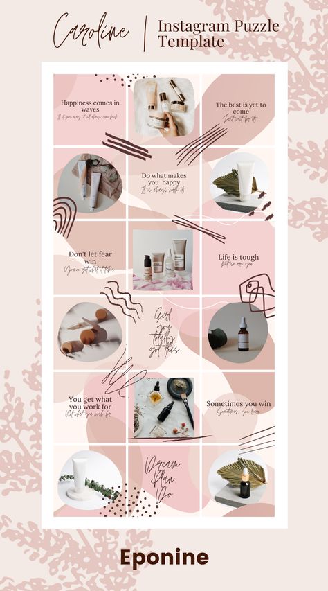 e. you have done your research and know what kind of content your subscribers like).
 In a nutshell, these are the three key elements of a successful Instagram content strategy that leads to a successful Instagram theme.
Once your content strategy is clear, you will need to think about your branding, especially your colors.
Integrating brand colors into your posts is ultimately the easiest way to create a cohesive Instagram theme. Here's a small example from Shopify that uses turquoise, one of their signature colors, once in every row of the feed. nine0003
This way the brand creates a consistent color palette that is easy to rely on when you need to decide what to post next.
There are millions of examples on Instagram where a user or brand has chosen one (or just a few) certain colors and stuck to them. You saw them.
Sometimes it is yellow.
Sometimes it is grey.
And sometimes pink.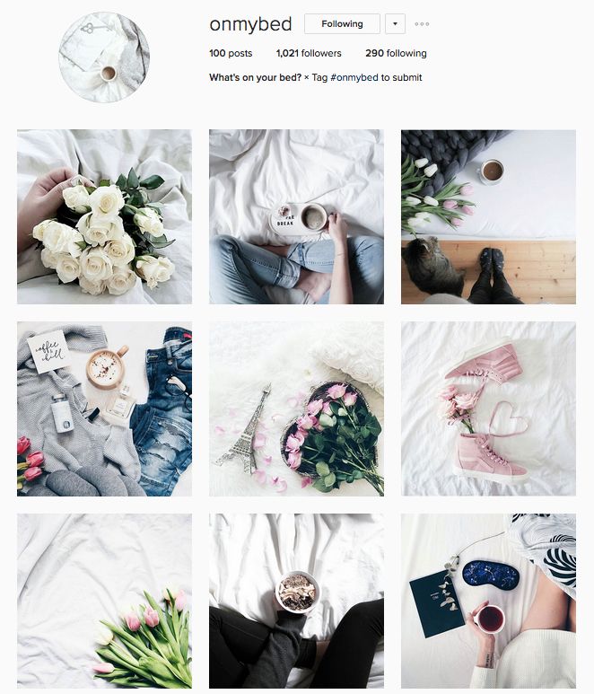
The important thing is that you choose a few primary colors (up to three) that will dominate your feed and appear at least once in each row. You can also choose two primary colors, but no more. nine0003
If you can't figure out what your color should be, don't stress. According to Alex Armitage, photographer at Fstoppers, you can experiment first to see what works for you.
Alex Armitage
“My Instagram theme is constantly changing. I used to post in blocks of 9 photos where everything matches, be it black and white, blue ocean scenes, sunrises, etc. After that, I tried something new: I posted 30 photos in 30 days with the same look to see the results. And now I'm trying to make a blue-green/orange/blue layout to see how it will look." nine0127
Another question to ask yourself: are my photos cold or warm?
Now I know what you're thinking: “Measuring the temperature of my photos? Are you feeling well?!" 🙈
Please bear with me.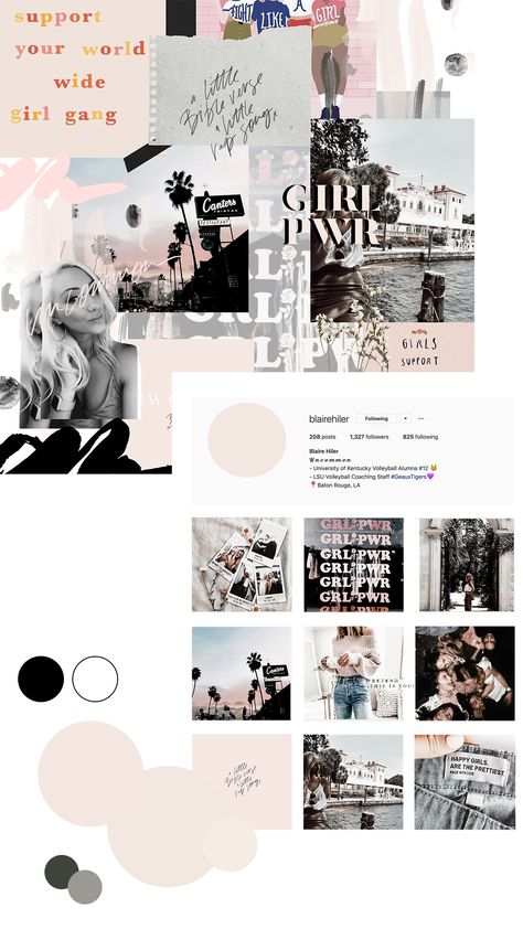
While the temperature of the content may be a little less obvious than the color palette, choosing a warm or cool tone for your ribbon is a great way to keep it consistent. Applying warmer colors will give you a yellow tint, while cooler colors will look a bit more blue. nine0003
Anastasia from @amsta.gangsta, a well-known Amsterdam lifestyle blogger, says she always shoots in daylight so that the photos have the same temperature.
Anastasia (amsta.gangsta)
“I shoot in daylight and always try to have something white in the background to match the photos. I also try to keep the photos at the same temperature (a little colder in winter, a little warmer in summer). And I also have a second, personal account that I use to see what the channel will look like beforehand.” nine0127
If you take pictures at different times of the day, they will look different. You do not want it. You want a uniform feel for the entire tape.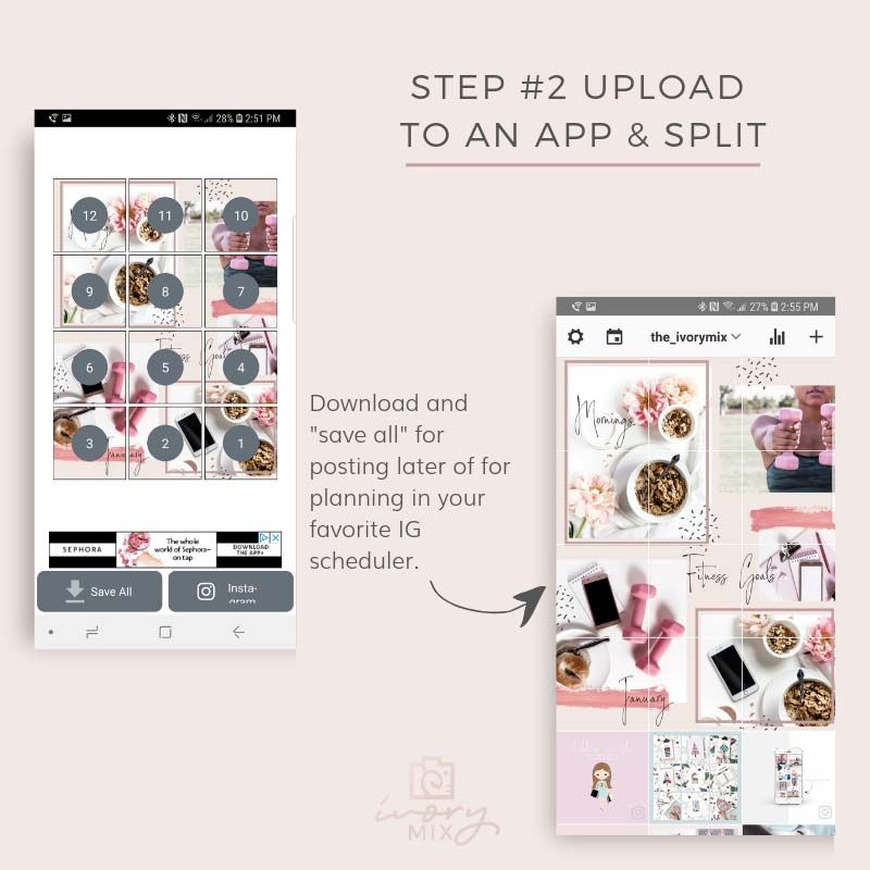
Now that you've taken the shots in the same light, you need to edit them in the same way to get the same look.
Most Instagram pros use Lightroom presets.
Meredith Braden, a photographer with over 30,000 followers on Insta, said: “I'm a professional photographer and graphic designer, so I shoot everything with my camera and then edit using a combination of Lightroom and Photoshop. I make sure that the editing is consistent and that the tones blend well with each other. Only Instagram Stories are filmed and edited on my phone!” nine0003
Photo editing applications:
All of these applications allow you to create and save your own filter combinations to apply them to your photos over and over again.
Now that you know you have to shoot in the same light and edit the same, the last step is to arrange your shots to create a perfect balance between shots. nine0003
By that I mean don't post the same messages over and over again. Instead, rotate your posts for variety is a tip from Kelsey Simone, a fashion and beauty blogger with nearly 800K Instagram followers. She says: “I categorize [my photos] into categories: selfies, clothing photos, product shots, and fillers. This is a rotation. For example, if I post a selfie, I don't want to post a selfie right after."
In other words, while it can be tempting to showcase your product over and over again, you need to place it and blend it with inspirational shots or lifestyle - or whatever, really - so that it doesn't look like annoyingly repetitive, but also to create more a holistic view of your brand. nine0003
You will need an application to schedule information in the feed. Apps like Postingram are great for scheduling posts.
Another point: when you post your photos in the feed, the rule is to hold them back. By that I mean don't post uploaded photos next to each other - your feed will look cluttered.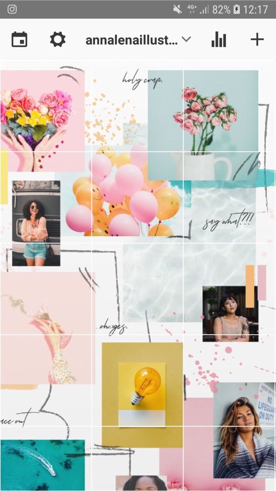 Use the so-called negative space, i.e. an empty background or borders that are not filled with any elements. This will help you achieve a balanced ribbon appearance. nine0003
Last advice. Although we have touched on this topic a couple of times already, it is worth noting that when planning your own Instagram design, you should always keep in mind the speed with which you can create quality content. In other words, don't forget about the consistency of your posts.
When planning your pitch, it's easy to get carried away with your content strategy and assume that you can do more than you actually can. If you start posting once a day, or even multiple times a day, your followers will expect you to follow the schedule you set for yourself. But if you run out of content in a month or two and struggle to create more at the same rate, your followers will hit the unsubscribe button and probably never come back. nine0003
Plan ahead. Use a calendar.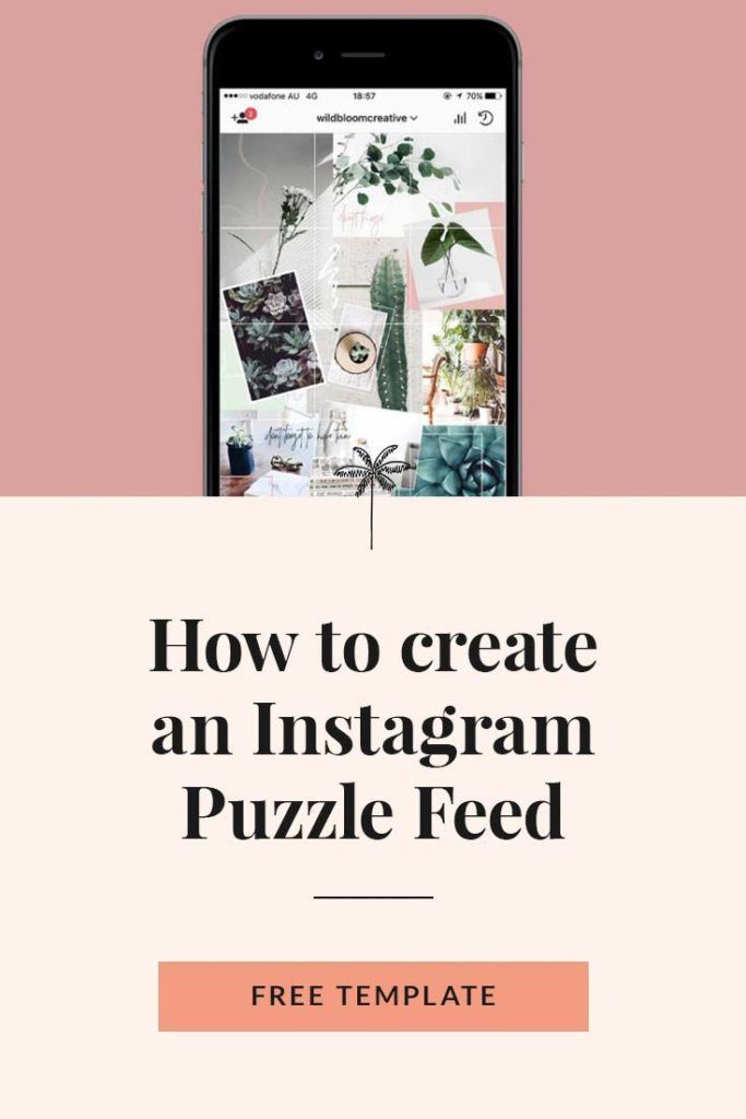 This is what the cool guys on Instagram do.
Instagram styling can be a daunting task at first, but if you follow the 5 rules outlined in this article, it will become easier for you to master it. A good Instagram theme starts with the right content strategy, followed by the right tactics and the right tools. The rest is just a matter of practice.
Continuation of the Instagram theme, you can find in a special section on my website. nine0003
Let me explain right away that the topic of the chat is not the main idea of the dialogue. This is the ability to change the background in the chat. This has long been in instant messengers and just in SMS correspondence. Now the topic can also be selected in the direct, and how to change the topic of the chat in messages, and what other features appeared in the Instagram dialogs, I will tell in the article.
Before we start to understand this and other new features of Direct, update the Instagram application. Since the "chat topic" function may simply not work for you due to the old version. Installation takes place in just a few clicks. nine0003
Step 1: Enter the dialog where you want to change the subject. In the upper right corner, click on the "i" icon, then "Theme".
Change Chat ThemeStep 2: Choose your favorite instagram chat theme and return to the dialog. A notification about which topic you set will be displayed at the end of the conversation.
Choosing and setting a themeBelow, after the chat theme options, you can customize the colors and gradients of the messages you send. But keep in mind that you cannot select both a theme and a gradient at the same time. nine0003 Colors and gradients
In addition to the chat theme, Direct has other convenient and visually unusual things for communication.
 Live text
 Now you can spice up your post. To do this, write the text, click on the magnifying glass on the left. Select an effect and an animation with the desired message will be sent to the user.
Animated messageYou can send stickers and gifs in direct. The principle is the same, type the text, click on the magnifying glass. Next, you can choose a gif or a sticker from those offered, or you can find it through the search on the desired topic.
Stickers and GIFsInteresting. You can quickly and safely promote your social network by boosting likes, reposts and views on publications. This is an inexpensive and safe way that will not make you wait long for the result. And most importantly, you will be able to increase coverage and get a hot target audience. Click and use -> TapLike
Now, if you have received several messages in a row, you can send a separate reply to each. And if you have a group chat - answer a specific user. You can drag the desired message to the right and a reply window will appear.
Another way is to respond quickly. Just long press on a message and select an emoji. If you need other emojis, click on +.
Quick responseIt is extremely easy to use updates in the direct on Instagram, in particular the theme of the chat. But questions can still arise, so in the end I answered the most frequent ones.
1. What if I don't have the update?
You can update the application in any market. If there is no update there, check if you have updated Android or IOS to the latest version.
As advertising
2. Can I put different topics in different chats? nine0047
You can enable a new topic through any chat.