Mary
art, materials, drawing
Do you want to find out why photographs of your drawings always look a bit ‘washed out’? How can you avoid shadows? What do you do about reflections?
There's more to taking good pictures of your artwork for Instagram, Pinterest or even your portfolio than simply pushing a button on your phone. But no worries, I've got you covered.
Here are some of the tips and tricks that I use to take photos of my own drawings and paintings, for a home-setup of course, since not everyone has access to a professional photo studio (nor do you need that).
However, keep in mind that even with skill and experience there are limitations to what you can achieve with any photo camera. If your goal is to have the very highest quality images of your art with no shadows and perfectly crisp, it’s best to buy a good scanner instead.
Let’s jump right in and deal with the main issue we face when taking photographs of any kind in a home-setup.
I've tried various options and find that natural daylight gives me the best quality pictures. If there is no daylight available (Scotland in winter, anyone?) any electrical source will do the trick, though you might need a little more time editing the photos later.
If you do go for daylight, make sure it's an overcast day, not full sun. The reason for that is that a layer of clouds will act as a giant diffuser to the sunlight, so they make shadows appear softer and not as prominent on your photographs.
Bright sunlight makes for hard shadows
Clouds act as a diffuser
When I'm at home on the weekend I tend to just have the drawings I want to photograph ready and laid out so I can jump up and take some pictures in those lucky five minutes of the day where the conditions are ideal.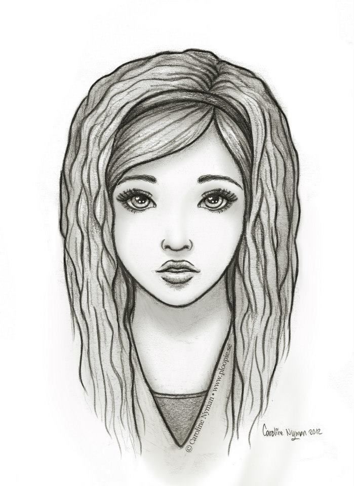
If you use a standard household lamp, the colour of your drawing might be a bit off, especially if it's not just graphite or charcoal. Which is fine, you can change that in Photoshop, though it's of course always best to avoid too much need for editing.
If you can wait a day or two until you've got a moment of proper daylight, that'd always be the preferred option.
As explained above, daylight is always the preferred kind of lighting. The ideal setup would be to have the artwork lie flat, outside, on an overcast day at noon (when the sun is overhead).
Of course, that's not an option for everyone. If you live in the city with no garden and maybe a handful of days a year where it's not chucking it down or wizard-of-oz windy, taking pictures outside just isn’t practical.
Instead, you can use a nice big window. Ideally, you'll want a north-facing one (to avoid hard shadows), but again, not everyone has that option. Just go with whatever window you have available and perhaps test it out at different times of day to see when the conditions are best.
In either setting you'll want to position yourself in a way that you face the drawing head-on (or use a stand, as explained below) but you are not right between the sun and the artwork, thus casting a shadow.
This can take a little bit of trial and error to work it out sometimes as you often only notice that you were indeed casting a shadow when you edit the pictures afterwards. It helps if you move back and forth a little before taking the picture to see if you notice any faint shadows on your drawing as you do.
You'll also want to make sure that the area surrounding your artwork is as ‘white’ as possible. This ensures that stray light bounces back from all sides, thus illuminating your artwork more and filling in some harsher shadows.
If your window frame and/or walls are dark, you could ask someone to hold up a white piece of cardboard or a bed sheet, to bounce some of that stray light onto your art.
As for artificial light, there's a simple triangle-style setup that you’ll often see in photo studios that’s really quite useful for reducing shadows.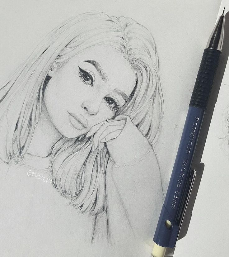 I find that it's really the only way I can get decent pictures done when there's just not enough daylight out and I don't have time to wait until there is.
Two-lamp setup to take photographs of your artwork at home.
Amazon sells cheap table top lamps for this. I bought a pair myself and tried it out and found that it worked just fine. Once I had worked out the right height and position the resulting photos were relatively free of shadows and almost as good as with actual daylight.
This setup comes in especially handy when you’re taking pictures of slightly glossy artwork, such as acrylic or oil paintings, as then it’s even more important to avoid uneven lighting and glares.
If you do try this at home make sure there's no other light source around interfering and casting unexpected shadows (faint daylight, other lamps etc). Overall this is a perfectly adequate solution for those rainy winter days.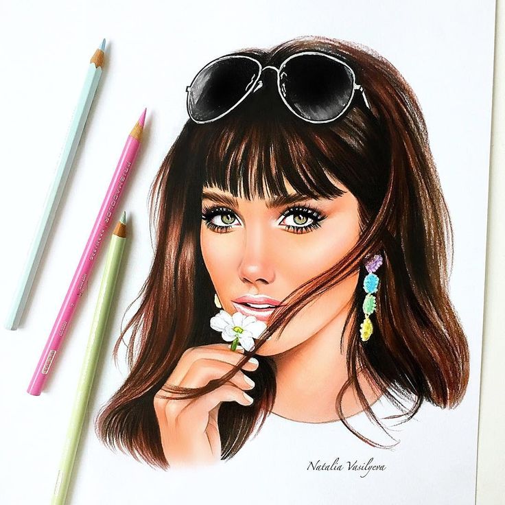
With all this being said, while it's always good to try and avoid shadows as much as (reasonably) possible, don't overthink it either. Some shadows are going to be there. There is literally nothing you can do, no setting or weather condition that will give you a photograph entirely without.
Some shadows can make a photograph more interesting even. Sometimes, when the light is just not right, it can be fun to embrace shadows instead, play around with them and use them as a style element.
Even with a really good phone it can be difficult to take sharp photographs of your artwork, especially in low light.
While you tend to get away with a bit of blurriness for a photo of the pretty hills you're hiking through you absolutely want your drawings to be as sharp as possible.
The easiest way to help with this is to use a stand, of course. Any cheap kind of tripod from Amazon will do the trick.
Another option that I often use myself is to lean your body against something, such as the wall or window frame while taking the picture.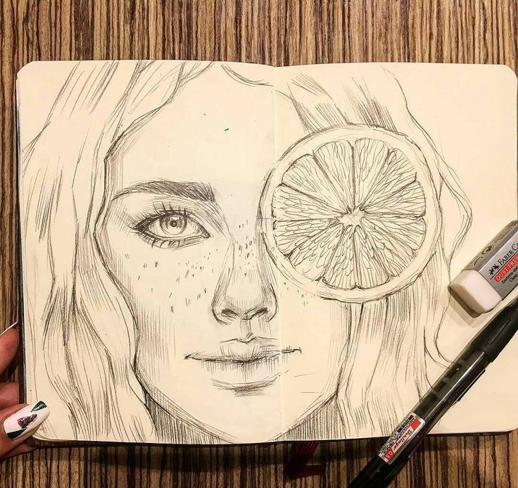
It will give you more stability and ensure you're not swaying like a leaf in the wind, so to speak. Which, trust me, all of us do very slightly, even if it's almost unnoticeable. It also helps to hold your breath the moment you take the picture.
With these precautions, once you’re all done with your photo session, you can just run a quick sharpening filter in Photoshop (or any other editing software) for that extra bit of crispness.
When you try to take pictures of something flat with straight edges, you'll inevitably notice that sometimes these edges aren't quite as straight in the photograph.
Every camera lens has a certain degree of distortion, most noticeable towards the edges, where flat surfaces may show slightly bent. But as long as you know it's going to happen you can work around it.
Old photograph of one of my paintings, before I knew about lens distortion. Note the curved edges at the op corners.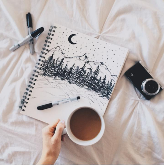
If you're planning to take a straight on photograph of just your drawing, move the camera a bit further back, so you've got an inch or so at the edges, then simply crop that out later.
Also make sure that your camera is actually parallel to your artwork. Especially with mobile phones it's very easy to have the angle off by a few degrees.
Below is an example of that, where the phone we took the pictures with was at a slightly wrong angle for the second one. You can clearly see how it changes the proportions in the image and makes the upper body appear way too big.
View fullsize
Photograph with camera held exactly parallel
View fullsize
Photograph at a slight angle, making the upper body appear much too large
This can look really odd when it's not clear what angle the camera was at when the picture was taken.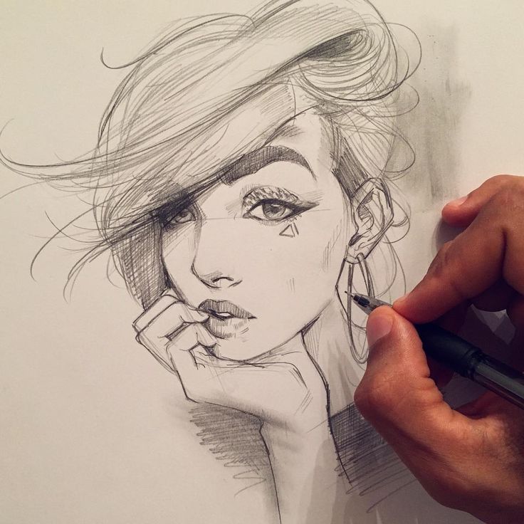 I often find it helps if you just take a couple of pictures from very slightly different angles, so you're sure to have one that's exactly right and does not distort the original.
On the other hand, if the composition shows more of the drawing's surroundings (see point 8 below), the viewer's brain expects the distortions to be off, so it's usually not a problem in that case.
Sometimes you just "accidentally" manage to create a really good piece on some cheap practice paper that rolls like scared a hedgehog with the tiniest bit of humidity.
Or perhaps you like case-bound sketchbooks that just never seem to stay open on one page. Either way, getting your work to stay put for a photograph might be a bit of a challenge.
My personal favourite option for rolling paper (humidity in Scotland, y'all) is to simply strap it to a piece of cardboard with some elastics bands.
View fullsize
View fullsize
Sketchbooks stay open easily if you use bulldog clips. They won't hold the pages completely flat, but they'll usually give you enough stability to take reasonable pictures.
Any kind of painting with a slight 3D surface texture might need some special considerations if it is to look good on a photograph.
Obviously you'll need to light your painting well, to avoid shadows and glares from the often glossy paint. But you'll also want to make sure the work doesn't look too ‘flat’ in the end.
You don't want lose all of the brush strokes and elevations that make up half the charm of any such painting.
The magic word here is raking light, which is basically a light source coming slightly from the side, so illuminating one side of the brush strokes and making the piece seem more three-dimensional in the photograph.
This is done by simply lighting the artwork unevenly, i.e. having a stronger light from one side. Outside or at a window you can turn your painting and adapt the angles, to see which direction works best or wait until a bit later in the day when the sun is lower in the sky.
Inside you'd use the above described two-lamp setup, but either have one of the lamps slightly closer to the painting or allow some additional light from one side, such as another lamp or the window.
It can be a bit of a trial and error thing to find the perfect setup for this, as it very much depends on the direction of brush strokes or general surface structure and the kind of paint you've been using. But it usually only takes a couple of minutes to find the setup that makes that particular piece look its best.
Even with the fanciest setup and all care taken throughout the process you really do need some kind of program to edit your photos if you hope for something that looks professional.
The best option is of course always Photoshop, but if you don’t want to spend the money on it (£20 a month for the subscription is honestly extortionate) or take the time to learn the admittedly quite complex program in the first place, there are a couple of very decent free alternatives.
I go into more detail on this in my article on how to edit photos of your artwork the easy way, but here are the basics:
Last but not least, let’s consider the main reason why a photograph of your artwork may be preferable in some situations (e.g. quite often for social media) to simply using a high-quality scanner.
Of course, you can just take a standard, straight-on photo of your piece. But you could also make use of the possibilities of being able to arrange your work in a 3D setting. You can change angles, use props, tell the story of the artwork, rather than just showing the picture itself.
A style you can’t go wrong with is taking pictures of your drawing or painting with your art materials on or next to it.
View fullsize
View fullsize
Another option is to have someone else take a picture (or use the timer function), so you yourself are in it.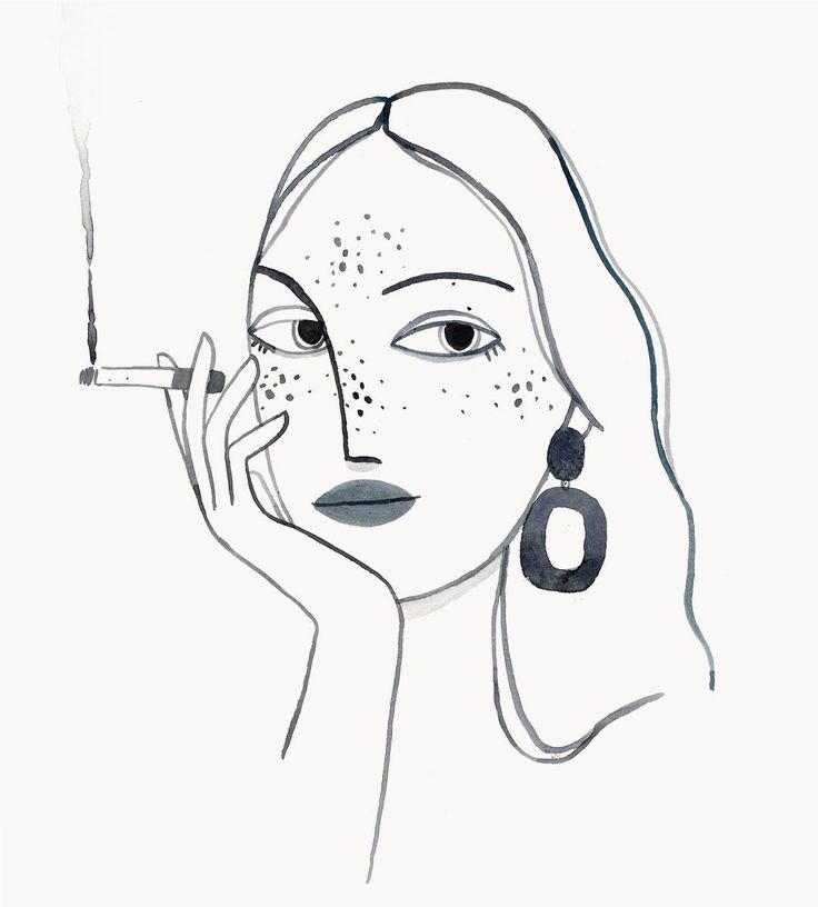 Showing you actually working on your art draws the attention to not only the drawing or painting but also to its maker, hopefully persuading the viewer to check out your other work, too.
Naturally this doesn't need to involve all of you, just showing your hands or you from behind is already enough to intrigue the viewer and remind them that behind every good work of art is the person whose skill and dedication created it.
View fullsize
View fullsize
This kind of photograph is extra compelling when it covers part of the artwork, showing only a fraction of it. Considering how the human mind works, the viewer is likely going to want to see the whole piece, so they’ll click into your profile or go to your website.
A very popular layout is arranging several pieces in one photograph, often with some either slightly blurred out or cut off in parts.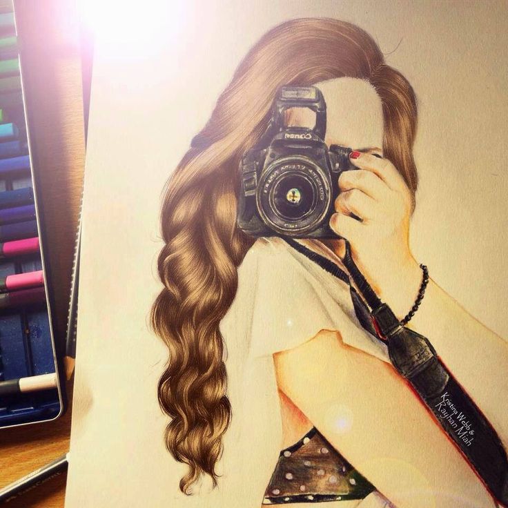 It shows that you're not just a "one-hit-wonder" but a working artist, and it indicates to the viewer that there's more to be seen where this photo came from.
View fullsize
View fullsize
It’s also visually stimulating if you use topic-related props, such as flower petals for a drawing of your garden in spring. Of course working out the design and obtaining and arranging the props can take some time, so this is mainly used for your very best work.
View fullsize
View fullsize
Naturally these are just a few ideas, there are many other possibilities out there and I’m sure you could come up with a million more if you put your mind to it.
I find that it often helps to think about what kind of art you’re photographing in the first place, and then adapt the composition to it. If your art is very neat and refined, choose a layout that plays into that, and the other way around.
Think of the photograph and everything in it as an extension of the artwork itself. Showcasing your art should be as much of an exercise in creativity as creating it, and there are virtually no limits.
Did you enjoy this article or feel like you have anything else to add? Feel free to leave me a comment below!
If you like this post, please share it, so others may like it too!
Show 3 comments
Table of Contents
Art, such as paintings and prints are an item we stock quite a few of at the gallery. After photographing art over the past year, I wanted to pass on what I have personally learnt about the process.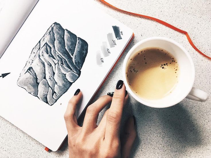 So…
So…
How do you photograph your art for Instagram? Paintings and prints should be taken using natural light, in a flat-lay fashion, parallel from above with a relatively new smartphone. Use secondary closeup shots to display details. Take multiple and choose the best for editing and uploading.
There are of course more details in which need to be written about to describe the finer details of each step listed above, which I go into below.
‘Mirror Mirror’ by Jane Ray at https://www.primaveragallery.co.uk/collections/paintings/products/cinderella-mirror-mirrorI actually have a complete ‘Photography for Instagram’ Course available. Just sign up below to get it straight to your inbox
I will never send you spam, and you can unsubscribe at any time!
When it comes to photography for Instagram, as long as you have a relatively new and good quality smartphone, then I suggest taking your pictures straight from this.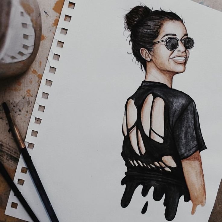 Now, smartphone cameras will never have a quality level as high as the top of the range cameras, as smartphone cameras improve, so will the top quality cameras. If you want to learn more in-depth about whether to use a mobile or a camera, I suggest reading the article over at https://www.techradar.com/uk/news/smartphones-vs-cameras-do-you-still-need-a-dslr.
My reasoning for using the smartphone is because they take photos that are crisp and clear, they can be uploaded to Instagram straight from the phone without having to transfer it over from the camera, and lastly, a bit of editing post-production will make the camera more than good enough to stand out (depending on the quality of the art of course).
Do you create drawings? Check this step by step article out!
One of the reasons we are sharing our work on Instagram is to get noticed. We want to get noticed so that we can either sell our work or find work. In other art forms, props are a good way to show how the item can be used, such as someone who creates bags, might use props like books or a laptop.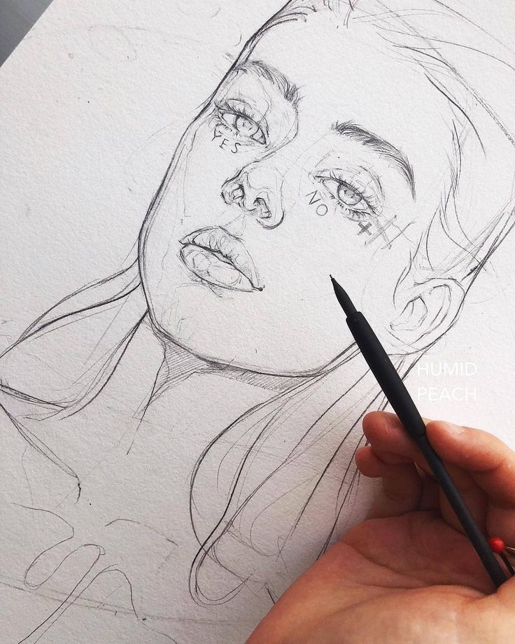 They might be hanging from an attractive looking women’s shoulder to show how you could look wearing it. Props have their place and can help to get attention, especially when used to reflect your viewer’s interests, which I have written more about on other posts.
However, when it comes to paintings and prints, my personal opinion is that the work speaks for itself. Everyone has their own preferences, and often strong opinions on what they do and don’t like when it comes to this form of art. Because of this, the imagery itself is enough to spark an emotional reaction strong enough to attract attention from the demographics that are interested in your specific style. My suggestion is to let the art speak for itself, plain and simple.
Natural light is always the best option where possible. Artificial light tends to give a yellow tint. Although these issues can be resolved in PhotoShop if natural light isn’t an option, the fact is, that the more work you do upfront, the less you have to do after in editing.
The best way to get this natural light is to pull a table up next to a window, preferably on a nice sunny day, and simply lay the art on the table. This is called a flat-lay and is the easiest way to go about this from my experience.
Unless the art is already hanging on a wall next to good natural lighting, you, of course, want to get it to a location that has good lighting and is easy to work with.
There will likely be a shadow cast on the opposite side from the window. The quick fix here is to hold up or balance some white card or paper to reflect the light coming from the window back on to it. This will help a lot and is a hassle-free way of doing things. I actually have a whole article on dealing with shadows.
Hold the smartphone directly above the art coming downwards. Do not use any angles because this will distort the image. You want it to be displayed head-on so that the viewers get as good a view as possible.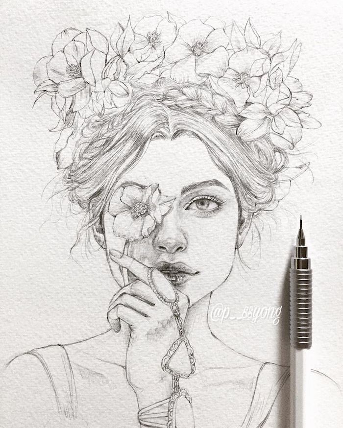
When you have the art in full view, start taking multiple pictures, some will tend to be out of focus so these can be deleted later and you will be left with the best quality images to upload. This will save you time from having to come back and give you the best quality possible.
It’s nice to keep all of your Instagram images to a 1:1 ratio (square) so that when people browse your page they can see the whole image instead of missing out the edges. To do this you will need to crop the image. Keep this in mind when taking the pictures because as the edges will get chopped off, you will want to hold the camera a bit higher to give more space around the art to work with.
Secondly, you want to close in on the details for secondary shots so that people can see the level of detail in more complex paintings and prints. Take multiple photos of these shots too and choose the best. You can then upload the best ones into Instagram straight from your phone ready to edit.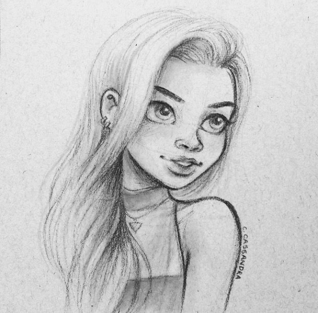 I have written more about zoom techniques here.
There are three main tools for improving the quality of images. I would generally avoid using filters because these will change the appearance too much and take away from the original intention behind the work.
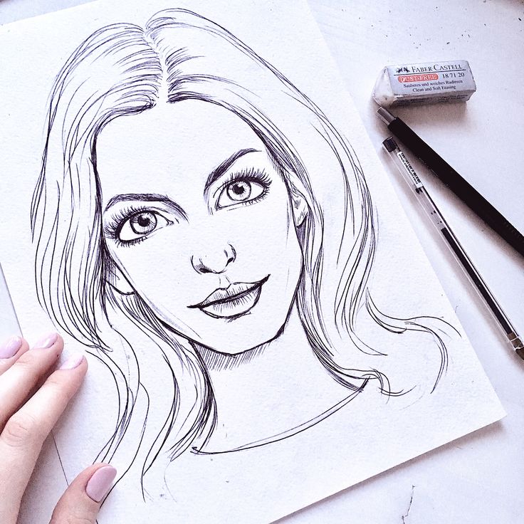
The above three are all you should need to improve the quality while keeping it looking as ‘natural’ as possible. Then click next. This is where you add the tags and hashtags to get as many people as possible to see your work!
In this step, add a description detailing the inspiration behind the piece to have people connect to the work. Add relevant locations so people in the areas you want to reach will be made aware of your work. Directly tag the people you know of whose attention you want to grab in particular. Then, it is time to choose the hashtags to get as many people as possible aware of this upload.
You can add up to 30 hashtags to get your work more awareness. Each hashtag adds you to searchable lists, the more likes you get, the higher in these lists you will appear. The quality of both the art and the photography will take care of the likes, the hashtags will take care of the ‘reach’ (how many people see it).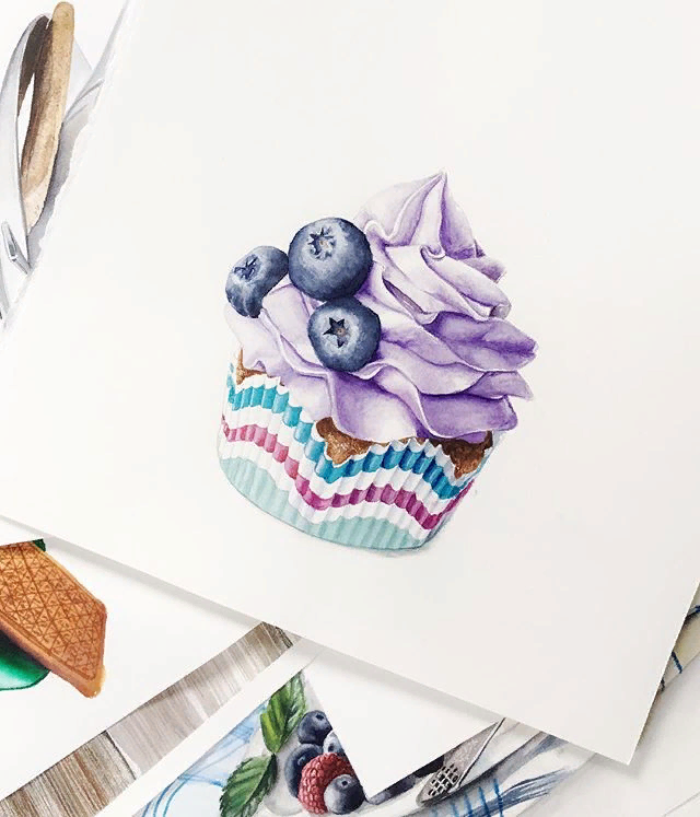 You can research your own, but here are the best based on my own research for paintings. Feel free to steal them, add to them, and change them where I use my own location and swap it for your own.
#Paintings
#PaintingStudio #PaintingsForSale
#PaintingsArtGallery #CambridgeArt
#CambridgeArtist #AbstractPaintings
#Landscape #LandscapePainting
#CityScape #CityScapes
#StillLife #Portrait
If you want a more comprehensive and bespoke list, here is a great resource http://best-hashtags.com/hashtag/arts/ .
I hope you found this post helpful, please leave comments and questions below.
Cheers,
Ian
Ian Rickard
Product photography has been a large part of my career in the art and craft market since 2017. I created this site to answer product photography-related questions to help people improve their work.
Latest posts by Ian Rickard (see all)
Like Loading.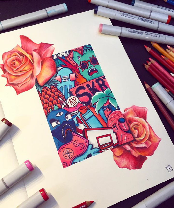 ..
..
The main thing to remember is that your drawing itself is of little interest to anyone, without proper design, no one will notice it, and even less likely to like it. In the end, it turns out that you drew it in vain, it may well turn out that you will not collect a single like for your work. But the situation can be changed, just by correctly filling out your drawing. Now I will show and tell you how to do it.
One of the most effective ways to present your drawings "like on Tumblr or on Instagram" is to collect the right still life of household items around them. Any thing can be used, as long as it turns out beautifully. Such a still life will immediately draw attention to your work and it will become clear to everyone that you are an interesting and creative person.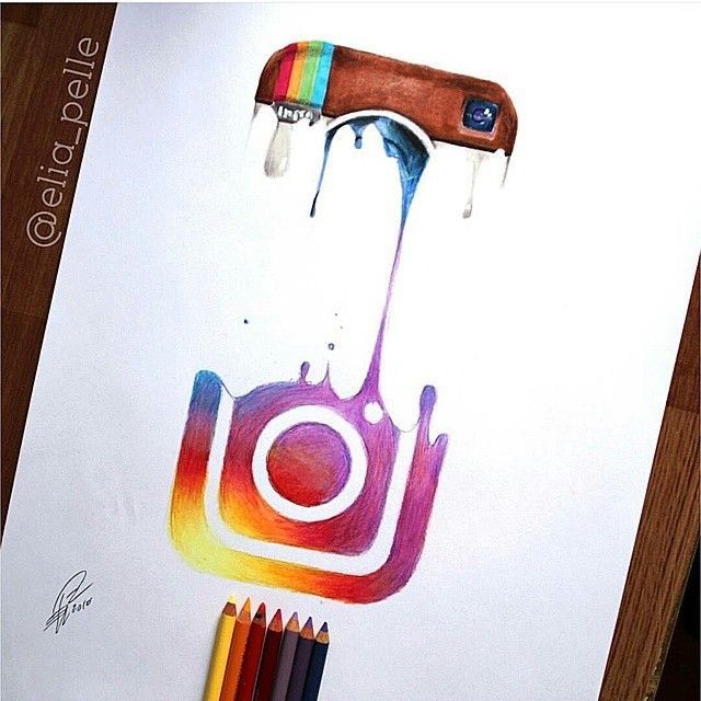 For inexperienced novice artists, we recommend laying out objects around the work in the "sun", this is the simplest and at the same time effective type of composition.
01.
Having dealt with the construction of a still life from a lot of things around your drawing, you can move on to more complex, concise types of still lifes. The main thing here is to carefully select the subjects for the composition - the more mysterious, the better. Let the viewer puzzle over why there is a cup of tea or sneakers or a comb in the frame. It is important to let the viewer know that you are mysterious, romantic and not as simple as it might seem.
02.
It has long been obvious to any experienced Tumbler or Instagram user that you can't just take and photograph your sketchbook or moleskin on the table, which is called "head on", it will not be interesting to anyone. Your drawings should live in the frame, take the drawing in your hand and photograph it against the backdrop of your room, preferably against the backdrop of bookshelves.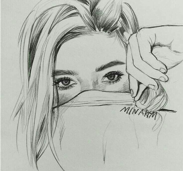 If you don't have your own books, you can take this picture in the Republic store, in a trendy cafe where ostensibly book lovers gather, or at the home of a friend who has a shelf or rack of books. It is very good if the hand of the author is visible in the frame. The presence of tattoos on the arm is a huge plus.
03.
Use your tattoos actively when publishing your artwork. It has long been noticed that the presence of tattoos in the frame attracts more users, which means that there will be more views and likes. For the sake of this, we all draw, you see. Experienced online artists think over the places and plots of their tattoos in advance so that they look as advantageous as possible in the photo with their drawings.
04.
Remember, the thieves of other people's drawings are not asleep, they tirelessly roam the expanses of the Web in search of naive artists who post their original works, taken frontally without distortion, in the public domain.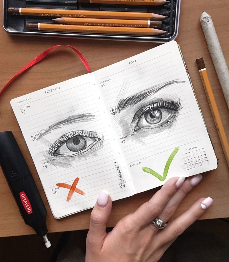 As you know, such works are immediately stolen. It is not yet clear why and for what purpose, but they steal. This can be avoided by photographing your work at as sharp an angle as possible and with perspective distortion. It does not matter that there is little to see, the main thing is not to steal.
And don't forget to compose your work, remember that it attracts likes.
05.
Another powerful way to attract viewers and collect hundreds of likes is light eroticism in the frame. Create such a casual scene in the photo: as if you are taking a bath with your drawing in your hand and suddenly want to take a picture of it. Make sure that your knee peeking out of the foam, or your thigh, accidentally gets into the frame. Frames of this type will always find their audience.
06.
Remember, the frame should tell about you as an outstanding and comprehensively developed personality. For example, it is very important to show not only your drawing, but also to demonstrate your talent as an amateur gardener.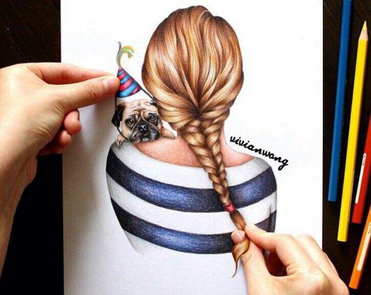 Actively use indoor plants and flowers grown by you in the frame. Again, if you do not have your own plants, geranium or ficus in the district clinic will always help you out, experiment more actively!
07.
I remind you once again that light nudes in the frame with your drawings are only welcome. Do not limit yourself to the bathroom, look for interesting solutions.
08.
Separately, I would like to say about the magical effect of candles in the frame. They work and attract attention even if they are not lit! When composing a composition with candles, remember that there are never too many candles in the frame. However, the use of hemorrhoid suppositories in the composition remains a rather controversial decision.
09.
Perhaps, in addition to being an amateur gardener, you also make excellent soups or puddings. So why hide it? Reflect your culinary talents in the design of your drawings. Food and products will always attract the interest of the viewer!
10.
In general, when publishing your artwork, follow these simple tips and you will be provided with followers, likes, reblogs and reposts in the future. After all, this is what we pick up a pencil and brushes for, right?
Like if you do this, repost if they are annoying.
Nowadays, it is not enough to be able to draw well, it is also necessary to present your work correctly. Pictures photographed carelessly will not cause the proper impression on the viewer. This article will tell you how to properly photograph paintings and post them on social media to get the response they deserve.
Large red or white numbers on top of your painting are not decoration and do not contribute to a favorable perception of the painting.
The frame gives an extra shadow around the edges of the picture, and the glass reflects.
The main enemy of your photo is a fuzzy, blurred image. This is the result of your hand shaking. To avoid this, attach your camera to a photo or video tripod.
It is advisable to set the camera to the self-timer to avoid camera shake as much as possible.
The picture must be placed on something stable and in no case should you hold it with your hands, otherwise the meaning of the tripod is lost - this time the picture will tremble, and the photo will turn out blurry.
This is the most important factor for photo quality when shooting a painting. Never use a flash when photographing your work as it produces strong glare.
If you don't have professional lighting, shoot in daylight. Lighting ordinary room lamps is not enough - it is better to take the picture to the street or balcony.
Ideal lighting option - during the day, outdoors, in cloudy weather. The light must fall on the picture from the side !!!
If you have a large picture, then there is a high probability of uneven lighting. This can be corrected by placing a large white sheet of drawing paper at the unlit edge of the picture.
Another enemy of your photo is rounded, barrel-shaped in the photograph of the painting. This is the result of photographing the painting at close range.
To avoid this, stand back and zoom in on the camera, but don't overdo it by moving too far away.
Sometimes the picture in the photo has a trapezoid shape. This is the result of the wrong position of the camera in relation to the picture. The camera lens should be exactly centered and parallel to the surface of the picture.
Don't go after a large digital photo, it takes longer to send such a photo and it will still need to be reduced to post it on the Internet. (I recommend a simple and convenient TinyPNG service for this)
More useful information on how to photograph your paintings here
However, to show a picture, you can simply take a picture of your work, or you can turn on your imagination and create a composition from your picture and brushes, pencils and paints lying around and much more suitable for the drawing, of course. Interesting ideas can always be found on the Internet and remake them to your taste.
Instagram (Instagram) is a free program that is designed to allow users to share their photos with the world. Launched this social network in October 2010.
It's simple: the user takes a photo, applies one of the standard filters to it if desired, and then uploads it to Instagram. Also, if you wish, you can share this photo in other social networks.
The peculiarity of the photographs is that they are square, which is reminiscent of photographs of old Kodak and Polaroid cameras.
Instagram is good because even non-professionals can easily get beautiful pictures in it!
Read in context:
Minimalism is almost the same “photo on a white background” that is usually taken for an online catalog, but a little more interesting.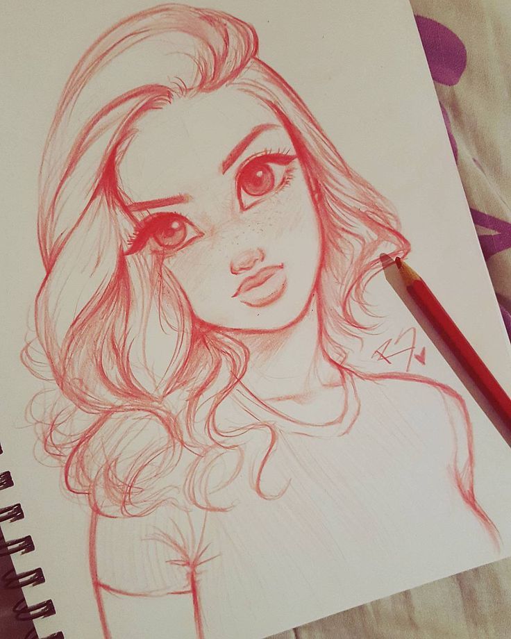
An unusual background (creased paper, sky, snow), placing the subject off-center or adding just 1-2 additional details (no more) will make the photo more interesting.
Look at your shelves - they must be collecting dust on holiday souvenirs. And for sure among them there are very photogenic specimens!
Not found on the shelves? Go to the refrigerator! It is quite possible there are a couple of beautiful magnets. Not? Then take coffee beans or, for example, marshmallows. Look for an old book, beautiful postcards, flowers are also great.
With the right lighting and framing, just about anything can make a splash, so let your imagination run wild.
In addition to art supplies, your photo can be supplemented by: nuts, acorns, cones, bark, shells, pebbles, inscriptions on a white sheet, herbarium, beautiful dishes, fruits and vegetables, sweets, lace, blankets, feathers and even your own hands :)
Taking a picture is just the beginning.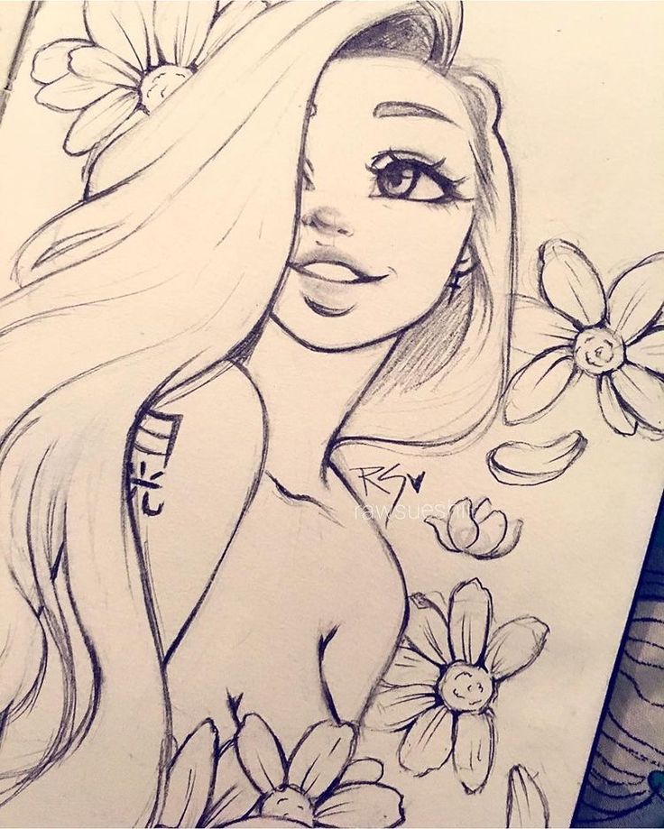 Photo processing allows you to improve the quality of the image, remove defects and minor imperfections.
Of course, this item does not imply that you are a Photoshop guru. But sometimes the photo needs some adjustment. For example, you need to rotate the photo a couple of degrees or crop what you don't need.
This can be easily done in the editors that are already built into the networks. Use automatic filters and effects to correct color or add lighting; this can greatly improve the quality of the result.
Only adjust brightness, contrast, sharpness, and so on for processing. And leave the filters for personal shots.
If you decide to make a collage, use the online program Fotor, Canva, Picasa or Layout (for Instagram) - just a couple of minutes, and the masterpiece is ready!
Photographs can also be labeled . For example, put your logo or a beautiful phrase. This feature is built into the VKontakte Facebook editors. And to do this on Instagram, you need to download a free application.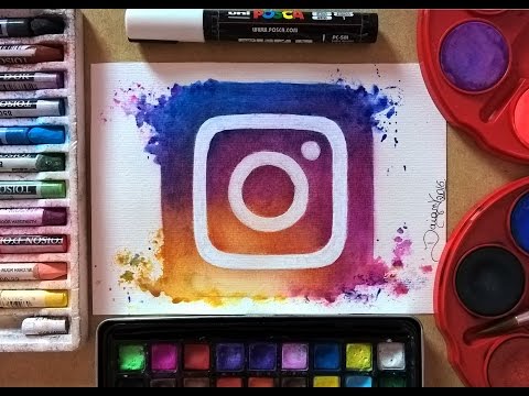 For example, Photo Grid or Overtext.
If your photo is intended for publication on a social network, then you can use the photo editors built into them to improve your photo.
Read in context:
After you upload a photo and hover over it, Facebook will offer to edit it (a brush icon will appear in the lower right corner).
The capabilities of the built-in editor are quite modest here: a number of filters, rotation, cropping, adding an inscription.
Therefore, if a photo needs, say, exposure correction, it is better to edit it in another editor beforehand (eg Paint, Microsoft Picture Manager, ACDsee)
Upload the image. Hover over it. At the bottom, 2 options will be active: open (magnifying glass icon) and effects (smiley icon).
In effects, you can add stickers, inscriptions, as well as finish painting a masterpiece.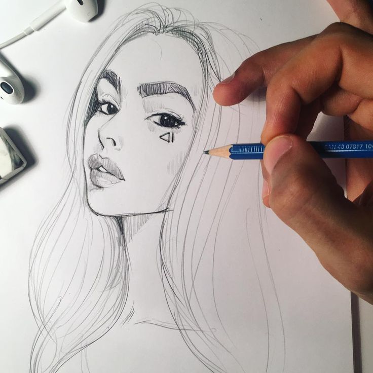
And by clicking on the magnifying glass and opening the photo in a larger view, look for the “more” tab. This is where the photo editor “hides”.
Compared to FB, there are more opportunities here. Since, in addition to 15 filters, you can change the parameters of exposure, vignetting, contrast, sharpness, saturation, sepia. For doubters, there is an “auto-correction” button.
Adding text, blurring, cropping - all these options are on the left.
Silent photographs contain too little information. You are wrong if you think that “a good picture speaks for itself”. It is always better to provide a photo with a commentary. At least with the name of the picture.
And it's better to write something other than that. What?
Everything that is made by hand has its own history. So tell it to the viewer.
This will complement his perception, enrich him, and your picture will be more understandable.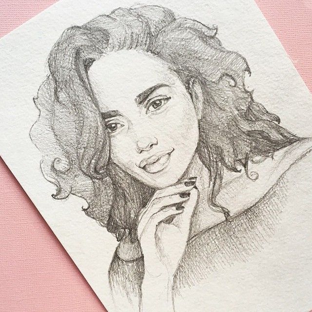
Hashtags are keywords that are written in social networks with the # sign. Everything is written in one word along with the symbol #
With this icon, the word in social networks becomes clickable, you can click on it and see all photos or all posts marked with this word.
Hashtags should be written under the photo on Instagram for three reasons:
For example, I use the following: #watercolormarine tweed (click to see selection) or #paintingmarine tweed.