Although I may not consider myself to be a “minimalist”, I’m trying to be better at getting rid of items that I no longer need or use. This includes furniture. I have sold quite a few furniture items on Facebook Marketplace and have even managed to make a profit on some of them. I’ve learned quite a few tips and tricks to take into account in order to get your item to sell quickly and for a decent price.
The best way to quickly sell furniture on Facebook Marketplace is to take good photos, write a detailed description, research keywords and price your item competitively. It’s important to take just a little bit of time and research when posting your item on Marketplace if you want it to sell quickly. But doing your due diligence, you will save time in the long run and potentially make a higher profit.
Selling furniture on Facebook Marketplace is a great way to make a quick buck. Whether you are trying to get rid of something that you no longer use, or you want to sell something that you found at the thrift store to make a profit, Facebook Marketplace is an excellent way to sell used furniture.
Although I was reluctant to switch my selling and buying from Craigslist to Facebook Marketplace, I have to admit that FB Marketplace is far superior than Craigslist. I even have a post about the best things to sell on Facebook Marketplace. It’s easier to search as a buyer and more streamlined to sell as a seller. I also feel much safer going through FB Marketplace since I can see the profile of the person that will be buying my item. All in all, I’ve had a very positive experience selling furniture through FB Marketplace and I have made hundreds of dollars doing so!
If you want to successfully sell your furniture on FB Marketplace, then there are some key tips and tricks to remember. You can snap a quick photo, post it and be done, but you might not sell your item quickly or for a decent price. By taking just a little bit of time to do your research and prep-work, you can sell your item faster and for a higher price.
I would argue that the most important aspect to successfully selling your furniture on FB Marketplace is to take great photos. I am so surprised and shocked at the poor quality of photos that people will post with their listing. All it takes is just a few minutes to snap a quality photo on your phone. Make sure to make your photo as light and bright as possible, take photos from every angle and any close up shots of flaws. This will save you time in the long run because it will limit questions from potential buyers.
Another way to save yourself time in the end is to take measurements of your furniture item to post on the listing. Even if you are selling something where the size seems obvious or inconsequential, it’s a good rule of thumb to just go ahead and take measurements. More often than not, people will ask for the dimensions if you haven’t listed them. If you go ahead and do this on the front end, it will prevent you from having to track down the tape measure, message back and forth with buyers and update your listing.
As a frequent buyer on FB Marketplace, I absolutely love it when a seller offers porch pickup for smaller items. It’s more convenient for everyone involved and saves the seller and buyer from having to interact with a stranger or coordinate schedules. If you are selling a small furniture item that is at a lower price point, offering porch pickup could bring in more buyers that aren’t interested in having to coordinate schedules. Porch pickup just means that you set the item out on the porch and the seller picks up at their convenience after paying you through Venmo or Paypal.
Before posting your listing, it’s important that you take a few minutes to research the price first. I have made the mistake many times in the past of just throwing up a quick posting and selling it quickly, only to find out later that I could have sold the item for a much higher price. If you have a unique or vintage item, it’s possible that similar items are selling for much higher than you would expect. Similarly, you may price something way higher than it is worth in your area. Search for similar items in your area and price your competitively. If you want to price yours higher than other similar ones, be sure to mention on the description why it is worth more.
I always price my items a little bit higher just to make room for negotiations. Most people will offer a slightly lower price. Being willing to go down in price will make a buyer more eager to purchase the item from you. If you don’t want to go down in price, then be sure to say “firm” in your listing. But in my opinion, rather than saying “firm”, just price it a little bit higher, keeping in mind what your bottom line is.
This might seem like a no brainer, but it’s an important one.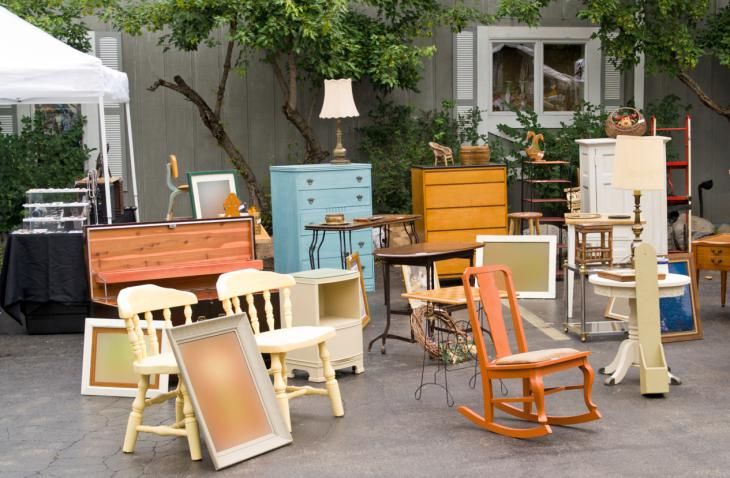 If you are selling something that is in storage and someone wants to purchase it that day, the last thing you want to do is be scrambling to get it out of storage or making a stranger walk through your house to your storage area. I always have my item in the garage so that when someone comes to pick it up, it’s easily accessible and they aren’t having to walk through my home.
I recently tried to purchase a desk from FB Marketplace. I had already paid for it on Venmo, but when I went to pick it up, the desk was damaged. The seller wasn’t honest in their posting and photos. Thankfully they graciously refunded me the money, but I saw it listed again later that afternoon with the same deceiving photos. Save yourself time and hassle by being honest and posting photos of any flaws. Trying to trick your buyers into purchasing something by being dishonest is only going to cause you time and energy in the long run. If you are really concerned, try fixing up any flaws or damaged areas ahead of time before listing it to get a higher price.
It’s important to put different keywords in your furniture posting so that it will pop up within different search results. For example if you are selling a credenza, some people might search for the term “buffet” or “sideboard” instead of credenza (for the differences between those terms, check out this helpful post!). So, put those terms in your title if possible, or at least in your description. You might also want to insert descriptive words like “farmhouse”, “mid century” or “vintage” to draw in more buyers that are searching for a more general style of furniture.
If you don’t get many inquiries after about a week, it’s probably time to drop the price. In my experience, if something is priced right, I will start receiving inquiries within the first few days. If that doesn’t happen, that’s a good indication that I’ve priced it too high. You can also refresh your listing so it shows up higher in the search results.
A great thing about Facebook is that is allows you to cross-post your item in multiple buying/selling groups. While Marketplace usually yields the best results for me, there are also a number of buy/sell groups in my area that I can post my listing to as well. I make sure to always indicate that I have cross-posted it in the listing description just to be fully honest.
If someone messages you about an item and you wait to respond to them, them many times they will keep searching for that furniture item and purchase another one. This has happened to me many times. Sometimes they go ahead and purchase a different one within a few hours. So, if you able to respond immediately, then your item could potentially sell faster.
Always be mindful of your surroundings and have a plan when interacting with a buyer. If you are selling during the pandemic, then be sure to wear a mask. Everyone has a different comfort level with interacting with buyers, so do what’s best for you. For example, if someone is coming to your home, then only meet them during the daylight hours and have someone else there with you. I always mention that my husband will be with my in messages back and forth with buyers just so that they are aware that someone else will be with me. If you are uncomfortable with someone coming to your home, then choose a public meeting place. I use often use a Walmart parking lot to meet potential buyers if I am not able to have someone else with me.
For TONS more tips and tricks about how to buy and sell used furniture, check out these related posts:

Selling your stuff online has become a popular alternative to garage sales. For casual sellers, Facebook Marketplace is a free option that connects you with potential buyers in your area. But there are restrictions to what you can sell, and it can take a bit of know-how to stand out on the platform.
Here's what you should know about selling on Facebook Marketplace.
Note: Facebook Marketplace is currently only supported in the US.
How to sell on Facebook MarketplaceYou can use Facebook Marketplace on either desktop or mobile.
On desktop1. Open Facebook and log in to your account, if needed.
2. Click Marketplace, located in the left sidebar.
Select "Marketplace" in the sidebar. Devon Delfino3. Click Create New Listing.
Select "Create new listing" to begin. Devon Delfino4. Select Item for Sale.
5. Click Add Photos and upload a photo of your item.
Add at least one photo to your listing. Devon Delfino6. Add the information about your item. Enter 0 as the price if you want to list it as a free item. Select Next.
7. Choose the delivery method, if needed, and hit Next.
You may need to choose a delivery method to move forward. Devon Delfino8. Click Publish to post the listing.
On mobile1. Open the Facebook app and log in to your account, if necessary.
2. Tap the Marketplace tap, located in the center of the bottom toolbar.
Go into the Marketplace to start making a listing. Devon Delfino
 3. Select Sell.
Hit the "Sell" button. Devon Delfino4. In the pop-up, under Create New Listing, choose Items.
Select "Items" from the list of options. Devon Delfino5. Add the information about your item, and at least one photo, and hit Next.
6. Choose a delivery method and hit Publish.
Tap "Publish" to finish your listing. Devon Delfino What can be sold on Facebook MarketplaceCertain items cannot be sold on the Marketplace. Those include:
The payment method on Facebook Marketplace is up to the seller. But the company recommends using Messenger or PayPal to get paid at the time of sale.
You can also use Messenger to decide what method of payment works best for both parties. For example, if you prefer PayPal or Venmo, but the buyer doesn't have those, you might talk about a cash handoff when they pick up their item, provided they're local.
Quick tip: You can also send money through Facebook Messenger if you link your debit card or PayPal account.
You can only use the shipping feature if you're selling as a shop. That means you'll also be subject to a selling fee of 5% per shipment, or a flat fee of $0.40 for shipments of $8.00 or less.
Once you've signed up for online checkout and shipping, you'll have a set amount of time after each purchase to ship the item to the buyer. Otherwise, the order will be deleted or canceled by Facebook. You can either choose to cover the shipping costs yourself or let the buyer pay. You must add tracking information and mark the package as shipped to get paid on items that use the shipping option.
If the buyer requests a refund, you'll have two business days to respond and attempt to resolve the issue. And any refunds have to be issued within two business days from when you receive the returned items.
Tips for selling on Facebook MarketplaceSince many sellers are on the Marketplace, it pays to stand out. Here are some tips to help you do that:
You should also familiarize yourself with the acronyms commonly used on the Marketplace so you can use them as well:
Devon Delfino
Devon Delfino is a Brooklyn-based freelance journalist specializing in personal finance, culture, politics, and identity. Her work has been featured in publications such as The Los Angeles Times, Teen Vogue, Business Insider, and CNBC. Follow her on Twitter at @devondelfino.
Read moreRead less
Headlines in Facebook ads are often overlooked, although they can make a big difference in ad performance. Specialists from the American agency AdEspresso have collected recommendations that will help you write an attractive catchy headline. We have prepared an adapted translation of this material.
The title is often not taken seriously because it is not the most visible part of the ad. First of all, the user sees the creative and ad text, and then the title. It is displayed at the bottom under the creative and contains no more than 40 characters, everything that is more is cut off.
If this is a carousel ad, then the principle is the same, but each card will have its own title.
As you can see, not the most visible element in the ad. It would seem, why then focus on it at all? In fact, the headline can reinforce the overall message of the ad. For example, you can write about a sale (“15% off”), strengthen the USP (“Premium Cotton Clothing”), give more information about the brand or the product itself.
To begin with, let's analyze the mistakes that advertisers make.
Researching promotion on Facebook and Instagram? It's time to start advertising yourself! Sign up for a course on advertising on Instagram and Facebook, and we will teach you how to set up effective campaigns, analyze and improve results.
The first mistake is to abandon the header altogether. This is an optional element when creating an ad, you can not write it at all. Technically, yes, it can be done. But is it worth giving up the opportunity to once again mention your strengths, advantages, give additional information about a product or brand? There is already little text in the ads, and you need to use every opportunity to expand the information. Here is an example where there is no header at all.
Another example of headline failure is to simply write the name of a brand or product. Of course, you can and even need to indicate the name, but not only it. For example, in this ad, the foreign language school indicated only its name in the title, and this did not add any information to the ad.
Finally, make sure that the title text does not conflict with the content of the ad. Here is an example from AdEspresso specialists.
Here the advertiser offers aesthetic dentistry services, namely teeth straightening. The text of the ad says that thanks to this service, you can get straight teeth in just three months with a lifetime guarantee, without having to come to the office to sign up. The advertiser also noted that they were mentioned in Forbes magazine. Everything is fine, but the headline invites you to come for a test drive. Nothing is said about this in the text, it is not clear what kind of test it is. Is it free? And what is a teeth straightening test drive anyway? The ad doesn't say a word about having a great smile (I'm sure they meant it), but it's mentioned in the title.
What should I do:
Write more about the test drive offered in the title.
Mention that beautiful, straight teeth will help you gain self-confidence.
Be sure to check whether the title matches the text of the ad before publishing the ad so that the user does not have any questions.
Banner
Let's take a look at simple and understandable headline writing techniques. We recommend testing each approach and choosing the one that worked best for your campaigns.
Good brand positioning can do wonders. It is important how the brand presents itself and its product. In one case, these are just household goods, and in the other, they are things that create coziness, comfort and warmth in the house, where you want to return every day.
Keep this in mind when writing your title. Depending on how the brand positions itself, try to create the right mood for the user, evoke emotions.
Here is an example of an advertisement for a handmade clothing brand.
The brand's message - "Clothes for self-made people" - is reflected here in the title. If we go to the site, we see that the brand is focused on the "self-made philosophy", that is, on the fact that each person is able to independently achieve what he dreams of.
Here is an interesting example of advertising in English.
Here the advertiser offers to buy a rug for the corridor. It would seem that such a simple product, what can you think of? And here's what: the advertiser notes that the rug at the door creates the first impression of the home and calls for rethinking your attitude to this, at first glance, a simple and not very important subject.
Most companies hold promotions, sales, and offer favorable delivery conditions that are aimed at attracting the user and making the offer more interesting. So why not focus on this in the title? You can write about it in the ad text, but it will not be superfluous for the user to also see an inscription like “20% discount” in large bold type next to the CTA button.
You can list several favorable conditions and offers at once, as they did in this announcement.
This includes the price, information about free shipping, and the opportunity to receive one product as a gift when ordering four. Just keep in mind that you should put at the beginning what you consider the most important, and also do not forget that after 40 characters the title is cut off.
Here is another ad from a coffee shop.
Peet’s Coffee is offering a generous 30% off your first order and says you need to be a subscriber to get it. This way you can weed out those who use the discount once and then forget about the store.
Note that the text and heading in both ads do not conflict with each other. They talk about the same thing - great deals and discounts.
A Unique Selling Proposition (USP) is what sets you apart from your competitors. Is your product premium, exclusive and unique? Or vice versa, different accessibility? Designed specifically for small businesses? All this can be noted in the title.
Tell users how you differ from competitors, from similar products and why the audience should pay attention to you. To do this, you have the text and, of course, the title.
Here is an ad for a video editor from Adobe.
Adobe mentions in the body of the ad that their editor is an industry leader, and in the title enhances the USP by stating that it offers professional video creation tools.
Here's an ad from Clean Republic, a cleaning vendor.
The title is simple and concise, it notes that the company loves animals and fights viruses, which is important in a pandemic. To make the title look more interesting, we added emoji. The advertiser presented the USP in an understandable playful way and pressed on the main pains of the consumer: the use of cleaning products that will not harm animals, and the prevention of viral diseases through disinfection.
Here is an advertisement from a company that sells furniture.
Joss & Main make patio furniture and emphasize that their products are affordable and won't break the customer. They write in the text that patio and patio furniture may be available and repeat this message in the headline.
If you look at how the title is displayed in the ad, you will see that it is next to the CTA button. The title can become the introductory element for the CTA button and make the call more coherent and informative. This approach is not often used, but it can work well.
Here is an example of what it looks like.
Purple sells bedroom products such as linens, pillows, mattresses, etc. The advertiser uses the headline "Try 100 Risk Free Nights" which leads very well to the "Read More" CTA button. The "More Info" button usually matches well with various test versions of the product, while the "Buy" button can in this case push the user away, because he wanted to try something, and he is asked to pay right away.
Here is an advertisement for a real estate agency.
Here, in the header, the advertiser calls to become the owner of the apartment in a month and, just as in the previous example, leads to the "Details" button.
Some brands use a title to tell you what they offer and what the product is for. Most often, the product is talked about in the text, but sometimes you can use a short and concise explanation in the title.
Here is an example of this tactic being used.
The Shine Bathroom company in the ad text does not talk about the product, but imitates the request that the user can give to the voice assistant: "Alexa, ask Shine to clean the toilet." And in the title, we learn that this is an advertisement for a smart device that cleans the toilet automatically.
Headings in the Carousel are a little different - each card has its own heading. The most common mistake is to use the same title for all cards. But in this case, the advertiser loses the opportunity to tell in detail about each offer. From the outside, it looks like you were too lazy to bother with the ad, and this has a bad effect on the perception of ads by users.
Below is an advertisement from the retailer KIM + ONO, which sells an unusual product - kimonos adapted to the modern consumer.
In the Ring Gallery, they demonstrate several products from the new collection and select a separate slogan for each product: “an eternal work of art”, “a modern look at old traditions”, etc. This helps to strengthen the USP.
You can also often see examples where the heading contains the name of the product and its price.
This ad is from another retailer, Rothy's, which offers shoes, bags and accessories.
Under each product in the header there is a short review from the buyer, such as "Yes, they are worth the money" or "How did I live without them before?". This is how the advertiser works out possible objections in advance and uses social proof.
Keep headlines in mind when creating your ads. Test suggested approaches, invent your own, and choose what works best.
12/27/2017
Content:
1. Economy segment
2. Middle and middle + price segment
3. Premium segment
4. Conclusions
Dear fellow furniture makers! You have been asking us for a long time to cover the work of furniture companies in social networks, and we decided to prepare several materials on this topic. In them, we will consistently reveal all the nuances of the work.
The topic is extensive, so we turned to the TexTerra web agency and asked them to prepare a review on the representation of furniture companies in social networks.
The material turned out to be large, interesting, perhaps ambiguous. We are waiting for your comments and questions. And also get ready: you are waiting for the continuation of the review.
Do furniture makers need to go to social networks? It is necessary, of course. No channel of promotion should be overlooked. Just let's understand what we do in social networks.
We sell in the shop. We show the product on the site and work with the doubts of the buyer. And in social networks we work with loyalty. There are people sitting there who don’t want to buy anything right now, they want a beer and read something interesting. That's what they need to give - tell them more about your business.
ASA comment: Through social networks, potential buyers often double-check the information, collect the missing information. Therefore, it is important not to try to sell something in them immediately, “on the forehead”, but to provide additional information about the company, product, reviews about it, that is, to make a potential client more loyal to us, to get his credit of trust. As a result, a potential client will be able to contact us easier and faster. Therefore, it is important not to try to sell something in them immediately, “on the forehead”, but to provide additional information about the company, product, reviews about it, that is, to make a potential client more loyal to us, to get his credit of trust. As a result, a potential client will be able to contact us easier and faster. |
But I’ll talk about this in more detail later, but for now I conducted a study of the social networks of large furniture stores. Let's see where the audience responds best to the furniture theme and what strategies the stores use.
| "In contact with" | | "Instagram" | "Classmates" | |
| Subscribers | 177 900 | 2800 | 8 700 | 2300 |
The company has a really large group on VKontakte. Apparently, the company is tired of fighting spammers, which is why they turned off comments. Now people there can only like posts and share them. So I can't say anything about the results. There are no comments, what people think is impossible to understand. Since August, the company has abandoned its page, it is no longer updated.
Comments are also disabled on Instagram, but the page is live. Curiously, there are 15 times fewer subscribers than on VKontakte, and the same number of likes.
| ACA comment: Perhaps it's not the spammers, but the large number of negative reviews that appeared in the group, they were difficult to "clean up". But disabling comments for such a prominent "player" in the furniture market is far from the best solution. |
Facebook page is not updating. But even before the response there was small. One or two likes per post. Sometimes a comment. That's all.
In Odnoklassniki, the situation is the same as on Facebook. Posts are there - no response.
"A lot of furniture" with loyalty works so-so. See picture:
From the group "A lot of furniture" in "VKontakte"
The buyer wanted this sofa. What to do if you didn’t even put a direct link to it? Go to the site, look at the huge catalog? It is unlikely that the buyer will be able to find the right product. But even here it was possible to tell more about this sofa. What is it made of, how does it work, is there another color. Where is the work with doubts? Where is the expertise? There is none of this.
| ACA comment: The lack of a direct link may be due to poor social media performance. networks, as well as some marketing considerations, for example: - you need to lure with this picture, and push through another product In any case, it must be taken into account that the user is now spoiled and can simply leave the site immediately without seeing the desired product. Therefore, it is necessary to lure to a specially organized page, on which you can explain why he got to it: the product / promotion is over, but for you .... |
From the group "A lot of furniture" in "VKontakte"
All these are empty words. What is a "double guarantee"? Twice as long? Twice as reliable? What is "100% furniture quality"? Compared to what? Competitors, apparently, say that they have 50% quality.
It can be seen that a lot of money was invested in this group, but it did not bring income, and therefore they abandoned it.
ACA comment: For any large company, having a page on social networks is a must. But you need to figure out the goals for which it will be formed: to create loyalty to the brand, to promote, to collect feedback and additional control over the operation of stores. Something must be prioritised. Something must be prioritised. |
| "In contact with" | | "Instagram" | "Classmates" | |
| Subscribers | 44 800 | 4 800 | 35 700 | 31 200 |
Stolplit has a lot of subscribers everywhere, but they receive feedback only on Instagram. People put likes, actively ask the price and size of the furniture, they are interested in what it is made of.
In all other social networks, there is almost no activity. A few likes, sometimes a comment.
Compare the results of the same post on different social networks:
International Trade Fair for Children's Goods Kind Jugend 2017, Cologne, Germany
Instagram - 132 likes
"VKontakte" - 15 likes
Odnoklassniki - 4 emotions
Instagram leads by a wide margin.
Stolplit has exactly the same content as the previous two communities. They talk about discounts and promotions, show their furniture.
At least there is a direct link to the product. From the Stolplit group on VKontakte
There is no way for the buyer to get additional information about the furniture. From the Stolplit page on Instagram
Instead of a seller, an SMM manager works with buyers. He does not have a script, he does not dispel the doubts of the buyer, he does not give additional information, he does not involve him in the conversation. Just simply answers the question. All the opportunities that were, they missed. Do you think these girls will buy this set now?
Okay, let's move on.
| "In contact with" | | "Instagram" | "Classmates" | |
| half price | 5 194 | - | - | - |
"Half price" leads a group in "VKontakte". They have a vibrant community there. People participate in contests, ask prices, brag about their purchases, complain, give likes. But slow, to be honest.
In other social networks, everything is completely dead, there is no activity.
With loyalty "Half price" does not work at all. Instead, they are trying to sell through social networks. Here they forget the main rule: we sell through the store, and in social networks we work for loyalty. They don't do any of that.
A typical ad in the "Half price" group on VKontakte
Buyers are sometimes interested, but with doubts, "Half Price" does not work in any way. Answer the question as briefly as possible. They will not invite you to the showroom, nor will they tell you in detail about your furniture. The only big activity they had was when they held a competition with a sofa as a prize.
Contest in the "Half price" group on VKontakte
| "In contact with" | | "Instagram" | "Classmates" | |
| Subscribers | 764 200 | 25 350 000 | 809 000 | 242 300 |
It would seem that the one who does not need to work with loyalty is IKEA, but they work. See which ad:
From the IKEA group on VKontakte
| ASA comment: In my opinion, IKEA is true to itself even in the social. networks, therefore, it brings to communication with the target audience its inherent emotions, style, desire to solve the “problems” of customers, and not just present and impose something primitive. Social networks are another example of how a single IKEA concept permeates all channels of communication with the consumer. |
It seems that everything is the same as the previous groups, they just show the product. But IKEA also solves the reader's problem. Do you have a small apartment? Of course, in Russia almost everyone has small apartments. So buy our wardrobe, it will be beautiful and comfortable. Do you think that after that readers will go to another store to buy a cabinet that is not clear why they need it? Yes, for nothing.
But look how they work with readers:
From the IKEA group on VKontakte
And the plate was advertised, and readers were stimulated to leave comments. This is what loyalty is all about.
From the IKEA group on VKontakte
Look, in absolutely every post they try to solve the problem of readers, at the same time increase their awareness of the products. And here are the results it gives:
From the IKEA group on VKontakte
The most ordinary users remember the unpronounceable Swedish names and product specifications! They themselves describe it and praise it! Ordinary readers, not sellers! This is what is called loyalty.
Let's move on to other companies.
| "In contact with" | | "Instagram" | "Classmates" | |
| Subscribers | 28 000 | 11 600 | 8 900 | 2600 |
Maria has live groups in all networks. A good response on Facebook, but Instagram and VKontakte still lead by the number of comments.
There is no response in Odnoklassniki.
"Maria" also solves readers' problems a lot and well. Here are some repair tips.
From the Maria factory group on VKontakte
Here's an interesting story:
From the Maria factory group on VKontakte
They even boast wisely:
From the Maria factory group on VKontakte
And here is the work with clients:
From the Maria factory group on VKontakte
Here the representative of the company, of course, does not act according to the script. Doesn't answer client's question, asks his own questions. But at least it's good that the answers are given on behalf of a living person, an official representative of the company, and not a faceless SMM manager, as in other groups.
ACA comment: Good sales come from those who are active in them. And this means that one must be able to seize the initiative in communication with the Client. An excellent script that will help you find out the contact information about a potential Client, “pull” him into direct contact and influence him, not only by texting, but by talking “live”. And this means that one must be able to seize the initiative in communication with the Client. An excellent script that will help you find out the contact information about a potential Client, “pull” him into direct contact and influence him, not only by texting, but by talking “live”. |
|
| "In contact with" | | "Instagram" | "Classmates" | |
| Subscribers | 7 800 | 800 | 5 200 | 138 |
| "In contact with" | | "Instagram" | "Classmates" | |
| Subscribers | 8 200 | 1000 | 5 800 | 7 700 |
| "In contact with" | | "Instagram" | "Classmates" | |
| Subscribers | 7 700 | 1000 | 17 500 | 38 300 |
| "In contact with" | | "Instagram" | "Classmates" | |
| Subscribers | 23 395 | 4600 | 23 700 | 8 500 |
| "In contact with" | | "Instagram" | "Classmates" | |
| Subscribers | 1700 | - | 1000 | 350 |
Some pages are a little better developed, some are a little worse. But the responses are about the same for everyone.
On VKontakte and Instagram, they write more, like more often. On Facebook, less so. In Odnoklassniki, everything is almost dead, even in Angstrem with 35,000 members.
But I did not unite these communities into one group for this reason. They just have the same content. Tell readers the same thing.
Lorena's post from VKontakte
Lazurite's post from VKontakte
Post "Beloved Home" from VKontakte
See the difference? I do not see. And readers won't see it. Where do they work for loyalty? All about warmth, about comfort. Of course, the rest of the kitchens create cold and gloomy, and these are warm and cozy. "Lorena" with "Lapis Lazuli" even repeat each other word for word.
There is no detuning from competitors here and close. They don't even try to be helpful to the reader. They do not give advice on choosing furniture, do not increase knowledge about their product, but simply pour from empty to empty.
When I started the research, I had the highest hopes for the premium segment. Well, I think it's all right. Published expert articles. They teach to distinguish an array from chipboard by eye. They talk about European factories where furniture is assembled. About designers, about design.
In reality, nothing of the kind.
| "In contact with" | | "Instagram" | "Classmates" | |
| Subscribers | 1400 | 13 487 | 3 100 | - |
Almost no response. On their main Facebook page, they collect ten likes for each post. There are almost no comments.
There are several dozen likes on Instagram, but there are no comments either.
Everything on VKontakte is completely dead.
Beautiful pictures.
From Neopolis Casa Facebook page
Nothing new. The same emotions as the previous groups with a minimum of useful information.
From Neopolis Casa Facebook page
Same.
| "In contact with" | | "Instagram" | "Classmates" | |
| Subscribers | 200 | 200 | 3 100 | 300 |
All pages, except for Instagram, are dead.
From the page of the shopping center "Etalon" in Instagram
Again about color, but about feelings.
From the page of the shopping center "Etalon" in Instagram
Already a little better. At least tell me what kind of thing it is.
| ACA comment: The text is really good. And according to the marketing director of this company, Yulia Ketroi, there are already results from such work on Instagram, I quote them here: “We are now receiving a considerable response from Instagram and other social networks, where we have been conducting targeted advertising campaigns since September. We managed to “find” a warm audience (we get a lot of direct messages, they browse the feed well, because there are requests from even very old posts), we managed to identify “working” and “completely ineffective” formats of advertising content and the optimal budget for a month.” |
| "In contact with" | | "Instagram" | "Classmates" | |
| Subscribers | 400 | 1000 | 2300 | 251 |
The only fairly lively community is on Instagram.
Everything is the same: beautiful interiors, but no additional information is given.
From APhome's Instagram page
The fact that the company's designers are very fond of this chair is a strong argument, of course. Now everyone will urgently go to buy it.
