Feeling like your Instagram feed is in a creative rut? Don’t worry, we’re here to provide you with 8 key tips on how to have a good Instagram feed and take your grid to the next level!
So what is an Instagram grid, anyway? When you’re viewing an Instagram profile on your smartphone, you’ll see nine photos at once. These nine photos make up “the grid”.
On some of your favorite accounts, you may even notice subtle color nuances and styles that make the content POP 💥!
These harmonious grid effects are super effective in getting people to stop scrolling, like their images and even comment!
When you’re thoughtfully trying to make your Instagram look better, by applying a theme or creating a cohesive look, you can create a style all your own.
Ready to learn how to make your Instagram feed look good and rock the grid? Let’s dive in!
There are a few tips and tricks that beautifying your Instagram feed really simple through visually planning your Instagram posts.
Let’s unpack our tips on how to make your Instagram pretty and follow-worthy below!
You’ll want to start thinking about your Instagram feed as a whole entity and not as individual posts.
This is the first small mental change to make to your Instagram posting process in order to implement a feed plan and create a cohesive look.
So what do we mean by think like an editor? Chiefly, you’ll want to take these things into consideration when creating a nice feed on Instagram:
For an example of a themed Instagram grid, this is Stitch Fix’s Instagram account and top nine grid.
Stitch Fix uses lighter photos with lots of white space.
Their content usually consists of product features and styled videos!
Think of your Instagram feed as a whole, not individual posts, if you want to rock the grid. Click to Tweet
On the other hand,Queenhorsfal rocks a super tight grid and she works in threes.
You can see from this top nine that she has one more post to add that will be blue.
Working in groups of threes, each with their own color story, is another great way to create beautiful content and make your Instagram look better.
Among our tips on how to improve your Instagram, this is one you should definitely apply!
Popular Instagram accounts have a theme and keep it super tight. To make your Instagram look better, you’ll need to set parameters for your feed and stick to it.
For example, take @artsyaffirmations Instagram feed. Their theme is pop culture art, and their content is all about positive affirmations.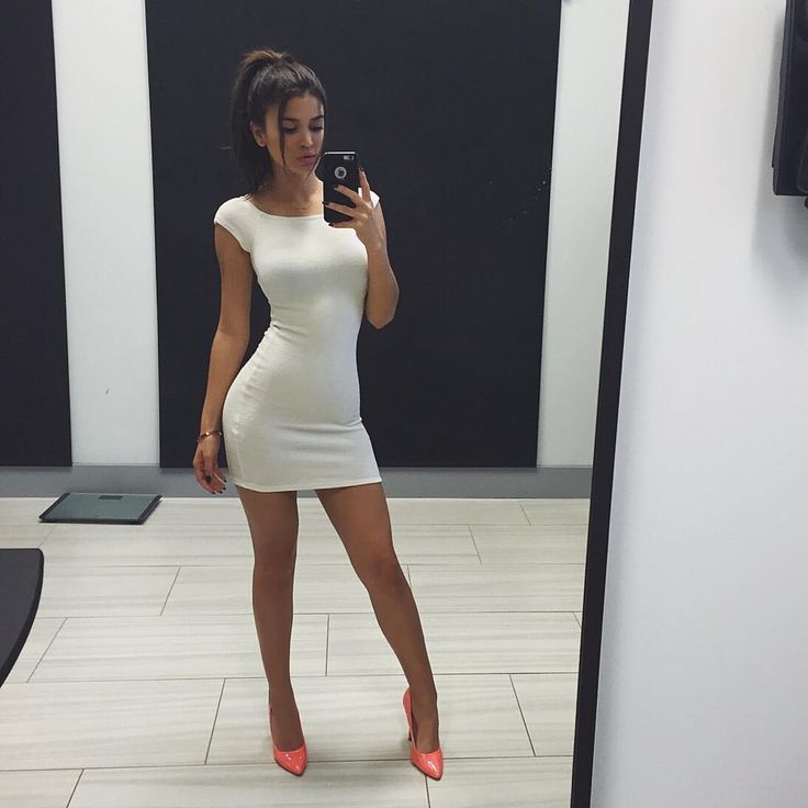
Although they use a suite of bright colors and funky graphics, their theme of positive messages and self-affirmation is present in every post.
If you’re wondering how to make your Instagram feed look good, kiss random spur-of-the-moment content goodbye.
Remember the mission and values behind your account, and make sure they’re present in every post!
Keeping a consistent visual theme is a crucial part of our list of tips on how to improve your Instagram feed.
Popular ways to unify your Instagram feed theme include focusing on color palettes and editing your photos in the same way!
You can create specific style guidelines to follow for each photo! Take @dananicoledesigns feed, for example!
Dana uses two main types of visual content to keep her feed looking unified: actual photos, and stylized graphics!
Let’s take a closer look! Psst… make a mental note to create similar style guidelines to ensure cohesiveness in your feed:
For methods on how to make your Instagram more appealing, look straight to designing your own aesthetic.
Whether you’re a Photoshop or smartphone user, you need to develop the way you want to edit each photo or video.
This creates a cohesive feed no matter where you take your photos.
With Photoshop, you can use Photoshop actions to process each photo with one click.
If you’re not a Photoshop pro yet, you can find many free Photoshop actions out there to save and then tweak them to make the mood and style you’re trying to achieve.
Lightroom is another great way to process photos. You can find Lightroom presets to achieve the same goal as Photoshop actions.
There’s also a Lightroom app for your phone so you can process your photos on the go and still match your style!
VSCO is the most popular app for processing Instagram photos with fashion and lifestyle bloggers.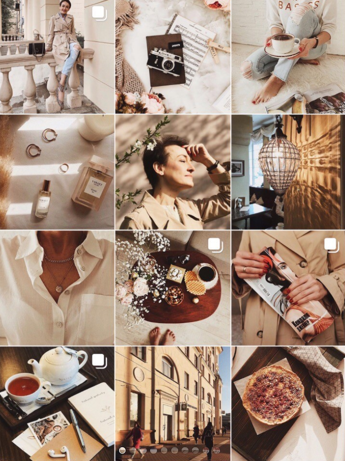
They have it down to a science and, wow, does it show in their amazing Instagram feeds.
If you’re hoping to make your Instagram look better, it doesn’t matter how you choose to take your photos or process them.
What matters is that you consistently use the same filters and settings for each photo to match the aesthetic that you choose!
Our list of tips for how to make your Instagram feed better wouldn’t be complete without this deceptively easy fix: high- quality photos!
High-quality photos aren’t out of your reach, even if you don’t have a fancy DSLR. You just need a steady hand, some patience and an eye for composing your photos in unexpected ways!
Whether you’re taking professional-looking photos with your iPhone, or snapping lifestyle shots with your Android device… nearly every modern SmartPhone device can deliver jaw-dropping photos!
Here are some tips to keep in mind:
For even more easy tips to become a Smartphone photography, pro, tune into our free webinar with stock photo master Kayla Marie Butler of The Ivory Mix!
 Color-coordinate your Instagram feed
Wondering how to make your Instagram pretty? Try adding splashes of color to your visual planning approach!
Adopting an Instagram color theme isn’t as complicated as it sounds.
You can peruse Pinterest and some of your favorite feeds for color inspiration – or even make your own random palette with free apps like Coolors!
Here are some things to keep in mind when choosing colors that work for you:
 Post consistently to Instagram
If you’re racking your brain wondering how to make your Instagram feed better, the answer may be simpler than you think. It’s consistency!
Whether you opt to post once per day, or only want to commit to three posts a week max, it’s important that you show up and post!
Why?
When you commit to posting consistently, you’re teaching your followers what to expect from you.
With regular posting and interaction, your followers will grow to expect your content in their feed and even happily wait for your latest and greatest post!
Here’s the key tip on how to make your Instagram better visually: Planning.
The best Instagram feeds are ones that have been carefully and thoughtfully curated and prepared.
By planning your feed, you’ll be able to see how your photos look next to each other and adjust where needed in order to achieve the cohesive look and feel of your dreams.
Once you batch process your photos, you can plan out your grid in Tailwind with the Auto-Scheduler tool to schedule them at the optimal times using our Smart Scheduling tool for Instagram! Just:
Once you have them scheduled, when you use Auto Scheduler, those posts will go out at the best time for your Instagram audience.
Now there’s nothing left to do but go out there and create those ‘Gram-able moments. Anyone know a coffee shop that does latte art? ☕️#DoItForTheGram
Have any questions about how to use Tailwind for Instagram or how to make your feed pretty? Let’s hear them in the comments below!
One of the top questions that pops into my DM’s is “What Instagram filter/preset do you use?” And to answer that question right off the bat — I don’t. I’ve tried. Believe me, I’ve tried. I’ve purchased expensive Instagram filters and inexpensive Instagram preset bundles and I just can’t seem to make them work for me (or I can’t find one I love enough to keep it for an extended period of time.)
So before I get to some tips for making your Instagram feed look good, cohesive and beautiful, let’s talk about Instagram photo presets for a second…
In order to make all of your photos look alike, you’d have to be shooting photos in the same type of lighting every single time, which of course isn’t plausible. Whether you’re in the shade or the sun, a simple applied preset won’t fix lighting differences. If you’re inside or outside or heck, in one room in your home or another, the lighting will be different. Whether it’s morning, midday or evening, a simple preset cannot just be applied and make every photo look the same because there are so many other factors involved, especially for those of us who aren’t professional photographers (ahem, myself). So while presets are a great start, making your Instagram feed look cohesive, it takes more than just a preset — adding warmth or coolness to the image, brightening, adjusting shadows, etc. It’s not just a simple click of a button like so many people think.
With all of that being said, I’m not against filters and presets. I think they’re a great base if you find one you love! But in order to actually make your Instagram feed look cohesive with a beautiful Instagram preset, you’ve got to put a little more work in than you may have thought.
So now let’s get to it:
How do you make your Instagram feed look good and cohesive without relying on filters and presets?
Look at my Instagram feed. What do you notice about the backgrounds? They’re all white — white, white, white. Now I’ve got some light tans in there, very light tans, and I’ve got some skies that are shot directly into the sun to make the sky appear a white tone but for the most part, I’ve got a lot of white space in every photo. And for me, that’s the base for how I keep my Instagram feed looking cohesive.
Now this isn’t something I personally do but it’s something I LOVE the look of when Instagrammers use this tactic. Let’s look at @taralynne.oha’s instagram feed, for example. Notice anything? I’m sure you see it. Yes, all of her photos are beautiful and edited with that same dark tone, but look at the colors, specifically. The clothes she and her kids wear, the sheets, the backgrounds, the pillows and furniture and even the leaves in the trees— they’re all burnt oranges, whites and tans. Even her Boxer blends in perfectly with the colors she uses on her Instagram feed and if you ask me, she’s got the most beautiful feed out there!
You’re probably like… huh? What the heck does this mean? And while I do try my best to do this, it' doesn’t always work out but I sure do try.
For example, I try not to put two close-up shots next to each other or on top of each other when appearing on the grid. And the same goes with super pulled-back shots. I try not to put two photos next to each other with the same angle (us standing side-by-side, from above, diagonally shot, selfie style, etc., for example) or two shots taken from a birds-eye view next to each other. What I do is I try to space is all out — maybe a close up shot, then Ava and I standing side-by-side next, and then a bird’s-eye-view angle and then a half body cropped shot next to keep them all spaced out nicely.
Like I said, though, this doesn’t always happen and that’s okay. I’ve been trying to stress less about caring about this so much but in all honesty, I do care because this is my career and many brands have told me that my feed IS why they have hired me time and time again so because of that, I keep it going to the best of my ability.
Quick Tip: I use the UNUM app to visualize my feed before posting anything live so I know how it’ll look a week or so out before everything setting anything in stone on my calendar.
I use a Nikon D3300 and typically use a 20mm lens (although I love that 50mm lens). It’s nothing fancy but it does the job well. And ever since I learned the basics of shooting manual, I swear it’s made a world of a difference for shooting in all types of light. For all (or most) paid campaigns, I use my camera because these companies are hiring me to take photos for them and oftentimes, they’re paying to use these photos professionally on their end in newsletters, ads, on their websites, etc. So for that reason, paid campaigns are always shot on my camera (unless they specify otherwise, which does happen occasionally).
But I’d say about 50% or more of my photos are taken on my iPhone. So you don’t have to own a camera to take pretty pictures…well, if you think my pictures are pretty, that is.
But other than the equipment I use, here are some tips for taking Instagram photos:
natural light: I turn all lights off in the house before shooting so they don’t end up with that fake yellow-light tone to them.
no direct sunlight: Unless you’re a professional photographer, you probably won’t be able to master direct sun and shadows and all of the fun that comes along with that. Not to say that I don’t try or don’t end up with cute shots in the direct sun, but it’s hard. So I always attempt to shoot in the shade (and just warm up the shot), in the morning or at night when the sun isn’t blaring over our heads.
take a million shots: A million is quite the exaggeration but we take a lot. Snap, snap, snap away and you’re sure to end up with a cute one whether it’s posed or candid! Just click that shutter over and over so you don’t miss a good moment!
vary your angles: Shoot from above, shoot selfie-style, pulled back, different angles and just get variety in there because you never know which angle you’ll end up loving the most for a shot!
And who takes my photos? My husband! I set the camera settings based on the lighting and he stands in as my lighting model and once everything is set on the camera, he takes the shots and I edit. If I’m not in the photo, then chances are I took the shot.
I have some basic settings I start off with on every photo — slightly warm, a little pink, light on the shadows and then I trial and error. I edit a photo, throw it onto my feed using the UNUM app and see what I think. Then I go back and make it warmer or colder, adjust the brightness, etc until I have the shot I feel looks best on my Instagram feed. I’m sure the professionals have a better way of doing this but for me, it’s all trial and error editing on the Lightroom app., which is my favorite photo editing app (and the only editing app I use!).
I hope this helps for those of you wanting to make your Instagram feed look more cohesive and uniform but my best advice to you is to not dwell on it too much. Of course if this is your career or you want to turn Instagramming or blogging into your career then yes, focus on good quality work because that’s what brands love! But don’t dwell on that feed too much or I promise it’ll make you go crazy!
The article may contain information about the social networks Instagram and Facebook, owned by the Meta corporation, which is recognized as extremist in the Russian Federation and banned.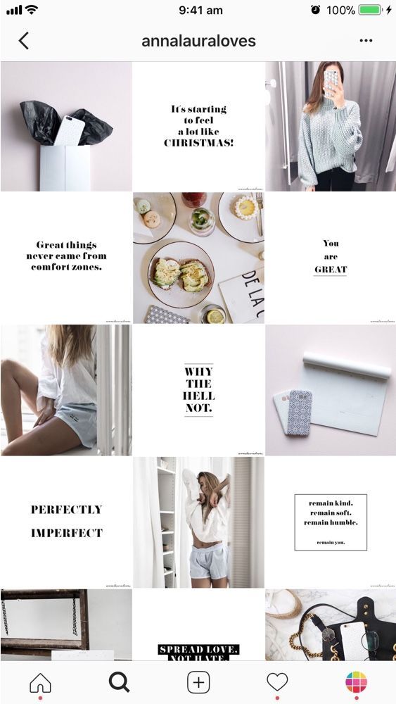 Articles about these social networks or mentioning them are for informational purposes only. We strongly recommend that you promote your business on VKontakte and Odnoklassniki.
Liked? Share!
Read LaterScreen time statistics on my smartphone consistently show that I spend 24-27 hours a week on social media. And when preparing this article, the time increased to almost 48 hours a week! FORTY-EIGHT HOURS, CARL! Two days left my life in the virtual world. As our blog editor said: “After this, readers simply have to like this article.” :D
And now without the lyrics: I present to your attention 50 Instagram profiles where you can get inspiration to improve your account.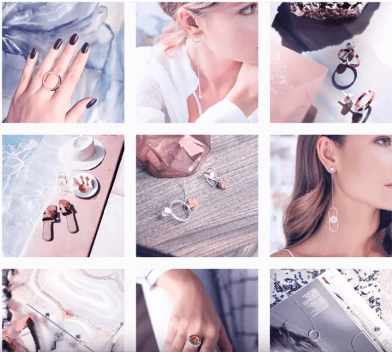
All presented profiles are not a model and an ideal to which one should mindlessly strive! Moreover, some of the profiles have a lame text feed, some have “Actual”, and others have BIO. So we just look at the beautiful pictures and, as usual, make ours even better.
P.S. Carefully! There is a share of subjective evaluation! For those who do not accept other people's opinions, we recommend drinking valerian extract before reading. nine0003
@magnitkrd
Of course, Instagram's biggest asset is its own style. Let it be strange, let it be “not for everyone”, let someone wrinkle at the sight of a visual... But true connoisseurs and like-minded people will roll their eyes with pleasure. Just look at what beauty "Magnit" creates!
@pyshechnaya1958
The same can be said about the profile of the same puffy one. There are few photos, but a lot of pleasure. It has its own identity, just as there is a sexual connotation. By the way, not so long ago they wrote about the "sex" trigger in advertising, you can look here. But if you decide to make your profile sexy, be careful: Instagram doesn’t take even hints of eroticism with a bang. Which is a little sad, because these hints are very aesthetic and appropriate.
@inspiration_decorstudio
Mosaic puzzle - call it what you want. The essence will not change - this technique attracts attention, whatever one may say, especially if it is used more than once in the profile. Take a look at this account, at the beginning it has several mosaics and all with green accents. There is definitely something in this. =) But when using a mosaic, keep in mind that not all subscribers love it, because it is very strange to see 6-9 incomprehensible fragments in a row in your feed. nine0003
@bibliiteka_club_official
We continue talking about mosaics. If desired, with the help of fragments, you can arrange an insta-lander. Everything is clear from the name: this is an ordinary landing page transferred to the Instagram profile. =) Why is such a thing needed? For example, if you don’t have a website and it’s hard for you to maintain social networks on an ongoing basis. We create an insta-landing, pour advertising there, voila, you can find out all the information about your company in one click. nine0003
@japan.papa
Another example of how snippets can be used in an Instagram profile. We take an advertising banner, cut it, lay it out. Done, you are amazing! The main thing is that banners should be informative and be combined with each other.
@adverteam_studio
I know, I know, we are already tired of mosaics, I promise that we will finish them soon. =) Showcase your product or service in one post? No, they didn't. Let's go to 9-ty, as, for example, a branding agency did when they showed their design development for a client company.![]() Looks damn cool and convenient for potential customers. When they get to your profile, they can get acquainted with examples of your work in a convenient and original format.
Looks damn cool and convenient for potential customers. When they get to your profile, they can get acquainted with examples of your work in a convenient and original format.
@ilfioredecor
By the way, if you didn’t know or didn’t think about it: photos in the puzzle can be cut not only across the entire width of the Instagram tile by 3, 6 or 9fragments. You can, for example, use only two vertical squares in the mosaic, as was done in this account.
@___aromagia___
Any SMM specialist, if he sees catalog photos on a white background in your profile, will start screaming heart-rendingly. Of course, depending on how it's all implemented and blah blah, but most often it looks ugly. What to do if there are no ideas? Alternatively, the white background can be replaced with silver or any other more interesting color. It will come out much prettier. nine0003
@jean_baby_shop
Another similar example, suitable for you if you find it difficult to crop products and transfer them to another background. You can lay out products on the same background and add thematic props. In total, you get the same catalog, only more Instagrammable.
@artberi_rings
And yes, you can lay out the goods not only on the photo background. The images in this profile are not intricate - just decorations for the box. But it looks very neat and aesthetic: both catalog and instagram. =)
@babygramhouse
Another variation of the catalog. This is just in case the white background cannot be cut down with an ax. Make the same substrates for each photo, they will save the situation.
@juvelarto_store
And this is how you can arrange a non-catalogue catalog. Stock up on fabrics, substrates, paper and combine backgrounds of different textures and colors. And do not forget about the props so that the product does not look "naked". nine0003
@island_soul_jewelry
And, of course, you can always demonstrate your product on models. The main thing is to repeat like a mantra: you need excellent photo quality, the same lighting and a single filter. Oh, yes... Also an interesting framing, the ability to be creative. In general, from experience I will say that for such cases it is better to hire a professional photographer, they have an eye for successful shots.
From personal observation: if you look at many, many profiles on Instagram in a row (as I did for this article), the eyes will be more attracted to accounts where black prevails. Why? Because there are far fewer of them. It just so happened that the Instagram audience loves everything light and glamorous, ignoring the charm of restrained, even a little gloomy photos. So there is a double-edged sword here: dark profiles stand out from the competitive ones, but not the entire audience will fall into ecstasy from their beauty. As they say, not everyone will understand. nine0003
@plekhanova_studio
One black-black profile contained black-black photographs taken with a black-black camera. =) I am almost 100% sure that if not all, then most of the photos in this profile are made by myself. Again, everything here is gloomy, although the theme of the beauty salon is conducive to "pink in rhinestones." Going to the "dark side" adds to the expensiveness of the profile, and unique shots add ... um ... uniqueness. In general, this example of Instagram is very successful, definitely worthy of attention. nine0003
@black
And this is for those who continue to claim that the mood color black is allowed only for Creed and Kirkorov, but for self-respecting profiles on Instagram. Look at this account with a sea of followers and amazing engagement! So black for Instagram is very viable. Proven!
@write__for_you
Let's continue to develop the theme of profiles "not for everyone". Here everything is done in black and white, and this is again an amateur, they say, gloomy and depressing. By no means! For my taste, it looks very stylish and stands out against the background of sugary profiles. nine0003
@vrn_mart_design
Definitely against black? You can choose white. The abundance of "air" in the profile also attracts attention and does not look boring.
@pinocchioosteria
Well, what are we all about black and black?! Let's add colors and lights! Now I will disgrace the whole village, but I can’t figure out how to indicate in a couple of words what is attractive in this profile. =D There are overlapping colors here, I'll assume that one filter is used. In general, different color and light photos miraculously form a harmonious and bright profile. As for me, this is the most difficult thing to achieve, but the result is excellent - a beautiful Instagram that you want to subscribe to. nine0003
@biancazapatka
And now the brightness is at maximum! I am sharing with you one of my favorite profiles. Do not look at an empty stomach! Each photo is like a work of art, each has a lot of color, a lot of design elements.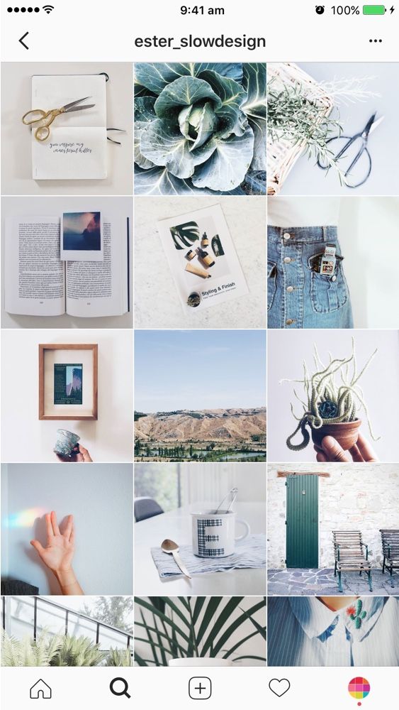 But all colors echo and the abundance of everything coexists in harmony.
@sushi__panda__
Golden mean. When you want to use classic black and white, but also bright colors. Just add a bright accent to the bw, for example, red. Ready! You are gorgeous! nine0003
@yam_yam_irk
A little more about food and professional unique shots. Showcase products in catalog format? Can! But it's too easy. =) What if you organize a photo shoot?.. Remember that unique pictures with an idea will be a hundred times more valuable than catalog ones. But they will also cost you more energy.
@mir_matematika
This is a math tutor profile. The photo tile itself is a simple “checkerboard” where identically designed photos go through one publication. The trick here is to style the profile to fit your theme. For example, geometric shapes and mathematical icons have been added to this account: this does not require a lot of fuss, but makes the profile much more attractive.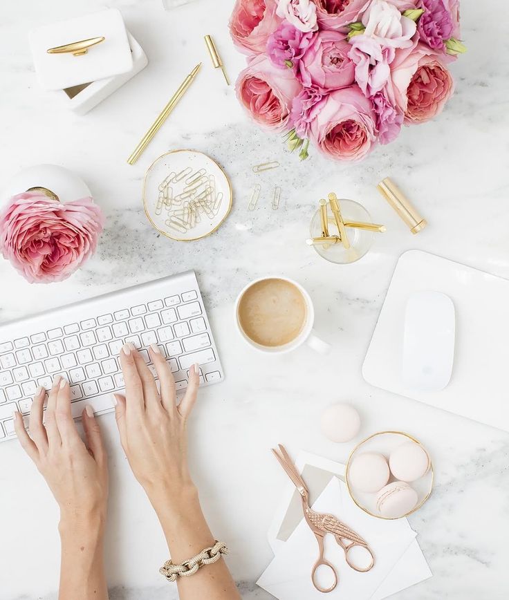 So feel free to take it into service, the main thing is not to overload. nine0003
@delfin_mkala
We continue the conversation about styling to fit your theme. Here the design is almost “too much”, there are many tricks, bright elements, contrasting colors. But! The topic itself allows such a search, everything related to goods and services for children can go a little beyond. In this example of a beautiful profile, we pay attention to stylization: ducks, lifebuoys - all this reinforces the theme of the children's pool.
nine0002 But these are not all tricks. Meet the endless feed on Instagram! Its essence is that the image or icon smoothly transitions from one publication to another. The endless tape has both admirers and haters. Where is the negative? It's simple: for many, due to the fact that all the photos in the profile are combined, it is difficult to catch the eye on something. In my opinion, here the endless feed is implemented very neatly and does not turn publications into mush.
Here we see an element of an endless ribbon - the line smoothly flows from one photo to another. Attracts attention, but does not distract from the main photos. As a result, we get a non-trivial and beautiful profile on Instagram.
@kidscare.official
Here we also see small infinite elements. Plus, there is compliance with the color scheme of the substrates: blue and pink. Why do such things? They help out a lot when there is no way to combine the photos themselves: they can differ in color, lighting, design. Then endless elements and backgrounds help merge diverse photos into one style. Immediately there is uniformity, which is so important for publications. nine0003
@the_barbershop_group
Here is another profile with an infinite element. The best option when you want to add raisins, but you don’t want to spend a lot of effort. We take one detail and run it through the entire profile. Done, you are amazing!
@mantin.home
A moment of subjective opinion. I really like the checkerboard on Instagram profiles, by the way, I already talked about it in this article. In my opinion, this is one of the most convenient and pleasant formats for perception. If the templates for checkers are also made in a stylish way, then they are generally delicious. As a rule, informational posts are drawn up with a checker, which is +90 points for convenience.
@grid_moscow
Did you think we would end the conversation about checkers so quickly? =D See Instagram example for a car service. Here we do not see dirt, spare parts lying around and car mechanics covered in fuel oil. Accuracy adds, firstly, a checker, and secondly, the thoughtfulness of the pictures themselves.
@avealalat
Maam, can we talk about checker? =D In general, in short: such a trick can be implemented not only with the help of the same template, but also with the help of inscriptions on the photo. The main thing is that the text is readable, of course. And if you also choose a cool font, you will definitely get a couple of points to the beauty of your profile on Instagram. nine0003
@repetitor_math_online
Olya, calm down with your checker! No! =D There is one more thing. Patterns for checkers may not always be 100% the same. If you keep the color scheme, but change some elements, it will be even cooler. So you can individually make your own template for each checkers post, or at least make 4+ different templates. It will turn out very nice and somehow more “wow, how the person got confused!”.
nine0006@pelmenya_irk
Potentially Delicious Content – Aesthetic food images immediately start salivating! The profile is made in dark colors, which makes it stylish and status, and most importantly, nothing distracts from food photos.
@wedress_studio
A simple solution to add aesthetics - frames! The same white frames, as in this example, add to the air profile, allow you to focus on the picture and, of course, add zest. So beauty is not always the invention of the bicycle. nine0003
@prazdnik138
Don't like the same frames? Business, do something different! It will also turn out very nice.
@chistyydomeco.belka
We will slowly move on to talking about templates with you. Now drawing an individual or buying a standard template is a very popular thing in the field of Instagram. You get a template - insert your photos - you're done! If you wish, you can make up the photo yourself, for example, in the Canva application. By the way, we already talked about it earlier in the article. nine0003
In this example, we see a color template where the whole design is based on 3 colors: blue, gray and white. As a rule, the prevailing colors are chosen based on the company logo.
@say.yes.agency
Another example of templates with multiple colors and designs. Remember that the more different elements you have and the more they are active in the feed, the more difficult it is to combine them.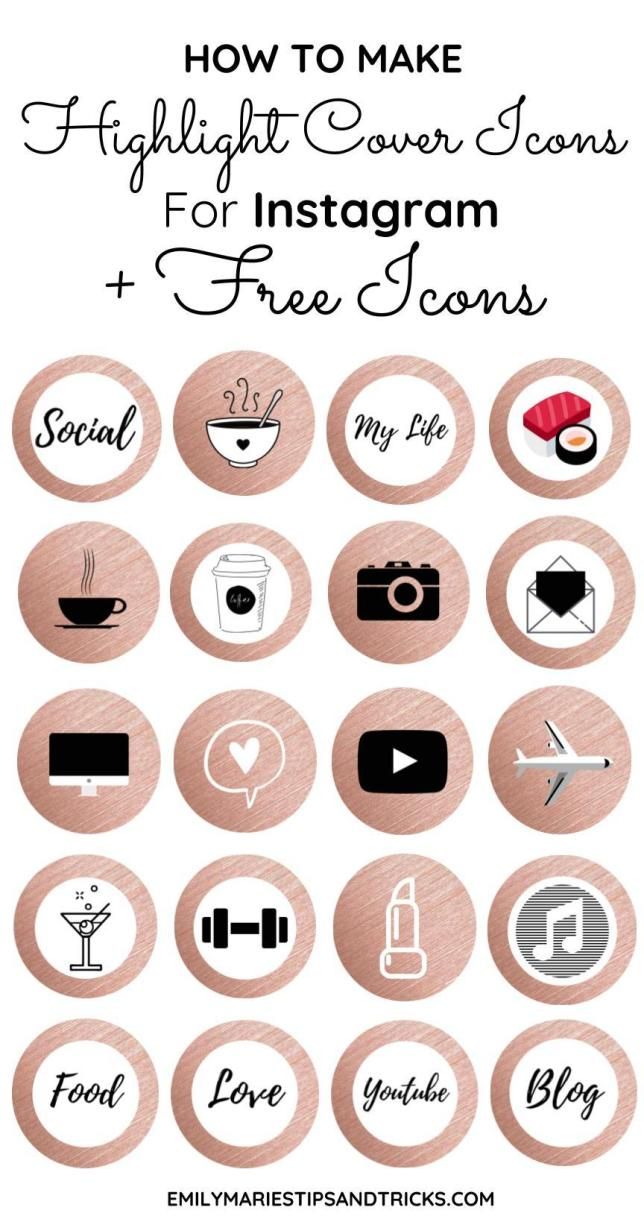 So advice to you: be sure to use the tile designer on Instagram. For example, the UNUM application. It reproduces the social network tiles, which gives you the opportunity to know in advance how certain pictures will look next to each other. You can learn even more useful applications in one of our articles. nine0003
@atami_jap
By the way, for some topics, color extravaganza is not only acceptable, but also desirable. For example, Korean cosmetics, baby products, dry pools. Here, the color play on the verge of a foul is quite harmonious. But again, everything depends on your taste: not everyone manages to catch the balance between extravagance and outright trash.
@nats_auto
nine0002 And you can get by with just one color in templates. Look, blue has been added to the profile: both in the main tile and in the covers for Topical. And everything went from the company logo. And as a result, we have a uniform profile, in which, by the way, there is also a lot of "air" due to the abundance of white.
 Watch how you can beautifully present a topic that is difficult for Instagram, as, for example, this car service did.
 @pigmalion_salon_krasoty
nine0002 There are templates a little more complicated, where not just uniform colors are used, but colored backgrounds or substrates, as in this example.
@ylettravel
Do not underestimate the work with captions on the photo - they help the user immediately grab what he is interested in. You can simply put an inscription on the photo, or you can, as here, use templates. By the way, pay attention to a common trick - to place similar photos in one line vertically. nine0003
@goodgarden_studio
Since we’ve already touched on the subject of post layout, posts with the same or very similar design can be placed in one line vertically, horizontally, or you can come up with your own order and post photos even as a snake, even as a spiral, at least . .. at least as, in general . =) What is enough for your imagination.
@gcc_irk38
In almost every article I say that banal stock photos are bad for your Instagram. But there are also exceptions. We take a cartoon stock, add a template, put inscriptions - it turns out very well! So, if you have time to select hand-drawn pictures on your subject or there is a designer in slavery who can be exploited, feel free to experiment with drawings. nine0003
@jp_clubbust
Continuing the theme of drawings, look how cute these painted busts are! They are in some info posts, on the avatar, on the covers of Actual. Yes, there is no super-originality in this, but the profile is remembered thanks to bright pictures. Plus, there are elements of an endless ribbon and work with white frames. I definitely approve! =)
@sidorova.koza.brand
Now I will embarrass myself again, because I don’t know how to describe this profile. Strange, even surreal in places... You have to muster up the courage and go beyond the limits of normality in order to start maintaining an account in a similar vein. Think you can't do it right? Photo stocks to help you. There are a lot of oddities there, you will definitely find something for yourself, I give a tooth. =) And I also give a link to an article where free photo stocks are collected.
@seizetheimpress
nine0002If using content on photo stocks is too easy for you, and you are eager to create and get up, you can take unique pictures in a similar vein, as the owners of this profile do. The guys are strange, but cool, bravo!
@keti_spain
Sometimes your merchandise can inspire you with ideas for an interesting presentation of photographs. How can you beautifully serve dolls? You can just take a picture of them on a photophone, or you can ... arrange a trip around the city for them! The very idea of humanizing dolls is not new, but with a stylish implementation, it all looks cool. Although a little creepy in places. nine0003
@timandtimicecream
When writing this article, it is not always possible to maintain objectivity, so I introduce you to the profile that fell in love with me at first sight. Something from pop art, something from minimalism... Personally, I am delighted! I definitely advise you to look through the account, pumping in a combination of bright colors is guaranteed to you!
@42coffeeshop
nine0002 This is my article, I do what I want until the editor sees it. =D Therefore, I show another profile on Instagram, which is similar to the previous one. Again, bright colors, mouth-watering photos, party-like, modernity. A little more and I will perform an ode to these profiles! In the meantime, I'm singing, you run into these accounts to soak up the beauty.
@alexandriaslens
Oh, we have a good charge of inspiration and practical advice! At least I really hope so. And therefore - at the end of the article, dessert. =) A profile of a talented photographer whose pictures you want to look at, and look at, and look at. Let's discard all the problems: a drop in activity on Instagram, an unwritten content plan... Just enjoy. nine0003
@service1ps
Well, now we have reached the promised figure of 50! Although I put the profile to the end, it takes first place in my heart. Yes, yes, this is the Instagram account of our 1PS Service! We try to please you with beauty and usefulness 2-3 times a week: we talk about useful things with metaphors and jokes, select images with trepidation. And, of course, do not forget to spoil you with gifts: subscribe to our profile, repost any post in your stories and get a 5% discount on any Service service. The commercial break is over! =)
Yes, there was no need for anything. =D Of course, if you are not concerned about the successful promotion of your profile, it is useful to see what others are doing, analyze their chips, think about how this or that stylistic move is implemented. All this encourages improvement. So don't forget to periodically raid Instagram.
In the end, I want to share with you my observations:
 In it, we told you how to objectively evaluate your account.
 If you don't have the time and energy to shovel mountains of profiles, analyze something there, for this you have us. We will evaluate your competitors and tell you how to improve your account. Learn more about Instagram promotion here. nine0003
Would you like to be consulted in detail? Our Support Department specialists are so cool that they will tell you about social networks just as well as real SMM specialists.
Write to [email protected] and find out how to start working on your account.
# SMM # promotion in social networks # content ideas # social networks
© 1PS.RU
We are sorry that we did not meet your expectations ((
You might like other blog articles.
39 pers. rated, average rating 4.9
7% discount on promoting your business
Discount on any of our services, which will help you save a little or bring a little more customers for the same money.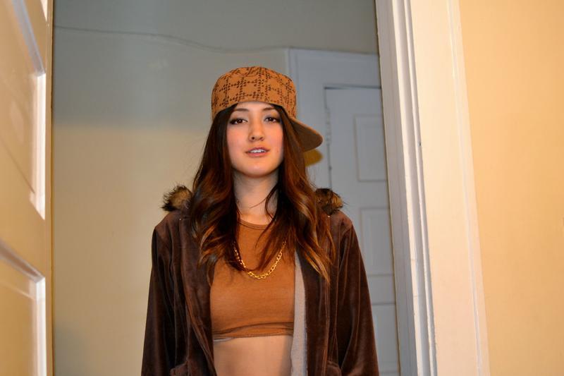 Activate so you don't get lost.
Activate
Comments for the site Cackl e
We design VKontakte Products: how to get sales directly on the social network#SMM#VKontakte#groups in social networksShop directly in the VKontakte community with a basket, an order form, a CRM system for their processing, as well as connected delivery and payment. Reality? Yes, and for a long time! All you need to do is to properly format the "Products" section. The article tells how to do it.
45 useful services for an SMM specialist: get inspired, get new skills and save time#SMM#groups in social networks#promotion in social networksDo you have enough Figma and Canva? But what if we tell you about the existence of many useful services that will not only make life easier, but also give a fresh look at your usual work? Read the article, learn new things and share the services that you use in your work.
Audience parsing for VKontakte advertising:
10 ideas for gathering users#SMM#vKontakte#promotion in social networks You won't find VK clients without parsers. This is such a free adaptation of the proverb “Without labor, you cannot take a fish out of labor.” :) Well, a statement of fact. Do you want a VK target that will bring results? Expand the capabilities of your advertising account through audience parsing. In the article you will find the first 10 ideas-examples of how to do this. nine0003
All popular articles ”
menu
Content
 1 Color scheme for a profile
 Not only celebrities and business account holders want to have a beautiful Instagram profile, but also ordinary users.
Please note that the article will not be about how to beautifully process photos for Instagram, but about how to add style and elegance to your account and properly design it.
Each user is trying to stand out from the crowd, so individuality is important. In business accounts and online stores, the originality of the presentation is also important. Let's figure out how to make a beautiful profile on Instagram.
Instagram account avatar must have a common style with the visual design of the feed. The image must be of the same color scheme as the ribbon. If the color palette of the ribbon changes, then the avatar is also updated.
Try to stick to a common style when changing your profile picture. So that even when changing the avatar, it is clear at first glance that this is your account.
You can also make an avatar with special effects or create an art avatar for Instagram.
In the Instagram description “about yourself”, you need to fit in 150 characters and try to hook the user. Write briefly and preferably in your native language. Describe what the blog will be about, who you are or what you do. nine0003
Give brief information so that a stranger, looking at you, immediately understands what is being written here. If you have your own hashtag, add it to your bio. This will help you create a beautiful and understandable account.
Fonts that can be applied to the Instagram profile bio.
Geotags and hashtags can easily find you, so add them to every post. Don't add overly popular Instagram hashtags, it won't do you any good. Come up with your own hashtags to quickly find your Instagram account or a specific post. nine0003
An example of using a unique hashtag on Instagram.
If the text below the post spans all characters, add the hashtags separately in the comments below the post, because placement does not affect promotion.
Share stories under posts, you can write about anything. The main thing is to be interesting to others. No need to make out a photo empty or with incomprehensible emoticons.
The profile should be interesting not only for its beautiful design, but also for its history. This increases engagement and has a positive effect on the Instagram algorithm. nine0003
Not all users view your Instagram Stories for 24 hours, so add them to the "Background". Constantly update this section, but try not to litter your account. nine0003
Design the entire Highlights section in a certain style by adding icons with captions.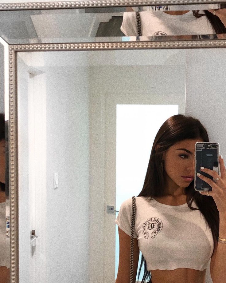 It all depends on how you manage your account.
Consistency is not always good, so in order to make a beautiful Instagram, constantly draw inspiration. Keep up with the times and change if the world around you changes.
So, let's move on to the most important aspect of a beautiful Instagram - visual content!
Visual is the key to blog success. Profile photos, its atmosphere and mood are the first thing a user can hook a subscriber (client) with. nine0003
The standard user's feed looks like a photo album that is intended for girlfriends, or worse, mom's girlfriends. The main mistake of photographs is the lack of detail of the “Instagram frame”: there is no emphasis on details, an incomprehensible background and no color correction.
Instagram account requires a lot of time and design approach. Your style must be recognizable. Therefore, it is worth considering the following details.
Think of a single style in which color you would like to design your account. Perhaps the color scheme will change with time and seasons, or you still prefer constancy in this matter. nine0003
Examples of visual design in the same style.
This is a choice of different variations of the effects and method of posting photos: checkerboard effects, changing photo margins, working with frames for Instagram, placing photos in a grid. This approach allows each rubric to give its own shade and stand out from the competition.
Posting scheme "Chessboard".
This is necessary to give Instagram a single thoughtful style. Using the same filters over and over will help keep this design consistent, as if you edit your photos by hand, it will be difficult to achieve a consistent color palette and the original idea.
We figured out how to submit content, but where do you get ideas for beautiful photos on Instagram?
 View other people's materials and ideas. If you want to take certain photos with some item, then search pinterest or weheartit for this word (for example, a red scarf). nine0468 You will immediately see a huge number of photos with a red scarf. This does not mean that it is necessary to repeat exactly after them. Take note of eye-catching details: what immediately catches your eye, how photos are fasted, in what color scheme and how often.
  ).
). Seasonal flatlay accessories.