“So, are you on Instagram?”
Years ago, knee deep at a networking event, you probably wouldn’t expect to field questions about your presence on a photo sharing app... But, it’s 2021. Instagram? Well, now it’s as synonymous as a business card.
Yes, Instagram (or “Insta”, thank you fellow millennials) rapidly became an essential online social media tool for artists, influencers, travellers, bloggers, dog lovers, creators, and business owners - just to name a few.
It’s simple aesthetic-centric delivery communicates your vibe and keeps your audience updated with an ever rotating collection of images, videos and 24 hr stories that connect you with the world - and all the people who want to peer into your brand.
Before you can start sharing a glimpse into your company, your services, or your lifestyle, you’ll want to make sure your account won’t look like that really lazy attempt at scrapbooking your Aunt Carol did last minute from your awkward prom photos.
We caught up with a handful of incredible and successful Instagrammers and Digital Marketing Specialists to dive deep on the best way to launch your own account, and how to maintain it to grow followers that will stay loyal to your brand.
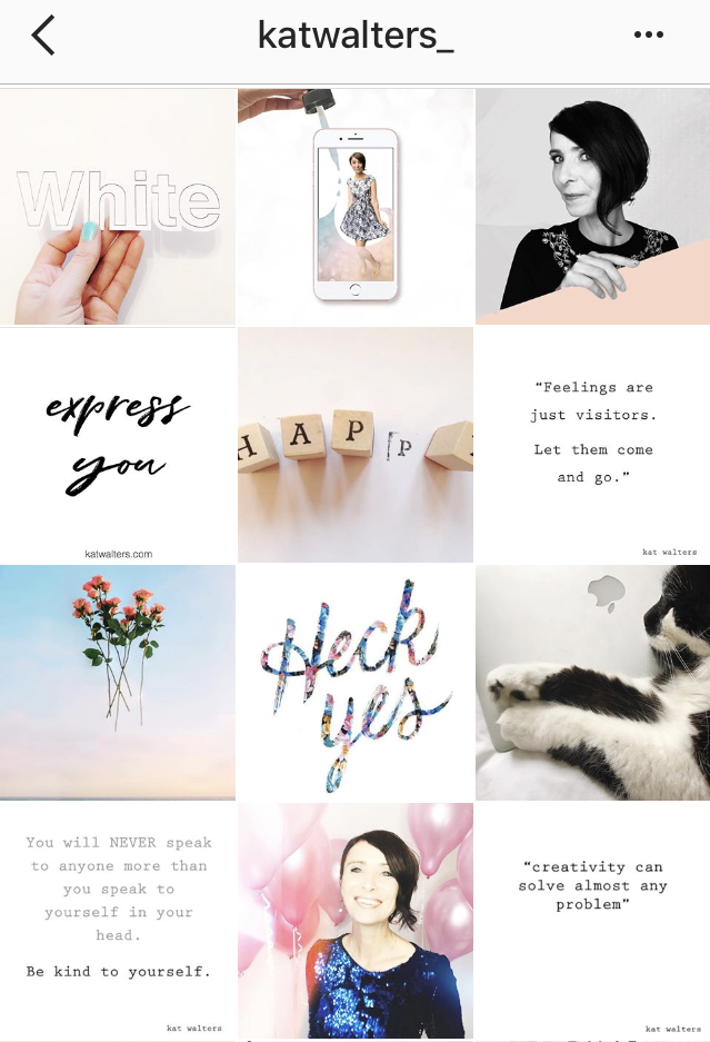
Instagram expert Kat Walters of @katwalters knows how important it is to visually connect your brand to your customers, and dedicates her creative energy to coaching others with a free Instagram class to achieve success with the app.
“You want to be clear about who your customer is, because you want to create an Instagram account that will appeal to them, and draw them into your world,” she suggests.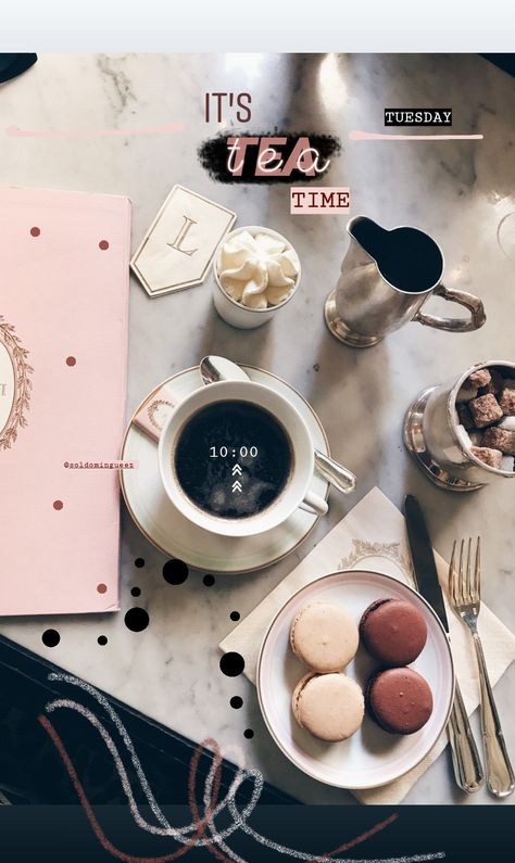 “You want an account that they will look at and say YES, this is so for me, I belong here.”
Personal Stylist, Sydney Lester from @chicstripes thinks of Instagram as a powerful tool for your brand, too. “You can set a vibe, create a tone, and use captions to bring value in a crowded market. This social media platform should be used as a marketing tool to support your business and give your community a clear call to action,” she says.
Of course messaging and captions are very important to your audience, but the visual aspects of your account are what resonate first. You don’t want to just dump any old images into your Instagram and hope your accompanying messaging and content will reach them, Kat explains.
“People will just not bother to read your captions if the images you’re using don’t look good. They will just scroll on past.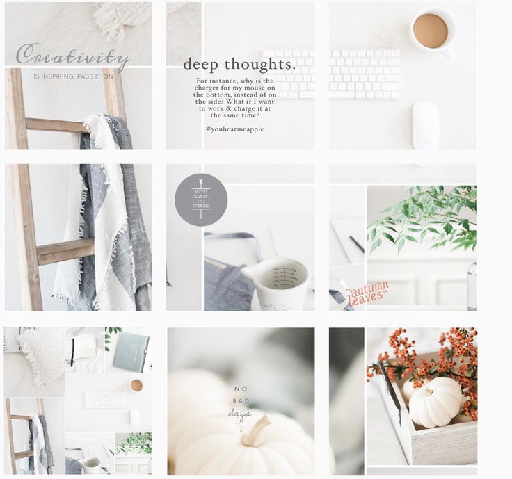 If your images and account looks great, well THEN your followers will read what you have to say.”
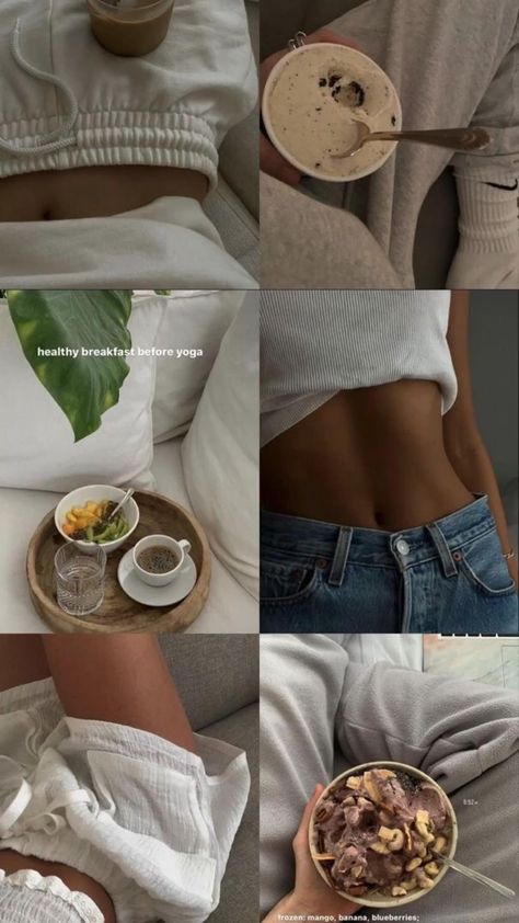
The first big thing to decide for your Instagram account - before you start fretting about hashtags and more advanced engagement - is a basic color scheme or color palette. This helps make your stockpile of images and videos look like one curated collection, rather than a jumbled hoard of disconnected moments.
Marisel Salazar, whose wildly popular Instagram account @breadbutternyc focuses on food and NYC lifestyle, uses consistent colors (her favourites) to stand out.
“I gravitate towards blues, greens, whites and slate,” she reveals, adding, “But that doesn't mean warmer colors don't make an appearance! Warm colors can actually make the feed pop when peppered in here and there.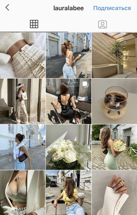 ”
”
Similar lighting conditions can really mean a lot too, according to Toronto lifestyle blogger, Joelle Anello of @lapetitenoob. Her pink-centric account goes beyond just hues - there are other important considerations for her ideal aesthetic.
“I make sure to have a similar color palette in all of my photos,” she says, “But as well, I take all of my shots in similar lighting conditions.”
So, you’ve chosen your colors, you’re being consistent with your lighting - now you can really start making an impact by limiting yourself to key filters, too.
“Using the same apps and filters to edit all of your photos is important,” Joelle explains. This is good advice, as 18% of all Instagram posts use a filter.
The most liked and most used filter in the world is Claredon - it highlights and brightens while adding subtle depth and saturation to any photo. Juno, Gingham, and Lark trail as close second choices. Don’t feel tied down by these champion filters though - you might stumble on the next great aesthetic by experimenting!
In the same sense that you want to have a consistent color scheme, you also need to choose a theme to focus on. A theme is also more than just a subject matter - it can also involve staying true to certain composition guidelines.
This will help you to develop your audience, nurture hashtags, and it also helps you stay on track and build followers.
Joelle, having carved out a niche for herself with a lifestyle theme that encompasses fashion, travel, and everything in between, has her own philosophy. “Develop a theme early on and be consistent with it no matter what. Consistency can be difficult, especially when starting to work with brands who may have their own vision for sponsored content.”
Choosing something you’re passionate about is important - maybe you want to share a sneak peek into the life of parenting, motorcycle restoration, raw food, or the excitement of chasing UFO’s - whatever speaks to you.
Ryan O’Connor, Co Founder of One Tribe Apparel learned quickly that a theme doesn’t have to be restrictive. “We've experimented with our @onetribeapparel Instagram feed a lot,” he admitted, “And now we don’t limit ourselves to photos that directly promote our products, but rather those that fit with our boho aesthetic.“
One Tribe Apparel doesn’t have a strict color theme like some accounts, he explained. “We try to stick to an outdoor nature aesthetic that vibes well with our colorful products, and the love of travel and yoga shared by our online community. ”
”
Sometimes you'll need to help your theme along while you’re taking your pictures. “There’s a lot of fussing around,” Marisel admits. “I always carry a couple of consistent accessories on my person to liven up any shot.“
Of course, when establishing a brand on Instagram, you need to consider a lot more than your individual photos - you need to think of how each image will look in the grid as well.
Lee Esposito from Digital PR firm Lee Esposito Associates thinks Instagram is about the ‘big picture’. “Remember that an Instagram feed is a mixture of images relating to one another, which means it incorporates individual images, as well as a grid of image thumbnails. It should tell a story,” he says.
Marisel agrees, but sees her feed as a giant puzzle, with a specific flow. “I tend to alternate between overhead shots and straight on vertical angles,” she explains.
“I always play around with what shots will come in a specific sequence to make sure everything is fluid,” adding that she likes to use the photo album on her phone to arrange images - which is a pretty cool hack!
There are lots of apps available that can also do the trick. “To keep your Instagram feed looking fab, work in rows of 3 using the Planoly app,” Kat recommends. (Planoly is free and lets you drag and drop the layout of up to 30 posts per month.)
“You can check that they are going to look good, and keep your feed design on track. Once you have your next 3 ready to go you can start to post them knowing that your feed will stay gorgeous,” she says.
Splitting photos into tiles for Instagram can also make a really big impact. You may have already seen the really neat spreads, where a single image takes up 6 or even 9 tiles on your grid, to make it look like one gigantic image.
You don’t have to do this manually anymore, thanks to apps like Pic Splitter, Tile Pic, or Instagrid. If you choose this approach, remember that you will throw your whole look ‘out of whack’ if you don’t plan ahead to post to maintain their alignment. Planning ahead isn't just about what you'll post but about when you'll post too.
Furthermore, you need to think beyond the grid when you’re planning this kind of layout, according to Zellie Freidnman, Social Media Manager at Power Digital Marketing. “You want to make sure each tile is a visually engaging photo that is unique enough to stand on its own outside of the grid,” she says.
Taking professional looking pictures with your smartphone is not only possible, but a fairly common practice, but that doesn’t mean you can cut out the most important step - the editing process.
Once in a while you’ll have a lucky moment, when your picture turns out “just right” on your phone and you can post it straight to Instagram, but that’s the exception, not the rule. The good news is, there have been a ton of apps created to help you edit and hack the perfect look for your images.
You can also get creative and create composite images - they are imaginative and very attention grabbing when someone is scrolling through images.
Kat, like many Instagram experts, knows that when it comes to your pictures “lots of little improvements add up to a BIG difference.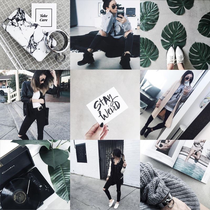 ” She edits her photos before she even considers opening her Instagram app. “My fav app for this is A Color Story,” she shares. “There is always something you can do to improve your pics, even if it’s just lightening it up a bit.”
Marisel is a fan of spot editing. “I personally don't use any filters,” she says, “I like to individually spot edit my images on Instagram using Snapseed. I favor high contrast images, so I like to bump down ambiance to create starker photos that stand out.”
Taking a page out of the Snapchat book, Instagram became interactive with the launch of “Stories” in 2016. Instagrammers (and Snapchat lovers) rejoiced!
“You should be using Instagram Stories as an ongoing "highlight" reel of your behind the scenes day-to-day client interactions,” explains Sydney, “To showcase your unique personality and work style.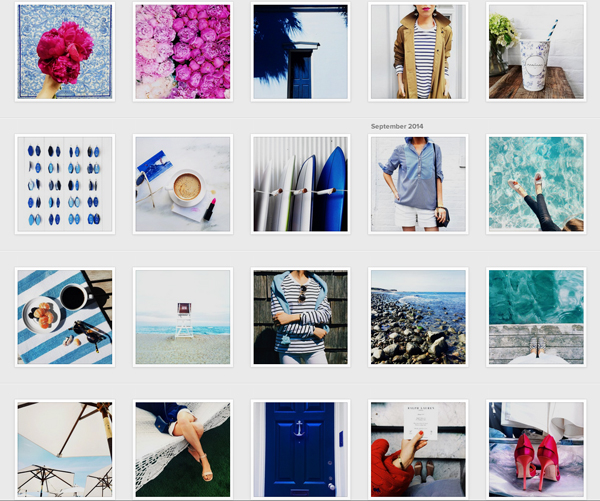
Self-professed foodie and blogger, Krysten Dornik of @KrystensKitchen agrees. “Instagram stories really helped me grow my Instagram account over the last year,” adding that she takes advantage of new tools available in the app.
“Using the ‘poll’ feature, the ‘swipe up’ option for links to your other content, and tagging companies to let them know you are talking about them are some of the easy ways to improve your marketing on Instagram.”
She also keeps up on the new features that Instagram introduces throughout the year, like highlights.
“Now you can choose a few things you would like to ‘highlight’ on your page from your instagram story,” she bubbles. “Right now, I am highlighting a giveaway and a new recipe on my blog!”
Food blogger Julia Nickerson of @SavoryTooth has some old school advice to growing followers - using actionable hashtags.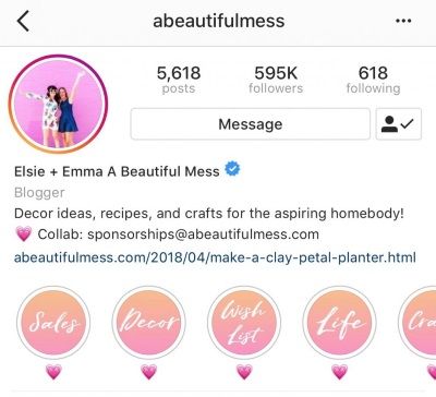 “My advice,” she shares, “Is that to drive engagement on your Instagram post, you should interact with posts using the same hashtags.”
She recommends regularly visiting posts from hashtags you currently use to leave comments and engage with the online communities associated with them. “Do this before and after publishing your post,” she advises. “This kind of activity tells the algorithm that you are active in that hashtag.”
If you pull all of these elements together, you’ll end up with a branded Instagram account that hits all the right chords online.
Take it from Kat: “Having an Instagram feed that looks like a mish mash will confuse your followers - BUT when you create a consistent theme that expresses your brand ‘soul essence’ it means that in just 3 seconds your followers are clear about your message and brand. It will create an instant deep connection with someone that is a fit for you. That’s how powerful it is.”
Well said. So, are you on Instagram?
Your Instagram account integrates seamlessly with your Pagecloud website! Grow your followers online today.
Did you know you can create a free link page to add to your social bios? Create a more engaging experience for your followers with a custom page for all your website, social media, shopping links, and more! For a step by step guide on how to create your free link page, check out this blog post!
If you want to get new Instagram followers, having a beautiful and cohesive Instagram aesthetic is the key to turning visitors into followers.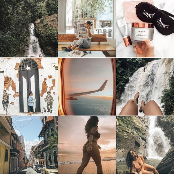
Having a curated Instagram aesthetic is one of the best ways to grow your account, build a following and show off your brand’s unique style and tone.
And the good news is, you don’t need pro photography skills or expensive editing software to really nail your aesthetic.
Why is a Cohesive Instagram Aesthetic So Important?You might be thinking: why is creating a cohesive Instagram aesthetic so important?
Your Instagram aesthetic is one of the best ways to get more followers and grow your account. And this year, creating a cohesive Instagram aesthetic is more important than ever!
More and more people are turning to Instagram to search for their favorite businesses. That means, your Instagram profile is now just as important as your website’s homepage.
Your Instagram feed is the first thing a visitor sees when they land on a new profile, so it’s important you make a good impression. When a visitor lands on your profile and knows exactly what they can expect to see on your feed, they’re much more likely to hit that “follow” button.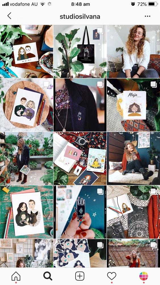
The first thing you’ll want to do is decide on the Instagram aesthetic you want for your profile. A great way to get started is just by looking for inspiration.
What do some of your favorite feeds look like? Are they bright and airy? Dark and moody? Do they follow some sort of pattern?
Taking the time to think about these things while you’re browsing your favorite profiles will help you decide what “aesthetic” will best represent you and your brand.
You’ll also want to consider what types of photos you’ll be posting. For example, even if you prefer a light and bright feed, if you live somewhere like Seattle, it may be a hard look for you to achieve.
Make sure you consider what and where you’ll be shooting, as this will be what you can maintain consistently. And consistency is really key when you’re creating your aesthetic and should be considered above all else!
Another way to help you determine what look you’d like to create on your feed is by creating a mood board.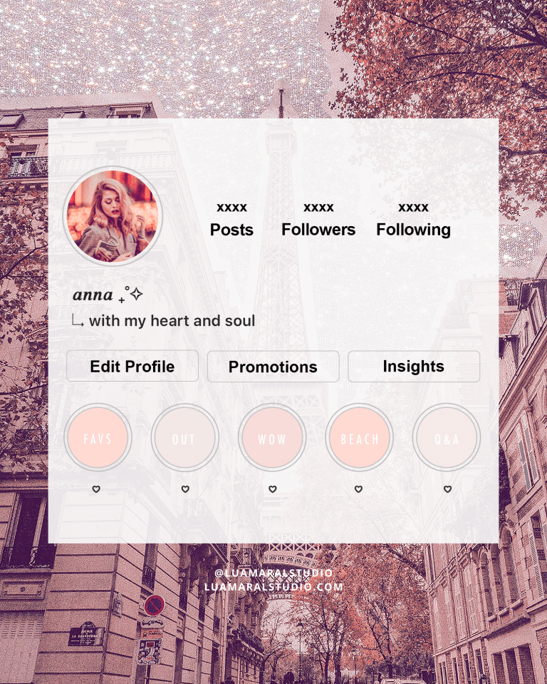
There’s a ton of different programs and apps, like Pinterest, that you can use to create a mood board. Creating a mood board is a really great way to help you get your creativity flowing and guide you in deciding what you want your feed to look like.
When you’re creating your mood board, make sure to include a mix of colors, textures, patterns, and quotes to help you better visualize what your Instagram feed should look like.
Once you’ve created your mood board, take a step back and decide what words come to mind? Your mood board should be a visual representation of what you want your Instagram brand to encompass.
And once you have a clear picture in your head of what you’d like your photos and Instagram feed to look like, it will make the editing process a cinch!
Ready to create your own Instagram aesthetic? Create a free account today and start planning and designing your Instagram feed with Later’s drag & drop visual planner!
Creating an Instagram Aesthetic Step #2: Editing Your Photos For Your Instagram FeedThe best way to create a cohesive Instagram aesthetic is during the editing process.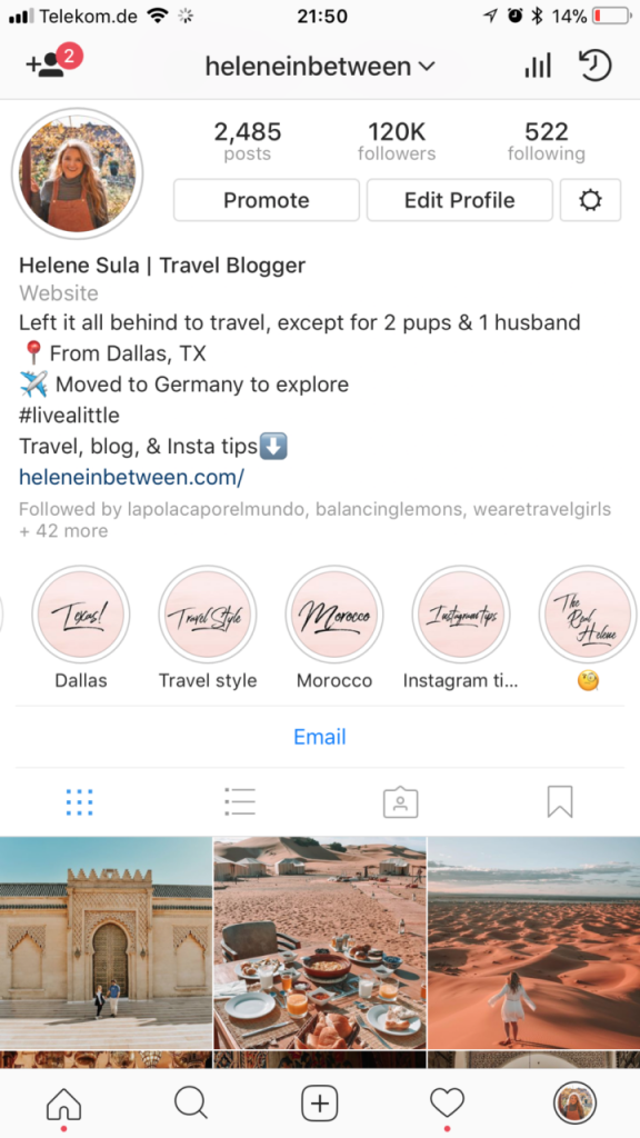 Choosing the same filter, set of filters or editing “rules”, will help you keep your photos looking consistent and “fit” together.
If you ’re looking to give your photos a more professional look, Lightroom is by far one of the most powerful photo editing tools out there, especially because you can use ready-made Lightroom presets!
Lightroom presets are one-click photo editing tools that can dramatically speed up your workflow and give your Instagram photos a professional look.
Using Lightroom presets on your mobile device can give your Instagram feed a serious upgrade and help you create high-quality Instagram Stories content (which we’ll talk about in step #4!).
While mastering Adobe Lightroom on desktop takes time and practice, using Lightroom presets on the mobile app is a quick and easy way to take your Instagram photos to the next level.
Since many presets are offered in “packs” or collections, you can choose from a selection of filters for each of your photos while still maintaining a cohesive look on your Instagram feed.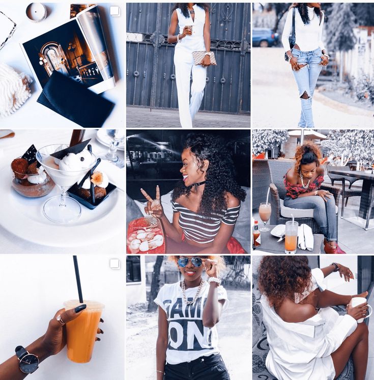
This year, many popular Instagrammers have even released their own preset collections, making it easy for you to achieve the same look and feel as your favorite influencers!
There’s really no one-size-fits-all filter, so it’s really important you play around, and figure out what filter is the best fit for your photo. Try find a “set” of filters or presets that all have the same look or feel to help you maintain that consistent aesthetic on every photo you’re posting.
Creating an Instagram Aesthetic #3: Create Balance on Your Instagram FeedAfter you’ve edited your Instagram photos, you’re going to want to think about how they’ll look next to each other. It’s important to create “balance” on your feed, and make sure it’s not too busy or cluttered. You want to make sure it’s easy for new eyes to move throughout your feed without interruption.
The goal here is to create a depth of field, similar to what you learn if you’ve ever taken a photography class. A great way to do this is by placing more busy photos next to clean or minimal photos to break things up a bit.
If you’re a business selling products on your Instagram feed, you can do this by mixing up your product shots, with some user-generated content post, lifestyle photos or any other different types of content you plan to publish.
If you haven’t already, it’s really time for you to start thinking in “grid-terms”. This will help you achieve a nice “balanced” look on your Instagram feed and help you create that killer aesthetic.
Creating an Instagram Aesthetic #4: Maintaining Your Aesthetic in Your Instagram StoriesPreviously, when you’d hear about an Instagram aesthetic, most people would just think about their feed, but now that’s all changed!
When crafting your Instagram aesthetic, you’ll also want to make sure you’re thinking about your Instagram Stories.
Creating cohesive Instagram Stories are a great way to build your brand and keep your followers coming back for more.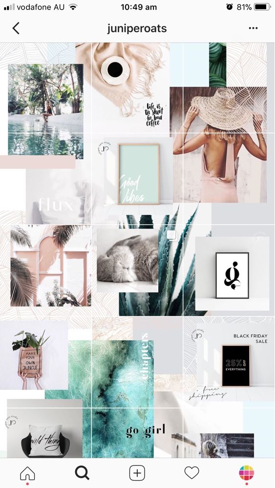 This can be as simple as using the same Instagram “font” all the time, or using your brand colors when using text or drawing tools.
While Instagram Stories continues to grow in popularity, brands are taking stories as seriously as their regular Instagram posts by creating highly designed stories that stand out on Instagram and stop people from swiping past your story.
You might notice brands and businesses like @oakandfort, taking the design and style of their website (like logo, font, color palette, and tone) and applying it to their Instagram Stories design.
If you want to create gorgeous Instagram Stories consistently, try using Instagram Stories templates!
Instagram Stories templates have really been growing in popularity this year, with businesses and influencers creating their own branded stories that have a really uniform color, tone, style, and format.
There are also heaps of apps like Canva and Unfold that can help you create beautiful and cohesive Instagram Stories with their ready-made templates.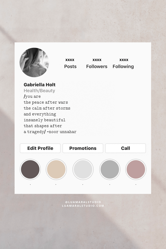
Instagram Stories templates are a great starting point for creating your stories, and Later has created 19 free templates that you can try out that are completely customizable to suit your brand’s aesthetic!
Designing templates for Instagram Stories make it easy to create stories from your phone or computer, and ensures that everyone on your team can create on-brand content.
Generally, Instagram Stories templates are pre-made layouts with graphics, text, or animations that you can edit to fit each new story.
By using the same (or similar) templates for your Instagram Stories, you can create cohesive, on-brand stories that align with your business as a whole.
If your Instagram Stories design and style don’t match the aesthetic of your profile page, you’re going to be missing the chance to introduce your brand to new audiences and leave a lasting first impression.
Creating an Instagram Aesthetic Step #5: Scheduling Your Cohesive Instagram FeedPlanning out your content in advance is really what’s going to make or break your Instagram aesthetic. You don’t just want to focus on how you’re editing your photos, but start considering what they look like next to each other, and what’s beside, below or on top of your new posts!
The best way to pre-plan your feed and make sure everything’s flowing together is by using a visual planner like Later.
Later’s visual Instagram planner shows you exactly what your Instagram feed would look like — and it’s seriously a game changer. The visual planner lets you easily rearrange or swap out photos to find that perfect balance for your Instagram feed.
Scheduling out your posts ahead of time doesn’t just help you maintain a consistent aesthetic, but it also helps you to post regularly, which is also really important when you’re trying to get more followers.
Again, new visitors on your profile are much more likely to convert into followers when they know exactly what they can expect from your feed, and your Instagram Stories.
And that’s our five easy steps to creating a killer Instagram aesthetic covered! By having consistent elements across your website, Instagram posts, and stories, your brand will have the chance to really unify your aesthetic and style from every single angle.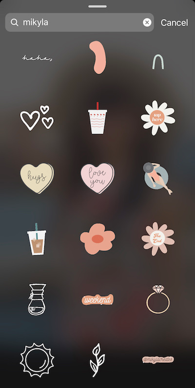
And now that you’ve learned exactly how to create and curate an Instagram aesthetic for your brand, you’re ready to design, execute and show off your very own beautifully-crafted Instagram profile!
It takes some planning, but once you’ve created an Instagram aesthetic that really wows, your Instagram account will go from strength to strength!
Ready to create your own Instagram aesthetic? Design, curate, and plan your feed using a free Instagram marketing platform like Later!
Why bother with text design on Instagram? After all, you can just take beautiful photos. If you run a commercial account, and your goal is to attract customers and make sales, then photos alone are indispensable.
Beautifully designed text is easier to read, attracts attention, reveals the essence of the photo, arouses interest. The text can encourage followers to follow your account, make a purchase, tell others about you and your business, or at least be active on your profile.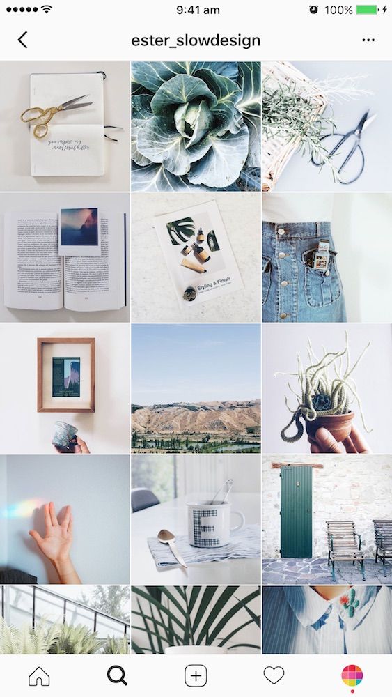 nine0003
Advertising: 2VtzqwCpaPT
In this article, we will give tips on how best to style the text under the photo on Instagram so that it works for you and helps to attract customers.
Read also : 10 services for mass looking on Instagram
Here are some tips that will allow you to beautifully format text on Instagram.
Do not write a canvas of text, divide it into paragraphs, so it is much easier to perceive information. nine0003
If you are too lazy to edit the text manually, you can use the Telegram bot Text4InstaBot . We find and open the bot in the messenger, click "Run".
The text must be divided into ordinary paragraphs in advance, then the bot will be able to divide them into “invisible” paragraphs that will be correctly displayed on Instagram (if you just throw the text even with paragraphs on Instagram, you still get a canvas).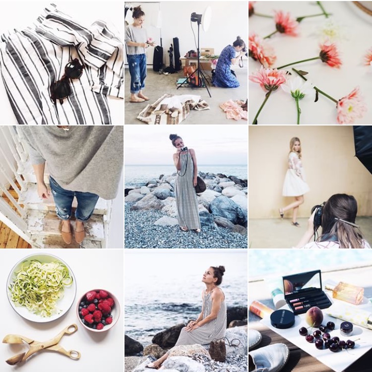 If this is not done, a warning will pop up from the bot. Visually finished texts do not differ, but you need to copy exactly the one sent by the bot. nine0003
In addition to dividing the text into paragraphs, the bot can align it in the center, underline and strikethrough words. You can also use any delayed posting service for Instagram, where there is text decoration.
If there is no desire to waste time on a bot or services, there is an option for the lazy - to separate paragraphs with dots.
Do not try to cram all the benefits of your product into one post, take some narrow topic and dedicate a specific post to it. For example, you held an event, released a new product, and are preparing for a competition - write your own text for each topic. nine0003
The structure itself must also have logic:
 Use Emoji
 Emoji help organize text and evoke certain emotions in readers. Yes, and just make the text bright. But use emoticons carefully and to the point - emoji stuck in different parts of the text without logic and meaning, on the contrary, are annoying. Like too many of them, the post is full of bright colors, which makes it difficult to perceive the text itself. nine0003
Example of good use of emoji in text :
Example of bad use of emoji in text :
With them, even large text is easy to read and you can note the most important points for yourself. nine0003
We have repeatedly written that the canvas of hashtags no longer works - they can be regarded by Instagram algorithms as spam and visually look ugly. In addition, an overly long list of hashtags distracts attention from the text itself.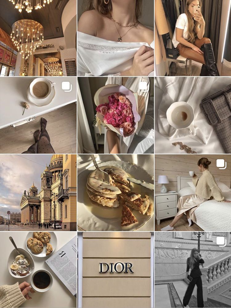 Choose 3-5 most important post tags.
Read more : How to use hashtags on Instagram to promote
This does not mean a call to buy something from you, it can be a phrase or a question that will provoke discussion in the comments. Activity in the comments will affect the reach and promotion of the account as a whole. In Instagram texts, write a call to action at the end of the post.
If you encourage subscribers to go to the site or write to you in instant messengers, then send their profile, where there are all these contacts. Or make a multilink.
Instagram doesn't have a caption and subtitle feature by default. The title can be visually highlighted using capslock, emoticons, dashes, symbols. The title will help identify the topic of the post and grab attention.
Also, you can make a title in the form of an inscription on the photo.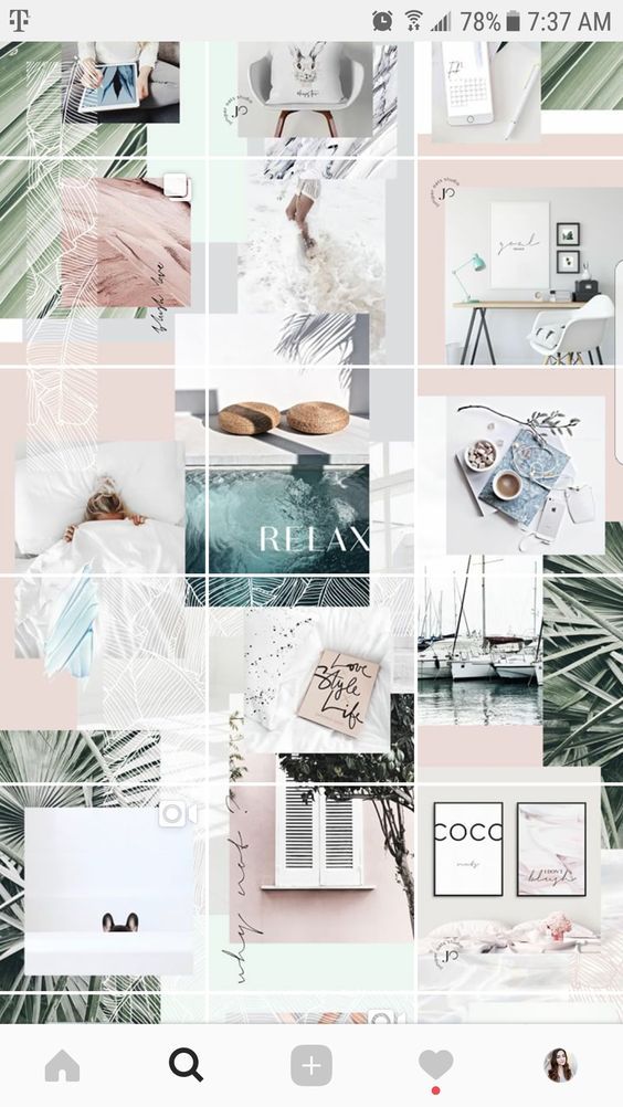
Sometimes the texts are very large and you don't want to divide them into several posts. And the number of characters in an Instagram post, as you know, is limited - 2200 characters, including spaces. nine0003
If you want to finish your thought, but the text no longer fits, you can place it in the form of photos following the main photo. At the end of the post, leave the call "Read the continuation in the carousel."
Periodically, you can post posts with strikethrough text to show an ambivalent attitude towards something or leave an understatement in the text. Such a function is available in the Text4InstaBot Telegram bot and the Spectrox application. nine0003
How to make strikethrough text on Instagram using the Text4InstaBot bot :
Run the bot and throw text there. Strikethrough words should be separated on both sides by three hyphens, like this: “Write texts as if you are communicating — not with clients, but — with friends.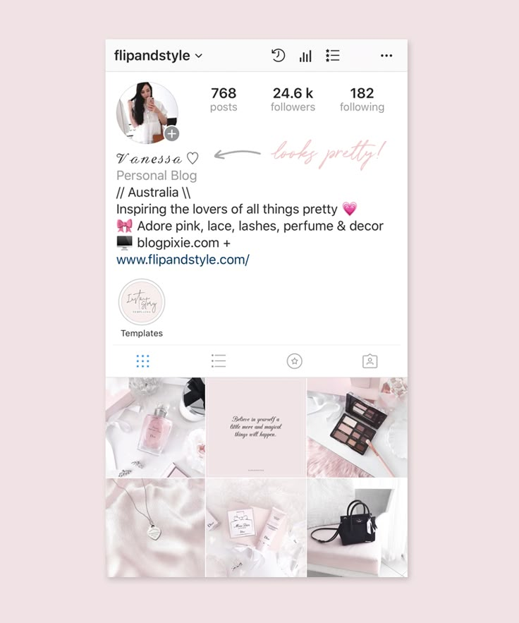 ” Then we copy the finished text and paste it into the post.
How to strikethrough text in Spectrox :
There are only 2 windows on the site. In the left, insert the words or phrases that need to be crossed out and press >>. nine0003
The finished piece will be copied and pasted into the post.
You cannot leave a clickable link to the site in the text of an Instagram post, but you can leave a link to the profile. You can create a separate advertising account or several accounts with the necessary links in the profile header. And redirect subscribers there by mentioning the profile in the text - @secondacc. In this case, you do not have to touch the main account.
Mentioning profiles in a post is more used to advertise other people's accounts, but do not underestimate the potential of this feature in terms of promoting your own.
You can leave your contacts right in the text of the post, then people will not have to look for them in the profile.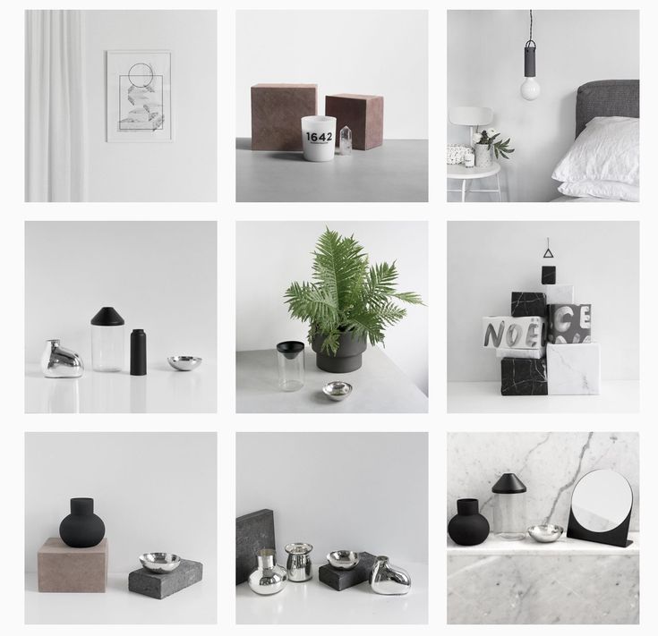 But this option is not suitable for everyone.
A couple of hashtags can be hidden in the body of a post as part of a sentence. They are well perceived by readers, while fulfilling their main function. nine0003
Stories have a very weak text editor by default. Apparently, because this function was originally conceived for creating video content, i.e. a lot of text there is simply useless. What can be done:
 In stories there is no function that allows you to make a voluminous text, you have to go for a trick. Write a word and fill it with a color, for example, black. Then write this word again and fill it with a different color. Make an overlay of one word on another, but with a slight offset, so that it looks like a 3D effect. nine0170
 If you don't have enough standard text settings for stories, you can use social media post builders like Canva and Crello. Or buy ready-made templates for Photoshop, After Effects and Premiere Pro and customize them to your liking.
Read also : Where can I learn how to promote on Instagram? Compilation of 10 courses
Beautifully designed text on Instagram grabs the attention of followers and increases engagement. In addition to decorating texts in the body of the post, you can also add text to the photo itself or to the story using third-party services.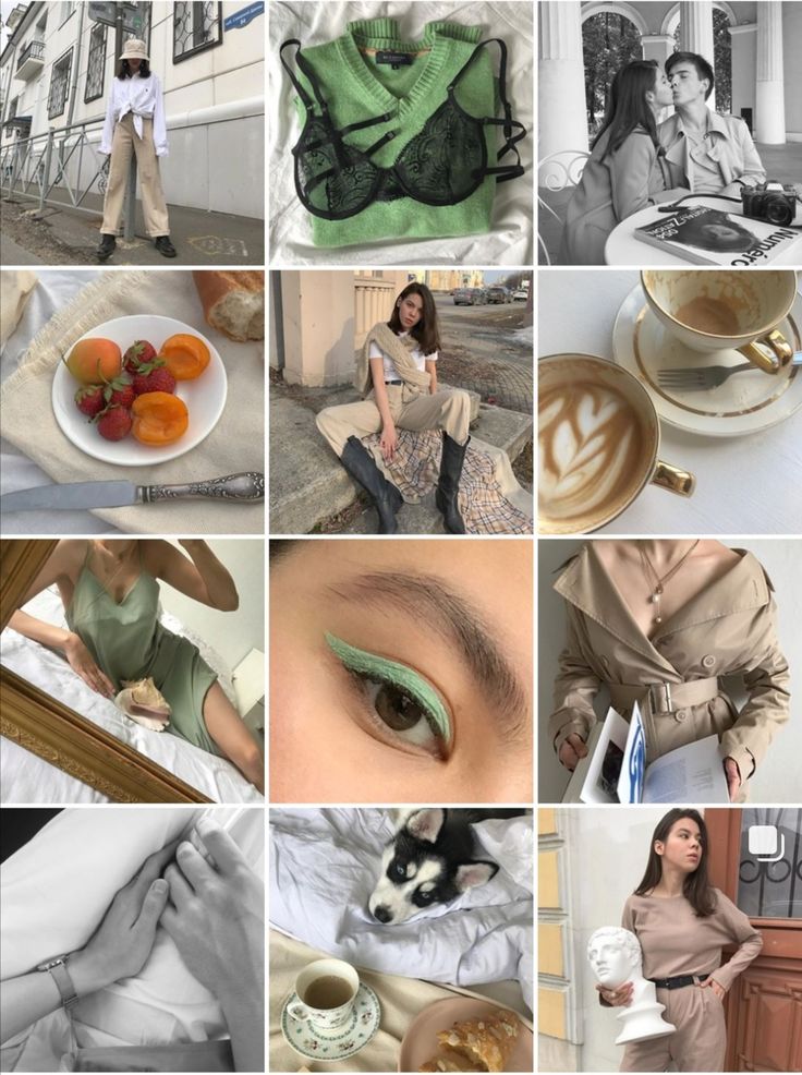
Comparison of online courses
Before you buy any course, compare conditions from different schools - tuition fees, discounts, duration, whether there is an employment program. Find an online course >>
Advertising
More articles on the topic:
Advertising
Create your first design
Now you are a real motion designer. With VistaCreate, you can animate posts in a matter of seconds. Take a template and use simple tools to add wow animation to photos and backgrounds. Ready!
In Animation Designer
Create Instagram posts quickly with the powerful VistaCreate editor.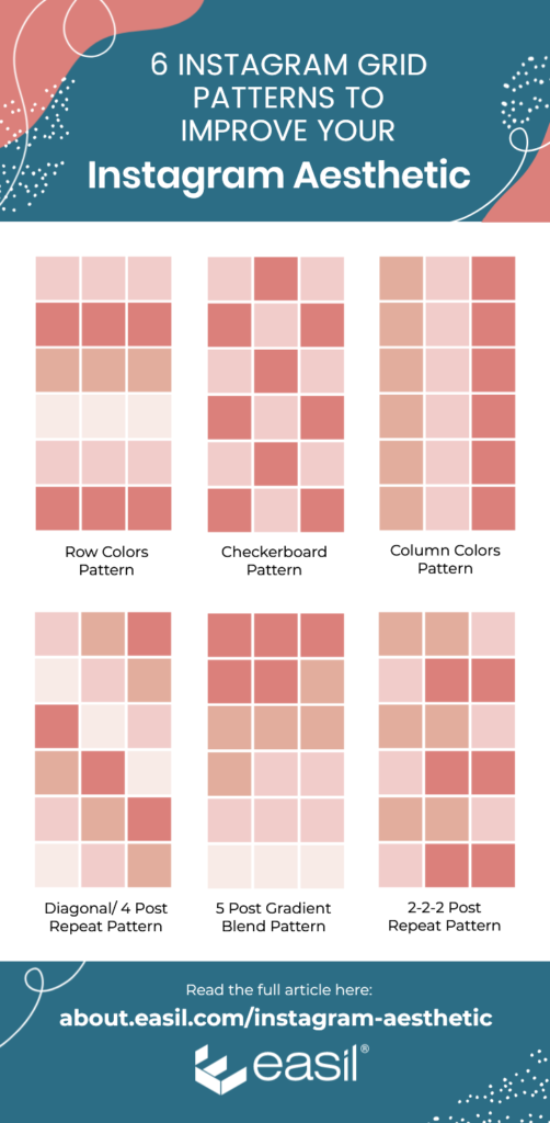 nine0003
Templates
Animation
Download
Edit
Change the size
Objects
Professional Vistacreate designers created an impressive library of 100,000+ Design Shabellons-here everything that is needed for a quick start.
Edit the template
Do you want more energy in your Instagram post? If you need videos and animations, take any of our extensive collection of motion templates and elements. nine0003
Animate
Add your voice and style to the design of the Instagram posts you edit. Upload photos, videos and graphics, and add or remove any element you want.
Go to the editor
Customize the layout for yourself - edit the inscriptions, replace fonts, backgrounds, images and other elements.
Start
Save time by resizing designs with one click.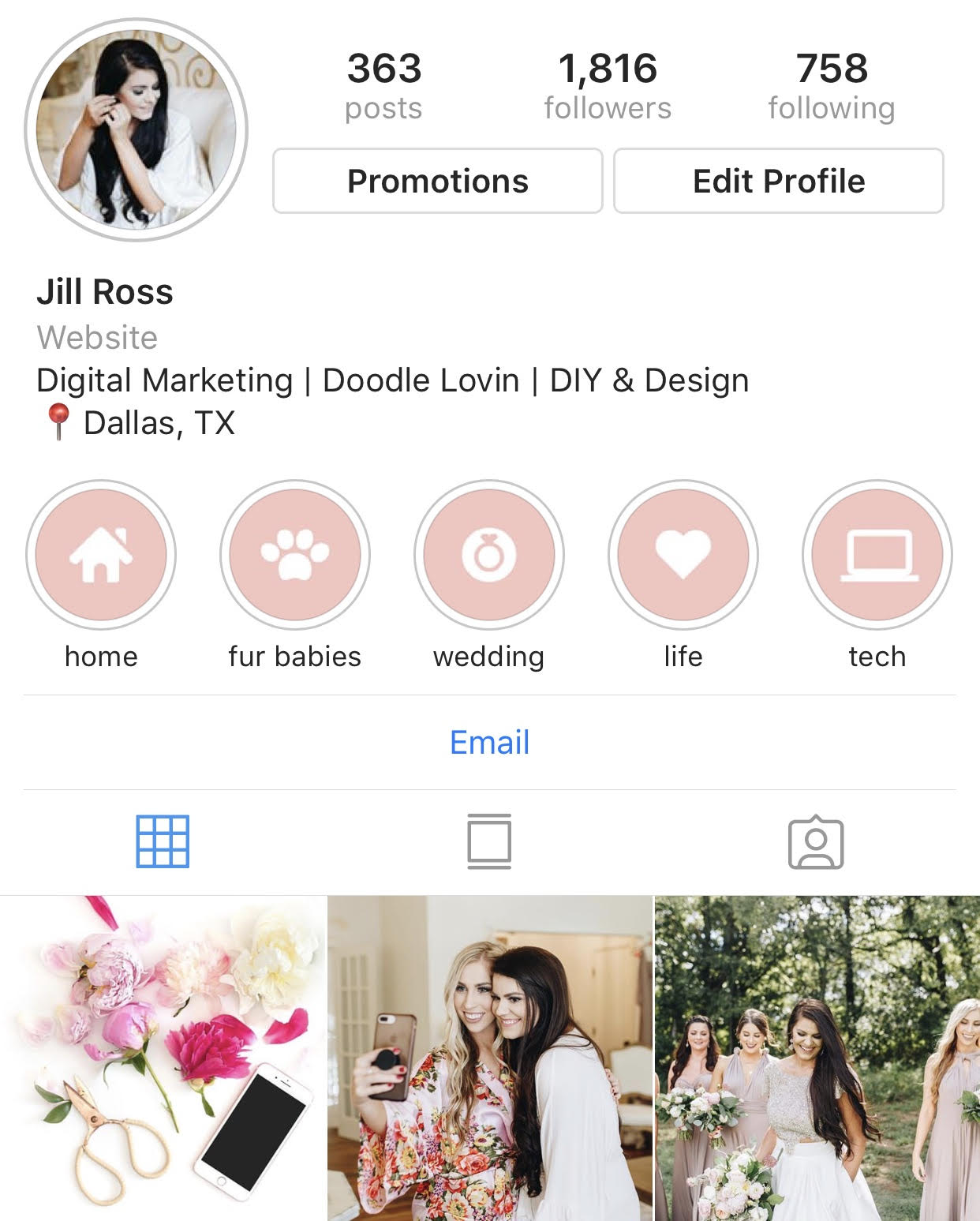 It's easy - choose one of the popular formats or set your own sizes.
Get started
Make your Instagram posts look like pure fun - add animations, illustrations, stickers, icons, frames and more.
See objects
VistaCreate has 1 million free stock photos, vectors, and more to encourage your creativity.
1600+ short videos at your fingertips that are easy to use in any motion format.
More than 680 font styles available in 25 languages. And if that's not enough for you, upload your own!
Access to 70M+ royalty-free photos, videos and vector images
Remove backgrounds from images with one click
Create multiple identity packs with colors, fonts and logos for your brand
Upload your own images and instantly turn them into stickers
Invite up to 10 members to a team account and create designs together
Get unlimited storage for all your files and designs
Access the version history of your project at any time
step 1
nine0002 Select format Switch to Instagram post format to start creating.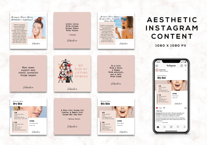
step 2
Select template
Browse through all the Instagram post templates or use the search to dive into our huge collection of templates - and find the right one! nine0003
step 3
Personalize
Add, remove or edit any element to make the design exactly match your mood and style.
step 4
Download and Share
Download the finished post and share it on Instagram directly from the VistaCreate editor.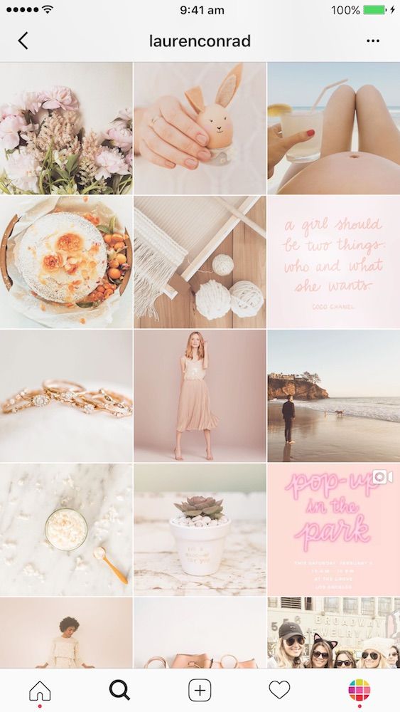
Create your first design
Click on the "Download" button - and the design will be saved in the "Camera Roll" section. Then upload the design to your Instagram account. Our team is already developing a feature that will allow you to post designs to Instagram directly from VistaCreate.
Discover more than 19,000 IG templates and effortlessly create engaging Instagram posts to grow your business. nine0003
Instagram templates
We take care of the design - you are left with pure creativity. Create for fun!
To editor
Using VistaCreate has helped me improve my marketing and content creation skills. My audience has noticed how my social media content has changed and I get a lot of nice comments. nine0003
Read Charlotte's story
If you're a small business owner with a lot of work on your shoulders, you can't do it without a time-saving tool like VistaCreate. Thanks to it, you also don't have to spend large sums to create beautiful designs for your company.
Read Jennifer's story
My visual content now looks much better than anything I've ever thought of. With VistaCreate, creating graphic designs is much faster and easier, so I have more time to run my business.