Feeling like your Instagram feed is in a creative rut? Don’t worry, we’re here to provide you with 8 key tips on how to have a good Instagram feed and take your grid to the next level!
So what is an Instagram grid, anyway? When you’re viewing an Instagram profile on your smartphone, you’ll see nine photos at once. These nine photos make up “the grid”.
On some of your favorite accounts, you may even notice subtle color nuances and styles that make the content POP 💥!
These harmonious grid effects are super effective in getting people to stop scrolling, like their images and even comment!
When you’re thoughtfully trying to make your Instagram look better, by applying a theme or creating a cohesive look, you can create a style all your own.
Ready to learn how to make your Instagram feed look good and rock the grid? Let’s dive in!
There are a few tips and tricks that beautifying your Instagram feed really simple through visually planning your Instagram posts.
Let’s unpack our tips on how to make your Instagram pretty and follow-worthy below!
You’ll want to start thinking about your Instagram feed as a whole entity and not as individual posts.
This is the first small mental change to make to your Instagram posting process in order to implement a feed plan and create a cohesive look.
So what do we mean by think like an editor? Chiefly, you’ll want to take these things into consideration when creating a nice feed on Instagram:
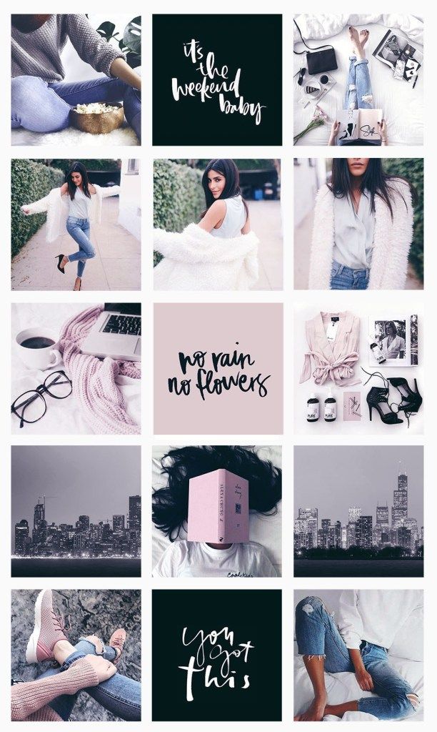
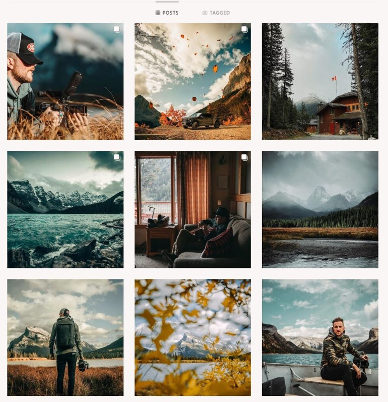
For an example of a themed Instagram grid, this is Stitch Fix’s Instagram account and top nine grid.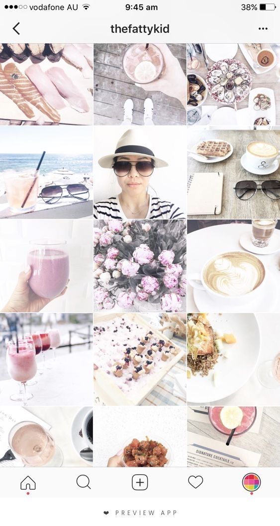
Stitch Fix uses lighter photos with lots of white space.
Their content usually consists of product features and styled videos!
Think of your Instagram feed as a whole, not individual posts, if you want to rock the grid. Click to Tweet
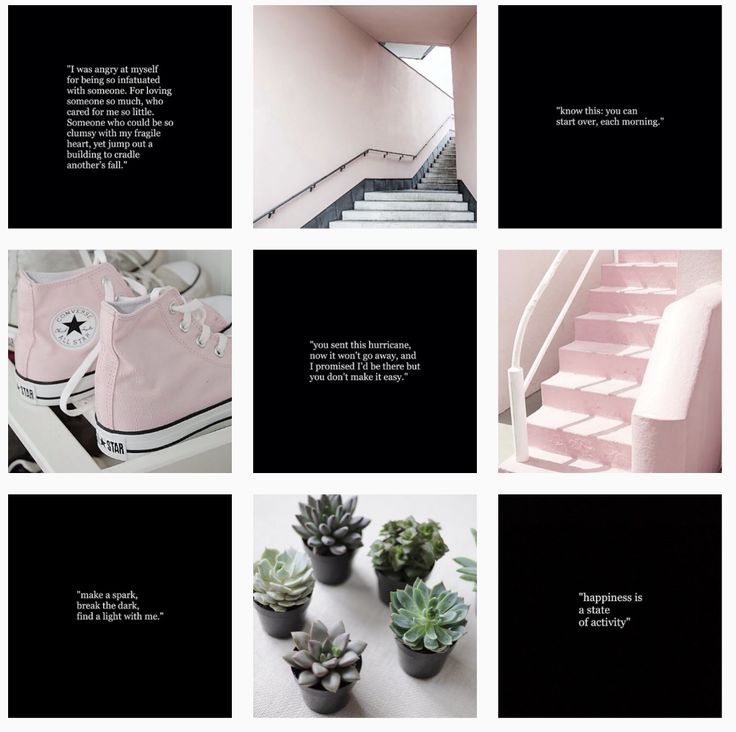
On the other hand,Queenhorsfal rocks a super tight grid and she works in threes.
You can see from this top nine that she has one more post to add that will be blue.
Working in groups of threes, each with their own color story, is another great way to create beautiful content and make your Instagram look better.
Among our tips on how to improve your Instagram, this is one you should definitely apply!
Popular Instagram accounts have a theme and keep it super tight. To make your Instagram look better, you’ll need to set parameters for your feed and stick to it.
For example, take @artsyaffirmations Instagram feed. Their theme is pop culture art, and their content is all about positive affirmations.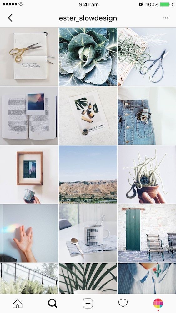
Although they use a suite of bright colors and funky graphics, their theme of positive messages and self-affirmation is present in every post.
If you’re wondering how to make your Instagram feed look good, kiss random spur-of-the-moment content goodbye.
Remember the mission and values behind your account, and make sure they’re present in every post!
Keeping a consistent visual theme is a crucial part of our list of tips on how to improve your Instagram feed.
Popular ways to unify your Instagram feed theme include focusing on color palettes and editing your photos in the same way!
You can create specific style guidelines to follow for each photo! Take @dananicoledesigns feed, for example!
Dana uses two main types of visual content to keep her feed looking unified: actual photos, and stylized graphics!
Let’s take a closer look! Psst… make a mental note to create similar style guidelines to ensure cohesiveness in your feed:
For methods on how to make your Instagram more appealing, look straight to designing your own aesthetic.
Whether you’re a Photoshop or smartphone user, you need to develop the way you want to edit each photo or video.
This creates a cohesive feed no matter where you take your photos.
With Photoshop, you can use Photoshop actions to process each photo with one click.
If you’re not a Photoshop pro yet, you can find many free Photoshop actions out there to save and then tweak them to make the mood and style you’re trying to achieve.
Lightroom is another great way to process photos. You can find Lightroom presets to achieve the same goal as Photoshop actions.
There’s also a Lightroom app for your phone so you can process your photos on the go and still match your style!
VSCO is the most popular app for processing Instagram photos with fashion and lifestyle bloggers.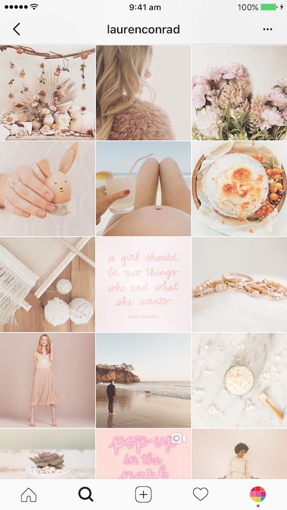
They have it down to a science and, wow, does it show in their amazing Instagram feeds.
If you’re hoping to make your Instagram look better, it doesn’t matter how you choose to take your photos or process them.
What matters is that you consistently use the same filters and settings for each photo to match the aesthetic that you choose!
Our list of tips for how to make your Instagram feed better wouldn’t be complete without this deceptively easy fix: high- quality photos!
High-quality photos aren’t out of your reach, even if you don’t have a fancy DSLR. You just need a steady hand, some patience and an eye for composing your photos in unexpected ways!
Whether you’re taking professional-looking photos with your iPhone, or snapping lifestyle shots with your Android device… nearly every modern SmartPhone device can deliver jaw-dropping photos!
Here are some tips to keep in mind:
For even more easy tips to become a Smartphone photography, pro, tune into our free webinar with stock photo master Kayla Marie Butler of The Ivory Mix!
 Color-coordinate your Instagram feed
Wondering how to make your Instagram pretty? Try adding splashes of color to your visual planning approach!
Adopting an Instagram color theme isn’t as complicated as it sounds.
You can peruse Pinterest and some of your favorite feeds for color inspiration – or even make your own random palette with free apps like Coolors!
Here are some things to keep in mind when choosing colors that work for you:
 Post consistently to Instagram
If you’re racking your brain wondering how to make your Instagram feed better, the answer may be simpler than you think. It’s consistency!
Whether you opt to post once per day, or only want to commit to three posts a week max, it’s important that you show up and post!
Why?
When you commit to posting consistently, you’re teaching your followers what to expect from you.
With regular posting and interaction, your followers will grow to expect your content in their feed and even happily wait for your latest and greatest post!
Here’s the key tip on how to make your Instagram better visually: Planning.
The best Instagram feeds are ones that have been carefully and thoughtfully curated and prepared.
By planning your feed, you’ll be able to see how your photos look next to each other and adjust where needed in order to achieve the cohesive look and feel of your dreams.
Once you batch process your photos, you can plan out your grid in Tailwind with the Auto-Scheduler tool to schedule them at the optimal times using our Smart Scheduling tool for Instagram! Just:
Once you have them scheduled, when you use Auto Scheduler, those posts will go out at the best time for your Instagram audience.
Now there’s nothing left to do but go out there and create those ‘Gram-able moments. Anyone know a coffee shop that does latte art? ☕️#DoItForTheGram
Have any questions about how to use Tailwind for Instagram or how to make your feed pretty? Let’s hear them in the comments below!
One question I get asked often is how to design a beautiful, cohesive Instagram feed. So I'm here to share five applicable steps that you can start applying today in order to design a gorgeous, professional feed.
If you're not clear on the overall look and feel of your brand, it's a lot harder to design a cohesive Instagram feed. Without a solid vision, chances are you'll end up feeling scattered. Committing to a chosen set of fonts, colors and an overall brand mood is important for your business in order to have a professional, consistent look across all platforms, including Instagram.
One of my favorite tips for establishing your brand mood, which I teach inside my branding course, is to choose a set of "mood words".
Here's what to do:
Ask yourself - how do you want people to feel when they interact with your brand?
Do you want them to feel empowered? Soothed? Inspired? How do you want people to feel when they land on your website or Instagram feed? Choosing a few descriptive words is a great way to guide your overall brand appearance and help you choose visuals that reflect a consistent vibe.
If you need help discovering the perfect look for your business, that's exactly what I teach in my quick start course - Branding Your Wellness Business.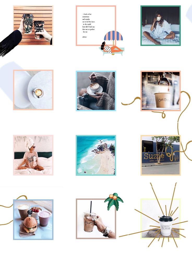 In the course, I take you step-by-step through the entire branding process, starting from the very foundation to connect your visual appearance to the heart and soul of your business.
Are you planning your photo layout ahead of time to make sure your photos look good together? Trying to imagine how your photos will look when collaged into your feed can be challenging.
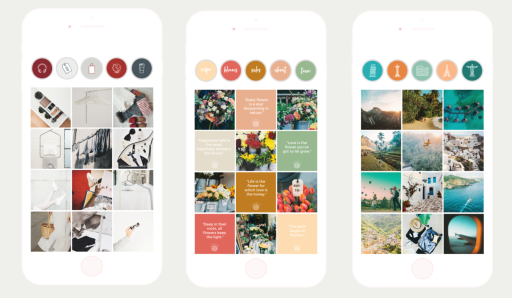
Choosing a design like one of these 5 popular Instagram grid layouts can help.
Tapping into an app like Plann, which allows you to see your existing feed and arrange future posts can also be so helpful for photo planning.
Plann has a free account for you to test out and I love their easy drag-and-drop system.
If you prefer to organize your posts from your computer, Planoly is an online scheduling tool that will also allow you to see your current feed while arranging future posts.
 Choose Your Post Topics
 Choosing specific topics to post about regularly can help you stay on track to weave together a cohesive story throughout your feed. It also helps your viewers to know what to expect when they follow you. How are you inspiring and educating your viewers? What do they want to see? What do they want to learn about? Which values do you share that you can connect on and post about regularly?
This easy exercise will help you stay cohesive on Instagram
Here's what to do:
Pick five to nine topics and stick to those so that you get cohesive with your post content. Then, choose images to reflect those topics. Sticking on-theme will help your followers to know what to expect when they follow you, and will keep your feed cohesive.
I see so many feeds that are super duper cluttered.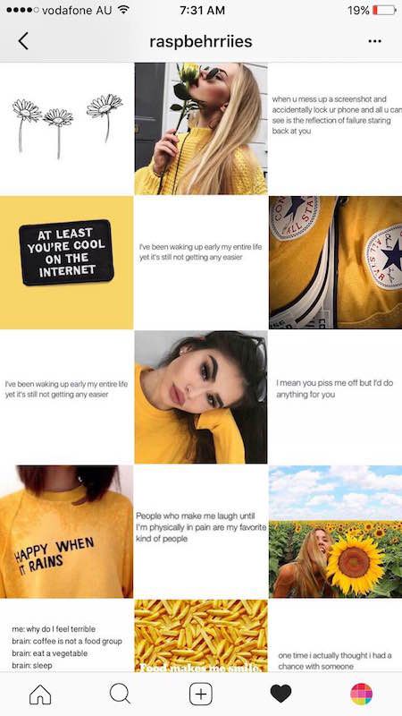 When people land on those feeds, they're like, whoa - it's really hard to actually pay attention to each individual image. When people feel overwhelmed, they're likely to bounce off your feed and onto something that feels more soothing and appealing. It's important to create space to allow room for your photos (and viewers) to breathe. And at the same time, you want to create balance so that your feed is soothing and attractive.
Here's an easy way to create space:
Every few photos share one image that has lots of white space. "White space", simply means empty or blank space around your subject. This could be, for instance a quote or fun word set on a white background. The blank space creates breathing room and allows people to focus more on the other images.
Here are some tips for designing your own Instagram quotes.
To create Balance:
Make sure you space out any similar images. For instance, make sure quotes, or any photos with the same subject, color or background aren't stacked on top of each other, or posted in a cluster. Sprinkle them throughout your feed.
A good rule of thumb is to space out similar posts with 1, 3, or 4 photos in between.
Beautiful photos are simply essential to creating a beautiful feed. If you're not a naturally amazing photographer or you don't have the time to invest in photo courses to help boost your skill, you can tap into stock photos.
Using quality photos which are natural and relatable (and not overly edited) like the ones inside this photo membership boosts the overall quality of your feed, helps your feed to easily look beautiful and cohesive, and still allows you to weave in your own snapshots while maintaining a quality look.
Here's what to do:
Check out these 3 tips for how to blend your own photos with stock images in order to give your feed that beautiful, professional boost that will help you stand out to your dream clients.
And don't forget to sign up below to receive a fresh new photo every month - absolutely FREE - as my gift to you.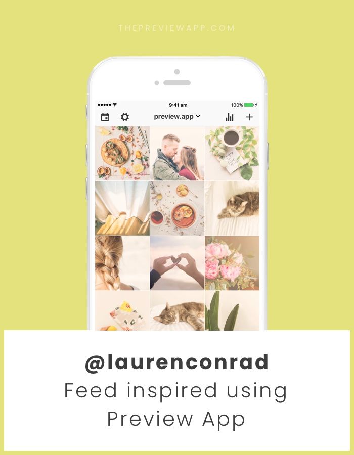
Please enter your name.
I agree to receive occasional offers and tips.
Please check the required field.
Download Now
Something went wrong. Please check your entries and try again.
June 25, 2022
Instagram is a great platform for promotion. And here a lot depends on what impression the profile makes: what is the general mood, color palette and combination of photos. We have put together a few tips to help you make a beautiful ribbon and develop a special brand aesthetic.
A single style is those details that unite the entire visual. For example, it can be a photo style - dark deep, airy light photos. Or the paraphernalia of the frame - rustic, vintage, kinfolk and others. Even some common character or object. However, in search of your own style, it is not at all necessary to drive yourself into rigid frames and lock yourself in one direction. You can combine completely different photos if you follow a few rules. nine0003
The account itself does not affect sales. For visitors to turn into potential customers, they need to be impressed. Think about what emotions you want to evoke in subscribers? The style of your feed and the choice of photos will depend on this.
For example, if you are selling home decor, a hygge aesthetic would be appropriate: photographs of candles and cozy blankets, warm colors and soft shadows in processing. And for premium leather goods, you can try shooting with gloomy light and deep hues - if you place all the accents correctly, such shots will be filled with a special atmosphere. nine0003
Accounts of photographers can also be different: on the left - conciseness and rigor, on the right - brightness and audacity. For example, photos of @neekmason and @kavalerchikyana are used
When one color is used in the profile - everything is light and airy or vice versa dark - it looks very stylish and beautiful. But after a while, when you see the fifth, tenth or hundredth such photo, you stop seeing the difference. Therefore, we recommend leaving the stereotype that it is enough to choose one filter for all photos in the past. nine0003
It's much better not to lock up your creativity in some kind of filter, but simply choose your favorite shades of base colors and make sure that they are regularly in photographs. If you are shooting portraits, ensure that the skin is the same color throughout. If you publish landscapes, the shades of the sky and greenery should also be the same. Then the shots taken in different conditions will remain natural and look harmonious.
On the left is an example of a tape in which each photo is very beautiful individually, but together they look very similar. And on the right is a tape in which the frames are very different, but thanks to the primary colors that are repeated from frame to frame, the tape looks harmonious. For example, photos of @meghan_faulk and @prostokrasivo. wear are used
You can combine dark and light, warm and cold shots in one profile - just make smooth transitions. For example, if you had three light shots and now you want to post a dark photo, post a light photo with dark accents first. Then it turns out that some shades seem to flow into others. Such a “gradient” looks beautiful in the feed and will help to fit photos of your customers into it.
Instagram Kinfolk is a great example of a harmonious feed without a single filter. This is achieved by smooth transitions and playing with color. Photos used as an example @kinfolk
Color adds zest to photos and encourages you to come in and see the details. This is due to the fact that our eye easily picks up bright spots, especially when looking at photos from the phone.
Therefore, for profiles in neutral tones, such as gray or beige, we recommend adding bright details so that the tape does not look boring.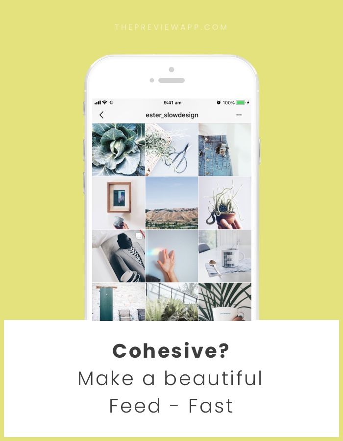 And if your frames are bright and colorful, on the contrary, it is better to add calm objects - this way there will be no extra variegation when looking at the feed. nine0003
Color attracts the eye, the main thing is to use it in doses. For example, on a neutral background - white, black, beige. Photographs @la_maison.n and @gkstories
The feed looks more harmonious when photos with different scales are published side by side. For example, if you have an online clothing store, you can first post a photo of a girl in a full-length dress, then a waist-length portrait, and then a large photo with a dress back or a beautiful clasp. So there will be no feeling that you are repeating yourself. nine0003
The alternation of plans helps to make the tape varied and lively. The characters in the photographs change, the surrounding world changes - then the tape looks eventful.
Cozymoss Instagram photos at different scales. This is another reason why the goats in the profile are so lively and active. @cozymoss photos used as an example
Use apps to plan your Instagram content in advance. They are convenient to upload photos, combine them and choose the perfect sequence. nine0003
We recommend trying Unum, Inpreview or Garny. To plan one account, a free version of any of them is enough, but if you maintain several profiles, Unum will suit you - there you can create several projects at once for free.
Download Unum for iOS →
Download Unum for Android →
Download Inpreview for iOS →
Download Garny for Android →
These simple tips will help you compose a beautiful and harmonious feed from various photos. At the same time, you don’t have to drive yourself into the framework of one style and limit yourself to one filter. If the article was useful to you, put ♥ and share your Instagram tricks in the comments. nine0003
To think that the same template for each photo will automatically make your Instagram feed beautiful is at least naive. After all, it’s 2020 in the yard 🙂 Instead, we suggest taking a closer look at the beautiful accounts of bloggers and brands, and using their example to understand: what really makes the feed beautiful. nine0003
Alternation should not be frank and too orderly, but should bring a nice looking order to the tape.
Examples of alternation:
etc.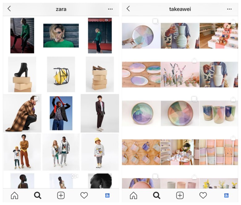
Choose 2-4 colors that will be in the photographs. For example, a combination of black, white, beige and brown is now popular.
To choose colors for your account, look at your space or your products: what colors do you see? Start from this, everything is simple 🙂 If the walls of your salon are white, the gloves of the masters are blue, the logo is pink, and the inscriptions on the bottles are black, then here is the recipe: take these colors and use them in the photo. For example, buy blue and pink flowers for backgrounds, use Americano coffee for layouts (it looks almost black), and purchase books and magazines in the matching color as props. nine0003
If props and storytelling are bad for a photo, don't do it. Use a solid, neutral background, such as white, against which your products will be photographed. It can be a wall or a drawing paper, a cyclorome in a studio or a light box. To add variety, you can sometimes add 1-2 elements: fabric as a lining for goods, a live flower, fruits, etc.
Photographs often look out of harmony because of the light. In one photo it is warm, in others it is cold, in one it is natural, in others it is from Ilyich's light bulb. Avoid it. nine0003
Assess your photo opportunities and stick to one solution. For example, you have a panoramic window in your showroom and from 12:00 to 14:00 soft light pours out of it, without the scorching sun. Use this window as a light source - position yourself in front of it and shoot content for a couple of weeks in advance.
Without this item, none of the previous ones will work 100%, unfortunately. To make the processing look good and make the profile harmonious, follow these rules:
We advise you to purchase ready-made presets or order the development of an individual preset for the lightroom application.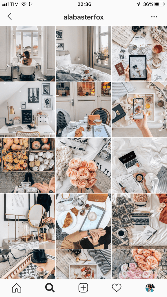 It is this application that bloggers and brands use to create beautiful, up-to-date processing. Ready-made filters in other applications, unfortunately, rarely allow you to process photos really beautifully. nine0003
Another plus for lightroom is that it's easy enough to tweak the filter if needed. For example, when we create custom presets, we give instructions to our customers on how to slightly change the filter if suddenly the original photo turns out to be too bright or dark, or it has unnecessary bright accents.
Let's take a look at some examples of a beautiful ribbon again and see which of these 5 techniques are used by their creators
What tricks are used:
2.