From its early days, Facebook has been one of the most popular social media websites on the web and continues to be so today with over 2.45 billion monthly active users. Owing to its robust and interactive layout Facebook has managed to amass the highest number of social media users and has about 1.62 billion daily active users. Although since the initial days of its conception, this number has only gone uphill, recent days have seen a decline in the charts. This can be attributed to the change in its layout, which has not been very well received by its users.
Every new design of a software or an application tends to improve on the previous version in both functionality and visual appeal; the new Facebook update however seems to have upset its users, with most of its user base longing for the older version.
The new layout of Facebook comes with an option of enabling dark mode, separate group tab interface, along with a Facebook Messenger for desktop, which does not require the users to go to their Facebook profile, instead simply access the same features available on the mobile version, through a desktop application. The 3-dimensional photo option allows users to publish immersive 3-dimensional photos through the portrait mode of the camera while the quiet mode allows the user to mute all the notifications, in an attempt to reduce screen-time.
There are a lot of differences between the classic layout of the Facebook page and the newer version. One such example is the ID numbers, which have somewhat different naming conventions in both versions, in case you want to find a specific profile through the source code. In the classic design, the profile, page, as well as location ID is named as entity id, while that in the new version profile ID is termed as user ID, page as page ID, and event as event ID.
Finding a previous post is also not so easy in the new version as it is in the classic version since the new version only offers to search by year, while the classic version allowed the users to sort and find posts not by the exact date, but by the month, making it a lot less tedious. In the classic design, you can find when an individual joined a group, simply by hovering over the post; furthermore, the classic version also allows you to view the calendar in case a particular group has come up with an event, while both of these options aren't available in the updated version.
Although some features that the classic design offers are better and welcomed by users, man features of the new layout also stand out. One such example is the 'Groups' tab, in which the new design offers you more filters including a filter for the city. Moreover, you can find friends and followers in the new design with ease owing to an additional search bar as well as posts within a group, with the help of the 'magnifying glass icon' available. Also, the new design comes in handy when you wish to search posts pertaining to a given topic, owing to the search option within the profile; although searching in the classic version would be easier in case you wish to search between dates.
Facebook Marketing Strategies: Increase Social Media Engagement
For a business to set up a social media presence it needs to market on famouswebsites. Facebook is the best choice to start marketing on social media. Ithelps businesses to generate leads and boost sales in any niche. On average morethan 2.8 Billion people use Facebook every single day. Some may …
StartupTalkyAbhishek Gupta
Regardless of all the new updates that Facebook has incorporated in its latest design, users are not quite satisfied and want to revert back to the previous version. On that note, here's how to revert back to old Facebook 2020 interface. Here are some simple steps you can follow, if you are one of the people longing for the older version or Facebook old design, to go back to the version.
Facebook also offers to revert back to the newer version, if the older version doesn't quite work with you and you prefer the new layout. All you will need to do is select the option that says, "Switch to new Facebook" from the downward-facing arrow on the top right corner. This allows you to go back to the new layout even after you have switched to the older version.This is how to switch to classic Facebook 2021. Hope it helps you out!
There has been an update which has removed this option but this video explains 2 other ways you can revert back to the old Fb.
Steps on the switch to classic design on Facebook:

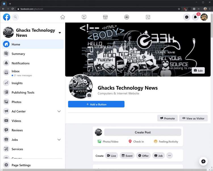
Facebook's new 2020 design features more white space and is easier to read on a desktop.
Facebook has a secret "dark mode" that makes the app gentler on your eyes at night by changing all the white spaces to black.
By Ben Stegner
Share Tweet Share Share Share Email
Hate the new Facebook design? Here's a simple way to get the old layout back in minutes.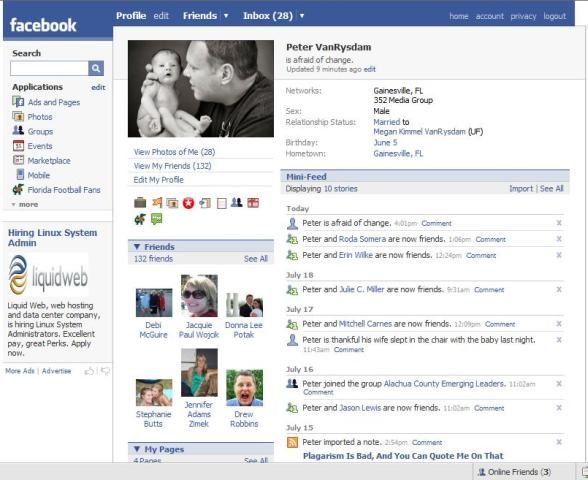
If you spend a lot of time on a certain social media site, it's jarring to deal with a change in layout. This happens every so often with Facebook, leaving many users upset every time.
In September 2020, Facebook made its latest redesign mandatory, meaning you can't switch back to the classic layout any more. At least not officially. However, using a workaround, it's still possible to go back to the old Facebook. And in this article, we'll show you how.
Until September, Facebook gave you a choice in the Settings menu whether you wanted to use the classic layout or the modern look. However, this is no longer an option---everyone is on the latest look, with no built-in option to change.
Thankfully, clever third-party developers have come to the rescue. Matt Krause, the developer behind the excellent Social Fixer extension, created a new browser extension called Old Layout. This lets you keep using Facebook's old look with a simple trick.
The extension doesn't perform any heavy programming changes. Instead, it simply fools Facebook into thinking that you're using an old browser that doesn't work with the new layout. Facebook then reverts back to the classic design, which you can enjoy without configuring anything.
Simply install Old Layout for your browser, then visit Facebook, and you'll see the familiar interface. If you have Facebook open when you install it, you'll need to reload the page for the change to take effect.
Click the extension's icon in your browser's menu bar to switch between the old and new layouts without disabling the extension.
The Old Layout extension is available for Chrome, Firefox, Opera, and the new Microsoft Edge. While there's no extension for Safari, you can use a workaround detailed on the site to get the same effect.
Download: Old Layout for Chrome| Edge | Firefox | Opera (Free)
So what are the differences between the old and new Facebook layouts that are causing so much of a fuss?
The new Facebook layout is more streamlined.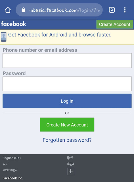 Compared to the old one, it makes groups, videos, and Facebook Marketplace more prominent on the top bar. It also has native support for dark mode and uses more of the screen's width.
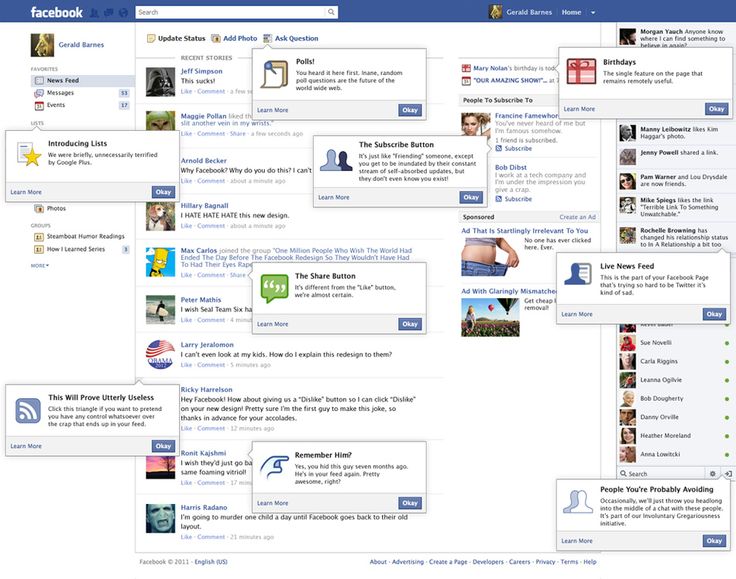
The old layout, by contrast, uses smaller text and icons. The options menu at the top-right is a little different, and the search bar is slightly more prominent.
Technically, there's nothing wrong with either one---your attachment to the old layout is probably from muscle memory of knowing where everything is. Especially if you use Facebook a lot.
As mentioned, Old Layout works by telling Facebook that you're using an old browser to force the classic look. However, this has some downsides.
You may see a notice at the top of Facebook that you're using an old browser. Even though your browser is current, Facebook doesn't register this due to the extension. You'll have to live with this as part of sticking with the old layout.
Similarly, some features may not work on Facebook when you're using the old layout. Since Facebook thinks you're using an unsupported browser, it may prevent you from playing some games or using newer features. You'll need to switch back to the new layout to access this content.
Finally, keep in mind that this isn't an official solution and could break at any time. If Facebook decides to stop supporting the "old browser" that the extension pretends to be, there's not much the developer can do. This will likely work for a limited time only.
If you find this workaround interesting, you can learn how to change your browser's user agent to do this yourself on other websites, too.
Old Layout is an easy option for switching back to Facebook's classic layout. It's good enough for now, and should hold you over until Facebook changes this to force everyone to use the new look no matter what.
Image Credit: Alexey Boldin/Shutterstock
News
Volodymyr Skripin Volodymyr Skripin
The mobile version of the Chrome browser on Android has been updated once again - the tab grouping feature that appeared in the desktop version last year has been added, and the vertical list with previews of open pages has been replaced by a new interface in the form of a grid for easier switching or closing. The grouping feature and the new interface appeared in the recent release of Chrome version 88, but then only a few users received them, and now it seems to have begun a full-fledged distribution.
The new Chrome interface on Android with a grid view of open pages is identical to the existing Google browser interface on iOS. About six tabs are displayed on the screen at the same time, you can swipe them left or right to close them. A small switch at the top of the screen gives access to tabs in incognito mode. Google first showed this interface back in 2019.
Tab grouping on mobile Chrome basically works the same as it does on desktop, providing a more convenient way to organize your tabs and manage multiple sites at the same time.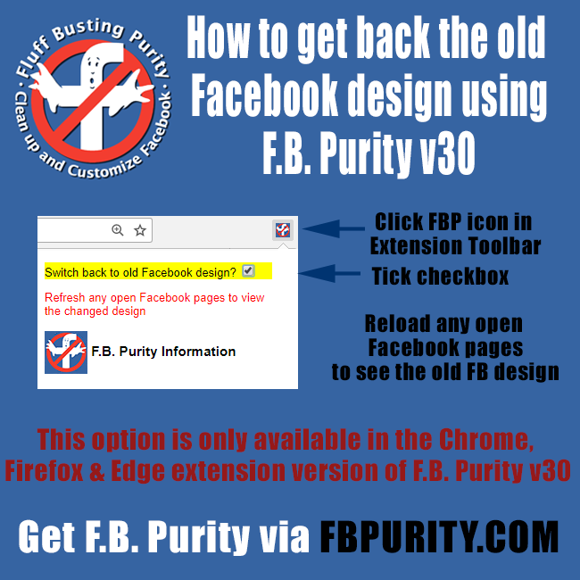 On Android, there are three ways to group tabs: the first and most intuitive is by dragging one tab onto another right in the interface, the second and less obvious is long-pressing (on the desired link) will bring up a context menu where, among other things, you can select "Open in new tab in the group”, and the third is to use the corresponding option of the main menu (the button with a vertical ellipsis in the upper right corner). There is also a switch for quickly switching between pages open in a group - it can be found at the bottom of the screen when viewing groups of tabs.
Course
Frontend resale
Earn $1800 now in two weeks and study at the open hour
REGISTER!
And while Google started rolling out the corresponding automatic update last week, many people don't seem to have received it yet. Those who wish can enable the grouping function and the new interface manually - the corresponding switches (Tab Grid Layout, Tab Groups, Tab Groups Continuation and Tab Groups UI options) are located in the service settings section at chrome://flags. By the way, you can also turn off the new interface there to return to the old vertical list with previews of open pages. So far, Google provides such an opportunity.
Chrome, Chrome 88, Chrome Canary, Chrome on Android, Chromium, Google, Google Chrome, Browsers, Updates, Software, Software
The new Facebook interface has become mandatory since September 1, 2020. Facebook used to allow you to return to the old version, but now it doesn't. But there are workarounds by which you can return the old version of the design (design).
On a computer (in the full version of the Facebook site), you can return the old version of the interface using one of the browser extensions. These extensions are made by enthusiasts, Facebook has nothing to do with them.
The principle of operation of such extensions is that they deceive Facebook, pretending that you are accessing through an old version of the browser. Therefore, Facebook is forced to show the old design, which still exists (but it can no longer be officially included), since so many people on the planet use old browsers, and the new design does not work there.
Facebook makes it difficult for browser extensions that return the old interface to work, so they may work intermittently or stop working altogether. Extension developers try to fix issues as they arise, so it's a good idea to stay tuned for updates.
If there comes a time when the old version of the design cannot be returned by any means, there will be extensions that change the new interface so that it looks like the familiar old one.
Bonus from the same author - Social Fixer extension that can remove unnecessary stuff from the Facebook site. Flexibly configurable.
 Extension F.B. Purity
 Converting the new Facebook interface to the old one is one of its functions, there are others. You can hide annoying elements and posts for specified keywords, turn off autoplay of videos, receive notifications when you are removed from friends, and more.
After installing the extension, its button will appear in the browser (usually to the right of the address bar). Click on it, check the box Switch back to old Facebook design, then open the Facebook site or refresh (reload) it if it is already open.
This option is only available in the Chrome, Firefox and Edge versions of the extension, although Safari and Opera versions of the extension also exist.
If any extension was useful to you, thank its authors.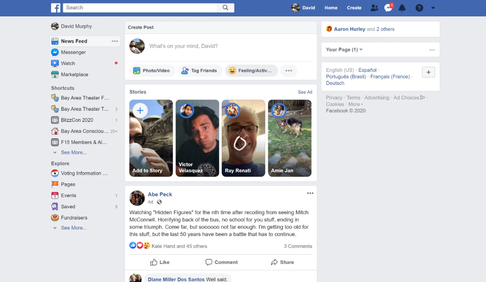 On extension sites, there are buttons or links for this (for example, Donate ) to make a money transfer. The amount is at your discretion.
Android only: You can try manually installing one of the older versions of the mobile app, but not all features may work. Before installation, you need to uninstall the new version, if it is installed.
You might also like Facebook Lite, which is a lighter version of the official app that consumes less data and looks different.
Another option is the mobile version of the Facebook website through a browser on your phone (we recommend Chrome). Just open your browser, type in the address fb.com and enter your page with your login and password.
Like any other site, Facebook changes over time. If the new design is uncomfortable for you personally, this does not mean that Facebook made a mistake.