OK, people, we spent most of our 2020 scrolling through G.O.R.G.E.O.U.S. Instagram grids. I tried to have one, my best friend tried to have one, even my personal-finance-obsessed teammate is planning to have one.
via GIPHY
Why am I still writing about grids then? 2020 was the year of experiments. We got excited and transitioned from one type of grid to another, used too many colors, or simply gave up when maintaining our grid became way too complicated.
2021 will be about mastering our grids. For that, we need all the information in one single place. And this is why I’m writing this.
From colors and formats to structure, examples, ideas, and tools, here’s the full guide you can check whenever you feel like your grid needs improvement. If you’re an Instagram grid novice, this guide will take you from how to post a grid on Instagram to how to automate your Instagram planning. If a year ago we were cool just for having a planned grid, now we need to innovate to stand out.
The Insta almighties decided the most appealing format is square. Square logo, square pictures, square ads. All this squareness was bound to lead to a grid format for each profile.
But then, somebody saw the big picture.
Hats off to the one who decided you can play with the entire grid and create art. From there, it was just a matter of time until people and brands jumped on the planned Instagram grids bandwagon and created puzzles, quotes, tiles, and so on.
The possibilities to create Instagram grid posts are limitless. Actually, the only limit is your imagination. And maybe your design skills. Having an aesthetic Instagram grid layout boosts engagement, which leads to more profile views and followers. Who wouldn’t want more followers?
Yes, creating a grid takes a bit of effort and time at first, but if built well and with the right technology, it can be a lot simpler than you might think.
Now, you have to pay attention to what you’re going to post next, so you don’t break the flow. And so, almost everybody is publishing three posts at a time in a specific order so the design remains sleek. Don’t worry, all this effort pays off, especially whenever you need to create a social media presentation to show off your work and impress clients or leads.
TL;DR: you now have to design the grid before you even think about individual pictures or posts. Fortunately, it’s not so hard to mock Instagram posts anymore.
As you’re reading this, probably a part of you is imagining how your profile would look with a new Instagram grid, what colors it’d have, image positioning, etc. As it so happens, you can actually preview your grid for Instagram using social media tools *cough cough Planable*; so don’t leave those amazing Instagram grid ideas of yours behind.
via GIPHY
Look, you’re about to scroll through some wonderful, beautiful, Instagram grids.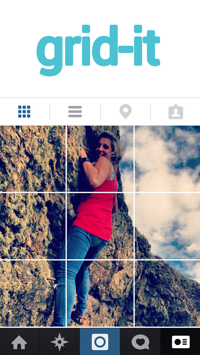 And I don’t want your first reaction to be “ain’t nobody got time for that”. I want to put your mind at ease that Instagram layout planning can be quite easy and fast. What am I hinting at? Well, Planable. I won’t take you through a long, boring journey. I’ll just lay it out for you with 3 beautiful steps:
Oh, and before I forget, yes you can schedule your Instagram posts through Planable too.
Here’s what Kumba Dauda, Freelance Social Media Manager, Blogger and Influencer Outreach Specialist, thinks about all this Instagram thing:
If Instagram had a spirit animal, it would be a chameleon.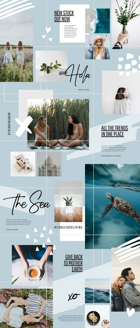 It is the one platform that is constantly learning to adjust to what’s trending.
Running Wholehearted Social, a Social Media Agency I have worked with a real variety of influencers and brands where we have experimented with so many different ideas based on current and forecasted trends as to ‘stay relevant’ on the gram.
One trend that seems to always be underlying within Instagram is the classic Instagram grid. I believe this was born out of the idea that the trend on Instagram at one point was a ‘perfect’ feed which had to cater to a certain aesthetic. With a grid or puzzle layout as it’s also called, users can create that cohesive look as well as bulk up on a ton of content that could be scheduled which is more time-efficient. Instagram grids are particularly useful for those who own businesses and want a cohesive brand image to be projected within their page to make that initial great impression. Here are a few examples of Instagram grids that we have created:
From experience using this type of layout here is what I would say are the overall pros and cons of adopting an Instagram grid layout.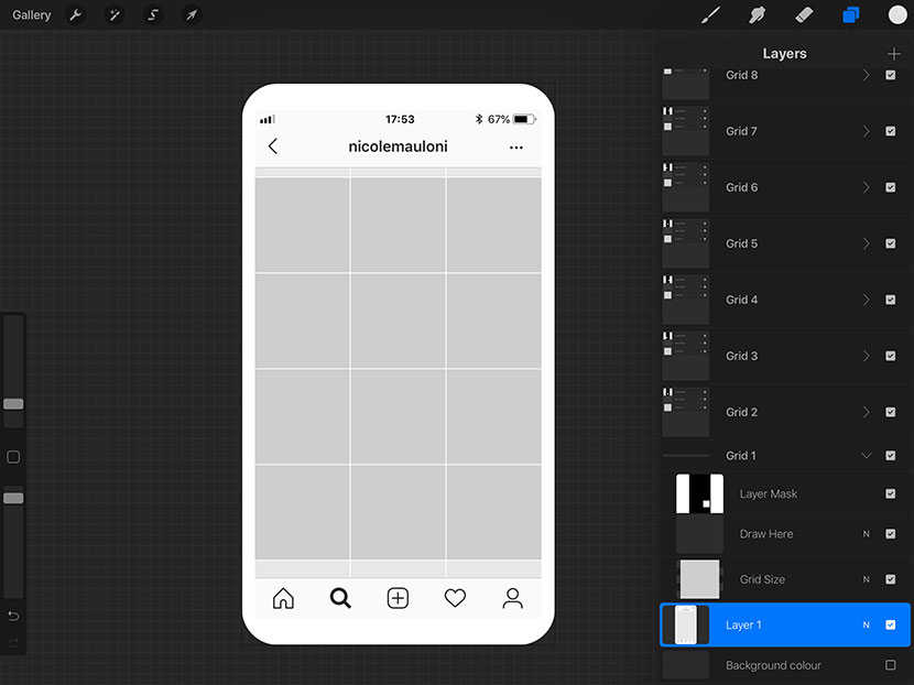
Pros
Cons
Deciding you want to plan your grid is just the tip of the iceberg.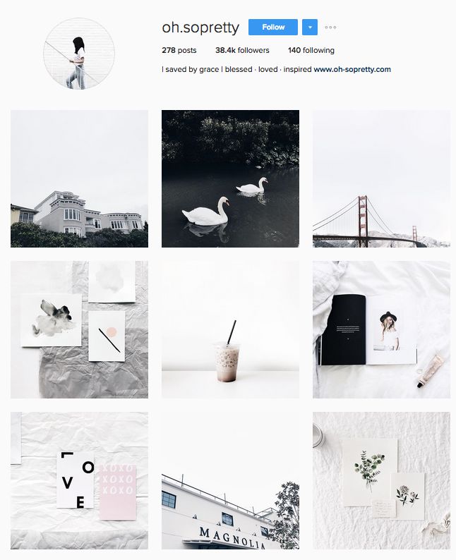 Deciding what type of grid you want is going to take hours of research, one night to sleep on it, three friends to advise, and five stakeholders to approve. But let’s start by scrolling through some profiles and see where inspiration will take us.
The checkerboard Instagram grid is led by background colors. Most accounts using this type of grid stick to two solid colors or non-colors and alternate them to create the checkerboard impression. But that’s only the beginning.
What’s happening in the foreground is more important to your brand. Usually, checkers are used for two scenarios, depending on your specific activity. If you’re inspiring through words, you can easily use only quotes and use the checkers to visually diversify your content.
If your content is a mix of words and images, you have the option to ditch one of the solid colors and only use the other one for quotes.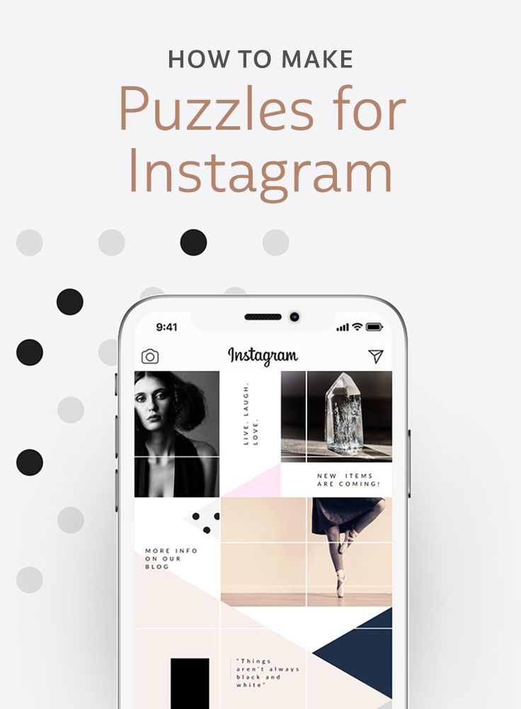 Alternate them with other images.
And of course, there’s a third option where you use pictures as backgrounds alternating with a solid color to create the checkerboard feeling. Use this Instagram photo grid everytime you want to tell a story or showcase your photography skills.
If you’re not into quotes that much, but still have something to express with words, you can use the single line of text type of grid. This allows you to tip the balance to more visual content, having a ration of 2:1 (2 photos, 1 quote).
This grid is also an excellent choice if you don’t have much time to play with backgrounds and strategies, as you’ll most probably stick to the same font and background color for every quote. And this way, you can easily include videos in your posting plan without struggling with the background. An elegant approach to a well-thought grid, the 2:1 text tiles grid can be used by any brand or person for inspiration, education, or entertainment.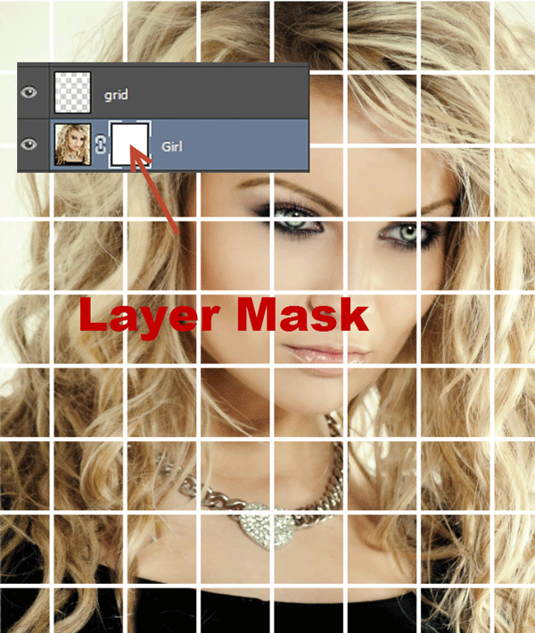 So which one are you?
Do you ever feel like your grid looks OK, but it still needs to be tidied up? Put a twist on your grid using borders — white, black or whatever color strikes your fancy. And you can juggle with photo formats too, either in square or rectangle format. The border grid will take your profile to a vintage chic kinda level.
Kind of like printed photos — which we probably imagine lined up in an important spot in our house, with frames to match the room design. Photos are that important for us.
So why not bring the frames to the digital world where we share the most beautiful and interesting moments of our lives? Borders are a great way to put the focus on each picture without needing a strong strategy for how the grid will look like and save the time and energy focusing on the actual photos you’re posting.
And here’s where things get complicated.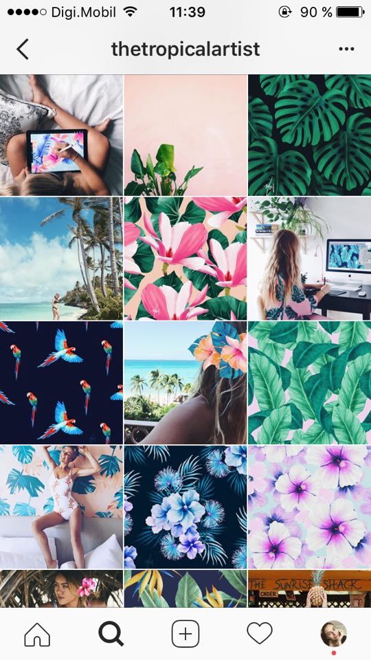 Because yes, I took a chance and showed you the simple-to-make but not-so-wow ones first. They’re a great start if you’re not an editing expert. I’m not either.
But what truly turned the Instagram world upside down are some crazy grid combinations that make me look through the green glasses. Why didn’t I think of it first? But enough with this jealousy, this is the diagonal grid.
Looks complicated? Well, it is not that hard to maintain this consistency. All you have to do is pick one kind of photo or video and one color. Then drag them to form a diagonal.
The tricky part? You have to plan your grid beforehand because you’ll constantly need magnificent trios of photos with the same content and color.
Example time. Look how Naomi created a diagonal grid using photos of sweets with a brown accent:
This creative layout makes me think of some sort of reinvented comic book.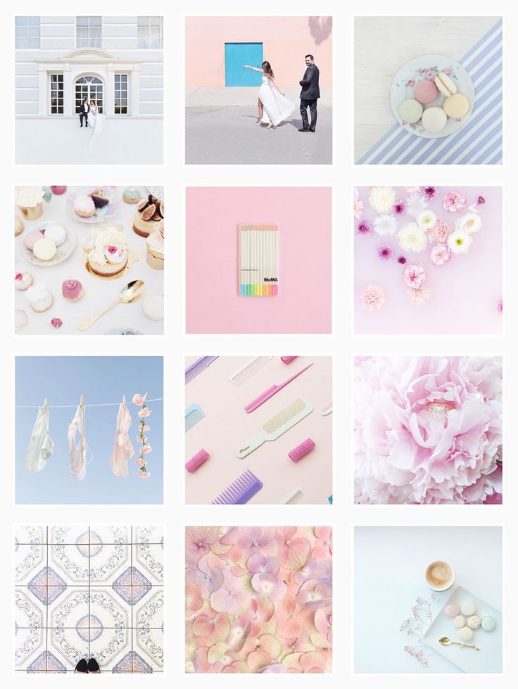 Want to tell a story in more than one photo with zero words? Then this is your perfect type of grid. Basically, you’ll use each row to create a story or one chapter of the story. Brand storytelling at its best!
Honestly, I’ll use that only because when I take my cat’s photos, I can’t pick only one to post. Jokes aside, I’ve seen pretty spectacular stories created using this type of grid. And it’s easy to make because it doesn’t need much planning. Its only disadvantage is you have to publish three posts at a time or you’ll break the flow. But the sacrifice is worth it.
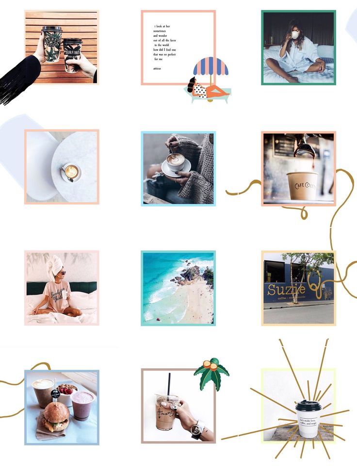
Not a fan of routine? Then this grid is for you. Because you’ll probably get tired of using the same colors or the same backgrounds over and over again, the rainbow grid will allow you to play with colors like no other grid. But spectacular details don’t come easy.
The rainbow grid requires a lot of planning, special tools, and creativity.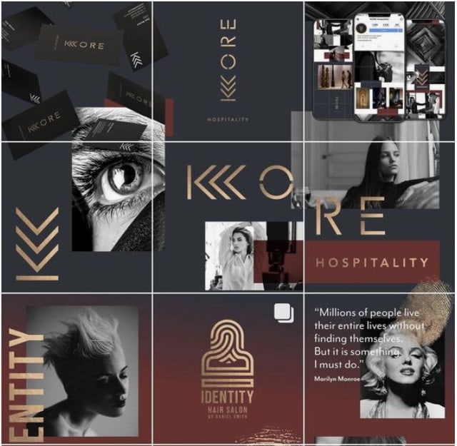 Basically, you’ll use the row by row technique, but every row should be connected with the one above and the one below. Are you committing to finding transitions every time? You’re my hero.
The rhythm is usually of 3, 6, or 9 photos for each color. But who’s counting anyway?
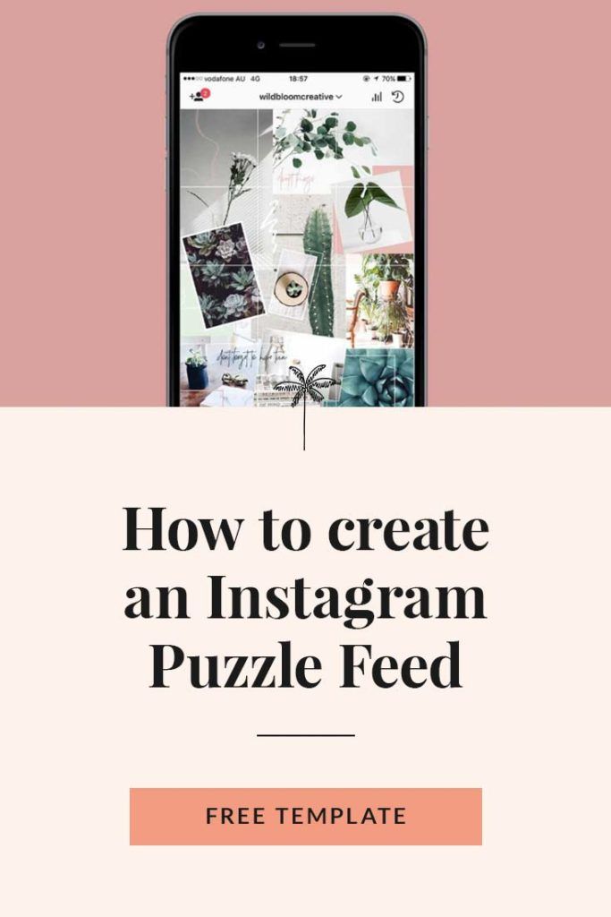
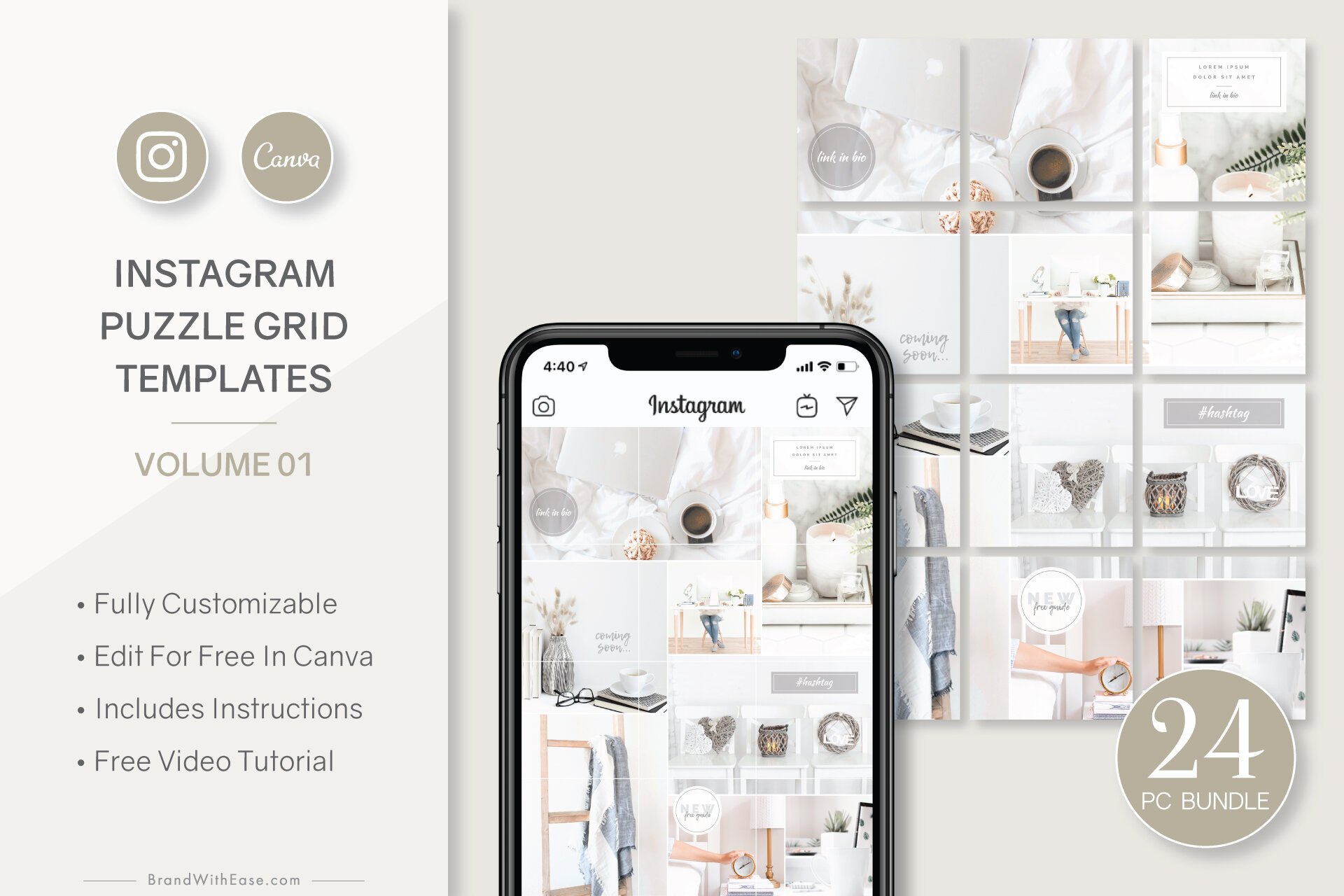
And now, for the grid of the grids, creme de la creme, the best of the best, we’ll talk about the puzzle grid. It may sound simple, but really, it is the most strategic, painful and beautiful form of art you can find on Instagram. It works great with videos too.
And I’ll tell you why: puzzles have a background that is continuously evolving. Each post should be connected with all its neighbor posts. Easy? Think about how when you post a picture, you also have to include elements of the picture that will come above it. And what happens if you don’t post the pictures in the correct order?
*Cough cough* Thank God for these tools that let you plan your grid and preview everything before hitting publish.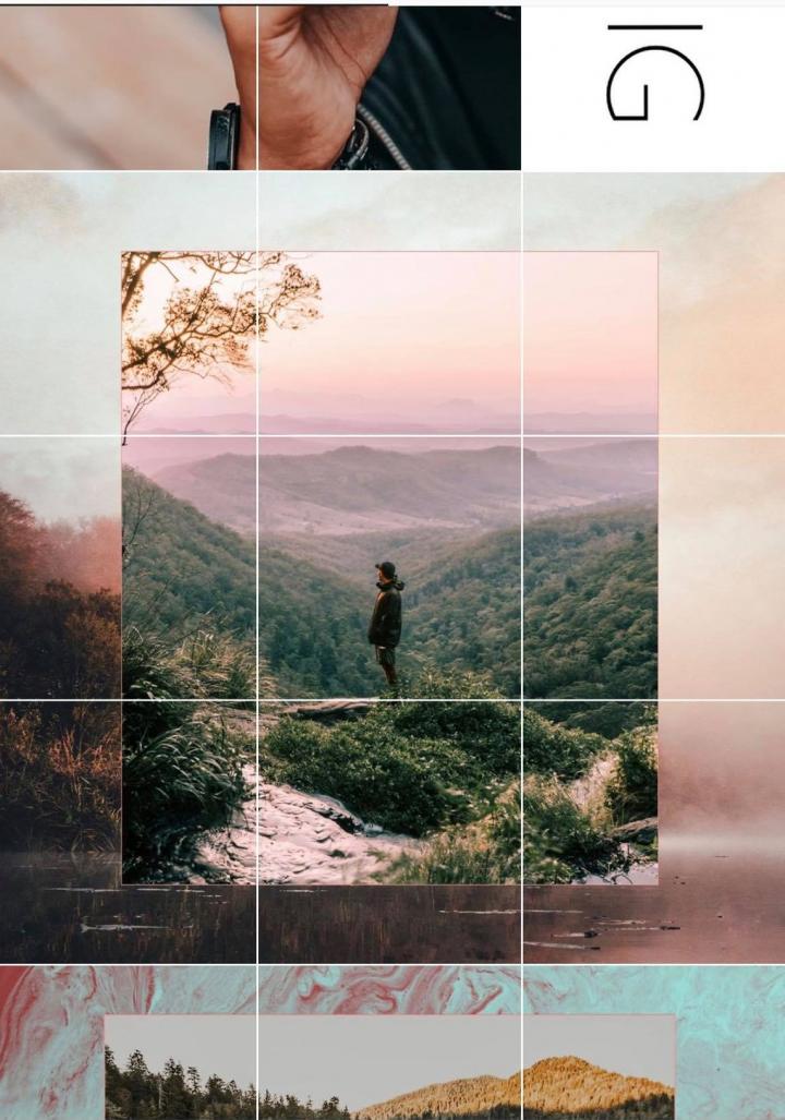
Now you’re probably thinking: “Wait a minute, Luciana, what’s there to talk about squares?”. What can I say, we live in weird times where squares are actually a thing.
We can’t miss the minimalist type of grid. The first type of grid that looked messy back in the day made Instagrammers transition to a minimalist layout where they focused on one or two colors positioned in the center of the picture, while the rest of it is just plain background. If you’re not all rainbows, then this grid may be the one for you.
Can’t stick to one type? Me neither! Don’t worry, there’s something for us too. Mixing and matching is also a type of layout and some Instagram accounts are slaying with creativity.
via GIPHY
How to mix the grid? Try the line in the middle with a puzzle, or row by row with borders.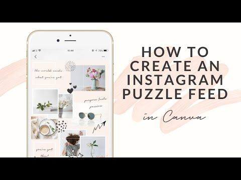 In the end, you have to be yourself, so don’t necessarily stick to the rules.
Well, Planable. Before diving into how great Planable is for planning, scheduling, and publishing Instagram grid posts, let’s go over the actual key factors that determine the future of your Instagram grid.
Consistency is key, and when working with photos and videos, it can become challenging to create cohesion. Especially if you’re dealing with managing multiple accounts. You can use some sort of formula and come back to it whenever you feel like you’re drifting away.
Personal or business account, there’s always some traits defining your brand. Which one are you? If you represent a business, think about the colors of that business. If you’re a lovely soul, think about what your friends say about you. Are you bright and glittery? Are you a minimalist or old school? Do you like nature or skyscrapers? Are you more into cats or flamingos? These questions will help you create visual harmony throughout the mighty scroll.
Turns out having a lot of Instagram grid examples to choose from doesn’t make things easier. It’s like picking ice-cream flavors: you want to go for vanilla but you’re also peeking at that Chocolate Chip Cookie Dough. The truth is you can always create an Instagram grid out of your own magic formula, combine the brand colors, add borders and sprinkle some quotes on top, or whatnot.
Believe it or not, the layout you’re going to choose will help you a lot, because it is going to tell you what type of content to prepare, when to publish it and where to place it. Sometimes, complicating things at first may help you in the long run.
I mentioned your brand’s colors at step one. They should be prominent in your layout. If you don’t have the colors yet, pick no more than three shades that fit your brand. Give it time and make sure you’re going with the right colors, as they will become the visual personality of your account.
A quick trick for maintaining consistency is to apply the same filter for every post. This filter should work with your colors and your brand personality, so it doesn’t have to be something very complicated.
If you don’t want to create your own filter, there’s plenty of presets you can choose from. Test them out until you feel like you found the one.
The order of your posts is also part of consistency, especially if your grid layout is more sophisticated. But don’t get anxious, you don’t have to put much effort into this arrangement anymore.
With tools like Planable, you can easily drag and drop your posts and rearrange everything until you reach perfection.
Here’s how simple everything works:
The answer is yes and no. Instagram won’t allow you to play with existing content, so what’s published can’t be rearranged. Unless you’ve got Planable. However, you still have two workarounds.
via GIPHY
Start now. Yes, you didn’t have the time and resources to plan your grid until now. But we all started somewhere and you can do that, too. Use all you’ve learned so far and create your perfect Instagram grid. You can even consider using an Instagram grid planner, or an Instagram layout maker. Or just use Planable where you can have both 𑁋 accurate previews of your posts and drag&drop grid posts to plan the heck out of your content. No need for mental gymnastics to plan an aesthetical Instagram grid layout.
Repost everything. Now don’t get scared. I have “only” 400 posts on Instagram and there’s nothing I’d hate more than having to save all my pictures and videos and post them all over again. But melancholy is stronger, so if I were to rearrange my grid, damn sure I’ll repost all the moments that marked my school years and sunny summers.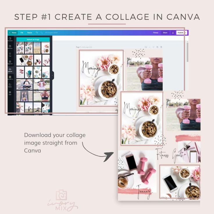 And it won’t even take me that long, because I can upload them in Planable. Simply drag and drop your posts however you like and schedule or publish them with a single click. For single image and single video grid posts, Planable does this automatically. Not so scary anymore, right?
And finally, it’s time to create some Instagram waves, right? You bring the photos, I’ll show you the best Instagram grid apps you can use to mock Instagram feeds.
Right now, Snapseed is the best choice in terms of photo editing tools. Instagram has its own filters, but it’s hard to match them with your content and it’s even more difficult to differentiate yourself from others.
Snapseed does two things that will help you big time: first, it lets you use effects using a brush – that means you can add an extra touch to the details for each photo you use; and second, its Stacks feature lets you save your filters as an Instagram grid template – consistency with one tap.
You can always start with Adobe Illustrator or Photoshop, but that can be complicated. Canva is the best Instagram grid maker if you’re just starting. Just create the blank grid and then one by one, create the grid. You may not need this step, but if your grid has quotes, borders, or puzzles, for example, this is the easiest way to create them. You can use Canva to build your Instagram grid online, without downloading or installing any app.
You got your assets, it’s time to prepare for publishing. With Planable, you can upload your files, add your copy and hashtags, and even collaborate with your team for feedback.
Preview your Instagram feed in a pixel-perfect tool that lets you drag&drop, rearrange, and schedule or publish the posts. No more misunderstandings, wrong order of publishing, or time wasted with manual posting.
The wow part? This Instagram grid planner has a desktop version that will let you pay attention to every little detail. Collaborate on everything your grid has to offer, hit the schedule button, and watch how it all goes live. Planable lets you directly publish your Instagram grid posts from your desktop. Buh bye push notifications for life!
If you got here, it means you’re ready to ditch experiments and create the best Instagram grid one can ask for in 2021. And if you do, please show it to me, because I can never get enough of them gorgeous layouts.
You picked the layout, learned a thing or two about consistency, built the tool stack. Now lay back and see how engagement grows row by row. Try it with Planable. It’s free.
Luciana Nitu
“Digital devotee & data junky. SEO is my religion and Social Media is my playground. Reciprocate is my favorite word for both its meaning and its sound.”
Sometimes it’s nice to take a break from endlessly scrolling through your feed — and endlessly scroll through someone’s individual Instagram page instead.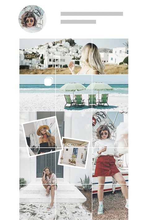
Welcome to The Grid.
Lined up neat rows of three, each Instagram post suddenly is part of a bigger picture. A peek into a user’s soul… or at least their content strategy.
And Instagram power users know just how to work this viewpoint to their advantage, with artfully planned posts that, together, create a gorgeous Instagram grid layout.
If you haven’t thought about what your own rows of squares add up to, it’s about time. Here’s all you need to know about building an attention-grabbing Instagram grid to grow your following and engagement.
Why your Instagram grid layout matters
7 creative ways to design an Instagram grid layout
5 tips for planning a gorgeous Instagram grid layout
Bonus: Get 5 free, customizable Instagram carousel templates and start creating beautifully designed content for your feed now.
When someone follows you for the first time, or navigates to your profile to check out your content, your grid is an opportunity to showcase your vibe or brand.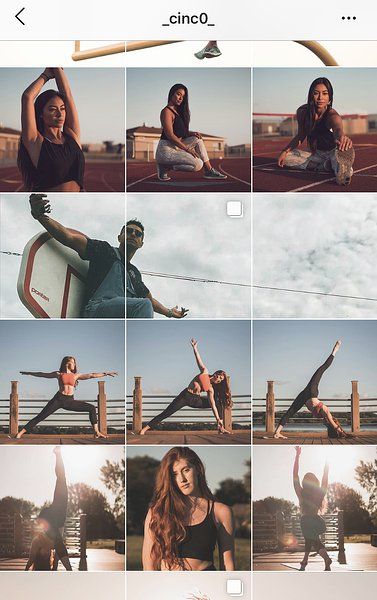
The grid gives you a birds-eye view of a user’s posting history. This is your first impression of their, uh, body of work: an introduction at a glance to their personal or professional brand at a glance.
For individual users, creating a beautiful grid may not matter — sure, color coding your posts could be a fun personal challenge, but if you’re just on the ‘gram to connect with friends, not amass an audience, branding likely isn’t too important.
But for brands, creatives or influencers, consistency and style are critical… particularly if your account is focused on aesthetics or lifestyle.
After all, your grid is a quick and easy way to get your message across. Plus, anyone viewing your profile is thinking about following you. This is your chance to show exactly what you offer.
Are you avant-garde, or on trend? Will your content soothe, or bring the drama? Is your brand consistent, or chaotic? One look at a grid, and they’ll get the (sorry not sorry) picture.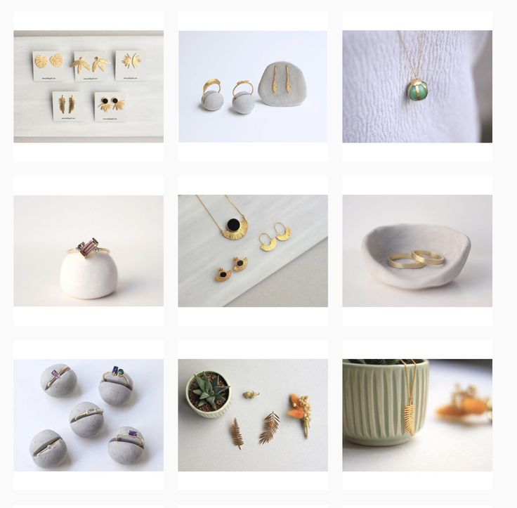
Great grids start with a vision, so we’ve scoured the depths of Instagram to dig up some of the slickest styles to inspire your own look.
Commit to a color comboThis is probably the most common grid style going — not that I’m calling anyone lazy (don’t @ me!), but it really doesn’t get much easier.
Pick a color palette (pinks and greys?) or a certain tone (high contrast neons?) to feature in every photo. Viewed together, your gallery will look like a matching set, even if the content of your pics vary. Home and lifestyle influencer
@the.orange.home exclusively features photos with bright, white backgrounds with earth-tone accents. It’s a vibe.
In case your home or office isn’t decorated like an Insta-ready backdrop, one easy way to make sure your photos all speak the same visual language is simply to use the same filter for every photo to help create a consistent tone.
A variation on this theme? Using a standard filter or color palette, but also working in an “accent” color or filter every few posts, too. Maybe your feed is mostly dreamy, sepia-toned boho fantasy, but every few rows, we see a vibrant pop of forest green. Woo! You’re playing with fire!
Create a checkerboard effectBy alternating the style of photo you post, you’ll easily create a checkerboard look on your grid. Try alternating text quotes with photography, or mixing close-up shots with landscape photos. Going back and forth with two distinct colors can work, too.
Some adorable inspo for you: here, parenting resource @solidstarts alternates between photos of snacking babies and how-to graphics.
Hot tip: if you’re using text-based posts, keep the background color or fonts consistent to really make the pattern clear. Check and mate.
(Need a little help on the graphic design front? There are tons of great tools and templates out there to create visuals that pop. )
)
Think outside the box… and inside the, um, row. Uniting the images on each row by theme or color can create a powerful impact.
PR firm @ninepointagency, for example, goes with a different background color for each palette on their grid.
The trick for this one, of course, is that you have to post three images at a time, or the alignment will be off.
If you’re bold enough to experiment with panoramic images for one of your rows — a trio of photos that add up to one long, horizontal image, you daredevil, you, — many users post the same caption for each one to make it clear they’re three parts of a whole, like photographer @gregorygiepel did with his architectural shots.
Create a vertical columnBreaking up the grid with squares that create a vertical, central image is a great way to mix graphic branding elements and photography together on your profile.
Vancouver’s @communitybreathwork uses both a vertical and a horizontal connected image in this part of their grid — but the images can technically all still stand alone. (Or… lay down alone?)
You need both patience and a great color sense to pull this look off. The goal is to post regularly in one saturated color… and then slowly transition to the next shade in the rainbow with your next rows of posts.
To truly get the full effect of drag queen @ilonaverley’s rainbow ‘gram grid, you’ll need to scroll for yourself, but here’s a screenshot of her transition from green to yellow.
Embrace the borderCreating a consistent look can be as simple as applying a border to all of your images.
Stylist @her.styling uses white square borders on all of her images, but you could create a signature look with any range of colors. The free Whitagram app is one option to quickly apply this edit, with borders and backdrops in all sorts of different shades.
Turn your posts into a puzzleThis layout is a tricky one to pull off on a day-to-day basis, but for a big announcement or campaign, or to launch a new account, a puzzle grid certainly packs a punch.
A puzzle grid creates one big, interconnected image out of all the squares. Individually, these posts probably look like nonsense. But viewed together, it’s a work of art.
Give commercial photographer @nelsonmouellic a round of applause for this visual feat, will ya?
Of course, none of these sleek grids happen by accident. You gotta grind for that grid! Here are some things to keep in mind as you’re planning out the big picture.
1. Preview firstBefore you post it: map it.
You could mock it up in photo-editing software, or use Hootsuite’s app integration that lets you preview your layout before it goes live. Right now, it’s for personal accounts only, but business account functionality is coming soon.
Bonus: Get 5 free, customizable Instagram carousel templates and start creating beautifully designed content for your feed now.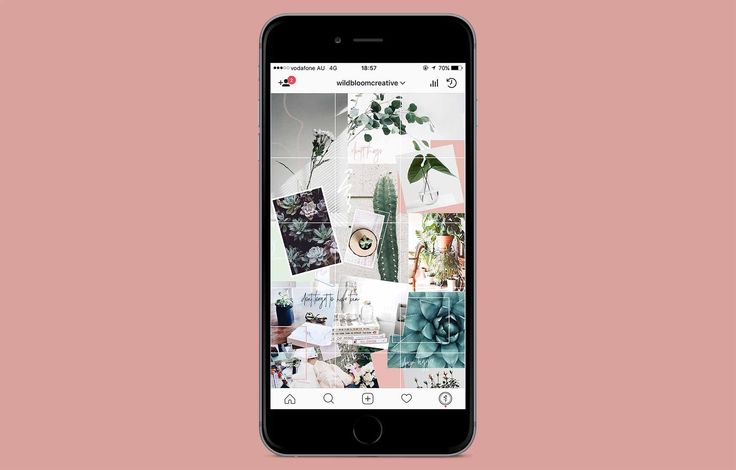
Get the templates now!
Create an Instagram grid layout of up to nine images, and then schedule them to go up in the exact right order via the Hootsuite dashboard.
2. Keep it consistentCreating a great Instagram grid means sticking to a plan. One off-beat photo in the wrong color, the wrong filter, or in the wrong order can throw your whole look out of whack.
Just imagine if luxury goods company @shopcadine tossed in a picture of a #kitchenfail to their muted, earth-tone, carefully curated collection of photos. Instant chaos!
3. Make sure it matches your brandUltimately, the goal of a grid isn’t just to impress your friends with your dedication to using a particular Lightroom preset filter. It’s to build a unified look for your brand.
So, if you’re a recruiting firm for high-level executives, like @mrinetwork for instance, having a playful rainbow grid might not quite fit the professional and serious tone you’re going for.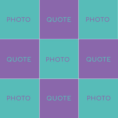 A monochromatic, text-based series of posts, on the other hand…
In case you haven’t figured it out yet: Instagram is a visual medium… and it’s hard to put together a great grid unless the individual pictures also are great.
Luckily, there are tons of great photo editing tools out there, as well as expert advice around every corner… for example, our guides to taking great Instagram photos and staying on top of the hottest Instagram trends.
5. Schedule your posts in advanceKeep your gorgeous grid active and updated with the help of a scheduling tool that allows you to drop just the right filtered pic (or three) at just the right time. Hootsuite’s dashboard, for example, makes it easy to prep your best photos at your convenience. Get that grid going!
Of course, creating a great grid is just one way to capture attention on the ‘gram. For more marketing tips and tricks to take your account to the next level, check out our ultimate guide to Instagram marketing here.
Grow your Instagram presence using Hootsuite. From a single dashboard you can schedule and publish posts and Stories directly to Instagram, engage your audience, measure performance, and run all your other social media profiles. Try it free today.
Get Started
Easily create, analyze, and schedule Instagram posts, Stories, and Reels with Hootsuite. Save time and get results.
Free 30-Day Trial
Back in 2010, Instagram was just a social network where people posted photos of food, cats, and selfies. Today it is a powerful marketing tool with a billion monthly users and dozens of features that engage the audience and help increase its loyalty.
We all love to receive information through visual channels. In recent years, Instagram has become the most important and convenient visual relay.
According to statistics, 72% of Instagram users are actively shopping online, and many brands are ready to work hard to win the audience at the very moment of scrolling the feed.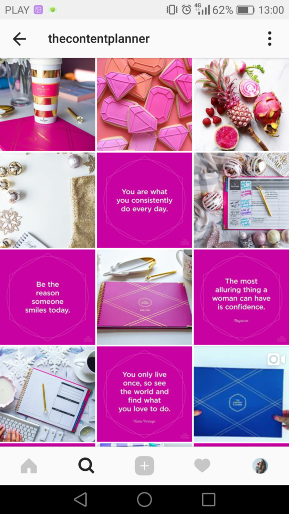 Bright and catchy account designs help grab attention and grow followers, who – quite possibly – will one day transform into consumers of the brand.
Want to share this success by turning your account into an addictive aesthetic treat? Then your Instagram page should look like that. But how can this be achieved?
In this article, we've collected cool Instagram grid designs. Many brands and bloggers are actively using these approaches - they are well aware that bright visual solutions in Instagram content bring pleasant bonuses in the form of thousands of new followers.
Showcasing seven of the most popular grid options on stylish Instagram pages. Get inspired and adopt techniques for your personal account or brand page. Who knows, maybe these ideas will push you to a grand redesign.
Here's some good news for you :
You don't have to be a professional designer to create an Instagram feed that everyone will appreciate. Just follow these steps:
Let's first understand what a grid is.
This is a feed of visuals that you post on your Instagram page to showcase your business or yourself as clearly as possible.
Surely you have already understood that a good feed needs something more than just some nice posts and good filters. Because page:
Instagram has a ton of amazing accounts, and the coolest of them all use the 7 grid types we're going to cover in a moment.
This is the easiest to repeat. Use the same filter and stick to the same color combinations to keep your account neat and consistent. If the brand has corporate colors, feel free to use them - the audience will recognize you and distinguish you from the crowd by them.
Hannah Rose
Horizontal, vertical, diagonal - an Instagram account that has lines always looks stylish and unbanal. Many Instagrammers use this approach in grid design, but you need to be very careful here: skip the post and the page architecture will immediately break.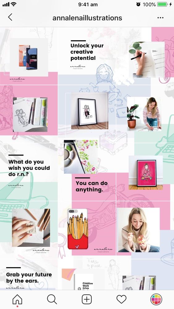
Any Instagram grid row can be turned into a storytelling element. Such a grid - where the "air" posts go under each other - resembles the page of a magazine or book.
This approach helps focus users on a particular element. Frames are needed for emphasis and contrast - and, of course, with them the grid looks more collected and solid.
In VistaCreate, you can choose frames and lines in different colors or shapes - or make an image with white edges. If you use frames in the same style for Insta-posts, the grid will turn out neater and “slenderer”.
Combine photos and graphics to create an image grid that looks like a checkerboard.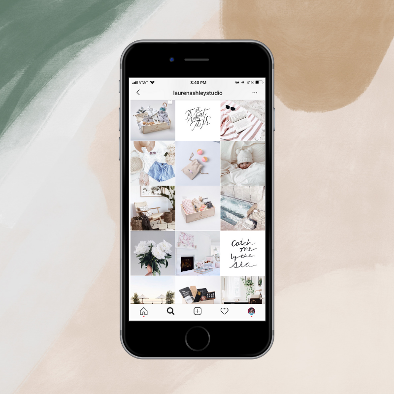 For the grid to look stylish, the graphics need to visually resonate.
The most popular approach to this solution is to combine photos and quotes. But don't limit yourself to just this content: include icons, pictures, emoji, screenshots of articles. Trust your inspiration or content plan. Lorraine Loots What if you add color and energy to your Instagram account? This grid is called the rainbow grid, and it looks like that: as the page scrolls, the shades flow from red to orange, from orange to yellow, from yellow to green, and so on.
Yes, making rainbow meshes is more difficult than creating everything we talked about above. Here you need to change filters and settings approximately every 6-9 photos and clearly monitor the smoothness of the color transition. But it's worth it.
Each picture in this grid is valuable in itself, but they are all superimposed on one more, overall picture.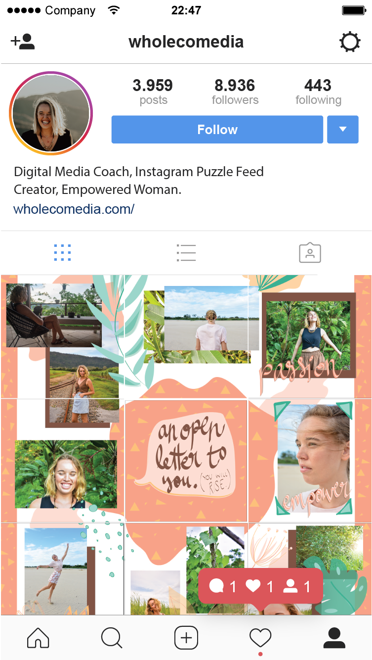 And she gives additional meaning. The hardest part of this approach is to cut the background image from the photo so carefully that they don’t lose any quality or meaning, otherwise users simply won’t click.
This grid resembles a puzzle - it seems to be assembled from different elements, but at the same time they are all organized into an interesting whole composition (or a poster, whichever you prefer). This is the perfect solution if you want to showcase your website or blog on Instagram.
Instagram collages are one of the hottest marketing trends in 2019. They work well if you need to grab the user's attention and smoothly guide them across the page - in fact, this is visual storytelling. There are many tools on the web that help implement this approach - cut and stitch backgrounds, pictures and stories.
Instagram has millions of users and doing something to stand out in this sea of content is no easy task. It is important to find a special way to show your creative side, to surprise and not tire. Grids are a good helper along the way. But whichever approach you choose to organize grids, remember that they should be neat and look coherent. VistaCreate will help you achieve this.
Also, don't forget that the aesthetics of your voice and style make all the difference. What are you? Minimalistic? Funny? Bold? Create images that fit with your personality - and tell your audience about yourself. VistaCreate will always be there to share trends and style inspiration!
Design with VistaCreate
Plan your Instagram posts visually with a grid.
We all know how important it is to have a cohesive, consistent Instagram feed. The grid is a strategic tool that can help you achieve the best Instagram feed for you or your business.
Use simple, easy-to-use controls to:
• schedule your Instagram posts ahead of time
• write captions for each post ahead of time
• Achieve the perfect timeline with intuitive drag and drop controls
• Post scheduled content to Instagram
Includes support for:
• Post original quality photos and videos
• Visualize how future posts fit into your past posts by syncing your Instagram feed with your grid
• scheduling and managing content for multiple Instagram accounts (professional feature)
Most of the features are free for everyone. If you plan to use multiple Instagram accounts, you can make a one-time in-app purchase.
Version 2.4.1
Added a link to the privacy policy in the settings.
ratings: 577
I have been looking for a planner for a long time where you can upload 100 photos and calmly plan for the future - and everything works perfectly. Thanks for the app.
Please add the visibility function of the reels in the grid, otherwise the whole composed tape will get confused
As I understand it, someone is fine, but someone has a glitch with the application.
I'm in the second group😅 I don't have a function to add a photo anywhere, it's just that my feed is loaded 9 photos and that's it, nothing can be done further🤷🏻♀️
The developer of The Good App Company, Limited Liability Company has indicated that, in accordance with the application's privacy policy, data may be processed as described below. Detailed information is available in the developer's privacy policy.
The following data may be collected, which is related to the user's identity:
Sensitive data may be used differently depending on your age, features involved, or other factors.