Written By Becca Booker
With the ever-changing Instagram algorithm, it is becoming increasingly important to utilize IG stories to create consistent engagement & show authenticity! IG stories are a great way to interact with your followers & give them a behind-the-scenes of what you’re all about.
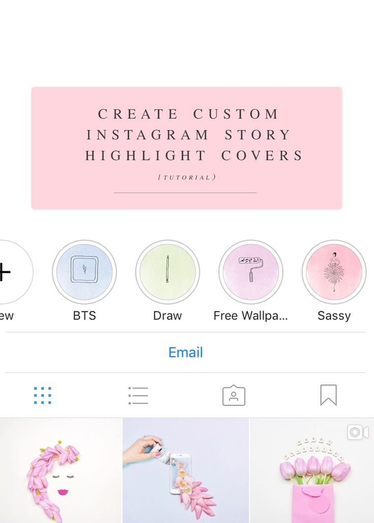
A great way to increase the traffic to your page is to save your Instagram stories to highlights so followers can refer back to them for information and entertainment. A big aspect of a cohesive theme and establishing a solid Instagram aesthetic, which we talked about in our recent blog post, is creating highlight covers. These are easy to create & make highlights more user friendly, while incorporating brand colors and themes.
A great website to use is Canva (it also has an app, but it’s not as easy to use). This site offers a ton of FREE templates & icons to use on highlight covers. You can also upload your own photos to turn into Highlight covers. The possibilities are endless! This is the perfect opportunity to be creative & try your hand at graphic design.
Have a few Instagram highlight ideas in mind? Watch below for an easy step-by-step tutorial on how to Instagram highlight covers & be sure to subscribe to our YouTube channel. Enjoy!
Go to canva.com
Once on the homepage, search Instagram Story
Choose any template
Clear out any text or images on the graphic
Add an icon, “illustration” or text. Play around with fonts to match your brand and aesthetic!
Type the Cover category
Duplicate that graphic for the # of covers you’ll need
Customize each cover’s icon and title to correspond with your category.![]() Don’t be afraid to switch up the background color either! Just make sure they align with your brand and Instagram content.
Don’t be afraid to switch up the background color either! Just make sure they align with your brand and Instagram content.
Download templates as a png file
Go to the Instagram app and click on a story highlight
Click More at the bottom of the story and choose Edit Highlight
From there you can edit the cover with your new designs!
Here are some other social media-related blog posts:
How to Use Instagram Stories Highlights to Wow Your Customers
3 Tips To Increase Your Engagement On Instagram Stories
Our 3 Favorite Instagram Story Apps
4 Tips For Service-Based Businesses To Improve Their Social Media Presence
6 Tools Every Content Creator Needs Under $25
How To Stay Up-To-Date With Social Media Trends
We hope you enjoyed this blog post and found it insightful! Making your Instagram highlight ideas into a reality through on-brand highlight covers can do wonders for helping you establish a cohesive theme and Instagram aesthetic overall! Be sure to follow along on Instagram at @homemadesocial_ and let us know if you have any questions! You can also subscribe to our weekly newsletter for social media tips & tricks & to stay up-to-date on the latest in the digital industry!
Becca Booker http://www. homemadesocial.com
What is an Instagram highlight cover?
How to create an Instagram highlight cover
8 tips for clicky Instagram highlight covers
Instagram highlight cover templates
Having an orderly, beautiful and consistent set of Instagram highlight covers looks cool, sure — but it’s also a great opportunity to show off your branding, color palette and sense of style to your followers. And, aesthetic highlight covers encourage profile visitors to click and view the Stories that contain all the important information you’ve essentially pinned to the top of your profile.
You can design personalized highlight covers from scratch or use a graphic design tool or photo editing app for extra support. Read this post and you’ll be, well, covered.
Download your free pack of 40 customizable Instagram Stories Highlights Icons now.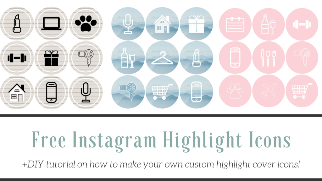 Optimize your profile and set your brand apart from the competition.
First: What is an Instagram highlight?
An Instagram highlight is a collection of Instagram Stories that a user has saved under a certain category. Instagram Stories can only be viewed for 24 hours, but adding a Story to a highlight gives it a permanent spot on your profile.
An Instagram highlight cover is a photo or graphic that appears above the highlight name on your profile page. It’s like a book cover, but for your highlight.
In the example below (indicated by the blue rectangle), a fashion brand uses highlights to feature important information—a sizing guide, care info, new launches, etc.—and each highlight has a cute floral highlight cover.
Source: Instagram
Highlight covers aren’t essential, but they do provide your profile with a polished look—and they make a great first impression for people visiting your Instagram page for the first time.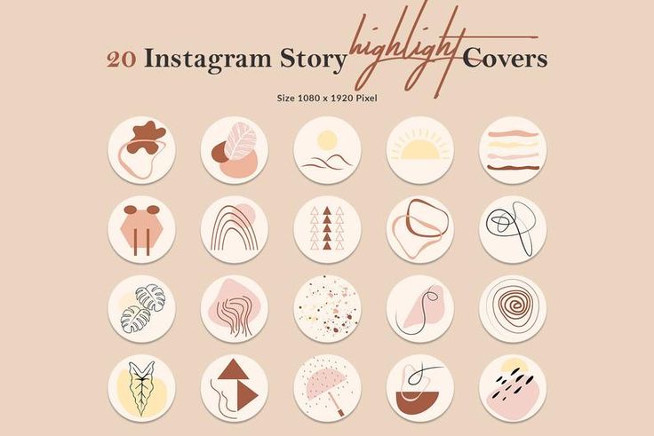
Here’s how to make them.
To create an Instagram highlight cover, first you need to have an Instagram highlight. Follow these step-by-step instructions to create a highlight (and if you already have a highlight set up, skip this part).
1. Open your Instagram account in the mobile app and click “New” in the highlights section below your bio.
2. Scroll through your Story archive and select the Stories you want to include in your highlight. Then, tap Next in the top right corner of the screen.
3. Type in the name of your highlight.
4. Optional: Tap Edit cover to edit the default cover picked by Instagram (a frame from the first Story in your collection). You can also do this later, once your highlight is live — we cover the process in detail below.
5. Click Add in the top right cover of the screen.
That’s it! Your highlight will show up on your profile page.
Once you create an Instagram highlight, the cover will generate automatically — but personalizing your Instagram highlight covers is way more fun. It’s also a great way to showcase your branding and add an individual touch to your profile.
We’ve put together 40 Instagram Story highlight cover icons that are free to download and easy to customize. Or, you can make your own.
You can create circular Instagram highlight covers using any design app or software. We’re fans of Canva (and psst… Canva is now integrated with Hootsuite, making it simple to design beautiful graphics for free). Here’s how to create a highlight cover using Canva.
1. Go to canva.com. Canva is free to use, but you do need to create an account to log in.
2. You can design your own Instagram highlight from scratch using any circular image, or personalize a Canva template (that’s what we’ll be doing in this example). Type “Instagram Story highlight” into the search bar to find thousands of templates.
3. Select your favorite template.
4. Once you’ve selected your template, you can edit the text…
5. …and the colours…
6. …and even add graphics, if you want to. Canva has a ton of free images and designs to choose from.
7. When you’re happy with the design, click “Share” at the top right of your screen to download the image.
8. Choose Download from the drop-down menu. Download the image as a PNG or JPG. If the template you’ve chosen has several pages, only download the pages that you want—in this case, we’re only saving page 2.
9. Save the image to your phone’s camera roll. Now, it’s time to use the image as a highlight cover.
To change your Instagram highlight cover to a personalized image, follow these simple steps:
1. Open the highlight from your Instagram profile.
2. Tap More in the bottom right corner.
3. Tap Edit highlight. Then, tap Edit cover, near the top of your screen.
5. To choose an image from your camera roll, tap the photo icon near the bottom of your screen.
6. Choose the new highlight cover from your camera roll. Then, tap Done.
That’s it! Your brand new highlight cover is live.
The formula for going viral
Everything you need to make engaging content. Post templates, an AI hashtag generator, and access to Canva and Grammarly Pro in Hootsuite.
Get 60 days for $0
Still searching for inspiration? Here are some great examples of engaging Instagram Story highlight covers and tips on how to get it right.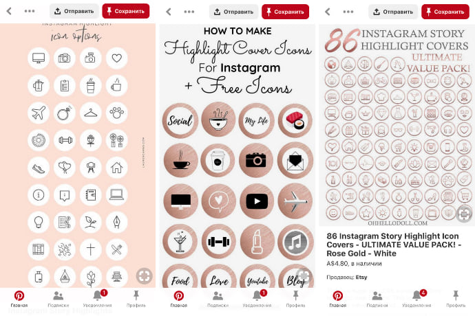
Instagram Story highlight covers are small—so small, in fact, that you’ll want to avoid crowding that precious little circle with too much text or overcomplicated images.
Source: Instagram
Keeping your covers basic and clean is ideal. Even simple color-blocked highlight covers (like the ones used by the artist above) are super effective: they’re not too busy, and pleasing to look at.
Your IG highlight covers don’t need to be identical, but ideally, they’ll match: consider picking a certain color, theme or pattern to follow when making your covers.
Source: Instagram
This restaurant uses a red circular frame on all of their highlight covers, creating a consistent look even though the photos within each frame are all different. It’s a small detail, but it gives the covers a cohesive look.
Highlight covers are an opportunity to show off your creativity as a brand. Think about how you can infuse your brand into your highlight covers as much as possible.
Source: Instagram
For example, paint brand Farrow and Ball has highlight covers that look like paint mixing together. It’s a very unique choice that effectively communicates something about the brand (mainly, that they sell paint).
Another way you can incorporate your brand into your highlight covers is by using your brand’s colors in the designs. Think of a cover like a label for your business: audiences should be able to look at it and immediately know that it belongs to you.
Source: Instagram
This cosmetic brand, for example, has a very consistent color palette across their products and on their Instagram. The highlight covers are no exception: they take on the same trendy pinky-brown hues as the rest of the profile.
Because there’s not much real estate on a highlight cover, using pictures that symbolize words and ideas—or icons—can be an excellent tool for communicating simple information.
Source: Instagram
Crate and Barrel’s Instagram highlight covers are quite basic, but the icons are effective when it comes to symbolizing ideas (and they’re pretty cute, too). Icons are where editing apps like Canva really shine—there’s thousands of symbols and simple illustrations built right in.
If you use Instagram for business, your highlight covers work as a tiny marketing tactic. Instead of having to scroll through your feed to see all of your merchandise, Instagram users can get a quick look at your products via the highlight covers.
Source: Instagram
This slow fashion brand uses highlights to feature specific products, so curious shoppers can easily research the design and fit of different pieces of clothing.
Don’t make the high school mistake of highlighting everything. Highlights should be used to showcase only the most important and useful information to your audience. It’s good to be picky about which Stories you highlight (and as a bonus, being selective means you won’t have to design a ton of highlight covers).
Source: Instagram
Pottery Barn Kids keeps their highlights simple and broad: topics like “Nursery,” “Toddler,” and “Bedroom” make it easy for Instagram users to find the inspo they’re looking for.
Highlight covers often symbolize the highlighted category in a very literal way, but if you’ve got an idea, try it—one of the best things about highlight covers is that they can be edited or switched out if you change your mind. Let your imagination go wild.
Source: Instagram
It’s not surprising that this graphic designer has very bold, distinctive highlight covers—they fit perfectly with his brand. For example, it would be the typical choice to go with Twitter’s logo for the “Tweets” section, but this designer created his own personal version of that iconic bird.
Now that you know how to create Instagram highlights and add custom covers to them, download this bundle of 40 free customizable designs and take the look of your Instagram profile to the next level.
Download your free pack of 40 customizable Instagram Stories Highlights Icons now. Optimize your profile and set your brand apart from the competition.
Easily manage all of your Instagram marketing with Hootsuite. From a single dashboard, you can schedule and publish posts directly to Instagram, engage your audience, measure performance and run all your other social media profiles. Try it free today.
Get Started
Better content in half the time
Boost engagement and save time with a hashtag generator, post templates, Canva, and Grammarly Pro in Hootsuite.
Free 60-Day Trial
Instagram highlights is a section where you can save the most important stories. They will be available to subscribers all the time until you remove them from your profile. It’s like a menu on a website – commercial profiles save information about delivery, prices, F.A.Q. in Highlights, bloggers post thematic collections of stories, experts post instructions, webinar recordings.
We have prepared for you a complete guide on current stories - how to add a story to a section, how to make a cover, how to change it and what to place in highlights.
Advertising: 2VtzquY3wEz
Read also : The best Instagram promotion courses
Why bother with the actual, do some covers? We explain:
 Direct - just post the answers in the current one.
 What is placed in highlights - collections of photos and videos (for example, stories from holidays, parties, family stories), photos of goods, information for customers (delivery, availability, prices), instructions and life hacks, portfolio , question-answer, excerpts from lectures.
Let's look at the example of specific accounts — what should be the highlights depending on the type of profile (bloggers, experts, company accounts, personal, portfolio).
Important : everything in the profile should be organic and highlights are no exception. Ideally, the icons should be made in the same style and not stand out from the overall picture.
It's interesting : How to design Instagram Stories beautifully
Olesya Makeeva — food blogger . Created unique covers with illustrations of the blogger. Highlights include recipes, meetings with friends, sports stories, trips.
What collections to create for bloggers — collections in the direction of the blogger. (A food blogger can post recipes, a beauty blogger can post collections with cosmetics, a weiner can post themed collections with vines, folders with their interests (sports, hobbies, favorite movies), folders with hangouts, travel, meetings with fans.
Bloggers can be creative with names, so that you don’t immediately understand that in the highlights, for example, the blogger Ksenia has such folders - “Dovecote”, “Humor”, “Back and forth”, “Chat”. they can, unless their work is creative related.0003
Nina Ovchinnikova — business coach . As covers - a photo from stories (that is, the cover does not have to have text or an icon). What collections are posted - trainings, student reviews, personal photos, travel, folders for specific events.
Designer Daria . In the highlights, she has a customer review, a list of services, promotions, progress (story with the work process) and a portfolio.
What collections to create for experts - collections of events, reviews, folders with information on trainings / books, folders of personal achievements, travels, a selection of your quotes, a folder with information about who you are.
Loft furniture store. Made highlights with categories of goods - kitchen furniture, office furniture, chairs, racks. The first selection is the cost of goods. Covers of different colors, each with an icon that defines the category, for example, on the cover of the “Chairs” category, a chair is drawn.
Paintings on canvas . All covers are black and white. We made a folder with a catalog of paintings, a video review, customer reviews, what they say about the company in the media and a highlight with prices. Lack of shipping information.
Mosvettorg - online flower shop . Highlights include customer reviews, bouquet selections, a folder with promotions, store opening hours, "Mono-bouquets" and "Compositions" folders, a highlight with company events.
What collections to create for company accounts - product catalogs, answers to customer questions (F.A.Q.), folders with information on prices and delivery, customer reviews, work schedule, events and company news.
There are no special standards for a personal profile, you can peep blogger highlights for inspiration.
What collections to create for personal accounts - thematic collections of photos and videos: stories from travels, meetings, events, images in clothes, food preferences, a folder with pets, family stories.
These are accounts of photographers, designers, artists, illustrators. Here it is logical to create collections of works divided into categories, for example, if you are a photographer, you can make highlights "Wedding photos", "Family photo session", "Master classes". It is also worth posting at least one selection about yourself so that subscribers not only get acquainted with the work, but also get to know you more as a person.
Photographer Natalya Makovoz — in the highlights of the folder on the topic of filming: Prague, wedding, wedding, christening, there is a folder "About me".
Photographer Inna Gulyaeva — 3 highlights with awards, photography conditions and types of shooting. In this example, the highlights contain only important information for potential clients, and the portfolio itself is a photo feed.
What collections to create for portfolio account - collections of works divided into categories, working conditions, reviews, awards, backstages + collections about you.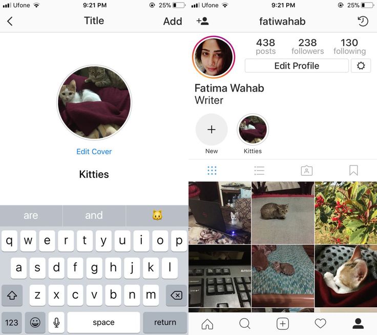
Stories can be placed in the current using the "Add" button, which is located under the profile. But initially this button is not there, so the first time a story is added through the menu in the story itself.
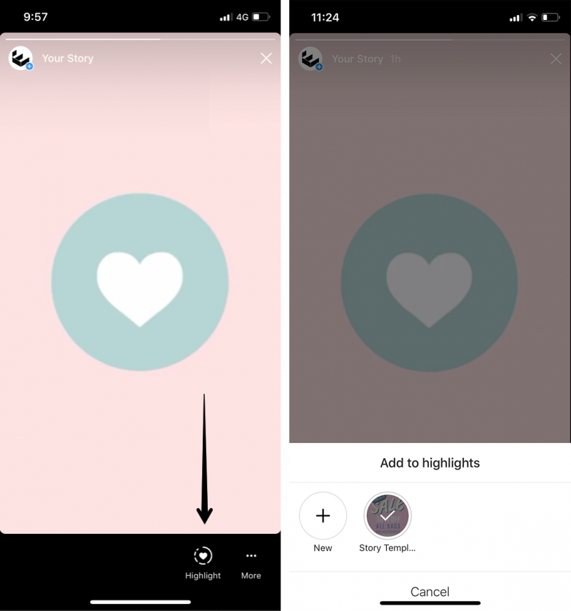
So, first you need to publish a story. Then you need to open the published story and in the lower right corner between the "Share" and "More" buttons, click on "Select". The tooltip "Highlight to keep content in your profile for more than 24 hours" will appear.
We will be asked to add stories to the current one. By default, the icon will be a story fragment, and below it there will be a “Relevant” field, where you need to write your name, for example, “Important”, “F.A.Q”, “Delivery”. When the collection is named, click "Add". You can immediately view it in your profile or just click "Done".
Now we have an Add button. Even if we delete the current one, the button will remain.
Now you can use this button to create collections of relevant stories. Click "Add" and select one or more stories from the archive, then click "Next". We will see the already familiar menu where you need to write the name of the collection and add a cover.
P.S. Save stories to the archive automatically, so that later it will be easier to transfer them to the current. The setting is performed 1 time - open any story, click "More - History Settings" and in the "Save" section move the slider to the "On" position opposite the "Save to archive" item.
There is the third easiest way to add a story to the highlights - when the story is ready, click "Recipients", then next to "Your Story" click the blue "Submit" button. The item “Where else to share” - “Add to current” will appear. We select it.
Important to know :
Read also0015 Introducing 4 ways to create covers of current stories in the same style. This is the easiest and fastest way to make a cover — create a static story (select the “Create” section). We make a one-color background of stories. Then go to stickers and click on the "GIF" sticker. We write the name of the icon, for example, "Shop". We choose a gif that fits the meaning and put it in the center of the story. It can be enlarged a little. The content of the cover (name or icon) should be placed in the center of the vertical image so that it eventually fits into the center of the circle. When the picture is completely ready, save the story to the gallery or publish it like a regular Instagram story. How to put the resulting image in the Highlights cover (2 options) : To register for the service, go to the main page of the site: canva and activate a 30-day free trial. Later, you can refuse it and use the service for free! Here it is much more convenient to create covers. Showing 2 options: 1. From scratch. Create a 1080 x 1920 px blank white canvas. Fill the background with color. Or select a background image in the "Background" section. The background is ready, you can add an icon or an inscription. The inscription is added through the "Text" tool. If you need an icon, then go to "Elements" and write the name of the icon, for example "Delivery". Add. If necessary, increase and change the color. Important : choose icons for covers in the same style. 2. From template. Open the "Instagram Story" section. We find a template with a suitable background, or immediately go to the “Current history cover” subsection - this option is preferable, since all the elements in it are already located correctly, nothing will be cut off and will not go beyond. The subsection is good because here in each template there are 5 cover options in the same style - you just have to replace the text and icons. You can take one template from the set or all 5. Replace the text with your own and save the image. If we choose another template (not from the subsection with highlights), then you need to remove all unnecessary elements and replace the text / add an icon. In general, any convenient editor will do, not just Canva. It's interesting : How to write an engaging post on Instagram There are special applications for creating covers. We go to the marketplace (App Store or Google Play) and write “Instagram Covers” or “Instagram Highlights”. Let's take the StoryLight app as an example. It has ready-made sets of icons in different styles - neon, minimalistic, boho, chalk on a blackboard. True, ready-made sets are paid, but in the application you can make covers from scratch. To create a cover, click "Create". First, set up the background - the "Background" button. You can choose a ready-made color from the proposed ones - the palette is quite wide. You can also choose the shade manually using the sliders or choose a background from ready-made selections with pictures. When we have decided on the background, we add a frame or shape - the "Frame" button. Frame color can be changed by clicking on the music rest icon. The icon can be moved, enlarged / reduced and deleted (cross in the upper left corner). Next, you need to add an icon or text - "Sticker" or "Text". In stickers, ready-made sets of icons, as we have already said, some are paid, but there are many free ones. When everything is ready, click "Save" and voila - the picture can be sent to Facebook / Whatsapp or immediately thrown into stories, and then used for highlighting. And all the pictures are saved in a special folder created by the application. Created icons can be found in the "Saved" section. Option 1 - download . If you don’t pretend to be original, and you’re not too worried about the uniqueness of the covers, you can simply download ready-made images from the Internet - go to Google Images and write “Highlights Instagram” or “Story Covers” (try different keyword options). You can also search for covers on Pinterest. Option 2 - download/buy PSD template for Photoshop . You can find it by searching "Instagram Highlight Covers Template PSD". But mostly they sell sets with icons in jpg format. Icons for every taste and color can be found on the iconfinder website - this is such a “search engine” for icons, there are almost 5 million of them in the library. There are many free ones. Icons are divided into categories. When we first create a selection of current stories, the cover is set automatically, but then it can be changed. To do this, go to the created folder. Story opens. Until it closes, click on "More" in the lower right corner. In the pop-up window, click "Edit current". You can change the folder name and cover art here. Click on the gallery icon and select the custom-made cover you want to put. If we want to remove stories from the current , in the same menu in the pop-up window, click "Remove from current". That is, you can not only delete the entire collection, but also individual stories in it. For example, if you have a folder with products, and one is discontinued, you can remove the story with it from the current one without deleting the entire folder. Instagram can replace your website if you set up folders with relevant stories correctly: structure them, beautifully design them and constantly update them - delete irrelevant folders or outdated stories, add new ones there. And of course, keep track of your profile statistics in order to understand what content your subscribers are interested in. Useful links : Instagram Stories* live for 24 hours. In this article, we'll show you how to create icons/covers for Instagram highlights* using different tools and how to design this section in the same style. Advertising: 2VtzquY3wEz Read also : How to remove inactive followers on Instagram * Many make a cover for the current one through the publication of stories. Therefore, it initially turns out to be 600 by 1067 pixels in size - it will not be possible to publish a smaller size in stories. In order for the cover to be beautiful and symmetrical and not be published in stories, you need to create a separate image and upload it through editing the actual one. Picture size for current . The cover size for highlights is 150 by 150 pixels. In order for it to display correctly, it is better to upload a JPG or PNG file with a size of 1080 by 1920 pixels. The diagram in the form of a circle shows which part of the picture will be visible in the current. Where to place the icon on the picture. It is best if it is in the center of the picture. In extreme cases, the icon may be slightly shifted down or up from the center. Highlight header length . The maximum length is 16 characters. It’s better to make it shorter so that Instagram* doesn’t cut off the title. You can use letters, numbers, symbols, emoji. At the same time, it is better not to write the name on the cover itself - most likely, it will be too small and unreadable. Maximum - 20 pieces. Interesting : How to make a joint post on Instagram* There are at least three easy ways to create Instagram Stories Icons: Story Editor, Canva, and Supa. Let's analyze each method in more detail. To create a highlight cover in this way, you can post an image to a story or create an image through the editor, save it to your phone, and then publish it. To create a single color cover using the story editor, follow the steps: Step 1 . Add a new story via the plus button on the main screen or by holding the circle with stories in the current ones. Step 2 . Choose any image in the gallery. It doesn't matter which one - in the future you will make it a solid background. Step 3 . Step 4 . Circles with flowers will appear at the bottom of the interface. Choose which one you like. You can hold down the color, then a large palette of shades will open. Step 5 . Place a colored dot anywhere on the image and hold your finger until the background of the stories becomes solid, and click "Done". Step 6 . Now you can add emoji. To do this, select the icon with the letter "A" in the upper right corner. Find emoji on your keyboard. Step 7 . Choose the emoji that best describes the contents of your current folder. For example, if the folder is called "Nature", you can add emoji with plants or animals. When adding emoji, the screen will be small. To make it bigger, pinch it with your fingers and stretch it out to the sides. A horizontal and vertical line can be displayed on the screen, they will help to set the emoji in the center. Step 8 . Now you can publish a picture or download it to your smartphone and set it as a cover without publishing it in stories. To download the image, click on the three dots in the upper right corner. Select Save. Step 9 . If you published the cover as a story, go to the story and under the created image, click on the icon with a heart and select the folder for which you made this cover. Step 10 . If you added an image to an empty folder with the current one, it will automatically become the highlights cover. If this is not the first image, then on the main screen, hold down the current one to which you added the image with your finger. In the window with functions that appears, select "Edit current". Step 11 . In the interface that pops up, at the top, click "Edit Cover". Step 12 . Select the cover you created at the bottom and center align the icon or emoji you placed on the picture. For more information on how to put or change the cover of the current - in article . Supa is a tool for creating videos and social media posts. Its functionality also allows you to quickly make a cover for the current one. To use Supa, you need to register or log in through an account on other platforms. Canva (How to login to Canva from Russia) is a graphic design service with a lot of ready-made elements. When creating a cover for a trending Instagram, focus on a single account style. That is, if your entire page is designed in pastel colors, then you do not need to make covers with a bright background. Choose colors that fit well with the color scheme of the profile. So, the look of the actual "Clean Line" and the design of the profile completely coincide in pastel and vegetable tones. Do not overload the cover with elements. It is better if it has one bright graphic element or a small, dim graphic element and a signature. For example, if you have a profile with recipes, divide all the recipes into groups. Place each group in different folders with the current one and mark them on the cover with different icons: soup recipes - a soup plate, salad recipes - an image with a salad plate. One of the food bloggers chose an empty path: he took the same design for all folders with the current one and signed them. All covers must be in the same style. To do this, use the same background on all images. If you're creating Instagram covers*, just always choose the same background color. In Supa and Canva, make one picture and make a copy of it and replace only the icons. LinguaTrip use their corporate color for the background: All icons and pictures should also be in the same style. To do this, use emoji or sets of graphic elements that can be found on Flaticon, Freepik, Iconfinder, Icons8 sites. You can also order pictures in the same style from the designer. Tinkoff Journal has all icons in the same style. Covers of articles on the site are decorated in the same style. It is better if the background and icon are in contrast. For example, a combination of blue and red. To select contrasting colors, use the color wheel: contrasting colors are located opposite each other. Icons of almost any dark or bright color on a white background also look good. Although there are companies that use several tones of the same color in their design: Relevant stories on Instagram* are needed to keep useful and interesting stories for a long time. If you maintain a personal account, you can keep the most important about you up to date. If you have a business, save in the current menu, prices, reviews, projects. Story editor, Supa and Canva can be used to create covers. In order for the cover to “fit” well in a circle with the current one, create an image of 1080 by 1920 pixels, and place the icon in the center. What's trending on Instagram* should be combined with the design of the page so that it doesn't look ridiculous. Use the same colors and shades as in the images in the posts. To make the covers harmonize with each other, use the same backgrounds and icons from the same set. Useful links : *Locked in the Russian Federation and owned by Meta, a recognized extremist organization in Russia. In the standard editor

Creating icons for action stories in Canva
 Save the image in jpg or png format.
Make the design of actual stories in the application
 The step is optional, but it will decorate your cover. Frames in three different styles.
 Download or buy a ready-made picture / template / set with icons for the current
 We choose the appropriate option and shamelessly download.
 How to add/change the cover of current stories
 Click "Edit Cover".
 Conclusion
How to make Instagram highlight covers*: 3 ways +5 examples
 So that they can be viewed later at any time, they must be saved in "Actual" or in another way highlights. This is the section below the profile header. For convenience, it is better to create several “circles” with stories united by one topic. And in order for the profile to look aesthetically pleasing and the pinned stories to be combined with the rest of the design, you need to create covers.
 Things to consider when creating covers: image sizes, format

How to Create Instagram Stories Covers*: The Ultimate Guide
Creating icon covers in the story editor
 After uploading the image, in the upper right corner, click on the three dots, and select "Draw".

 Click Finish. The cover for the actual is ready! It can be used for several folders at once.
 Creating a picture in the Supa editor
 To do this, move the icon or emoji inside the rectangle: if a red line appears vertically or horizontally, then you are in the center vertically or horizontally. It is necessary that both lines cross the icon at the same time.
Create a cover in Canva
 To work in Canva, you need to register or log in through an account on other sites.
 By clicking on the photo icon, select the created image and align it to the center. Click Done.
 How to make icons for Instagram highlights* in the same style: tips + examples

Briefly about the main
