Alexandra | Apr 25, 2018
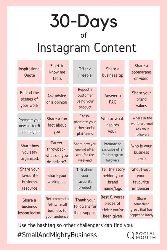
Organizing your Instagram is a lot of fun! And it saves you a LOT of time and stress. But how do you do it without feeling overwhelmed? It’s much easier than you think.
I’m going to summarize all the tips I’ve been giving you in this blog post. I’m going to show you how to organize your Instagram photos and your hashtags. Follow these steps and I promise you’ll see a big difference.
Ready? Let’s go!
First step: get Preview app. Do you have it already? It’s an Instagram planner. It will help you see how your feed looks like before you post anything on Instagram.
You can organize your feed, rearrange your photos, schedule your posts, find hashtags and edit photos… and the list goes on.
You can upload as many posts as you want (photos, videos and slideshows). And you can create any theme you want (with all the filters).
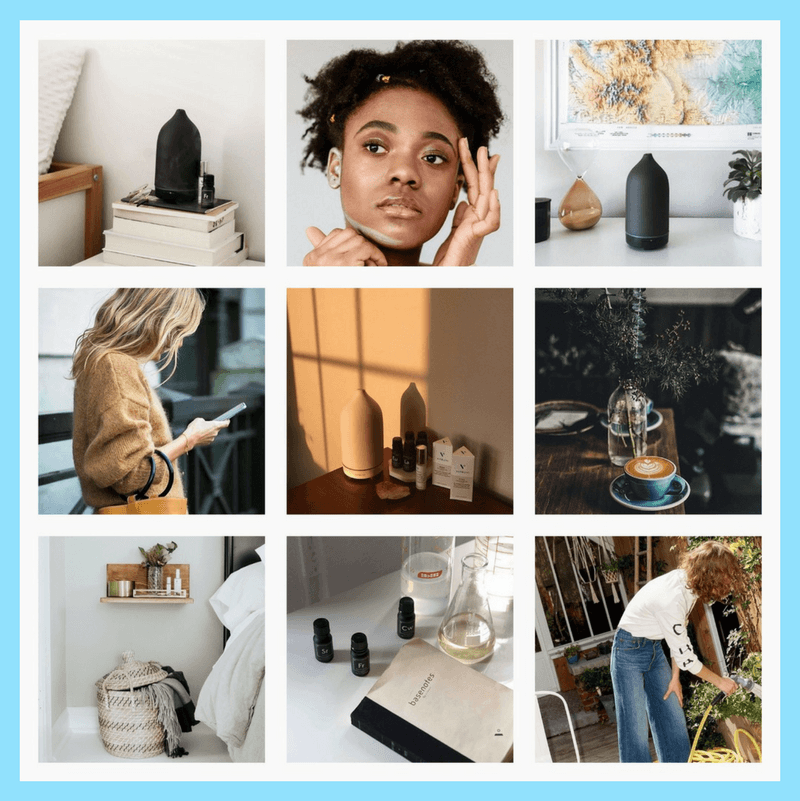
Shoutout to our community for sharing their beautiful feeds with us:
Choosing a layout is probably on of the easiest ways to organize your Instagram. There are 9 different types of Instagram layouts:
Choose one layout and stick to it.
Another way to organize your Instagram feed is by rearranging the order of your posts. You can do that in Preview.
Tricks you can use to organize your feed:
 Choose a color palette
Another good way to organize your Instagram is by sticking to certain colors in your photos. These colors are going to be your color palette. If you feel like your feed looks messy, this trick will save your Insta-life.
Choose 1 – 5 colors that always appear in your feed.
Pay attention to the colors of your subjects, objects, even your outfits (yes, next time pay attention to popular Instagrammers, you’ll see they wear the same colors most of the time). Instagramming is a lifestyle, my friend.
The background of your photos have a massive impact on your feed. Try to always use the same background for your photos (especially if you take a lot of flatlays photos, photos of food). If you can’t keep the same background, it’s okay. Try to keep it as clean, simple and minimalist as possible. This way it won’t clash with the rest of your feed.
A feed looks more organized instantly if you use the same filter all the time. A filter is a visual personality. It will make your whole feed look cohesive.
Another way to organize your Instagram feed is by knowing what you want to post about. I know it seems hard / impossible if you’re taking photos of a lot of different things all the time.
But try to find 1 – 5 things we really love to share. Example: quotes, food flatlays, nature photos, outfit photos, your dog.
Post about these 1 – 5 things all the time. It will create consistency on your Instagram.
You can also find your “hero” photo. A “hero” photo is a photo you always share from time to time in your feed. For example: cute photos of your dog or very funny quotes. Your hero post should intrigue people and make them want to scroll down more and more. It will tie all your posts together. So choose something that stands out. Think about it as your Instagram signature.
Take half a day or one day (or more if you want to) to prepare a bunch of photos / videos / quotes in advance. This trick will really help you organize your Instagram. You won’t have to stress about “what to post next” – because you’ll already have a lot of content ready to go.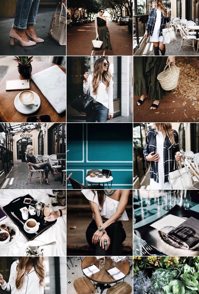
Just upload everything in your Preview app. Post when it’s time to post. #winning
Do you want to post once a day? Once every 2 days? Once every 3 days? There’s no wrong answer. Just pick a schedule and post consistently.
Schedule your posts in Preview app.
And lastly: organize your hashtags. If you want to connect with people, become best friends with the Instagram algorithm and grow your account naturally… hashtags are a must.
You can save your favorite hashtags in Preview. Then just select which hashtag group you’d like to use and it will be automatically added to your caption.
I hope you found this article useful. If you have any questions please leave them in the comments below.
Have fun organizing your Instagram!
Click here to use it
Alexandra | Dec 15, 2016
I used to STRUGGLE big time when I was trying to design my Instagram feed.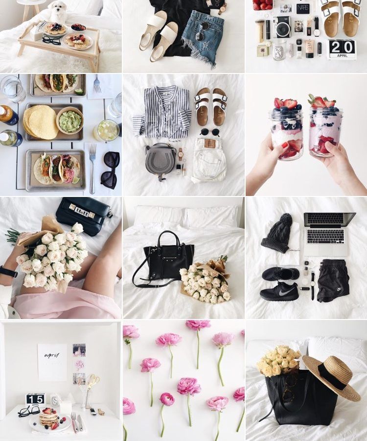
Now I’m using 4 tricks every single time I make a theme:
I use Preview App to rearrange my feed. I love it because it allows you to rearrange posts using 3 different methods (and you can schedule unlimited posts for free).
I’ll show you exactly how I use the app to design my feed and to stay consistent.
Ready? Let’s go!
Click here to use it
Forget everything you know about Instagram. Let’s start fresh together.
You need a strong base when you start a theme.
The first thing you want to do is upload photos in your Preview App.
Here’s the trick:
Upload 9 photos only at the beginning.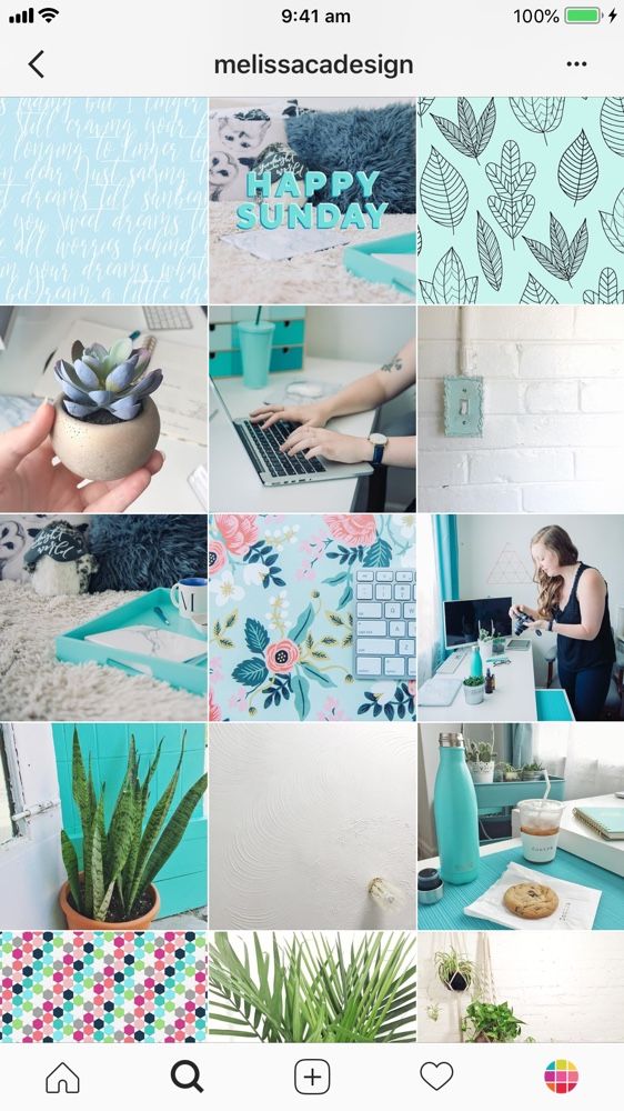
That’s my “Rule of 9”.
It will be:
Your 9 photos are going to be the BASE of your theme.
You will be building on top of it.
If you upload too many photos, you might get overwhelmed and won’t know where to start.
Start focusing on a small grid.
I like to focus on 9 photos at a time, but you can also upload 6 or 12 photos:
Here are examples of a few themes I have started in my Preview App using the “Rule of 9”. As you can see, my base doesn’t move. it means that I can easily color coordinate and rearrange my future post (next tip):
Once you have your photos in Preview, you can rearrange their order.
There are 3 ways you can rearrange photos in Preview:
My personal favorite is the swap feature because I like to take my time visualising where to move my posts.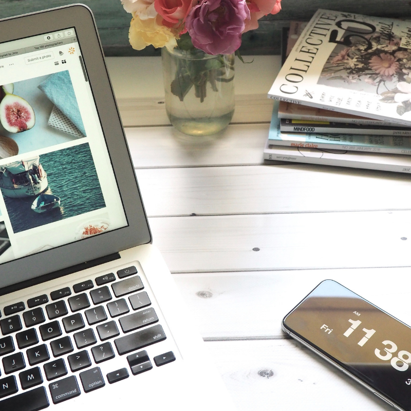 I use the drag and drop feature when I want to quickly rearrange posts. And I use the shuffle feature when I create specific Instagram grid layouts.
Now the big question is: “What photos should I put next to each other?”
Easy!
Generally, people avoid putting the same kind of photos next to each other (unless they’re posting about the same thing all the time).
The trick is to alternate your photos based on:
The goal is to balance the overall look of your feed.
Here are some examples:
When you design your feed, look at the photo that is on the right, left, top and bottom. Try not to put the exact same photos next to each other all the time – space them out.
How do you keep your theme look consistent?
Alright, now you have a strong base with your 9 photos. Don’t mess it up!
After I finish designing my grid of 9 photos, I always upload 3 photos at a time in my Preview App.
3 photos = one row = my base stays intact
Have a look to see what I mean:
I love how I can build on top of my base!
This trick makes it so much easier to visualise my overall feed, and most importantly stick to my theme. Since I have a strong base at the beginning, rearranging my photos becomes a breeze.
Every time I add more photos in Preview, this is what I automatically think about:
This trick is especially crucial for you if you want to maintain a specific grid layout.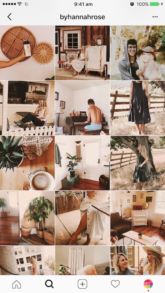
For example, if you want to do a “white line in the middle” layout, you need to stick to the Rule of 3:
I hope you found this article useful!
If you need more help creating a cohesive feed, I share all my tips in my step-by-step guide. You can download it below.
Have fun!
Alexandra
Download on App Store
► Get it on Google Play
+400,000 Instagrammers are already using Preview App to edit, plan & schedule their feed. If you haven't tried it, you're missing out.
June 25, 2022
Instagram is a great platform for promotion. And here a lot depends on what impression the profile makes: what is the general mood, color palette and combination of photos. We have put together a few tips to help you make a beautiful ribbon and develop a special brand aesthetic.
A single style is those details that unite the entire visual.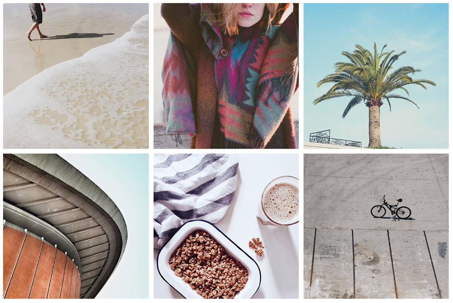 For example, it can be a photo style - dark deep, airy light photos. Or the paraphernalia of the frame - rustic, vintage, kinfolk and others. Even some common character or object. However, in search of your own style, it is not at all necessary to drive yourself into rigid frames and lock yourself in one direction. You can combine completely different photos if you follow a few rules.
The account itself does not affect sales. For visitors to turn into potential customers, they need to be impressed. Think about what emotions you want to evoke in subscribers? The style of your feed and the choice of photos will depend on this.
For example, if you are selling home decor, a hygge aesthetic would be appropriate: photographs of candles and cozy blankets, warm colors and soft shadows in processing. And for premium leather goods, you can try shooting with gloomy light and deep hues - if you place all the accents correctly, such shots will be filled with a special atmosphere.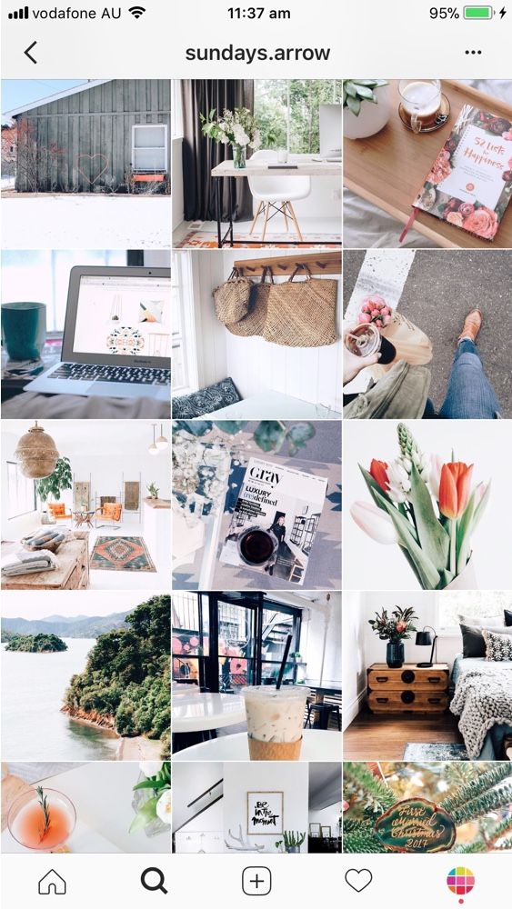
Accounts of photographers can also be different: on the left - conciseness and rigor, on the right - brightness and audacity. For example, photos of @neekmason and @kavalerchikyana are used
When one color is used in the profile - everything is light and airy or vice versa dark - it looks very stylish and beautiful. But after a while, when you see the fifth, tenth or hundredth such photo, you stop seeing the difference. Therefore, we recommend leaving the stereotype that it is enough to choose one filter for all photos in the past.
It's much better not to lock up your creativity in some kind of filter, but simply choose your favorite shades of base colors and make sure that they are regularly in photographs. If you are shooting portraits, ensure that the skin is the same color throughout. If you publish landscapes, the shades of the sky and greenery should also be the same. Then the shots taken in different conditions will remain natural and look harmonious.
On the left is an example of a tape in which each photo is very beautiful individually, but together they look very similar. And on the right is a tape in which the frames are very different, but thanks to the primary colors that are repeated from frame to frame, the tape looks harmonious. For example, photos of @meghan_faulk and @prostokrasivo.wear are used
You can combine dark and light, warm and cold shots in one profile - just make smooth transitions. For example, if you had three light shots and now you want to post a dark photo, post a light photo with dark accents first. Then it turns out that some shades seem to flow into others. Such a “gradient” looks beautiful in the feed and will help to fit photos of your customers into it.
Instagram Kinfolk is a great example of a harmonious feed without a single filter. This is achieved by smooth transitions and playing with color. Photos used as an example @kinfolk
Color adds zest to photos and encourages you to come in and see the details.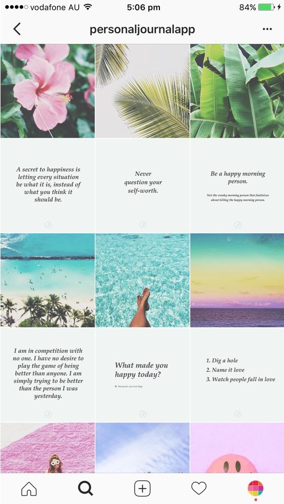 This is due to the fact that our eye easily picks up bright spots, especially when looking at photos from the phone.
Therefore, for profiles in neutral tones, such as gray or beige, we recommend adding bright details so that the tape does not look boring. And if your frames are bright and colorful, on the contrary, it is better to add calm objects - this way there will be no extra variegation when looking at the feed.
Color attracts the eye, the main thing is to use it in doses. For example, on a neutral background - white, black, beige. Photographs @la_maison.n and @gkstories
The feed looks more harmonious when photos with different scales are published side by side. For example, if you have an online clothing store, you can first post a photo of a girl in a full-length dress, then a waist-length portrait, and then a large photo with a dress back or a beautiful clasp. So there will be no feeling that you are repeating yourself.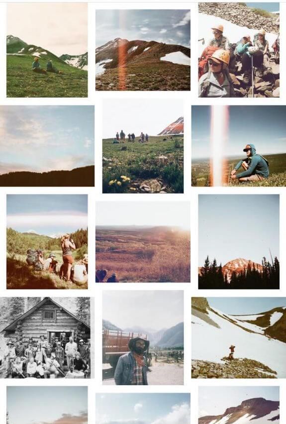
The alternation of plans helps to make the tape varied and lively. The characters in the photographs change, the surrounding world changes - then the tape looks eventful.
Cozymoss Instagram photos at different scales. This is another reason why the goats in the profile are so lively and active. @cozymoss photos used as an example
Use apps to plan your Instagram content in advance. They are convenient to upload photos, combine them and choose the perfect sequence.
We recommend trying Unum, Inpreview or Garny. To plan one account, a free version of any of them is enough, but if you maintain several profiles, Unum will suit you - there you can create several projects at once for free.
Download Unum for iOS →
Download Unum for Android →
Download Inpreview for iOS →
Download Garny for Android →
These simple tips will help you compose a beautiful and harmonious feed from various photos. At the same time, you don’t have to drive yourself into the framework of one style and limit yourself to one filter. If the article was useful to you, put ♥ and share your Instagram tricks in the comments.
On March 4, 2022, Roskomnadzor decided to restrict access to Facebook, and on March 11, 2022, access to Instagram. If you are in Russia, most likely, both social networks are currently unavailable to you.
But we have some useful material for you.
(For those who have social networks working - the text of the article is below, under the list of links) for Telegram: step-by-step instructions
VKontakte:
Designing the VKontakte community: the most detailed guide in Runet
VKontakte promotion: 54 tips and a sea of useful services
A complete guide to setting up VKontakte targeting
Odnoklassniki:
Odnoklassniki for business: to use or not?
"Yandex.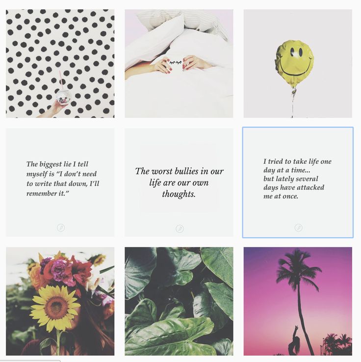 Zen":
Zen":
Channel on "Yandex.Zen" to help small businesses
How to write a good selling article in "Zen" in just 1 hour
8 myths about "Yandex.Zen" for business : debunking the main misconceptions
When promoting a business on Instagram, you need to hook the user at first sight. If a person is not attracted by the picture, he is unlikely to read about the wonderful properties of your products and follow the links. And when you post useful content, it is also important to structure it for users: the arrangement of pictures in the profile in a grid gives a lot of opportunities for this.
Let's look at account design options for a variety of businesses.
Arrange photos in a checkerboard pattern, alternating similar images through one. For example, photos - with quotes. Or contrast photos with pastels.
Don't limit yourself - come up with a unique sequence. If you have an online store, alternate product photos with text content (reviews, useful information). Choose what suits the content of your page.
Another simple and effective way to personalize your account. Each row can be devoted to one topic or section. You can group by color, style, or type of content.
Inline placement can be not only horizontal but also vertical.
Use the same approach and place visually similar photos diagonally.
When using Line and Diagonal layouts, post three photos at a time. Otherwise, the rows will be mixed up, and the design logic will go astray. If you still want to publish one picture at a time, choose a structure with three vertical lines - provided that the location of these very lines does not matter to you. Then, when adding a new photo, the lines will change places, but this will not interfere with the design.
This format is popular with shops, fashion designers, beauty and tattoo parlors. Alternate close-ups showing details with general ones. This will give a complete picture of your product or service.
Promotion on Instagram* in 2021: the most detailed guide
The above methods require self-discipline: you must definitely upload photos according to the schedule - today one color, tomorrow - another, today a photo of a product, tomorrow - an inscription ... If impulses of the soul or business needs require you to publish some content urgently without regard to order, you will like this option:0003
The Instagram grid is very flexible: you can simply choose a few formats for yourself (for example, panoramic photos, portraits and captions) and post them in a free sequence. If different types of images are clearly distinguished from each other, they will still give the profile the necessary structure: we clearly see different content groups in the example even with a free order.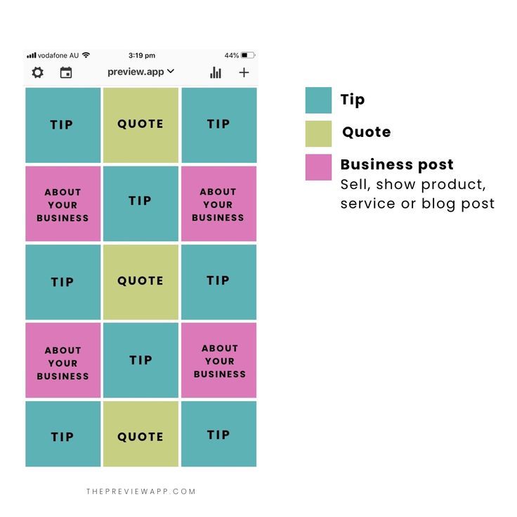
By the way, we have examples of designing not only the Instagram feed, but also profile headers, avatar, stories and highlights. A huge number of beautiful accounts and examples were dismantled in the video below.
Free social media audit
Drawing of 3 places until 24.08. The rest of the participants of the drawing - 50% discount
MoreYou don't have to limit yourself to just square frames. Rectangular, round - experiment with different geometric shapes.
It looks good to use frames of different sizes...
...and frames of different shapes.
Not only white, but also black, frames in all colors of the rainbow.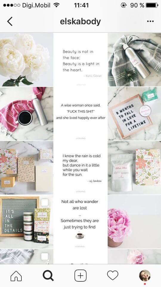
The use of these frames is ideal for the portfolio of a photographer, artist or designer. The frame highlights each photo individually and draws attention to the image itself.
Instagram Stories*: 100+ post ideas
Sometimes frames can not only emphasize a particular photo, but also link the images together to make the profile look whole.
The white-framed branch image is broken into four parts: it creates a sequence between photos and encourages scrolling through the profile further and further. This is a flexible design option, you can only upload one photo at a time. Technically, this is a design along vertical lines, where each line corresponds to the desired part of the frame.
Here is another interesting and plastic design with frames:
Semi-circular frame pieces form waves: they can be of any color, with or without any inscriptions. Sometimes, as in the example, it can be seen that the frames do skip at all - the composition of portrait photos is built in such a way that the image itself fits into the “wave”. Thanks to the variability, the account looks lively and modern, and when publishing a new picture, there are no strict restrictions on colors and content.
A profile with this design is hard to leave. Scrolling through it, you do not notice how time flies. Photos and elements flow harmoniously into each other.
Do you have a marketing blog about your industry? Then this is the perfect submission format. It is easy to lead and guide the reader through the highlighted headings. And additional design elements immediately tell about the theme of the page.
And you can make it easier - cut one photo into 9or 12 parts. Insta-landings are created according to this principle. If you need an Instagram landing page, there is no better option.
Collage and Puzzle designs require third-party applications or skills in Adobe Photoshop, Adobe Lightroom.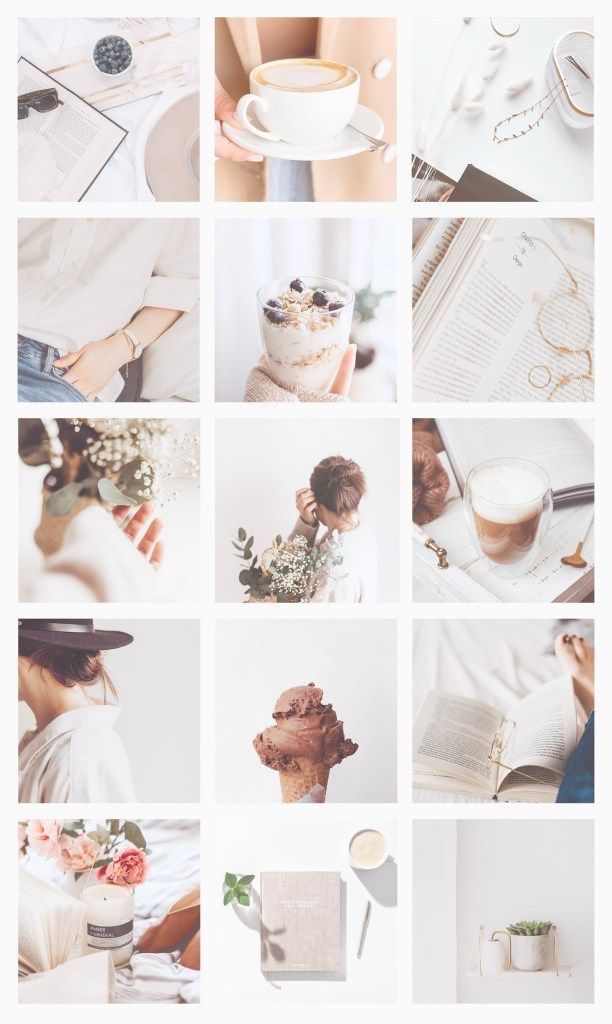
How to work in Photoshop: a complete guide for beginners
An account made up of black and white photos will always look stylish and harmonious. But a little monotonous for a commercial profile. Therefore, you can choose one or more primary colors and use them in your content.
The main color of the page can be changed by planning transitions and choosing photos.
Do you have company colors? Design your page with them. If not, choose those that suit the image you are creating and are better perceived by the audience.
Use the same settings when editing photos. This will give integrity to the page. Bright and contrasting or airy and weightless?
Apply one filter to all photos to get this effect. No matter what your Instagram is dedicated to, this technique will add attractiveness and harmoniously combine all the elements.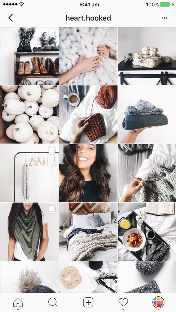
Sometimes using a single color scheme for an account is very restrictive. You can make smooth transitions between colors like gradients.
With transitions between colors, you can publish not only similar photos in the same range, but any pictures. The color will serve as a structure - this is how you can make impromptu sections with photographs: first a series of one color, then a transition, a series of another color.
Interested in promoting on Instagram? We recommend watching a video from our marketer. It contains 15 important tips and a huge number of practical examples:
Select the angle from which photos are taken. Shots with a repeating element or the same feed make the profile recognizable.
Successfully used by cafes, food delivery services, manicure and tattoo artists.
Black and white photography, minimalism, pop art, comics, dudling.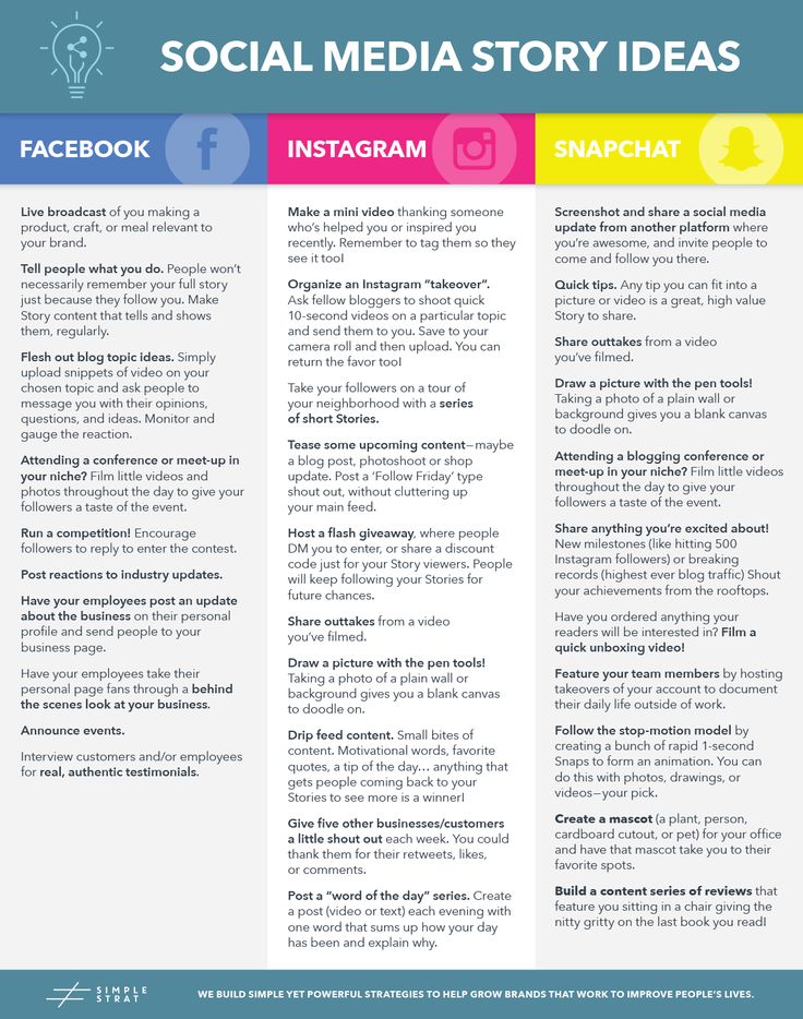 A design in which the components are designed in the same style. Good for illustrators, artists and designers who have found their own style.
Recently, the appearance of the profile is influenced not only by photos: many save their stories in the profile, and for them you can make covers that fit into the style of the account. The covers are quite small, so the images there should be concise and understandable.
Very often illustrations are taken as covers. Simple icons can be downloaded on the Internet or made independently. Perhaps your company already has a set of frequently used illustrations, website icons, or interesting pieces of a corporate pattern that can be transferred to story covers.
70+ resources with free icons, logos, and fonts
Photos might work too. But there are two criteria here. Firstly, they must necessarily depict one object, large and clear.