Mar 23rd, 2017 Last update
If you’re trying to harness the power of Facebook to market your business, great content and lots of engagement are only 2 pieces of the puzzle. To really make the most of your presence on this popular social network, you need your business page to be attractive.
Why is an attractive Facebook page important?
Plus, an attractive, branded page looks more professional, amplifying the benefits of being on Facebook. Use these 5 ideas to get started with this social media and make your business Facebook pages more attractive.
Your page’s cover photo and profile picture are the first things visitors see, so you want them to be beautiful, professional, and powerful. Here are some ways to make your cover and profile photos more attractive:
There are many ways to make these visual aspects of your page more attractive. For example, HubSpot uses a bold yet simple branded cover and matching logo profile. SEOMoz takes a unique approach, showing their headquarters of Seattle in the cover and their mascot robot in the profile photo.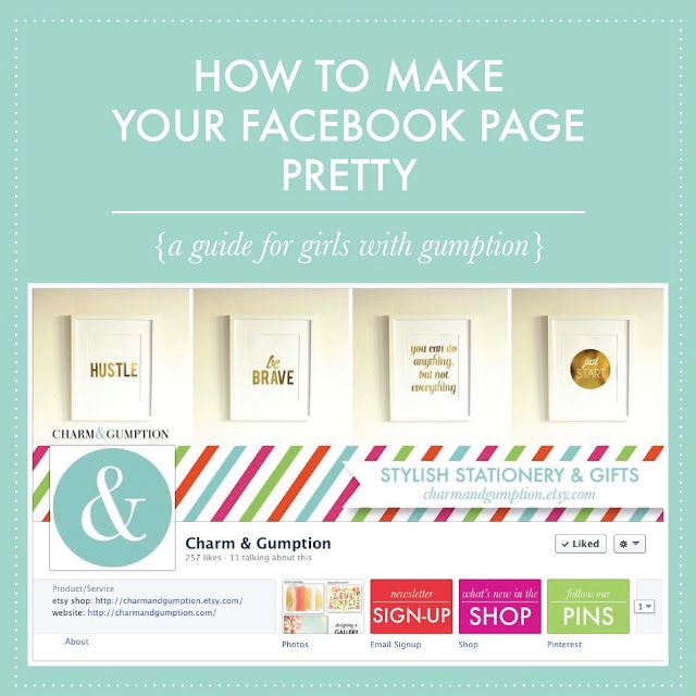
Break up polls, links, and other types of posts with lots of multimedia. Any visual you create for your blog or specific media channels, such as videos for YouTube or infographics for Pinterest, can and should also be shared on Facebook. Visual and interactive content are super popular right now and make a more attractive Facebook page.
What should be in your photos, images, and videos?
Image courtesy of Hubspot

Of course you want to share links on your Facebook page to your own great content and to relevant content you curate. But too many links, especially those with poor or no thumbnail photos or descriptions, quickly clutter your page and make it unappealing.
There are 2 things you can do to solve this problem: use multimedia and other types of posts more often in addition to links, and include great thumbnail photos and descriptions with your links.
That means including a great custom image with every blog post and article you write. And it means writing powerful meta descriptions that entice both searchers and social media users to click through.
Most posts appear about the same size. Even with varied posts and multimedia, this uniform size can make a page a bit boring. To combat this, you can highlight certain posts to make them bigger.
Highlighted posts work especially well with attention-grabbing images of the right size. Small images won’t always resize properly, so in this case bigger is better. HubSpot does a great job using highlighted posts to capture visitors’ attention and make a more attractive Facebook page.
The logo colors in your cover and/or profile help fans know they’ve found the right business page. Using those colors throughout your page in the content and images you create makes the page more attractive and the experience more cohesive, and it helps draw visitors into conversations and down the page. The HubSpot and Content Marketing Institute Facebook pages are good examples.
What works for you? What other business pages are good examples of what makes an attractive Facebook page? Please share your thoughts in the comments below!
Christina Walker
A professional freelance web copywriter with several years’ experience in web marketing and SEO copywriting.
Other posts by Christina Walker
Please enable JavaScript
For full functionality of this site it is necessary to enable JavaScript.
Making your Facebook look attractive is a task that requires time, well-laid-out plans and effort. You must be aware of what is important to your brand image and what you stand for. Having a Facebook page without any idea as to what your brand represents, shows users that you do not care for their attention. All you need is great content and a lot of engagement and you can watch your page grow into the customer-hogging monster that you want it to be. How can you achieve this? All you need to do is make your Facebook page attractive and aesthetic, that would automatically attract people’s eyes.
Facebook, is a widely popular social network, and being one among millions is hard. Especially when you want people to see you. However, by making your business page look attractive you will be inviting a lot more users to engage with your content and it will gradually help you in marketing your business on Facebook. Consider why an attractive Facebook page is important.
• Attractiveness: The more attractive it looks, the more people are drawn to it.
• Aesthetic: it gives people pleasure to look at, thereby influencing them to make decisions of buying your product or service.
• Engagement: People will consume content more often.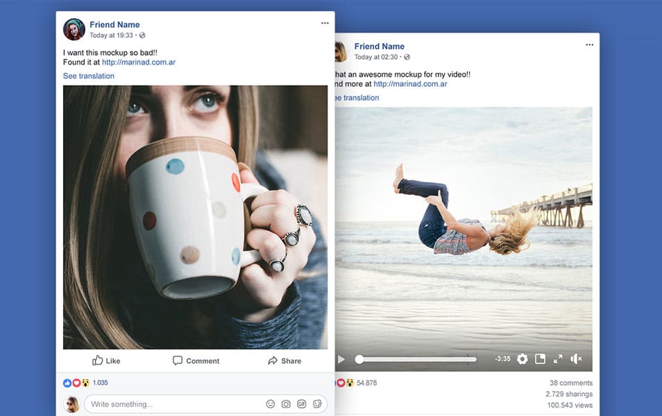
• Sharing: If your posts, photos look good people are more likely to share it with other people.
Additionally, an attractive, branded page looks more professional, thereby amplifying the benefits of being on Facebook. Having effective Facebook posts are important. Here are five things that will make your page more attractive:
1. Creating a big, aesthetic cover photo:Your Facebook page’s cover photo and profile picture are the first things that visitors see when they view your page. So, it must be beautiful, professional and must have a powerful impact on them. There are some ways to make the cover photo and your profile photo more attractive.
• Your profile photo must reflect your brand. It can either include your logo, or an edit relating to what your brand stands for.
• Including some texts in the cover photo, tells the visitors more about business. It can include your company’s motto, vision or tagline.
• Create a cohesive brand experience, your cover photos must include your entire logo or will be similar to your website header.
There are a lot of ways to make your cover photo and profile photo visually appealing thereby attracting more engagement on your Facebook page.
2. Posting a lot of photos, images and videosPosting the same type of content can become monotonous and people could lose attention. Break up posts, polls and links with other types of multimedia.
Any visual you create for your blog or specific media channels, such as videos for your YouTube channel, infographics for Pinterest, must also be included on your Facebook page.
Now, the question arises: What should you include in the photos, videos and images?
• People love to feel connected. Fans and customers want to observe the human side of the brand like your employees, some behind the scenes, other customers, etc.
• Show your company’s products in action. Use videos, photos, infographics, GIFs, etc to show what you do and help your fans connect and visualize the product more. One must also know how to write engaging Facebook posts.
• Memes are a great way to make your content go viral. People can relate and it even makes them laugh, which will make them feel good about themselves. Using images everyone makes it easier to recognize.
• By hosting and attending events, people are aware of who you are as a brand. Take a lot of pictures and behind the scenes to keep people in the loop, to let people relive that experience through these photos.
• Create images that could be your industry or process, infographics depicting statistics and information, testimonials from satisfied customers, excerpts from your blog will make for varied content to prevent your audience from being bored.
3. Use great thumbnail photos and descriptions with links:People need a way to buy your product. Creating great content that is relevant to the content you curate, is an important fact to consider.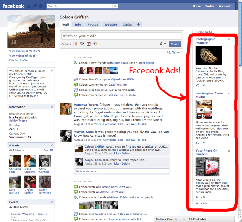 But too many links, with poor or no thumbnail photos or description, quickly clutter your page and make it unappealing. You can simply use multimedia and other types of posts most often in addition to links. Additionally, you can also great thumbnail photos and descriptions with your links. Including great custom images with every blog post and articles that you have written. Writing powerful meta descriptions so that your website can rank better and entice a lot more users to click on your website.
All posts on Facebook have a standard size. By changing up the size of your posts, it calls the attention of the user’s eyes and encourages them to engage with your posts more. Uniform post size makes the page boring. You can choose to highlight the posts to make them appear bigger and better. Editing them to look slightly different also works. Highlighted posts work well with attention-grabbing images of the standard size. These posts can include funny pictures, important slogans, etc. Small images will not resize properly, so having bigger pictures is better.
You must use only your brand colors to keep it uniform and easily identifiable. If people know that your brand colors are white, red and black, make your posts look like that. Integrate those colors as the primary choice to keep it cohesive. Additionally, it helps draw visitors to your page and encourages conversation.
Making your Facebook page attractive is all about creating the right content to keep users engaged and coming back for more. Your page must be reflective of your brand and what you stand for.
Author Vitaliy Kravchenko Reading 4 min. Views 5.5k. Posted by
A personal page on Facebook or any other social network is an effective tool for networking and promotion.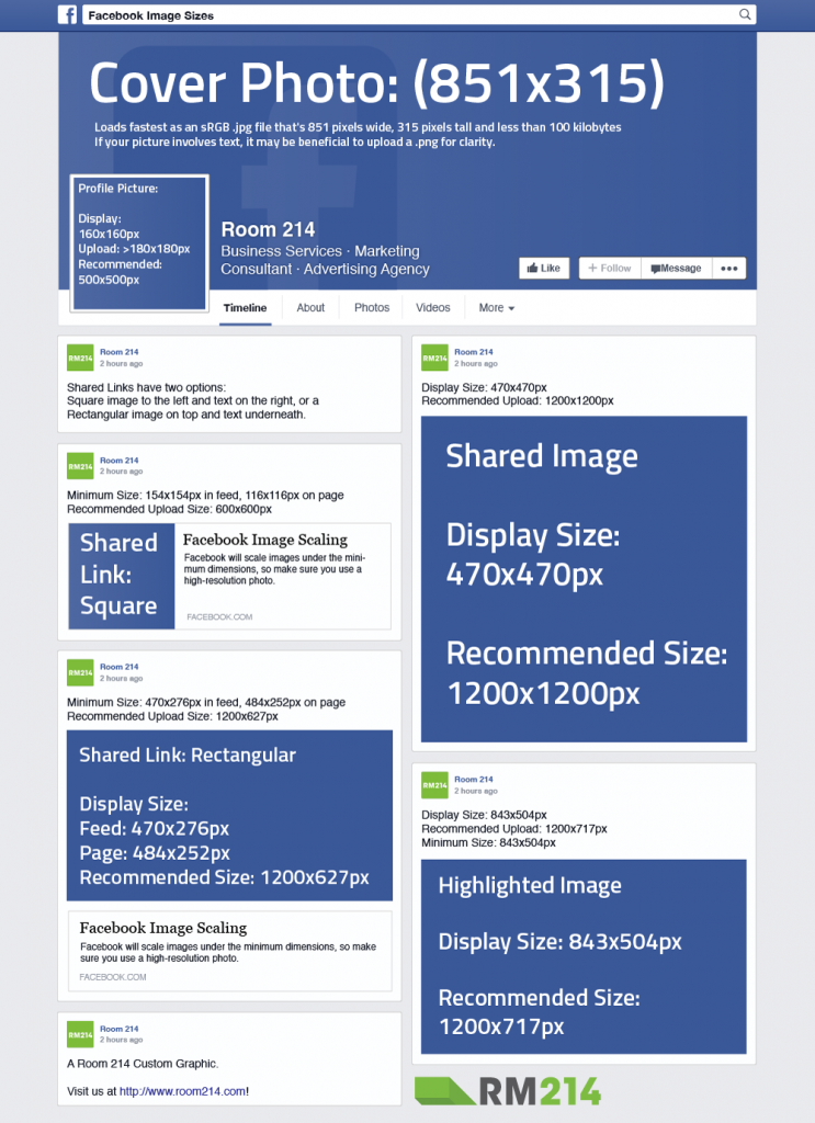 Two factors that affect efficiency are the quality of page maintenance (content) and the quality of design. Today we will tell you what to consider when designing your page. nine0007
Whether you're going to acquire customers, build an HR brand, sell a product, or develop your media presence, it's important to get your Facebook page right.
This social network allows you to create not only a personal account, but also a public page, which in fact will have the same set of functions and tools as a business page. In this article, we will discuss a personal account page.
Contents
The profile header is what a person sees for the first time. It is important to give him as much information as possible, thanks to which he will understand what you are doing and build his associative array.
Cover (1) . You can place any image on it, but it is better not to use family photos and pictures from the Internet. Either design a unique cover, or choose a high-quality photo that is related to your activity. nine0007
Profile picture (2) . There should be a high-quality portrait photo in this place. Without other people, not in full growth, without an overabundance of graphics. You should be perceived by this photo in the comments and posts.
Biography (3) . Here you should write briefly about your activities. Imagine that you need to introduce yourself in just 2-3 words. After reading these phrases, a person should get answers to two questions: what do you do and why is it worth following you. nine0005
In this block, you need to fill in the background information about yourself as much as possible. Thanks to this data and the number of common friends, we can get into the list of recommended pages. In addition to background information, you can add your interests.
Below is a block with selected photos. It should not be left empty either - upload your favorite photos to it or those that vividly reflect the essence of your activity.
To edit this information we have 3 sections:
Facebook has an interesting feature - life events. It was created so that you can share key events in your life with the audience. Next, we will be able to view the chronology of all these changes.
This is how the block looks on the page itselfTo add a new event to the page, click on the plus button (create) and select “Event from life”. nine0007
Facebook has a limit on the number of friends - you can add no more than 5000 friends to your account. This number is reasonably small for many, and Facebook has made it possible to subscribe to your updates without adding them as friends.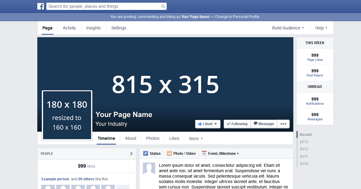
How to allow to subscribe to your page?
1. In the upper right corner, click on the down arrow and select "Privacy Settings", and then - "Settings". nine0005
2. Select the “Public publications” section, mark in the items we need “Available to everyone”.
3. If subscribers are not displayed in the brief information, it is worth checking the inclusion of the option in the “Edit information” block.
To view your subscribers, go to the "Friends" section, select "More" and then "Subscribers".
Content is the most important component of an expert profile on Facebook. We will not discuss how to properly maintain a page or write content within the framework of this article, but I will give some tips that will help increase the number of friends and subscribers. nine0007

Subscribe to the newsletter of the news from Webline Promotion
Email *
Provided SENDPULSE
 In the case of a negative decision, you lose a potential client. And very often - also a chance to at least be deposited in his memory. How, in just a couple of moments, to attract the attention of a person and get him to get in touch with your company? In this article, we will tell you how to create a Facebook page, show you 5 design tricks that will help your company attract more fans, and also give you a delicious bonus at the end of the article. nine0005
 Since 2016, Facebook has changed the requirements for page covers, so the information in this article is outdated. We have written a new review with updated requirements. Read it here.
So, in order to design a Facebook page, at least you will need to upload a cover photo (Cover Photo) and a profile picture (profile picture). Requirements for them:
 Insults, threats, incitement to violence, manifestations of hatred, erotica and pornography, fraud, publication of other people's personal data and copyright infringement are unacceptable. nine0018
  Previously, these restrictions were spelled out in paragraph III B. The requirements for the amount of text remained the same. It should occupy no more than 20% of the total area of the cover.
 1. Be yourself . Your brand must remain recognizable. Even on social media. Use corporate colors, fonts, logo, as well as images relevant to your activity. Visiting your page, people should clearly understand who you are and what you do.
2. Integrate . Sometimes pages look very impressive, on which the cover and profile photo look like one. nine0005
Another interesting trick is to integrate the cover with one of the elements below it. For example, you can draw attention to your blog, application or photo albums.
3. Use text . Visualization is important. But you can convey maximum information only with the help of words.