Nowadays, Instagram is often someone's initial contact with a brand, and nearly half of its users shop on the platform each week. If it's the entryway for half of your potential sales, don't you want your profile to look clean and inviting?
Taking the time to create an engaging Instagram feed aesthetic is one of the most effective ways to persuade someone to follow your business's Instagram account or peruse your posts. You only have one chance to make a good first impression — so it's critical that you put effort into your Instagram feed.
Finding the perfect place to start is tough — where do you find inspiration? What color scheme should you use? How do you organize your posts so they look like a unit?
We know you enjoy learning by example, so we've compiled the answers to all of these questions in a list of stunning Instagram themes. We hope these inspire your own feed's transformation. But beware, these feeds are so desirable, you'll have a hard time choosing just one.
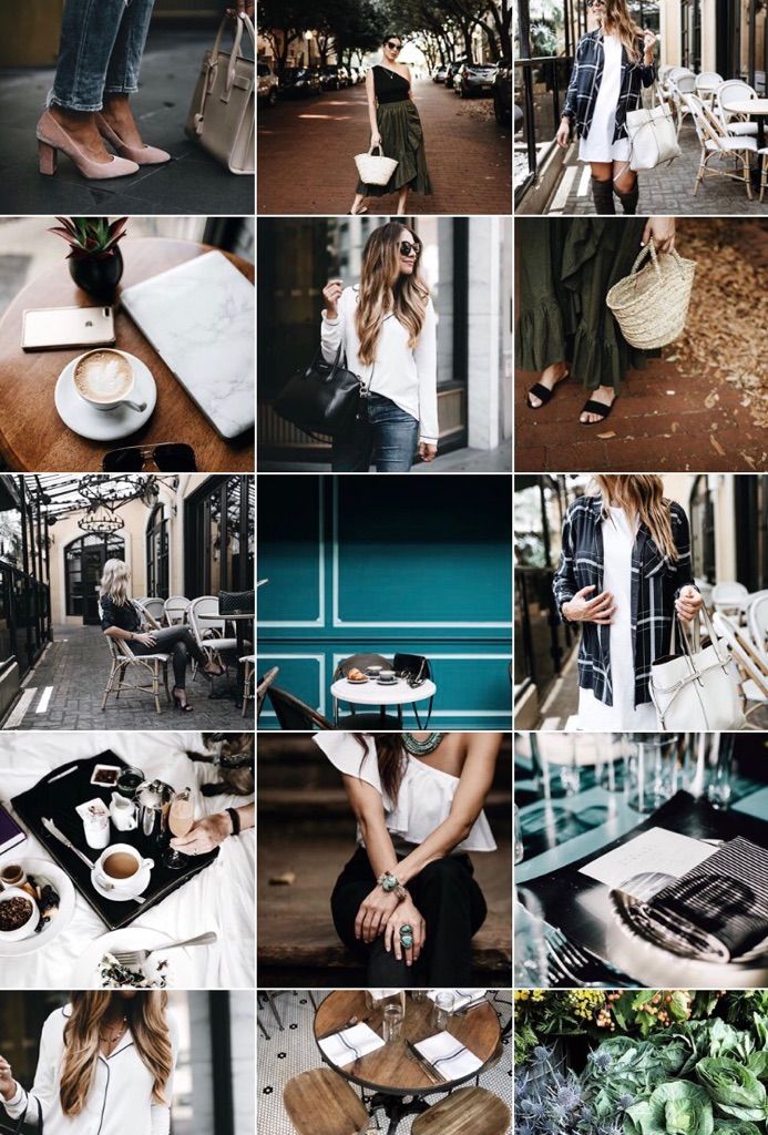
An instagram theme is a visual aesthetic created by individuals and brands to achieve a cohesive look on their Instagram feeds. Instagram themes help social media managers curate different types of content into a digital motif that brings a balanced feel to the profile.
Creating a theme on your own requires a keen eye for detail. When you’re editing several posts a week that follow the same theme, you’ll want to have a design tool handy to make that workflow easier. Pre-set filters, color palettes, and graphic elements are just a few of the features these tools use, but if you have a sophisticated theme to maintain, a few of these tools include advanced features like video editing and layout previews. Here are our top five favorite tools to use when editing photos for an Instagram theme.
Creators look to VSCO when they want to achieve the most unique photo edits. This app is one of the top-ranked photo editing tools among photographers because it includes advanced editing features without needing to pull out all the stops in Photoshop. If you’re in a hurry and want to create an Instagram theme quickly, use one of the 200+ VSCO presets including name-brand designs by Kodak, Agfa, and Ilford. If you’ll be including video as part of your content lineup on Instagram, you can use the same presets from the images so every square of content blends seamlessly into the next no matter what format it’s in.
FaceTune2 is a powerful photo editing app that can be downloaded on the App Store or Google Play. The free version of the app includes all the basic editing features like brightness, lighting, cropping, and filters. The pro version gives you more detailed control over retouching and background editing. For video snippets, use FaceTune Video to make detailed adjustments right from your mobile device — you’ll just need to download the app separately for that capability. If you’re starting to test whether an Instagram theme is right for your brand, FaceTune2 is an affordable tool worth trying.
You know Canva as a user-friendly and free option to create graphics, but it can be a powerful photo editing tool to curate your Instagram theme. For more abstract themes that mix imagery with graphic art, you can add shapes, textures, and text to your images. Using the photo editor, you can import your image and adjust the levels, add filters, and apply unique effects to give each piece of content a look that’s unique to your brand.
Image Source
Have you ever used Adobe Illustrator to create interesting overlays and tints for images? You can do the same thing to develop your Instagram theme. Traditionally, Adobe Illustrator is the go-to tool to create vectors and logos, but this software has some pretty handy features for creating photo filters and designs. Moreover, you can layout your artboards in an Instagram-style grid to see exactly how each image will appear in your feed.
Photoshop is the most well-known photo editing software, and it works especially well for creating Instagram themes. If you have the capacity to pull out all the stops and tweak every detail, Photoshop will get the job done. Not only are the editing, filter, and adjustment options virtually limitless, Photoshop is great for batch processing the same edits across several images in a matter of seconds. You’ll also optimize your workflow by using photoshop to edit the composition, alter the background, and remove any unwanted components of an image without switching to another editing software to add your filter. With Photoshop, you have complete control over your theme which means you won’t have to worry about your profile looking exactly like someone else’s.
 Transition
If you aren’t set on one specific Instagram theme, consider the transition theme. With this aesthetic, you can experiment with merging colors every couple of images. For example, you could start with a black theme and include beige accents in every image. From there, gradually introduce the next color, in this case, blue. Eventually, you’ll find that your Instagram feed will seamlessly transition between the colors you choose which keeps things interesting without straying from a cohesive look and feel.
Image Source
A polished black and white theme is a good choice to evoke a sense of sophistication. The lack of color draws you into the photo's main subject and suggests a timeless element to your business. @Lisedesmet's black and white feed, for instance, focuses the user’s gaze on the image's subject, like the black sneakers or white balloon.
Image Source
If your company's brand is meant to imply playfulness or fun, there's probably no better way than to create a feed full of bright colors.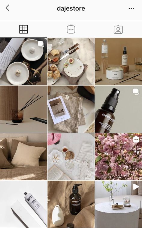 Bright colors are attention-grabbing and lighthearted, which could be ideal for attracting a younger audience. @Aww.sam's feed, for instance, showcases someone who doesn't take herself too seriously.
Image Source
For an artsier edge, consider taking a minimalist approach to your feed, like @emwng does. The images are inviting and slightly whimsical in their simplicity, and cultivate feelings of serenity and stability. The pup pics only add wholesomeness to this minimalist theme. Plus, minimalist feeds are less distracting by nature, so it can be easier to get a true sense of the brand from the feed alone, without clicking on individual posts.
Image Source
One of the easiest ways to pick a theme for your feed is to choose one color and stick to it — this can help steer your creative direction, and looks clean and cohesive from afar. It's particularly appealing if you choose an aesthetically pleasing and calm color, like the soft pink used in the popular hashtag #blackwomeninpink.
Image Source
If you're interested in creating a highly cohesive feed but don't want to stick to the one-color theme, consider trying two. Two colors can help your feed look organized and clean — plus, if you choose branded colors, it can help you create cohesion between your other social media sites the website itself. I recommend choosing two contrasting colors for a punchy look like the one shown in @Dreaming_outloud’s profile.
Image Source
Similar to the one-color idea, it might be useful to choose one color palette for your feed, like @creativekipi's use of pastels. Pastels, in particular, often used for Easter eggs or cupcake decorations, appear childlike and cheerful. Plus, they're captivating and unexpected.
Image Source
As evident from @mustdoflorida's feed (and username), it's possible to focus your feed on one singular object or idea — like beach-related objects and activities in Florida. If you're aiming to showcase your creativity or photography skills, it could be compelling to create a feed where each post follows one theme.
Image Source
Creating a puzzle out of your feed is complicated and takes some planning, but can reap big rewards in terms of uniqueness and engaging an audience. @Juniperoats’ posts, for instance, make the most sense when you look at it from the feed, rather than individual posts. It's hard not to be both impressed and enthralled by the final result, and if you post puzzle piece pictures individually, you can evoke serious curiosity from your followers.
Image Source
Displaying everyday items and activities from unexpected angles is sure to draw attention to your Instagram feed. Similar to the way lines create a theme, angles use direction to create interest. Taking an image of different subjects from similar angles can unite even the most uncommon photos into a consistent theme.
Image Source
A picture is worth a thousand words, but how many pictures is a well-designed quote worth? Confident Woman Co. breaks the rules of Instagram that say images should have a face in them to get the best engagement. Not so with this Instagram theme.
The bright colors and highlighted text make this layout aesthetically pleasing both in the Instagram grid format and as a one-off post on the feed. Even within this strict text-only theme, there’s still room to break up the monotony with a type-treated font and textured background like the last image does in the middle row.
Image Source
If you're not a big fan of horizontal or vertical lines, you might try a checkerboard theme. Similar to horizontal lines, this theme allows you to alternate between content and images or colors as seen in @thefemalehustlers’ feed.
Image Source
While it is a bit jarring to have black or white borders outlining every image, it definitely sets your feed apart from everyone else's. @Beautifulandyummy, for instance, uses black borders to draw attention to her images, and the finished feed looks both polished and sophisticated. This theme will likely be more successful if you're aiming to sell fashion products or want to evoke an edgier feel for your brand.
Image Source
If you prefer uniformity, you'll probably like this Instagram theme, which focuses on using the same filter (or set of filters) for every post. From close up, this doesn't make much difference on your images, but from afar, it definitely makes the feed appear more cohesive. @marianna_hewitt, for example, is able to make her posts of hair, drinks, and fashion seem more refined and professional, simply by using the same filter for all her posts.
Image Source
If your primary goal with Instagram is to showcase your products, you might want a Flatlay theme. Flatlay is an effective way to tell a story simply by arranging objects in an image a certain way and makes it easier to direct viewers' attention to a product. As seen in @thedailyedited's feed, a flatlay theme looks fresh and modern.
Image Source
If it aligns with your brand, vintage is a creative and striking aesthetic that looks both artsy and laid-back. And, while "vintage" might sound a little bit vague, it's easy to conjure. Simply try a filter like Slumber or Aden (built into Instagram), or play around with a third-party editing tool to find a soft, hazy filter that makes your photos look like they were taken from an old polaroid camera.
Image Source
In @girleatworld's Instagram account, you can count on one thing to remain consistent throughout her feed: she's always holding up food in her hand. This type of repetition looks clean and engaging, and as a follower, it means I always recognize one of her posts as I'm scrolling through my own feed. Consider how you might evoke similar repetition in your own posts to create a brand image all your own.
Image Source
 Mix-and-match Horizontal and Vertical Borders
While this admittedly requires some planning, the resulting feed is incredibly eye-catching and unique. Simply use the Preview app and choose two different white borders, Vela and Sole, to alternate between horizontal and vertical borders. The resulting feed will look spaced out and clean.
Image Source
If you're a writer or content creator, you might consider creating an entire feed of quotes, like @thegoodquote feed, which showcases quotes on different mediums, ranging from paperback books to Tweets. Consider typing your quotes and changing up the color of the background, or handwriting your quotes and placing them near interesting objects like flowers or a coffee mug.
Image Source
@JackHarding's nature photos are nothing short of spectacular, and he highlights their beauty by filtering with a dark overtone. To do this, consider desaturating your content and using filters with cooler colors, like greens and blues, rather than warm ones. The resulting feed looks clean, sleek, and professional.
Image Source
One way to introduce color into your feed? Try creating a rainbow by slowly progressing your posts through the colors of the rainbow, starting at red and ending at purple (and then, starting all over again). The resulting feed is stunning.
Image Source
Most people on Instagram stick to photos and filters, so to stand out, you might consider adding drawings or cartoon doodles on top of (or replacing) regular photo posts. This is a good idea if you're an artist or a web designer and want to draw attention to your artistic abilities — plus, it's sure to get a smile from your followers, like these adorable doodles shown below by @josie.doodles.
Image Source
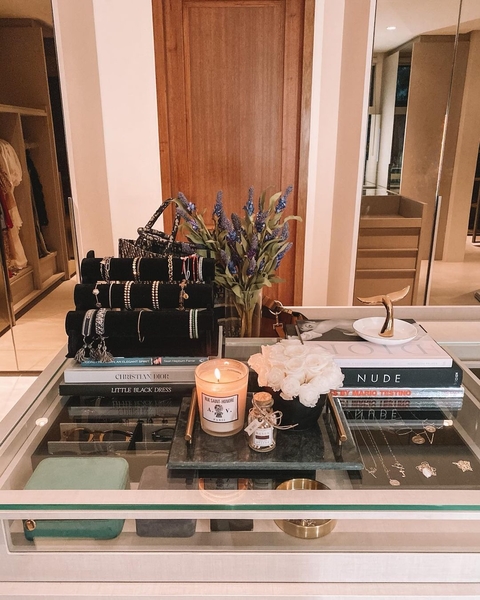
Similar elements in your photos can create an enticing Instagram theme. In this example by The Container Store Custom Closets, the theme uses shelves or clothes in each image to visually bring the feed together. Rather than each photo appearing as a separate room, they all combine to create a smooth layout that displays The Container Store’s products in a way that feels natural to the viewer.
Image Source
Something about this Instagram feed feels different, doesn’t it? Aside from the content focusing on skyscrapers, the lines of the buildings in each image turn this layout into a unique theme. If your brand isn’t in the business of building skyscrapers, you can still implement a theme like this by looking for straight or curved lines in the photos your capture. The key to creating crisp lines from the subjects in your photos is to snap them in great lighting and find symmetry in the image wherever possible.
Image Source
If your brand does well with aligning photography with content, you might consider organizing your posts in a thoughtful way — for instance, creating either horizontal or vertical lines, with your rows alternating between colors, text, or even subject distance.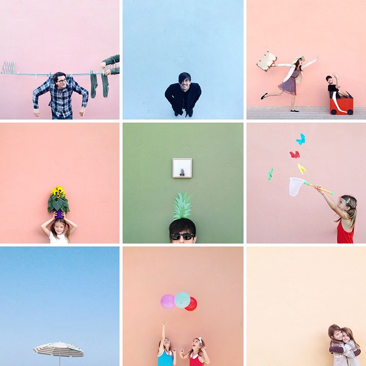 @mariahb.makeup employs this tactic, and her feed looks clean and intriguing as a result.
Image Source
One major factor of any Instagram theme is consistency. For instance, you wouldn't want to regularly change your theme from black-and-white to rainbow — this could confuse your followers and damage your brand image. Of course, a complete company rebrand might require you to shift your Instagram strategy, but for the most part, you want to stay consistent with the types of visual content you post on Instagram.
For this reason, you'll need to choose a color palette to adhere to when creating an Instagram theme. Perhaps you choose to use brand colors. HubSpot's Instagram, for instance, primarily uses blues, oranges, and teal, three colors prominently displayed on HubSpot's website and products.
Alternatively, maybe you choose one of the themes listed above, such as black-and-white. Whatever the case, to create an Instagram theme, it's critical you stick to a few colors throughout all of your content.
As noted above, consistency is a critical element in any Instagram theme, so you'll want to find your favorite one or two filters and use them for each of your posts. You can use Instagram's built-in filters, or try an editing app like VSCO or Snapseed. Alternatively, if you're going for a minimalist look, you might skip filters entirely and simply use a few editing features, like contrast and exposure.
Whatever you choose, though, you'll want to continue to edit each of your posts similarly to create a cohesive feed.
It's vital that you plan your Instagram posts ahead of time for a few different reasons, including ensuring you post a good variety of content and that you post it during a good time of day.
Additionally, when creating an Instagram theme, you'll need to plan posts in advance to figure out how they fit together — like puzzle pieces, your individual pieces of content need to reinforce your theme as a whole. To plan posts far in advance and visualize how they reinforce your theme, you'll want to use a visual Instagram planner like Later or Planoly. Best of all, you can use these apps to preview your feed and ensure your theme is looking the way you want it to look before you press "Publish" on any of your posts.
In middle school, I often liked to change my "look" — one day I aimed for preppy, and the next I chose a more athletic look. Of course, as I got older, I began to understand what style I could stick with for the long haul and started shopping for clothes that fit my authentic style so I wasn't constantly purchasing new clothes and getting sick of them a few weeks later.
Similarly, you don't want to choose an Instagram theme you can't live with for a long time. Your Instagram theme should be an accurate reflection of your brand, and if it isn't, it probably won't last. Just because rainbow colors sound interesting at the get-go doesn't mean it's a good fit for your company's social media aesthetic as a whole.
When in doubt, choose a more simple theme that provides you the opportunity to get creative and experiment without straying too far off-theme.
When you start an Instagram theme, there are so many options to choose from. Filters, colors, styles, angles — the choices are endless. But it’s important to keep in mind that these things won’t make your theme stand out. The content is still the star of the show. If the images aren’t balanced on the feed, your theme will look like a photo dump that happens to have the same filter on it.
To curate the perfect Instagram theme, choose what photos you plan to post before choosing a theme. I highly recommend laying these photos out in a nine-square grid as well so you can see how the photos blend together.
Sure, no one is going to see the captions of your Instagram photos when they’re looking at your theme in the grid-view, but they will see them when you post each photo individually. There will be times when an image you post may be of something abstract, like the corner of a building, an empty suitcase, or a pair of sunglasses. On their own, these things might not be so interesting, but a thoughtful caption that ties the image to your overall theme can help keep your followers engaged when they might otherwise check out and keep scrolling past your profile.
If you’re having a bit of writer’s block, check out these 201 Instagram captions for every type of post.
Earlier, we talked about choosing a theme that you can commit to for the long haul. But there’s an exception to that rule — color transitions. Some of the best themes aren’t based on a specific color at all. Rather than using the same color palette throughout the Instagram feed, you can have colors blend into one another with each photo. This way, you can include a larger variety of photos without limiting yourself to specific hues.
Instagram marketing is more than numbers.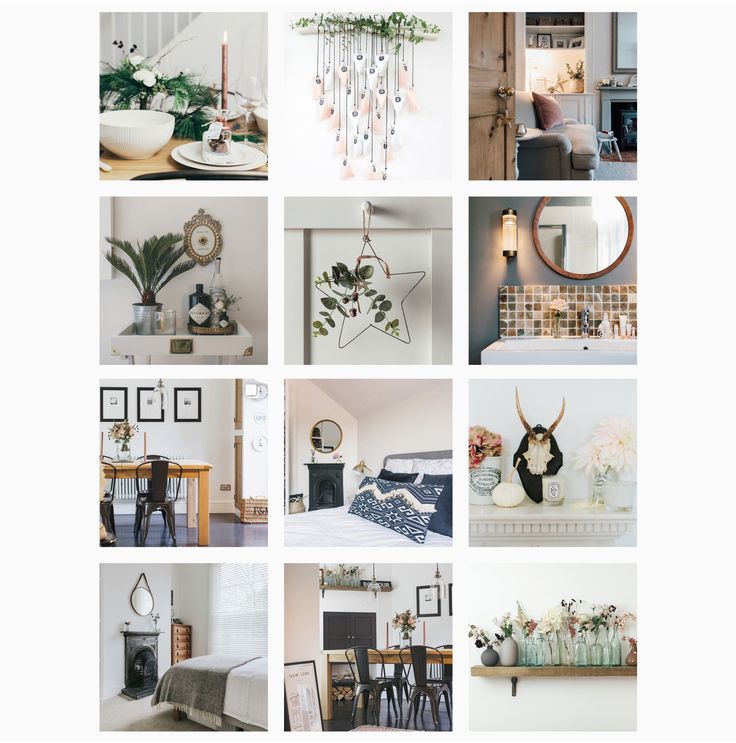 As the most visual social media platform today, what you post and how it looks directly affects engagement, followers, and how your brand shows up online. A cohesive Instagram theme can help your brand convey a value proposition, promote a product, or execute a campaign. Colors and filters make beautiful themes, but there are several additional ways to stop your followers mid-scroll with a fun, unified aesthetic.
Editor's note: This post was originally published in August 2018 and has been updated for comprehensiveness.
Topics: Instagram Marketing
Sometimes it’s nice to take a break from endlessly scrolling through your feed — and endlessly scroll through someone’s individual Instagram page instead.
Welcome to The Grid.
Lined up neat rows of three, each Instagram post suddenly is part of a bigger picture.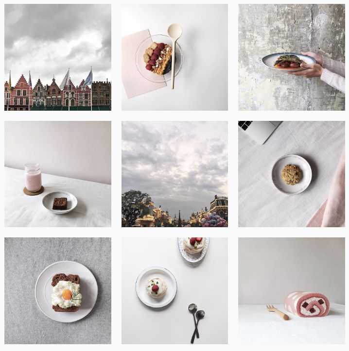 A peek into a user’s soul… or at least their content strategy.
And Instagram power users know just how to work this viewpoint to their advantage, with artfully planned posts that, together, create a gorgeous Instagram grid layout.
If you haven’t thought about what your own rows of squares add up to, it’s about time. Here’s all you need to know about building an attention-grabbing Instagram grid to grow your following and engagement.
Why your Instagram grid layout matters
7 creative ways to design an Instagram grid layout
5 tips for planning a gorgeous Instagram grid layout
Bonus: Get 5 free, customizable Instagram carousel templates and start creating beautifully designed content for your feed now.
When someone follows you for the first time, or navigates to your profile to check out your content, your grid is an opportunity to showcase your vibe or brand.
The grid gives you a birds-eye view of a user’s posting history. This is your first impression of their, uh, body of work: an introduction at a glance to their personal or professional brand at a glance.
For individual users, creating a beautiful grid may not matter — sure, color coding your posts could be a fun personal challenge, but if you’re just on the ‘gram to connect with friends, not amass an audience, branding likely isn’t too important.
But for brands, creatives or influencers, consistency and style are critical… particularly if your account is focused on aesthetics or lifestyle.
After all, your grid is a quick and easy way to get your message across. Plus, anyone viewing your profile is thinking about following you. This is your chance to show exactly what you offer.
Are you avant-garde, or on trend? Will your content soothe, or bring the drama? Is your brand consistent, or chaotic? One look at a grid, and they’ll get the (sorry not sorry) picture.
Great grids start with a vision, so we’ve scoured the depths of Instagram to dig up some of the slickest styles to inspire your own look.
Commit to a color comboThis is probably the most common grid style going — not that I’m calling anyone lazy (don’t @ me!), but it really doesn’t get much easier.
Pick a color palette (pinks and greys?) or a certain tone (high contrast neons?) to feature in every photo. Viewed together, your gallery will look like a matching set, even if the content of your pics vary. Home and lifestyle influencer
@the.orange.home exclusively features photos with bright, white backgrounds with earth-tone accents. It’s a vibe.
In case your home or office isn’t decorated like an Insta-ready backdrop, one easy way to make sure your photos all speak the same visual language is simply to use the same filter for every photo to help create a consistent tone.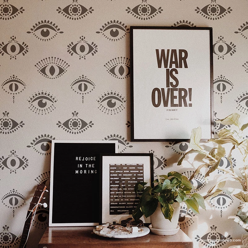
A variation on this theme? Using a standard filter or color palette, but also working in an “accent” color or filter every few posts, too. Maybe your feed is mostly dreamy, sepia-toned boho fantasy, but every few rows, we see a vibrant pop of forest green. Woo! You’re playing with fire!
Create a checkerboard effectBy alternating the style of photo you post, you’ll easily create a checkerboard look on your grid. Try alternating text quotes with photography, or mixing close-up shots with landscape photos. Going back and forth with two distinct colors can work, too.
Some adorable inspo for you: here, parenting resource @solidstarts alternates between photos of snacking babies and how-to graphics.
Hot tip: if you’re using text-based posts, keep the background color or fonts consistent to really make the pattern clear. Check and mate.
(Need a little help on the graphic design front? There are tons of great tools and templates out there to create visuals that pop.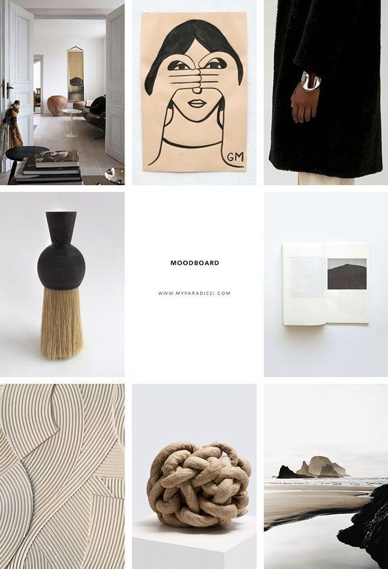 )
)
Think outside the box… and inside the, um, row. Uniting the images on each row by theme or color can create a powerful impact.
PR firm @ninepointagency, for example, goes with a different background color for each palette on their grid.
The trick for this one, of course, is that you have to post three images at a time, or the alignment will be off.
If you’re bold enough to experiment with panoramic images for one of your rows — a trio of photos that add up to one long, horizontal image, you daredevil, you, — many users post the same caption for each one to make it clear they’re three parts of a whole, like photographer @gregorygiepel did with his architectural shots.
Create a vertical columnBreaking up the grid with squares that create a vertical, central image is a great way to mix graphic branding elements and photography together on your profile.
Vancouver’s @communitybreathwork uses both a vertical and a horizontal connected image in this part of their grid — but the images can technically all still stand alone.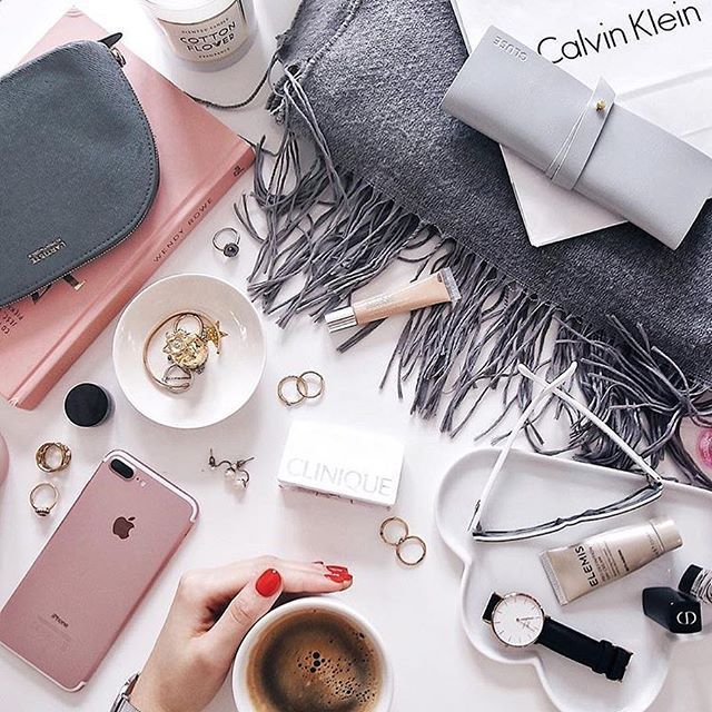 (Or… lay down alone?)
You need both patience and a great color sense to pull this look off. The goal is to post regularly in one saturated color… and then slowly transition to the next shade in the rainbow with your next rows of posts.
To truly get the full effect of drag queen @ilonaverley’s rainbow ‘gram grid, you’ll need to scroll for yourself, but here’s a screenshot of her transition from green to yellow.
Embrace the borderCreating a consistent look can be as simple as applying a border to all of your images.
Stylist @her.styling uses white square borders on all of her images, but you could create a signature look with any range of colors. The free Whitagram app is one option to quickly apply this edit, with borders and backdrops in all sorts of different shades.
Turn your posts into a puzzleThis layout is a tricky one to pull off on a day-to-day basis, but for a big announcement or campaign, or to launch a new account, a puzzle grid certainly packs a punch.
A puzzle grid creates one big, interconnected image out of all the squares. Individually, these posts probably look like nonsense. But viewed together, it’s a work of art.
Give commercial photographer @nelsonmouellic a round of applause for this visual feat, will ya?
Of course, none of these sleek grids happen by accident. You gotta grind for that grid! Here are some things to keep in mind as you’re planning out the big picture.
1. Preview firstBefore you post it: map it.
You could mock it up in photo-editing software, or use Hootsuite’s app integration that lets you preview your layout before it goes live. Right now, it’s for personal accounts only, but business account functionality is coming soon.
Bonus: Get 5 free, customizable Instagram carousel templates and start creating beautifully designed content for your feed now.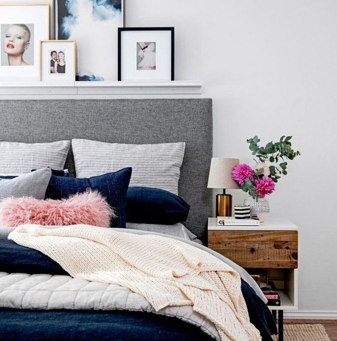
Get the templates now!
Create an Instagram grid layout of up to nine images, and then schedule them to go up in the exact right order via the Hootsuite dashboard.
2. Keep it consistentCreating a great Instagram grid means sticking to a plan. One off-beat photo in the wrong color, the wrong filter, or in the wrong order can throw your whole look out of whack.
Just imagine if luxury goods company @shopcadine tossed in a picture of a #kitchenfail to their muted, earth-tone, carefully curated collection of photos. Instant chaos!
3. Make sure it matches your brandUltimately, the goal of a grid isn’t just to impress your friends with your dedication to using a particular Lightroom preset filter. It’s to build a unified look for your brand.
So, if you’re a recruiting firm for high-level executives, like @mrinetwork for instance, having a playful rainbow grid might not quite fit the professional and serious tone you’re going for. A monochromatic, text-based series of posts, on the other hand…
In case you haven’t figured it out yet: Instagram is a visual medium… and it’s hard to put together a great grid unless the individual pictures also are great.
Luckily, there are tons of great photo editing tools out there, as well as expert advice around every corner… for example, our guides to taking great Instagram photos and staying on top of the hottest Instagram trends.
5. Schedule your posts in advanceKeep your gorgeous grid active and updated with the help of a scheduling tool that allows you to drop just the right filtered pic (or three) at just the right time. Hootsuite’s dashboard, for example, makes it easy to prep your best photos at your convenience. Get that grid going!
Of course, creating a great grid is just one way to capture attention on the ‘gram. For more marketing tips and tricks to take your account to the next level, check out our ultimate guide to Instagram marketing here.
Grow your Instagram presence using Hootsuite. From a single dashboard you can schedule and publish posts and Stories directly to Instagram, engage your audience, measure performance, and run all your other social media profiles. Try it free today.
Get Started
Easily create, analyze, and schedule Instagram posts, Stories, and Reels with Hootsuite. Save time and get results.
Free 30-Day Trial
Choose a nickname, avatar, make a description, buttons and "Eternal Stories".
Valeria Svirskaya
founder of InShow agency, commercial writer
The head of the InShow content marketing agency and commercial writer Valeria Svirskaya talks about the basic principles of creating a profile on Instagram. The product belongs to an organization recognized as extremist in the Russian Federation, which will help you quickly find your profile in search and convert a client into a buyer.
As a basis, we took the account @primacandle on Instagram. The product belongs to an organization recognized as extremist in the Russian Federation, which is maintained by our agency. It is designed according to all the rules described in the article.
The best thing you can do for the promoted brand is to come up with a simple and understandable nickname that both the student and his grandmother will write down by ear. In this matter, the main rule is not to complicate things. Usually, the user enters a new nickname no more than 2-3 times, if the required account is not found, he easily switches to another brand.
Avoid:
How Apple does social media - detailed analysis with examples of good design of profiles on Instagram *
by InstagramThe product belongs to an organization recognized as extremist in the territory of the Russian Federation.
is the same as letters, so @rr_r and @ppr are two different accounts and the user will get confused. A simple nickname that repeats the name of the brand. Easy to remember, no unnecessary characters and numbersGetting it right
- Use words that are simple and clear and easy to write down by ear.
- If there are 2-3 words in the profile name, write the nickname without dots and underscores. But better - cut it down to one word.
- Try to come up with a name that does not repeat well-known brands.
- Ideally, if the nickname is short and easy to remember, for example, @ohmylook, @tsvetnoy and @idocvm.
Connect Instagram* in Amplifer and publish photos, videos and carousels directly through your computer. Get recommendations for the best time and track post statistics. 7 days free
Cheat sheet for social media with platform recommendations
An avatar is the face of your brand and can be seen in the general feed, Stories, comments, and profile. A weighty reason to look good and become recognizable. Tips for photos in Instagram will help you make an avatar. The product belongs to an organization recognized as extremist in the territory of the Russian Federation. Let's say you produce handmade bears and want to put a product photo on an avatar. The worst thing you can think of is to shoot a bear on an old smartphone in the evening under artificial yellow light. And such examples on Instagram The product belongs to an organization recognized as extremist on the territory of the Russian Federation.
is too much.
InstagramThe product belongs to an organization recognized as extremist on the territory of the Russian Federation.. The avatar shows a color, high-quality photo of the owner of the Primacandle brand with the product. It immediately gives the impression that the account is maintained by Natalia herself, this inspires confidence among new subscribersHow to do it right
- If you have an online store or a brand, put a large logo on the avatar. Subscribers react more actively to photos with faces, but if you are not the face of your business, it is better to show the logo.
A high-quality logo inspires more trust in the brand even before the moment of purchase.
- If you are an entrepreneur or freelancer, put the best portrait on your avatar. The photo must be of high quality, with an open face. High-quality does not mean studio and made on an expensive camera, now it is easy to take a great photo on a smartphone. Choose a sunny day, find a white wall, clean your smartphone camera and take dozens of photos, you will surely like one of them.
- Be sure to adapt the logo for the avatar. The brand name should be clearly visible, for this it is better to choose a sans-serif font, so it will be better read, and the font and background colors should be contrasting. If you have a logo in pastel colors, come up with a black and white version or a monogram specifically for
InstagramThe product belongs to an organization recognized as extremist on the territory of the Russian Federation..- Choose real photos for your avatar, no stock images.
Users have learned to identify falsehood and such an avatar can play against you.
Account name - 30 characters. This information is indexed by the search InstagramThe product belongs to an organization recognized as extremist in the territory of the Russian Federation. Therefore, fill in carefully. Indicate the city and keywords, for example, "cakes Moscow" if you are a confectioner from Moscow. There is no need to duplicate the brand name if it is indicated in the nickname.
Account description - 150 characters. It's kind of a price tag. At first glance, the client must understand whether he needs you or can move on. In the description, include all the key information about the brand:
How to use emoji in social networks - Amplifer's guide
Emoji . In profile descriptions, we use emoji to structure the text, highlight keywords, and grab attention. Users
Users InstagramThe product belongs to an organization recognized as extremist in the territory of the Russian Federation. are already accustomed to the fact that emoji with an envelope indicate mail, and a handset - a mobile number. This makes it easier to grab attention and quickly find the most important thing.
Unusual font . In some profiles, you can see non-standard text in the account description. This is a good way to draw the user's attention to the most important thing. You can make such a test at sprezzkeyboard.com.
Additional text in account description . If 150 characters is not enough for you, there is an easy way to add information in the profile description. To do this, you must have a connected business profile. Go to Settings (Options) → Edit profile (Edit profile) → section Company information (Business information) → Contact options (Contact options) → Address (Address). In field City (City/town) enter your city, and in field Address (Street Address) - missing text.
Instagram analytics guideThe product belongs to an organization recognized as extremist in the Russian Federation. — detailed analysis
Active buttons . Business accounts have active buttons Call , letter , text and How to get to if the owner has added a phone number, email address and location. On the one hand, this is the instant inclusion of the user. On the other hand, not everyone notices the buttons, because they merge with the background of the application, and in the desktop version they are not displayed at all. Therefore, duplicate important information in the account description.
In the mobile application InstagramProduct belongs to an organization recognized as extremist in the territory of the Russian Federation. buttons for call, mail and location are active These buttons are not available in the browser Link in the description . When you add an active link, make sure that it leads to the actual page. For example, if you have an online store, then put a link not to the main one, but immediately to hot commodity items. If the emphasis is on the blog, then indicate the link to the last article. Sometimes, instead of a link to a website, you can see a link generated by mssg.me, linktr.ee, or a similar service.
Such services make simple landing pages where you can specify several ways of communication. For example, WhatsApp, Viber, Telegram and website. This is convenient, but often users do not respond to unfamiliar and incomprehensible links and simply do not follow them. Therefore, add a call to click on the link in the description.
List of buttons that open via a link from the descriptionTry Amplifer to post to Instagram* directly from your computer, without notifications, receive analytics reports and recommendations on the best time to post
How beautiful it is to lead InstagramThe product belongs to an organization recognized as extremist in the Russian Federation.
company — column of the founder of "Periodiki Press" Varvara Vedeneeva
Recently InstagramProduct belongs to an organization recognized as extremist in the Russian Federation. added Highlights - collections of "Stories" that are displayed under the profile description. This feature is not available to all profiles, but “eternal stories” are actively used abroad. The most popular format is thematic icons with a description of a service or product.
We added candle-making videos to Eternal Stories, but this format didn't really go well: such posts got only 2,000 views more than regular Stories. We left them, but moved promotions and sweepstakes to the first positions.
Announcement of the action for Valentine's Day InstagramThe product belongs to an organization recognized as extremist in the territory of the Russian Federation. .
. InstagramThe product belongs to an organization recognized as extremist in the Russian Federation, so add keywords (your city, what you do) Register and connect Instagram* to Amplifer to schedule posts with text, photos and videos directly from your computer. Track post statistics and get recommendations for the best time to post
Share
* The activities of the Meta organization are recognized as extremist and banned on the territory of the Russian Federation
Instagram page design is an important part of promotion. An attractive visual will set you apart from the general background, attract the attention of the target audience. And this is a guarantee of a large number of subscriptions, likes and sales. You can make an aesthetic design without specific knowledge and skills.
In this article, you will learn what an ideal Instagram profile should look like. Get ideas and examples of original account design.
Program for promotion in Instagram - SocialKit:
Registration >>>
We recommend that you divide the profile transformation process into subsections. Here is an example checklist:
Let's move on to a detailed analysis of each item.
The first step is choosing a nickname and username. The main thing here is not to complicate things. The name can be written both in Cyrillic and in Latin. Nickname - only in Latin.
Nick is displayed in the header and link to the account, indexed by search engines. The page title should be unique, memorable and simple. It is better to use one word, and without letters with double spelling in Latin. Users should easily pronounce it and find it in the search.
For a personal profile, choose a first and last name. For example, Johnny Depp's account nickname is @johnnydepp.
The nickname of a business page is often the brand name. You can add a description of the subject of goods or activities to it. So, the company "Children's World" chose the nickname @detmir_shop.
Some more good examples: @flowers_cafe and @my_cake_kiev. Already from the nicknames themselves it is clear what these accounts are about. Add a keyword to your nickname - this way you will take a higher position in the search.
The profile name must not repeat your nickname. You have only 30 characters at your disposal. Therefore, discard unnecessary emoticons and symbols, display the main topic of the account. Add a few keywords to this column that reveal the scope of your activity. For example:
Be sure to indicate if you provide services or sell goods in a specific location. For example, a FAMILY PHOTOGRAPHER. Rostov-on-Don.
The blogger can write his real name, surname or his creative pseudonym.
The picture in the left corner of the profile is your face on Instagram. The selected photo should be clear and contrasting, without unnecessary details.
Users like to see the lives of real people. Therefore, for a personal profile, you should choose your portrait from an original angle.
It can be unusual, for example, painted - art avatars are in trend now. Ideally, the snapshot should reflect the theme of your blog. For example, a photographer with a camera, a pastry chef near the oven, a zoo volunteer with animals.
The best avatar for a business page is a photo of a top product or a company logo.
If you work for quantity, not quality, and you need many accounts with avatars at once, then you can use the profile photo generation function in the SocialKit program. This option can be activated during mass registration of Instagram accounts.
You have 150 characters to describe yourself concisely but succinctly.
Ask potential subscribers the following questions:
USP and call to action at the end play an important role in the description. For example, “Subscribe if you want to keep abreast of beauty news!”. Also in the bio, you can add a link to the branded hashtag, information about fresh discounts, promotions and bonuses. For example, how did the Ozon online store.
The text in the profile header can be supplemented with emoji that will set the mood and structure the lines. Here is a good example of a commercial account using emoji.
It is important to take care of formatting. The Telegram bot @text4InstaBot will help you make paragraphs and indents.
Another feature is the use of original fonts. To do this, you can use applications and services, for example, Font for Instagram or Textygram.
Advice : Avoid complex sentences and specialized terms. People should understand the meaning of the description by reading it once.
Be sure to add a link to another social network or your own website in the description.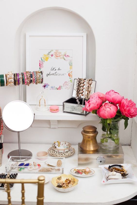 It can also be a link to a messenger, a page with a lead magnet, a blog.
But there is one caveat: according to the developers' idea, there should be only one link in the description. Those wishing to bypass this limitation are advised to create a multilink. Using the Taplink, MeConnect or, for example, Sitelite service, you can make a business card page indicating pages in other social networks, instant messengers, a website and special offers. And all this will be available through one link, which you will have to add to Instagram.
This is how it is implemented in the @house_textiles profile.
And when the link is opened:
The business profile owner has the ability to add feedback buttons to the header. Any user will be able to send you a letter by email, write to Direct or call.
After a recent Instagram update, cafes and restaurants that have delivery services can add an "Order food" button to their profile.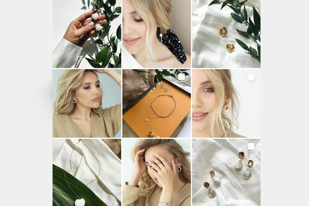
If you have an offline store, be sure to include its address. A potential buyer will click on the line with the address and get on the map - this will allow him to clearly see where you are.
Highlights Stories are useful for adding reviews, product catalogs, FAQs, etc. With their help, you can create any sections that will be displayed at the bottom of the profile. For each album, you can choose a cover and a title (maximum 16 characters).
Here are three examples with different visuals.
Rezon used their own logo for all covers, making them the same.
Beauty Center "Style" posted the name of the company. In order for the letters to go in the right order, the SMM specialist had to add the sections in reverse order. After all, the function of changing the location in Instagram is not provided.
Another example of attractive covers. Here they are different, but decorated in the same style.
Find suitable images on Pinterest, FreePik or Highlight cover maker. It is important that the visual is combined with the overall style of your profile. And he clearly demonstrated what the user is waiting for in this section.
Album options:
Although you can create more than 20 menu sections, it's best to limit yourself to 4-5. So the audience will not get lost in the variety of topics.
IGTV is Instagram TV, sort of like a YouTube channel. Its design also plays an important role in the overall perception of your page.
Upload a cover image for each video instead of a freeze frame. Ideally, it should be a photo that explains the essence of the video. The cover can be created using Canva.
It is important that the covers in the IGTV tab are combined with each other and the design of the entire profile.
A single visual design of the account will interest users and encourage them to subscribe.
For this, it is important to consider the following points.
Before publishing, evaluate not each photo separately, but as part of the overall composition. Pictures should merge without standing out from the background of others. If the images are too different, harmonize with frames and filters. Alternatively, use ready-made covers for posts. Programs and services will help you design the feed: Snapseed, Canva, VSCO, Instasize and UNUM.
To quickly fill the feed, you can prepare several photos at once and set up auto-posting to Instagram via SocialKit. As an option to do Installing.
A beautifully designed Instagram account will help you make a big statement about yourself and attract the attention of potential followers.
Every step is important here: