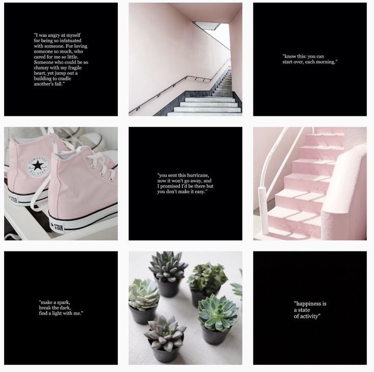
Share a photo, then a quote, then a photo, then a quote, etc…
Alexandra | Nov 16, 2017
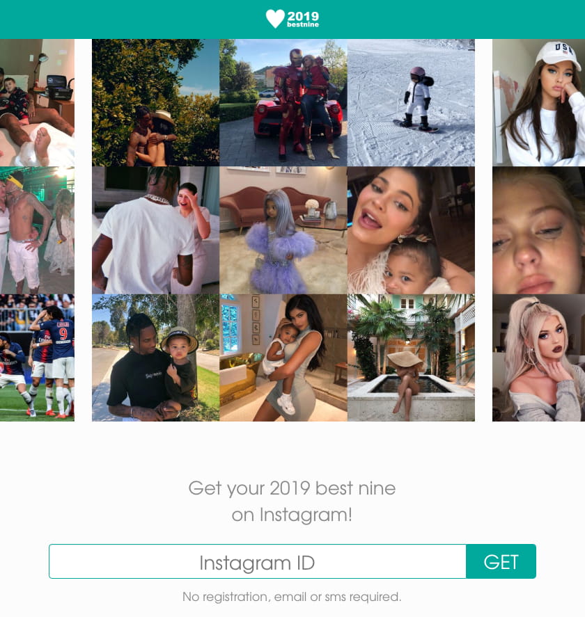
There are 7 different Instagram feed layouts you can create.
In this blog post I’m going to show you how you can make the “tiles” layout using Preview app.
The most popular tiles layout is when people alternate between a photo and a quote.
Let me explain exactly how you can make an Instagram feed like that:
Sounds good? Let’s start.
The most popular way to use this layout is by choosing 2 types of posts. For example:
You don’t have to only use quotes. Be as creative as you want.
For example, you can share your new blog post title, an icon, an emoji, a drawing…
Let’s say you want to use quotes. The trick is to alternate between quotes and photos like this:
Share a photo, then a quote, then a photo, then a quote, etc…
That’s when using Preview app becomes super handy because it helps you rearrange the order of your posts. You can design your entire feed in the app before you post anything on Instagram.
Before I show you how to do that, you need to prepare your quotes.
Do you want to use quotes for your layout? If yes, keep reading.
If you already have all your posts ready, jump to the next part.
People usually share quotes on a white background.
There are 4 ways you can create quotes for your Instagram. You can use:
I show you how to use the last three in this blog post: 3 Tools to Create Instagram Post Templates.
Quick tip: Keep your quotes simple. Try to use the same font, font size and font color. It will make your feed look cleaner and more organized. It will also create visual consistency very easily.
Here are some quotes I’m going to use:
Do you have some posts ready? Let’s add them in Preview to design your feed.
To add your photos in Preview:
Your photos will load in Preview. It will look messy like this. It’s ok. We’ll take care of it in the next step.
This is the fun part! It’s time to rearrange the order of your posts to make the tiles.
Use the drag and drop feature in Preview to rearrange the order of your photos.
To drag and drop:
Don’t forget: The trick is to alternate between a photo and a quote.
When you want to post on Instagram:
Done!
Quick note: If you had prepared your caption, Preview will automatically copy it for you. All you have to do is paste it in your Instagram caption before you post.
Click here to use it
Want to have fun and give your Instagram account a creative and unique look? Then, try to split photos into a grid. You’ve seen this technique used on other accounts, and now we’ll show you how to do it for yourself. Who knows – maybe this could help you get out of your engagement slump and attract new followers.
You could split your photos into a variety of formats:
To get more creative, you can also tell a running story through your images.
First, find the image that you would use and cut it into equal square sizes using the Instagram photo editing tools we provide further below.
It’s important to make sure every image looks good individually when splitting because people will see each image separately while scrolling through their feed.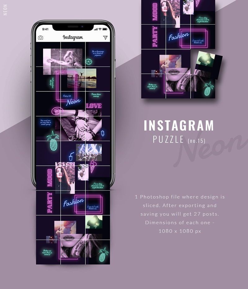
After you’ve split all the images, it’s best to upload the photos one at a time. You should wait for the first one to finish uploading before uploading the next one to avoid mishaps.
Below is an example of our attempt at having some fun with photo tiles.
Book Your Free Instagram Consultation
Below are some apps and websites to split photos into a grid for Instagram.
Turn your pictures into big tiled banners to share on Instagram and make your profile stand out from the crowd!
The app is fun and simple to use. First select the size you would like the banner to be. Then add your photo and scale or move if necessary. Once you’re satisfied, hit save and the app will then cut your photo into tiles and save it to your photo album. You can then upload all those photos to Instagram and enjoy!
Tile Pic on Apple Store (iOS devices)
Cost: Free (In-App Purchases)
Use Pic Splitter to split your photos into grids for Instagram.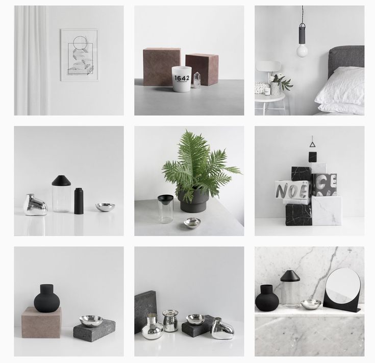 This is an essential photo app for your collection and will give your Instagram profile a professional look!
This pro version has no ads whatsoever, so you can create your photos uninterrupted.
Pic Splitter on Apple Store (iOS devices)
Pic Splitter on Google Play (Android devices)
Cost: $1.99 for iOS devices or $1.99 for Android devices
The #1 best free app to crop your pictures into 3×1, 3×2, 3×3, 3×4, 3×5 grids and upload directly to Instagram. Impress all your Instagram followers with high resolution grids that you can create from your personal pictures! Gain more followers and attention by having the best looking grids on Instagram.
9 Square for Instagram on Google Play (Android devices)
Cost: Free
Book Your Free Instagram Consultation
The complete solution of square formats on Instagram. Post your photo beyond square boundary on Instagram.
By nSquares, you can freely choose to post your photo with different square formats:
With n-Squares, you can also post your photo in Banner or Photo Grid format. We provide a variety of banner and grid patterns for you to post your large photo and composite your multiple photos into a photo grid to tell your story.
nSquares on Apple Store (iOS devices)
Cost: Free
Break your large rectangular photos or panoramas into a number of square pics and upload them to Instagram to awe your friends and impress your profile page visitors!
Watch separate tiles combine into one mind blowing image allowing for unparalleled level of detailing and flexible scaling options! Be it a casual selfshot, a city skyline or a mountain landscape, with Grids they will look amazing on your profile page.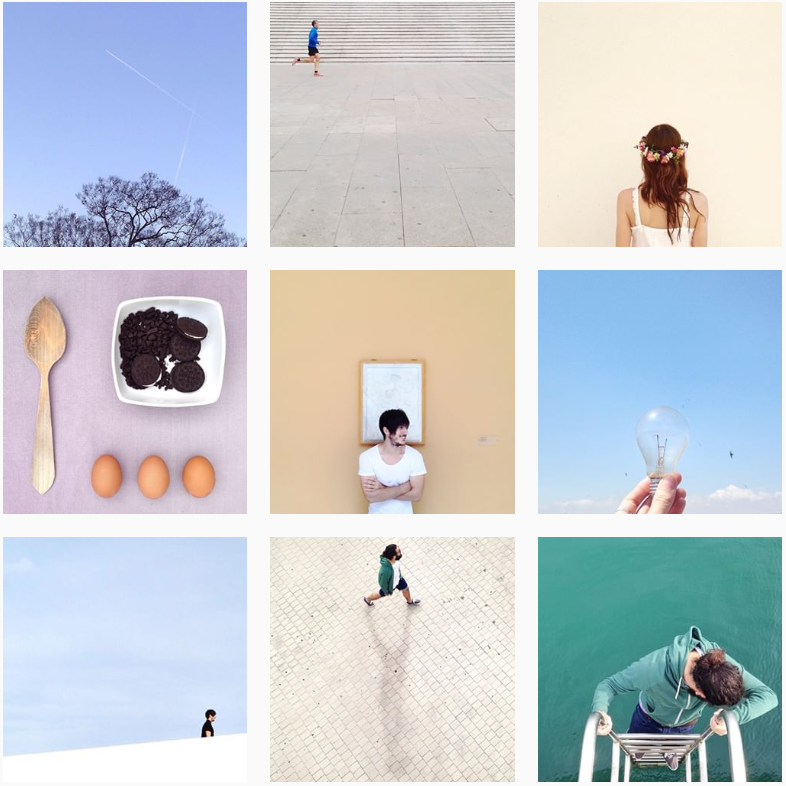 You won’t have to shrink or resize your creations ever again.
Take a new picture right from within the app or upload an existing one from your Library, choose a suitable sizing option among the 6 available options, and let Grids crop the image for you! All you have to do is to submit the resulting pics to your Instagram in the order suggested by the app. You don’t even have to save the tiles to your device as sharing to Instagram is embedded in the application!
You are not limited to solid grids with three rows. Choose one of the more intricate styles with the possibility to substitute certain squares with color or gradient for amazing results!
Grids introduces a totally new way of using your Instagram, wrapped in simple and beautiful design. Don’t miss the chance to express yourself by embellishing your profile page and posting breathtaking large scale images in their full glory!
Grids – Feed Banner Pics on Apple Store
Cost: Free – Offers In-App Purchases
 Phototiling
PhotoTiling is an app that enables you to crop your photos into multiple squares (tiles), then arrange them on your Instagram profile page to create Banners and Photo Grids. PhotoTiling not only enables you to easily and quickly make banners, but also provides you the maximum flexibility to tile your photos into any grid pattern you want. Besides uploading to Instagram, you can also save your Banner/PhotoGrid as a single photo.
Phototiling on Apple Store
Cost: $0.99
Book Your Free Instagram Consultation
Instant Squares let’s you split/splice your pictures into multiple squares and upload them directly to Instagram to create a big square/banner/carousel/album and amaze all your Instagram followers. Take your Instagram to the next level, by creating an amazing Instagram profile grid and increase your followers for organic Instagram growth.
Instant Squares on Google Play (Android devices)
Cost: Free
 Giant Square for Instagram
The Giant Square cuts up your pictures into several pieces that are perfectly aligned for you to upload to your Instagram gallery – in any size and combination you want!
You can make vertical, horizontal and even diagonal panorama pictures and banner pictures in your Instagram gallery. You can also create what they call the GIANT SQUARE which is 9 square pictures that make up one big square picture in your Instagram gallery.
Giant Square on Apple Store
Giant Square on Google Play (Android devices)
Cost: Free
If you have an interesting account that uses this style of photo tiles, or have split photos into a grid for Instagram that we should feature, please drop your handle in the comments. We’re looking for inspiration for a future blog post that will feature such accounts.
Step 1. Create a canvas.
Select Custom Sizes and create a 3600×3600 px canvas.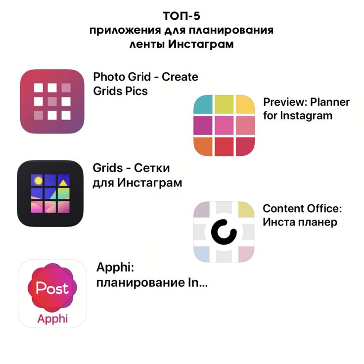
Step 2. Choose a background for the Instagram Infinity Frame.
You can use a color fill or an image as the background. To add a background, open the "Background" section.
Step 3. Add photos.
To do this, open the Elements → Meshes tab and select the first square mesh. Hold shift and resize the square below the photo. To duplicate a square, click "Copy" in the top right corner and drag it to the desired location.
Next, open the "Downloads" section and upload photos, which you then drag and drop into the placed squares. Place 6-9 photos in this way. If you want to insert a non-square photo, just drag one of the edges of the square grid and scale it.
Step 4. Add decorative elements and text.
All decorative elements in Canva are located in the Elements section. Use search to find the items you need. The editor allows you to change the color, size and position of elements. To place an element on one photo on top of another, and vice versa on the other, in the "Position" settings for each photo, select "Forward" or "Back" respectively. Next, place the desired text.
Step 5. Prepare for unloading.
The collage for the endless tape is almost ready, it remains only to upload it and divide it into 3 parts. But before that, you need to add a 3x3 grid like in Instagram and check the layout. If necessary, edit the layout, move the objects so that each post individually is complete: the text is not divided into 2 posts, and so on. If the layout is correct, upload it as a jpeg. To do this, click on the arrow in the upper right corner.
Step 6. Divide the layout into parts.
Divide the layout into 9 parts in the Imgonline service. In the settings for the parts of the photo, specify 3 in width and 3 in height.
And if you don't want to waste time and figure it out, you can purchase ready-made templates in the Storio app or on the Creative Market.
Only important news in the monthly newsletter
By clicking on the button, you agree to the processing of personal data.
What's new in SMM?
Subscribe now and get 9ways to promote on Instagram for free
LiveDune marketing products — 7 days for free
Our products help to optimize your work in social networks and improve accounts with the help of deep analytics
Analysis of your own and other people's accounts by 50+ metrics in 6 social networks.
Account statistics
Optimization of message processing: operators, statistics, tags, etc.
Direct Instagram
Automatic reports for 6 social networks. Upload to PDF, Excel, Google Slides.
Reports
Monitoring the progress of KPI for Instagram accounts.
Audit of Instagram accounts with clear conclusions and advice.
Express audit
We will help you to select "pure" bloggers for effective cooperation.
Checking bloggers
You've probably heard that Instagram feeds need to have the same style so that pictures and videos blend together. Yet, it is referred to as one style for a tile in profile. Or you have already heard that this is an anti-trend (spoiler: it's not) 🤪 I suggest you first figure out why people spend time editing photos on Instagram and whether you need it.
Five reasons to design the tape in the same style and edit photos:
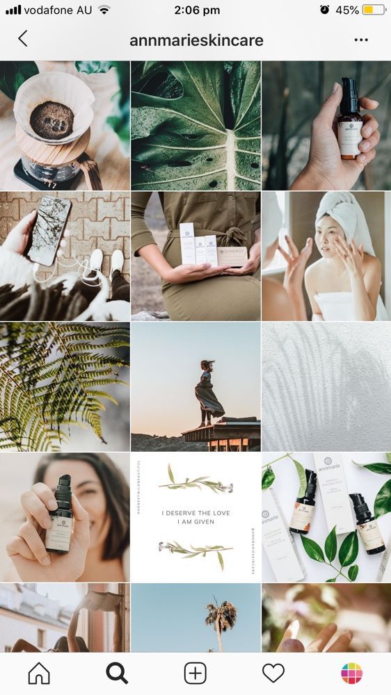 Photo editing is just a method.
 Approx. Why do we need a single tape figured out. Now let's move on to how to compose it.
The most important step that most people skip. Before you start designing a profile, you need to conduct a minimum analysis. View profiles in your category and competitors. Search for accounts that you inspire. And most importantly, decide which profile you want to create. To do this, try to answer the questions for yourself:
Do not be lazy, write for yourself the answers to these questions. This will be a hint for you during the selection of your own Instagram profile processing. Also use coolors to understand what palette the authors of the pages you like use.
If you didn't like the first service, you can try colorkuler. It composes the palette automatically. The only negative is that the very bright colors for which we love processed profiles do not always fall into the palette. Apparently, this is a technical feature of the service.
After analysis, see if you have enough ready-made material to create such a profile? There must be at least 9 photos or videos that match your vision for the perfect Instagram tile. Nine, because you can design three visuals and decide if this is really what you want to see on your profile.
To make your life easier, I recommend installing a few photo editing and arranging apps before you start compiling your feed. Having them at hand, it will be convenient for you to read the article and see how the work actually looks in the application.
Applications that I use for photo editing:
Lightroom is the most popular application among photographers and bloggers. There are standard functions here: contrast, exposure, shadows, warm and cold shades, sharpness, etc. The main advantage of the application is that you can set the toning yourself using curves. For example, make photos bluish or greenish. You can also pull up specific colors. For example, make pink red, and blue - blue. Basically, I only process photos in this application.
Presets work in Lightroom - a special set of settings with ready-made settings for photos. If you don't want to process the photos yourself, you can buy a preset from bloggers or download the ones that are available for free. For example, presetlove.com has a lot of free presets.
Snapseed is a photo editing app from Google. There are many standard features, like in Lightroom. What I love about Snapseed is the ability to remove small things like pimples and unwanted objects. It is good in the application to blur objects, vignette, use ready-made filters, add graininess to photos and text.
VSCO is an application with ready-made filters, very simple and convenient. It was popular in 2015-2017, when the wave of photo processing was just gaining momentum. Now it is used much less often, since the functionality is more limited than in Lightroom. The application is worth installing if you find it difficult to understand Lightroom or just want to bother with processing as little as possible and need a ready-made solution.
In fact, these three applications are enough to cool photos and make a feed in the same style. After installing them, I also recommend adding a layout application to your arsenal for decorating the ribbon. There are a lot of them and they perfectly help to plan the tape in advance and understand whether your photo will fit into the tile or not. The list of applications that I liked the most.
Garny is my favorite photo arranging app. You can crop photos in the app itself and even set up delayed posting if you need it.
Preview is an app for scheduling Instagram posts. The functionality is somewhat wider than in Garny. There are additional features for using hashtags. The app is visually pleasing on the interface.
Plann is a good app for arranging photos and videos in the feed. The functionality is almost identical to Garny. The only negative is that sometimes it can freeze and somehow visually the functionality is less pleasant for me.
Is it possible to do without processing, but at the same time design the ribbon in the same style? Yes. But then keep in mind that your photos should be as similar as possible in colors. This is hard enough to achieve. You need to use objects of the same colors, have good photo sources and take pictures + - in the same light.
Want to learn more about SMM? Subscribe to my Telegram channel
In fact, maintaining a profile in the same style is a kind of system. If you understand its components, it is easier for you to work with it. Now we will analyze each of them.
Principles of plans
Oddly enough, I would start drawing up a single tape not from the color scheme, but from the plans. So you can already at the stage of planning a photo shoot understand what pictures you need to take. In photography, there are different plans: close (close), medium plan and general (far). I would also highlight intermediate plans. For example, when the photo was taken not in the middle ground, but not in the far one either. The main magic of a beautiful Instagram feed is to choose photos in such a way as to alternate shots. Then the tape will really look harmonious and stylish.
For example, take the photos you have on your phone. Try to compose the tape (without processing yet) so that your plans do not intersect with each other on the right, left, top and bottom. Let the distant plan alternate with the middle or close plan. I am sure you will immediately notice a certain harmony in the profile.
Light settings
Some tapes in darker colors, others in lighter ones. To achieve this effect, you need to learn how to work with light at the stage of photo processing. Lighting and color correction can be adjusted automatically by downloading a preset for Lightroom. But very often it happens that a preset looks good in certain lighting. For example, in bright sunshine, everything looks great, but in cloudy weather, the set does not fit well. To do this, you need to be able to tighten the light in the photo and adjust it for yourself. Let's see what light settings exist.
Exposure - is responsible for the amount of light in the photo. If we want to make the frame darker, we reduce the exposure and vice versa if the photo should be light.
Contrast is the difference between darker and lighter areas of an image. The higher the contrast, the greater the difference. But high contrast is not needed in every image. If you want to achieve softness in the photo, the contrast needs to be made weaker.
Light areas - responsible for the light areas in the photo. By adjusting them, you can make them darker or lighter.
Shadows - This setting helps to lighten or darken dark areas. Very often the shadows are made lighter in contrasting bright light, so that the photo is softer.
White - work with white color in the photo. Often applied to photos in which white objects give off blue or yellow. The main thing is not to overdo it so that the white does not turn into a spot on the image.
Black - the setting works with black or black areas in the photo. By analogy with white, you can achieve the same effect with black areas in the photo.
Color correction
One of the main elements in photo editing in a single style. The main task is to adjust the colors in different photos to approximately the same shade. Important! Only approximately, and not completely to one. Otherwise, everything will look very artificial.
Most often, several shades in each color are chosen for color correction, which are constantly repeated in the photo. For example, blue in most of your photos will be muted, and green will be warmer than in life. Thus, we form a color system and, adhering to it in the photo, make up one single feed for the Instagram account.
In Lightroom, you can adjust each color by parameters:
- Hue - is responsible for the color. By moving the slider to the side, the shade can be made in a color close to the color standing next to it on the color palette. For example, make green yellow.
- Saturation - the level of how rich the color will be in the photo. Always be careful here and don't overdo it.
- Brightness - adjusts the amount of light in the hue. For example, if we need to make the skin more tanned, then in an orange shade we reduce the brightness.
Color correction also includes general frame temperature settings. When we give the whole photo a warm or colder tone. When it comes to frame temperature in terms of ribbon in the same style, it's important for us to choose one shade and use it. The same goes for shades. Or all photos are greenish or pinkish or neutral. Choose one option and stick to it.
Disclaimer. If you run a clothing, furniture, or make-up brand, I don't recommend using color distorting processing. Otherwise, it may be that the green top in life turns out to be light green and you will get a dissatisfied client.
Sharpness and Grain
These two settings have less effect on the overall picture of the Instagram feed. But they can really transform your photos. Just know the measure, very sharp or highly grainy photos are not always pleasing to the eye.
Toning
Toning or working with curves - level for more advanced users. You can create a ribbon in the same style without shading. But if you are a confident user of all the functions described above, I recommend learning how to work with curves. The function helps to work out shadows, midtones and highlights with a certain color. Almost all photographers make an S-curve from a straight line to add dimension to photographs. This is a rather complicated process and it may not work the first time. But definitely worth a try.
To come up with your own processing, you need to study examples from other bloggers and photographers. My favorite site dedicated to presets is presetlove.com. The site has very good processing options for free. From time to time I download presets there, upload them to lightroom and leave them if I like the processing. Also, based on the presets downloaded from this site, I look at what techniques are used in lightroom. I take note of the successful ones and use them when creating my own processing.
Lots of cool processing examples can be found on Pinterest. It is enough to drive in the query lightroom presets and choose from dozens of options. The only negative is that often the preset itself cannot be downloaded and the settings will have to be entered from scratch into the application.
https://www.pinterest.com/pin/231161393362357956
Popular bloggers also sell presets. You can download the processing from them and then adjust the colors to your unique style. The only thing, before buying, I advise you to pay attention to the photo sources that are processed by this preset. Ideally, before buying, you should see photos processed by the preset in different weather. For what? Some presets are only suitable for photos in cloudy weather or vice versa in bright sunny weather. They are not universal and you cannot use one preset for absolutely all photos.
Instagram has its own profile trends. Most often they reflect the real trends that occur in the world. After all, everything is really interconnected. For example, the trend to create natural photos has been in fashion for many years. And with the growing trend towards an eco-friendly lifestyle, it has become even more relevant. Therefore, it is not surprising that a trend has appeared on Instagram for the natural processing of photos.
https://www.instagram.com/katie_sapegina/
Minimalism . It’s not even really about the processing, it’s about the frames themselves: the minimum number of objects, the focus on conveying the atmosphere, simple lines and neutral, slightly faded colors in the photo. Such shots are quite difficult to make, even though they seem simple.
https://www.instagram.com/honeyyaney/
Bright profiles. If you think profiles are all about boring neutral finishes, you know it's not. Bright profiles with a tasty juicy picture are also popular.
https://www.instagram.com/milkbarkyiv/
Creative photography. There are few such profiles, since coming up with creative ideas is a laborious and costly process. Not every brand or blogger is willing to invest their time and money in it. But thanks to this approach, you will be 100% noticed among other similar profiles.
https://www.instagram.com/bezdelnikiev/
Is it necessary to use only photos to create an Instagram account? No. Can use illustrations, drawings or characters, if so provided in the communication.
https://www.instagram.com/monobank.ua/
Another option is to combine real life with drawn characters . It looks unusual and interesting in its own way. And, most likely, your competitors do not. A unique idea to stand out from the rest.
https://www.instagram.com/dariart.art/
Is it necessary to follow trends? Of course not! I want to note that the trends themselves are a convention that bloggers and experts point out - in fact, ordinary people.