* This post contains affiliate links. That means that if you make a purchase after clicking on a link, I may earn a small commission at no extra cost to you.
SCROLL DOWN FOR A FREE CANVA TEMPLATE!
Instagram carousel posts (the ones with multiple images that you swipe through) can be an effective way to communicate a tonne of value, show off multiple products or share a series of great images that really help you connect with your audience.
Of course, you can simply upload multiple images - up to 10 in fact. But how cool do carousel posts look when you have images or elements splitting multiple frames? And how enticing is it for your audience to swipe across to see the rest?
Seamless Instagram carousel posts are super simple to make. And you can even make them in our favourite design tool, Canva!
1. Sign up for a free Canva account, or log in to your existing account.
2. Create a custom design, 1080px high and 1080px x the number of images you would like in your carousel wide. Yes, we need to do some maths. So if you would like a 6 image carousel, make your custom design 1080px high x 6,480px wide (1080px x 6).
3. Now you want to add guides to help you see where the joins will be. To do this, click File and then Show Rulers and also File and then Show Guides.
4. Now hover over the vertical ruler until your cursor changes to a double-headed arrow thingy and hold your mouse button down and drag the guide out to 1080px and let go. You want to do this every 1080px so 2160px, 3,240px, 4,320px and 5,400px. (Keep going if you want your carousel to be more than 6 images wide.
What you should then have is something like this:
I have created a template for you to save you some time - click on the image to access it:
When you have accessed the template, make sure to switch on your guides in Canva by clicking File and then Show Guides.
5. Now you can create your post. Make sure to add some elements across the guides as this will encourage your audience to swipe across. When you are happy with the finished design, download it as a PNG file.
6. Next we need to split the long image up into 6 separate images. To do this, head to the Pine Tools split image tool.
Input your image by uploading it from your device. Then you want to split horizontally, by equal height, with the number of blocks equal to the number of images, in this case, that is 6:
7. Select PNG as the output format and then click SPLIT IMAGE!
8. Now you have 6 separate images which you can upload (in the right order) to Instagram! You can share them to your phone and upload directly or use Facebook's Business Suite to upload from your computer. Or you could use a third-party tool like Later or Publer to post or schedule for later.
Carousel Posts are one of the hottest trends on Instagram right now.
With Reels getting most of the attention from the algorithm and Instagram pushing video content, many creators notice that their regular posts get less reach than the past years.
Still, there is one type of post format that gets enough engagement to make the algorithm notice: Carousels.
The swipe through posts are a great way to reach your ideal audience if you don’t want to hop on the Reels bandwaggon or just want to diversify your content.
The best thing about it? You don’t have to be a Adobe Photoshop pro to design viral-potential Instagram carousels. You can do the same with Canva for free.
This article will show you step-by-step how to design a seamless carousel post in Canva.
You could just create five single posts in Canva.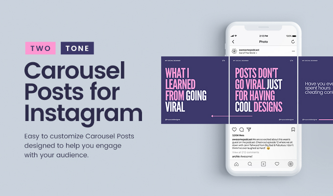 But what we want to do in this post is create a carousel with seamless transitions in between the slides.
The full Canva design can look like this:
This is how your Instagram carousel design will look before cutting it into slidesOne design that will only later be split into the single carousel slides. This way we create the seamless effect of all slides being connected and give the user a great experience when swiping through.
In your Canva dashboard, go to Create a Design and select Custom Size.
Create a new custom-sized design in CanvaIn Instagram, you can add carousels with up to 10 single slides. The general formula for figuring out how big your initial design needs to be, is:
Width: 1080px * Number of Slides – Height: 1080px
Or, for portrait sized carousel posts that take up more space in your feed (recommended):
Width: 1080px * Number of Slides – Height: 1350px
As a shortcut, here are the Canva design sizes for carousels with 2 to 6 slides:
Now that you’ve got your design artboard in the correct size, we can start designing.
Canva lets you add purple guidelines to your designs. This feature comes in really handy when desinging seamless carousels.
When creating your carousel, you need to know where one slide ends and the next one begins.
To enable guides, in your design click on File (in the top left corner) and then tick both Show Guides and Show Rulers.
Now you can drag a ruler with your mouse key pressed down onto your design. This works either from left or from the top. For carousels, we’ll need to drag them in from the left.
Add a ruler guide every 1080px to mark the borders of your carousel slides.
Tip: To perfectly align content on the slides, use a rectangle, draw it to fit one slide (between two guides), send it to the back and lock it. Now you can drag your content around and it will show you if it’s centered.
Here are a few designer tips you can use to make your seamless carousel super engaging and inviting for people to swipe through until the end.
As a starting point, you can use this free carousel template:
Free Seamless Instagram Carousel Template for CanvaOnce your design is ready, you have to download the full design and split it into single posts.
Go to the Instagram Grid Maker, and click on the Upload an Image button.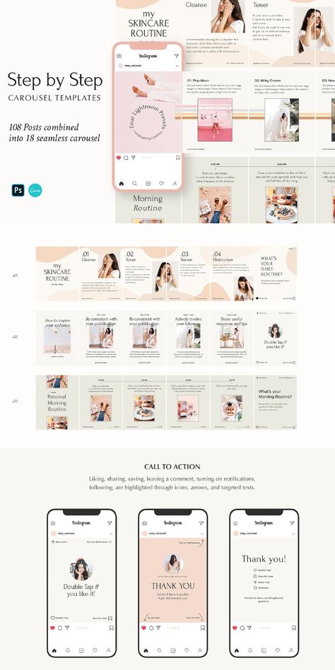
Select your carousel graphic and upload it into our tool.
Now you only need to set Columns to how many slides you want to have and Image Cut to Carousel.
Click the Split Image button and the Grid Maker will cut your carousel into equal slides.
Your Instagram carousel slides are ready to downloadYou now have six individual slides cut out of one seamless carousel graphic.
All you need to do is upload them to Instagram as a carousel.
If you want to create more carousels for Instagram, you will love our Template Membership!
You’ve seen Canva’s free templates (and, let’s be real, also the paid ones) all over the place on Instagram and want your brand to stand out from the rest. Right?
→ Discover more than 2,000+ unique and engaging Social Media Templates (+ carousels!) in our affordable Canva Template Membership:
Do you want more Canva Templates to level up your social media content? Check out the Template Membership!Are you struggling to keep up with the constant demand for new content on Instagram? In this blog post, we share 3 strategies for creating successful evergreen content that will help you reach your goals with less effort.
Read More »
If you are on Instagram as a brand and don’t know how to reach your ideal audience and turn them into followers, here is what the experts say.
Read More »
All users probably know about the so-called “carousels” on the social network Instagram. Traditionally, this is a set of images or videos in gallery format that can be scrolled through directly from the phone. A seamless carousel on Instagram is a “design move” when all slides are designed in the same style, or, the carousel background is a single picture that smoothly flows from one slide to another.
Examples:
Number 1 Number 2 Number 3 Number 4 Number 5 A seamless carousel increases the audience engagement rate on Instagram and has a positive effect on the reach of publications. It has been proven that Instagram users are more likely to save such posts in the Favorites folder.
Moreover, Instagram itself promotes this format and gives the post a “second chance”.
Such content is shown twice in the feed to an Instagram subscriber, if he did not react to this publication the first time.
Content:
Most often, slides on Instagram are used to decorate photos or add screenshots of text if there were not enough characters in the post. Agree that this is a rather ordinary way to attract the attention of the audience.
The following content formats work great in seamless carousels:
Choose “evergreen” topics for instructions on Instagram that will not lose their relevance for a long time. This will cause users to more actively save the post in order to periodically return to it in order to refresh their knowledge.
The seamless carousel places great emphasis on visual design. Any carousel should have an attractive cover and headline that grabs attention. Next is the introduction, which, if desired, can be placed in the description under the post. The following slides are content formatted in the format discussed a little earlier. On the last “seamless” slide, it is recommended to make a call to action. For example, ask your readers to save this post to their Instagram Favorites. nine0003
| A carousel post can include up to 10 images, image size - 1080x1080 px, aspect ratio 1:1, JPG or PNG format, file size up to 30 MB. |
Please note that in addition to the “squares” in the seamless carousel, you can use vertical images with the following size of 1080x1350 px.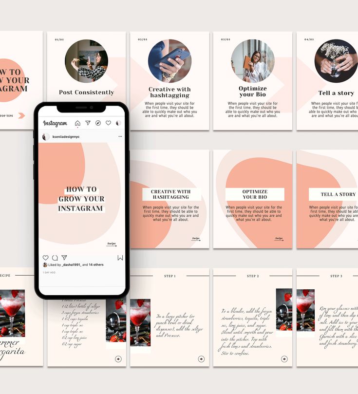 |
You can use your phone, but for this you will have to download an application that contains this functionality. If you know how to use a graphic editor, then any image for Instagram can be processed in Photoshop or the Figma online service. For those who do not want to bother with the design, I recommend using the ready-made templates of the online designer Canva.
For Android mobile phones, you can use the Caro application to create seamless carousels without cropping. The application is paid, but three free projects are available for testing. Next, you need to make a one-time payment, and the program remains in your use forever. nine0003
There are ready-made layouts for seamless carousels that only need to be slightly edited. And also all slides can be created from scratch.
You can see the whole process of creating beautiful slides in the Caro mobile application in my video tutorial.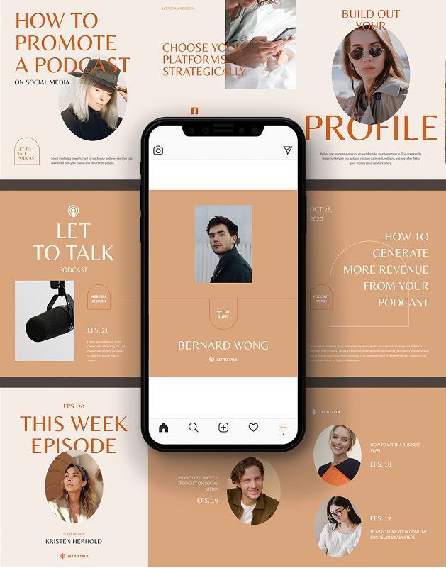
If you know how to work with Photoshop, then you will not need paid applications or online editors. In Photoshop, you can realize any idea for Instagram.
All the details in the video tutorial.
Canva allows you to create slides from scratch, and also offers ready-made templates for a seamless carousel in which you only need to edit the text.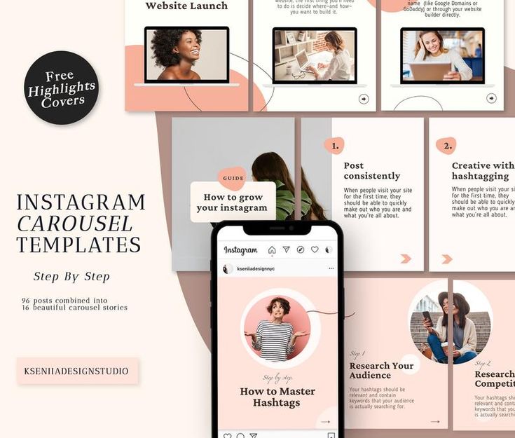 A very convenient option for those who do not have time to comprehend the basics of graphic programs or who are simply deprived of the talent of a designer.
Figma works similarly to Photoshop, but does not require installation on a computer. This is a kind of flexible graphical online editor. Its only drawback is that it does not have a Russian-language interface. However, Figma is very popular in Russia, and many web designers work with this particular program. How to create a seamless carousel in Figma, watch the video tutorial. nine0003
Article author Olga Abramova, Money Streams blog
2417 views
We attract the attention of the audience and create creative advertising
Carousel appeared on Instagram back in 2017. But even now this format of publications remains in demand among advertisers. What are the advantages of placing ads in the carousel, when to use it and how to arrange it - we tell in our article. nine0003
Instagram carousel: features of the
formatCarousel is an Instagram post format that allows you to post up to 10 photos, videos or a combination of them in one post.
This format is also called "panorama" because the seamless design allows users to scroll through photos/videos without noticing the borders between them.
The main advantage of carousels is a higher level of audience engagement compared to regular posts . A study by Socialinsider found that carousels have an average engagement rate of 1.92%, compared to 1.74% for Instagram photos and 1.45% for videos. Moreover, the level of audience involvement increases to 2% if you use the format to the maximum and publish 10 photos at once.
At a glance, the user can determine that there is a carousel in front of him - dots will be visible under the photo or video. Their number indicates how many photos/videos are posted in the carousel. nine0003
For example, below is a carousel containing three publications:
You can swipe right or left to view the post:
8 ideas on how to use the carousel to your advantage
The carousel is great for filling out a profile if the account owner wants to reveal a topic in detail. For example, share photos from the latest photo shoot, show a selection of videos on a specific topic, showcase the results of your work, etc.
It is also an excellent advertising format - you can offer a selection of products to the target audience, describe in detail the benefits of your offer, or provide use cases.
Here are some ideas on how you can use a carousel to engage your audience.
1. Place the results of the work in the "before/after" format. Cosmetologists, make-up artists, designers, nutritionists, trainers, stylists and many other professionals often post the results of their work in the “before / after” format in one image:
Instead of dividing one image into two parts, you can post full size photos. For example, put the first photo “before”, and in the next, reveal the results of your work. Sometimes the “after” photo is put first in the carousel to interest the audience with a more attractive picture:
2. Show different products with links to different landing pages. If you have collected enough data about what products your customers are most interested in, then the carousel format allows you to compile them and show the best and most profitable offers. The user will be able to go to the landing page of exactly the product that interested him.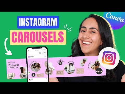 And the launch of advertising will not only increase the involvement of the audience, but also its reach. nine0003
3. Explain the benefits of one product or service. It's better to see once - this rule definitely works for those people who place an order online. They want to see the product from all sides, to consider the style, the quality of tailoring, etc. And the carousel is best suited for this - you can post both a video review and photos from different angles.
4. Prepare educational content. Psychologists, nutritionists, nutritionists often post useful tips to their subscribers next to an image that is not related to the topic of the post. As a result, they get likes, but only a few read their posts. You can fix this situation by placing educational content directly in the carousel. In this case, the number of people who read important information will increase, as well as the level of audience engagement. nine0003
In the post itself, you can place a pleasant wish for your subscribers or a brief explanation of the information presented in the carousel, as is done in the example below.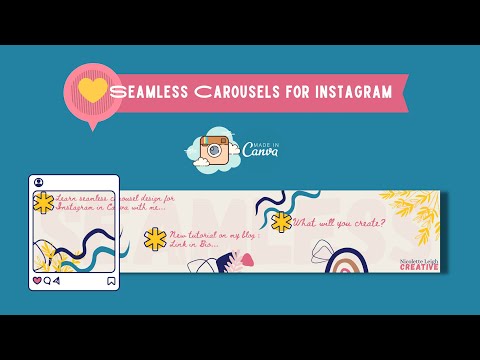
5. Post customer testimonials. Reviews are the best advertisement for any specialist. Sometimes business profile owners post screenshots with a review of one client in their posts. If there are many such responses, the credibility of a specialist or a company will increase. Therefore, the carousel is great for placing reviews and allows you to attractively design them. nine0003
Reviews are often posted either in stories or in the Highlights section. Read this article for tips on how to design highlights.
6. Work with user-generated content. UGC content has been among the digital marketing trends for years. When a client shares their user experience on their Instagram page and mentions your brand, the company has a powerful tool to attract potential buyers.
In this case, one of the best ways to engage with your followers is to highlight their content in your feed, which is what a carousel is great for. nine0003
7. Summarize or make promotional events. Instagram Carousel posts are great for conveying the energy and atmosphere of events that have already taken place (or will be held again soon). The organizers can show the highlights and increase the interest of potential participants in the events.
8. Tell a story. In the carousel, you can tell the story of the creation of your brand, the launch of a new product, or just make a joke.
nine0014How to create an Instagram carousel
Carousel photo and video requirements
Square and vertical images can be loaded into the carousel. In order for the picture not to be blurry and not lose quality, you should follow some rules.
Image requirements:
Videos also have their own requirements:
Create a carousel and run ads
You can create an Instagram carousel in a couple of clicks. To do this, simply click "+" to add a new post to the feed:
Then in the menu click on the button "Select multiple options":
nine0002 Specify those photos and videos that we want to show in our carousel:Posting a new post. To advertise the carousel below the post, click "Promote Post":
Next, set the target. We want to advertise products on the site. Therefore, we indicate the goal - "More site visits":
Specify a website and add a CTA button:
Let's move on to setting up the audience. You can turn on autotargeting or set up the audience manually:
Set up the budget. The system will automatically suggest the optimal budget size. You can change it if necessary. nine0003
Adding tags:
Checking the ad and clicking "Promote Post":
This completes setting up the carousel and launching ads on Instagram. It remains only to monitor the results of the campaign and, if necessary, make adjustments.
You can also run ads through Facebook Ads Manager. In this case, the carousel will be shown not only on Instagram, but also on Facebook, Audience Network and Messenger. If necessary, in Ads Manager, in the campaign settings, you can select the sites on which ads will be shown. nine0003
How to make a seamless carousel in Canva
What is seamless design
Making your Instagram carousel a breeze.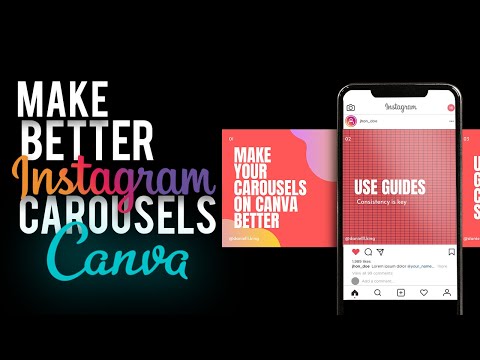 But directly in the application it is inconvenient to work with its design. Canva graphic editor allows you to create a unique seamless carousel design, work with backgrounds, fonts, and add various graphic elements.
The seamless design allows you to define the borders between the slides when creating the canvas. To do this, the initial dimensions of the layout are selected, taking into account the number of frames used and their sizes. nine0003
Here is a table showing the dimensions of the original layouts. When calculating the initial size of the layout, the optimal sizes were taken for square (1080x1080 px) and vertical images (1080x1350 px).
The result is that when placing two square frames in the carousel, the layout size is:
How to design a seamless carousel
Go to Canva. In the main menu, select "Instagram Posts":
Set the template size. To do this, click "File" - "Create Design":
Select custom size. Our carousel will have three square slides. Therefore, according to the table above, the size of the layout will be 3240x1080 px.
Added in the markup editor to set conditional slide borders. We click "File" - "Show rulers", and we have a horizontal ruler. Next, click "File" - "Show Guides". nine0003
This results in a vertical and horizontal ruler. To mark the slides, we clamp the edge of the vertical ruler. A guide appears and is dragged to where the separation should be between the first and second slide. The other slides are divided in the same way.
Selecting connecting elements. To do this, select the "Elements" item in the menu and select the appropriate graphic elements there:
Then set the background:
Add photos:
nine0002 Upload your own photo or take it from a photo bank, add text:As a result, we get the following slides:
We're done with the Canva editor.