Alexandra | Dec 15, 2016
I used to STRUGGLE big time when I was trying to design my Instagram feed.
Now I’m using 4 tricks every single time I make a theme:
I use Preview App to rearrange my feed. I love it because it allows you to rearrange posts using 3 different methods (and you can schedule unlimited posts for free).
I’ll show you exactly how I use the app to design my feed and to stay consistent.
Ready? Let’s go!
Click here to use it
Forget everything you know about Instagram. Let’s start fresh together.
You need a strong base when you start a theme.
The first thing you want to do is upload photos in your Preview App.
Here’s the trick:
Upload 9 photos only at the beginning.
That’s my “Rule of 9”.
It will be:
Your 9 photos are going to be the BASE of your theme.
You will be building on top of it.
If you upload too many photos, you might get overwhelmed and won’t know where to start.
Start focusing on a small grid.
I like to focus on 9 photos at a time, but you can also upload 6 or 12 photos:
Here are examples of a few themes I have started in my Preview App using the “Rule of 9”.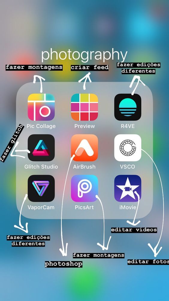 As you can see, my base doesn’t move. it means that I can easily color coordinate and rearrange my future post (next tip):
Once you have your photos in Preview, you can rearrange their order.
There are 3 ways you can rearrange photos in Preview:
My personal favorite is the swap feature because I like to take my time visualising where to move my posts. I use the drag and drop feature when I want to quickly rearrange posts. And I use the shuffle feature when I create specific Instagram grid layouts.
Now the big question is: “What photos should I put next to each other?”
Easy!
Generally, people avoid putting the same kind of photos next to each other (unless they’re posting about the same thing all the time).
The trick is to alternate your photos based on:
The goal is to balance the overall look of your feed.
Here are some examples:
When you design your feed, look at the photo that is on the right, left, top and bottom. Try not to put the exact same photos next to each other all the time – space them out.
How do you keep your theme look consistent?
Alright, now you have a strong base with your 9 photos. Don’t mess it up!
After I finish designing my grid of 9 photos, I always upload 3 photos at a time in my Preview App.
3 photos = one row = my base stays intact
Have a look to see what I mean:
I love how I can build on top of my base!
This trick makes it so much easier to visualise my overall feed, and most importantly stick to my theme. Since I have a strong base at the beginning, rearranging my photos becomes a breeze.
Every time I add more photos in Preview, this is what I automatically think about:
This trick is especially crucial for you if you want to maintain a specific grid layout.
For example, if you want to do a “white line in the middle” layout, you need to stick to the Rule of 3:
I hope you found this article useful!
If you need more help creating a cohesive feed, I share all my tips in my step-by-step guide. You can download it below.
Have fun!
Alexandra
Download on App Store
► Get it on Google Play
+400,000 Instagrammers are already using Preview App to edit, plan & schedule their feed. If you haven't tried it, you're missing out.
Page Contents
Instagram has always been a visual operating system, and your photos could persuade Instagram users to follow you or not and grow your followers. Therefore, if they face different and non-relevant pictures, people might not be interested in following you. As a business marketer, you might be concerned about how to Rearrange Existing Instagram Photos. Take it easy! This article has the best answer to your concern.
This article will introduce a unique platform that lets you manage multiple accounts all at once while scheduling posts, feeds, and stories that allow you to get more engagement on your posts.
Sometimes, you may love your old posts and need to rearrange Existing Instagram photos (maybe even inspired by the crap principles) by changing or rescheduling already posted feeds to reuse them or create a particular Instagram aesthetic.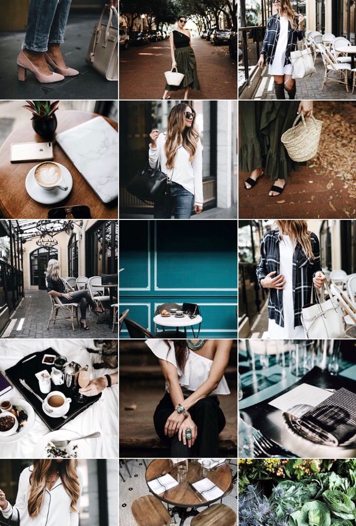 Unfortunately, Instagram does not permit anyone to rearrange Instagram posted photos. The only way to rearrange your photos on a page is by deleting the post and republishing it. This will refresh the post and show it to your followers again, resulting in more engagement on behalf of your newer followers. But sometimes, just eliminating posts that have many likes and comments won’t be a good idea.
Additionally, you can ignore deleting the post and repost it later with the new arrangement. This will keep the past statistics and scores on your previous post and add to your latest post the engagement from your more recent followers, but it makes duplicate photos on your page and may ruin its design.
Above all, if you are willing to rearrange Instagram posts that you already posted, then here is the way.
Apps to Rearrange Existing Instagram Photos1. AiGrow
One of the ways to rearrange your Instagram photos is AiGrow’s post scheduler. For rearranging existing Instagram photos, you could set and organize your posts with it and then edit or rearrange them instantly. You can now reschedule your feeds according to your taste. Don’t worry about your likes and comments since this app has unique plans to grow your real followers and get engagements to obtain your real results on Instagram.
It offers you Intelligent post scheduling, content linking, social monitoring, and campaign tools for Instagram marketers. Design story and feed posts using a full-featured, desktop-enabled editor.
It’s the full package with powerful tools to help you perform your tasks easier and grow faster. Besides, take advantage of Instagram gurus powered by advanced Ai software to organically grow your followers and engagement FAST with real and relevant users on Instagram and at a fraction of traditional agencies’ cost. It is a must-have tool for any influencer or brand serious about growing their business on Instagram. It is safe, secure, and rated the #1 scheduling tool for Instagram Marketers!
2.Preview
If you want to rearrange and design your feed, you can use the Preview app. With this app, you can rearrange Instagram posts, edit your photos, find unique hashtags, and so much more! There are three ways to rearrange Instagram posts:
2.1.Drag and Drop
This is the tool when you need to move a post between two other posts. To drag and drop:
2.2.Swap
The “Swap” feature allows you only to move/swap two posts. This is an excellent feature if you like to stick to a specific Instagram grid layout or only move two posts. Go through the steps below to swap them:
2.3.Shuffle
This option lets you change the order of multiple posts, at the same time, in one tap. To shuffle:
When you open the app, you will need to upload your posts. To upload your posts:
It would be best to narrate a story and make your profile a visual voice of your content to let them know what they must expect of you. It also helps you to express your motto. Hence, it allows you to develop your business and get more followers and customers if you give a service or sell products.
Another advantage of arranging Instagram photos is that a unique theme or color pallet would attach all your photos even if the content is not the same. By connecting the posts via a superior pallet, you can cover various contents and subjects throughout the paramount integrity.
Notice that Instagram doesn’t allow anyone to rearrange photos that you have already posted on Instagram. They are fixed. You can use appropriate apps to plan your future posts. So you need to upload pictures in the app first, and then you will be able to design your new feed.
Instagram.
7 ways to structure your account.
Instagram.
7 ways to structure an account,
which have changed beyond recognition
How to make an account understandable, structural and harmonious. Instagram design examples. Single profile design.
Let's talk about the structure of an Instagram account: modern and user-friendly.
At the dawn of Instagram, both me and my clients on the Sales System knew only one visual account structure - a column.
Then designers and other talented visuals came to Instagram. They gave us other Instagram design ideas: checkerboard, horizontal lines, collages for 3-6-9 posts and "infinite structure"
Users repeated these schemes a million times until everyone got tired of them. And if 4 years ago we, marketers, "with meat" tore off the usual "snapseed circles" from customers, today we call for letting go of licked "ideal" accounts, photos from photo stocks and "beige beige" into the past.
(find 10 differences)
In 2020, minimalism and naturalness entered the chat in the design of Instagram. But that doesn't mean we should all go back to muddy selfies and feed chaos.
The marketing mission of any design (even insta, even a website) is to make the buying process UNDERSTANDABLE and convenient.
So how can you create an Instagram account for sales in 2022? I will tell and show examples of current Instagram layouts.
Same column
___________
Posting on Instagram in a column is when every 3rd photo is in the same style. We do not recommend using it by experts and infobiz. But in other niches, where in general there is a lot of the same type of content (beauty, dentistry, cottage construction), the column can still work well. We add relevance due to unique and high-quality photo content (not stocks!), Modern template design (fonts, colors).
For example - @vse_svoi_khv
Chess
___________
The perfect chess ribbon combined with borders and curlicues is a thing of the past.
But the structure itself hasn't gone away: it's one of the most convenient for Instagram! Modern chess is soft and veiled: alternating plans, shades, dark and light images. It creates a rhythm in the account, helps to orientate and at the same time does not "hit" in the eyes.
Example:
Single post
___________
When every 6th photo is decorated in a special way. A good solution for those who are tired of the column, but do not want to leave the geometry. Still convenient for organizational posts in the store ("How to order, how to pay, etc.")
Naturalness does not mean chaos take as a reason to return to 2013: "Easy-do-as-you-like!"
But no))) Negligence in relation to customers kills sales, so the business faced the task: how to make an account beautiful, but not polished, and convenient, but not cloying? To remain modern and at the same time understandable and convenient for the client?
The task is solved in 2 steps:
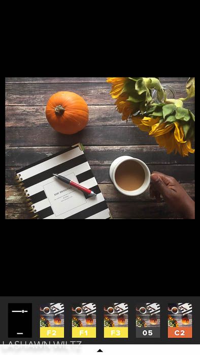
Modern design - expensive. I mean it looks expensive. And if possible, I recommend contacting a designer. The specialist will create a corporate identity for you, tie together your meanings and competitive advantages, existing content and personal preferences / wishes.
With or without a designer, there are 2 options that no one has canceled.
Text on photo
___________
Yes, in any order. Horizontally, vertically, diagonally, scatter.
Is my account easy to navigate? Easily. Does it have geometry? No.
Infinite structure on Instagram
___________
The jigsaw puzzle layout on Instagram was super popular among aesthetes. One picture smoothly flowed into another from all "sides". It looked very cool, but there was a minus: it was necessary to get confused. Straight strong. And cool designers, like other specialists, are only 5% on the market. It is quite expensive to make an endless structure to order, and ready-made templates look lurid and cheap.
Cool endless structures were made by our client Anastasia Tozge:
If you like it and have resources, no one will forbid you to use BS. But ... there are much easier and more relevant ways to put your account in order.
(Nastya's account in 2018 and 2022)
Post templates
___________
Yes, they are also regularly "buried". But templates are still used when
- you need to add "air" to the feed
- there is a shortage of photo content
- there are sections in which it is convenient to use templates (cases, testimonials, samples of work performed, etc.)
Templates also save you if you are bored with just captions on photos. Or it turns out not something stylish, but something collective farm
Illustrations solve the same problems. They work great, especially if they are author's illustrations made specifically for your project.
Here are my other subjective recommendations for Instagram design that objectively work:
I usually recommend signing only ⅓ of all posts. But in some projects, captions under each post work well. Example - our client - @dr.nikolife
And the last. Any design is a continuation of the marketing of your project. The first thing a normal designer will ask when accepting your project is: Who is your target audience? What are the main benefits? What is the product line?
Yes, even a designer. This is not a conspiracy. This is a sincere desire to help you earn more.
Like this article? Share with your friends using the buttons below.
More useful posts on my Instagram page.
For full or partial copying (without reference to the author) you will not have sales for 7 years. Dare!
On March 4, 2022, Roskomnadzor decided to restrict access to Facebook, and on March 11, 2022, access to Instagram. If you are in Russia, most likely, both social networks are currently unavailable to you.
But we have some useful material for you.
(For those who have social networks working - the text of the article is below, under the list of links) own stickers for Telegram: step-by-step instructions0005
VK promotion: 54 tips and a sea of useful services
A complete guide to setting up VKontakte targeting
Odnoklassniki:
Odnoklassniki for business: to use or not?
"Yandex.Zen":
Channel on "Yandex.Zen" to help small businesses
How to write a good selling article in "Zen" in just 1 hour
8 myths about "Yandex.Zen" for business : debunking the main misconceptions
When promoting a business on Instagram, you need to hook the user at a glance. If a person is not attracted by the picture, he is unlikely to read about the wonderful properties of your products and follow the links. And when you post useful content, it is also important to structure it for users: the arrangement of pictures in the profile in a grid gives a lot of opportunities for this.
Let's look at account design options for a variety of businesses.
Arrange photos in a checkerboard pattern, alternating similar images through one. For example, photos - with quotes. Or contrast photos with pastels.
Don't limit yourself - come up with a unique sequence. If you have an online store, alternate product photos with text content (reviews, useful information). Choose what suits the content of your page.
Another simple and effective way to personalize your account. Each row can be devoted to one topic or section. You can group by color, style, or type of content.
Inline placement can be not only horizontal but also vertical.
Use the same approach and place visually similar photos diagonally.
When using Line and Diagonal layouts, post three photos at a time. Otherwise, the rows will be mixed up, and the design logic will go astray. If you still want to publish one picture at a time, choose a structure with three vertical lines - provided that the location of these very lines does not matter to you. Then, when adding a new photo, the lines will change places, but this will not interfere with the design.
This format is popular with shops, fashion designers, beauty and tattoo parlors. Alternate close-ups showing details with general ones. This will give a complete picture of your product or service.
Promotion on Instagram* in 2021: the most detailed instruction
The above methods require self-discipline: you must definitely upload photos according to the schedule - today one color, tomorrow - another, today a photo of a product, tomorrow - an inscription ... If impulses of the soul or business needs require you to publish some content urgently without regard to order, you will like this option:0005
The Instagram grid is very flexible: you can simply choose a few formats for yourself (for example, panoramic photos, portraits and captions) and post them in a free sequence. If different types of images are clearly distinguished from each other, they will still give the profile the necessary structure: we clearly see different content groups in the example even with a free order.
By the way, we have examples of designing not only the Instagram feed, but also profile headers, avatar, stories and highlights. A huge number of beautiful accounts and examples were dismantled in the video below.
Free social media audit
Drawing of 3 places until 24.08. The rest of the participants of the drawing - 50% discount
More You don't have to limit yourself to just square frames. Rectangular, round - experiment with different geometric shapes.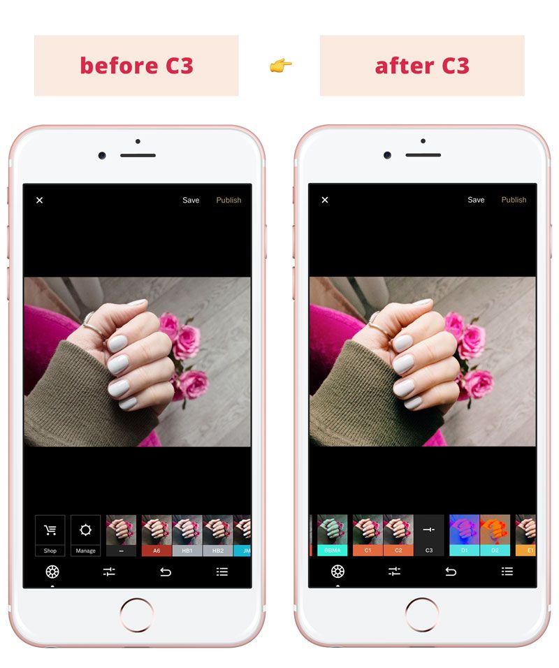
It looks good to use frames of different sizes...
...and frames of different shapes.
Not only white, but also black, frames in all colors of the rainbow.
These frames are ideal for a photographer, artist or designer's portfolio. The frame highlights each photo individually and draws attention to the image itself.
Instagram Stories*: 100+ Post Ideas
Sometimes frames can not only emphasize a particular photo, but also link the images together to make the profile look whole.
The image of branches on white frames is divided into four parts: it creates a sequence between photos and encourages you to scroll through the profile further and further. This is a flexible design option, you can only upload one photo at a time. Technically, this is a design along vertical lines, where each line corresponds to the desired part of the frame.
Here is another interesting and plastic design with frames:
Semi-circular frame pieces form waves: they can be of any color, with or without any inscriptions.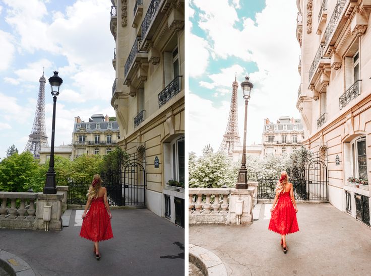 Sometimes, as in the example, it can be seen that the frames do skip at all - the composition of portrait photos is built in such a way that the image itself fits into the “wave”. Thanks to the variability, the account looks lively and modern, and when publishing a new picture, there are no strict restrictions on colors and content.
A profile with this design is hard to leave. Scrolling through it, you do not notice how time flies. Photos and elements flow harmoniously into each other.
Do you have a sales blog about your field of activity? Then this is the perfect submission format. It is easy to lead and guide the reader through the highlighted headings. And additional design elements immediately tell about the theme of the page.
And you can make it easier - cut one photo into 9or 12 parts. Insta-landings are created according to this principle.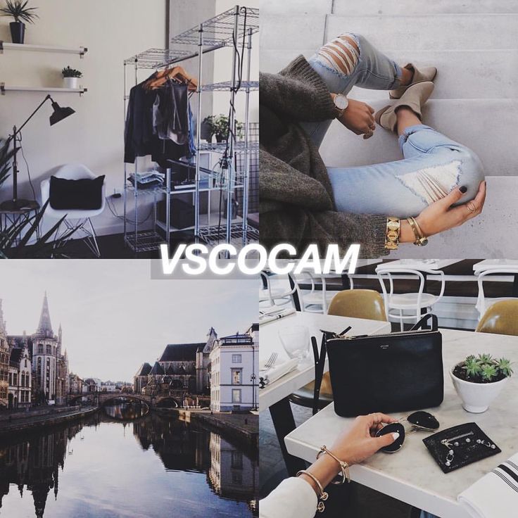 If you need an Instagram landing page, there is no better option.
Collage and Jigsaw designs require third-party applications or skills in Adobe Photoshop, Adobe Lightroom.
How to work in Photoshop: a complete guide for beginners
An account made up of black and white photos will always look stylish and harmonious. But a little monotonous for a commercial profile. Therefore, you can choose one or more primary colors and use them in your content.
The main color of the page can be changed by planning transitions and choosing photos.
Do you have company colors? Design your page with them. If not, choose those that suit the image you are creating and are better perceived by the audience.
Use the same settings when editing photos. This will give integrity to the page. Bright and contrasting or airy and weightless?
To get this effect, apply one filter to all photos. No matter what your Instagram is dedicated to, this technique will add attractiveness and harmoniously combine all the elements.
Sometimes using a single color scheme for an account is very restrictive. You can make smooth transitions between colors like gradients.
With transitions between colors, you can publish not only similar photos in the same range, but any pictures. The color will serve as a structure - this is how you can make impromptu sections with photographs: first a series of one color, then a transition, a series of another color.
Interested in promoting on Instagram? We recommend watching a video from our marketer. It contains 15 important tips and a huge number of practical examples:
Choose the angle from which photos are taken. Shots with a repeating element or the same feed make the profile recognizable.
Successfully used by cafes, food delivery services, manicure and tattoo artists.
Black and white photography, minimalism, pop art, comics, dudling. A design in which the components are designed in the same style. Good for illustrators, artists and designers who have found their own style.
The appearance of the profile has recently been influenced not only by photos: many save their stories in the profile, and you can make covers for them that fit into the style of the account. The covers are quite small, so the images there should be concise and understandable.
Very often illustrations are taken as covers. Simple icons can be downloaded on the Internet or made independently. Perhaps your company already has a set of frequently used illustrations, website icons, or interesting pieces of a corporate pattern that can be transferred to story covers.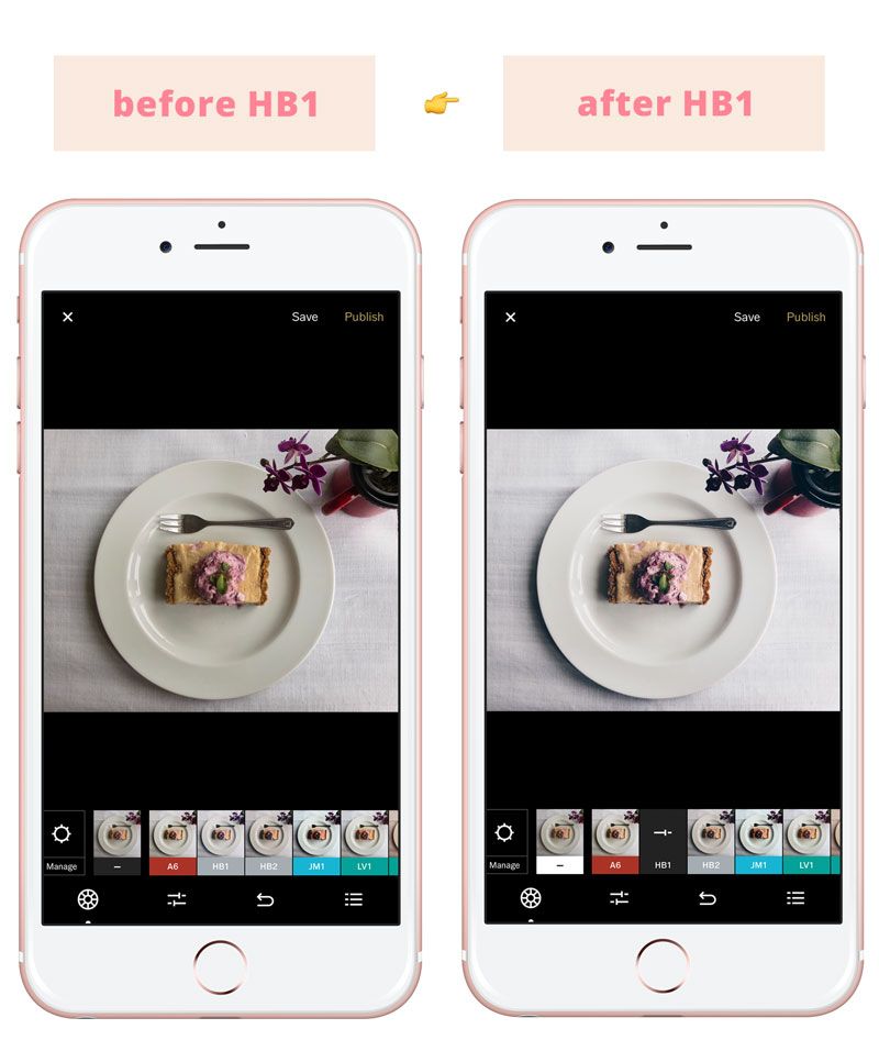
70+ resources with free icons, logos and fonts
Photos might work too. But there are two criteria here. Firstly, they must necessarily depict one object, large and clear. Secondly, they must match the color scheme of the profile.
Suitable covers should be chosen based on the direction of the company. Sometimes even abstract patterns from stocks or fragments of famous paintings work well. If there are no corporate illustrations, and it doesn’t work out on your own, you can adapt any graphics on the Internet to fit the covers.
A beautiful design doesn't need to be published on a tight schedule, and you can do without artistic skills. The main thing is to choose a design method that meets your needs and stick to it.
And if there is a catastrophic lack of time for all this SMM and you want to delegate it, contact TexTerra specialists for promotion in social networks. The service includes strategy development, account registration, design and content, targeting.
