UPDATE: Try our new all new Instagram Profile Mockup Generator Tool. The new tool includes responsive layout for desktop/mobile. Automatic scaling for longer texts, click add more rows for images and turn highlights on/off. Continue below for the older version of Instagram Mockups.
Even though Instagram is picture-heavy, it doesn’t let you visualize your profile unless you make it live and private so others don’t see what you’re doing just yet. As it’s useful to preview what your profile and subsequently, posts would look like, why not create a fake Instagram profile using mockups to visualize it?
To visualize what your profile and posts would eventually look like! By doing so, it can help you to:
Align with marketing goals, branding, and strategy
Especially if your brand has a specific look and feel, or key colors and themes, creating a fake Instagram profile will allow you to get an overview to see how you can best align it with marketing goals, branding, and strategy.
Save time and effort
You no longer have to create any fake accounts or toggle the privacy of your account, for trial and error. With mockup generators, all you have to do is drag and drop picture ideas to see what it looks like.
Pitch marketing ideas and enhance presentations
Do you need to show what an Instagram profile would look like for a presentation? Or perhaps you’re a marketing person or freelancer who needs to pitch for a project. Creating a fake Instagram profile can certainly help to show what the live profile would look like, enabling you to better pitch ideas and enhance presentations.
Here at Mediamodifier, creating a fake Instagram profile in our mockup generator can be done in 3 simple steps.
1. Gather your intended account details
Gather all the details you need to fill in the basic aspects of your Instagram profile:
2. Prepare intended posts and categories
With your branding, color scheme, and marketing goals in mind, prepare the following:
3. Choose the Instagram mockup template you’d like to use and start creating
Need a simple Instagram profile and highlights mockup template or a more specific mobile Instagram profile mockup template? Simply pick the Instagram mockup template you’d like from our library and start creating!
In our mockup generator, for example, the Instagram Profile and Highlights Mockup Generator, you can add and edit your fake Instagram profile using our sidebar menu and drag-and-drop function.
Last but not least, to help you start creating straight away, here are some templates you can use to create a fake Instagram profile!
Edit This Template
Edit This Template
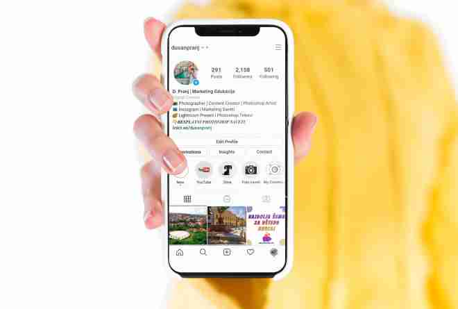
To make your fake Instagram profile even more realistic, combine your profile mockup with actual devices, for example:
Edit This Template
Edit This Template
With our hundreds of device mockups all within our technology mockup generator, there are endless possibilities for you to easily create a convincing fake Instagram profile.
Check out more tutorials here:
About Mediamodifier
Our company’s mission is to empower everyone, from individuals to large brands, to create world-class visual assets for their marketing needs. We help small companies, graphic designers, and online marketers to visualize their ideas quickly. With our products, everyone can save valuable time and effort and bring their ideas to life – on the go and professionally. Mediamodifier is trusted by global brands like Prada, Superdry, Pinterest, and Netflix.
Do you need to preview how a post would look like on Instagram without actually posting it?
Luckily there’s an easy way to preview your Instagram posts with just a few clicks online…
Say hello to our Instagram Mockups!
Creating a real preview of your Instagram post, video, sponsored ad, profile or feed will not get any easier than this.
Use the Instagram templates to create a quick preview for yourself, or send them to your clients for previewing your Instagram profile branding or advertising ideas.
Let’s get started:
There are dozens of Instagram Post Templates to choose: all post types and devices are supported (desktop vs mobile posts).
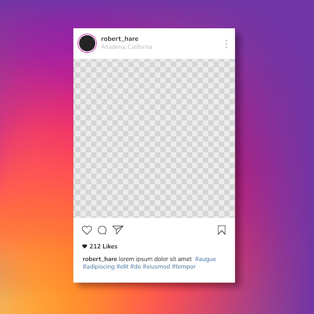
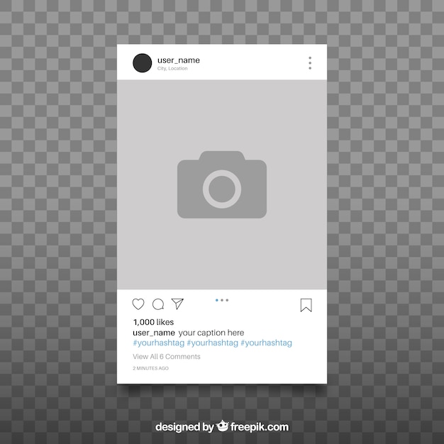
For the sake of this tutorial, let’s choose the Free Instagram Post Mockup below which can be used to preview how a post would look like on a Mobile Device:
Edit This Free Instagram Template
This part is real easy!
Now you need to:
To add your own image for the post or profile, simply drag and drop your picture from the computer, straight onto the placeholder image like this:
or alternatively you can also:
both of these will open the image uploader modal window.
For customizing the texts, head over to the right sidebar next to the post.
From there choose the text line you wish to edit and add your own content. (emoji input is supported too, head over to emojipedia to find your favorite)
The final step is choosing the background color for your Instagram post.
Click the color selector tool on the right sidebar to pick a color…
or completely turn off the layer for a transparent PNG. This way you can easily integrate it into a larger design.
Now you have a beautiful and high quality mockup preview of an Instagram post.
Use it to showcase your branding or advertising concepts to a client or simply validate your own ideas about future Instagram posts.
Once you’ve completed your Instagram post mockup, you can easily download it as a JPG or PNG file.
Using the PSD tab you can also download the PSD source file for the template (for premium Mediamodifier users only).
When it comes to online marketing and getting your ideas out there, then speed matters!
By using our blazing fast Online Mockups you’ll be able to impress your clients with realistic Instagram mockups in no time.
Take care and don’t forget to Follow us on Instagram 🙏 🙂
Vyacheslav Perevalov, marketing manager of 31 studio, talks about an application that simplifies design work from a mobile phone.
12,805 views
A professional Instagram account is immediately visible. This is a well-written profile description, contacts, convenient up-to-date “stories”, but most importantly, a thoughtful and consistent design.
And if an online business has a designer or editor on staff who is responsible for the quality of publications, then for those new to Instagram, design can be a difficult test. The importance of profile design cannot be underestimated as Instagram is a visual platform. This, for example, is not Twitter, where the main thing is concise text.
So how to solve the problem, having the following input: publication without the help of a designer, from the phone, according to ready-made templates?
We suggest using an unfairly little-known program for laying out layouts - Comp from the Adobe product family.
Adobe Comp frees you from the need to work as a designer, and you from the daily stamping of the same type of images. This is a program for creating, editing and using design templates right from your phone.
Done once - installation of the program
You can download the program for both iOS and Android. We recommend using Comp on iPhone to avoid the sync issues we've experienced. If you do not need to share the project, then the Android version is quite suitable.
 The app is ready to go right after a simple tutorial on how to use gestures.
 Creating design templates
There are two ways: create a template from scratch or import a layout prepared in another program. In the second case, remove the inscriptions from the sources, it is better to add them later in Adobe Comp itself with the ability to edit.
Choose the size of the canvas or set it yourself.
Synchronization capability
The iOS version has a useful feature that allows you to share layouts with other users. The recipient of the link can download a copy of the project for editing - this helps when several people are responsible for Instagram.
In the Comp version with Google Play, signs of synchronization were not noticed, and this is a significant minus. It's hard to understand why there's such a difference in functionality between the two apps from competing stores.
How do you share designs with Android owners? The InShot app will help. Send ready-made layouts in .png format (if transparency is required) - and they can be placed on the required photo through the option to add a sticker. Yes, InShot lacks a handy placeholder and layer order adjustment, but until Adobe developers update Comp on Android, this is a good alternative.
Conclusion
Adobe Comp is a simple program that allows you to design samples for Instagram and other social networks and design publications right from your phone. We actively use it in our work - it is convenient to edit ready-made templates both by ourselves and send them for further use to clients.
We hope you found our little guide helpful. Have you used Adobe Comp?
15 515 views
The best Instagrammers know how to properly schedule posts that create a great Instagram grid on their profile.
Why your Instagram grid is so important
When someone first follows you or goes to your profile to check out your content, your grid is an opportunity to showcase your vibe or brand.
The grid gives you a bird's eye view of the user's post history. This is your first impression of their ... work: a brief introduction to their personal or professional brand at a glance.
So:
Stick to the color combination
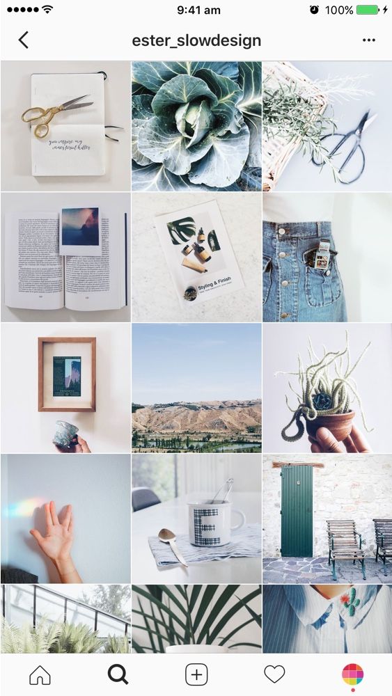
This is probably the most common grid style. Choose a color palette (pink and grey?) or a specific tone (high contrast neon?) for each photo. When viewed together, your gallery will appear as a matching set, even if the content of your photos differs.
Create a checkerboard effect
By changing the style of your published photo, you can easily create a checkerboard look on your grid. Try interlacing text quotes with a photo, or mixing close-up shots with landscape photos. You can also switch between two different colors.
Line by line design
Combining images in each row by theme or color can have a big impact. For example, use a different background color for each palette in your grid.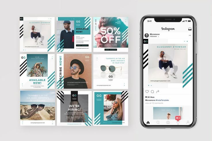
Create a vertical column
Dividing the grid into squares to form a vertical center image is a great way to combine graphic branding and photos on your profile.
Turn your grid into a rainbow
You'll need patience and great color sense to create this look. The goal is to post one saturated color regularly... and then gradually move on to the next shade of the rainbow with your next rows of posts.
Embrace the border
Creating a consistent look is as easy as applying a border to all your images. The free Whitagram app is one option to quickly apply this edit, with borders and backgrounds in a wide range of hues.
Turn your messages into a puzzle
This layout is difficult to implement on a day to day basis, but for a large ad or campaign, or for launching a new account, the puzzle grid certainly makes a big difference.
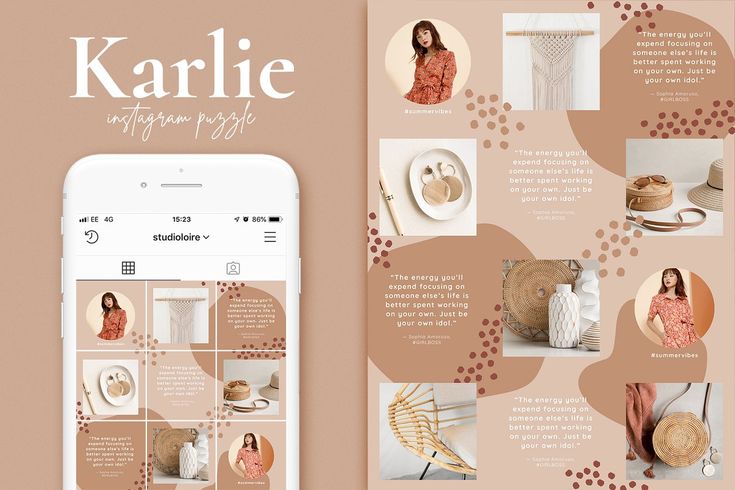
Puzzle grid creates one large interconnected image from all the squares.