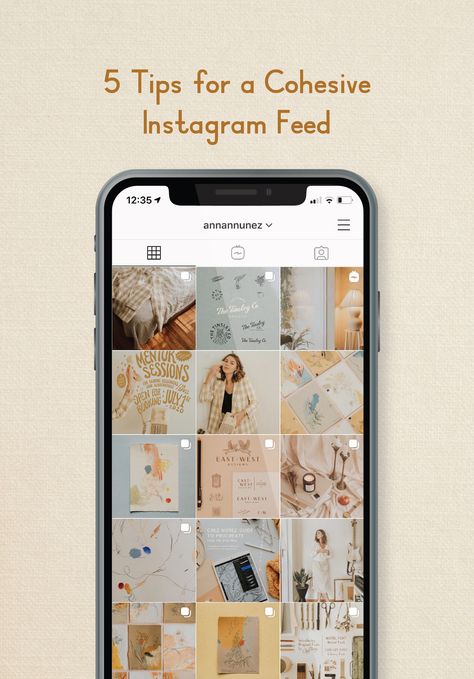
Creating a cohesive Instagram feed is definitely a form of art. We have worked hard to develop our Instagram feed and we are incredibly proud of it. But it wasn’t created overnight. It takes dedication, planning and most importantly strategy. Creating a cohesive Instagram feed is actually one of our most requested client services and today we are giving you the secret tips we use to create this magic.
Creating a cohesive Instagram feed is more than just pretty pictures, it’s built from a foundation of strategy and insights.Before we dive into these tips on how you can create a consistent Instagram feed, take a moment to browse your favorite feeds. Who inspires you? Are their styles consistent? Do you gravitate towards a particular look? You’ll first need to understand what you like. This is your feed, you should love it. This is extremely important. Whenever you click on your gram profile, you should feel proud and inspired by your work. We know we do and that is our goal with each and every client we touch. Alright, now you are ready. Let’s dive into these nine secrets to building a cohesive and consistent Instagram feed.
We wholeheartedly believe that you cannot have a strong Instagram feed without a social media strategy in place. You need to understand the why behind your posting and who you are posting for in order to see success. You can post all the pretty pictures you want, but without a reason, those images will get lost amongst your audience. Pretty pictures might be what made them hit the follow button, but your captions and content is what gets them to stick around, engage and ultimately turn into paying customers and clients.
2. Brand StyleDo you have a defined brand style? In other words, do you have a rulebook for your brand that identifies colors, typography, logo variations, patterns and more? If not, this is where you need to start.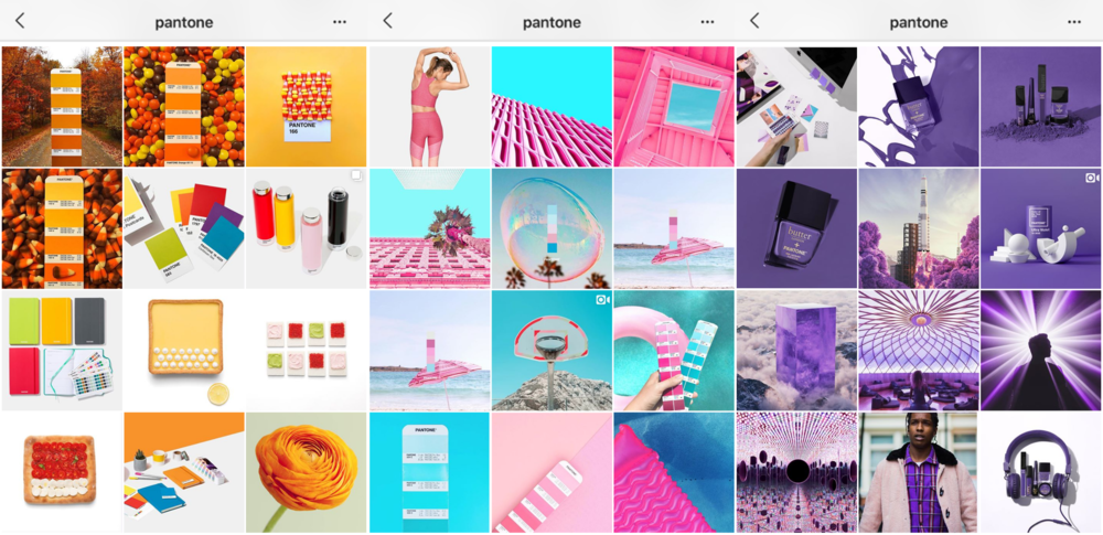 Whether you start by creating a moodboard or by hiring a branding service (we can help!) you will want this in place. Have you ever seen an Instagram feed that is constantly changing? The colors change, the fonts change and even their photo filters change. It can be hard to keep up and oftentimes you might find yourself hitting the unfollow button. Without a unique brand style in place you will begin to feel lost in all those Canva templates and start posting content you “like” versus content that is truly on brand.
Let’s dig into that brand style a little deeper. Your brand should evoke a feeling from your audience. Similarly, so should you Instagram feed. At first glance, do you want your feed to feel poppy, colorful, moody, natural or vintage? This feeling should reflect your brand. These feelings don’t need to be the exact same personality traits of your brand, but they should be synonymous.
4. ColorYou now have an identified brand style and you confidently understand and know your brand colors. You are one step closer to creating a cohesive Instagram feed. If you use Canva, put these colors into your brand kit and use them as you build and find new templates. If your brand guidelines only include a couple colors and you want to offer more variety, it is okay to introduce 1 to 2 new colors into social media. However, choose that color and stick to it and make sure it works well with your core colors. Another option, rather than adding an entirely new color, is to explore transparencies within your brand colors. These transparencies will almost always work well within your feed and offer a little more variety for your viewers.
Let’s talk about fonts. This topic can be tricky not to mention entering a legal area. We are definitely not lawyers, but please make sure you have the legal rights to the fonts you are using, especially if you are uploading these files directly to your website, Canva or any other service you are using. Just a quick little PSA before we move on.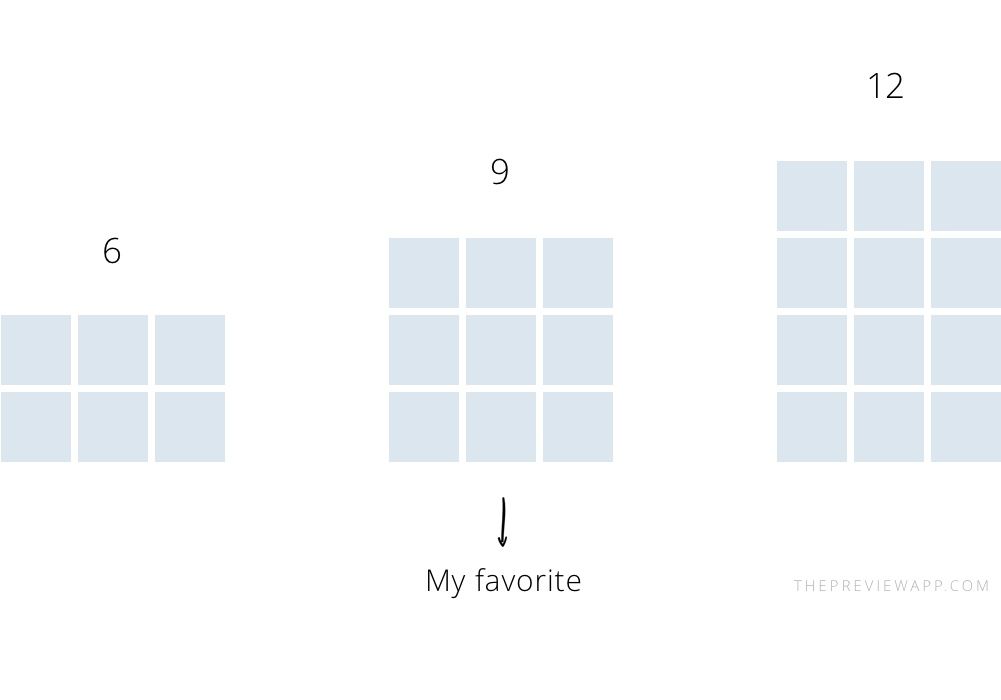 ? When using fonts in your social templates, our rule is to stick to 2-3 type treatments. This will create consistency throughout your posts. If you use anymore than three your Instagram feed will begin to feel cluttered. Setting these typography rules is an important part of identifying your brand style in tip number two.
Now we get to the fun part. The beautiful content that makes up your Instagram feed. First, you need to source this content. We recommend sourcing content from four key buckets:
The most important part about sourcing and compiling all of this content is to make sure the various images fit your brand style. Save all these images and file them in a folder on your computer so you can view them together and delete the ones that feel out of place. We like to do this in Tailwind by dropping all the images into our grid. More on this in tip number eight!
7. Content VarietyAs you gather all your content, you’ll want to make sure you are alternating it. Posting five images in a row of your face and then five images in a row of beautiful home office spaces isn’t going to create a very cohesive instagram feed. Of those four buckets we mentioned above, make sure you have a handful of images for each. If one bucket feels light for that month, start sourcing some more. You’ll be thankful you did as we jump into tip number eight.
It’s time to layout your Instagram Grid! Guessing what you should post each day is never the answer. You absolutely cannot create a cohesive Instagram feed without laying it out first and planning ahead. Start by uploading all the content you sourced to a scheduling system like Tailwind, Planoly or Later. As you layout your content, consider these rules:
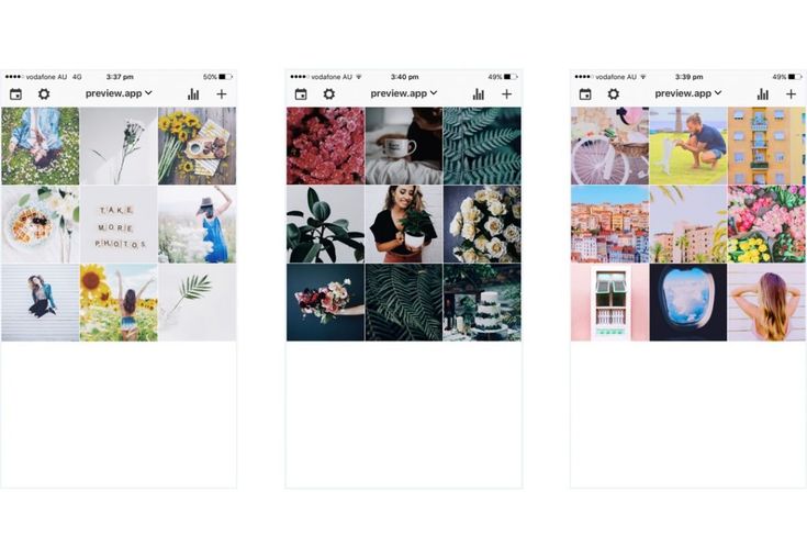 Is the photo capturing details or the bigger picture? Sometimes the answer isn’t to find a completely new image, but rather think about how it could be cropped to better fit the feed.
Last, but definitely not least, have fun! The great thing about your Instagram feed is that it can be a mini extension of your brand beyond just your website. This is also a platform where you are allowed to break a few rules. Bring in some fun elements and graphics – Canva is always dropping new assets and we love it! You may never be able to use some of these elements elsewhere. Social media is that platform where you can play and have fun.
There you have it, 9 steps to building a naturally beautiful & cohesive Instagram feed.If this is an activity you don’t want to tackle yourself, don’t worry. It’s one of our favorite services. Just email us to get started. Building a cohesive instagram feed and social media strategy is our bread and butter.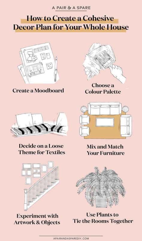
Ready to keep upping your social media game? Jump into six of our favorite, absolutely free, social media management tools.
So I’ve been asked this questions so so many times and for me personally creating a cohesive Instagram feed is a mix of trusting what my eyes see and having a plan and theory behind all that.
I’m going to show you exactly how I plan my feed (when I’m not eyeballing it).
In fact, after I started really carefully planing my grid, I immediately saw that people liked what I was producing. I was gaining much more followers than before. After a while, I started to do planning less theoretically and trusted my own eyes more and more. I got used to how my feed looks and took me less time (and less thinking!) to create a feed that flows.
So if you’re having trouble making your feed consistent and cohesive, I suggest you start with theory (that’s where this article comes in) and after a while, you’ll see that you’ll do it more and more spontaneously. It’s going to become second nature.
It’s hard to start, when your feed looks all over the place, right?
Start with planning at least 9 images ahead (12 or 15 are even better). This way you’ll actually be able to see how your new and shiny feed will look like!
So here are the steps that you need to take in order to create a stunning visually pleasing and cohesive feed:
There a few ways you can plan your grid online with software. The ones I like are Later and Planoly (not sponsored). They are free for les than 30 posts a month. You can use them only for planning the grid or you can post from their software as well. You can use either their app on your phone or plan via their website. Either way, that’s probably the easiest way to start planing how your grid will look like.
Do you prefer darker photos, lighter photos, do you like everything very colorful, do you love monochromatic images, desaturated, warm, cold, vintage, modern, natural, a specific color palette… so many styles and colors to choose from.
Choosing one style doesn’t mean you can’t integrate other styles too, but one or maximum of two is the best.
Will you be sharing only photos or you’ll also share videos, text, graphics… you should consider all the content you want to share with your audience and what type of content they’ll appreciate. Just make sure they all look great together. If you’re including any graphical elements, thy need to work togeher as well and they should match the style of other content in your feed.
If you are sharing more than one type of content then it is essential to decide how often you’ll share each type of content. For example, if you’re sharing photos and text, then you could share a one-to-one ratio, so every second day you’ll share text and all other days a photo. You can consider some other ratios too. I love 6 to 1. Six photos and one text image. Be creative!
When I plan my Instagram grid, I always take into consideration the colors in the photos. I usually have one or two main colors in a photo. When I plan a grid, I’ll place images with the same main color on the different parts of the grid so they don’t all touch each other. I post mostly dark images but I include brighter ones as well and I follow the same principle there too.
Same goes with shapes. If I post a photo of a round cake in the middle of the frame, I won’t post other images with similar shape so that they fall in a line (unless it’s a diagonal). I also don’t want to squeeze them all in one corner.
One way to creatively use color theory is to have a color-coordinated grid, where you post one color only for a specific number of days and then continue with another.
Balance is the magic word when it comes to a cohesive Instagram feed. Try to think of your image as having weight. Some weigh less (meaning they are less busy), some weigh more (busy images with big elements or multiple elements). Now imagine your feed being an old fasioned kitchen scale. You should place the images in your feed so that your scale is in balance. Just like with colors and shapes you need to consider placing images with same ‘weight’ in oposite parts of the grid to balance things out.
The same goes for angles. I post photos from different angles in my feed and that also takes some thought. Just like, with color, shapes, and negative space, I like to spread mix photos taken at different angles so that they don’t compete with each other.
Please, don’t go and follow these things I just wrote about very very strictly. Like I wrote in the beginning, sometimes something will look better and you won’t necessarily have a clear explanation. Follow your gut and your creativity.
You might say, but I’m not a professional yet, I don’t have high-quality images. It doesn’t matter, use what you have, but be picky at the same time. Choose the best photo you have and if you’re unsure and decide between two or three photos, use stories to ask your followers. As an IG user, I can say that I love voting and people really do love engaging in things like questions and anything that requires their input in the stories. So why not ask your followers? This way you’ll also learn what type of content they like seing from you. Win-win!
While creating a cohesive Instagram feed takes some preparation and careful planning it’s not the only thing to do if you want your IG channel to attract followers (aka ideal followers). One of the most important think about running an IG feed is being personal and showing who you are. Poeple love following real people not machines!
Let me know if you found this useful in the comments below or on my IG.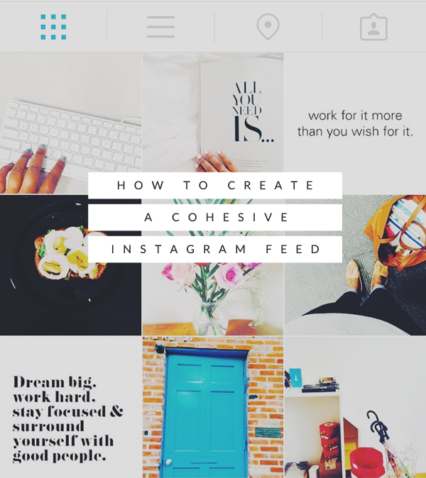
June 25, 2022
Instagram is a great platform for promotion. And here a lot depends on what impression the profile makes: what is the general mood, color palette and combination of photos. We have put together a few tips to help you make a beautiful ribbon and develop a special brand aesthetic.
A single style is those details that unite the entire visual. For example, it can be a photo style - dark deep, airy light photos. Or the paraphernalia of the frame - rustic, vintage, kinfolk and others. Even some common character or object. However, in search of your own style, it is not at all necessary to drive yourself into rigid frames and lock yourself in one direction. You can combine completely different photos if you follow a few rules. nine0003
The account itself does not affect sales. For visitors to turn into potential customers, they need to be impressed. Think about what emotions you want to evoke in subscribers? The style of your feed and the choice of photos will depend on this.
For example, if you are selling home decor, a hygge aesthetic would be appropriate: photographs of candles and cozy blankets, warm colors and soft shadows in processing. And for premium leather goods, you can try shooting with gloomy light and deep hues - if you place all the accents correctly, such shots will be filled with a special atmosphere. nine0003
Accounts of photographers can also be different: on the left - conciseness and rigor, on the right - brightness and audacity. For example, photos of @neekmason and @kavalerchikyana are used
When one color is used in the profile - everything is light and airy or vice versa dark - it looks very stylish and beautiful. But after a while, when you see the fifth, tenth or hundredth such photo, you stop seeing the difference. Therefore, we recommend leaving the stereotype that it is enough to choose one filter for all photos in the past. nine0003
It's much better not to lock up your creativity in some kind of filter, but simply choose your favorite shades of base colors and make sure that they are regularly in photographs. If you are shooting portraits, ensure that the skin is the same color throughout. If you publish landscapes, the shades of the sky and greenery should also be the same. Then the shots taken in different conditions will remain natural and look harmonious.
On the left is an example of a tape in which each photo is very beautiful individually, but together they look very similar. And on the right is a tape in which the frames are very different, but thanks to the primary colors that are repeated from frame to frame, the tape looks harmonious. For example, photos of @meghan_faulk and @prostokrasivo.wear are used
You can combine dark and light, warm and cold shots in one profile - just make smooth transitions. For example, if you had three light shots and now you want to post a dark photo, post a light photo with dark accents first.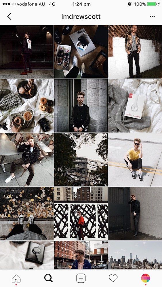 Then it turns out that some shades seem to flow into others. Such a “gradient” looks beautiful in the feed and will help to fit photos of your customers into it.
Instagram Kinfolk is a great example of a harmonious feed without a single filter. This is achieved by smooth transitions and playing with color. Photos used as an example @kinfolk
Color adds zest to photos and encourages you to come in and see the details. This is due to the fact that our eye easily picks up bright spots, especially when looking at photos from the phone.
Therefore, for profiles in neutral tones, such as gray or beige, we recommend adding bright details so that the tape does not look boring. And if your frames are bright and colorful, on the contrary, it is better to add calm objects - this way there will be no extra variegation when looking at the feed. nine0003
Color attracts the eye, the main thing is to use it in doses. For example, on a neutral background - white, black, beige.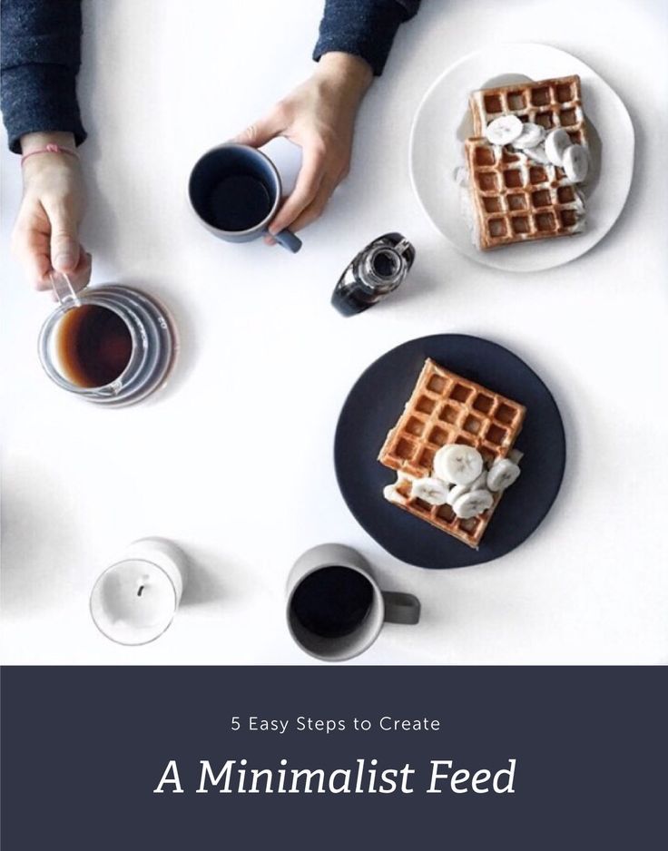 Photographs @la_maison.n and @gkstories
The feed looks more harmonious when photos with different scales are published side by side. For example, if you have an online clothing store, you can first post a photo of a girl in a full-length dress, then a waist-length portrait, and then a large photo with a dress back or a beautiful clasp. So there will be no feeling that you are repeating yourself. nine0003
The alternation of plans helps to make the tape varied and lively. The characters in the photographs change, the surrounding world changes - then the tape looks eventful.
Cozymoss Instagram photos at different scales. This is another reason why the goats in the profile are so lively and active. @cozymoss photos used as an example
Use apps to plan your Instagram content in advance. They are convenient to upload photos, combine them and choose the perfect sequence. nine0003
We recommend trying Unum, Inpreview or Garny. To plan one account, a free version of any of them is enough, but if you maintain several profiles, Unum will suit you - there you can create several projects at once for free.
Download Unum for iOS →
Download Unum for Android →
Download Inpreview for iOS →
Download Garny for Android →
These simple tips will help you compose a beautiful and harmonious feed from various photos. At the same time, you don’t have to drive yourself into the framework of one style and limit yourself to one filter. If the article was useful to you, put ♥ and share your Instagram tricks in the comments. nine0003
Instagram brings sales to businesses if you know what to post. We at Chizhov Studio have analyzed thousands of publications and collected in one place 65 of the best post and story ideas that will help you attract an audience, increase reach, improve engagement and increase sales. nine0003
138 890 views
Contents
95% of companies come to Instagram for sales. Accordingly, they enter the social network with a bunch of selling posts. It seems logical, but it doesn't really work.
In social networks, we work with a cold audience, so before selling, you need to attract them and form a desire to buy in them. And these tasks cannot be fulfilled by selling publications alone. nine0003
We at the Studio have been working on projects on Instagram for many years and have analyzed the effectiveness of thousands of publications. And for you, we have collected the top 65 content ideas that solve all business problems.
Content ideas for publications
We divide content on Instagram into three main types:
- engaging - helps to bring a new audience and increase coverage;
- warming up - makes users more loyal and gradually creates a desire to buy; nine0003
- and selling - sells our products or services.
Each of them leads the user to a new level of the sales funnel and, as a result, helps to increase sales in the account. Below we analyze them in more detail.
Engaging content for publications
Needed to involve the audience in communication with the brand, and serves to increase coverage, engagement and loyalty. This is the first stage in the funnel, but it is no less important than direct sales. nine0003
To whom will you sell in an empty and dead profile? Engaging content solves this problem.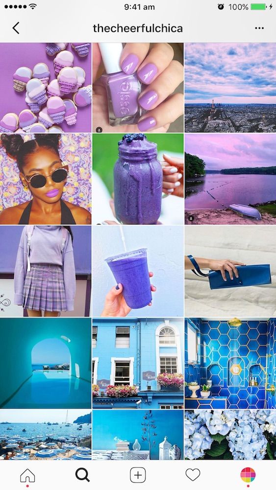
Subscription tender
Standard mechanics for attracting an audience to your account. If you're visiting Instagram for the first time, it's a must-have. You send such a contest to advertising to your target audience and get the first subscribers with whom you can work with in the future to get sales.
The prize in the competition must be related to the business you are promoting. No need to give jewelry if you are selling cosmetics, let the cosmetics set be a gift. Thanks to this, you will, firstly, attract the target audience, and secondly, simplify the task - it is more convenient and profitable to give your own goods. nine0003
The mechanics of this may include the need to write a comment, mark friends or repost in stories.
Subscription Contest Example
UGC Competition
UGC is content created by the brand's audience. And the competition itself is aimed at getting the greatest possible return from users, involving them in communication with the brand.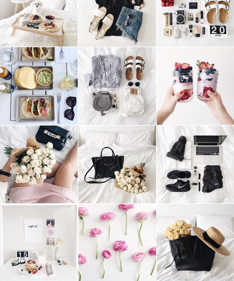 It is worth launching when the audience is already active.
In this way, you can collect, for example, reviews if there are few or simply none, or use more complex engagement mechanics with the creation of photos, drawings, generation of ideas and other things - let your imagination run wild.
We've scaled this mechanic many times with great results. For example, an online career development simulator was created for the Netology educational platform, and in a week they collected 11,000 ideas for developing career skills.
Sample contest with UGC for feedback
Poll
A simple mechanic to increase the number of comments. Choose a scandalous, controversial or just a bright topic related to your product or services and offer several answers.
It is important to work with the audience. If you do not respond to user comments, there will be a feeling that the account is maintained formally. This means that it will be more difficult to create a relaxed atmosphere and win the loyalty of subscribers.
Poll Publishing Example
Interactive
These are one-time games that allow you to quickly get a lot of comments. Engagement should start with them, accustoming users to write comments and communicate with each other.
There are a lot of interactive options.
Describe with emoji . For example, you might be asked to describe your day, job, or dream.
Example of interactive "Describe with emoji"
Arithmetic puzzle . Create an equation in which images are unknown variables. Subscribers need to calculate everything and write the answer in the comments.
Example of arithmetic puzzle
Cold - hot . A variation of the children's game in which you guess a certain number about the company and invite subscribers to guess it. You will need to answer each commentator whether he is close to the result with the words “cold”, “warm”, “hot”, etc.
An example of a publication with the interactive "Cold - hot"
False fact. Another guessing game in which you write facts about the company, among which one or more will be fictitious. The audience needs to guess which one is false.
Example of a publication with the False Fact interactive
Associations . The essence of the game is to write your associations to the word. Set a specific topic related to the company, enter the first word and watch the comments develop. nine0003
An example of a post with interactive "Associations"
Spot the differences . Invite subscribers to find the differences in the two pictures and write them in the comments.
Example of a post with Spot the Difference interactive
Feelward . Create a grid of pre-written letters to form words and let your subscribers find as many of them as possible.
Example of interactive "Filword"
To stir up the audience's interest in interactive games, it is worth offering small prizes for winning them. You don’t need expensive and complicated gifts here: offer a cup, stickers, a notebook or a small souvenir from your assortment.
Popular vote
Invite subscribers to choose their favorite products from your range. To do this, you need to run a series of votes that determine the winner in different categories. nine0003
This will not only increase engagement and get comments, but also find out which products your customers think are the best. This information can then be used to create an appropriate post or select promoted products. The mechanics are more complex, so you should use it in communities with an already formed loyal audience.
Example of a publication with popular vote
Chat
Creating discussions among subscribers is another opportunity to increase audience reach and loyalty. You bring up a controversial topic for discussion and invite everyone to speak out about it. nine0003
There can be a long discussion in the comments about what works for us.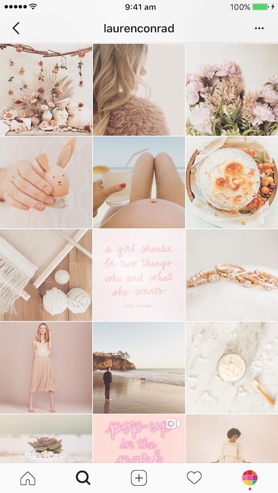 But do not forget about chat moderation so that subscribers do not get carried away and do not switch to insults.
It is worth starting discussions already at the later stages of engagement, when subscribers are used to discussing something in the comments.
Example post with chat
Quest
This is a series of interactive posts with the story of one hero. You come up with a character, a situation in which he finds himself, and then put before him a problem that needs to be solved. This decision will be made by subscribers. They vote for one of the options, and you prepare the next post with the continuation of the story, based on the most popular answer. You can repeat as long as there is interest in the quest. nine0003
The mechanics are complex and require a formed loyal community or advertising support.
An example of a post with quest
Warm-up content for publications
After we have attracted new subscribers and involved them in communication, we need to tell about the company.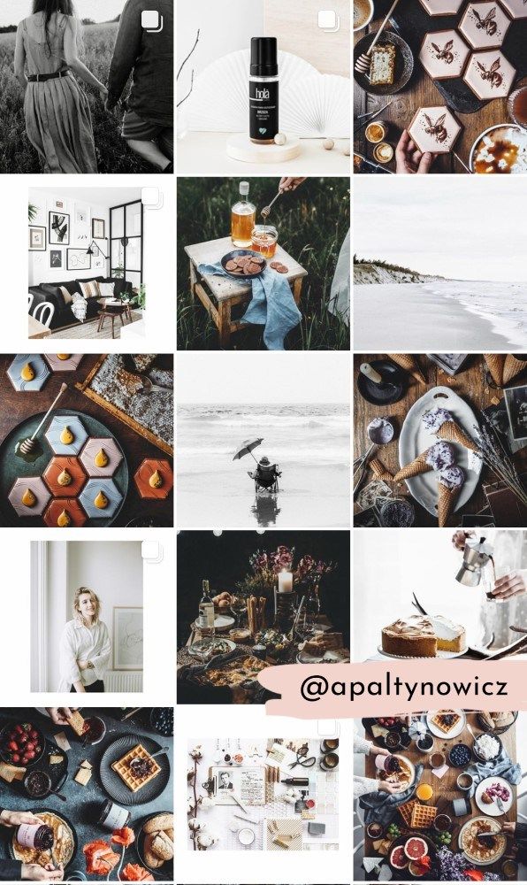 With the help of warm-up content, we convey the values and benefits of the brand, show expertise and increase loyalty.
Show your expertise and help your audience make life easier by solving their everyday problems.
Life hacks should be selected from the company's area of activity. For example, if you sell handmade shoes, show how to remove creases from leather boots.
An example of a post with useful cards
How to (how to do something)
Select a topic that buyers often have questions about and do a brief or detailed discussion. For example, tell us how to choose the right carpet care product. nine0003
An example of a post with an answer to the question of how to choose the color of a sofa
Processes
Backstage is always interesting. Show how you actually work, develop products, pack and deliver them.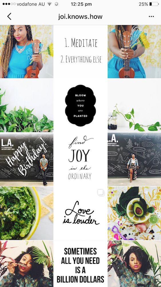 So you will immediately remove some of the objections and increase the loyalty of the audience.
An example of a post with the process of manufacturing goods
Commodity in life
Buying a drill, a person buys a hole in the wall. So show how your product actually behaves in real life. For example, if you are selling sofas, show how they fit into the interior and whether they are comfortable to lay out.
An example video that shows shoes in a real life setting
Reviews
Ask customers to talk about their experiences with your product or service. Let it be text, photo or video. This will close audience objections and prove the quality of your products or services. nine0003
Example of a post with feedback
FAQ
A rubric where you can answer frequently asked questions, closing the objections and pains of the audience.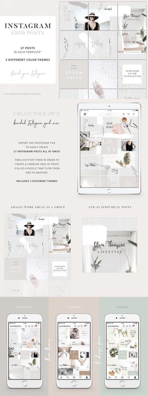 Tell us about how you can order, pay and return the product if it does not fit. Or let your subscribers know what guarantees you have, production time and whether there is a product designer.
Post describing how to place an order and arrange delivery
Infographic
In infographic format, show what the company stands out for or is proud of, and explain why it matters to the customer. If you have a lot of stores, say you don't have to travel far, or if you're handcrafted, emphasize the uniqueness of the item.
Post with infographics in which cities there are salons of the company
Content about the
team People buy from people, so it is important for them to know who is behind the abstract brand name. Show your team, tell what experience and knowledge they have and how they solve the problems of your audience. In this case, not only its name will speak about the brand, customers will also have pleasant associations with your team, which can increase loyalty. nine0003
An example of a post with a story about an employee of the company
Executive Blog
One of the approaches in business social networks is communication on behalf of the manager. In this case, the account will be primarily associated with the first person of the company, and publications can be more trustworthy. But even in the case of maintaining a profile on behalf of the brand, you can periodically make posts with messages from the manager. For example, he can talk about the company, its values and the difficulties that you solve with hard work. nine0003
An example of a post on behalf of the head of a legal organization
News
Reading company news about updating computers or a new coffee machine in the office is not interesting. But if your news directly concerns buyers, tell about it. For example, if you ordered a new German machine and doubled the production time, future buyers will appreciate it.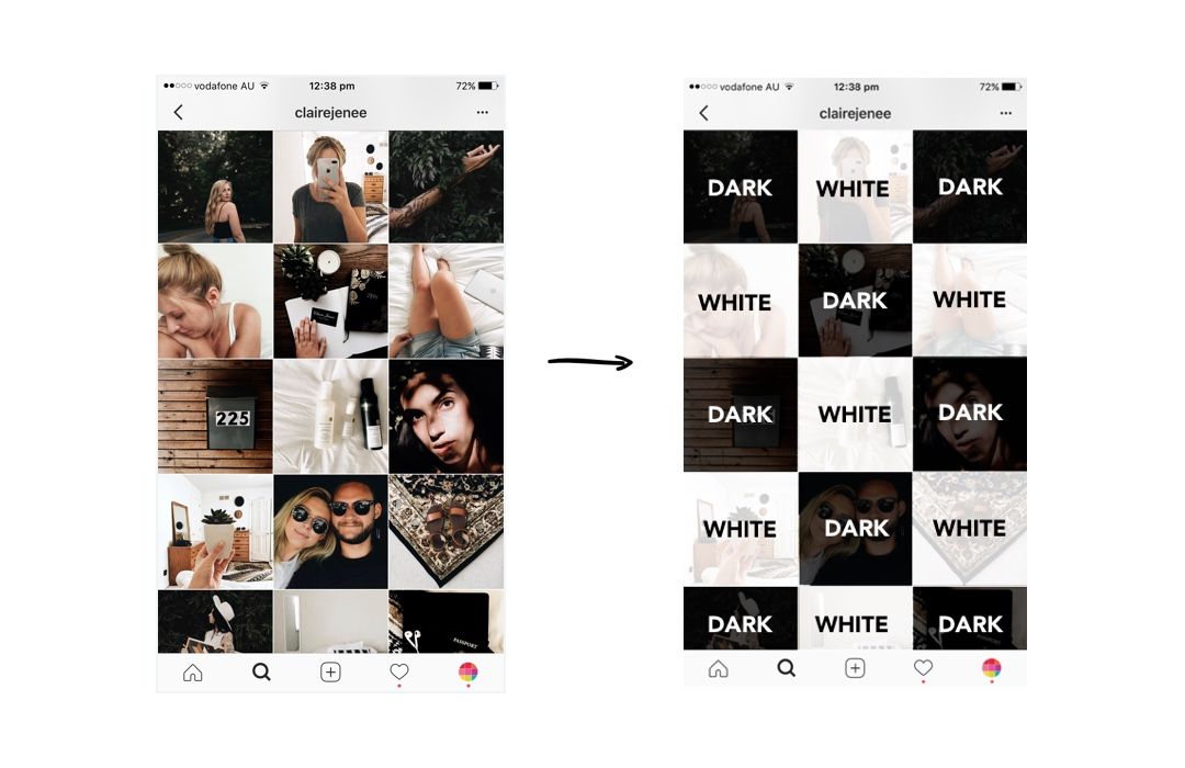
An example of a publication with news about a company
Before/after
This is a classic way to demonstrate how useful and high quality your services are. For example, show the transformation of a person after make-up or compare photos of an apartment before and after renovation.
An example of a post showing a carpet before and after cleaning
Sales content for publications
And finally, the third stage of the funnel is sales. Here we present goods and services, describe their properties, explain why it is worth choosing them. nine0003
With this kind of content, we encourage a warm audience to buy.
Overview
The easiest selling post is to take one specific product or service and talk about its main features and benefits. There is no need to praise - put pressure on the pains of customers.
If this is a product, show it on the main visual, or better, take a series of photos in a carousel or even a video.
Product review post example
Discounts
By posting discounts, you close the "expensive" objection and get those who wanted to postpone it back to checkout. According to research, most users look for discounts on products before ordering - take advantage of this. And do not forget to make a time limit to motivate you to buy right away.
Sample post with discount
Shares
Another variant of motivation to buy. But in this case, you do not reduce prices, but offer a gift with the order, make free delivery, when ordering two products, give the third one for free, and so on. Again, it is important to limit the action in time so that the audience does not put it off until later. nine0003
An example of a post with action
Tops
In such publications, you collect several products or services that rank first in certain parameters.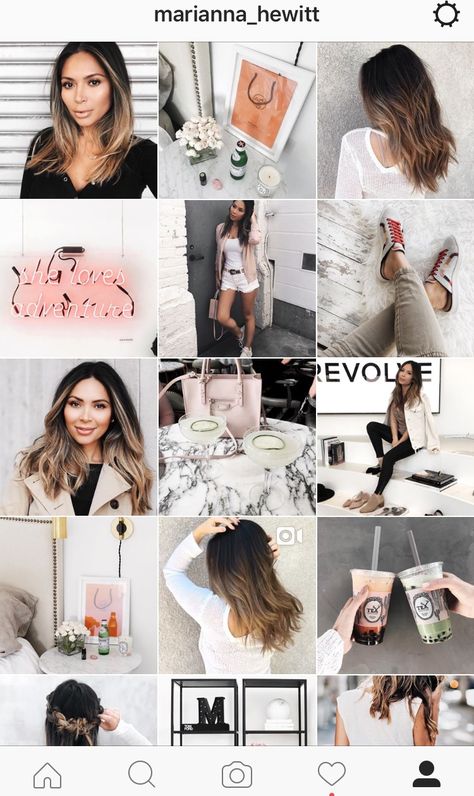 For example, the top order-leading products, the most wear-resistant boots or compact sofas.
An example of a post with top products on orders
Comparisons and battles
We contrast products, suggesting that subscribers choose the one they like best. In such a post, we can immediately talk about the distinctive features of several products and at the same time help the undecided in choosing. For example, you can compare sneakers and high boots and explain what occasions each pair of shoes can be useful for. nine0003
An example of a post with a battle of goods
Thematic collections
Collect several items by use, for a holiday or news event, for men or women, and so on. Such selections show the variety of your assortment and help customers in choosing.
An example of a post with thematic collections
Event announcement/invitation
nine0011 If your company organizes or participates in an event, invite your customers to attend. Indicate when and where to go, what will be interesting there and what benefits the client will receive. And then with the hottest audience, you can work on personal selling.
An example of a post announcing event
Stories content ideas
Engaging content for stories
We form the core of an active audience, involve subscribers in communication with the brand. nine0003
Predictions
Create a video with rapidly changing captions, and subscribers have to stop the story at random times or take a screenshot to get a prediction. You can jokingly predict how a person's day will go or what kind of worker he is. It is important to adapt the idea to your business, only in this case it will work. For example, in the account of a furniture company, you can make a prediction about what changes in the interior await users in the next year. nine0003
An example of a story with prediction
Find hidden goods
Simple interactive mechanics to find hidden things.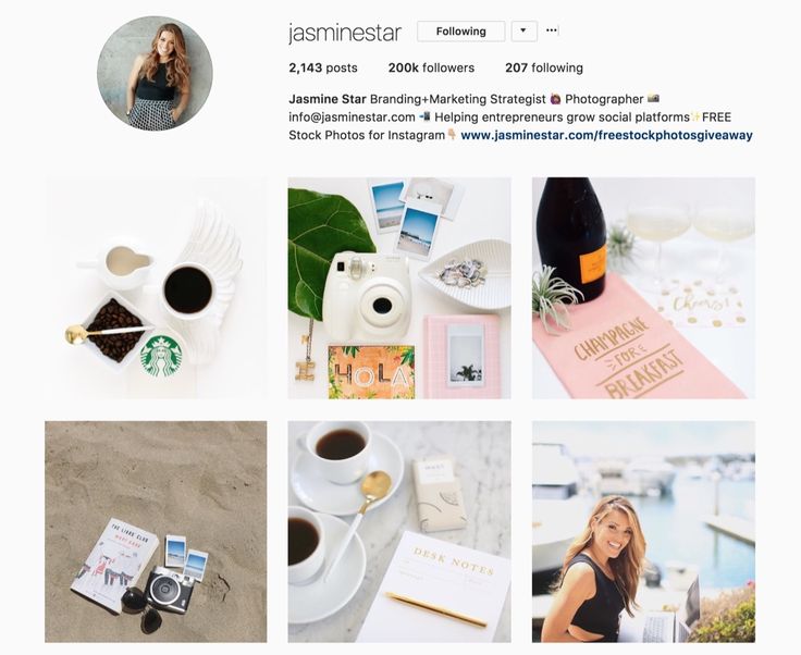 First, in the graphic editor, place products or thematic elements according to the photo, hiding them, and then invite subscribers to write their number using the “questions” sticker.
An example of a story with "Find the hidden goods" mechanics
Slider
With the slider sticker, you can play a variety of games with a choice of one of the options. For example, suggest choosing the best day for the event, summing up the game with a choice of the number of guessed things, or choosing the most successful dress.
Checklists, questionnaires, lists
Create a story about your community topic, in which you need to check certain items, choose between options, and so on. Such checklists or questionnaires need to be reposted to your story and manually ticked. The mechanics are complex, but can bring high reach and a new audience, especially if you reward subscribers with a small prize. nine0003
Example of a story with checklist
Guess by frame
Take one frame from any movie, cartoon, TV show, etc.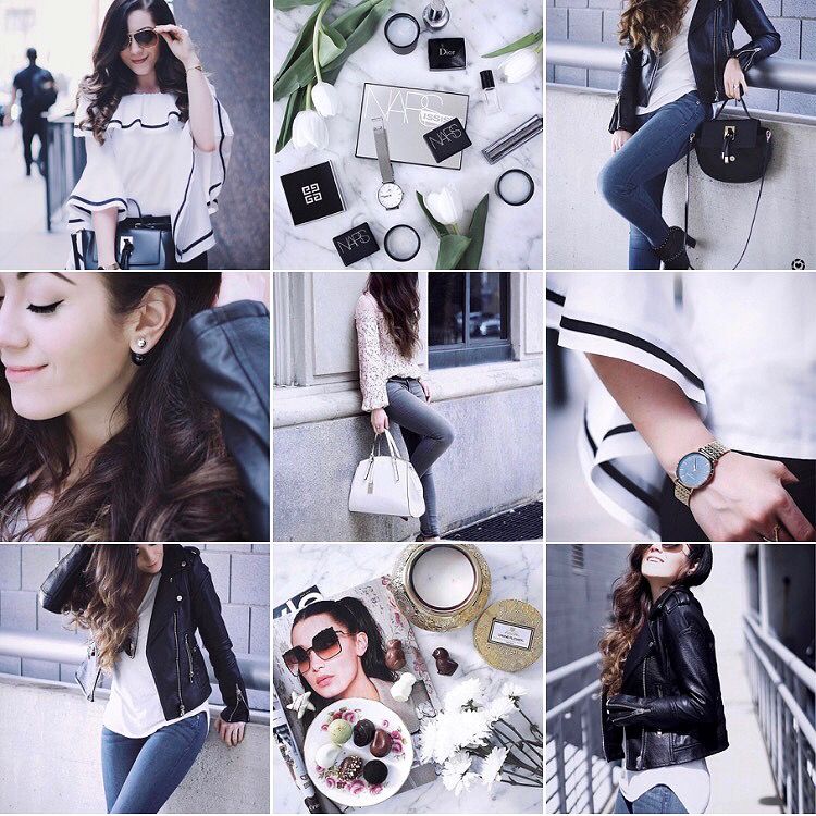 and ask them to guess the name of the original work. Don't forget to add a "questions" or "test" sticker to collect audience responses.
An example of a story with the game "Guess the movie by frame"
Guess by emoticons
nine0011Similar to the previous mechanics, but here you need to guess by emoji. Compose a series of emoticons describing a movie, picture, book or music, and invite subscribers to determine what you have guessed.
An example of a story with the game "Guess by emoji"
Spot the difference
You make two stories with almost identical pictures, except for a few differences. Subscribers of your account will have to find them, and then write their number using the “questions” or “test” sticker. nine0003
An example of a story with the mechanics of "Spot the differences"
Puzzles
Puzzles were of interest to the audience both in the times of Murzilka and now in social networks.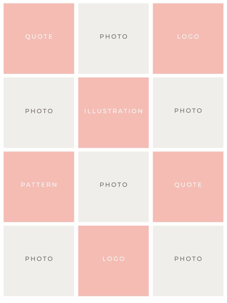 But it has become much easier to make them - there are dozens of online generators that will automatically prepare a rebus for you. Invite subscribers to guess what you thought of and write their answer using an interactive sticker.
An example of a story with rebus
Quiz
This is a series of stories with tests on a specific topic. You can time the quiz to coincide with a holiday or newsbreak, and you can also make tests about the company if the audience is already loyal.
An example of a quiz in stories
What is hidden in the photo
Another guessing game. In the photo, blur or cover the product with a sticker. And then invite subscribers to guess what is shown in the picture. nine0003
Hidden item story example
Catch an object
In this interactive, subscribers need to click on the specified area to catch some object. If you arrange the elements on the left, then on the right side of the screen, the user will move back and forth through the stories until he reaches the final.
Catch the logo story example
Was or was not
A small game with polls that can be answered "was" or "was not." Questions can be very different: did you find money on the street, did you forget your passport before the flight, did you lose your phone. Surveys can also be linked to your company or product.
An example of a story with the game "Was or was not"
True or False
You need to create a story with facts on a certain topic and invent some of them. And then invite the audience to answer whether it is true or false. These can be facts about a company, product, or related topic. nine0003
An example of the game "True or False" in stories
Feelward
Word grid, “questions” sticker and caption “what words could you collect?”.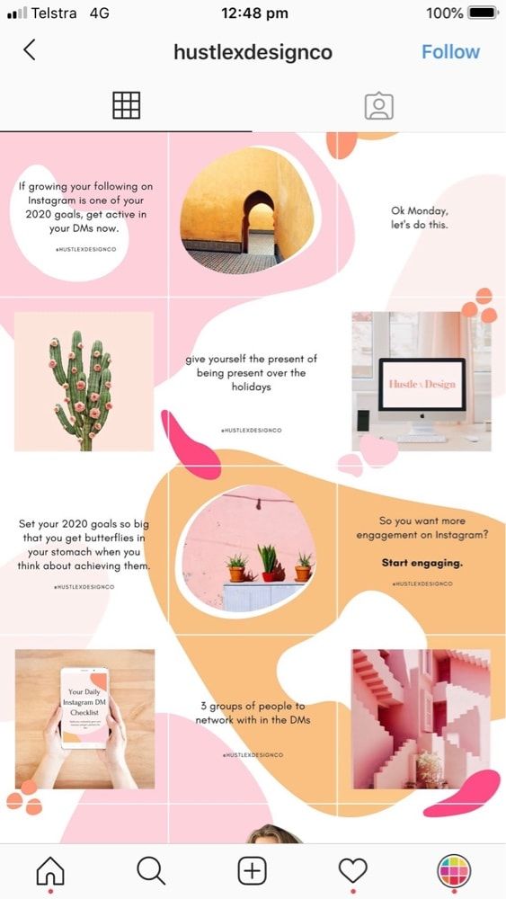 That's the whole interactive - simple and effective.
An example of a story with a
fieldwordPublication announcement
The simplest, but no less effective way to promote posts. Just repost the post to your story with an engaging caption or just a new post sticker. nine0003
An example story with the announcement of publication
Warm up content for stories
We talk about the company, show the advantages and close the objections.
Q&A
Potential customers often have questions about the company, products, shipping, returns, and more. Find out what concerns them with the help of the “questions” sticker and answer the questions in separate stories. nine0003
An example of a story with an answer to a subscriber's question
Poll
Universal sticker with which you can find out the opinion of the audience on any issue.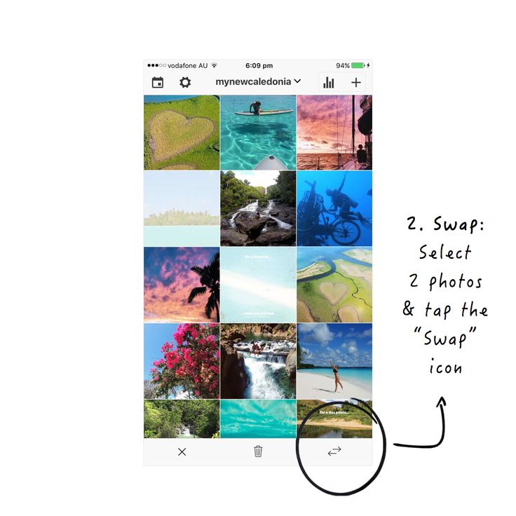 Ask which dress should be the first to be mass-produced or which color of the sofa should be included in your assortment - communicate with the audience and increase its loyalty.
Sample post with poll
Visualize what happens after your product or service is delivered. For example, show a photo of a sofa before and after a reupholstery or compare a video with a broken and completely intact iPhone.
Sample stories with photos before and after using product
Entertainment video
When the business is live and real, audience loyalty grows. Show that no less cool people stand behind a cool brand by making a short funny video from your production, shop or office. But do not forget about the specifics of your target audience, because for subscribers of a brokerage account, such a video may be inappropriate. nine0003
An example of an entertaining video in stories
Processes
Show how you work.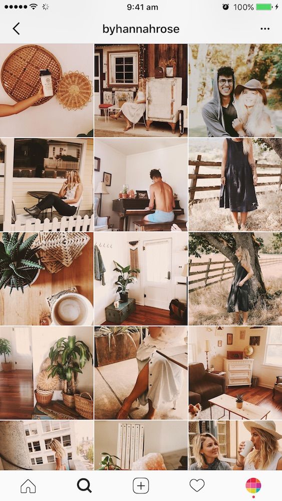 If a person sees how food is prepared for him, his confidence in the restaurant increases. Just like in any other business, consumers want to see your "kitchen" - do not hide it.
Example of a story with the production process
Lifehacks
Small expert videos or infographics with life hacks or useful and interesting facts. For example, a dentist can tell you how to properly brush your teeth, or a furniture store can tell you how to choose a comfortable mattress. nine0003
Sample story with helpful tips
Frequently Asked Questions
Step-by-step instructions for any customer questions: how to order, arrange delivery, choose a color, etc. Take a video, photo or make an infographic - any format will do.
Sample story with answer to FAQ
How to use the product or service
nine0011 Tell, or rather show on video, how to use your product or service correctly.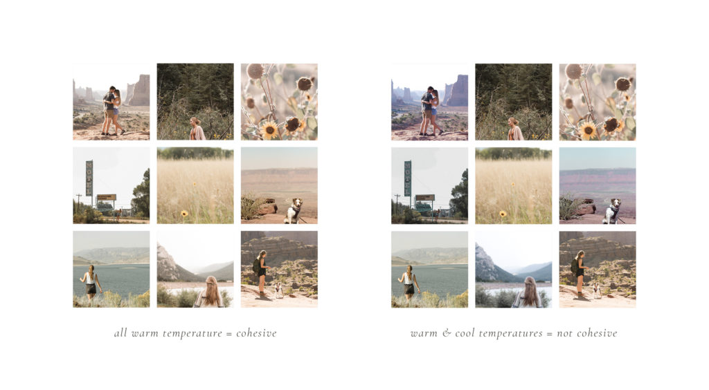 Make instructions for assembling a sofa, caring for shoes, or using an English learning platform.
Example of a story with a demonstration of the use of product
Reviews
Show screenshots of a customer thanking you, share a video from a customer, or insert a text review into a story. nine0003
Sample story with recall
About us
Tell us about the company, its history, values and products or services.
History with facts about the company
Addresses
Share the addresses of your offline points: shops, showrooms or warehouses. If it is difficult to get there, make a short video on how to do it most conveniently.
Example of a story with the address of the pickup point
Live broadcasts
Broadcasts help to revive the company, to acquaint the audience with its face.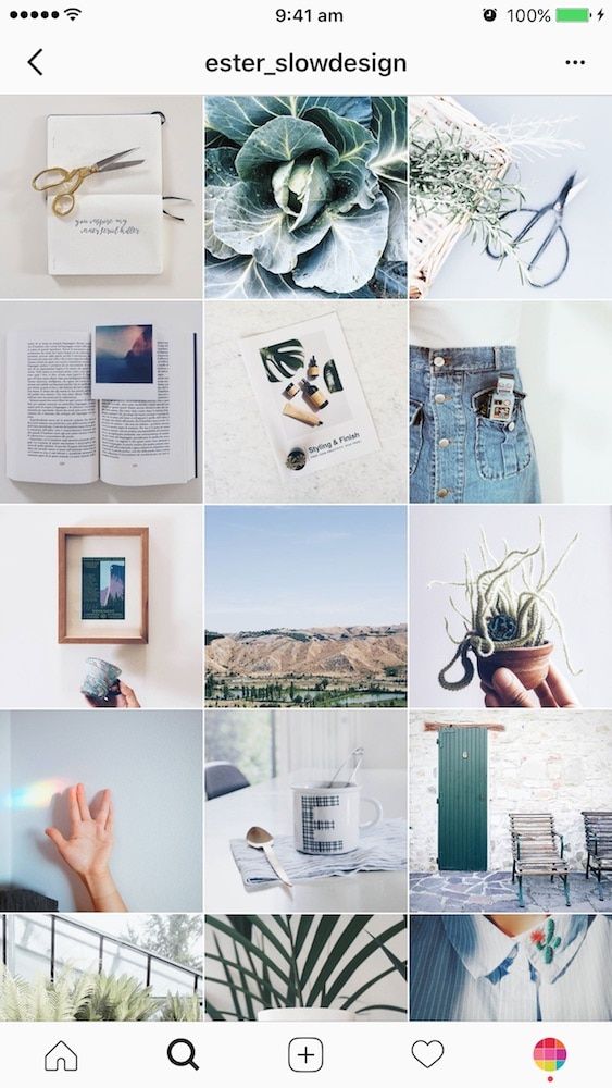 Live, you can talk about the changes in your company, answer questions from subscribers or showcase a new collection. Of course, it’s worth launching streams with an already formed core of an active and loyal audience.
After the end of the live broadcast, it is worth saving it in IGTV
Repost photo subscribers
Don't forget to share the content your audience generates. This idea will be especially relevant for brands of clothing and accessories, whose subscribers often share photos with new things. Repost a photo of a subscriber with your product and write a few words of gratitude or just attach a GIF animation.
An example of a story with a repost of a photo of a subscriber
Selling content for stories
Encourage the audience to buy.
Product overview
As in the publications, tell us about one of the products from your range. You can also make a video review of the product: show how it looks, describe its main characteristics.
Example of a story with a video review of the product
Event announcement
Whether you're opening a new store soon, speaking at a conference next week, or about to start a livestream, announce it. Make a short news about the upcoming event and tell why it should be important to your customers. nine0003
Event announcement example
Discounts
They work in the same way as in publications - offer a discount, limit it in time, tell where to go and how to order.
Sample story with discount
Shares
Another option to stimulate the audience to buy is a special offer with a limited duration.
An example of a story with stock
Vacancies
In the accounts of HR companies, this will be the main type of selling stories. However, other companies may also use this recruiting channel. Tell us about your vacancy, describe how you can apply for it, and wait for applicants.
Job story example
New product announcement
Announce new additions to your range. Tell us how soon they will be available, what makes them stand out and why you should order them. nine0003
An example of a story with the announcement of a new collection of goods
Totals
So that nothing is forgotten or lost, let's put the most important thing on the checklist:
