Nowadays, Instagram is often someone's initial contact with a brand, and nearly half of its users shop on the platform each week. If it's the entryway for half of your potential sales, don't you want your profile to look clean and inviting?
Taking the time to create an engaging Instagram feed aesthetic is one of the most effective ways to persuade someone to follow your business's Instagram account or peruse your posts. You only have one chance to make a good first impression — so it's critical that you put effort into your Instagram feed.
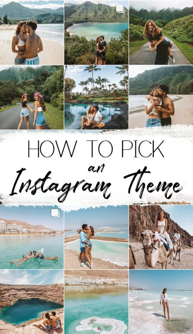
Finding the perfect place to start is tough — where do you find inspiration? What color scheme should you use? How do you organize your posts so they look like a unit?
We know you enjoy learning by example, so we've compiled the answers to all of these questions in a list of stunning Instagram themes. We hope these inspire your own feed's transformation. But beware, these feeds are so desirable, you'll have a hard time choosing just one.
An instagram theme is a visual aesthetic created by individuals and brands to achieve a cohesive look on their Instagram feeds. Instagram themes help social media managers curate different types of content into a digital motif that brings a balanced feel to the profile.
Creating a theme on your own requires a keen eye for detail. When you’re editing several posts a week that follow the same theme, you’ll want to have a design tool handy to make that workflow easier. Pre-set filters, color palettes, and graphic elements are just a few of the features these tools use, but if you have a sophisticated theme to maintain, a few of these tools include advanced features like video editing and layout previews. Here are our top five favorite tools to use when editing photos for an Instagram theme.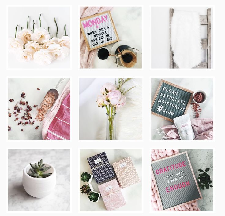
Creators look to VSCO when they want to achieve the most unique photo edits. This app is one of the top-ranked photo editing tools among photographers because it includes advanced editing features without needing to pull out all the stops in Photoshop. If you’re in a hurry and want to create an Instagram theme quickly, use one of the 200+ VSCO presets including name-brand designs by Kodak, Agfa, and Ilford. If you’ll be including video as part of your content lineup on Instagram, you can use the same presets from the images so every square of content blends seamlessly into the next no matter what format it’s in.
FaceTune2 is a powerful photo editing app that can be downloaded on the App Store or Google Play. The free version of the app includes all the basic editing features like brightness, lighting, cropping, and filters. The pro version gives you more detailed control over retouching and background editing. For video snippets, use FaceTune Video to make detailed adjustments right from your mobile device — you’ll just need to download the app separately for that capability.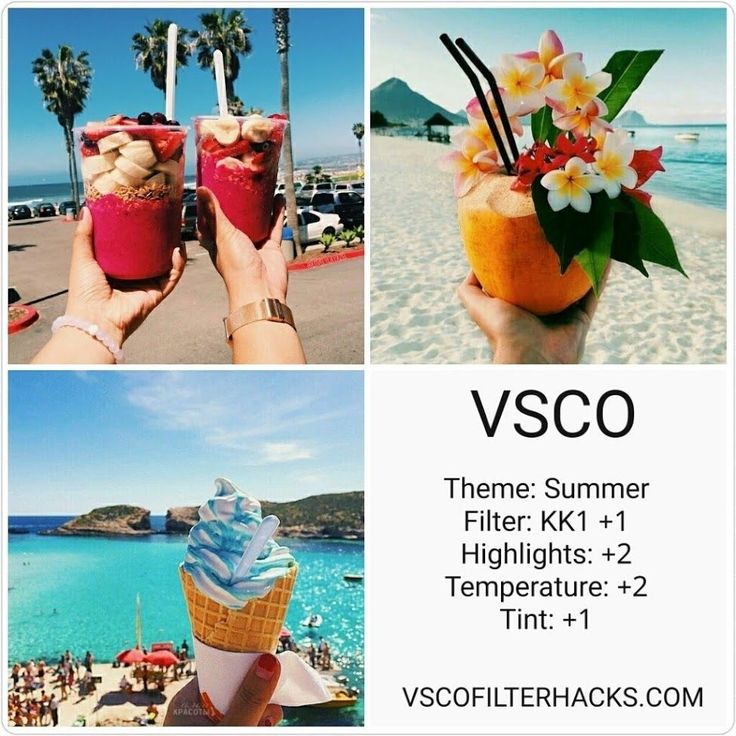 If you’re starting to test whether an Instagram theme is right for your brand, FaceTune2 is an affordable tool worth trying.
You know Canva as a user-friendly and free option to create graphics, but it can be a powerful photo editing tool to curate your Instagram theme. For more abstract themes that mix imagery with graphic art, you can add shapes, textures, and text to your images. Using the photo editor, you can import your image and adjust the levels, add filters, and apply unique effects to give each piece of content a look that’s unique to your brand.
Image Source
Have you ever used Adobe Illustrator to create interesting overlays and tints for images? You can do the same thing to develop your Instagram theme. Traditionally, Adobe Illustrator is the go-to tool to create vectors and logos, but this software has some pretty handy features for creating photo filters and designs. Moreover, you can layout your artboards in an Instagram-style grid to see exactly how each image will appear in your feed.
Photoshop is the most well-known photo editing software, and it works especially well for creating Instagram themes. If you have the capacity to pull out all the stops and tweak every detail, Photoshop will get the job done. Not only are the editing, filter, and adjustment options virtually limitless, Photoshop is great for batch processing the same edits across several images in a matter of seconds. You’ll also optimize your workflow by using photoshop to edit the composition, alter the background, and remove any unwanted components of an image without switching to another editing software to add your filter. With Photoshop, you have complete control over your theme which means you won’t have to worry about your profile looking exactly like someone else’s.
 Transition
If you aren’t set on one specific Instagram theme, consider the transition theme. With this aesthetic, you can experiment with merging colors every couple of images. For example, you could start with a black theme and include beige accents in every image. From there, gradually introduce the next color, in this case, blue. Eventually, you’ll find that your Instagram feed will seamlessly transition between the colors you choose which keeps things interesting without straying from a cohesive look and feel.
Image Source
A polished black and white theme is a good choice to evoke a sense of sophistication. The lack of color draws you into the photo's main subject and suggests a timeless element to your business. @Lisedesmet's black and white feed, for instance, focuses the user’s gaze on the image's subject, like the black sneakers or white balloon.
Image Source
If your company's brand is meant to imply playfulness or fun, there's probably no better way than to create a feed full of bright colors. Bright colors are attention-grabbing and lighthearted, which could be ideal for attracting a younger audience. @Aww.sam's feed, for instance, showcases someone who doesn't take herself too seriously.
Image Source
For an artsier edge, consider taking a minimalist approach to your feed, like @emwng does. The images are inviting and slightly whimsical in their simplicity, and cultivate feelings of serenity and stability. The pup pics only add wholesomeness to this minimalist theme. Plus, minimalist feeds are less distracting by nature, so it can be easier to get a true sense of the brand from the feed alone, without clicking on individual posts.
Image Source
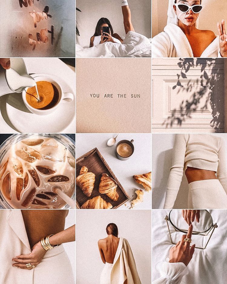
One of the easiest ways to pick a theme for your feed is to choose one color and stick to it — this can help steer your creative direction, and looks clean and cohesive from afar. It's particularly appealing if you choose an aesthetically pleasing and calm color, like the soft pink used in the popular hashtag #blackwomeninpink.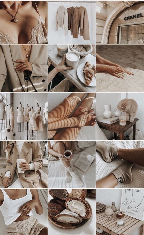
Image Source
If you're interested in creating a highly cohesive feed but don't want to stick to the one-color theme, consider trying two. Two colors can help your feed look organized and clean — plus, if you choose branded colors, it can help you create cohesion between your other social media sites the website itself. I recommend choosing two contrasting colors for a punchy look like the one shown in @Dreaming_outloud’s profile.
Image Source
Similar to the one-color idea, it might be useful to choose one color palette for your feed, like @creativekipi's use of pastels. Pastels, in particular, often used for Easter eggs or cupcake decorations, appear childlike and cheerful. Plus, they're captivating and unexpected.
Image Source
As evident from @mustdoflorida's feed (and username), it's possible to focus your feed on one singular object or idea — like beach-related objects and activities in Florida.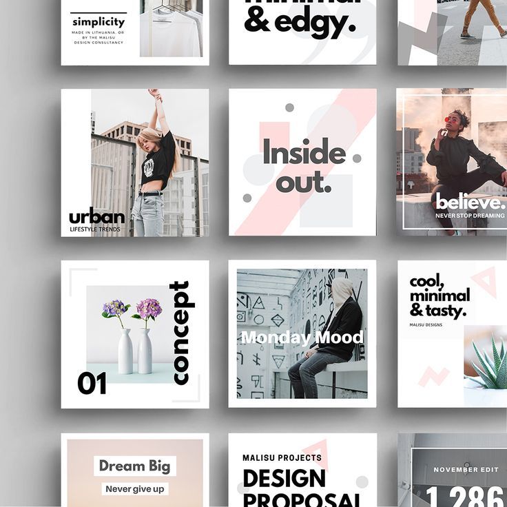 If you're aiming to showcase your creativity or photography skills, it could be compelling to create a feed where each post follows one theme.
Image Source
Creating a puzzle out of your feed is complicated and takes some planning, but can reap big rewards in terms of uniqueness and engaging an audience. @Juniperoats’ posts, for instance, make the most sense when you look at it from the feed, rather than individual posts. It's hard not to be both impressed and enthralled by the final result, and if you post puzzle piece pictures individually, you can evoke serious curiosity from your followers.
Image Source
Displaying everyday items and activities from unexpected angles is sure to draw attention to your Instagram feed. Similar to the way lines create a theme, angles use direction to create interest. Taking an image of different subjects from similar angles can unite even the most uncommon photos into a consistent theme.
Image Source
A picture is worth a thousand words, but how many pictures is a well-designed quote worth? Confident Woman Co. breaks the rules of Instagram that say images should have a face in them to get the best engagement. Not so with this Instagram theme.
The bright colors and highlighted text make this layout aesthetically pleasing both in the Instagram grid format and as a one-off post on the feed. Even within this strict text-only theme, there’s still room to break up the monotony with a type-treated font and textured background like the last image does in the middle row.
Image Source
If you're not a big fan of horizontal or vertical lines, you might try a checkerboard theme. Similar to horizontal lines, this theme allows you to alternate between content and images or colors as seen in @thefemalehustlers’ feed.
Image Source
While it is a bit jarring to have black or white borders outlining every image, it definitely sets your feed apart from everyone else's. @Beautifulandyummy, for instance, uses black borders to draw attention to her images, and the finished feed looks both polished and sophisticated. This theme will likely be more successful if you're aiming to sell fashion products or want to evoke an edgier feel for your brand.
Image Source
If you prefer uniformity, you'll probably like this Instagram theme, which focuses on using the same filter (or set of filters) for every post. From close up, this doesn't make much difference on your images, but from afar, it definitely makes the feed appear more cohesive. @marianna_hewitt, for example, is able to make her posts of hair, drinks, and fashion seem more refined and professional, simply by using the same filter for all her posts.
Image Source
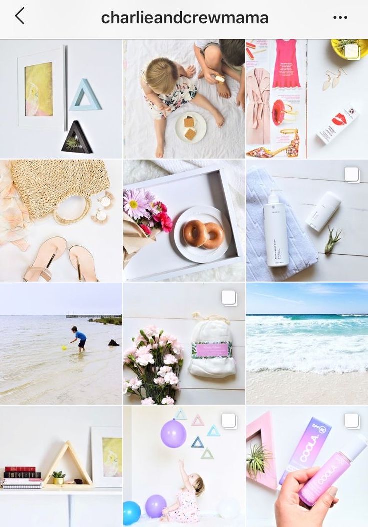
If your primary goal with Instagram is to showcase your products, you might want a Flatlay theme. Flatlay is an effective way to tell a story simply by arranging objects in an image a certain way and makes it easier to direct viewers' attention to a product. As seen in @thedailyedited's feed, a flatlay theme looks fresh and modern.
Image Source
If it aligns with your brand, vintage is a creative and striking aesthetic that looks both artsy and laid-back. And, while "vintage" might sound a little bit vague, it's easy to conjure. Simply try a filter like Slumber or Aden (built into Instagram), or play around with a third-party editing tool to find a soft, hazy filter that makes your photos look like they were taken from an old polaroid camera.
Image Source
In @girleatworld's Instagram account, you can count on one thing to remain consistent throughout her feed: she's always holding up food in her hand. This type of repetition looks clean and engaging, and as a follower, it means I always recognize one of her posts as I'm scrolling through my own feed. Consider how you might evoke similar repetition in your own posts to create a brand image all your own.
Image Source
 Mix-and-match Horizontal and Vertical Borders
While this admittedly requires some planning, the resulting feed is incredibly eye-catching and unique. Simply use the Preview app and choose two different white borders, Vela and Sole, to alternate between horizontal and vertical borders. The resulting feed will look spaced out and clean.
Image Source
If you're a writer or content creator, you might consider creating an entire feed of quotes, like @thegoodquote feed, which showcases quotes on different mediums, ranging from paperback books to Tweets. Consider typing your quotes and changing up the color of the background, or handwriting your quotes and placing them near interesting objects like flowers or a coffee mug.
Image Source
@JackHarding's nature photos are nothing short of spectacular, and he highlights their beauty by filtering with a dark overtone. To do this, consider desaturating your content and using filters with cooler colors, like greens and blues, rather than warm ones.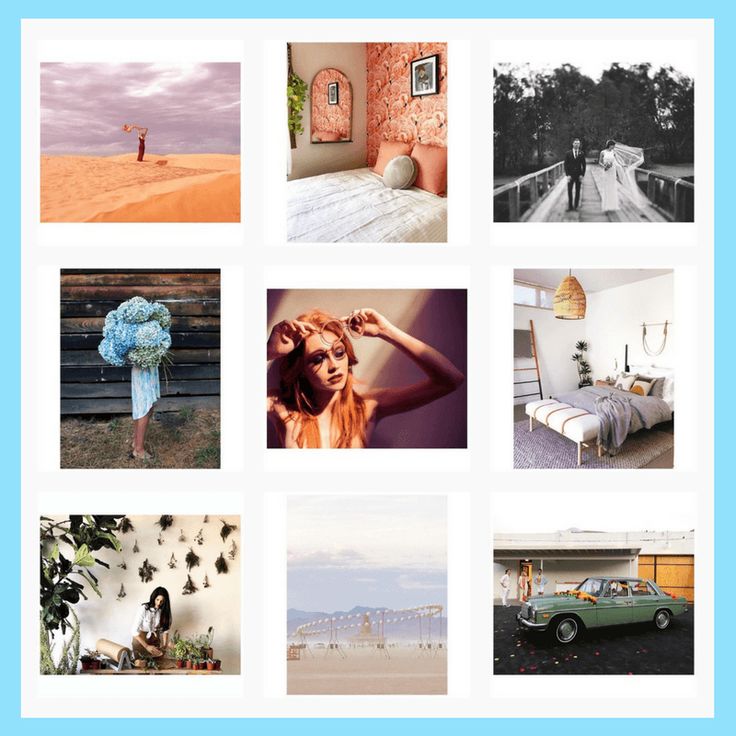 The resulting feed looks clean, sleek, and professional.
Image Source
One way to introduce color into your feed? Try creating a rainbow by slowly progressing your posts through the colors of the rainbow, starting at red and ending at purple (and then, starting all over again). The resulting feed is stunning.
Image Source
Most people on Instagram stick to photos and filters, so to stand out, you might consider adding drawings or cartoon doodles on top of (or replacing) regular photo posts. This is a good idea if you're an artist or a web designer and want to draw attention to your artistic abilities — plus, it's sure to get a smile from your followers, like these adorable doodles shown below by @josie.doodles.
Image Source
Similar elements in your photos can create an enticing Instagram theme. In this example by The Container Store Custom Closets, the theme uses shelves or clothes in each image to visually bring the feed together.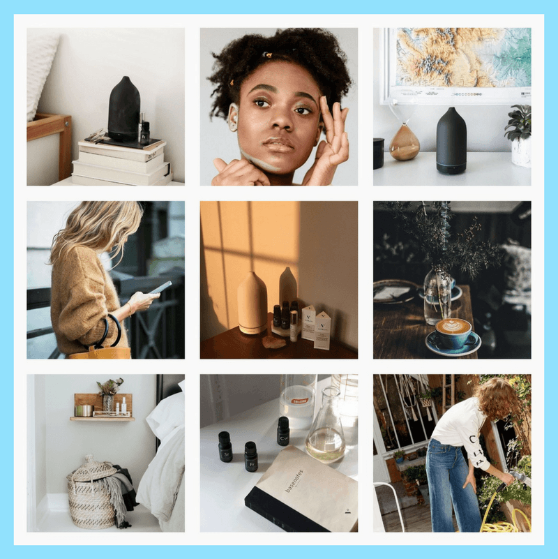 Rather than each photo appearing as a separate room, they all combine to create a smooth layout that displays The Container Store’s products in a way that feels natural to the viewer.
Image Source
Something about this Instagram feed feels different, doesn’t it? Aside from the content focusing on skyscrapers, the lines of the buildings in each image turn this layout into a unique theme. If your brand isn’t in the business of building skyscrapers, you can still implement a theme like this by looking for straight or curved lines in the photos your capture. The key to creating crisp lines from the subjects in your photos is to snap them in great lighting and find symmetry in the image wherever possible.
Image Source
If your brand does well with aligning photography with content, you might consider organizing your posts in a thoughtful way — for instance, creating either horizontal or vertical lines, with your rows alternating between colors, text, or even subject distance. @mariahb.makeup employs this tactic, and her feed looks clean and intriguing as a result.
Image Source
One major factor of any Instagram theme is consistency. For instance, you wouldn't want to regularly change your theme from black-and-white to rainbow — this could confuse your followers and damage your brand image. Of course, a complete company rebrand might require you to shift your Instagram strategy, but for the most part, you want to stay consistent with the types of visual content you post on Instagram.
For this reason, you'll need to choose a color palette to adhere to when creating an Instagram theme. Perhaps you choose to use brand colors. HubSpot's Instagram, for instance, primarily uses blues, oranges, and teal, three colors prominently displayed on HubSpot's website and products.
Alternatively, maybe you choose one of the themes listed above, such as black-and-white. Whatever the case, to create an Instagram theme, it's critical you stick to a few colors throughout all of your content.
As noted above, consistency is a critical element in any Instagram theme, so you'll want to find your favorite one or two filters and use them for each of your posts. You can use Instagram's built-in filters, or try an editing app like VSCO or Snapseed. Alternatively, if you're going for a minimalist look, you might skip filters entirely and simply use a few editing features, like contrast and exposure.
Whatever you choose, though, you'll want to continue to edit each of your posts similarly to create a cohesive feed.
It's vital that you plan your Instagram posts ahead of time for a few different reasons, including ensuring you post a good variety of content and that you post it during a good time of day.
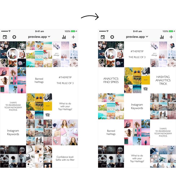
Additionally, when creating an Instagram theme, you'll need to plan posts in advance to figure out how they fit together — like puzzle pieces, your individual pieces of content need to reinforce your theme as a whole.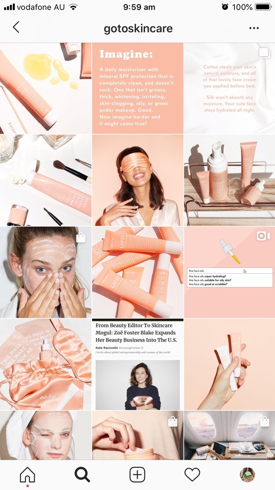 To plan posts far in advance and visualize how they reinforce your theme, you'll want to use a visual Instagram planner like Later or Planoly. Best of all, you can use these apps to preview your feed and ensure your theme is looking the way you want it to look before you press "Publish" on any of your posts.
In middle school, I often liked to change my "look" — one day I aimed for preppy, and the next I chose a more athletic look. Of course, as I got older, I began to understand what style I could stick with for the long haul and started shopping for clothes that fit my authentic style so I wasn't constantly purchasing new clothes and getting sick of them a few weeks later.
Similarly, you don't want to choose an Instagram theme you can't live with for a long time. Your Instagram theme should be an accurate reflection of your brand, and if it isn't, it probably won't last. Just because rainbow colors sound interesting at the get-go doesn't mean it's a good fit for your company's social media aesthetic as a whole.
When in doubt, choose a more simple theme that provides you the opportunity to get creative and experiment without straying too far off-theme.
When you start an Instagram theme, there are so many options to choose from. Filters, colors, styles, angles — the choices are endless. But it’s important to keep in mind that these things won’t make your theme stand out. The content is still the star of the show. If the images aren’t balanced on the feed, your theme will look like a photo dump that happens to have the same filter on it.
To curate the perfect Instagram theme, choose what photos you plan to post before choosing a theme. I highly recommend laying these photos out in a nine-square grid as well so you can see how the photos blend together.
Sure, no one is going to see the captions of your Instagram photos when they’re looking at your theme in the grid-view, but they will see them when you post each photo individually.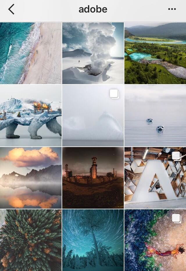 There will be times when an image you post may be of something abstract, like the corner of a building, an empty suitcase, or a pair of sunglasses. On their own, these things might not be so interesting, but a thoughtful caption that ties the image to your overall theme can help keep your followers engaged when they might otherwise check out and keep scrolling past your profile.
If you’re having a bit of writer’s block, check out these 201 Instagram captions for every type of post.
Earlier, we talked about choosing a theme that you can commit to for the long haul. But there’s an exception to that rule — color transitions. Some of the best themes aren’t based on a specific color at all. Rather than using the same color palette throughout the Instagram feed, you can have colors blend into one another with each photo. This way, you can include a larger variety of photos without limiting yourself to specific hues.
Instagram marketing is more than numbers. As the most visual social media platform today, what you post and how it looks directly affects engagement, followers, and how your brand shows up online. A cohesive Instagram theme can help your brand convey a value proposition, promote a product, or execute a campaign. Colors and filters make beautiful themes, but there are several additional ways to stop your followers mid-scroll with a fun, unified aesthetic.
Editor's note: This post was originally published in August 2018 and has been updated for comprehensiveness.
It’s spring cleaning season 🧹, and this year we’re cleaning up more than our closets. If you’ve been scrolling through your Instagram profile feeling a little uninspired, it might be time to change your theme on Instagram.
An Instagram theme change takes some planning and foresight 🧐.
Whether you’re planning to change the dominant color or filter of your photos, or you want to completely reimagine your content, it will take a well-executed transition and a clear new direction to avoid losing followers.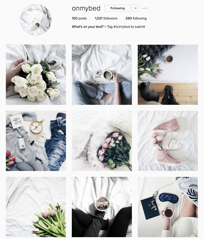
Today we’re talking about how to change your theme on Instagram: dos and don’ts, the essential tools, the best methods, and how to get your theme scheduled and ready to post.
You can change your Instagram theme without losing that beautiful feed you’ve planned so carefully, as long as you follow a few guidelines.
From an idea to a spotless new 9-grid, there’s only five simple steps!💡
But before we get started, let’s think about your goal with your new Instagram theme.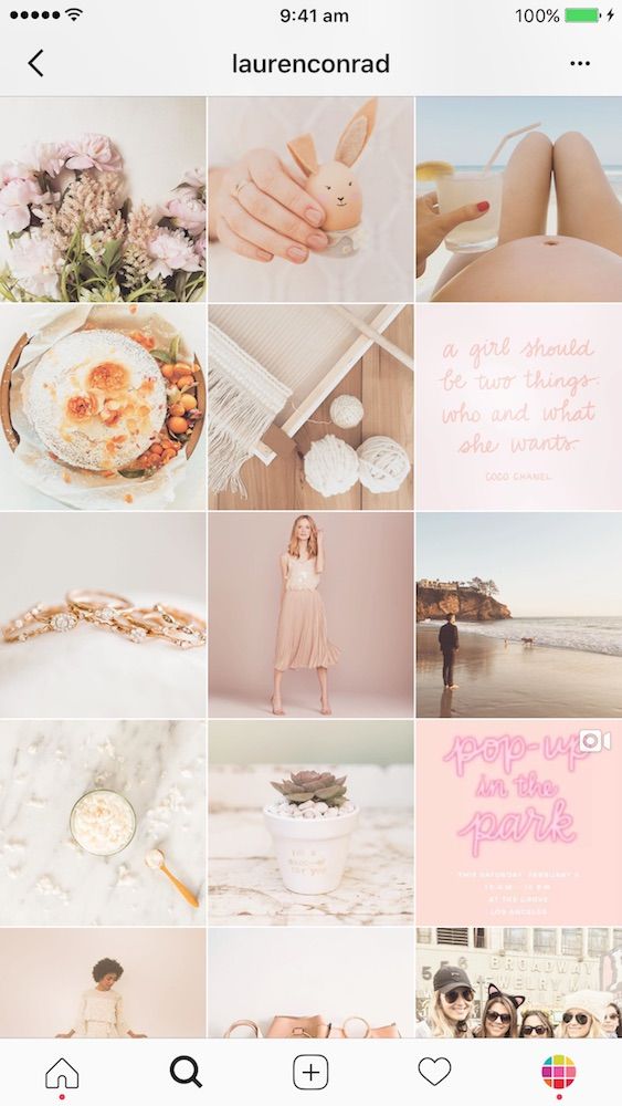
Are you making a gradual change with the seasons so your feed feels current? 🍃🌸☀️
Are you changing your theme to highlight a specific campaign, product, or content shift? Are you switching to a new way of editing photos? Or are you just looking to mix up your Instagram color theme?
Establishing why you’re changing your theme will help you figure out the best way to transition and communicate the shift to your followers.
For example, a gradual season change should feel seamless to your followers the way real season changes do.
But a pivot to highlight a piece of content or a brand shift should draw attention, you’ll want your followers to notice the change right away.
The first step to changing your Instagram theme is choosing your new color palette 🎨.
Having your new colors in mind will help you decide the best way to transition.
In this example, @alilabelle switched from a film-inspired, washed-out color palette, to a pinker, brighter palette.
She was able to slowly incorporate film photos with more and more pink to ease the transition to her final theme.
After you’ve picked your color palette, it’s time to plan the in-between.
Whether you want a transition that signals to your followers that you’re changing the theme, or you want a more seamless and gradual transition, planning ahead of time will make sure the right effect comes across.
The following methods are our favorite for transitioning your theme:
Instagram theme dividers are a row of three photos that show up in your Instagram feed between themes, giving a stark contrast between when your old theme ended and the new one began.
The dividers can be three white images, a photo split into three images, or any other set of images that are set apart from the rest of your feed.
You can find Instagram theme dividers by searching #themedivider on Instagram or Pinterest!
Or you can make your own with an app like PhotoSplit for Instagram.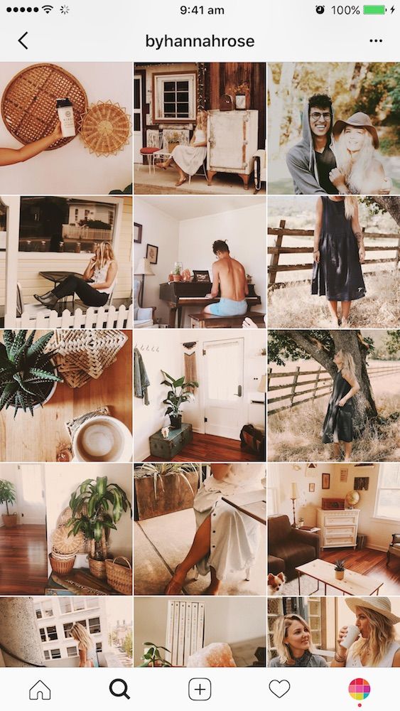
A theme divider is the best method if your new theme is very different than the old theme, or if you’re trying to draw attention to a particular campaign or event.
A bridge photo is the first photo you post when you start a theme change. It has colors from your old theme and your new theme, so it connects the two and makes the change look seamless.
In this example, @kaylynweir has a primarily orange theme, but she uses a few bridge photos with blue and orange featured prominently.
These photos allow her to sprinkle in photos that are predominately blue, like her photos of the ocean, without them looking wonky and out of place in her feed.
If you want the least disruption to your feed, you can do a gradual change to a new theme.
This method takes the most foresight and planning your Instagram grid, but it can lead to a satisfying scroll through your feed.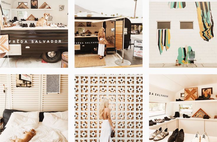
A gradual change works well for slight shifts in a theme like changing your theme along with the seasons, or for a change in filter.
In this example, @designlovefest moved from a pastel, pink color palette to a brighter and bluer palette by slowly posting images with more colors.
She transitions from pink to multicolor, before landing in a blue theme.
Before you start the change, you’ll want to get all your ducks in a row. 🦆🦆🦆
First, you’ll need a 9-grid planning app like Tailwind for Instagram.
This will help you see what your feed will look like when you add new photos, so you can try out different methods for changing your Instagram theme and see what looks best.
Then, depending on how you decide to transition your theme, you might need a few more tools like:
Along with those tools, you’ll need your content at the ready!
Before you start changing your theme, you want to have at least 9 photos or videos prepared. Why? You want your new theme can come to life quickly.
Posting a photo from your new theme every day will push your old feed out of the way faster.
Your followers will see your new grid take shape. Plus, the transition will be less obvious as it gets buried by new photos.
Tailwind’s scheduling tool is the perfect place to get your photos, captions, and hashtags ready to go as you’re planning content.
It’s time! Launch your new theme by scheduling your theme transition and new 9-grid in Tailwind for Instagram.
With Tailwind, you can see how your photos will look in the feed. You can also prepare captions and hashtags, and schedule your post!
Our Smart Schedule tool will automatically post photos at the best time of day. This gives you more exposure with less guesswork!
Your new feed will be scheduled in no time, then you can sit back and watch it take shape. 👍

No credit card required
When a user of a social network comes from an advertising post, the first thing he sees is your photos. The quality of the visual concept affects the cost of a subscriber in an ad - and often significantly.
There are situations in which professional photography is essential. "Visual sales" are needed for handicrafts, clothing and jewelry, for restaurants, private chefs, artists, doctors and cosmetologists. Psychologists, copywriters, business consultants in most cases can do without studio shooting.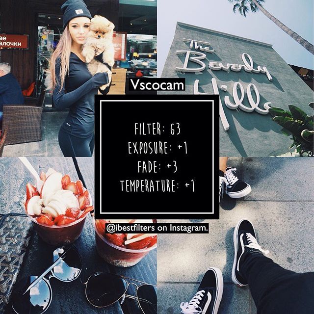
Let's look at how you can use the visual concept for the benefit of your blog.
It is important to make not just relatively good photos, but a stylish, attractive and memorable account feed. Once, in a conversation with designer Avrora Batyreva, we deduced two basic principles of visual content in Instagram:
I highlight five approaches to the visual beauty of the account.
Only photographs are used, there is a certain filter or dominant color.
In the case of only photos or only videos of the author, it is important not to overdo it so that the account does not turn into a mess.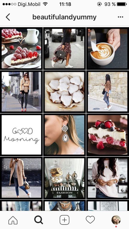 Often the strength of such accounts is not at all in the photo, but in the texts, the charm and charisma of the author. This concept is not suitable for stores, but is good for bloggers or for expert projects. Please note that most of the major bloggers form their feed this way. But they grew up at a time when Instagram was relatively free, and you have to grow when it's almost full, so take this approach with caution.
My favorite example is @handmadejournal: they have all their account photos taken from other profiles. At the same time, the tape looks more than pleasant and uniform. This is achieved by using the same filter — such processing even of photos with different color content and composition helps to make the account beautiful.
The account contains only photos in a similar style and a single color concept
Among the enduring and very effective applications, in addition to the built-in Instagram filters, are VSCO, PicsArt, Snapseed. They are available in paid and free versions and are updated regularly.
A dominant color or a photo in the same color scheme is also very cool to visually unite the account. But it is important not to stand out: if you decide to keep an account in cold gray-blue tones, then a warm photo will not look the best. And vice versa: cold photos in a warm account will cause bewilderment.
The popularity of this approach has created a whole new market - the market of instadesigners. This approach is equally loved by stores ”(for example, @bowsandtulle), and bloggers-experts.
Using templates and photos in your account
The idea is that for certain headings you and the designer develop a template - a background for text, on which it is easy to write the title of an article or hide screenshots of reviews. Using templates structures your account: you visually highlight important topics, focus on them.
Depending on your goals, you can develop one, two or more templates for each category.
Text on the photo is also often used. Its difference from templates is that your photo is used instead of a design background. For many expert accounts, this approach has already become the level of expectations - it immediately becomes clear what the blog is about, which articles are key, and what to pay special attention to. You can insert templates or photos with text in a chaotic manner, or you can add structure and meaning to the placement. Here are the options:
I sincerely recommend this method as one of the most convenient! In my agency, we regularly use the account design method for almost any niche.
Read also:
Sales post on Instagram: complete step-by-step instructions
0022
10 things not to do on Instagram
The design of templates has one significant disadvantage: covers for publications are liked many times less.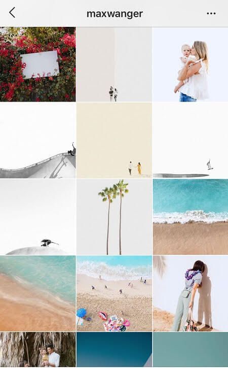 Consequently, engagement decreases and the post gets less reach.
In this case, you can work with an illustrator and create your own character or picture to illustrate the post. This method is also suitable for selling some very specific services or products - when just showing the product is not enough.
One day a young woman came to me for a consultation, whose business is related to the production of a gentle cleaner for swimming pools, both home and professional.
Illustrator's work in account
We do not live in California, where there is a pool in every house, but in Russia, where mothers put pools - and those inflatable ones - in the dacha for children for two months a year. Selling such a product is difficult, the season is short, and the transaction cycle is long.
It is also difficult to demonstrate the advantages of the product and talk about its quality with the usual visual content. The owner of the account was very doubtful about using her own invented character - but in the end she decided. Her account with Grandfather the Cleaner still walks in collections with reposts of the most successful accounts on Instagram.
An example of an unusual design for a complex product
Many single-shops — conditionally selling one product — actively use this technique. The connecting element in the visual concept is the product itself. It's amazing how many photos can be taken with just one product.
The same technique works successfully in expert "non-material" accounts - for Websarafan we used balloons that were present on each photo with the announcement of the article.
Instagram account example for “one” product
Dasha Pepelyaeva’s account with her famous whales looked very good.
Everyone is talking about the video trend, including on Instagram. In practice, short useful videos are rarely used. Although viner (video blogger) accounts are among the most popular and fastest growing, few people use this approach in sales. If you want to use video content for sales right now, try it! This method is good because it brings you as close as possible to subscribers, gives the effect of possession and builds up your account advantageously.
Yulia's account, which sells hand-painted T-shirts
You can also make a cover for the video and put it for preview. The functionality also allows you to upload a video gallery - this means that you can cut the video into 10 minutes and post it in one post.
Which approach to visual concept do you prefer? What would you like to see in your account? Surf Instagram and choose the profiles you like: see how their visual content works. Adapted borrowing has not been canceled :)
An important point: it makes sense for stories to create a separate content plan, including only planned announcements, games or contests.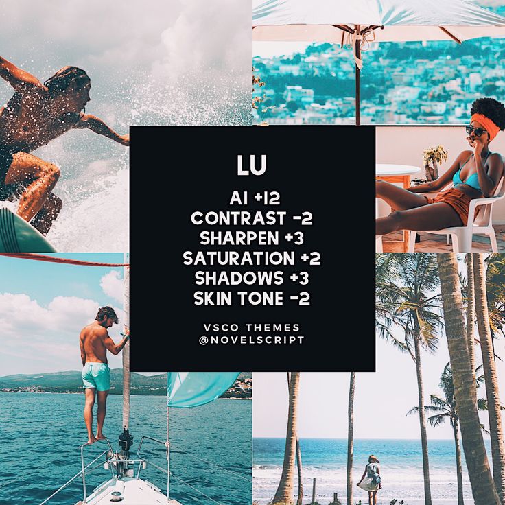
There are now many different applications for stories that make the visual content of stories at least unusual: these are various options for pop-up fonts and short 15-second videos.
Examples of questionnaires that I used in my profile
At the same time, do not forget that a lot of stories are spontaneous, recorded on the go and added only at the moment when you want it. The element of surprise and the absence of super-quality photos in stories very often makes the account just the same more charming and interesting.
One way or another, you will have to take mobile photos - whether for your account or for stories. I once took about five courses in photography and regularly shoot myself, so I will share with you the necessary minimum knowledge on this topic.
What you need to know about shooting:
 If you are shooting in bright light, there will be hard shadows and highlights, which will not give a correct understanding of the texture. If in the dark with a flash, the color quality will be useless. Shoot between 12:00 and 16:00, during daylight hours.
  There are very few photos taken from top to bottom at an angle, and it is not common to see photos taken at an angle of 45%. If you follow the rules of composition and choose the right shooting point, you simply do not have a chance to take a bad photo, even if you are new to this business!
 Without editing, photos for the account will not work. Pay attention to the following parameters (in one form or another they are present in all mobile photo editors):
Content creation can be time-consuming and labor-intensive, and is one of the most labor-intensive tasks. Therefore, many people have a question: is it possible to work with photo stocks?
In my opinion, the use of photo stocks, especially the most popular ones, will not affect your brand in the best way.
This photo is used by all brands, from Vse po 50 stores to construction companies in advertisements for mortgages with maternity capital . I usually recommend using Thestock.im stock aggregator or Unsplash, Deathtostockfoto. I am sure that if you spend a little time searching, you will find some more non-trivial and with great shots.
Another option is to agree on a permanent collaboration with a photographer.
How to look for a photographer and what to negotiate with him:
 In addition, you can immediately see his work and understand even before communication whether you like or dislike his style. If the photographer shoots in black and white, it is unlikely that he will take great bright color shots for you.
 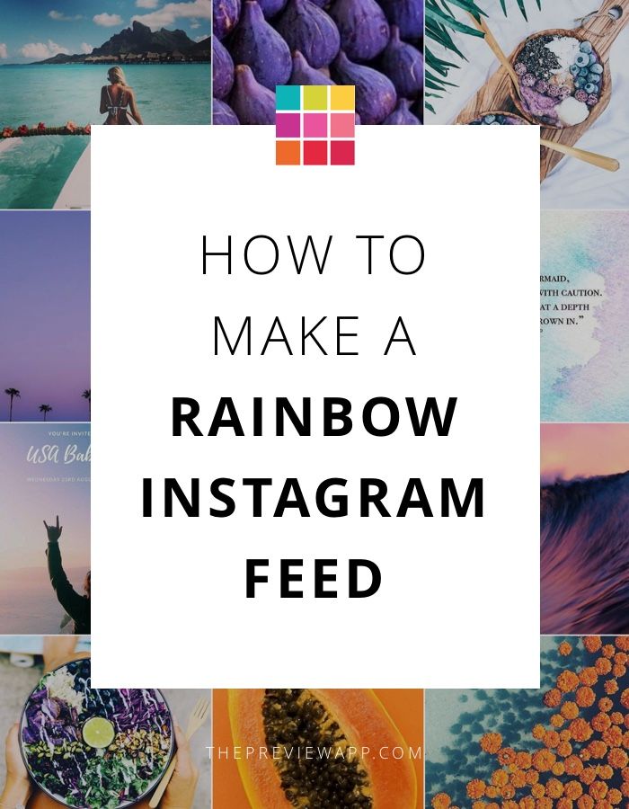 As a result, you get about 70 excellent shots. This is an ideal situation - all photographers work with different retouchers and offer different conditions. Therefore, it is better to clarify everything on the shore so that expectations and reality coincide.
 Please remember that the quality of a photographer's work depends on the correct setting of the task.
A good photographer:
A professional can cost a little more than a beginner, and if your goal is to do the best you can in a short amount of time, it's better to go to the pros. If you are limited in funds and are ready to spend time on coordination, clarification and organization, choose newcomers.
There are applications that allow you to create a photo strip in advance and achieve the perfect result. I use Content Office, an application from Russian developers that allows you to collect all photos into a single canvas, add texts and formatting using emoji, paragraphs and hyphens. Similar applications are available for Android and iPhone in paid and free versions.
Unfortunately, there are no delayed posting services for the phone, Onlypult, SMMplanner work on the computer.
Photos, the visual concept of an Instagram account is not just something that gets likes (although this is important), but something that sells your product or service. The main task of visual content is not only to reflect your values and goals, but also to reduce the cost of a subscriber, form a style, and create product value.
Gather a selection of pictures in any planner, you can immediately stock photos to use them later.
Look at your account from the outside: do you like it? Would you subscribe?
You can show it to several clients and ask them what they like and don't like. Getting feedback is extremely important, with its help you can bring the profile to the ideal.
Visual content should be treated very carefully.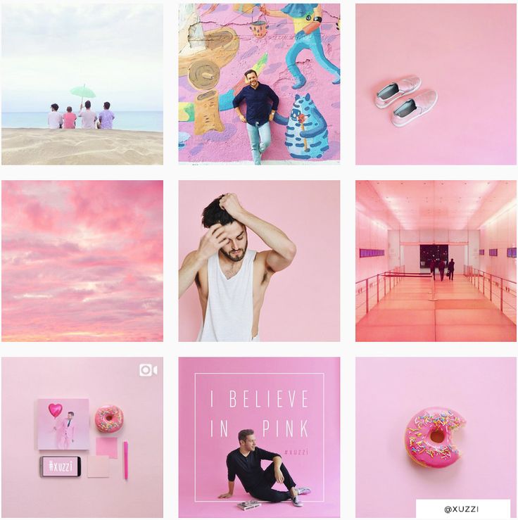 However, do not forget that the text still performs the main selling function.
Related materials:
Cover photo: Depositphotos.
The article may contain information about the social networks Instagram and Facebook, owned by the Meta corporation, which is recognized as extremist in the Russian Federation and banned. Articles about these social networks or mentioning them are for informational purposes only. We strongly recommend that you promote your business on VKontakte and Odnoklassniki.
 8K
8K Liked? Share!
Read laterScreen time statistics on my smartphone consistently show that I spend 24-27 hours a week on social media. And when preparing this article, the time increased to almost 48 hours a week! FORTY-EIGHT HOURS, CARL! Two days left my life in the virtual world. As our blog editor said: “After this, readers simply have to like this article.” :D
And now without the lyrics: I present to your attention 50 Instagram profiles where you can get inspiration to improve your account.
All presented profiles are not a model and an ideal to which one should mindlessly strive! Moreover, some of the profiles have a lame text feed, some have “Actual”, and others have BIO. So we just look at the beautiful pictures and, as usual, make ours even better.
P.S. Carefully! There is a share of subjective evaluation! For those who do not accept other people's opinions, we recommend drinking valerian extract before reading.
@magnitkrd
Of course, Instagram's biggest asset is its own style. Let it be strange, let it be “not for everyone”, let someone wrinkle at the sight of a visual... But true connoisseurs and like-minded people will roll their eyes with pleasure. Just look at what beauty "Magnit" creates!
@pyshechnaya1958
The same can be said about the profile of the same puffy one. There are few photos, but a lot of pleasure. It has its own identity, just as there is a sexual connotation. By the way, not so long ago they wrote about the "sex" trigger in advertising, you can look here. But if you decide to make your profile sexy, be careful: Instagram doesn’t take even hints of eroticism with a bang. Which is a little sad, because these hints are very aesthetic and appropriate.
@inspiration_decorstudio
Mosaic puzzle - call it what you want. The essence will not change - this technique attracts attention, whatever one may say, especially if it is used more than once in the profile. Take a look at this account, at the beginning it has several mosaics and all with green accents. There is definitely something in this. =) But when using a mosaic, keep in mind that not all subscribers love it, because it is very strange to see 6-9 incomprehensible fragments in a row in your feed.
@bibliiteka_club_official
We continue talking about mosaics. If desired, with the help of fragments, you can arrange an insta-lander. Everything is clear from the name: this is an ordinary landing page transferred to the Instagram profile. =) Why is such a thing needed? For example, if you don’t have a website and it’s hard for you to maintain social networks on an ongoing basis. We create an insta-landing, pour advertising there, voila, you can find out all the information about your company in one click.
@japan.papa
Another example of how snippets can be used in an Instagram profile. We take an advertising banner, cut it, lay it out. Done, you are amazing! The main thing is that banners should be informative and be combined with each other.
@adverteam_studio
I know, I know, we are already tired of mosaics, I promise that we will finish them soon. =) Showcase your product or service in one post? No, they didn't. Let's go to 9-ty, as, for example, a branding agency did when they showed their design development for a client company. Looks damn cool and convenient for potential customers. When they get to your profile, they can get acquainted with examples of your work in a convenient and original format.
@ilfioredecor
By the way, if you didn’t know or didn’t think about it: photos in the puzzle can be cut not only across the entire width of the Instagram tile by 3, 6 or 9fragments.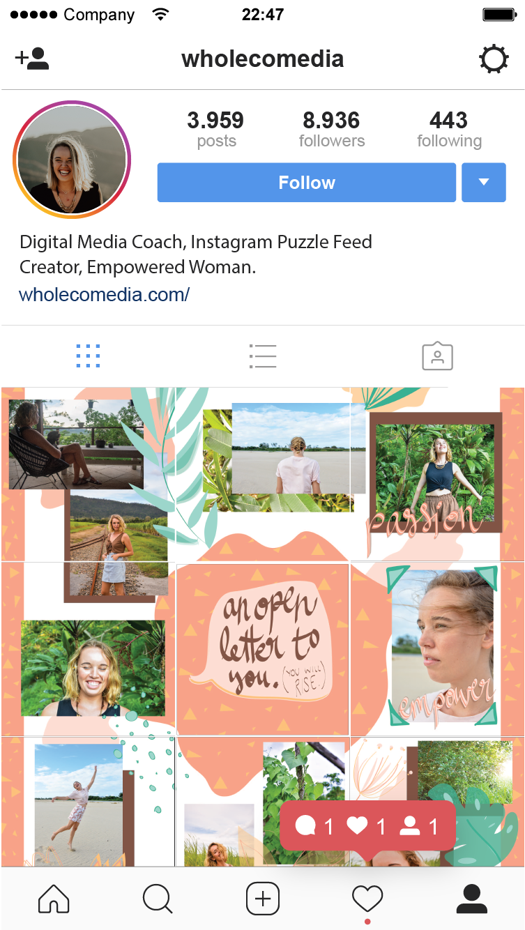 You can, for example, use only two vertical squares in the mosaic, as was done in this account.
@___aromagia___
Any SMM specialist, if he sees catalog photos on a white background in your profile, will start screaming heart-rendingly. Of course, depending on how it's all implemented and blah blah, but most often it looks ugly. What to do if there are no ideas? Alternatively, the white background can be replaced with silver or any other more interesting color. It will come out much prettier.
@jean_baby_shop
Another similar example, suitable for you if you find it difficult to crop products and transfer them to another background. You can lay out products on the same background and add thematic props. In total, you get the same catalog, only more Instagrammable.
@artberi_rings
And yes, you can lay out the goods not only on the photo background. The images in this profile are not intricate - just decorations for the box.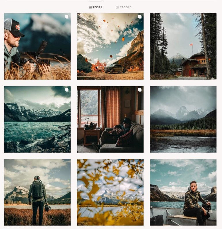 But it looks very neat and aesthetic: both catalog and instagram. =)
@babygramhouse
Another variation of the catalog. This is just in case the white background cannot be cut down with an ax. Make the same substrates for each photo, they will save the situation.
@juvelarto_store
And this is how you can arrange a non-catalogue catalog. Stock up on fabrics, substrates, paper and combine backgrounds of different textures and colors. And do not forget about the props so that the product does not look "naked".
@island_soul_jewelry
And, of course, you can always demonstrate your product on models. The main thing is to repeat like a mantra: you need excellent photo quality, the same lighting and a single filter. Oh, yes... Also an interesting framing, the ability to be creative. In general, from experience I will say that for such cases it is better to hire a professional photographer, they have an eye for successful shots.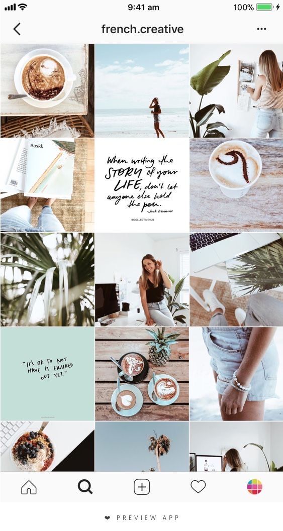
@sushi_holl_
From personal observation: if you look at many, many profiles on Instagram in a row (as I did for this article), the eyes will be more attracted to accounts where black prevails. Why? Because there are far fewer of them. It just so happened that the Instagram audience loves everything light and glamorous, ignoring the charm of restrained, even a little gloomy photos. So there is a double-edged sword here: dark profiles stand out from the competitive ones, but not the entire audience will fall into ecstasy from their beauty. As they say, not everyone will understand.
@plekhanova_studio
One black-black profile contained black-black photographs taken with a black-black camera. =) I am almost 100% sure that if not all, then most of the photos in this profile are made by myself. Again, everything here is gloomy, although the theme of the beauty salon is conducive to "pink in rhinestones. " Going to the "dark side" adds to the expensiveness of the profile, and unique shots add ... um ... uniqueness. In general, this example of Instagram is very successful, definitely worthy of attention.
@black
And this is for those who continue to claim that the mood color black is allowed only for Creed and Kirkorov, but for self-respecting profiles on Instagram. Look at this account with a sea of followers and amazing engagement! So black for Instagram is very viable. Proven!
@write__for_you
Let's continue to develop the theme of profiles "not for everyone". Here everything is done in black and white, and this is again an amateur, they say, gloomy and depressing. By no means! For my taste, it looks very stylish and stands out against the background of sugary profiles.
@vrn_mart_design
Definitely against black? You can choose white. The abundance of "air" in the profile also attracts attention and does not look boring.
@pinocchioosteria
Well, what are we all about black and black?! Let's add colors and lights! Now I will disgrace the whole village, but I can’t figure out how to indicate in a couple of words what is attractive in this profile. =D There are overlapping colors here, I'll assume that one filter is used. In general, different color and light photos miraculously form a harmonious and bright profile. As for me, this is the most difficult thing to achieve, but the result is excellent - a beautiful Instagram that you want to subscribe to.
@biancazapatka
And now the brightness is at maximum! I am sharing with you one of my favorite profiles. Do not look at an empty stomach! Each photo is like a work of art, each has a lot of color, a lot of design elements. But all colors echo and the abundance of everything coexists in harmony.
@sushi__panda__
Golden mean. When you want to use classic black and white, but also bright colors. Just add a bright accent to the bw, for example, red. Ready! You are gorgeous!
@yam_yam_irk
A little more about food and professional unique shots. Showcase products in catalog format? Can! But it's too easy. =) What if you organize a photo shoot?.. Remember that unique pictures with an idea will be a hundred times more valuable than catalog ones. But they will also cost you more energy.
@mir_matematika
This is a math tutor profile. The photo tile itself is a simple “checkerboard” where identically designed photos go through one publication. The trick here is to style the profile to fit your theme. For example, geometric shapes and mathematical icons have been added to this account: this does not require a lot of fuss, but makes the profile much more attractive. So feel free to take it into service, the main thing is not to overload.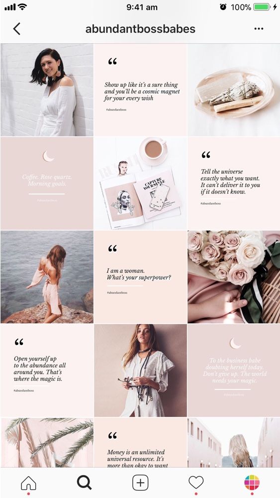
@delfin_mkala
We continue the conversation about styling to fit your theme. Here the design is almost “too much”, there are many tricks, bright elements, contrasting colors. But! The topic itself allows such a search, everything related to goods and services for children can go a little beyond. In this example of a beautiful profile, we pay attention to stylization: ducks, lifebuoys - all this reinforces the theme of the children's pool.
But these are not all tricks. Meet the endless feed on Instagram! Its essence is that the image or icon smoothly transitions from one publication to another. The endless tape has both admirers and haters. Where is the negative? It's simple: for many, due to the fact that all the photos in the profile are combined, it is difficult to catch the eye on something. In my opinion, here the endless feed is implemented very neatly and does not turn publications into mush.
@bs_bomond
Here we see an element of an endless ribbon - the line smoothly flows from one photo to another.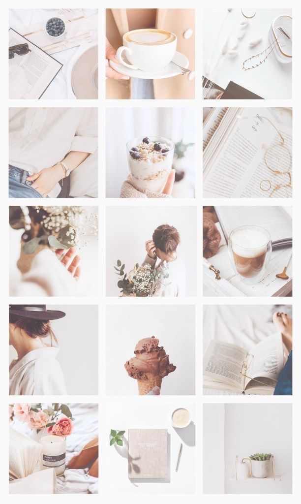 Attracts attention, but does not distract from the main photos. As a result, we get a non-trivial and beautiful profile on Instagram.
@kidscare.official
Here we also see small infinite elements. Plus, there is compliance with the color scheme of the substrates: blue and pink. Why do such things? They help out a lot when there is no way to combine the photos themselves: they can differ in color, lighting, design. Then endless elements and backgrounds help merge diverse photos into one style. Immediately there is uniformity, which is so important for publications.
@the_barbershop_group
Here is another profile with an infinite element. The best option when you want to add raisins, but you don’t want to spend a lot of effort. We take one detail and run it through the entire profile. Done, you are amazing!
@mantin.home
A moment of subjective opinion. I really like the checkerboard on Instagram profiles, by the way, I already talked about it in this article. In my opinion, this is one of the most convenient and pleasant formats for perception. If the templates for checkers are also made in a stylish way, then they are generally delicious. As a rule, informational posts are drawn up with a checker, which is +90 points for convenience.
@grid_moscow
Did you think we would end the conversation about checkers so quickly? =D See Instagram example for a car service. Here we do not see dirt, spare parts lying around and car mechanics covered in fuel oil. Accuracy adds, firstly, a checker, and secondly, the thoughtfulness of the pictures themselves.
@avealalat
Maam, can we talk about checker? =D In general, in short: such a trick can be implemented not only with the help of the same template, but also with the help of inscriptions on the photo. The main thing is that the text is readable, of course. And if you also choose a cool font, you will definitely get a couple of points to the beauty of your profile on Instagram.
@repetitor_math_online
Olya, calm down with your checker! No! =D There is one more thing. Patterns for checkers may not always be 100% the same. If you keep the color scheme, but change some elements, it will be even cooler. So you can individually make your own template for each checkers post, or at least make 4+ different templates. It will turn out very nice and somehow more “wow, how the person got confused!”.
@pelmenya_irk
Potentially Delicious Content – Aesthetic food images immediately start salivating! The profile is made in dark colors, which makes it stylish and status, and most importantly, nothing distracts from food photos.
@wedress_studio
A simple solution to add aesthetics - frames! The same white frames, as in this example, add to the air profile, allow you to focus on the picture and, of course, add zest.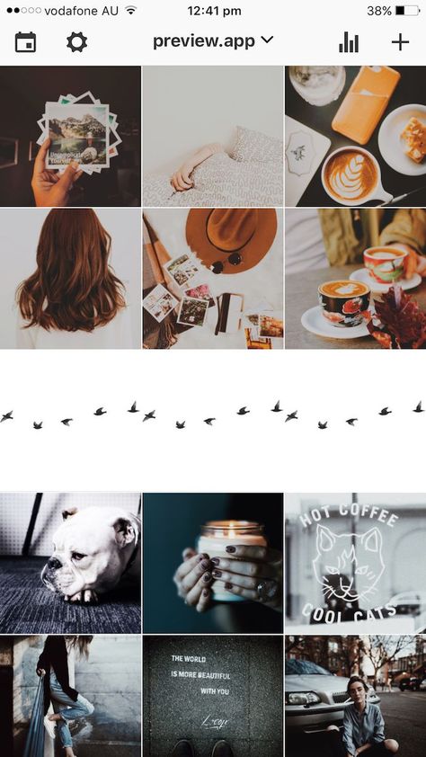 So beauty is not always the invention of the bicycle.
@prazdnik138
Don't like the same frames? Business, do something different! It will also turn out very nice.
@chistyydomeco.belka
We will slowly move on to talking about templates with you. Now drawing an individual or buying a standard template is a very popular thing in the field of Instagram. You get a template - insert your photos - you're done! If you wish, you can make up the photo yourself, for example, in the Canva application. By the way, we already talked about it earlier in the article.
In this example, we see a color template where the whole design is based on 3 colors: blue, gray and white. As a rule, the prevailing colors are chosen based on the company logo.
@say.yes.agency
Another example of templates with multiple colors and designs. Remember that the more different elements you have and the more they are active in the feed, the more difficult it is to combine them. So advice to you: be sure to use the tile designer on Instagram. For example, the UNUM application. It reproduces the social network tiles, which gives you the opportunity to know in advance how certain pictures will look next to each other. You can learn even more useful applications in one of our articles.
@atami_jap
By the way, for some topics, color extravaganza is not only acceptable, but also desirable. For example, Korean cosmetics, baby products, dry pools. Here, the color play on the verge of a foul is quite harmonious. But again, everything depends on your taste: not everyone manages to catch the balance between extravagance and outright trash.
@nats_auto
And you can get by with just one color in templates. Look, blue has been added to the profile: both in the main tile and in the covers for Topical. And everything went from the company logo. And as a result, we have a uniform profile, in which, by the way, there is also a lot of "air" due to the abundance of white. Watch how you can beautifully present a topic that is difficult for Instagram, as, for example, this car service did.
@pigmalion_salon_krasoty
There are templates a little more complicated, where not just uniform colors are used, but colored backgrounds or substrates, as in this example.
@ylettravel
Do not underestimate the work with captions on the photo - they help the user immediately grab what he is interested in. You can simply put an inscription on the photo, or you can, as here, use templates. By the way, pay attention to a common trick - to place similar photos in one line vertically.
@goodgarden_studio
Since we’ve already touched on the subject of post layout, posts with the same or very similar design can be placed in one line vertically, horizontally, or you can come up with your own order and post photos even as a snake, even as a spiral, at least . .. at least as, in general . =) What is enough for your imagination.
@gcc_irk38
In almost every article I say that banal stock photos are bad for your Instagram. But there are also exceptions. We take a cartoon stock, add a template, put inscriptions - it turns out very well! So, if you have time to select hand-drawn pictures on your subject or there is a designer in slavery who can be exploited, feel free to experiment with drawings.
@jp_clubbust
Continuing the theme of drawings, look how cute these painted busts are! They are in some info posts, on the avatar, on the covers of Actual. Yes, there is no super-originality in this, but the profile is remembered thanks to bright pictures. Plus, there are elements of an endless ribbon and work with white frames. I definitely approve! =)
@sidorova.koza.brand
Now I will embarrass myself again, because I don’t know how to describe this profile. Strange, even surreal in places... You have to muster up the courage and go beyond the limits of normality in order to start maintaining an account in a similar vein. Think you can't do it right? Photo stocks to help you. There are a lot of oddities there, you will definitely find something for yourself, I give a tooth. =) And I also give a link to an article where free photo stocks are collected.
@seizetheimpress
If using content on photo stocks is too easy for you, and you are eager to create and get up, you can take unique pictures in a similar vein, as the owners of this profile do. The guys are strange, but cool, bravo!
@keti_spain
Sometimes your merchandise can inspire you with ideas for an interesting presentation of photographs. How can you beautifully serve dolls? You can just take a picture of them on a photophone, or you can ... arrange a trip around the city for them! The very idea of humanizing dolls is not new, but with a stylish implementation, it all looks cool. Although a little creepy in places.
@timandtimicecream
When writing this article, it is not always possible to maintain objectivity, so I introduce you to the profile that fell in love with me at first sight. Something from pop art, something from minimalism... Personally, I am delighted! I definitely advise you to look through the account, pumping in a combination of bright colors is guaranteed to you!
@42coffeeshop
This is my article, I do what I want until the editor sees it. =D Therefore, I show another profile on Instagram, which is similar to the previous one. Again, bright colors, mouth-watering photos, party-like, modernity. A little more and I will perform an ode to these profiles! In the meantime, I'm singing, you run into these accounts to soak up the beauty.
@alexandriaslens
Oh, we have a good charge of inspiration and practical advice! At least I really hope so. And therefore - at the end of the article, dessert. =) A profile of a talented photographer whose pictures you want to look at, and look at, and look at. Let's discard all the problems: a drop in activity on Instagram, an unwritten content plan... Just enjoy.
@service1ps
Well, now we have reached the promised figure of 50! Although I put the profile to the end, it takes first place in my heart. Yes, yes, this is the Instagram account of our 1PS Service! We try to please you with beauty and usefulness 2-3 times a week: we talk about useful things with metaphors and jokes, select images with trepidation. And, of course, do not forget to spoil you with gifts: subscribe to our profile, repost any post in your stories and get a 5% discount on any Service service. The commercial break is over! =)
Yes, there was no need for anything. =D Of course, if you are not concerned about the successful promotion of your profile, it is useful to see what others are doing, analyze their chips, think about how this or that stylistic move is implemented. All this encourages improvement. So don't forget to periodically raid Instagram.
In the end, I want to share with you my observations:
If you don’t have the time and energy to shovel mountains of profiles, analyze something there, for this you have us. We will evaluate your competitors and tell you how to improve your account. Learn more about Instagram promotion here.
Would you like to be consulted in detail? Our Support Department specialists are so cool that they will tell you about social networks just as well as real SMM specialists.
Write to [email protected] and find out how to start working on your account.
#SMM #promotion in social networks #content ideas #social networks0003
7% discount on promoting your business
Discount on any of our services, which will help you save a little or bring a little more customers for the same money. Activate so you don't get lost.
Activate
Comments for the site Cackl e
How the smart feed works: features of ranking publications in social networks#SMM#promotion in social networks#social networksThe devil is not as bad as he is painted. Smart Tape is not as bad as people make it out to be. It is quite possible to defeat the algorithm that frightens everyone and get to the heart of your subscribers. It’s worth starting with the basics: what is a smart feed, how does it work, and what does it take into account in ranking? We answer these questions in detail using the example of VKontakte, Facebook and Instagram in the article.
Website or group in social networks: what works better?#groups in social networks#social networksFor a young offline business, it is enough to have a group in social networks. Is it so? Is it worth spending money on your own website or can you really get by with a group? What is the fundamental difference between a website and a social media page? About this in our article.