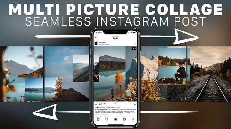
Carousel Posts are one of the hottest trends on Instagram right now.
With Reels getting most of the attention from the algorithm and Instagram pushing video content, many creators notice that their regular posts get less reach than the past years.
Still, there is one type of post format that gets enough engagement to make the algorithm notice: Carousels.
The swipe through posts are a great way to reach your ideal audience if you don’t want to hop on the Reels bandwaggon or just want to diversify your content.
The best thing about it? You don’t have to be a Adobe Photoshop pro to design viral-potential Instagram carousels. You can do the same with Canva for free.
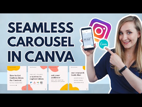
This article will show you step-by-step how to design a seamless carousel post in Canva.
You could just create five single posts in Canva. But what we want to do in this post is create a carousel with seamless transitions in between the slides.
The full Canva design can look like this:
This is how your Instagram carousel design will look before cutting it into slidesOne design that will only later be split into the single carousel slides. This way we create the seamless effect of all slides being connected and give the user a great experience when swiping through.
In your Canva dashboard, go to Create a Design and select Custom Size.
Create a new custom-sized design in CanvaIn Instagram, you can add carousels with up to 10 single slides. The general formula for figuring out how big your initial design needs to be, is:
Width: 1080px * Number of Slides – Height: 1080px
Or, for portrait sized carousel posts that take up more space in your feed (recommended):
Width: 1080px * Number of Slides – Height: 1350px
As a shortcut, here are the Canva design sizes for carousels with 2 to 6 slides:
Now that you’ve got your design artboard in the correct size, we can start designing.
Canva lets you add purple guidelines to your designs. This feature comes in really handy when desinging seamless carousels.
When creating your carousel, you need to know where one slide ends and the next one begins.
To enable guides, in your design click on File (in the top left corner) and then tick both Show Guides and Show Rulers.
Now you can drag a ruler with your mouse key pressed down onto your design. This works either from left or from the top. For carousels, we’ll need to drag them in from the left.
Add a ruler guide every 1080px to mark the borders of your carousel slides.
Tip: To perfectly align content on the slides, use a rectangle, draw it to fit one slide (between two guides), send it to the back and lock it. Now you can drag your content around and it will show you if it’s centered.
Here are a few designer tips you can use to make your seamless carousel super engaging and inviting for people to swipe through until the end.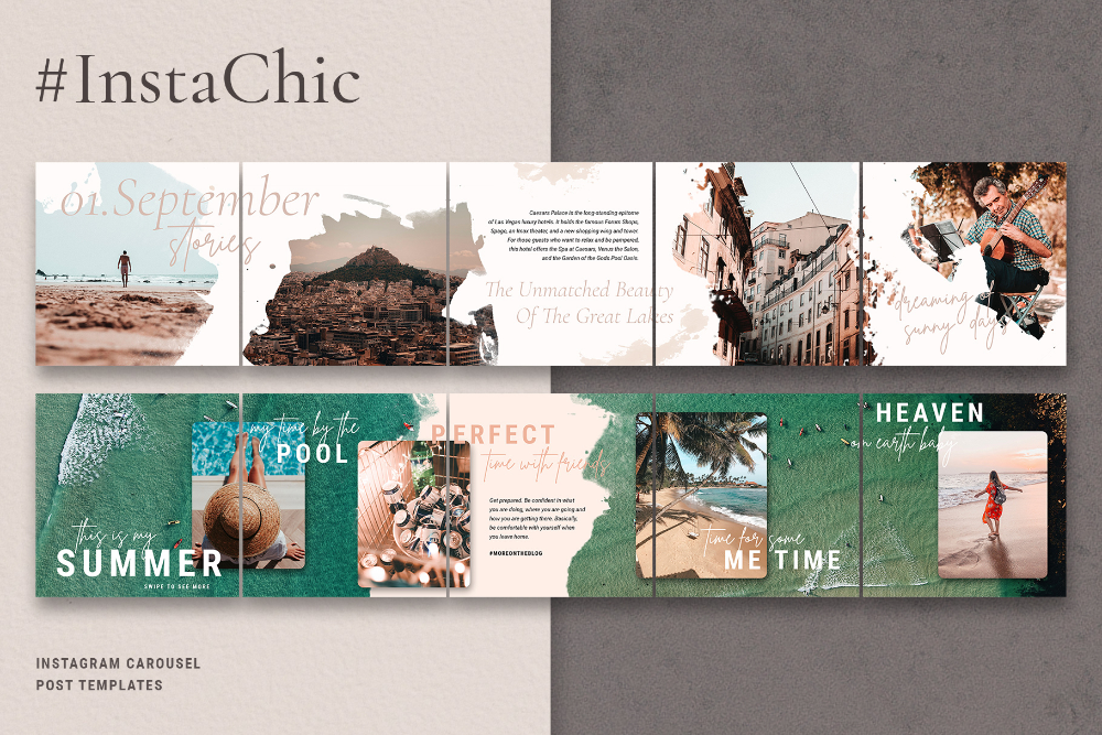
As a starting point, you can use this free carousel template:
Free Seamless Instagram Carousel Template for CanvaOnce your design is ready, you have to download the full design and split it into single posts.
Go to the Instagram Grid Maker, and click on the Upload an Image button.
Select your carousel graphic and upload it into our tool.
Now you only need to set Columns to how many slides you want to have and Image Cut to Carousel.
Click the Split Image button and the Grid Maker will cut your carousel into equal slides.
Your Instagram carousel slides are ready to downloadYou now have six individual slides cut out of one seamless carousel graphic.
All you need to do is upload them to Instagram as a carousel.
If you want to create more carousels for Instagram, you will love our Template Membership!
You’ve seen Canva’s free templates (and, let’s be real, also the paid ones) all over the place on Instagram and want your brand to stand out from the rest. Right?
→ Discover more than 2,000+ unique and engaging Social Media Templates (+ carousels!) in our affordable Canva Template Membership:
Do you want more Canva Templates to level up your social media content? Check out the Template Membership!Are you struggling to keep up with the constant demand for new content on Instagram? In this blog post, we share 3 strategies for creating successful evergreen content that will help you reach your goals with less effort.
Read More »
If you are on Instagram as a brand and don’t know how to reach your ideal audience and turn them into followers, here is what the experts say.
Read More »
Reels may be the hottest thing on Instagram right now. But Instagram carousels are still thriving on the platform. In fact, they could be the key to sustaining engagement because they get people to stop and swipe.
In this guide, we give you a breakdown of why posting an Instagram carousel is a great idea for your social media strategy. We’ll also give you plenty of tips, examples and ideas to help you get started. Let’s dive in.
An Instagram carousel is a post containing more than one photo or video, which users can view by swiping left on a post through the phone app. Desktop users can view a carousel post by clicking on the arrow button on the right of a post. Think of it as a slideshow of posts that users can control manually.
View this post on Instagram
A post shared by Everlane (@everlane)
Carousel posts are a great way to get people to pause and engage with your content, especially if the first slide is enticing enough. So it’s no surprise that Instagram carousels outperform both photo and video posts in terms of engagement.
Socialinsider.io found that carousel posts get higher engagement rates than photos and videos. Depending on follower size, carousels manage to hit engagement rates between 1.65% and 5.40%. This is higher than the average platform engagement rate, which stands at 1.22% according to the latest Instagram stats.
The unique nature of Instagram carousels makes them a great option for strategic Instagram content. Some of the best ways to use an Instagram carousel post are:
When creating a carousel post on Instagram, you’d want to make sure that it looks great on the platform. So it’s important to follow the size requirements and specifications. Design and optimize your posts with the three aspect ratio options in mind:
For images, Instagram recommends a resolution of 1080 x 1080 pixels. Videos can have a minimum resolution of 600 x 600 pixels and a maximum resolution of 1080 x 1080 pixels.
Once you have the perfect images or videos lined up, you can start creating an Instagram carousel post using the steps below:
Step 1. Click on the “+” button from the navigation bar at the top of your screen.
Step 2. Select the option to create a new “Post.”
Step 3. Tap on the option to “Select multiple.”
Step 4. Choose the photos or videos you want to upload as a carousel post. You can select up to 10 photos or videos for your carousel. Then tap on “Next.”
Step 5. Just like creating a single-image post, you’ll get the option to edit your photos and videos by applying filters. To create a cohesive look throughout, you can choose to apply the same filter throughout all the images and videos. Once you’re done, tap on the “Next” button.
Step 6. Now add details to your carousel post. Make sure you include a suitable and enticing caption that could prompt engagement. You can even include popular and relevant Instagram hashtags to improve your post visibility. This is also the section where you can tag people, add a location or add a reminder similar to a regular post.
Step 7. Once you have everything sorted, tap on the “Share” button and that’s it. You’ve created and shared your Instagram carousel post.
The manual publishing process may be straightforward, but it can be time-consuming. As a social media manager, one of your main goals is to do your job as efficiently as possible. That means scheduling content ahead of time so you can maintain a consistent publishing schedule.
And the same would hold true for your Instagram carousel posts. Fortunately, you have the option to schedule your Instagram posts using the Facebook Creator Studio. Here are the steps to follow:
Step 1. Log into your Creator Studio account and select the Instagram button at the top.
Step 2. Click on the “Create Post” button from the left-hand panel and select the option to create a post for your “Instagram Feed.” This option is suitable for creating image carousel posts and sharing videos shorter than 60 seconds.
Step 3. Click on the “Add content” button under the caption window and choose the first image or video you want to upload. After selecting the first content, the “Add content” button will move to the top of the caption window. Click on this button to keep adding all the photos and/or videos you want to include in the post.
Step 4. Once you’re done creating the post and adding all the info you want to include, click on the drop-down arrow next to the “Publish” button. Select “Schedule” and choose the date and time you want the carousel post to go out and click on the “Schedule” button. And that’s it–your Instagram carousel post is now ready to go out.
While this is a useful tool to have, keep in mind that it’s only accessible on desktop. This may make it a bit challenging if you’re used to managing everything from your phone or if you want to schedule a carousel post while on the go.
If you’re using an all-in-one social media management tool like Sprout Social, you can directly publish and schedule Instagram carousel posts to your accounts. Sprout recently updated it’s capability to allow users to publish Instagram carousels directly from the desktop app rather than the Mobile Publishing Workflow.
Step 1. Open Compose in Sprout desktop or mobile app.
Step 2. Select your Instagram Business Profile from the Profile Picker.
Step 3. Add your content for the Instagram post.
Step 4. Select up to 10 images to include in your post. Note that images and videos cannot be combined in your Instagram carousel posts published through the Sprout app at this time.
Step 5. Personalize your post, whether it’s tags, hashtags, Instagram First Comment or even post links.
Step 6. Schedule when you want to publish your post.
Step 7. Click Submit or Send.
For more information on publishing and scheduling Instagram carousel posts within Sprout, visit our Help Center.
Need some inspiration for creative ways to use carousel posts? Here are some Instagram carousel examples to inspire you:
Sprout used Instagram carousels to share answers to pressing questions. This helped to inform the audience and show the platform’s social listening capabilities.
View this post on Instagram
A post shared by Sprout Social (@sproutsocial)
Canva made the most of carousels to share short and actionable visual guides for its users.
View this post on Instagram
A post shared by Canva (@canva)
 ColourPop Cosmetics: Revealing a new collection/product line
ColourPop Cosmetics used a carousel post to reveal all the products in its new In the Limelight collection.
View this post on Instagram
A post shared by ColourPop Cosmetics (@colourpopcosmetics)
NotionHQ shared a series of photos announcing a virtual conference.
View this post on Instagram
A post shared by Notion (@notionhq)
The Australian skincare brand used carousels to put a spotlight on key native ingredients and their benefits.
View this post on Instagram
A post shared by frank body (@frank_bod)
Exist Green shared photos of their redesigned eco-boutique section. This gave followers a mini-tour of its store to invite foot traffic.
View this post on Instagram
A post shared by Exist Green (@exist_green)
One of the best practices to follow on Instagram is maintaining a consistent feed containing high-quality images. That means you should carefully pick the visuals for your carousel posts to make sure that your feed looks cohesive and on-brand. Instagram carousel templates can help with this.
Instagram carousel templates act as a framework for your carousel posts. They use a consistent style of color schemes, fonts and other design elements to make sure that each image comes together to form a unified look. Customize these templates with text, graphics and photos to create a new carousel post.
You can find plenty of stock templates on websites like Canva, PicMonkey and Adobe Stock. These templates are available to customize and download for free or for a small fee. Stock templates are a great option if you want to save time. They’re also perfect if you don’t have a knack for designing but still want professional-looking templates.
Alternatively, you can also design your own Instagram carousel templates from scratch. This is a good choice if you have a strong brand visual identity that you want to showcase through your Instagram carousels. It gives you more flexibility to create a template that fits your exact needs.
The data doesn’t lie–there’s no doubt that Instagram carousel posts are highly engaging. So if you’re not using them already, you’re missing out on the opportunity to engage your audience. Make the most of the tips, ideas and template resources above to design eye-catching carousels that get people to swipe left.
In fact, engaging your audience is the key to becoming “best in class” on social media, according to 46% of consumers. Download the Sprout Social Index Edition XVII: Accelerate to gain more insights into the social consumer.
The longer an Instagram user* reads a post, the more loyal the social network algorithms are to its author. The task of bloggers is to keep readers' attention on their publications longer.
Not only videos, but also carousels can cope with this task. And if a series of photos is not just scrolled through, but flipped through several times - success!
Let's talk about seamless carousels in detail:

Let's show the process of creating a seamless carousel, which is divided into points:
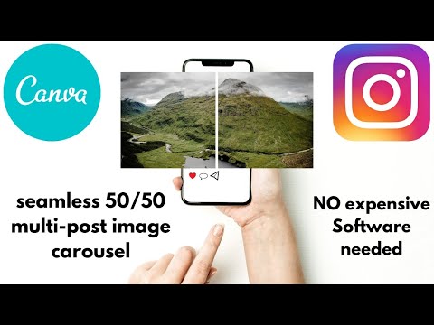
A seamless carousel is when you scroll through your slides to get a single image.
Cut the photo in half and published sequentiallyWhy seamless carousels are good:

Let's get inspired by the examples of seamless carousels and start creating our own masterpiece!
The main niche where seamless Instagram carousels are used* is ads that flash across your feed. But there are accounts that have made such carousels their feature.
When viewing each slide, a piece of the next photo is visible, which makes the user scroll through at least out of curiosity :–)Of course, you can just put 3 photos in the carousel and not invent. But it's more interesting, more creative, the page has a common style.
The principle is also applied here, when part of the slide "climbs" onto anotherThis oblique/straight transition is a hallmark of the BMW Blog. An unusual way to show the product from different angles.
And here a woman combines two different photographs into a single pictureAn interesting solution: first, when scrolling through the carousel, the eye clings to the woman, and then I want to scroll through the slides in the carousel to check if it is one woman :–)
Various photos and bright the background is forced to unconsciously scroll through a series of slides to the endAnd in this video - a unique seamless video carousel! nine0003
The idea is simple – in order to get a single image when scrolling through the photo in the gallery, a carousel on Instagram* should be made from one image (panorama, blank), divided into separate photos in 1:1 or 4:5 format.
What is better to use: 1:1 or 4:5? Compare:
The square format is suitable for regular posting, the elongated format is suitable for advertising carousels to capture the reader's full attention on the screenFor everything to work out, the blank for dividing by slides in the carousel should be with the following proportions:
Proportion:
1080 pixels - 4 parts
X pixels - 5 parts
X = 1080 * 5/4 = 1350 pixels.
To recap: for a 4-square-picture carousel, the original photo should be 4320 x 1080. For a 4-picture 4:5 carousel, the original image would be 4320 x 1350. *. Your pictures may well be smaller, but you already know how to calculate the rest of the sizes. The maximum number of slides in a carousel is 10.
Consider creating a seamless carousel for Instagram* in Canva:
Algorithm:
Take Canva.
If you've never used this popular service, learn all about it in our Canva Service Overview article.
Go to the main page and select the size of the future design. Set image options and click Create Design.
Before you is a single lane of the future carousel. First, mark the borders of the slides. There are two ways to do this.
Method 1 : using a ruler. Go to "File" - "Show rulers". Hover over the vertical sidebar until you see back and forth arrows. Click and, without releasing, drag the line to the desired location. nine0003 Finding the right place is easy. The length of each slide is 1080 pixels. Therefore, you put the first border at 1080, the second - at 2160 (1080 + 1080) and so on
Method 2 : using a grid.
In the Elements section, open grids and find a grid with 4 images in a row. Drag the grid to the workspaceFor convenience, reduce the grid so that it remains only at the very bottom. Now you will see where the borders of future carousel slides go. nine0003 Upload your carousel image or use a photo from the Canva collection. Drag it to the workspace and expand it however you like.
We stretched the photo across the entire carousel image area, moving the image up and down to select the best part. If you are using a grid, send the photo to the background by right-clicking on it and the grid will be visible.
If you want to post your photo as a seamless carousel, consider this the last step. Save the image. Cut into 4 pieces, as shown in the "cutting the blank" section below in the article, and publish. nine0003
So, the main image for the seamless Instagram carousel* is ready. Write the text on the slides in the Instagram carousel*, add additional elements, frames. Then remove the grid from the image if it was used.
We've added gray borders, text, and found images of mittens in the Canva elements. Placed so that the mittens were on the border of the images.
Download the image to your computer by clicking on the appropriate button in the upper right cornerRemember - if you used paid elements in your design, you will have to buy them. nine0003
The principle of creating a blank for a carousel from scratch is the same as with a finished image, only the background or a combination of some elements is taken as a basis.
There are enough applications that can cut a panoramic image into parts for a seamless carousel. Let's take PanoramaSplit as an example. nine0003
On the main page, click choose photo and add the created blank to the program. There are 2 main tools:
The meaning is as follows: select the number of slides, the program will show the corresponding frames on the workpiece. By moving the slider, adjust the image so that it takes up the entire space of the future carousel. Press split and on the next screen post to Instagram*. nine0003
Don't be afraid that the publication will start right now, no. Just the save button to the Smartphone Gallery is called that here.
Before saving, the program will show the result - how the carousel will look like on Instagram *.
Another seamless carousel cutting app for Instagram* is PanoramaCrop. After opening the app, select New swipeable post, enter the number of slides, and click the checkmark in the top right corner. nine0003 The program will show the preliminary result. Click the checkmark again and the result will be saved in the phone's Gallery
There are many options to make several images from one image on a computer. For lovers of online services - IMGonline.
The service is free and simple: select an image, specify the number of parts by width. The service will offer to download ready-made pictures in an archive or one at a time For lovers of programs, there is Photoshop, in which you can not only cut into parts, but also create an image from scratch. nine0003
Pictures are ready - add a carousel to Instagram* and enjoy! If you accidentally add an extra picture, it doesn't matter, now Instagram* has a function to delete one of the carousel slides.
For starters, try making your first seamless animated carousel.
Action algorithm:
In order not to waste time and effort on transferring files from your computer to your phone and generally save time, create animation and publish photos and videos immediately from your computer.
Go to SMMplanner and start creating a new Instagram post*. For those who are not familiar with the social network posting service, we advise you to read the article "Instructions for posting photos on Instagram * through SMMplanner" in our blog.
In the new post window, click the Photo/Video button and select images for the carouselIf you only need a slight correction of existing images, click on the pencil in the upper left corner of the image. Built-in photo editor SMMplanner at your service.
Fans of the same style will find it convenient to immediately go to Canva from the application by clicking on the corresponding button, create an image there, and it will immediately be added to the post creation window.
It’s impossible to make a seamless carousel on Instagram* in this way, but it’s quite possible to animate prepared images When the images are ready, write the text of the post, add hashtags, tags, select the posting time. Now you don't have to look at your watch and set an alarm to post at a specific time! SMMplanner is a convenient way to publish carousels on Instagram* from your computer, as well as regular posts and stories.
What else to surprise readers - read the article "Live" photos: what is it and how to take them.
Use original features in your profile design and let your readers look forward to new publications! nine0003
Adding not one, but several photos and videos to a post - we get a carousel of photos on Instagram*. You'll be fine with this on your own. And an article in order to teach how to do it cool, and also learn:
Just like a regular post! With one nuance - add several photos instead of one.
Start adding a new post, select the option to add multiple imagesClick "Select Multiple", and indicate with numbers in what order and which photos will be published. Then apply a filter to all images at once, or edit each one individually. Write the text, put hashtags and publish the carousel on Instagram*. nine0003
Up to 10 photos or videos can be uploaded to the Instagram carousel*.
Remember the technical point: the format of the entire carousel is set by the first photo or video.
That is, if your carousel cover is a standard square, and the next image is 4:5, then be prepared for the social network to crop it to a square. This is often forgotten, especially when posting videos.
There are unwritten rules for posting photo carousels on Instagram*:
 The exception is brand pages created solely for customer reviews;
 If you are afraid that users will forget to scroll through the photos, remind them of this. This can be done in two ways:
Please note that it is not possible to add a photo to the Instagram carousel* after the post has been published. By opening the editing of the publication, you can mark an account on the pictures, change the text or geotag, but not the pictures themselves. Therefore, always check if everything is in order immediately after publishing the carousel. If something is wrong, delete and download again. nine0003
A seamless carousel is when you scroll through your slides to get a single image.
adidasrussia actively uses this techniqueThe meaning is simple – to make a single image when scrolling through the photo in the gallery, make a carousel on Instagram * should be made from one image (panoramas, blanks), divided into separate photos of 1:1 or 4 format :five.
Is it better to use 1:1 or 4:5? Compare:
The square format is suitable for regular posting, the elongated format is suitable for advertising carousels to capture all the reader's attention on the screenTo make it work, the blank for dividing by slides in the carousel should be in the following proportions:
 If you do not want to remember all the lengths of the formats, it is easy to calculate the height, remembering school algebra lessons. nine0010
 We make a proportion:
1080 pixels - 4 parts
X pixels - 5 parts
X \u003d 1080 * 5 / 4 \u003d 1350 pixels.
To recap: for a 4-square-picture carousel, the original photo should be 4320 x 1080. For a 4-picture 4:5 carousel, the original image would be 4320 x 1350. *. Your pictures may well be smaller, but you already know how to calculate the rest of the lengths. nine0003
Consider creating a seamless carousel using an illustration created from scratch.
Algorithm:
You can take a background or a combination of some elements as a basis.
We took one of the free backgrounds, added text, an image and graphic elements: a lattice and a cupcake image Arranged text so that it doesn't break at the slide border. When everything was ready, we removed the mesh and saved the image.
We used Canva, but in 2023 it won't be available to users in Russia. You can use any convenient editor, the principle is the same. And if you need to regularly create bright creatives for social media posts from scratch or from templates, use the built-in SMMplanner tool - Canvas. The section is free by default and available on all plans. nine0003
Programs that can cut a panoramic image into parts are enough. Let's take PanoramaSplit as an example.
On the main page, click choose photo and add the created blank to the program. There are two main tools:
The meaning is as follows: choose the planned number of slides, the program shows the corresponding frames on the workpiece. By moving the slider, adjust the image so that it occupies the entire space of the future carousel. Press split, and on the next screen post to Instagram *. nine0003
Don't be afraid that the publication will start right now, no. Just the save button to the Smartphone Gallery is called that here.
After all the manipulations, your cut pictures will be waiting in the Phone Gallery in the appropriate folderfrom one image, several on the computer are also many. For lovers of online services - IMGonline. nine0003 The service is simple: select an image, specify the number of pieces by width, and include the square pieces. The service will offer to download an archive with ready-made pictures or download them one at a time
And for program lovers there is Photoshop, in which you can not only cut into pieces, but also create from scratch.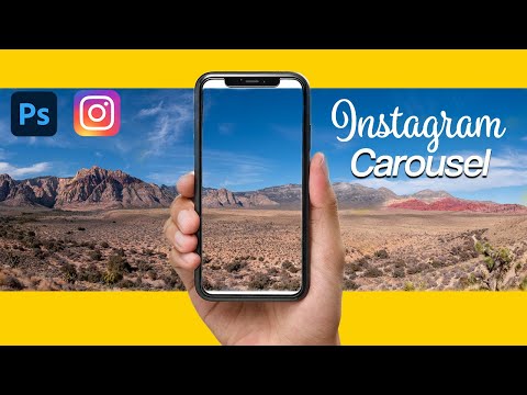
When the pictures are ready, add a carousel to Instagram* and enjoy! nine0003
The main niche for using seamless Instagram carousels* is ads that flash across your feed. But there are accounts that have made such carousels their feature.
When viewing each slide, a piece of the next photo is visible, which forces the user to scroll through ... or even out of curiosity :)Of course, you could just put three photos in the carousel and not invent. But it's more interesting, more creative, and maintains the overall style of the page. nine0003 This also applies the principle that part of a slide "climbs" onto another.
This oblique/straight transition is a hallmark of the BMW Blog. An unusual way to show the product from different angles.
And here is a double seamless technique - both in the general view in the profile and when opening one of the posts to see the steering wheel. nine0003 A variety of photos plus a bright background unconsciously make you scroll through a series of slides to the end Not quite a seamless carousel, but at first glance you can’t understand this, because the general style is preserved on all slides: cloudy background, flexible lines, white / light colors, uniform contrast and brightness of pictures
 And on this video - a unique seamless video carousel!
Go to SMMplanner and start creating a new Instagram post*. Those who are not familiar with the service of posting to social networks are advised to read the article "Instructions for posting photos on Instagram* through SMMplanner" in our blog.
In the opened window for creating a new post, click the "Photo / Video" button, and select all the images that should be in the carousel If you need image correction, use the built-in SMMplanner photo editor. It has tools for working with backgrounds, layers, elements, and text. Try it - the feature is available for free! nine0003
After the images are ready, write the text of the post, add hashtags, tags, select the time for the post to go online and publish. This is a convenient way to post carousels to Instagram* from your computer.
Let's move on to cases using albums.
Make-up artists, photographers and stylists cheer the most: they don't have to make ugly collages to show the effect of their work. Feel free to upload the final result to the main album, and hide the details of the work inside it. nine0003 My favorite category for photographers: the result and the place where it was shot. Sometimes it's downright shock content!
This case was just asking for the hands of sellers of everything: clothes, appliances, cosmetics.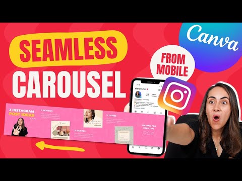 Now the product can be shown from all sides. If you're selling clothes, take pictures of the model in the dress from the front, side, and back. It is important for online shoppers to see the product from different angles.
It is noticeable that Instagram* makes its updates not only in favor of business promotion, but also in the direction of getting rid of rubbish. At first, we were allowed to remove everything superfluous in stories, and now it can also be done in albums. SFS results were usually posted by bloggers in the form of a continuous feed of posts. Frankly, it did not please the audience. Now the results can be hidden in albums. Or post only in Stories, yes.
For example, you have a blog about SMM and you train people. Combine tips on one topic, overlay them on a photo or picture and upload them to an album. If you did an interview, but you know that no one will go to your site from Instagram *, take the main phrases and upload them to the album. Do you make cakes? Explain the process step by step with a photo. Well, and so on.
And it doesn't matter if you really didn't have enough 2200 characters of the post to describe your thoughts. Describing the gist of a 1,000-character post and then sending it to the end of a carousel is a way to keep the reader as long as possible.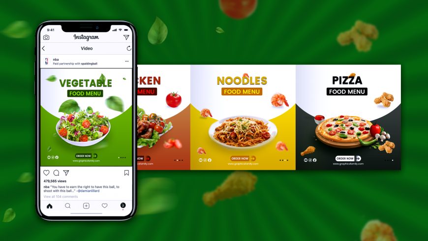 And those who first start scrolling through the carousel will see the text, and are more likely to start reading the information under the carousel, that is, from the beginning. nine0003
Making such a carousel is easy - write the entire post in notes on your smartphone or in a notepad on your computer, and then take screenshots. You can remove the excess using standard image editing tools.
This format is especially suitable for promotional posts.Look how smart: take readers to the carousel, but before showing the text, demonstrate the product again. And at the end, the final chord is once again a photo of the product. Five to the blogger for such a supply of goods. nine0003
Carousels seem to be made for restaurants and cafes. With their help, it is convenient to present a seasonal menu or a special offer. You can also create a product catalog. Use Instagram* concisely, the more it contributes to this.
Updated cafe menu.