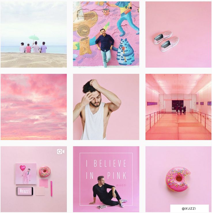
Ready to make your Instagram stand out from the crowd? Anyone can pick up a camera, take a photo, and post it on Instagram but to truly provide value and build a loyal following is something else entirely. The goal of any Instagram marketing strategy is to entice users to take action - whether it be engaging with your content, following your account, and ultimately purchasing your product. An easy way to do this is by creating an aesthetically appealing Instagram that also tells a story about your brand. Having an Instagram feed that catches the eye and makes you want to take a second look keeps people on your page longer, which increases the likelihood that they will engage with your content, follow, and even become a customer.
Here are six ways to create a visually appealing Instagram:
Overall themeBefore getting started, think about what you want your overall theme for your Instagram page to be. What do you want people to feel? How do you want to be perceived? By keeping questions like this in mind throughout the rest of this article and while taking photos for your Instagram page, you'll be able to accurately get this across to users who stumble upon your profile.
Bonus tip- If you're not able to articulate what exactly it is you like and are more of an "I'll know it when I see it" type of person, then head over to Instagram and start finding a few pages that you like. Then start writing down what it is you like about each of these pages. Is it the color scheme? Or perhaps the way the feed made you feel? Whatever it is you like most, try to see how you can incorporate that into your own Instagram page.
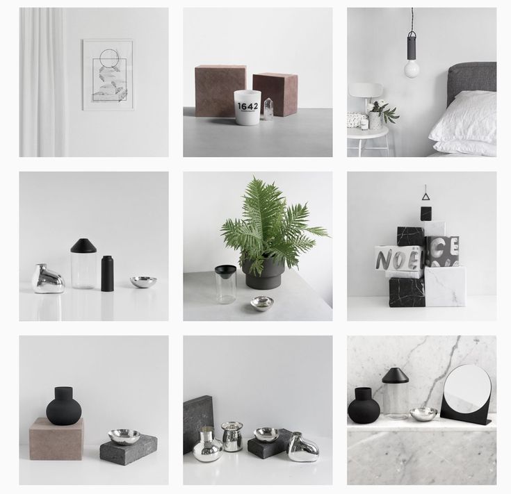
Color schemeOne of the easiest things you can do to create an aesthetically appealing Instagram is to choose a color scheme. You don't even need a ton of knowledge on this subject to pick one out. It can be as simple as selecting a specific color and making that color the focus of all of your photos or choosing a warm/cold color scheme. Warm color schemes include colors like reds, browns, beiges, yellows, and oranges. Cool color schemes include blue, grey, purple, and green. If your brand has more of a warm feeling and you want to evoke this emotion, then a warmer color scheme may be the way to go. However, if you are a travel brand that wants to make people think of the open sky and sea, a more cooling color scheme would be perfect for you. This is a great point to start from, and you can get more specific as time goes on.
Many people just choose photos to post on Instagram without thinking about how this will affect the overall design of the feed. Planning out how your feed will look is the cherry on the cake to an aesthetically appealing Instagram feed and can easily make all of your other work obsolete if this step is skipped. This process includes seeing what your feed will look like before posting new photos and how it will affect the overall "look" of your page.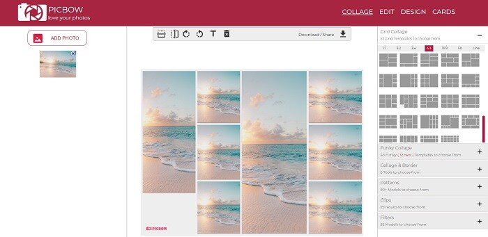 VSCO is a great tool to use that can show you what your feed will look like before posting a photo. This will allow you to plan your feed accordingly and place photos in the optimal position and keep it visually appealing.
There's a reason you're on Instagram. Businesses are there to provide social customer service and to market their product or services. Influencers are there to connect with their audiences and provide value. If all of your posts are about you, you, you, there is a chance that users may get tired of your content and even unfollow you. Focus on how your brand can provide value and make sure that the majority of your posts showcase this.
FiltersIf you're going for a visually cohesive profile, then your use of filters is also going to need to be consistent. It can throw off your overall color scheme if you are using warm filters on some photos and cold filters on others. Once you decide on your color scheme, take a look at all of the Instagram filters and note which ones can and cannot be used as part of your color scheme. Make sure to update this list if you decide to change your color scheme.
Regardless of what equipment you are using to take your photos, you need to make sure that they are professional looking and fitting to your overall theme. Your overall layout and color scheme can look great and even make users want to click on some of your images, but your photos also need to be able to hold their own. Make sure to take photos that are in line with your brand, provide value, and get users' attention.
If you need help figuring out what exactly gets people's attention, perform a little test. First, look up one of the hashtags that is popular in your industry. For example, if you run a hotel try looking up the hashtag travel. Of course what will come up are a ton of different travel photos. First, you'll notice the box at the top of the page that says, "Top Posts." Examine these photos to see how they became so popular were able to make it to the top.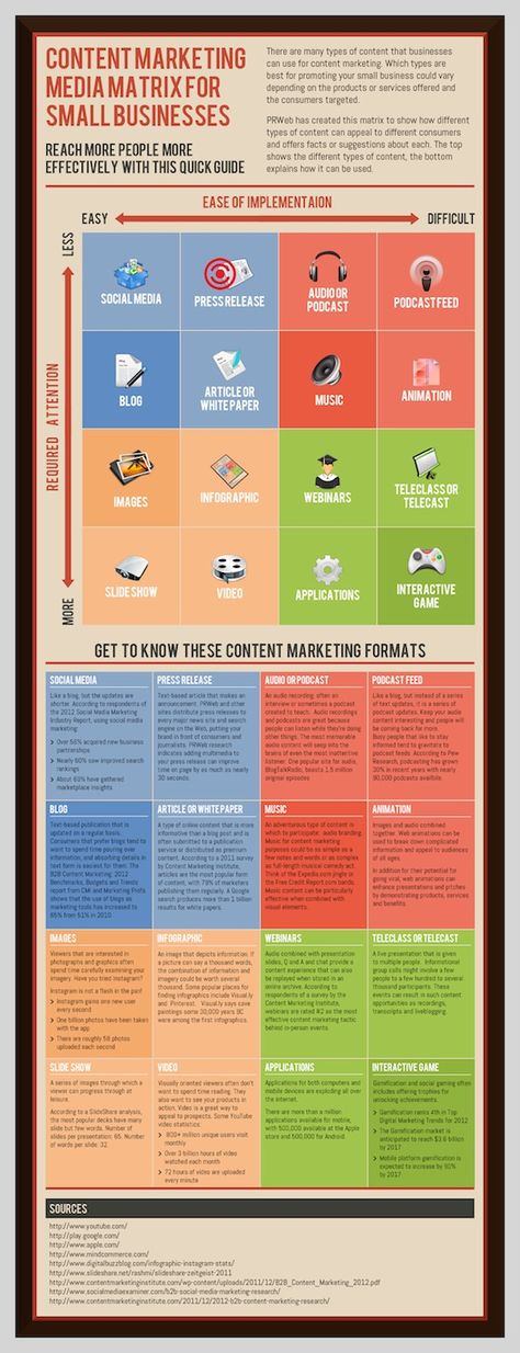 You can do this for a variety of hashtags, but be sure to keep a list of your findings. You can use these tips the next time you are taking photos and creating content for your Instagram page.
Photo credit: @hazelmaven
Instagram truly is the social media platform of this decade. It has exploded in popularity and seen massive growth. Instagram has become a social media platform for the masses, and for all types of purposes. From billion dollar companies like Snickers, to influencers, to freelancers. Instagram has one thing that everyone, no matter what they wish to achieve wants, and that is people’s attention.
In order to do anything, whether it is to convince someone to hire you as a freelancer, or whether you’re just looking to spread awareness about your business and what you do, you need people’s attention.
As such, the usage of Instagram has exploded, because people realize the immense power that Instagram has.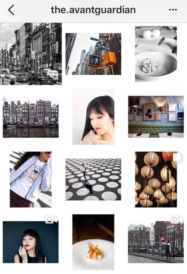 In fact, it was not long ago that Instagram reached the staggering number of 1 billion monthly users.
Instagram has proven to be an effective tool for getting people’s attention and spreading the message you want to spread, but with increased users comes increased competition. No longer is it enough to simply snap a photo, upload it and wait for the results to roll in. Now, you need a more thought-through and well-planned strategy for how you’re going to operate and win on the platform.
Since Instagram is a visual platform, driven by visual content, visual content is everything. Of course, as a designer, you are one step ahead, but in order to fully succeed on Instagram, you need to know how to create a visually appealing Instagram that stands out from the crowd and gets people’s attention.
Before starting to post content on Instagram, you want to decide on an overall theme. Think of your theme as the way you want to be perceived and what feelings you want to create.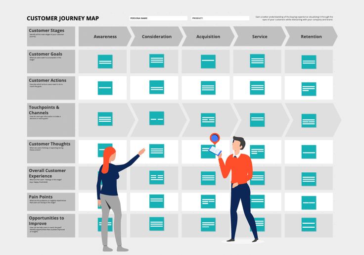 By creating a theme, you’ll be able to make your Instagram posts and profile more consistent—as opposed to just sharing random posts without any thought behind them. Creating an overall theme is also great since it makes your profile more instantly recognizable and makes it stand out from your competitors.
There are several elements to creating a theme with your Instagram posts, and these elements make up an overall theme, but these are the most important aspects you want to pay attention to:
Having a consistent color scheme on Instagram is probably the easiest way you can make your Instagram profile more visually appealing fast.
Creating a color scheme is simple, too! Simply decide on which colors/side of colors that you want your account to lean towards and then go with that. It’s not necessarily that your posts need to be all about a single color every time, but it’s more common to focus on warm/cold schemes, as well as choosing a color and then incorporating various colors that are variants of the chosen color.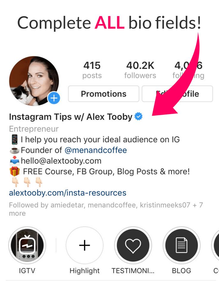
You can choose 1-3 colors that you want to focus on, and which you will always incorporate in your posts. Just take a look at Coca-Cola. No matter where you come across them, it’s obvious which colors they want you to associate their brand with.
A consistent color scheme is key to a consistent theme, and this allows your posts and profile to look more coherent, but most importantly, it helps make your posts Instantly recognisable. Once you’ve chosen your colors, there are several ways to make your posts aligned with your color scheme.
One of the most common is to edit them in the same way and then increase the saturation of the objects in the image that are your color scheme color.
Another common and effective method is to strategically include elements in your images which have the color of your color scheme.
This is similar to having a color scheme, but there is nothing that say you can’t work with filters AND use a filter as well.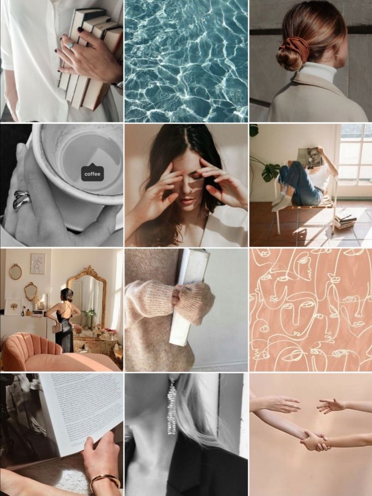
Choosing a filter and then using it consistently is the ultimate way to make your posts more coherent. The filter adds a similar look and style to your posts, and this allows you to create an obvious connection between all of your posts.
Using a consistent filter to make your posts more connected is super simple. Simply go through Instagram’s filters (or filters in any editing app) and then choose one that you like. Now, just use it consistently across all your posts.
A great example is @Aleksandrazee. With her consistent filters, she has been able to create a very coherent feed that looks extremely inviting.
First things first.
Before you do anything else, it’s crucial that you focus on this above all.
The reason is that it’s very hard to save a low-quality image with the help of a filter.
Instagram is a visually-driven social platform, and this demands you to pay great attention to the images you take. Not just the way you edit them.
You don’t need a super expensive camera to take great photos anymore. The phone in your pocket is more than enough. Just make sure that you avoid any rookie mistakes when photographing, such as having a dirty lens, shaking, taking blurry pictures, and so on. Also, when taking photos, you also want to think of what you’re going to post about, and this brings me to my next point…
This one is super important. While how your images look is also very important, if your posts are just beautiful but don’t really bring any real value, they won’t see a lot of traction anyway.
This is why you need to not only focus on creating appealing images, but also focus on what you’re going to take images of.
Ask yourself: ”What are my followers and fans interested in?” and then build upon that.
After all, this may be the most important step to creating a visual appealing feed, so pay some extra attention to it.
 Audit Your Images
Before posting on Instagram, you need to make sure that they are up to standards. Both in terms of quality, but also in a visual theme and style sense.
Does your post align with your visual theme? Does your post align with your style, color scheme, and overall theme?
If so, great! Go ahead and post it. If not, you may want to rethink posting it.
Bad lightning is often the reason for low-quality images on Instagram, and I cannot emphasise just how important good lightning is for your Instagram posts’ quality.
If you have bad lightning for your images, it won’t matter that much if you use consistent colors or a consistent filter, because good lightning really lays the foundation for a great photo on Instagram.
And make sure you don’t use poor lightning, for example from a lamp. Natural light is always best. With natural light, you’ll be able to take higher quality photos with a greater sharpness and quality.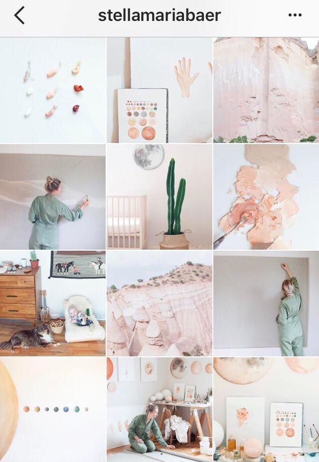
Most people on Instagram just choose pictures to upload randomly, but think about the fact that your Instagram posts are after posting, showcased in your profile like a collage, and paying attention to how your posts look in unity is part of making your Instagram profile visually appealing.
Sharing visually appealing images is the first step, but if you truly want to go above and beyond, planning your feed layout is the answer.
Don’t just pay attention to how the image looks in people’s feed, but consider how you can make your profile feed visually appealing and coherent.
Before sharing any new posts, ask yourself, “How will my feel look with this image in it?” This allows for greater planning with your feed.
When it comes to designing your Instagram profile properly, it’s not only about creating visually appealing content for your page. Even though the visual content you post plays an important role in your success on Instagram—no matter what you wish to achieve—If you haven’t designed and set up your profile properly, it will cripple your success on the platform.
As such, you need to begin by completing all of the information boxes in your Instagram profile.
Start by adding a profile picture to your account. Make sure that it is high-quality and attention grabbing. Ideally, it should be in a strong color, alternatively the color of your visual theme. If you have your own personal brand where you yourself are your brand, a faceshot is great. On Instagram, your profile picture will display as 110 x 110 pixels in the mobile app. But if you look at your profile from the web, it will be displayed in a larger size, so Instagram recommends that you use an image that is 180 x 180 pixels for optimal quality.
Second, you have your bio, also known as profile description. This is probably the most important part of your Instagram profile. You only have 150 characters for your Instagram bio, so it’s important that you are clear, concise, and to the point.
Your Instagram needs to quickly tell people who you are, what you do, and why they should follow you.
Lastly, you have the contact information. If you have an Instagram business profile, you have the option to add contact buttons to your Instagram profile, which includes call, email, and location. If you don’t, you still have the option to add your website to your profile. This helps add more context to your audience, and allows you to tell them what you do.
Goods and services are promoted on different platforms. One of the most interesting is Instagram. Here you can show your company in album format and talk about its activities. And also inspire users with your content. On Instagram, you need to be able to work with the visual part and text so that users read you and get inspired by your work.
In this article, we have prepared information on how to properly set up an account on Instagram. nine0003
Business uses Instagram to promote a product or brand. The quality and number of followers will depend on how you set up an Instagram account. nine0003
The correct design of an Instagram account is an opportunity to arouse user interest and create a positive impression. The main task is to get subscribers and activity on your page.
What the user pays attention to in the brand account on Instagram:
Interesting and useful content always attracts more subscribers and leads them to buy your product. Let's look at all the intricacies of designing a profile on Instagram.
The profile header is located under the account photo. Consider the account structure:
Account structure in the mobile version of InstagramAccount structure in the desktop version:
Account structure in the desktop version of Instagram This version does not have an address and the ability to contact the company by phone number. Companies include a phone number in the profile header to make it easy for you to dial the number from your smartphone.
Please note! From a smartphone, when you click on contacts, you can select a connection by phone number or email. If you select a phone number, you will automatically switch to dialing, the second option will open the mailbox window. nine0003
Build auto sales funnels and answer user questions using a chat bot on Facebook, VK and Telegram.
Nickname should be simple and clear so that any user can find you in the search. Especially if you are just starting to market your product.
30 characters are available for entering a nickname.
When choosing a nickname, use the following principles:
Important! Dots and underscores can be used in the title to separate words. This will make it easier for the user to read your nickname.
An example of an account name indicating the type of product and linking to the city where it is produced:
An example of a nickname for a key queryAn example of a brand name in an account name:
An example of a brand nameImportant! Do not enter the same name in the nickname and account name. In the first case, specify the brand, and in the second case, the type of activity.
Here is an example of how to create an Instagram profile. The girl promotes her services: the nickname is a brand, and the account name indicates what she does.
Making a profile on Instagram And this example is indicative of the fact that when you enter the name, you immediately see the description of the profile and understand what information you will find. nine0003 An example of how to create an Instagram profile with a brand name and a description of the company's activities
The correct design of the Instagram header is very important for positioning your product and brand. In the profile description, you must specify:
Important! nine0064 Only 150 characters can be used for a description, so try to include key information.
If you are promoting a personal brand, please describe your services, benefits and qualities. Briefly describe why users should subscribe to you, buy a course or order services.
Using the LingoJam or Textygram services, you can change the font in the profile header and add characters to them.
Hashtags are often added to the description - this allows you to better navigate your channel. This can be a permanent section on the site - new movies of the week, a review of the company's news and products, examples of your work, a description of services, short stories from the life of the company. nine0003
Users can also subscribe to your hashtags, which will allow them to always see the necessary posts in their feed.
Important! Use only your hashtags. Adding popular tags in the description can lead to a ban, they are best added to posts or stories.
An example of a profile with the hashtag :
Using the hashtag in the description for the reviews sectionFor commercial organizations: in the profile header indicate the contact numbers of the company, the website page or a multilink with options for interacting with the company. You also need to specify the address of the company or store. The user will be able to click on the address and see your location on a Google Maps map. nine0003
The example below shows the address of the photo studio and options for contacting the company: phone number and email.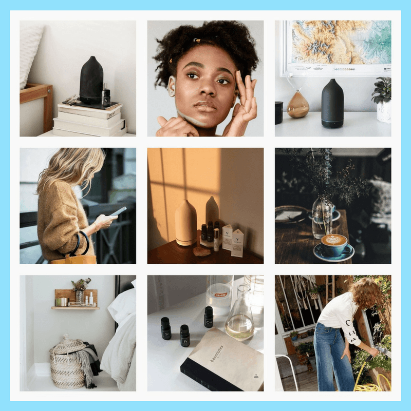
Below are examples of displaying a phone and a multilink. In the mobile version of Instagram, it is possible to call the company - just click on the "How to call" button - it is located under the profile header. In this case, the Taplink service was used for the multilink:
An example of using a multilink and a phone numberAn example of how a multilink works to redirect to a website and view a restaurant menu:
Multilink exampleImportant! In a multilink, you can specify materials for downloading, a website, contact information, a map of offline stores.
For personal pages: in the profile header indicate links to other pages: YouTube, VK, Twitter, WhatsApp. Or links to work pages where examples of your work or services are given.
Below is an example of a description of a book selling account. It contains the name of the store, year of establishment, address, opening hours, shipping, and customer services. nine0003 Instagram profile example
Account example with a short description to inspire and improve the space around you:
Ikea brand profileThis example shows company activities, additional Instagram accounts, geographic location, postal address, phone number and multilink .
An example of how to fill out a profile on InstagramAn account with a description of activities, company benefits and an indication of the site.
Example of an account with a list of main activities in the descriptionRecommended reading! Read our article for details on how to create a business account on Instagram.
Next, let's look at examples of blogger descriptions:
The profile contains the blogger's name, his activities and a link to the publication, a website for communication and a link to a YouTube channel.
An example of an account with information about the blogger's activities. A travel account with contact information, services and an option to contact the blogger.
An example of an account that contains information for users and contact details for cooperation. nine0003 Account registration example
Please note! To make it easier for the user to understand you, speak to him in his language: no need to use professional language, write simply and for ordinary people.
Description text can be supplemented with emoji. On Instagram, emoji are considered the beginning of a paragraph and help draw attention to important points.
Important! Don't use a million emojis in descriptions or posts. One smiley per paragraph or line will be enough. nine0003
When creating content for a potential audience, think about the design for future posts so that the audience is attracted to images, headlines and the design of the entire feed.
The visual component is the main thing in Instagram. Therefore, it is important to follow the design of the feed so that users can not only receive useful information, but also be inspired by your photos.
The feed in the Instagram business account is designed in two ways:
Photos or creatives are designed in the same style or color scheme.
Placing three creatives in the same styleDesigning posts in the same style using a filter to create a warm color scheme: one arrangement of images, text and themes. nine0003 An example of how to design a page on Instagram
Designing a feed with photos with texture. The screenshot below shows the account of a concrete plant:
An example of how to maintain a beautiful Instagram for a highly specialized businessDesigning a profile using corporate colors and identical elements on creatives:
An example of designing creatives in the same styleAdding one to creatives element or effect that is your feed feature:
An example of designing posts using a single element for creativesAn example of designing a feed with a combination of posts in a checkerboard pattern:
An example of how to design InstagramCheckerboard design of an account: alternating photos with interior design and images with texture for interior decoration :
An example of how to create a beautiful Instagram Design of the feed with one-color creatives arranged diagonally.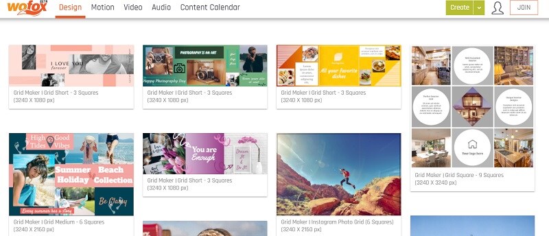 In the example below, three photos are interleaved with a creative with text written on it. In order not to get confused in publications, it is best to use post schedulers. nine0003 An example of how to beautifully design Instagram
Designing a feed with three posts with one product: presentation, description, video with the application of the product in life.
An example of designing a feed with one product in three posts: product presentation, characteristics and applicationDesigning a feed with a block of identical posts located on the left, right or in the center. nine0003
An example of the design of a feed with creatives in the same style located on the right side: it can be a creative with text, a block with a thematic section, or a weekly rubric.
An example of the design of the feed Another example of a clear structure in the feed: working moments, cases and personal information.
Send chains of trigger messages of welcome, abandoned cart, reactivation, combining email, SMS and web push within one chain. nine0003
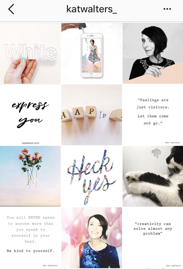
Decoration of the ribbon with a canvas from one photo or banner.
Filling the feed with posts from one photoVibrant typography refers to the use of several colors that are somehow repeated in your creatives. That is, you adhere to a single style in terms of colors.
The example below shows an MTS account. Creatives use corporate colors:
An example of how to design your InstagramIn the Setters account, creatives use one color scheme and elements that can be repeated in every second or third image.
An example of using bright design and duplicating elements in posts Nine posts in the Instagram account in any style: one photo is presented as a puzzle divided into nine pictures, alternating image and text, or filling the feed with nine creatives. These posts provide basic information about the company: services, cost, contact information, and benefits. Everything else is told in stories every day and fixed in highlights. nine0003
An example of a checkerboard design of nine posts: photos and creatives with descriptions of services.
Instagram account design exampleImportant! The design of the feed you create for your users, so evaluate the reaction of the audience, using polls and ratings in stories, and compare your content with competitors.
It is recommended to update the feed for business accounts two or three times a week. For online stores and personal blogs, posts can be added more often. Sprout Social published a study on the best times and days to post on Instagram. nine0003
Auspicious time to post:
Time to post
Auspicious time to post about products:
Time to post a productFavorable time for media publications:
Time for media publicationsThe only caveat: make sure that the frequent addition of posts does not interfere with users and they do not start unsubscribing from you.
It is best to use the story format for every day. Short videos attract more attention and make people interested in your channel.
Use stories and pinned stories to attract your audience. This will allow the audience to learn more about you, your product, your employees and the inner workings.
Highlights allow users to get to know you and your product. They do not have to scroll through the entire feed and look for the main information.
The number of highlights is unlimited, but in the description for them you can use only 16 characters. To structure information, create a single cover design for thumbnails. nine0003
Important! Highlights save stories in chronological order. Therefore, immediately think about how to arrange the sections.
Examples of what can be specified in pinned stories:
Recommended reading! Find out about all the interesting features of Instagram Stories in our article.
Here is an example of designing an Instagram page with pinned stories that contain information about the company: addresses, bestsellers, products, how to order, customer reviews. nine0003 An example of pinned stories with a short description
An example of pinned stories with products:
An example of story designRecommended reading! Conviva has prepared an annual report on the dynamics of user interaction in Instagram Stories. Spoiler alert: Users are more interested in short videos and are more likely to interact with them. Posts in the feed fade into the background.
There are several tricks to design a post that are used by the authors of popular blogs. nine0003
In the post title, it is best to indicate a question or sentence that will provoke the user to read your article: “15 non-obvious facts”, “Invest or spend?”, “How to write a selling copy?”.
It is important to divide the text into paragraphs. The main thoughts can be highlighted with emoji.
To break text into paragraphs, use applications: for example, "Instaspace". If you write directly to Instagram, then the text will turn out to be solid - and it will be difficult for users to perceive the information. nine0003 The text is divided into paragraphs, where the list is highlighted with emoji
There are many types of hashtags, we will consider the most popular of them:
To search for hashtags, you can use information from competitor accounts and special services: stapico.ru, hashtags.org, tagdef.com. You can use Instagram search and check the number of interested users.
It is not recommended to use many hashtags in posts, up to a maximum of 30 hashtags. Many companies follow the formula: 5 high frequency + 10 mid frequency + 7 low frequency + 4 geo + 4 viral. Add hashtags after a post or as a separate comment.
A post with hashtags in a separate comment:
Decorating a post with hashtagsAnd here is an example of hashtags for a beauty salon in the post itself:
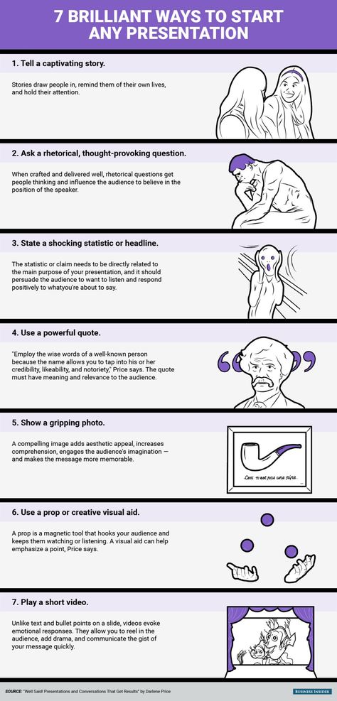
An example of a post with hashtags End the post with a short conclusion. This helps users understand the essence of your text, understand the problem that you have considered, and enter into a dialogue with you. If this is a sponsored post, include a call to action. nine0003
An example of a post with a philosophical thought that should encourage users to think and talk about their impressions:
An example of post designAnd the last thing: write for the reader - in simple language, explaining the terminology if you have a narrow specialization, and engaging in discussions.
Recommended reading! Read more ideas for Instagram posts in our article.
An example of successful account management that sells products for dogs:
An example of how to beautifully design an Instagram profileThe following points are well worked out in the example:
And this is an example of an account from a headphone manufacturer who very successfully came up with the design of his feed:
An example of user-generated content in Instagram design purchases. nine0008An example of maintaining an account with interesting and bright posts from a cleaning equipment manufacturer:
An example of creating an Instagram accountThe following points are well worked out in the example:
 nine0008
 An example of an account for a manufacturer of hammocks and tents with an original visual effect. The decor is inspiring to go on an adventure and grab a hammock.
Beautiful Instagram designThe following moments are well worked out in the example:
An example of an unusual account for a narrow specialization is the production of Boeing. Spectacular videos and photos of employees, stories about new technologies and much more:
Beautiful design InstagramThe following moments are well worked out in the example:
 nine0008
 An example of a paint manufacturer's account that offers handmade lessons. Useful content for those who just want to start or are already engaged in creativity.
An example of how to beautifully design InstagramThe following points are well worked out in the example:
We have reviewed the steps of creating a profile on Instagram, let's fix the basic information in the checklist.
Instagram profile checklist:
 nine0008
 Register with SendPulse, explore our materials and create unique pages on your social networks. And do not forget about additional promotion methods: email newsletters, web push, Viber and SMS newsletters and chat bots in Telegram, Facebook Messenger and VKontakte messengers!
Visual Instagram plays a big role in promoting your account, increasing engagement and audience loyalty. It's not just about beautiful pictures: all parts of the visual concept should be in harmony with each other and convey the meaning inherent in them. We analyze how to create a high-quality visual and avoid mistakes. nine0533
Visual is the general view of an Instagram account: colors, images, their combinations and layout, presentation and style. This is the “clothes” by which they meet, that is, they evaluate your profile, and which works for the brand image. nine0003
The main components of the visual:
All this is determined by the direction and purpose of the blog, the specifics of the target audience, as well as the taste and capabilities of those involved in the design. For example, it is logical to use bright rich colors for a travel blog or an outdoor store, while for a psychotherapist profile it is better to choose restrained tones.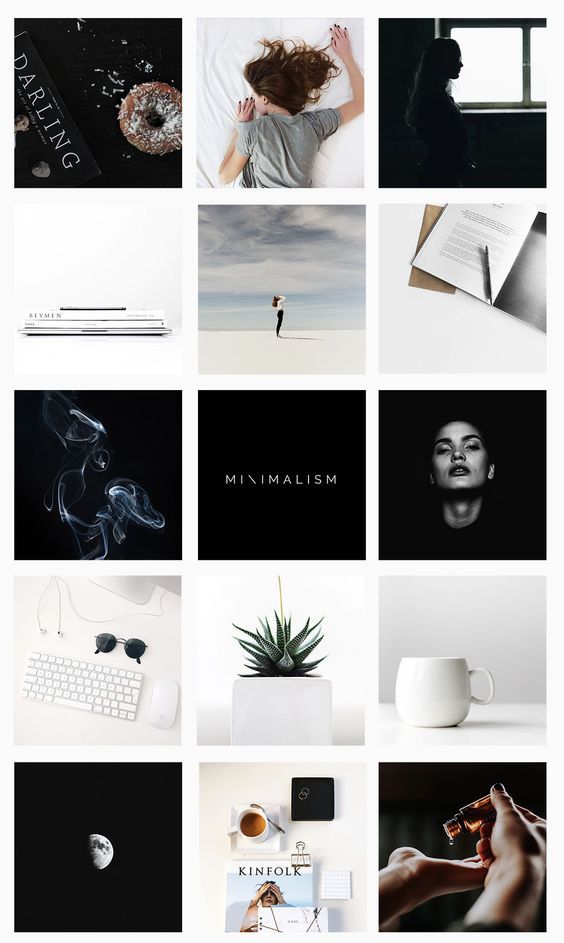 nine0003
There are visually appealing profiles whose owners seem to have no particular style. This usually applies to personal pages. Promoted bloggers can maintain accounts more freely - they have a large audience and recognizable features. If you are just gaining followers, it is better not to deviate from the chosen style.
The appearance of the account is the first thing that visitors pay attention to. Indistinct design, fuzzy images do not inspire confidence. If the owner is not very confused about the page, which is his face, what to expect from the product? It is clear that there is no direct connection here - a dummy can be hidden behind a beautiful profile, and vice versa. But the attitude towards you depends on the first impression. nine0003
If a user found your account in a search or clicked on a link from an advertisement, he evaluates it visually within a couple of seconds. Poor design repels, and people leave the page. Of course, a visitor can give you a chance by opening a post and discovering interesting and useful content. But with an attractive picture and a harmonious ribbon, it is more likely that he will stay and sign or even place an order.
If you have original photos and videos, users will share publications, and more people will know about your account. Seeing a post in the recommended one, a person pays attention to the picture. If the image is fuzzy, taken from stocks, or creates such a feeling, no one will read the text, much less go to the profile. nine0003
Unusual catchy photos and videos have a chance to go viral, which will increase the reach and popularity of the blog.
When your account is really cool, you don't have to ask your followers to be active. They themselves will write what a good photo, beautiful dress or stunning view. Often, users first like the photo and only then read the text - after all, Instagram is primarily about the visual.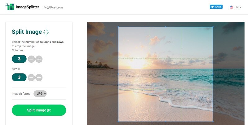 Even if you sell equipment or building materials, pay attention to this aspect. nine0003
If you have developed your own unique style, have distinctive signs that the audience can read, your content becomes recognizable. This makes it easier to keep your attention. People who are interested in you will not scroll through the post, but will stop to look at the images and read the text. Regular “fans” will also share your posts and stories, and this also contributes to the growth of recognition.
Sometimes a business does not have a specific mission, but if you are building a brand, you need to convey key messages to the audience. This is done through the visual. Those who see something of their own in your stories respond and stay with you. For example, accounts where the main theme is the happiness of motherhood or self-development attract different audiences, and their content is required to influence it. nine0003
To create a high-quality Instagram profile, you need to do a lot of work.
An experienced SMM manager will cope with the task. If you don’t have it, but you have free time, and you are confident in your sense of style, you can try to prepare a visual yourself. If the budget allows, it is better to hire specialists. Usually they are searched for through groups in social networks, Telegram channels or freelance exchanges, sometimes on job search sites. nine0003
The visual assistant helps you develop or improve your blog concept and design your profile accordingly. If you provide ready-made photographic materials or agree to use stock ones, the cost will be lower. If you plan to work from scratch on a turnkey basis, it turns out to be noticeably more expensive.
The salary of a photographer varies greatly depending on the city, qualifications and promotion. For the premium segment, saving on photo and video materials is undesirable. If you sell economy-class clothes or cosmetics, when you need to post constantly and in large numbers, you can get by with mobile shooting and simple processing.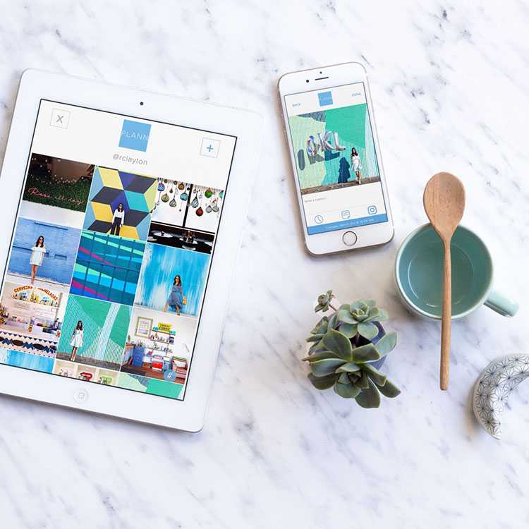 If you want something unusual, look for interesting solutions from competitors or photographers' accounts. nine0003
The range of prices for renting premises and work of models is quite wide, you can find options for any budget or even refuse it altogether.
Choose the style you want to follow. Start from the impression you want to create: freedom or restraint, everyday life or a sense of celebration, a businesslike atmosphere or lamplight. You can simply focus on the brand book of the company: if it is large and well-known, and there is a ready-made solution, then this is only for the benefit of recognition. nine0003
Stick to the same treatment. It can be warm and bright, for example, for a travel blogger, or in soft colors, like for a children's clothing store.
A beautiful visual on Instagram about travel Cool muted processing is appropriate in personal blogs or shops, if you make accents on suitable shades. For example, in an interior design account, white and gray are successfully diluted with shades from the wood color palette.
Choose up to five shades to help bring your concept to life, use them in your frame and design. If the account is about sophistication and style, for example, expensive watches, cold work with a predominance of white and black with accents on blue and metal color will do. nine0003
White and black fit well into the field of technology, you can dilute them with green and blue shades. For a bedding store or goods for girls, pastel colors are suitable: beige, light peach, soft pink or mint.
These are examples rather than a direct guide. Of course, no one forbids experimenting. Moreover, if you move away from the generally accepted, you can stand out favorably. But do not forget that colors should convey the values and emotions that your brand conveys. nine0533
Convert subscribers into regular customers, automate communication with them and improve sales.
Different approaches to content creation and layout are used to create a harmonious overall picture.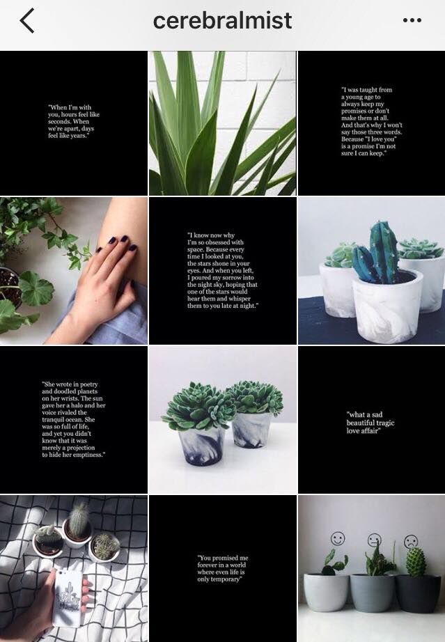 Let's consider the most interesting ones.
Layout according to strict rules like "eternal tape" or "checkerboard" is becoming less and less common. Naturalness has replaced it: the profile looks like the owner does not really think about the general appearance of the tape, but it turns out harmoniously. In fact, a lot of work is often hidden behind external lightness. nine0003 The natural visual of the Instagram feed
One option is to place three posts in a row that are united by one story or some kind of element. In the example below, each line is reserved for a separate outfit.
Instagram feed visual in trinity format You can make a vertical layout where each column has its own type of content, for example, entertaining, useful and selling. Sometimes they are divided by format: posts with photos, videos and text. This allows you to structure information in the most convenient way for users, especially in educational projects. Less common are examples of accounts in which the columns differ in the predominant color. nine0003
Lay out posts in such a way that the diagonal stands out with color, the presence of a plot or some element. For example, place portraits diagonally, and the rest of the images will be figures of people or objects.
Add frames to make dissimilar images look harmonious. Use templates to create a consistent style. You can apply these elements for each post or use them selectively, as in the example below. nine0003 Beautiful visual on Instagram using frames
The layout in the feed can be tiled, when all images are combined into one. Now this technique is used less often, and a few years ago it was one of the most popular. It can be used in some cases, for example, on the information product page, when you need to provide basic information about the program. Usually this is an additional page of the course author, and visitors come from him already warmed up and with confidence in the product.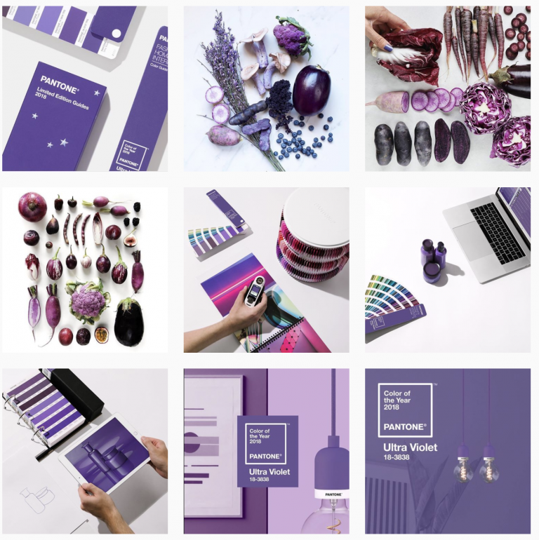 New information in such accounts is submitted to stories, so an “endless” feed is suitable for the design of basic data, although it will most likely not be very long. nine0003
Dark theme was the trend in 2020 and remains popular to this day. Mysteriousness, calmness, confidence, luxury, aesthetics - you can achieve different effects depending on the chosen visual solutions and attract the attention of the audience you are targeting.
Animations attract attention and look stylish, you can stick to them for a long time. Show your product or work process, animate the background or a single element - there are many options. nine0003 Animated Instagram visual
Experiment with angles so your followers don't get bored. Shoot close-ups, alternate with distant ones. Apply the rule of thirds: the image is mentally divided into nine equal parts by two horizontal and vertical lines, and objects are located along them or at the intersection.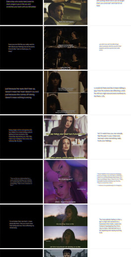 Line up objects or unusual shapes, add elements of dynamics: splashing water, swaying fabric, flowing hair, and the like. nine0003 Instagram visual: different angles and plans
To increase recognition, add a brand element that will appear in every post or periodically come across throughout the feed. It can be a character, an animal, something. Inanimate objects can also become characters - it's up to your imagination.
Some accounts consist entirely of illustrations, in others they are diluted with ordinary photographs. nine0003
Illustrations allow you to express emotion, draw attention, embody an idea that cannot be conveyed through photographs.
Artist's Instagram VisualCreate original content by joining photos into a collage. Add elements: stickers, emojis, gifs. The result should fit into the visual concept of the brand. An example from the Evening Urgant account:
Instagram visual with collage effect This is a convenient way to divide information into parts for better perception.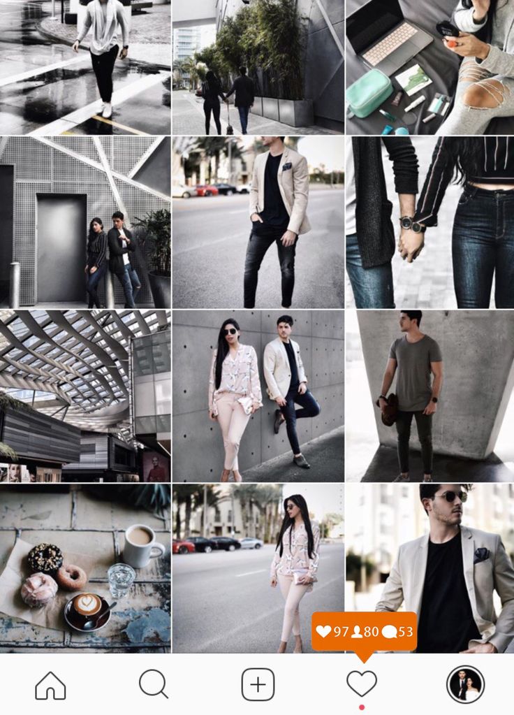 Show the most important things in pictures or videos, and details can be added in the text. nine0003 Instagram carousel visual
People like video content because they can get more information from it in a short time. And with the help of video it is easier to influence the audience emotionally.
Instagram visual: add interesting videosAll these options can be combined with each other and create a unique visual concept that will make you stand out in a niche. For more ideas, check out Instagram Trends 2021 to Make Your Account More Engaging for Followers. nine0003
The first error is the lack of a unified style. You can try different layouts and image processing, but in any case, the tape should look harmonious. So you can convey those thoughts and feelings that need to be conveyed to the user. When everything is jumbled together, confusion makes it difficult to perceive your meanings.
Sometimes the visual concept does not match the theme of the account or is not suitable for the target audience.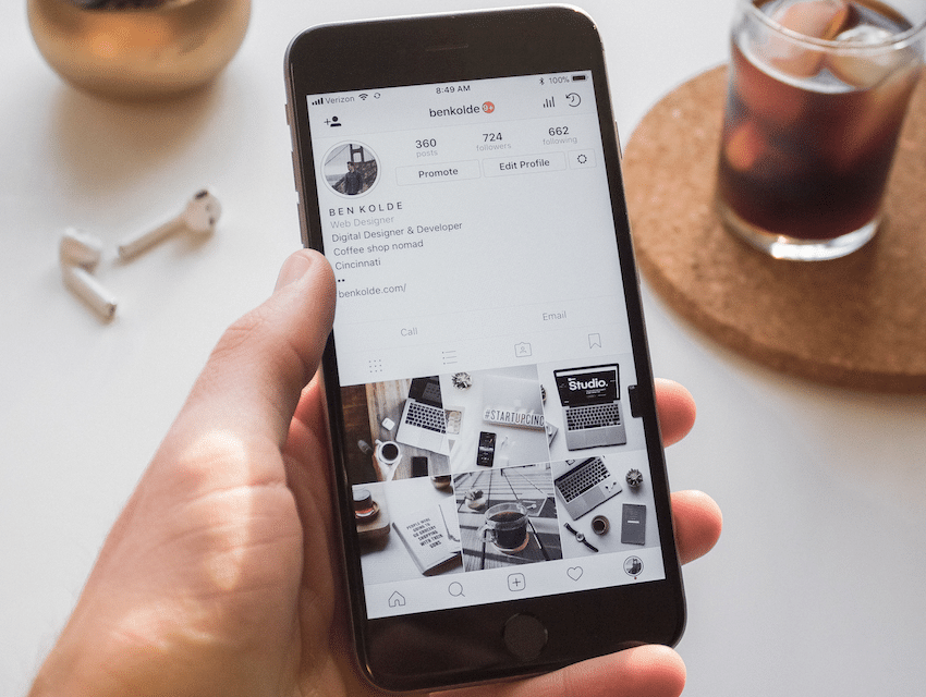 Too bright colors should not be used where tenderness is the key element. If you want to create a feeling of confidence and power, subdued processing is unlikely to be appropriate. A store designed for people with an average income should not look like a luxury boutique, and so on. nine0003
Stories and design for the actual should be combined with the feed. Sometimes they are not given due attention, but they are important visual elements that should not be forgotten. We have an article about the features and features of Instagram stories, as well as a selection of ideas for them.
Monotonous tape and lack of originality hinder your progress. Try unusual angles, creative design, alternate formats so that users are interested in you. Get inspired on Pinterest, look for references on other accounts, as well as on Behance, Dribbble and similar sites. nine0003
Another mistake - low-quality photos and videos, clumsy illustrations. In rare cases, this can become a kind of feature, but is usually perceived negatively by the audience.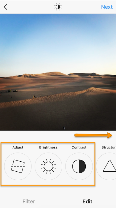 Give the visual the attention it deserves.
In order to develop taste, it is necessary to increase observation. Let's analyze examples of visual design of profiles. Let's start with the good ones.
Los Angeles-based photographer hungryhipsters has a twist: from time to time she completely changes the mood and style of the tape. It is always something "girlish", but in different colors and emotions. Now her feed is filled with photos in the retro style of the 70s: muted shades of yellow, brown and orange, clothes and accessories in the style of that period. nine0003 A beautiful visual on the creative photographer's Instagram
The girl calls her page colorful moodboard: the mood of summer in retro style is perfectly conveyed. Covers of the actual also fit into the overall concept.
In the following example, accounts for women's clothing stores. In all cases, processing was performed in muted shades. The first store specializes in casual style, and the colors are appropriate.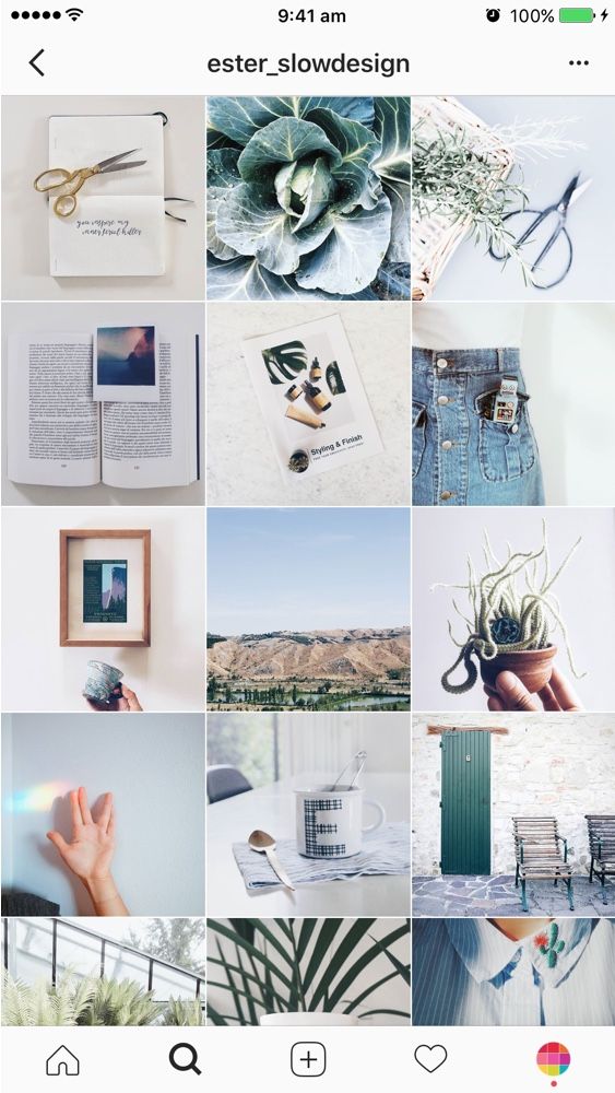 The feed contains everyday scenes, diluted with images of individual wardrobe details and useful posts. A good visual that conveys the main idea: beautiful and comfortable clothes every day. nine0003
Macrocosm conveys ideas of comfort and joy from life, and this is felt in every photo and video. Delicate shades are selected, and the whole profile creates the mood of a warm summer evening without worries.
The third store is about naturalness and aesthetics with an emphasis on femininity. This is conveyed through the visual. The girls in the pictures look natural, there is a lot of nature in the feed and a retro vibe is felt.
Instagram feed visual in clothing stores Skyeng online school account is well-designed. The school positions itself as a place where they follow trends and teach only up-to-date English. The emphasis on modernity is emphasized by bright colors, emoji, stickers. A distinctive feature is the presence of text on each image so that subscribers immediately understand the topic of the post.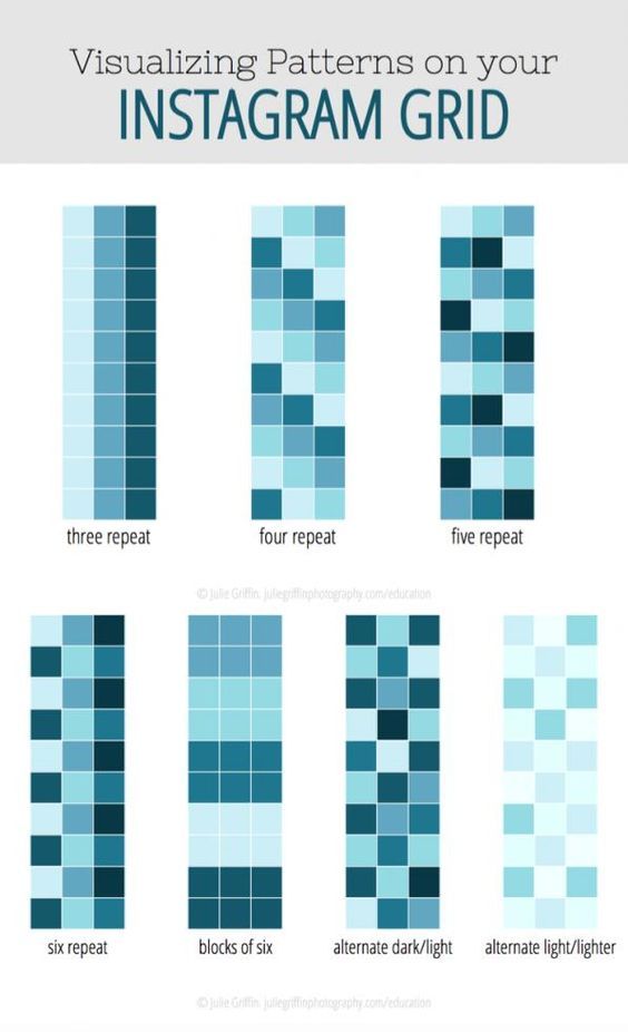 nine0003 An Instagram visual that grabs attention
Let's move on to worse examples.
The Golden Apple store sells expensive branded cosmetics and perfumes. But when looking at the page, the impression of premium goods is not created. There is no unifying element or single processing, something original. If you take posts from different accounts and mix, it will look something like this.
Instagram visual that doesn't catchyTinkoff Bank has a rather interesting idea: one row - one story, and the photos themselves are atypical for such an account. But the embodiment is not the best: the rows seem to be unrelated, and at first glance it is not clear what's what. Perhaps, through this design, the idea is transmitted that this bank is different from others, but the visual impression is a bit sad. nine0003 Ambiguous Instagram feed visual
The third example is a bookstore. Many accounts that sell the same type of products look similar: furniture, bags, phones, other equipment and accessories. This is the case when there are a lot of goods, and it is unprofitable to arrange a cool photo session for each receipt. But you can stylishly arrange a small space for filming or change the location within the room, choose different angles, do light processing.
The design in the example looks like a shop window. It may be convenient, but not attractive. People are reluctant to subscribe to such accounts, they are difficult to promote. A little creativity will fix this situation. nine0003 Unfinished Instagram visual
On Instagram, how your account looks is very important. You need to try to hook the user at first sight.
A good visual will help you attract new subscribers and get more orders. To successfully complete business tasks, register with SendPulse. In the service, you can create chat bots for instant messengers and social networks, including Instagram; collect mobile landings and multilinks; launch mailings for email, SMS and Viber. Use our CRM system and browser push notifications for efficient work.