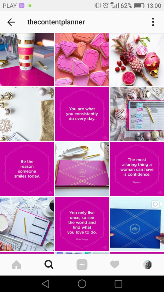
Nowadays, Instagram is often someone's initial contact with a brand, and nearly half of its users shop on the platform each week. If it's the entryway for half of your potential sales, don't you want your profile to look clean and inviting?
Taking the time to create an engaging Instagram feed aesthetic is one of the most effective ways to persuade someone to follow your business's Instagram account or peruse your posts. You only have one chance to make a good first impression — so it's critical that you put effort into your Instagram feed.
Finding the perfect place to start is tough — where do you find inspiration? What color scheme should you use? How do you organize your posts so they look like a unit?
We know you enjoy learning by example, so we've compiled the answers to all of these questions in a list of stunning Instagram themes. We hope these inspire your own feed's transformation. But beware, these feeds are so desirable, you'll have a hard time choosing just one.
An instagram theme is a visual aesthetic created by individuals and brands to achieve a cohesive look on their Instagram feeds. Instagram themes help social media managers curate different types of content into a digital motif that brings a balanced feel to the profile.
Creating a theme on your own requires a keen eye for detail. When you’re editing several posts a week that follow the same theme, you’ll want to have a design tool handy to make that workflow easier. Pre-set filters, color palettes, and graphic elements are just a few of the features these tools use, but if you have a sophisticated theme to maintain, a few of these tools include advanced features like video editing and layout previews. Here are our top five favorite tools to use when editing photos for an Instagram theme.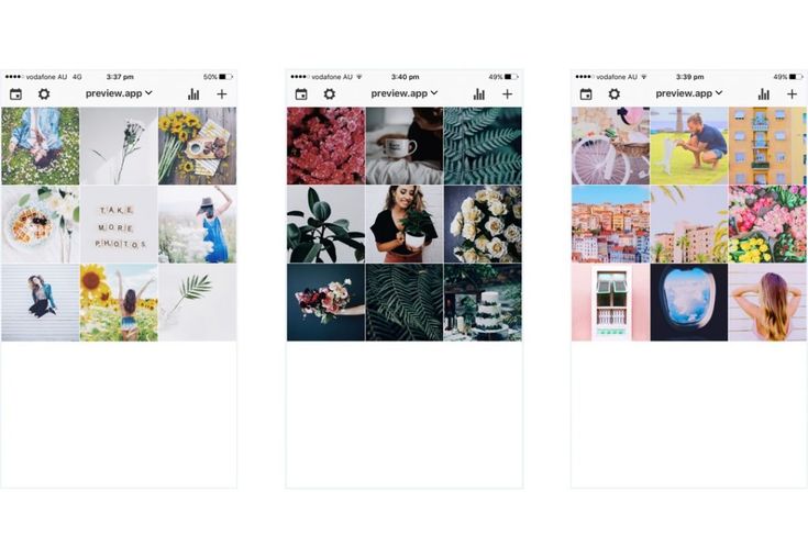
Creators look to VSCO when they want to achieve the most unique photo edits. This app is one of the top-ranked photo editing tools among photographers because it includes advanced editing features without needing to pull out all the stops in Photoshop. If you’re in a hurry and want to create an Instagram theme quickly, use one of the 200+ VSCO presets including name-brand designs by Kodak, Agfa, and Ilford. If you’ll be including video as part of your content lineup on Instagram, you can use the same presets from the images so every square of content blends seamlessly into the next no matter what format it’s in.
FaceTune2 is a powerful photo editing app that can be downloaded on the App Store or Google Play. The free version of the app includes all the basic editing features like brightness, lighting, cropping, and filters. The pro version gives you more detailed control over retouching and background editing. For video snippets, use FaceTune Video to make detailed adjustments right from your mobile device — you’ll just need to download the app separately for that capability. If you’re starting to test whether an Instagram theme is right for your brand, FaceTune2 is an affordable tool worth trying.
You know Canva as a user-friendly and free option to create graphics, but it can be a powerful photo editing tool to curate your Instagram theme. For more abstract themes that mix imagery with graphic art, you can add shapes, textures, and text to your images. Using the photo editor, you can import your image and adjust the levels, add filters, and apply unique effects to give each piece of content a look that’s unique to your brand.
Image Source
Have you ever used Adobe Illustrator to create interesting overlays and tints for images? You can do the same thing to develop your Instagram theme. Traditionally, Adobe Illustrator is the go-to tool to create vectors and logos, but this software has some pretty handy features for creating photo filters and designs. Moreover, you can layout your artboards in an Instagram-style grid to see exactly how each image will appear in your feed.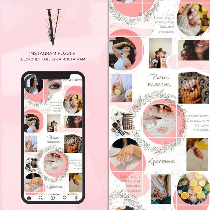
Photoshop is the most well-known photo editing software, and it works especially well for creating Instagram themes. If you have the capacity to pull out all the stops and tweak every detail, Photoshop will get the job done. Not only are the editing, filter, and adjustment options virtually limitless, Photoshop is great for batch processing the same edits across several images in a matter of seconds. You’ll also optimize your workflow by using photoshop to edit the composition, alter the background, and remove any unwanted components of an image without switching to another editing software to add your filter. With Photoshop, you have complete control over your theme which means you won’t have to worry about your profile looking exactly like someone else’s.
 Transition
If you aren’t set on one specific Instagram theme, consider the transition theme. With this aesthetic, you can experiment with merging colors every couple of images. For example, you could start with a black theme and include beige accents in every image. From there, gradually introduce the next color, in this case, blue. Eventually, you’ll find that your Instagram feed will seamlessly transition between the colors you choose which keeps things interesting without straying from a cohesive look and feel.
Image Source
A polished black and white theme is a good choice to evoke a sense of sophistication. The lack of color draws you into the photo's main subject and suggests a timeless element to your business. @Lisedesmet's black and white feed, for instance, focuses the user’s gaze on the image's subject, like the black sneakers or white balloon.
Image Source
If your company's brand is meant to imply playfulness or fun, there's probably no better way than to create a feed full of bright colors.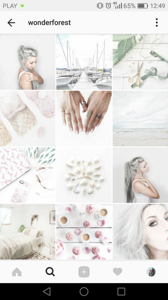 Bright colors are attention-grabbing and lighthearted, which could be ideal for attracting a younger audience. @Aww.sam's feed, for instance, showcases someone who doesn't take herself too seriously.
Image Source
For an artsier edge, consider taking a minimalist approach to your feed, like @emwng does. The images are inviting and slightly whimsical in their simplicity, and cultivate feelings of serenity and stability. The pup pics only add wholesomeness to this minimalist theme. Plus, minimalist feeds are less distracting by nature, so it can be easier to get a true sense of the brand from the feed alone, without clicking on individual posts.
Image Source
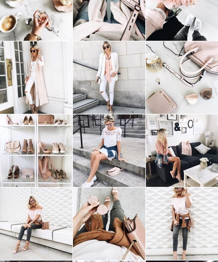
One of the easiest ways to pick a theme for your feed is to choose one color and stick to it — this can help steer your creative direction, and looks clean and cohesive from afar. It's particularly appealing if you choose an aesthetically pleasing and calm color, like the soft pink used in the popular hashtag #blackwomeninpink.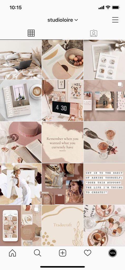
Image Source
If you're interested in creating a highly cohesive feed but don't want to stick to the one-color theme, consider trying two. Two colors can help your feed look organized and clean — plus, if you choose branded colors, it can help you create cohesion between your other social media sites the website itself. I recommend choosing two contrasting colors for a punchy look like the one shown in @Dreaming_outloud’s profile.
Image Source
Similar to the one-color idea, it might be useful to choose one color palette for your feed, like @creativekipi's use of pastels. Pastels, in particular, often used for Easter eggs or cupcake decorations, appear childlike and cheerful. Plus, they're captivating and unexpected.
Image Source
As evident from @mustdoflorida's feed (and username), it's possible to focus your feed on one singular object or idea — like beach-related objects and activities in Florida. If you're aiming to showcase your creativity or photography skills, it could be compelling to create a feed where each post follows one theme.
Image Source
Creating a puzzle out of your feed is complicated and takes some planning, but can reap big rewards in terms of uniqueness and engaging an audience. @Juniperoats’ posts, for instance, make the most sense when you look at it from the feed, rather than individual posts. It's hard not to be both impressed and enthralled by the final result, and if you post puzzle piece pictures individually, you can evoke serious curiosity from your followers.
Image Source
Displaying everyday items and activities from unexpected angles is sure to draw attention to your Instagram feed. Similar to the way lines create a theme, angles use direction to create interest. Taking an image of different subjects from similar angles can unite even the most uncommon photos into a consistent theme.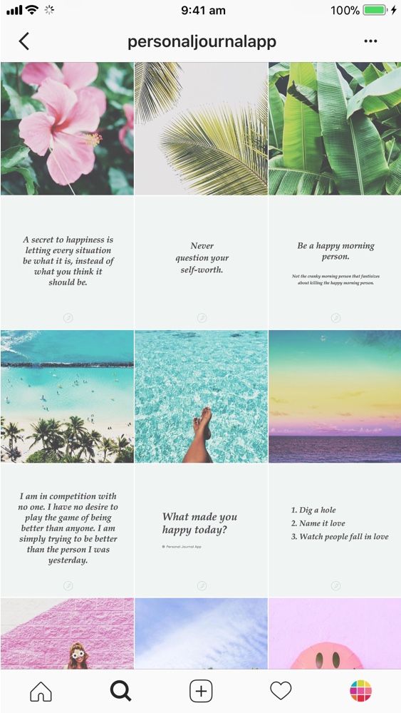
Image Source
A picture is worth a thousand words, but how many pictures is a well-designed quote worth? Confident Woman Co. breaks the rules of Instagram that say images should have a face in them to get the best engagement. Not so with this Instagram theme.
The bright colors and highlighted text make this layout aesthetically pleasing both in the Instagram grid format and as a one-off post on the feed. Even within this strict text-only theme, there’s still room to break up the monotony with a type-treated font and textured background like the last image does in the middle row.
Image Source
If you're not a big fan of horizontal or vertical lines, you might try a checkerboard theme. Similar to horizontal lines, this theme allows you to alternate between content and images or colors as seen in @thefemalehustlers’ feed.
Image Source
While it is a bit jarring to have black or white borders outlining every image, it definitely sets your feed apart from everyone else's.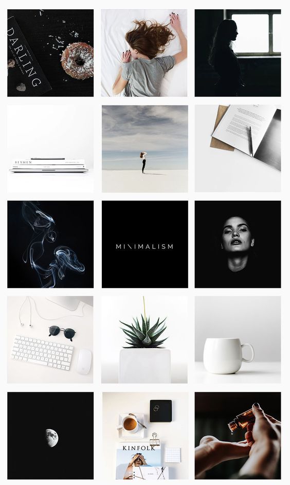 @Beautifulandyummy, for instance, uses black borders to draw attention to her images, and the finished feed looks both polished and sophisticated. This theme will likely be more successful if you're aiming to sell fashion products or want to evoke an edgier feel for your brand.
Image Source
If you prefer uniformity, you'll probably like this Instagram theme, which focuses on using the same filter (or set of filters) for every post. From close up, this doesn't make much difference on your images, but from afar, it definitely makes the feed appear more cohesive. @marianna_hewitt, for example, is able to make her posts of hair, drinks, and fashion seem more refined and professional, simply by using the same filter for all her posts.
Image Source
If your primary goal with Instagram is to showcase your products, you might want a Flatlay theme. Flatlay is an effective way to tell a story simply by arranging objects in an image a certain way and makes it easier to direct viewers' attention to a product. As seen in @thedailyedited's feed, a flatlay theme looks fresh and modern.
Image Source
If it aligns with your brand, vintage is a creative and striking aesthetic that looks both artsy and laid-back. And, while "vintage" might sound a little bit vague, it's easy to conjure. Simply try a filter like Slumber or Aden (built into Instagram), or play around with a third-party editing tool to find a soft, hazy filter that makes your photos look like they were taken from an old polaroid camera.
Image Source
In @girleatworld's Instagram account, you can count on one thing to remain consistent throughout her feed: she's always holding up food in her hand. This type of repetition looks clean and engaging, and as a follower, it means I always recognize one of her posts as I'm scrolling through my own feed. Consider how you might evoke similar repetition in your own posts to create a brand image all your own.
Image Source
 Mix-and-match Horizontal and Vertical Borders
While this admittedly requires some planning, the resulting feed is incredibly eye-catching and unique. Simply use the Preview app and choose two different white borders, Vela and Sole, to alternate between horizontal and vertical borders. The resulting feed will look spaced out and clean.
Image Source
If you're a writer or content creator, you might consider creating an entire feed of quotes, like @thegoodquote feed, which showcases quotes on different mediums, ranging from paperback books to Tweets. Consider typing your quotes and changing up the color of the background, or handwriting your quotes and placing them near interesting objects like flowers or a coffee mug.
Image Source
@JackHarding's nature photos are nothing short of spectacular, and he highlights their beauty by filtering with a dark overtone. To do this, consider desaturating your content and using filters with cooler colors, like greens and blues, rather than warm ones.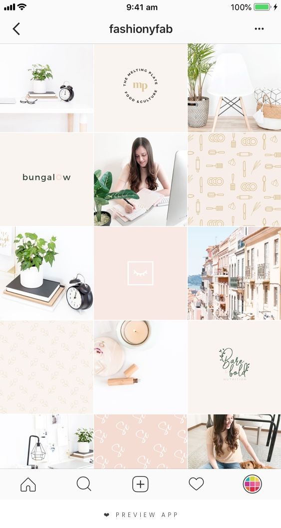 The resulting feed looks clean, sleek, and professional.
Image Source
One way to introduce color into your feed? Try creating a rainbow by slowly progressing your posts through the colors of the rainbow, starting at red and ending at purple (and then, starting all over again). The resulting feed is stunning.
Image Source
Most people on Instagram stick to photos and filters, so to stand out, you might consider adding drawings or cartoon doodles on top of (or replacing) regular photo posts. This is a good idea if you're an artist or a web designer and want to draw attention to your artistic abilities — plus, it's sure to get a smile from your followers, like these adorable doodles shown below by @josie.doodles.
Image Source
Similar elements in your photos can create an enticing Instagram theme. In this example by The Container Store Custom Closets, the theme uses shelves or clothes in each image to visually bring the feed together.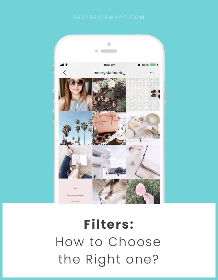 Rather than each photo appearing as a separate room, they all combine to create a smooth layout that displays The Container Store’s products in a way that feels natural to the viewer.
Image Source
Something about this Instagram feed feels different, doesn’t it? Aside from the content focusing on skyscrapers, the lines of the buildings in each image turn this layout into a unique theme. If your brand isn’t in the business of building skyscrapers, you can still implement a theme like this by looking for straight or curved lines in the photos your capture. The key to creating crisp lines from the subjects in your photos is to snap them in great lighting and find symmetry in the image wherever possible.
Image Source
If your brand does well with aligning photography with content, you might consider organizing your posts in a thoughtful way — for instance, creating either horizontal or vertical lines, with your rows alternating between colors, text, or even subject distance.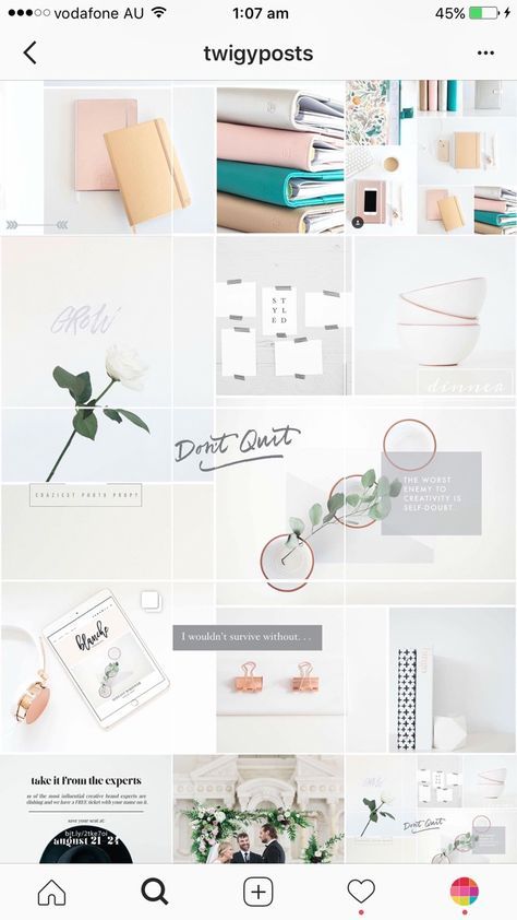 @mariahb.makeup employs this tactic, and her feed looks clean and intriguing as a result.
Image Source
One major factor of any Instagram theme is consistency. For instance, you wouldn't want to regularly change your theme from black-and-white to rainbow — this could confuse your followers and damage your brand image. Of course, a complete company rebrand might require you to shift your Instagram strategy, but for the most part, you want to stay consistent with the types of visual content you post on Instagram.
For this reason, you'll need to choose a color palette to adhere to when creating an Instagram theme. Perhaps you choose to use brand colors. HubSpot's Instagram, for instance, primarily uses blues, oranges, and teal, three colors prominently displayed on HubSpot's website and products.
Alternatively, maybe you choose one of the themes listed above, such as black-and-white. Whatever the case, to create an Instagram theme, it's critical you stick to a few colors throughout all of your content.
As noted above, consistency is a critical element in any Instagram theme, so you'll want to find your favorite one or two filters and use them for each of your posts. You can use Instagram's built-in filters, or try an editing app like VSCO or Snapseed. Alternatively, if you're going for a minimalist look, you might skip filters entirely and simply use a few editing features, like contrast and exposure.
Whatever you choose, though, you'll want to continue to edit each of your posts similarly to create a cohesive feed.
It's vital that you plan your Instagram posts ahead of time for a few different reasons, including ensuring you post a good variety of content and that you post it during a good time of day.
Additionally, when creating an Instagram theme, you'll need to plan posts in advance to figure out how they fit together — like puzzle pieces, your individual pieces of content need to reinforce your theme as a whole.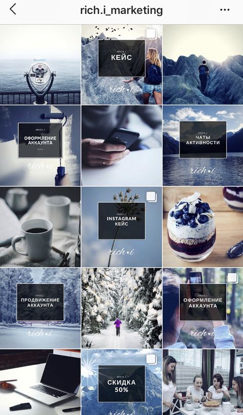 To plan posts far in advance and visualize how they reinforce your theme, you'll want to use a visual Instagram planner like Later or Planoly. Best of all, you can use these apps to preview your feed and ensure your theme is looking the way you want it to look before you press "Publish" on any of your posts.
In middle school, I often liked to change my "look" — one day I aimed for preppy, and the next I chose a more athletic look. Of course, as I got older, I began to understand what style I could stick with for the long haul and started shopping for clothes that fit my authentic style so I wasn't constantly purchasing new clothes and getting sick of them a few weeks later.
Similarly, you don't want to choose an Instagram theme you can't live with for a long time. Your Instagram theme should be an accurate reflection of your brand, and if it isn't, it probably won't last. Just because rainbow colors sound interesting at the get-go doesn't mean it's a good fit for your company's social media aesthetic as a whole.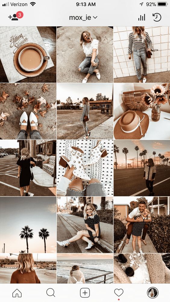
When in doubt, choose a more simple theme that provides you the opportunity to get creative and experiment without straying too far off-theme.
When you start an Instagram theme, there are so many options to choose from. Filters, colors, styles, angles — the choices are endless. But it’s important to keep in mind that these things won’t make your theme stand out. The content is still the star of the show. If the images aren’t balanced on the feed, your theme will look like a photo dump that happens to have the same filter on it.
To curate the perfect Instagram theme, choose what photos you plan to post before choosing a theme. I highly recommend laying these photos out in a nine-square grid as well so you can see how the photos blend together.
Sure, no one is going to see the captions of your Instagram photos when they’re looking at your theme in the grid-view, but they will see them when you post each photo individually.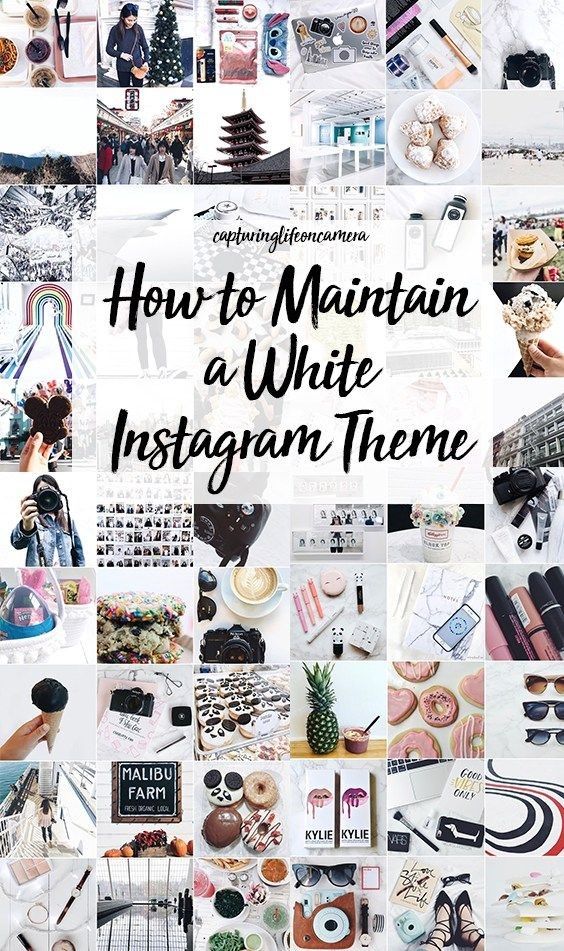 There will be times when an image you post may be of something abstract, like the corner of a building, an empty suitcase, or a pair of sunglasses. On their own, these things might not be so interesting, but a thoughtful caption that ties the image to your overall theme can help keep your followers engaged when they might otherwise check out and keep scrolling past your profile.
If you’re having a bit of writer’s block, check out these 201 Instagram captions for every type of post.
Earlier, we talked about choosing a theme that you can commit to for the long haul. But there’s an exception to that rule — color transitions. Some of the best themes aren’t based on a specific color at all. Rather than using the same color palette throughout the Instagram feed, you can have colors blend into one another with each photo. This way, you can include a larger variety of photos without limiting yourself to specific hues.
Instagram marketing is more than numbers.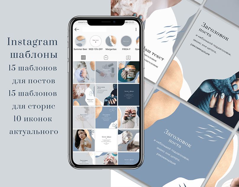 As the most visual social media platform today, what you post and how it looks directly affects engagement, followers, and how your brand shows up online. A cohesive Instagram theme can help your brand convey a value proposition, promote a product, or execute a campaign. Colors and filters make beautiful themes, but there are several additional ways to stop your followers mid-scroll with a fun, unified aesthetic.
Editor's note: This post was originally published in August 2018 and has been updated for comprehensiveness.
Topics: Instagram Marketing
Imagine if you could make the time you spend on Instagram profitable. Instead of spending hours every day pointlessly scrolling, you could make money out of your account. It sounds tempting, I know.
You have probably heard of influencers, these people with thousands of followers that are living the dream, getting free stuff from brands, eating out in the best restaurants in exchange for an Instagram story, traveling all around the world…
Lots of gurus online will tell you that it’s easy and that you can also do it.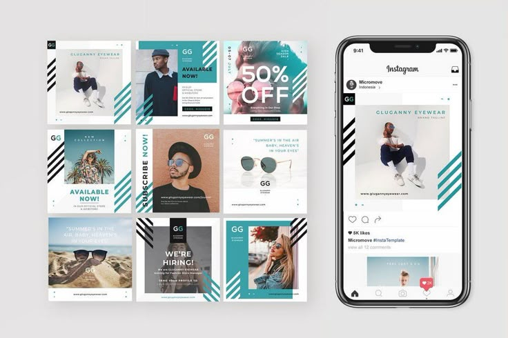 The truth is, getting to this level of fame on Instagram is a proper full-time job, and most people are not ready to make the sacrifices to get to this lifestyle. Trust me, I’ve worked with influencers before, and it’s a lot more stressful and dreading job than they let it seem.
However, what if you could make some money out of Instagram without having to put in all this work, time, and dedication?
Of course, we’re not talking here about the same level of income, but with a little bit of work, you could build a real empire through this strategy.
That’s how I started in social media. Through this strategy and business model, I got into this field, and it was the best and quickest way to learn all about the platform. So why buy a course to learn Instagram when you could make money mastering it?
So what exactly is this strategy? Instagram theme pages.
Niche pages, or theme pages, are trendy on Instagram. They post consistently, have very high engagement, and usually have thousands and sometimes hundreds of thousands of followers. You might be following a few niche pages without realizing it.
Theme pages don’t create their content. They curate popular content in a specific niche on their account while giving credit to the original creator. These accounts are an extensive collection of popular content on a particular niche. Because these accounts are reposting viral content, their posts usually drive considerable traffic and generate impressive numbers of likes or video views.
The high engagement helps with having the niche accounts featured on the explore page often, which increases the engagement even more, driving thousands of people a day on such profiles.
Because they have lots of followers and excellent engagement, these accounts are often targeted by brands or by people trying to grow their accounts in a particular niche. These people would pay a fee to be featured on a niche page.
Here is a practical example: you have a print-on-demand business where you sell T-Shirts with dog designs on it. You could build your own Instagram account, but it would take you around a year to have a big-enough audience to start selling your products through your account. So instead, you identify a few Instagram accounts in the dog niche, you DM them, pay them a little commission, then they post on their account, advertising your product with a link to your e-commerce site in their bio. Most niche account would leave the promotional post for 24 hours before taking it down. The goal is to make more profit in these 24 hours than the amount you spent on the promotion. As the Instagram niche page owner, this is pure profit. All you have to do is collect the money and publish the post prepared by the person asking for the promotion. After 24 hours, you delete or archive the post, and your feed looks beautiful again.
To sum up a niche page’s business model: niche pages sell their high engagement and high followings to brands or to other accounts that want to grow in a specific niche.
The job of the owner of a niche page is to grow their audience and maintain high engagement numbers. The more subtle part of the job is to keep a balance between regular posts and paid posts to make sure people don’t disengage or consider the account as a spammy promotional account.
Once the theme account gets big enough or hits a plateau, the owner will usually sell it and buy another page. The buying and reselling aspect of the business usually allows theme page owners to scale their Instagram business. Once you own a few pages in different niches, the micro-income can add up to quite significant amounts of money.
It’s a popular business model as it doesn’t require any investment to get started. It doesn’t require any content creation knowledge. It can get quite profitable if the account gets big enough.
The first step is to find the right niche. You need to pick a niche that has a high-growth potential. But it would help if you also targeted a specific sub-niche to make sure that it’s not as saturated. That means you need to pick a niche that’s mainstream enough and then go for a more specific niche in that mainstream niche. For example, Photography could be your mainstream niche, and Film Photography or US Cityscapes could be your sub-niche.
As a general rule, try to stay away from the niches that are too specific or seem to have no competition. If you go too narrow, it will be hard to grow your account. If you pick a niche that appears to have no competition, it might mean the niche is too small, or there’s no interest in that topic on Instagram.
Once you chose your niche, you need to come up with a name. Don’t overthink it, try to make it readable, and try to make it visible what your niche is. Let’s take the film photography niche; for example, thefilmphotographyproject, capturedonfilm, filmshots, filmphotosonly could all be decent Instagram handles.
Regarding the bio, the same rules as a regular account apply. You want to make sure you explain what you will post, for whom, and you might specify that you take requests via DM. This will let people know that they can advertise on your account.
Now that you have your account set up, you need to find the best content to repost.
You can use whatever tool you have to find content in your niche. The most obvious one would be to browse through the popular hashtags relevant to your niche. From there, identify content that has performed well, save the content (lots of websites and third-party apps exist to do that), and repost it on your account without forgetting to mention the original creator of the photo or video.
It can be tempting to repost the content that performed the best, but keep in mind that a lot of other niche accounts are doing the same thing as you, so you may want to stay away from the content that has been shared over and over again for years. Try to find more recent content or that haven’t been shared a lot by other accounts.
Regarding your hashtag strategy, use all 30 available. You want to rank on as many hashtags as you can.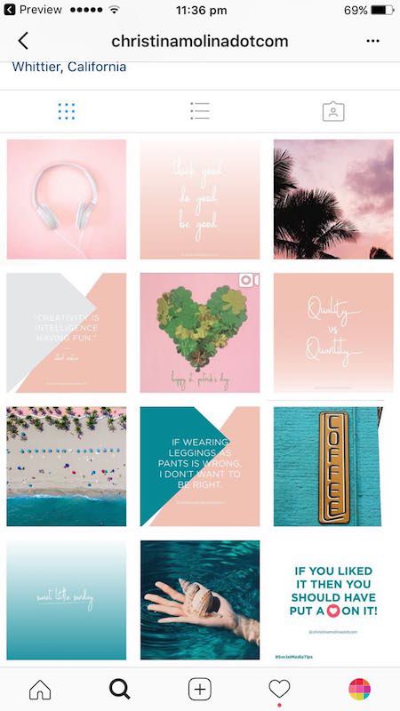 On each of them, you want to make sure you can appear on the top posts. The best way to do that is to estimate the average engagement of your posts. Then, while browsing hashtags, take a look at the engagement of the top posts. If it is similar to the engagement you usually get, that’s a hashtag you can use.
Now that you know your niche and how to find viral content, you need a strategy to grow your account quickly.
Fortunately, you will be using content that is already proven to be viral and engaging, so that’s an aspect you don’t have to worry about. But imagining the content will be enough to get you tens of thousands of followers in just a few days is wrong.
You will have to drive traffic to your page. The best way is to engage with people interested in your niche. Lots of niche page owners are relying on bots to follow and unfollow accounts automatically. While I don’t recommend using bots to automate your Instagram account, it’s a lot let risky to use them on a niche page as your brand is not associated with the account.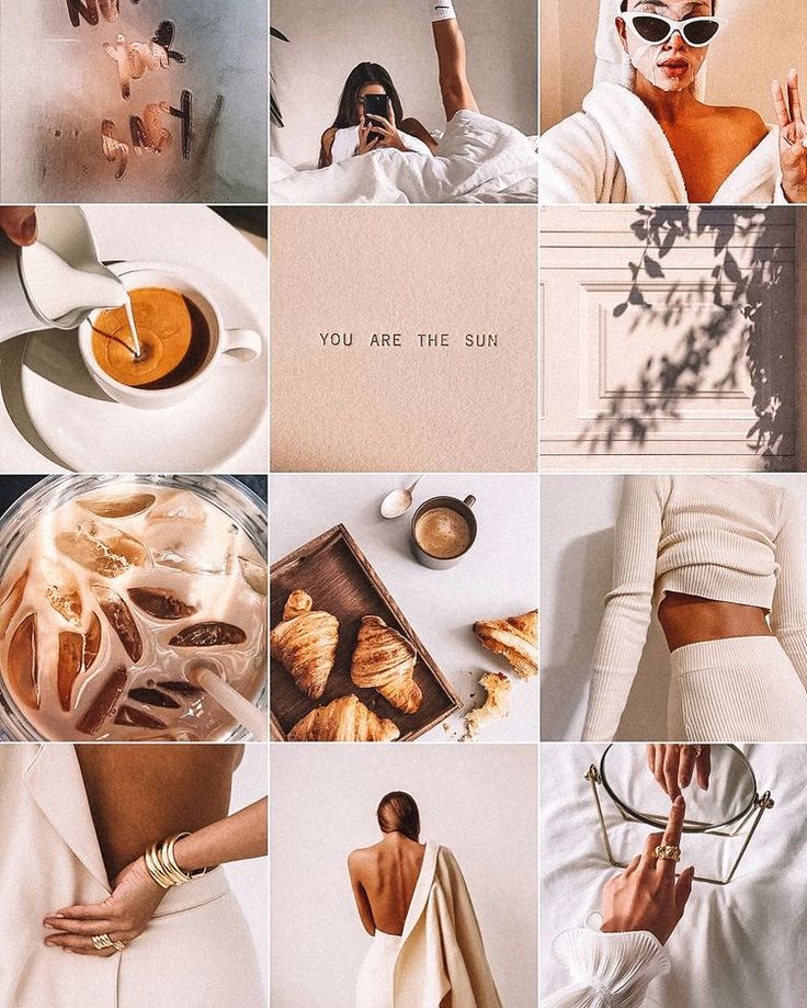 Since you’re reposting content, you won’t be losing any of your hard work if your account gets suspended or deleted.
If you don’t like the idea of using a bot to automate your account, you can do it by hand. Please take a few minutes a day to follow a few accounts, like their posts, comments on some of their content. The more you behave like an actual account, the better it will be.
Engaging with others is the best way to get started and grow your account to a few thousand followers. But once your account gets big enough and generates good enough engagement, you may want to switch to a different growth strategy such as optimizing your hashtags, doing partnerships with other niche accounts, and so on.
Some people recommend using ads to boost your niche page. While I’m sure that works, it’s not mandatory, and you can grow your accounts to tens of thousands of followers without spending a dollar in ads.
Theme pages can make from a few hundred to a couple thousands of dollars per month. It all depends on the niche and the size of your account. While they require some time to maintain and time to grow, they’re usually relatively straightforward to manage as you don’t have to spend much time on content creation, which is the more time-consuming part of every Instagram strategy.
Visual Instagram plays a big role in promoting your account, increasing engagement and audience loyalty. It's not just about beautiful pictures: all parts of the visual concept should be in harmony with each other and convey the meaning inherent in them. We analyze how to create a high-quality visual and avoid mistakes.
Visual is a general view of an Instagram account: colors, images, their combinations and layout, presentation and style. This is the “clothes” by which they meet, that is, they evaluate your profile, and which works for the brand image.
The main components of the visual:
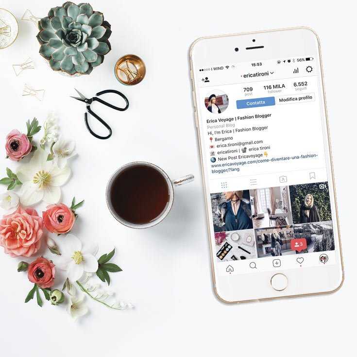
All this is determined by the direction and purpose of the blog, the specifics of the target audience, as well as the taste and capabilities of those involved in the design. For example, it is logical to use bright rich colors for a travel blog or an outdoor store, while for a psychotherapist profile it is better to choose restrained tones. nine0004
There are visually appealing profiles whose owners do not seem to adhere to a particular style. This usually applies to personal pages. Promoted bloggers can run accounts more freely - they have a large audience and recognizable features. If you are just gaining followers, it is better not to deviate from the chosen style.
The appearance of an account is the first thing that visitors pay attention to. Indistinct design, fuzzy images do not inspire confidence. If the owner is not very confused about the page, which is his face, what to expect from the product? It is clear that there is no direct connection here - a dummy can be hidden behind a beautiful profile, and vice versa.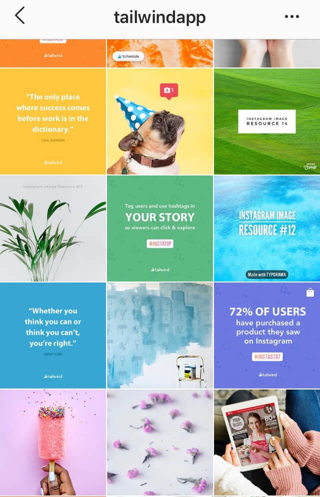 But the attitude towards you depends on the first impression. nine0004
If a user found your account in a search or clicked on a link from an advertisement, he evaluates it visually within a couple of seconds. Poor design repels, and people leave the page. Of course, a visitor can give you a chance by opening a post and discovering interesting and useful content. But with an attractive picture and a harmonious ribbon, it is more likely that he will stay and sign or even place an order.
If you have original photos and videos, users will share publications, and more people will know about your account. Seeing a post in the recommended one, a person pays attention to the picture. If the image is fuzzy, taken from stocks, or creates such a feeling, no one will read the text, much less go to the profile. nine0004
Unusual catchy photos and videos have a chance to go viral, which will increase the reach and popularity of the blog.
When your account is really cool, you don't need to ask your followers to be active.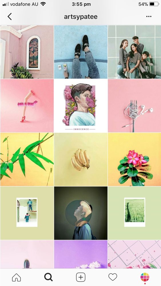 They themselves will write what a good photo, beautiful dress or stunning view. Often, users first like the photo and only then read the text - after all, Instagram is primarily about the visual. Even if you sell equipment or building materials, pay attention to this aspect. nine0004
If you have developed your own unique style, have distinctive signs that the audience can read, your content becomes recognizable. This makes it easier to keep your attention. People who are interested in you will not scroll through the post, but will stop to look at the images and read the text. Regular “fans” will also share your posts and stories, and this also contributes to the growth of recognition.
Sometimes a business does not have a specific mission, but if you are building a brand, you need to convey key messages to the audience. This is done through the visual. Those who see something of their own in your stories respond and stay with you.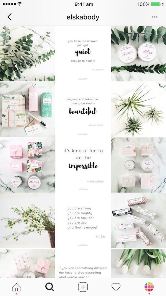 For example, accounts where the main theme is the happiness of motherhood or self-development attract different audiences, and their content is required to influence it. nine0004
It takes a lot of work to create a good Instagram profile.
An experienced SMM manager will cope with the task. If you don’t have it, but you have free time, and you are confident in your sense of style, you can try to prepare a visual yourself. If the budget allows, it is better to hire specialists. Usually they are searched for through groups in social networks, Telegram channels or freelance exchanges, sometimes on job search sites. nine0004
The visual assistant helps you develop or improve your blog concept and design your profile accordingly. If you provide ready-made photographic materials or agree to use stock ones, the cost will be lower. If you plan to work from scratch on a turnkey basis, it turns out to be noticeably more expensive.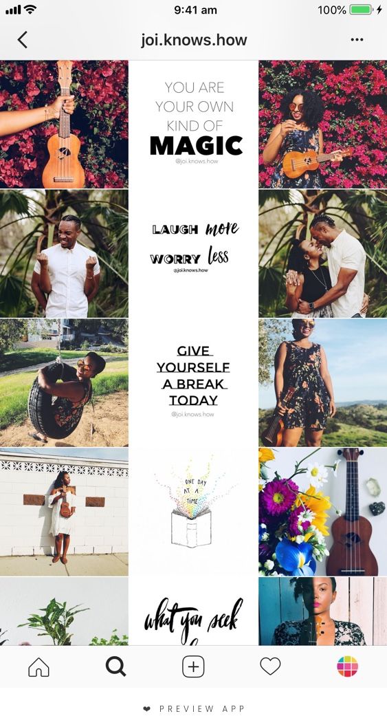
The salary of a photographer varies greatly depending on the city, qualifications and promotion. For the premium segment, saving on photo and video materials is undesirable. If you sell economy-class clothes or cosmetics, when you need to post constantly and in large numbers, you can get by with mobile shooting and simple processing. If you want something unusual, look for interesting solutions from competitors or photographers' accounts. nine0004
The range of prices for renting premises and work of models is quite wide, you can find options for any budget or even refuse it altogether.
Choose the style you want to follow. Start from the impression you want to create: freedom or restraint, everyday life or a sense of celebration, a businesslike atmosphere or lamplight. You can simply focus on the brand book of the company: if it is large and well-known, and there is a ready-made solution, then this is only for the benefit of recognition.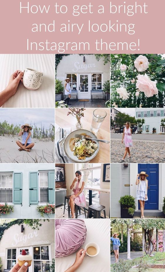 nine0004
Stick to the same treatment. It can be warm and bright, for example, for a travel blogger, or in soft colors, like for a children's clothing store.
A beautiful visual on Instagram about travelCool, muted processing is appropriate in personal blogs or stores, if you make accents on suitable shades. For example, in an interior design account, white and gray are successfully diluted with shades from the wood color palette.
Instagram Feed Harmonious VisualChoose up to five shades to help bring your concept to life, use them in your frame and design. If the account is about sophistication and style, for example, expensive watches, cold work with a predominance of white and black with accents on blue and metal color will do. nine0004
White and black fit well into the field of technology, you can dilute them with green and blue shades. For a bedding store or goods for girls, pastel colors are suitable: beige, light peach, soft pink or mint.
These are examples rather than direct instructions. Of course, no one forbids experimenting. Moreover, if you move away from the generally accepted, you can stand out favorably. But do not forget that colors should convey the values and emotions that your brand conveys. nine0003
Convert subscribers into regular customers, automate communication with them and improve sales.
Different approaches to content creation and layout are used to create a harmonious overall picture. Let's consider the most interesting ones.
Layout according to strict rules like "eternal tape" or "checkerboard" is becoming less and less common. Naturalness has replaced it: the profile looks like the owner does not really think about the general appearance of the tape, but it turns out harmoniously. In fact, a lot of work is often hidden behind external lightness. nine0004 Instagram feed natural visual
One option is to place three posts in a row that are united by one story or some kind of element.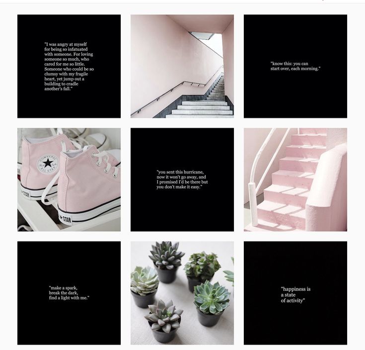 In the example below, each line is reserved for a separate outfit.
You can make a vertical layout where each column has its own type of content, for example, entertaining, useful and selling. Sometimes they are divided by format: posts with photos, videos and text. This allows you to structure information in the most convenient way for users, especially in educational projects. Less common are examples of accounts in which the columns differ in the predominant color. nine0004
Lay out posts in such a way that the diagonal stands out with color, the presence of a plot or some element. For example, place portraits diagonally, and the rest of the images will be figures of people or objects.
Add frames to make dissimilar images look harmonious. Use templates to create a consistent style. You can apply these elements for each post or use them selectively, as in the example below.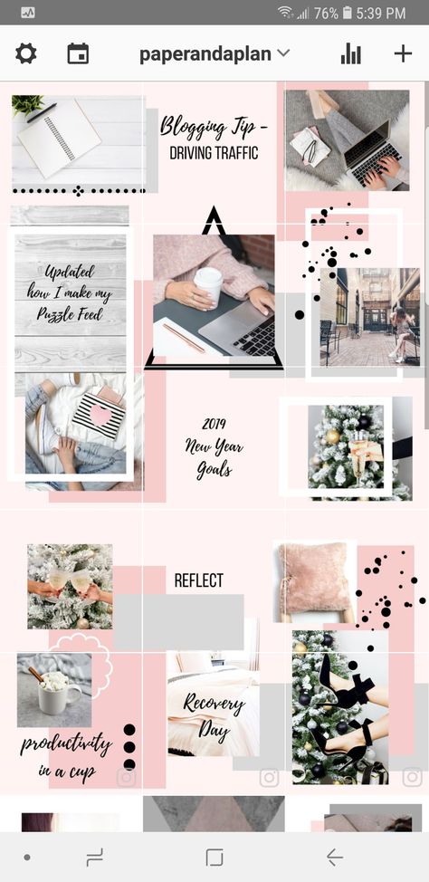 nine0004 Beautiful visual on Instagram using frames
Feed layout can be tiled when all images are combined into one. Now this technique is used less often, and a few years ago it was one of the most popular. It can be used in some cases, for example, on the information product page, when you need to provide basic information about the program. Usually this is an additional page of the course author, and visitors come from him already warmed up and with confidence in the product. New information in such accounts is submitted to stories, so an “endless” feed is suitable for the design of basic data, although it will most likely not be very long. nine0004
Dark colors became a trend in 2020 and remain popular to this day. Mysteriousness, calmness, confidence, luxury, aesthetics - you can achieve different effects depending on the chosen visual solutions and attract the attention of the audience you are targeting.
Animations attract attention and look stylish, you can stick to them for a long time.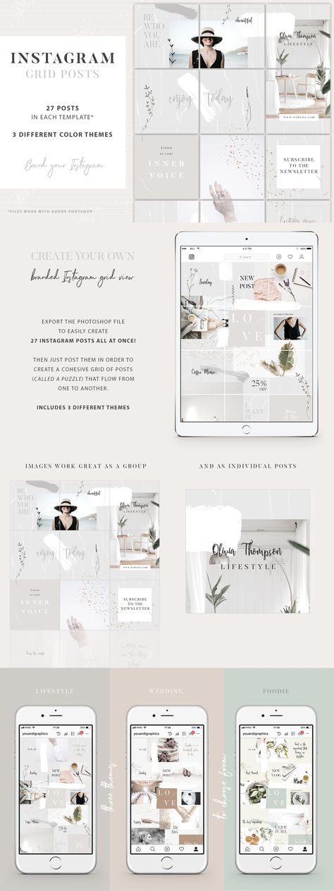 Show your product or work process, animate the background or a single element - there are many options. nine0004 Animated Instagram visual
Experiment with angles so your followers don't get bored. Shoot close-ups, alternate with distant ones. Apply the rule of thirds: the image is mentally divided into nine equal parts by two horizontal and vertical lines, and objects are located along them or at the intersection. Line up objects or unusual shapes, add elements of dynamics: splashing water, swaying fabric, flowing hair, and the like. nine0004 Instagram visual: different angles and plans
To increase recognition, add a brand element that will appear in every post or periodically come across throughout the feed. It can be a character, an animal, something. Inanimate objects can also become characters - it's up to your imagination.
Some accounts consist entirely of illustrations, in others they are diluted with ordinary photographs. nine0004
Illustrations allow you to express emotion, draw attention, embody an idea that cannot be conveyed through photographs.
Artist's Instagram VisualCreate original content by joining photos into a collage. Add elements: stickers, emojis, gifs. The result should fit into the visual concept of the brand. An example from the Evening Urgant account:
Instagram visual with a collage effectThis is a convenient way to divide information into parts for better perception. Show the most important things in pictures or videos, and details can be added in the text. nine0004 Instagram carousel visual
People like video content because they can get more information from it in a short time. And with the help of video it is easier to influence the audience emotionally.
Instagram visual: add interesting videos All these options can be combined with each other and create a unique visual concept that will make you stand out in a niche.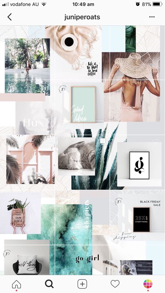 For more ideas, check out Instagram Trends 2021 to Make Your Account More Engaging for Followers. nine0004
The first error is the lack of a unified style. You can try different layouts and image processing, but in any case, the tape should look harmonious. So you can convey those thoughts and feelings that need to be conveyed to the user. When everything is jumbled together, confusion makes it difficult to perceive your meanings.
Sometimes the visual concept does not match the theme of the account or is not suitable for the target audience. Too bright colors should not be used where tenderness is the key element. If you want to create a feeling of confidence and power, subdued processing is unlikely to be appropriate. A store designed for people with an average income should not look like a luxury boutique, and so on. nine0004
Stories and design for the actual should be combined with the feed. Sometimes they are not given due attention, but they are important elements of the visual that should not be forgotten. We have an article about the features and features of Instagram Stories, as well as a selection of ideas for them.
Monotonous tape and lack of originality hinder your progress. Try unusual angles, creative design, alternate formats so that users are interested in you. Get inspired on Pinterest, look for references on other accounts, as well as on Behance, Dribbble and similar sites. nine0004
Another mistake - low-quality photos and videos, clumsy illustrations. In rare cases, this can become a kind of feature, but is usually perceived negatively by the audience. Give the visual the attention it deserves.
In order to develop taste, it is necessary to increase observation. Let's analyze examples of visual design of profiles. Let's start with the good ones.
Los Angeles-based photographer hungryhipsters has a twist: from time to time she completely changes the mood and style of the tape. It is always something "girlish", but in different colors and emotions. Now her feed is filled with photos in the retro style of the 70s: muted shades of yellow, brown and orange, clothes and accessories in the style of that period. nine0004 A beautiful visual on Instagram of a creative photographer
The girl calls her page colorful moodboard: the mood of summer in retro style is perfectly conveyed. Covers of the actual also fit into the overall concept.
In the following example, accounts for women's clothing stores. In all cases, processing was performed in muted shades. The first store specializes in casual style, and the colors are appropriate. The feed contains everyday scenes, diluted with images of individual wardrobe details and useful posts. A good visual that conveys the main idea: beautiful and comfortable clothes every day. nine0004
Macrocosm conveys ideas of comfort and joy from life, and this is felt in every photo and video. Delicate shades are selected, and the whole profile creates the mood of a warm summer evening without worries.
The third store is about naturalness and aesthetics with an emphasis on femininity. This is conveyed through the visual. The girls in the pictures look natural, there is a lot of nature in the feed and a retro vibe is felt.
Instagram feed visual in clothing storesSkyeng online school account is well-designed. The school positions itself as a place where they follow trends and teach only up-to-date English. The emphasis on modernity is emphasized by bright colors, emoji, stickers. A distinctive feature is the presence of text on each image so that subscribers immediately understand the topic of the post. nine0004 An Instagram visual that grabs attention
Let's move on to worse examples.
The Golden Apple store sells expensive branded cosmetics and perfumes. But when looking at the page, the impression of premium goods is not created. There is no unifying element or single processing, something original. If you take posts from different accounts and mix, it will look something like this.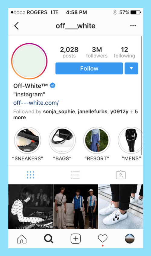
Tinkoff Bank has a rather interesting idea: one row - one story, and the photos themselves are atypical for such an account. But the embodiment is not the best: the rows seem to be unrelated, and at first glance it is not clear what's what. Perhaps, through this design, the idea is transmitted that this bank is different from others, but the visual impression is a bit sad. nine0004 Ambiguous Instagram feed visual
The third example is a bookstore. Many accounts that sell the same type of products look similar: furniture, bags, phones, other equipment and accessories. This is the case when there are a lot of goods, and it is unprofitable to arrange a cool photo session for each receipt. But you can stylishly arrange a small space for filming or change the location within the room, choose different angles, do light processing.
The design in the example looks like a shop window. It may be convenient, but not attractive. People are reluctant to subscribe to such accounts, they are difficult to promote.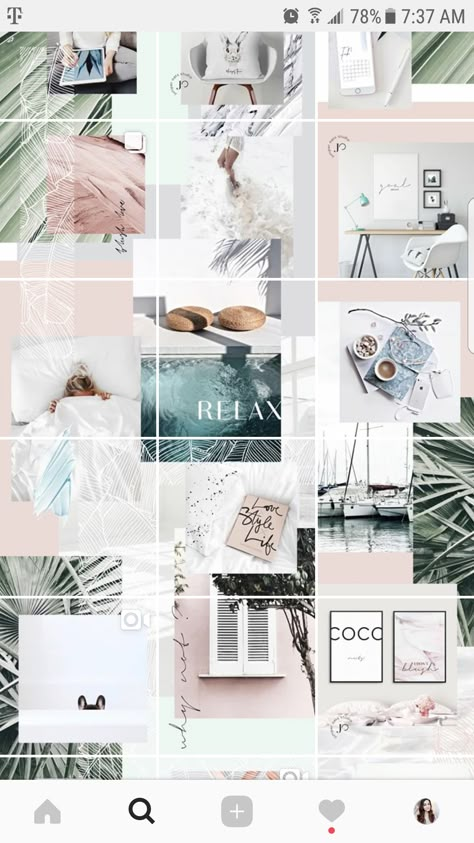 A little creativity will fix this situation. nine0004 Unfinished Instagram visual
On Instagram, how your account looks is very important. You need to try to hook the user at first sight.
A good visual will help you attract new subscribers and get more orders. To successfully complete business tasks, register with SendPulse. In the service, you can create chat bots for instant messengers and social networks, including Instagram; collect mobile landings and multilinks; launch mailings for email, SMS and Viber. Use our CRM system and browser push notifications for efficient work. nine0004
Instagram has evolved from a social network where people share news and photos of food to a blogging platform. The audience is used to quality content, and the competition is high: you compete with users from all over the world, because photos do not care about language or geographic location, and professional models, photographers, makeup artists and artists also actively use the social network.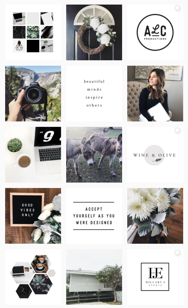 Of course, many do not know how to manage Instagram so that it develops and generates income. nine0004
But everyone has a chance to find their audience. Both schoolgirls from small towns and big brands with interesting content are becoming popular on Instagram. We figure out how to come up with a concept, take photos, write posts and maintain an Instagram account so as not to sink to the bottom of the algorithmic feed, but to find subscribers.
Instagram is not just your page on a social network. Of course, no one will forbid sharing news with friends, we are talking about blogging on Instagram for a person or business, which will be of interest not only to your loved ones, but also to strangers. nine0004
Look at the pages of stars: they rarely combine photos with each other and generally bother with content, but fans are interested in any news from the life of idols. If you do not have a couple of million fans, you will not be forgiven for low-quality and uninteresting photos.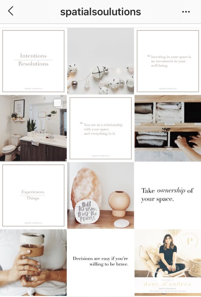
Start with an idea. Even if it’s hard to decide, and “taking pictures of everything that surrounds me” seems like the best way out, focus on a specific topic. Culinary blogs, profiles about proper nutrition, about dancing, about clothes, make-up - yes, Instagram already has it all. But you will do it your way. And people don't collect a list of subscriptions based on the principle "I already subscribed to a food blog, so I don't need another one." nine0004
Of course, if your idea is interesting and relatively new, it will be easier to move forward. But if you don't find one, don't give up. Maintaining Instagram is constant experimentation and finding a balance in content and interaction with the audience.
How to be in business? You need a concept too. Remember the character of the brand, decide on the tone of voice. Create value for subscribers: talk about topics related to your product. Consider that SMM from 2010, when beauty salons could post "10 hairstyle ideas" and get thousands of likes, is in the past.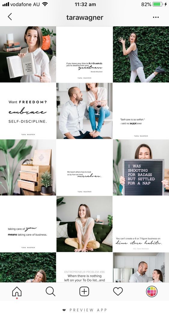 People won't subscribe to something they can google. Create authoring content: create a branded character or choose your storytelling style and list of topics you can cover. nine0004
At first glance, your account should be clear what it is about. Briefly formulate the topic of the blog in the bio and tell us about yourself. Typically, users enter their first name, age, and city.
How to get a business account to start Instagram?
The company account must contain contacts, information about the work of offline points and detailed conditions for ordering or recording. If you are unable to fit all the necessary information in your bio, you can use the multilink service. nine0004
Use emoji to highlight different information blocks in your bio. It is not necessary to choose bright and intrusive ones: dots, arrows, squares will look neat, but everyone will visually separate the text (name and topic of the blog) in meaning.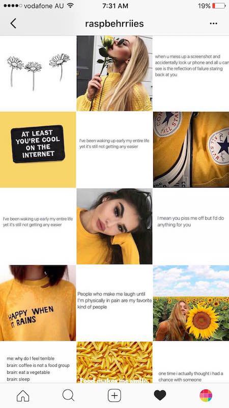
There is an unspoken rule: profile photos must match. Open the pages of bloggers again: you will surely notice that the pictures standing next to each other were taken in the same tone or overlapped with each other in vivid detail. nine0004
A Facebook study showed that users spend 0.2 seconds per post on the mobile feed. Therefore, your posts should be visually cool and catchy at first sight. Let's figure out how to manage Instagram to be qualitatively different from others.
Photos must be of high quality, interesting and well processed. Instagram has its own trends - just try to bring photos processed in the Retrica app to your audience.
Follow Audience Members to find the visual style for your profile. See what content they post, what profiles they follow. nine0004
It is not necessary to use professional equipment, but you will definitely have to learn how to photograph and process images.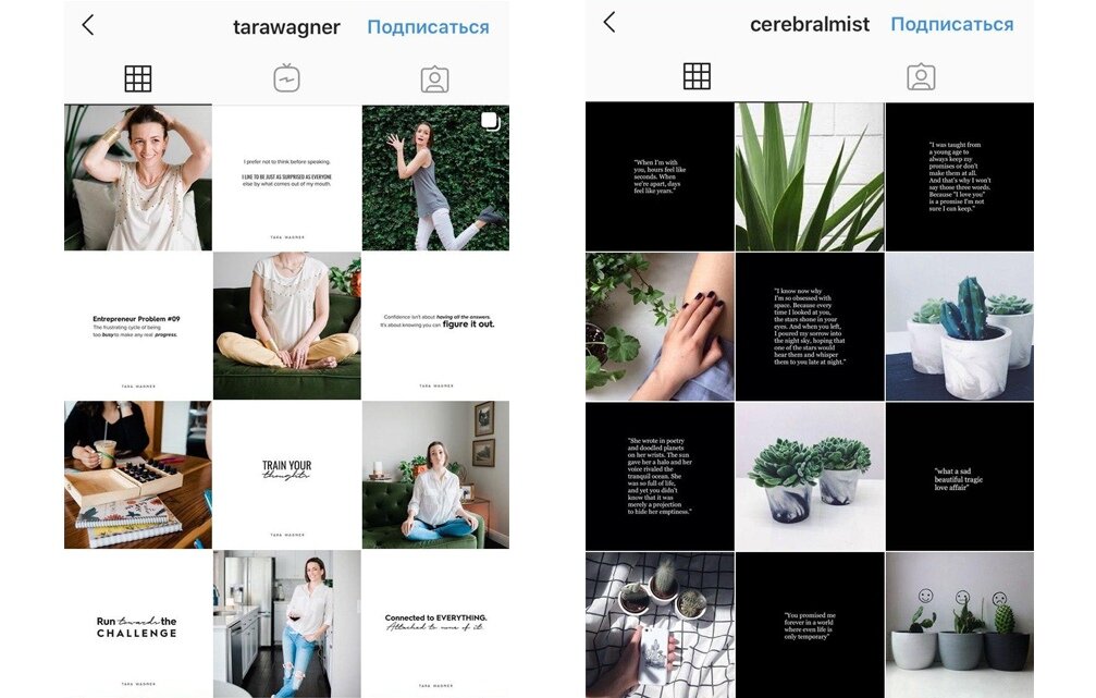 See the photos you like, save them, don't be afraid to repeat, you're unlikely to be seen through, but you'll get your hands on it.
Layouts - a separate big topic. Think this is a joke? Try to create something similar yourself. You will find that you don't have many items that match. And those that exist cannot be organically placed in the frame. nine0004
To make high-quality layouts, bloggers buy accessories (candles, sparkles, postcards, fruits, garlands, frames, flowers) and spend a lot of time on them.
In 2017, a new trend appeared on the social network: users are interested not only in photos, but also in texts. Thematic blogs have appeared that talk about proper nutrition, makeup, motivation, parenting, or just about your life. And judging by the number of subscribers on such accounts and interactions under publications, users are ready to consume not only visual content in contact, but also read texts, even long ones.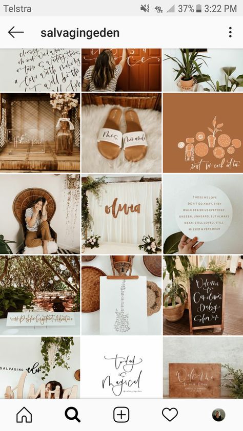 nine0004
Therefore, the desire to create and maintain an Instagram blog may be a good idea. But first, how to lead it? As with the concept of an account, a blog also needs one. Define a list of topics you write about, designate them in the profile header.
Follow the pages of users whose content you like. Pay attention to how often they publish posts, at what time they do it. How the audience is asked questions in posts, and what topics the audience is discussing more actively.
nine0002 Instagram post contains up to 2200 characters. If your text does not fit in this size, move the part to the first comment, this is a common practice among bloggers. The problem will arise if there are too many discussions: then users will have to get to the first comment in the topic for a long time. Therefore, it is better to shorten the texts or split the story into several posts, publishing them under one hashtag. Anyone can broadcast on Instagram.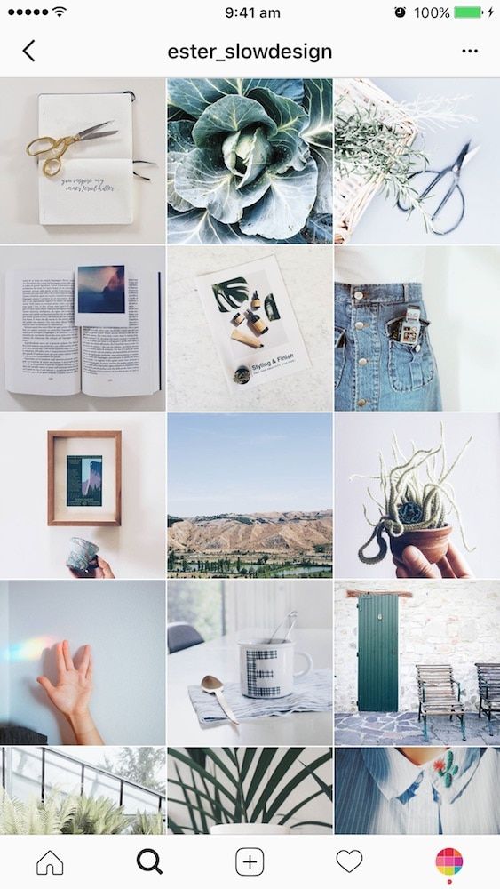 After the end, it will be available, like stories, 24 hours. nine0004
To start the broadcast, go to the news feed, click on your profile picture (just like when creating Stories). Select the option "Live" in the horizontal menu below. Now by clicking "Start" you will be able to broadcast live on Instagram.
Warn your subscribers about the broadcast in advance: make an announcement in a post or story. Pick a time when your audience is online. To do this, analyze the social network account in Popsters. On the chart "Activity / Days of the week" and "Activity / Time of day" you will find the most successful days and times for live broadcasts. nine0004
Wait for a larger audience, don't jump straight into the main topic of the broadcast. But at the same time, you can’t lose the audience who have already arrived: figure out in advance what will take the waiting time. Tell stories about the topic of the broadcast or arrange an interactive one: answer subscribers' questions or, conversely, ask them about something.