Updated: 28 May 2021
How’d you like to know ALL the best Instagram feed tips out there?
With 1 billion active users (that’s per day!), Instagram continues to be the leading visual platform and a reliable source of new friends, followers and exposure.
So you really need to put in some extra effort to stand out.
No pressure, right?
*Eye twitches.*
You probably already know that having a cohesive feed is half the battle on the road to turning you into an Instagram content master.
A few of you have been asking how I plan my feed, how I put together my content and even what filters I’m using on my photos
So I thought I’d share EVERYTHING here.
Below you’ll find the INs and OUTs of content planning.
Oh, and my top Instagram feed tips and apps that’ll help you stay on track.
Let’s get going!
Now that you’ve decided to make Instagram your no.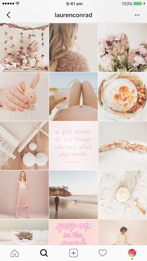 1 priority, there’s just one dilemma holding you back…
Which theme should you pick for your feed?
Well, it depends!
I know, I know.
But really.
Here are the questions you should ask yourself when picking a theme:
Answer all of these questions in a truthful and practical way before reading the Instagram feed tips below, or else all your hard work will be in vain!
For example, you may *really* be into tropical hues, but you may not have the surroundings or the props to shoot such photos on a regular basis.
Now that you’ve decided to make Instagram your no.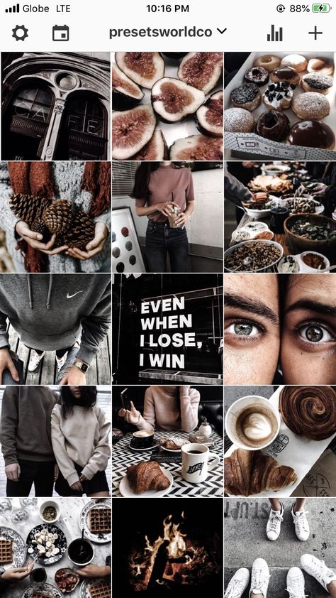 1 priority, there’s just one dilemma holding you back…
Which theme should you pick for your feed?
Well, it depends!
I know, I know.
But really.
Here are the questions you should ask yourself when picking a theme:
Answer all of these questions in a truthful and practical way before reading the Instagram feed tips below, or else all your hard work will be in vain!
For example, you may *really* be into tropical hues, but you may not have the surroundings or the props to shoot such photos on a regular basis.
The first step to a curated, themed feed is to get rid of all the photos that don’t feel *good* enough.
You know, the heavily filtered ones that you might still having around since ~2013.
Make full use of the Archive option.
(You’ll find it in the top right top of your profile page.)
You have a brand new account?
Congrats – you already have a clean slate to work on and you’re straight-off ready to implement other Instagram feed tips.
So let’s get down to business and nail your theme.
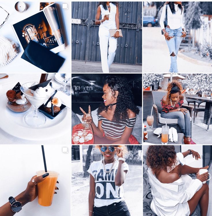
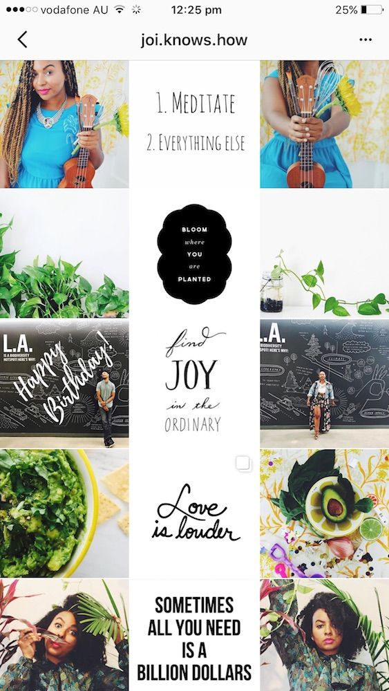
Before we fully dive into the best Instagram feed tips, we need some inspo.
That’s right:
Time to roll up our sleeves and get INSPIRED!
Here are a few Instagram aesthetic ideas from real accounts that are kicking ass:
Instagram Aesthetic IdeasBefore we fully dive into the best Instagram feed tips, we need some inspo.
That’s right:
Time to roll up our sleeves and get INSPIRED!
Here are a few Instagram aesthetic ideas from real accounts that are kicking ass:
@andicsinger
@emily_luciano
@kristinabazan
@sincerelyjules
@majawyh
@marianna_hewitt
@negin_mirsalehi
@tezza
Instagram Theme Apps That’ll Change Your LifeDo you use a secret, throwaway Instagram account to plan your feed and make sure your posts look good next to each another?
It’s time you deleted that sucker, because there’s a far better way to plan your Instagram feed.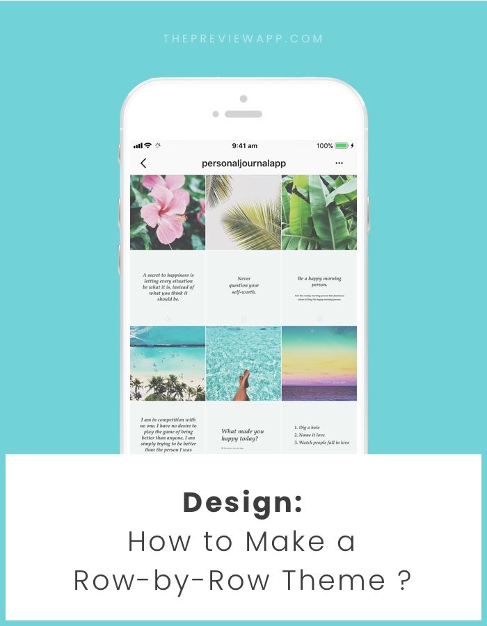
There are a handful of AMAZING Instagram feed planning apps out there and they’ll blow your mind!
Want to know the best part?
You’ll be able to plan your content well ahead of time, add captions and, when it’s time to post, do so with confidence and excitement.
Here are my TOP 3 FAVOURITE Instagram theme planning apps that’ll help you save time, energy and ensure you always have the perfect feed:
Instagram Theme App: PlanolyNot gonna lie, Planoly is legit my go-to app for Instagram feed planning.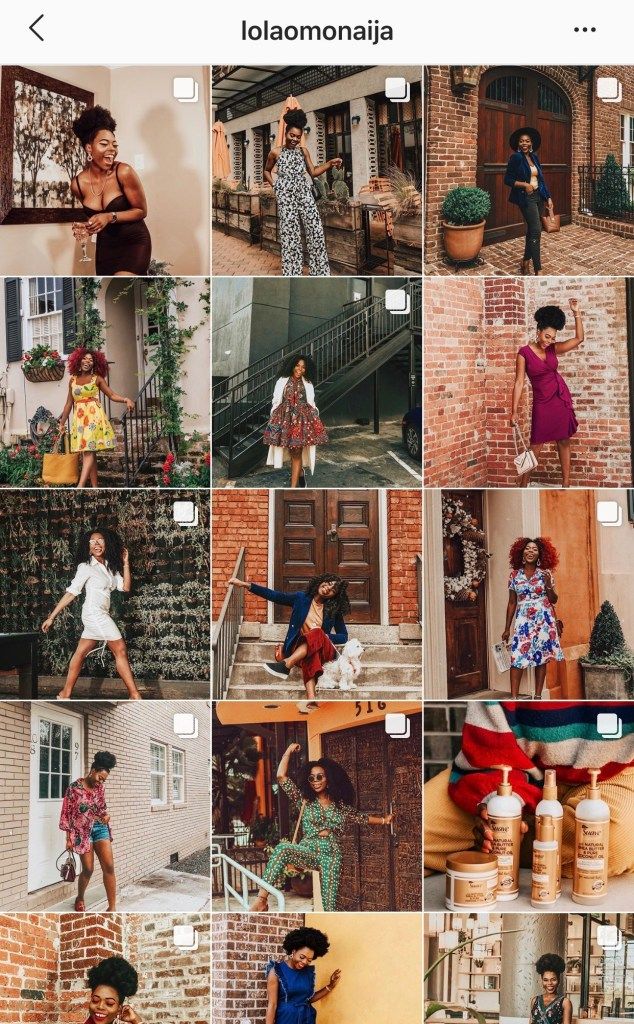
Its drag & drop feature makes it super-easy to swap out photos for one another and to tinker around until your feed looks perfect.
And there’s more:
When adding your captions, it will auto-populate hashtags and @username handles, saving you tones of time you would’ve spent searching and guessing.
Of course, you can schedule content days or even weeks in advance.
Pro Instagram Feed Tips With Planoly: Use its Stories feature to plan ahead for the stories portion of your Instagram. So. Good. Also, use the hashtag groups to streamline & organize your caption writing process.
And finally, it is available both from the web dashboard and from the phone app.
UNUM is the coolest kid in the bunch (of Instagram theme app planners).
Sleek, powerful and intuitive, UNUM lets you drag & drop your photo or swap them out for one another using the rearrange tool.
You can also add captions and hashtags, as well as schedule your posts.
Other than these, it also comes with a super helpful edit & filter tool that allows you to fine tune your pics to perfection.
Pro Instagram Feed Tips With UNUM: The Live Grid will make your grid interactive, the Phantom Mode can hide your posted Instagram photos to see what your feed would look like without them and the Draft Feature lets you plan an alternative feed to swap with your current one.
PS: Their app update notes are absolutely HILARIOUS. I’d be hard pressed to find another app that does these as cleverly and whimsically – you know it’s going to be a good day if UNUM has an update!
If you’re just getting started with planning & curating your Instagram feed and don’t want to jump straight away into a paid app or plan, your best bet would be Preview.
This app will let you plan your future content without even connecting your Instagram – you can, if you want to, of course!
Among Preview’s features are: drag & drop, unlimited grid space, a fantastic selection of filters, hashtag grouping and the ability to add captions and schedule future posts.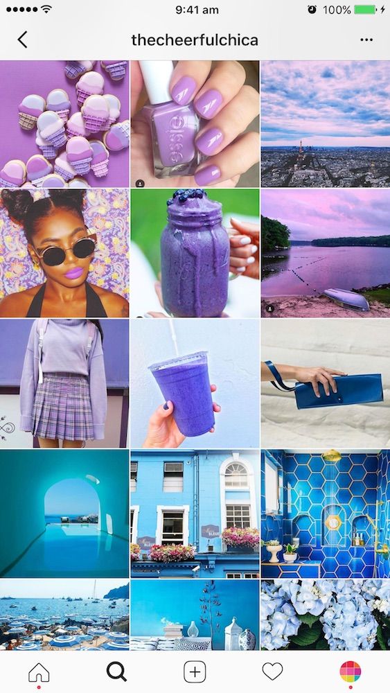
Pro Instagram Feed Tips With Preview:
You don’t even need Internet to use this app and you don’t need to log into your Instagram account to start planning.
Simply start adding in photos from your camera roll and watch your future feed take shape.
Boom!
Plann is a versatile app for your Instagram feed that has a lot of useful features.
You can of course, connect your Instagram profile and start adding content just like in other apps. It also has a Stories tap which you can use to plan & schedule your next Stories.
However, unlike other apps, it has a nifty little tab called Strategy, which helps you plan your content around themes! (Read more about themes, or content pillars as I call them, below.)
Also important: the Performance tab, which gives you granular stats & advanced analytics including your Instagram account’s color palette! Haven’t seen this in any other Instagram feed planning apps, so this is very impressive.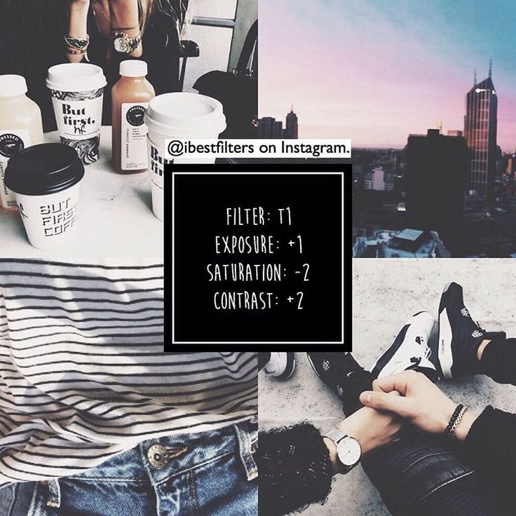
Pro Instagram Feed Tips With Plann: My top tip with Plann would be for you to go ahead and make full use of the Performance tab, it has lots of important info.
Plann also lets your add and edit your own hashtag groups, so you can copy & paste them as you go along planning your posts. Very useful!
Instagram Theme App: PlanolyNot gonna lie, this is legit my go-to app for Instagram feed planning.
Its drag & drop feature makes it super-easy to swap out photos for one another and to tinker around until your feed looks perfect.
And there’s more:
When adding your captions, it will auto-populate hashtags and @username handles, saving you tones of time you would’ve spent searching and guessing.
Of course, you can schedule content days or even weeks in advance.
Pro Instagram Feed Tips With Planoly: Use its Stories feature to plan ahead for the stories portion of your Instagram.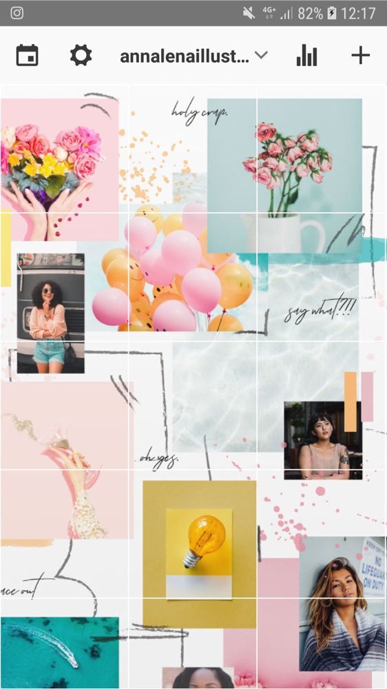 So. Good. Also, use the hashtag groups to streamline & organize your caption writing process.
And finally, it is available both from the web dashboard and from the phone app.
UNUM is the coolest kid in the bunch (of Instagram theme app planners).
Sleek, powerful and intuitive, UNUM lets you drag & drop your photo or swap them out for one another using the rearrange tool.
You can also add captions and hashtags, as well as schedule your posts.
Other than these, it also comes with a super helpful edit & filter tool that allows you to fine tune your pics to perfection.
Pro Instagram Feed Tips With UNUM: The Live Grid will make your grid interactive, the Phantom Mode can hide your posted Instagram photos to see what your feed would look like without them and the Draft Feature lets you plan an alternative feed to swap with your current one.
PS: Their app update notes are absolutely HILARIOUS.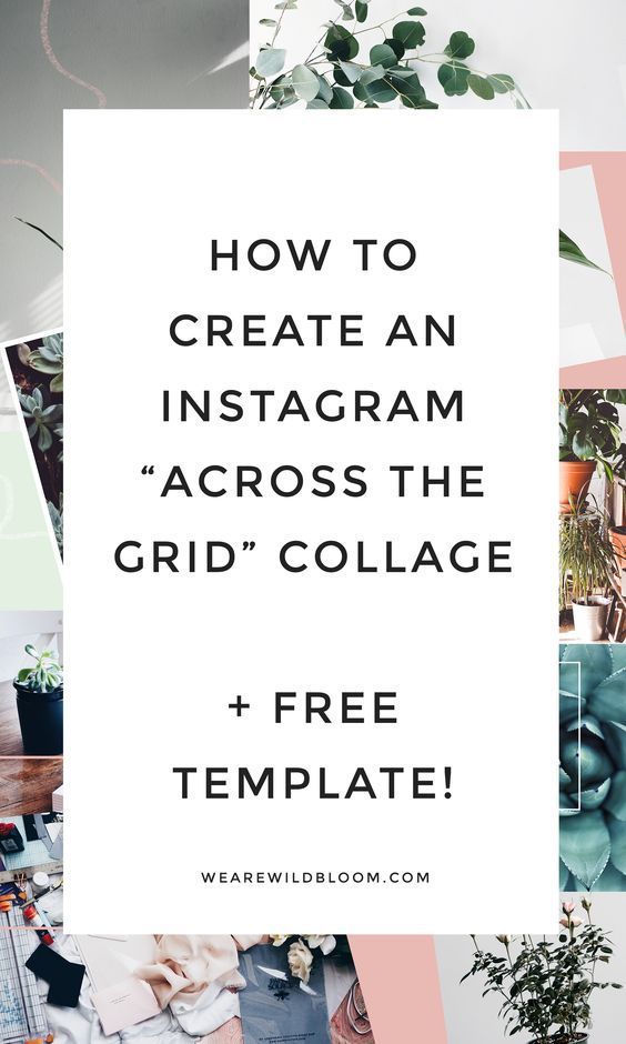 I’d be hard pressed to find another app that does these as cleverly and whimsically – you know it’s going to be a good day if UNUM has an update!
If you’re just getting started with planning & curating your Instagram feed and don’t want to jump straight away into a paid app or plan, your best bet would be Preview.
This app will let you plan your future content without even connecting your Instagram – you can, if you want to, of course!
Among Preview’s features are: drag & drop, unlimited grid space, a fantastic selection of filters, hashtag grouping and the ability to add captions and schedule future posts.
Pro Instagram Feed Tips With Preview:
You don’t even need Internet to use this app and you don’t need to log into your Instagram account to start planning.
Simply start adding in photos from your camera roll and watch your future feed take shape.
Boom!
Plann is a versatile app for your Instagram feed that has a lot of useful features.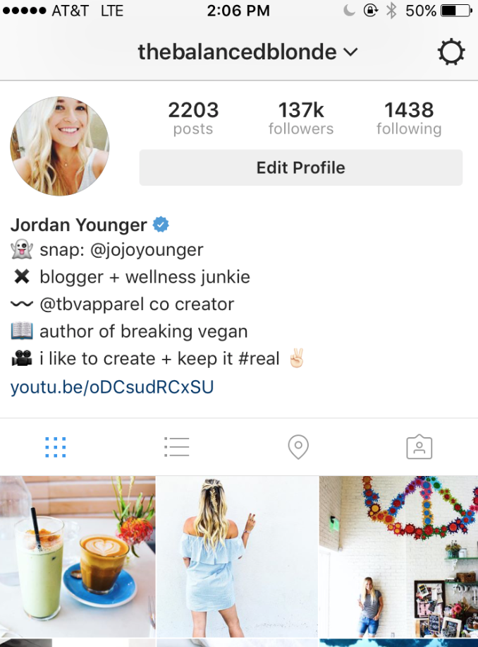
You can of course, connect your Instagram profile and start adding content just like in other apps. It also has a Stories tap which you can use to plan & schedule your next Stories.
However, unlike other apps, it has a nifty little tab called Strategy, which helps you plan your content around themes! (Read more about themes, or content pillars as I call them, below.)
Also important: the Performance tab, which gives you granular stats & advanced analytics including your Instagram account’s color palette! Haven’t seen this in any other Instagram feed planning apps, so this is very impressive.
Pro Instagram Feed Tips With Plann: My top tip with Plann would be for you to go ahead and make full use of the Performance tab, it has lots of important info.
Plann also lets your add and edit your own hashtag groups, so you can copy & paste them as you go along planning your posts. Very useful!
Now that you have the main Instagram planning tools all sorted out, it’s time to take a closer look at how to achieve feed perfection.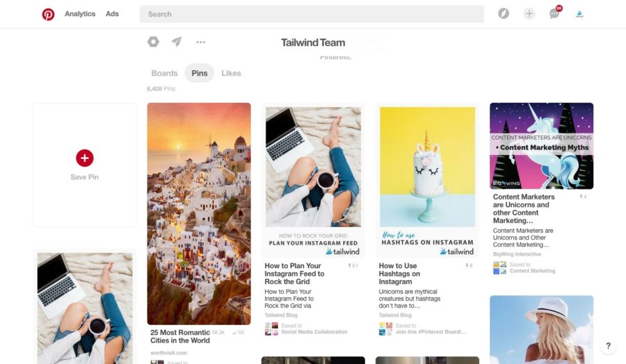
My best tip to do that is to pick your content pillars.
Remember I was asking you above which 5 types of content you are most likely to be able to produce on a daily basis?
Those will be the foundation of your feed.
All you have to do after you’ve figured them out is to cycle through them.
You’ll never have to wonder “what the hell should I post today?” because you’ll have everything figured out well ahead of time.
Like. A. Boss.
So, which *are* your content pillars?
For me, it’s easy: I cycle through lettering, selfies, urban shots, flowers and flatlays.
Other people may cycle through full outfit shots, outfit details, flatlays, inspo pics, quotes.
And others might cycle through drone photography, people photography, quotes, close-up shots and office life.
Once you figure out your own pattern, every piece of your Instagram story will fall into place.
Now that you have the main Instagram planning tools all sorted out, it’s time to take a closer look at how to achieve feed perfection.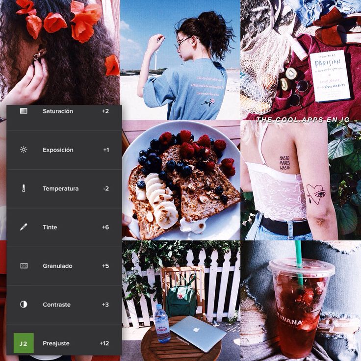
My best tip to do that is to pick your content pillars.
Remember I was asking you above which 5 types of content you are most likely to be able to produce on a daily basis?
Those will be the foundation of your feed.
All you have to do after you’ve figured them out is to cycle through them.
You’ll never have to wonder “what the hell should I post today?” because you’ll have everything figured out well ahead of time.
Like. A. Boss.
So, which *are* your content pillars?
For me, it’s easy: I cycle through lettering, selfies, urban shots, flowers and flatlays.
Other people may cycle through full outfit shots, outfit details, flatlays, inspo pics, quotes.
And others might cycle through drone photography, people photography, quotes, close-up shots and office life.
Once you figure out your own pattern, every piece of your Instagram story will fall into place.
Instagram Feed Tip:
Start keeping an eye on your favourite Instagrammers’ feed and see how they cycle through different types of content.
At one point, you’ll start seeing a pattern.
Be inspired and take it all in, but remember not to copy – you do you. It’s best in the long run both for your brand and for your mind.
We’ve all been there: it’s been a day or two since you last posted on Insta and you’re literally FREAKING OUT because you don’t know what to post next.
So you go down the rabbit hole that is your camera roll hoping you’ll maybe, maaaybe find a pic you haven’t posted before. Oh, and it also has to somehow fit in with the feed.
The struggle, right?
Here’s the real question:
How do you make sure you never find yourself in that situation again?
The answer is simple: plan ahead, using CONTENT PILLARS.
If you’ve scrolled past this particular Instagram feed tips chapter, back up and read from the start.
Here are a few extra tips I personally stick to:
We’ve all been there: it’s been a day or two since you last posted on Insta and you’re literally FREAKING OUT because you don’t know what to post next.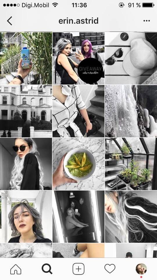
So you go down the rabbit hole that is your camera roll hoping you’ll maybe, maaaybe find a pic you haven’t posted before. Oh, and it also has to somehow fit in with the feed.
The struggle, right?
Here’s the real question:
How do you make sure you never find yourself in that situation again?
The answer is simple: plan ahead, using CONTENT PILLARS.
If you’ve scrolled past this particular Instagram feed tips chapter, back up and read from the start.
Here are a few extra tips I personally stick to:
And by this I don’t mean just several different shots from a single session.
I mean literally plan out two or three mini shoots throughout a day.
For example, for me it would be flatlays, outfits and urban shots (often times the latter will get done in the same session).
Same goes for my lettering and illustrations.
Most of them are done once per month and then spaced out to go live when the time is right.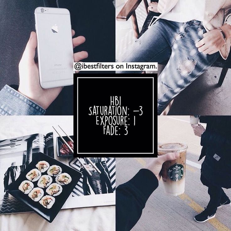
Sure, it takes a bit of time to get it right, but being able to snap photos on-the-go that also fit in with your feed will prove to be a life saver.
The easiest way to achieve this?
Read up!
Get your hands on art albums or coffee table books and browse through them. Pay attention to all the little details like font placements and sizes, crops, cuts and colors.
Sometimes, no matter how hard you try, plan or arrange, things don’t really fall into place and you’re left with a blank pesky square that you just can’t fill.
When that happens, I usually reach for external content.
Pressed for time? Regram a photo from your favourite Instagram influencer and give them a small shoutout – it’ll help others discover their profile, too.
Just remember to always give credit both in the caption and by tagging them in the photo (or, even better, ask for permission before posting).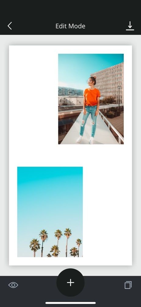
And by this I don’t mean just several different shots from a single session.
I mean literally plan out two or three mini shoots throughout a day.
For example, for me it would be flatlays, outfits and urban shots (often times the latter will get done in the same session).
Same goes for my lettering and illustrations.
Most of them are done once per month and then spaced out to go live when the time is right.
Sure, it takes a bit of time to get it right, but being able to snap photos on-the-go that also fit in with your feed will prove to be a life saver.
The easiest way to achieve this?
Read up!
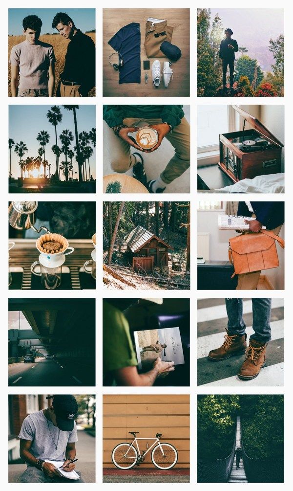
Get your hands on art albums or coffee table books and browse through them. Pay attention to all the little details like font placements and sizes, crops, cuts and colors.
Sometimes, no matter how hard you try, plan or arrange, things don’t really fall into place and you’re left with a blank pesky square that you just can’t fill.
When that happens, I usually reach for external content.
Pressed for time? Regram a photo from your favourite Instagram influencer and give them a small shoutout – it’ll help others discover their profile, too.
Just remember to always give credit both in the caption and by tagging them in the photo (or, even better, ask for permission before posting).
Pro Tip:
When in doubt, snap a picture anyway!
(Even if you cringe when you look at it – there’s a delete button for a reason…) The camera never lies and it will sometimes show you little details that you would never have noticed otherwise.
When all else fails, you can turn to sites which host CC0 photos. Images published under this license can be used however you like, free of charge, for both commercial and non-commercial purposes.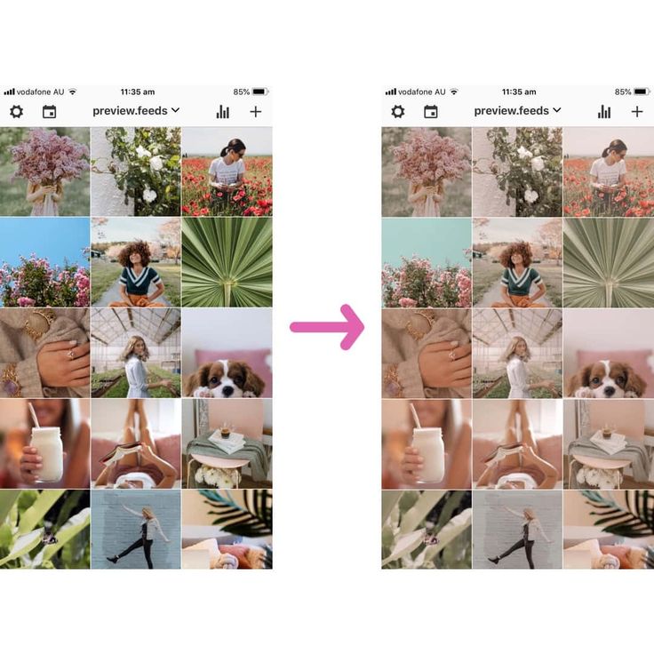
This is one of the best guarded Instagram feed tips for a reason: you’ll have amazing pictures at your fingertips in a matter of seconds!
Just don’t rely on them *too* often so you won’t dilute your brand.
You’re a content creator first and a curator second.
Enter Unsplash and Pixabay. On both of them you’ll find professional images of anything your heart desires.
What a time to be alive, right?
When all else fails, you can turn to sites which host CC0 photos. Images published under this license can be used however you like, free of charge, for both commercial and non-commercial purposes.
This is one of the best guarded Instagram feed tips for a reason: you’ll have amazing pictures at your fingertips in a matter of seconds!
Just don’t rely on them *too* often so you won’t dilute your brand.
You’re a content creator first and a curator second.
Enter Unsplash and Pixabay. On both of them you’ll find professional images of anything your heart desires.
What a time to be alive, right?
Instagram Feed Tips Using VSCOFact:
VSCO is one of the most popular editing apps on mobile. (If not THE MOST popular.)
And it’s pretty clear why: an insanely gorgeous selection of filters, a generous array of editing tools and a straight-forward interface.
So what are you waiting for?
Jump on the bandwagon.
If you’re a newbie, here are the best Instagram feed tips using VSCO filters to help you achieve a fantastic feed:
Use VSCO’s A6 filter when you want your images to have a subtle, moody vibe without going overboard.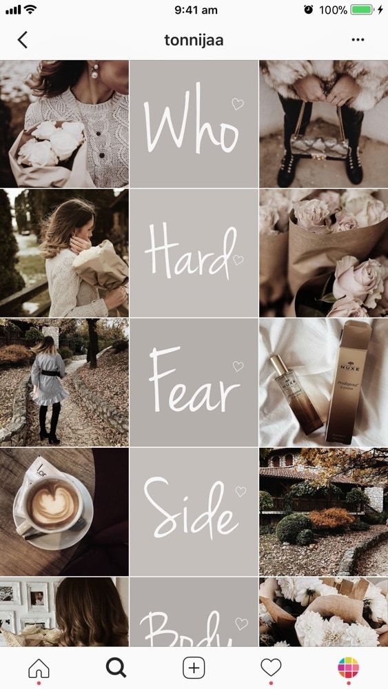
VSCO’s HB1 brightens your image, while also turning it slightly blue.
The HB2 is the perfect cross between the A6 and the HB1 filters: not as moody as A2, yet not as cool as HB1. HB2 is my go-to when I edit flower photos, because it creates that saturated, rich green for the leaves.
VSCO’s C1 is the best if you’re going for vibrant colors. Even when the colors in the photo are pretty bright to begin with, this filter can bring them up a notch without them appearing unrealistic. *Winning*
Use VSCO’s A6 filter when you want your images to have a subtle, moody vibe without going overboard.
VSCO’s HB1 brightens your image, while also turning it slightly blue.
The HB2 is the perfect cross between the A6 and the HB1 filters: not as moody as A2, yet not as cool as HB1. HB2 is my go-to when I edit flower photos, because it creates that saturated, rich green for the leaves.
VSCO’s C1 is the best if you’re going for vibrant colors. Even when the colors in the photo are pretty bright to begin with, this filter can bring them up a notch without them appearing unrealistic. *Winning*
C2 is the tamest filter in the C series. I mainly use this one for selfies to subtly add some boost.
C3 is the warmest and most intense of the C filters. I use this one when my base image already has a good balance of cool and warm colors in it.
The S2 filter subtly brightens the image, while also giving it a cleaner look. I love using this one for fine tweaks on punchy images.
S3 is very similar to the C series filters, except that it’s a lot brighter. I love using this one on photos where the C filters are just not bright enough – yes, sometimes that can be the case!
Instagram Feed Tips Using The Tezza AppAs I’m writing this in 2020, there is another editing app that is becoming super popular for Instagrammers – the Tezza App!
In case you are not familiar, it is a photo & video editing app created by influencer Tezza Barton and her husband, Cole Herrmann.
The app has lots of fantastic filters, along with classic editing options like brightness, saturation, HSL and all that jazz.
Aaaand it also has some really nice dust effect you can apply to your photos. My favorite feature though?
The options to add vintage subtitles to your photos or videos. It is something that is so simple to do, yet so effective!
Here are the best Instagram feed tips using the gorgeous filters in the Tezza App to help you achieve an amazing feed:
Instagram Feed Tips Using The Tezza AppAs I’m writing this in 2020, there is another editing app that is becoming super popular for Instagrammers – the Tezza App!
In case you are not familiar, it is a photo & video editing app created by influencer Tezza Barton and her husband, Cole Herrmann.
The app has lots of fantastic filters, along with classic editing options like brightness, saturation, HSL and all that jazz.
Aaaand it also has some really nice dust effect you can apply to your photos.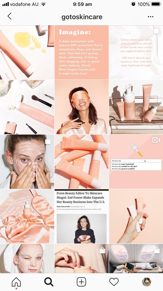 My favorite feature though?
The options to add vintage subtitles to your photos or videos. It is something that is so simple to do, yet so effective!
Here are the best Instagram feed tips using the gorgeous filters in the Tezza App to help you achieve an amazing feed:
The INSPR filter is one of my go-tos when it comes to editing in the Tezza App. It gives an easy, effortless vibe to pretty much any photo.
FILM is one of my favorite new Tezza App filters, right after INSPR. It gives photos an old-school, moody look like the name suggests.
VINTAGE is the perfect filter to use if you want that unapologetic throwback vibe. I only use this sparingly or turn the intensity lower for best results.
MOOD 2 is a fantastic filter to use if you have bright & loud photos that you want to tone down.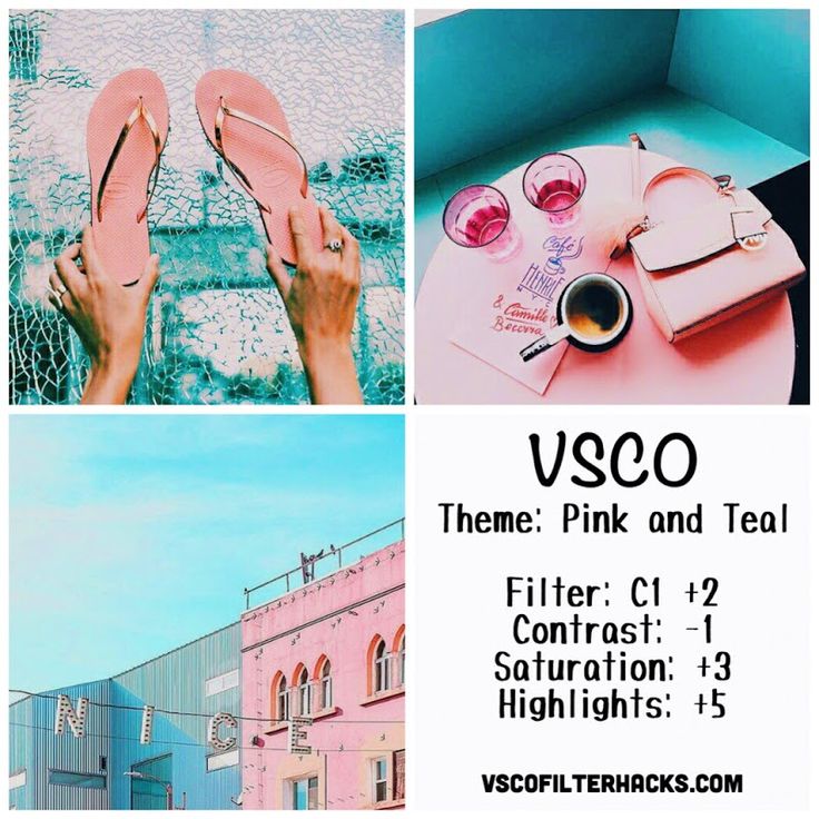 So good!
Instagram Feed Tips For SuccessAnd finally, a few tips to keep in mind as you go about crafting your own perfect feed:
Instagram Feed Tips For SuccessAnd finally, a few tips to keep in mind as you go about crafting your own perfect feed:
1. Be Consistent
Remember you’re in it for the long haul and don’t give up if your photos are not what you want right from the start.
Keep tweaking your filters, refining your process and, most importantly, do it on a recurring basis.
You know what they say… practice makes perfect, so keep at it.
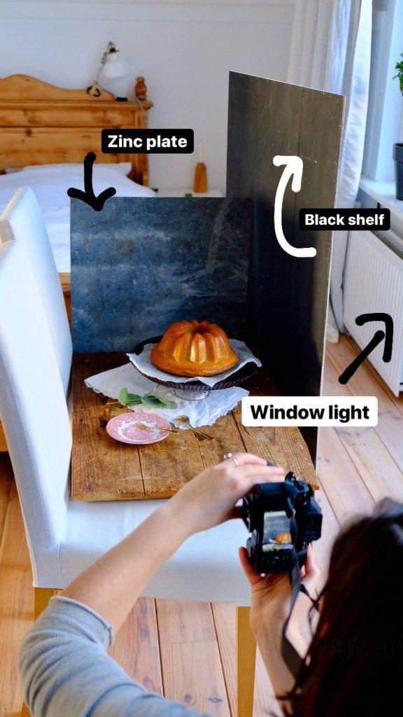
2. Always Shoot In Natural LightShoot all your photos in natural light, regardless if you’re using a phone or a DSLR.
This way, you’ll get nice, crisp pictures that only need minimal editing.
If not, you’ll have grainy pics that’ll take FOR-EVAH to edit – no good!
3. Look At The Bigger PictureWhat purpose does your content serve?
Do you want to establish yourself as an influencer? Get more business from Instagram? Connect with fellow creators?
Your greater purpose should influence the type of content you make, so be strategic about it.
1. Be ConsistentRemember you’re in it for the long haul and don’t give up if your photos are not what you want right from the start.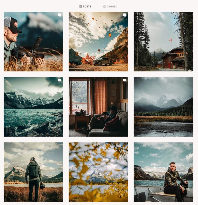
Keep tweaking your filters, refining your process and, most importantly, do it on a recurring basis.
You know what they say… practice makes perfect, so keep at it.
2. Always Shoot In Natural LightShoot all your photos in natural light, regardless if you’re using a phone or a DSLR.
This way, you’ll get nice, crisp pictures that only need minimal editing.
If not, you’ll have grainy pics that’ll take FOR-EVAH to edit – no good!
3. Look At The Bigger PictureWhat purpose does your content serve?
Do you want to establish yourself as an influencer? Get more business from Instagram? Connect with fellow creators?
Your greater purpose should influence the type of content you make, so be strategic about it.
Your turn!
Tell me which Instagram feed tip you found most helpful! What else would you like to know? What tips do you want to share? Do you have any go-to accounts that you checkout for inspiration? Which are they? What other questions do you need answers to? (Besides the meaning of life, haha.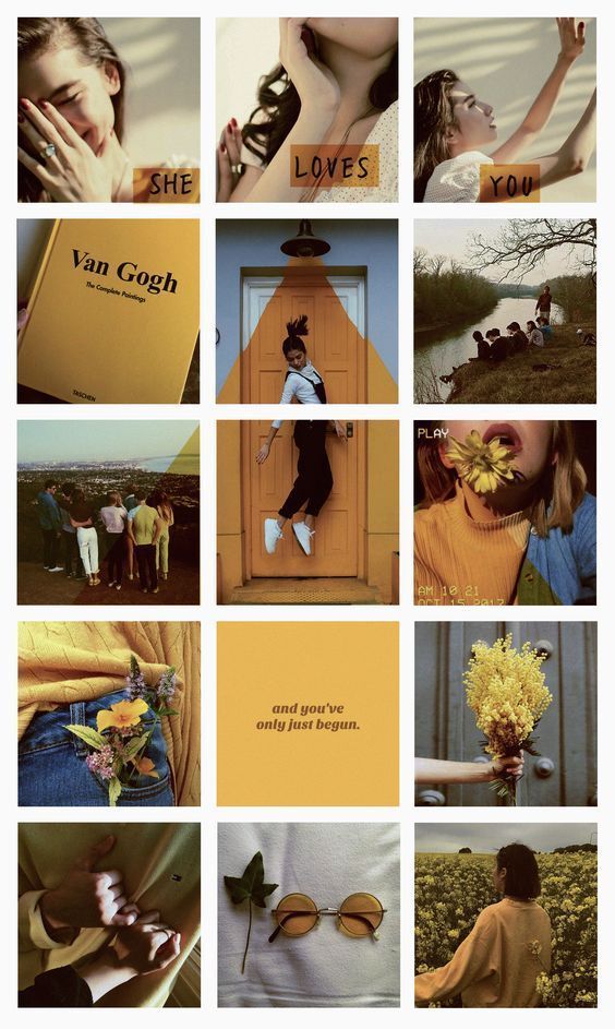 )
)
Please share your tips, ideas or main inspo sources in the comment section – talk soon!
PS: Here’s how to take your Instagram Stories to the next level.
Your turn!
Tell me which Instagram feed tip you found most helpful! What else would you like to know? What tips do you want to share? Do you have any go-to accounts that you checkout for inspiration? Which are they? What other questions do you need answers to? (Besides the meaning of life, haha.)
Please share your tips, ideas or main inspo sources in the comment section – talk soon!
PS: Photos look good, but no idea what to write? Here are 50 short Instagram captions you can start using right away.
About
Daiana
Daiana is a creative consultant, designer and writer. After a decade working with various businesses on developing their voice, editorial approach and aesthetic, she has returned to her first love, personal blogging, sharing what she's learned along the way.
Feeling like your Instagram feed is in a creative rut? Don’t worry, we’re here to provide you with 8 key tips on how to have a good Instagram feed and take your grid to the next level!
So what is an Instagram grid, anyway? When you’re viewing an Instagram profile on your smartphone, you’ll see nine photos at once. These nine photos make up “the grid”.
On some of your favorite accounts, you may even notice subtle color nuances and styles that make the content POP 💥!
These harmonious grid effects are super effective in getting people to stop scrolling, like their images and even comment!
When you’re thoughtfully trying to make your Instagram look better, by applying a theme or creating a cohesive look, you can create a style all your own.
Ready to learn how to make your Instagram feed look good and rock the grid? Let’s dive in!
There are a few tips and tricks that beautifying your Instagram feed really simple through visually planning your Instagram posts.
Let’s unpack our tips on how to make your Instagram pretty and follow-worthy below!
You’ll want to start thinking about your Instagram feed as a whole entity and not as individual posts.
This is the first small mental change to make to your Instagram posting process in order to implement a feed plan and create a cohesive look.
So what do we mean by think like an editor? Chiefly, you’ll want to take these things into consideration when creating a nice feed on Instagram:
For an example of a themed Instagram grid, this is Stitch Fix’s Instagram account and top nine grid.
Stitch Fix uses lighter photos with lots of white space.
Their content usually consists of product features and styled videos!
Think of your Instagram feed as a whole, not individual posts, if you want to rock the grid. Click to Tweet
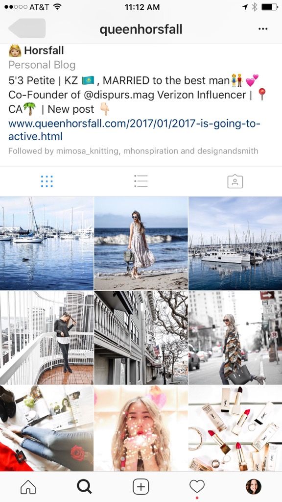
On the other hand,Queenhorsfal rocks a super tight grid and she works in threes.
You can see from this top nine that she has one more post to add that will be blue.
Working in groups of threes, each with their own color story, is another great way to create beautiful content and make your Instagram look better.
Among our tips on how to improve your Instagram, this is one you should definitely apply!
Popular Instagram accounts have a theme and keep it super tight. To make your Instagram look better, you’ll need to set parameters for your feed and stick to it.
For example, take @artsyaffirmations Instagram feed. Their theme is pop culture art, and their content is all about positive affirmations.
Although they use a suite of bright colors and funky graphics, their theme of positive messages and self-affirmation is present in every post.
If you’re wondering how to make your Instagram feed look good, kiss random spur-of-the-moment content goodbye.
Remember the mission and values behind your account, and make sure they’re present in every post!
Keeping a consistent visual theme is a crucial part of our list of tips on how to improve your Instagram feed.
Popular ways to unify your Instagram feed theme include focusing on color palettes and editing your photos in the same way!
You can create specific style guidelines to follow for each photo! Take @dananicoledesigns feed, for example!
Dana uses two main types of visual content to keep her feed looking unified: actual photos, and stylized graphics!
Let’s take a closer look! Psst… make a mental note to create similar style guidelines to ensure cohesiveness in your feed:
For methods on how to make your Instagram more appealing, look straight to designing your own aesthetic.
Whether you’re a Photoshop or smartphone user, you need to develop the way you want to edit each photo or video.
This creates a cohesive feed no matter where you take your photos.
With Photoshop, you can use Photoshop actions to process each photo with one click.
If you’re not a Photoshop pro yet, you can find many free Photoshop actions out there to save and then tweak them to make the mood and style you’re trying to achieve.
Lightroom is another great way to process photos. You can find Lightroom presets to achieve the same goal as Photoshop actions.
There’s also a Lightroom app for your phone so you can process your photos on the go and still match your style!
VSCO is the most popular app for processing Instagram photos with fashion and lifestyle bloggers.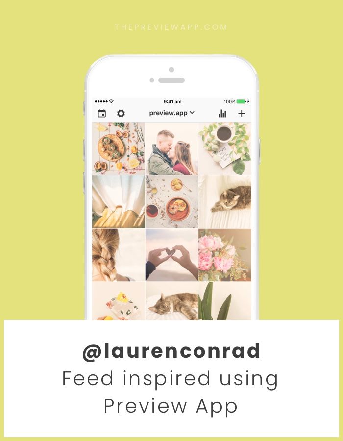
They have it down to a science and, wow, does it show in their amazing Instagram feeds.
If you’re hoping to make your Instagram look better, it doesn’t matter how you choose to take your photos or process them.
What matters is that you consistently use the same filters and settings for each photo to match the aesthetic that you choose!
Our list of tips for how to make your Instagram feed better wouldn’t be complete without this deceptively easy fix: high- quality photos!
High-quality photos aren’t out of your reach, even if you don’t have a fancy DSLR. You just need a steady hand, some patience and an eye for composing your photos in unexpected ways!
Whether you’re taking professional-looking photos with your iPhone, or snapping lifestyle shots with your Android device… nearly every modern SmartPhone device can deliver jaw-dropping photos!
Here are some tips to keep in mind:
For even more easy tips to become a Smartphone photography, pro, tune into our free webinar with stock photo master Kayla Marie Butler of The Ivory Mix!
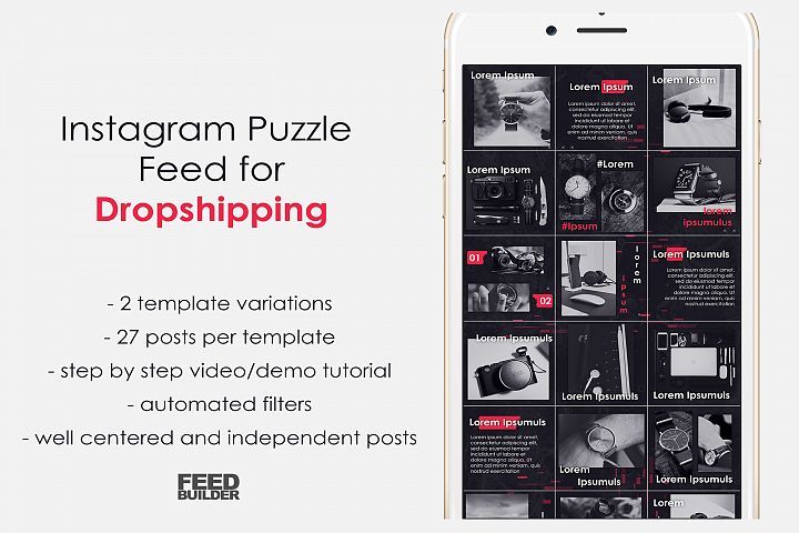 Color-coordinate your Instagram feed
Wondering how to make your Instagram pretty? Try adding splashes of color to your visual planning approach!
Adopting an Instagram color theme isn’t as complicated as it sounds.
You can peruse Pinterest and some of your favorite feeds for color inspiration – or even make your own random palette with free apps like Coolors!
Here are some things to keep in mind when choosing colors that work for you:
 Post consistently to Instagram
If you’re racking your brain wondering how to make your Instagram feed better, the answer may be simpler than you think. It’s consistency!
Whether you opt to post once per day, or only want to commit to three posts a week max, it’s important that you show up and post!
Why?
When you commit to posting consistently, you’re teaching your followers what to expect from you.
With regular posting and interaction, your followers will grow to expect your content in their feed and even happily wait for your latest and greatest post!
Here’s the key tip on how to make your Instagram better visually: Planning.
The best Instagram feeds are ones that have been carefully and thoughtfully curated and prepared.
By planning your feed, you’ll be able to see how your photos look next to each other and adjust where needed in order to achieve the cohesive look and feel of your dreams.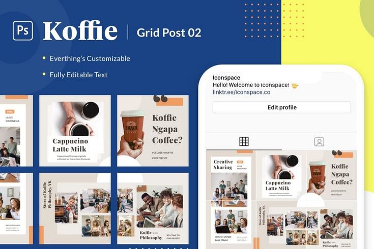
Once you batch process your photos, you can plan out your grid in Tailwind with the Auto-Scheduler tool to schedule them at the optimal times using our Smart Scheduling tool for Instagram! Just:
Once you have them scheduled, when you use Auto Scheduler, those posts will go out at the best time for your Instagram audience.
Now there’s nothing left to do but go out there and create those ‘Gram-able moments. Anyone know a coffee shop that does latte art? ☕️#DoItForTheGram
Have any questions about how to use Tailwind for Instagram or how to make your feed pretty? Let’s hear them in the comments below!
June 25, 2022
Instagram is a great platform for promotion. And here a lot depends on what impression the profile makes: what is the general mood, color palette and combination of photos.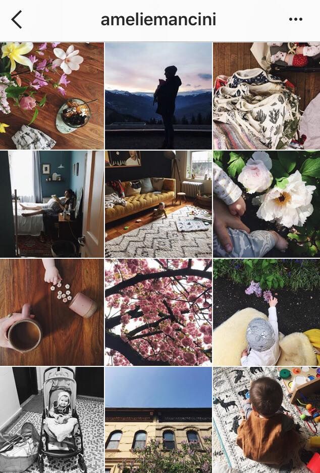 We have put together a few tips to help you make a beautiful ribbon and develop a special brand aesthetic.
A single style is those details that unite the entire visual. For example, it can be a photo style - dark deep, airy light photos. Or the paraphernalia of the frame - rustic, vintage, kinfolk and others. Even some common character or object. However, in search of your own style, it is not at all necessary to drive yourself into rigid frames and lock yourself in one direction. You can combine completely different photos if you follow a few rules. nine0003
The account itself does not affect sales. For visitors to turn into potential customers, they need to be impressed. Think about what emotions you want to evoke in subscribers? The style of your feed and the choice of photos will depend on this.
For example, if you are selling home decor, a hygge aesthetic would be appropriate: photographs of candles and cozy blankets, warm colors and soft shadows in processing. And for premium leather goods, you can try shooting with gloomy light and deep hues - if you place all the accents correctly, such shots will be filled with a special atmosphere. nine0003
Accounts of photographers can also be different: on the left - conciseness and rigor, on the right - brightness and audacity. For example, photos of @neekmason and @kavalerchikyana are used
When one color is used in the profile - everything is light and airy or vice versa dark - it looks very stylish and beautiful. But after a while, when you see the fifth, tenth or hundredth such photo, you stop seeing the difference. Therefore, we recommend leaving the stereotype that it is enough to choose one filter for all photos in the past. nine0003
It's much better not to lock up your creativity in some kind of filter, but simply choose your favorite shades of base colors and make sure that they are regularly in photographs. If you are shooting portraits, ensure that the skin is the same color throughout. If you publish landscapes, the shades of the sky and greenery should also be the same. Then the shots taken in different conditions will remain natural and look harmonious.
On the left is an example of a tape in which each photo is very beautiful individually, but together they look very similar. And on the right is a tape in which the frames are very different, but thanks to the primary colors that are repeated from frame to frame, the tape looks harmonious. For example, photos of @meghan_faulk and @prostokrasivo.wear are used
You can combine dark and light, warm and cold shots in one profile - just make smooth transitions. For example, if you had three light shots and now you want to post a dark photo, post a light photo with dark accents first. Then it turns out that some shades seem to flow into others. Such a “gradient” looks beautiful in the feed and will help to fit photos of your customers into it.
Instagram Kinfolk is a great example of a harmonious feed without a single filter.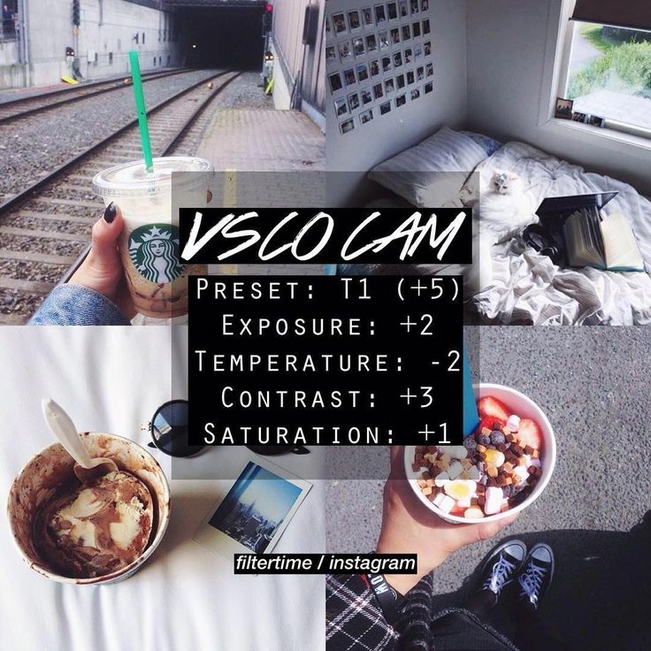 This is achieved by smooth transitions and playing with color. Photos used as an example @kinfolk
Color adds zest to photos and encourages you to come in and see the details. This is due to the fact that our eye easily picks up bright spots, especially when looking at photos from the phone.
Therefore, for profiles in neutral tones, such as gray or beige, we recommend adding bright details so that the tape does not look boring. And if your frames are bright and colorful, on the contrary, it is better to add calm objects - this way there will be no extra variegation when looking at the tape. nine0003
Color attracts the eye, the main thing is to use it in doses. For example, on a neutral background - white, black, beige. Photographs @la_maison.n and @gkstories
The feed looks more harmonious when photos with different scales are published side by side. For example, if you have an online clothing store, you can first post a photo of a girl in a full-length dress, then a waist-length portrait, and then a large photo with a dress back or a beautiful clasp.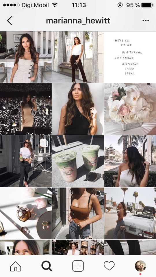 So there will be no feeling that you are repeating yourself. nine0003
The alternation of plans helps to make the tape varied and lively. The characters in the photographs change, the surrounding world changes - then the tape looks eventful.
Cozymoss Instagram photos at different scales. This is another reason why the goats in the profile are so lively and active. @cozymoss photos used as an example
Use apps to plan your Instagram content in advance. They are convenient to upload photos, combine them and choose the perfect sequence. nine0003
We recommend trying Unum, Inpreview or Garny. To plan one account, a free version of any of them is enough, but if you maintain several profiles, Unum will suit you - there you can create several projects at once for free.
Download Unum for iOS →
Download Unum for Android →
Download Inpreview for iOS →
Download Garny for Android →
These simple tips will help you compose a beautiful and harmonious feed from various photos.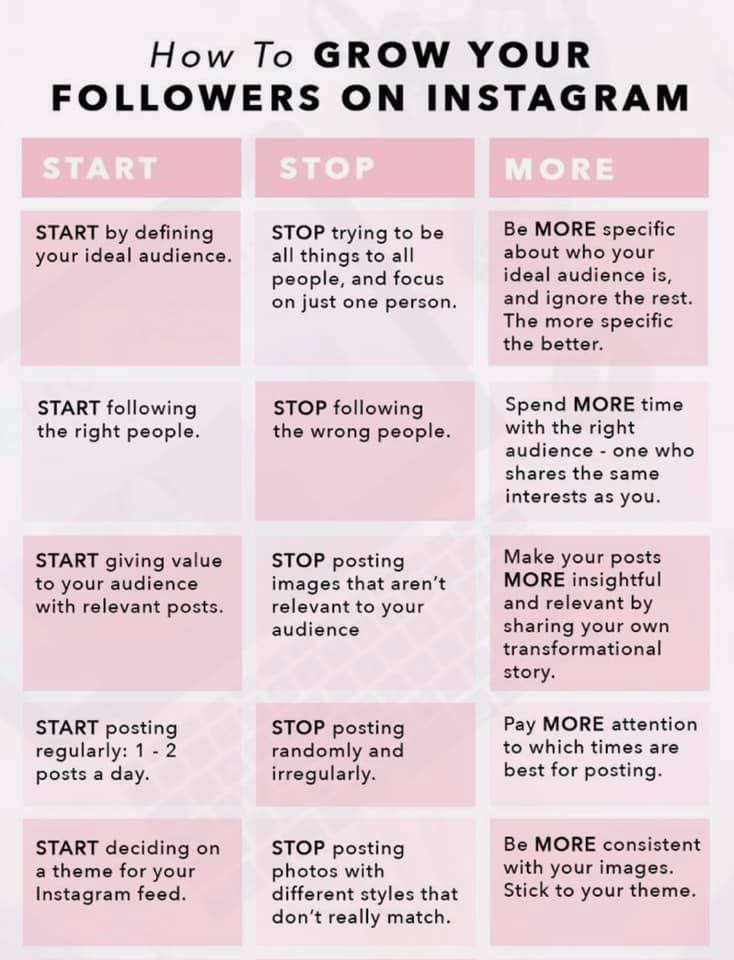 At the same time, you don’t have to drive yourself into the framework of one style and limit yourself to one filter. If the article was useful to you, put ♥ and share your Instagram tricks in the comments. nine0003
To think that the same template for each photo will automatically make your Instagram feed beautiful is at least naive. After all, it’s 2020 in the yard 🙂 Instead, we suggest taking a closer look at the beautiful accounts of bloggers and brands, and using their example to understand: what really makes the feed beautiful. nine0003
Alternation should not be frank and too orderly, but should bring a nice looking order to the tape.
Examples of alternation:
etc.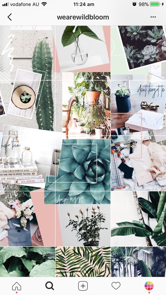
Choose 2-4 colors that will be in the photographs. For example, a combination of black, white, beige and brown is now popular.
To choose colors for your account, look at your space or your products: what colors do you see? Start from this, everything is simple 🙂 If the walls of your salon are white, the gloves of the masters are blue, the logo is pink, and the inscriptions on the bottles are black, then here is the recipe: take these colors and use them in the photo. For example, buy blue and pink flowers for backgrounds, use Americano coffee for layouts (it looks almost black), and purchase books and magazines in the matching color as props. nine0003
If props and storytelling are bad for a photo, don't do it. Use a solid, neutral background, such as white, against which your products will be photographed. It can be a wall or a drawing paper, a cyclorome in a studio or a light box. To add variety, you can sometimes add 1-2 elements: fabric as a lining for goods, a live flower, fruits, etc.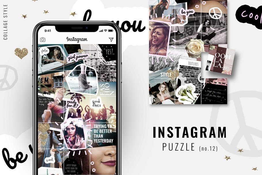
Photographs often look out of harmony because of the light. In one photo it is warm, in others it is cold, in one it is natural, in others it is from Ilyich's light bulb. Avoid it. nine0003
Assess your photo opportunities and stick to one solution. For example, you have a panoramic window in your showroom and from 12:00 to 14:00 soft light pours out of it, without the scorching sun. Use this window as a light source - position yourself in front of it and shoot content for a couple of weeks in advance.
Without this item, none of the previous ones will work 100%, unfortunately. To make the processing look good and make the profile harmonious, follow these rules:
We advise you to purchase ready-made presets or order the development of an individual preset for the lightroom application.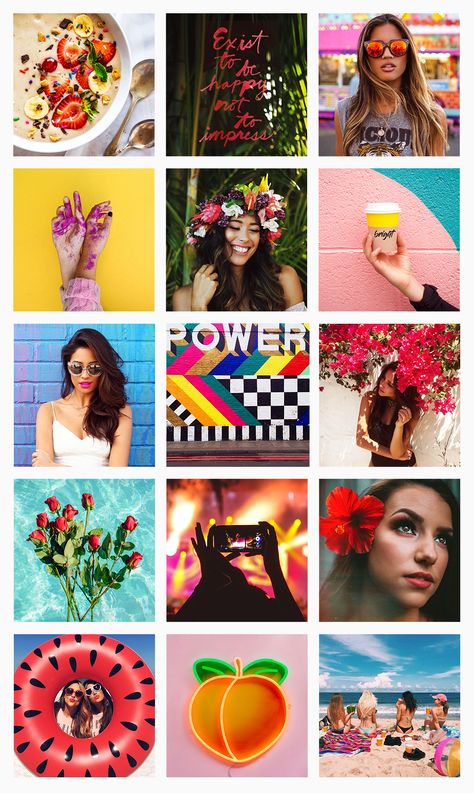 It is this application that bloggers and brands use to create beautiful, up-to-date processing. Ready-made filters in other applications, unfortunately, rarely allow you to process photos really beautifully. nine0003
Another plus for lightroom is that it's easy enough to tweak the filter if needed. For example, when we create custom presets, we give instructions to our customers on how to slightly change the filter if suddenly the original photo turns out to be too bright or dark, or it has unnecessary bright accents.
Let's take a look at some examples of a beautiful ribbon again and see which of these 5 techniques are used by their creators
What tricks are used:
2.