I am sure you must have come across many Instagram accounts that have posted multiple single square photos that look ridiculous alone, but when you see them together, they form a big, bold image. Doesn’t it look interesting?
If you want to grow your Instagram audience, then try Instagram Banners. They provide a perfect opportunity for you to attract an audience and enhance engagement to your page. The Instagram Banner became a thing after A$AP Rocky used it to introduce his new album.
Further, creative artists like michnotfound used it abundantly to showcase their aesthetic vision and work. Now everybody, from bloggers to big brands, uses Instagram banners to promote their work.
To learn more on Instagram Banner, Keep reading!
Table of Contents
Instagram banner is like a puzzle that consists of many square photos/posts, which join together to form a larger photograph or post. The feature made it to the mainstream when A$AP Rocky used it to introduce his new album. Though, it did not go well with his audience. He even lost many followers the day he posted it. It has now become a significant feature to showcase one’s work and vision more impactfully.
Instagram Banners are big and thus are instantly noticeable to the eyes because of their size. Their vibrant color and themes appeal to the audience and encourage them to interact with the brand.
Consider Instagram Banner as a canvas for creative individuals to paint it however they want. This Instagram layout allows users to display their photography skills and artwork more effectively.
Many wedding photographers use this feature to show their photography skills to potential clients. Clothing Brands use this feature to showcase their new runway collections to get the audience’s attention. Makeup Brands use it to introduce their new launches.
Similarly, interior designers, visual artists, makeup artists, etc., use the Instagram banner feature to flaunt their work to get attention and possibly work from their potential clients.
Guide To Create Instagram BannerStep #1: Designing the Banner (Puzzle)Here you can use any platform to design an Instagram Banner. We are using Canva. You can also use Adobe Illustrator. You can create puzzles of 3, 6, 9, and 12 images with varied dimensions.
We recommend you use the following dimensions for designing your desired grids:
Now, let’s design the banner via Canva. So here it goes:
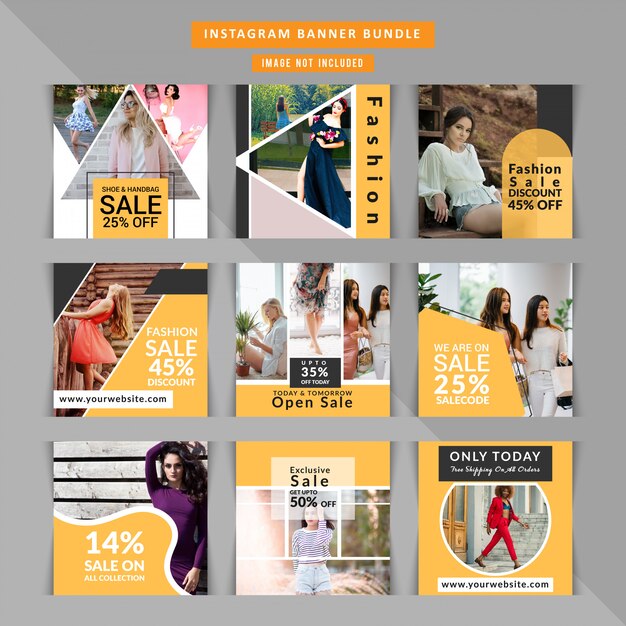
After choosing the dimensions, you can start designing your banner. You can use various templates, elements, photos, shapes, and fonts available on Canva to design your banner.
You can design each grid separately with all the elements of your choice. After creating the banner, download it to save it on your phone or computer (whatever you are using).
Step #2: SplittingNow, it is time to split those images into various tiles (for us, it is: 9 tiles – 3 horizontal and verticals) to post on Instagram. You can use many apps and sites to do that for you.
Here we are using PhotoSplit App, as it is convenient and does not affect the quality of the images. You can also use the Pine Tools website, Giant Square, PhotoTiling, etc.
Please note that PhotSplit only lets you split two photos for free; after that, it requires purchase.
The image will be split into different parts with sequence numbers. Click on the images based on their sequences to upload each post individually on Instagram. When they all are downloaded collectively, they will look like one big post.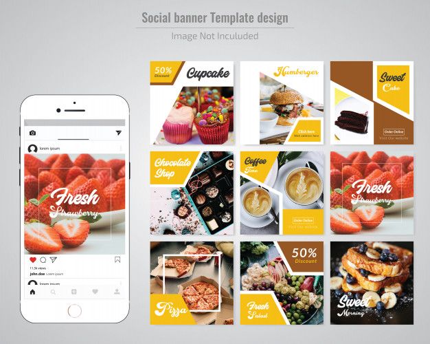
If you are an individual looking to amp up your profile, you can directly upload any of your pictures on the PhotoSplit App and split and post them on Instagram as one big photo.
The Wrap UpInstagram banners are efficient ways to differentiate your brand from that of others. You can design your banner in whatever way you like; we recommend you go for Canva.
After designing, use any Splitting App you prefer. The Splitting Apps will break your photos into different squares with numbers. Upload them on Instagram based on their numbers.
Viola! You have the most creative and engaging post to grab your audience’s attention.
Like any other social media on the market, Instagram has to evolve and adapt to market changes to survive – and the same can be applied to its users, as well. The addition of newer features by Instagram allows it to remain relevant and interesting, and inventing new ways to present your content with what you have is a great way to stand out for any Instagram user.
In this context, it’s possible to see two new or unusual ways of adding a banner to your Instagram account – by uploading it as a Story, which is an Instagram’s own feature, or by uploading several images that generate one, bigger image for your Instagram page (this one was invented by users themselves).
Instagram Stories are one of the biggest features that Instagram ever added to the platform, allowing for instant updates for your followers with short videos or singular photos that disappear after staying for 24 hours. Stories can be added permanently to your Instagram profile page as a highlight, and it is possible to view specific people that have seen one of your Instagram Stories.
Since more and more brands are also starting to use Instagram Story banners more frequently, it’s important to keep track of what is and is not relevant when it comes to Stories – which is exactly what we’re going to go over below.
Of course, the first part of it is all the technical recommendations and restrictions that Instagram Stories have.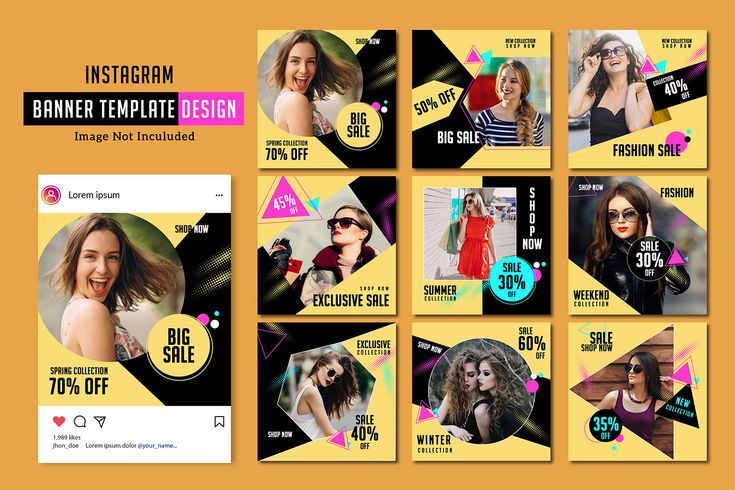 As such, there are two types of content that can be uploaded as one of your Stories – a photo or a video.
Your Instagram Story photo is supposed to have a 1080 x 1920 px size and a 9:16 aspect ratio since Instagram’s main platform is still your regular mobile device. There are two main file formats that are supported (JPG and PNG), and the file size for one Story is supposed to be less than 30 MB.
Video content for Stories, on the other hand, keeps the same pixel size (1080 x 1920 px), but greatly raises the file size limit – up to 4 GB or less. Additionally, there are only two video formats that are accepted: MOV and MP4 (with the latter one being the preferable option).
It is very important to adhere to these recommendations since Instagram has a tendency of cropping or zooming in on your Stories if they do not meet the requirements in the first place, which can easily mess up your composition and the initial intent of a Story.
It’s relatively easy to create Instagram Stories on paper – since the main idea of Stories is that you can add any vertical photo or video from your own phone as a Story. However, brands might be more careful with their approach to stories, like using image/video editing software before uploading, among other things. Luckily enough, the majority of image editors and most video editing tools have an option to crop photos/videos to a 9:16 ratio.
When it comes to the actual content of your Stories – it is hard to give specific recommendations, especially when it comes to Instagram banner design, since the content varies greatly depending on a mixture of factors, from the target audience to the intent of a user. However, we can also point out unusual features and ideas that can be utilized using the current Instagram feature set:
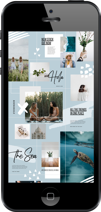
Of course, it is also possible to highlight some of the biggest mistakes that could be done when working with Stories:
 As with a lot of other sources of content that are not strictly meant for promotion, there is a need to have a healthy balance between regular content and promotional one, since too much promotion can easily turn off a lot of people away from your brand entirely.
 You have to bring value and entertainment to your audience with the text in Stories, but putting in too much is a great way to lose their interest immediately.
Instagram Stories are a great place to insert all kinds of banners for many types of content – but there are some things that you have to keep track of, and some technological limitations included, as well. Additionally, Stories were implemented by Instagram itself, while our next topic was pretty much invented by the community.
As we’ve mentioned before, Instagram users always strive to invent some new form of presenting their content, to stand out and look different among many other users of the same service.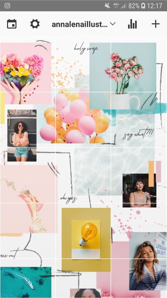 One of the most popular tendencies in this context has been the invention of “Instagram banners”, or “IG banners” – uploading not one single picture, but a combination of pictures that, when looked at from your profile page, create one massive image.
It’s a great way to stand out and it does attract a lot of attention – when done correctly. Nowadays, Instagram banner photos are used quite commonly by many influencers and companies in different fields to spotlight their recent achievements or to advertise things to come.
There are several reasons to try and make an Instagram banner of your own. Some of the biggest ones we’ll go over below:

As we’ve mentioned before, creating an Instagram photo banner like that is slightly different from your regular process of taking a photo, editing it, and uploading to social media. First of all, you have to choose the shape of your future banner – since the shape will define how many parts you’ll be splitting your image into.
Since the usual Instagram profile page shows only three images in a row, you’re forced to keep that in mind and pick one of the four main banner shapes:
While it is possible to create bigger Instagram account banners with this template, some of the mobile phone screens might not fit more than twelve images at once without scrolling – which would ruin the purpose of a banner in the first place.
Figuring out dimensions if you have the shape in mind is relatively easy – since Instagram might crop or zoom one of your images of an unusual shape, it’s recommended to use 1080 px for both height and width of each image. With that in mind, we can figure out basic dimensions for all four of the banner types above:
As soon as you’re done with choosing the shape of your banner, it’s the moment to start designing your Instagram banner post – decorating and changing it just like your regular Instagram post or Story, with the usage of photo editors, special effects, and so on.
However, the process does not end with designing the image – you still have to split it into several images to upload to Instagram. Luckily enough, there are several ways to do that – with the help of some of the more complex photo editing software or with one of many applications from either Google Play Market or Apple App Store.
Splitting your Instagram banner image into several parts with software like Photoshop or Adobe Illustrator is more difficult and requires some knowledge of the software, but allows you to do both the design and the splitting in a single application. Mobile apps that split images in parts for you, on the other hand, are easy to work with and require little to no effort in the first place in most cases.
After that, all you have to do is upload, either manually or using a scheduler. Instagram profile banners are a great way to diversify your content in this social media, and it’s way easier to do than it might look at the first glance.
We just went over two distinct cases of Instagram banners – be it Stories or multi-part images that comprise an Instagram banner post. Both of these cases involve some form of photo editing to create Instagram banners– and while it is quite common to use full-fledged solutions like Photoshop, it’s not the only option available.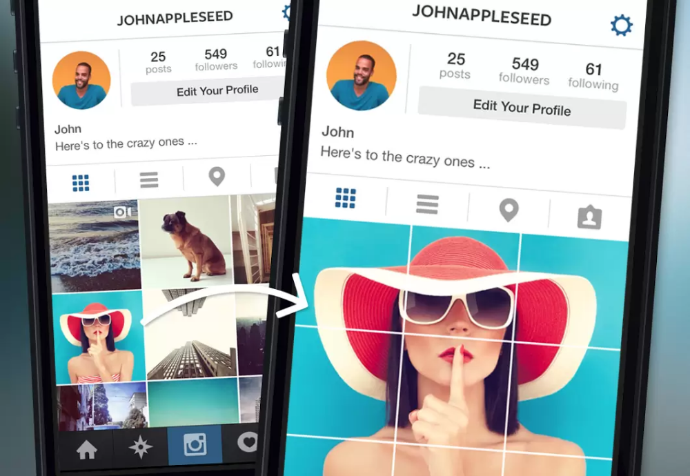
For people that have not studied the art of doing everything in Photoshop, there’s always an abundance of online banner creators – such as Viewst. It can be used to perform many different operations, including coloring, adding objects, adding text boxes, and other means of designing a banner for yourself.
It’s a great tool that requires little to no knowledge to work with and is compatible with both of the cases we’ve described above – since it allows you to set the image dimensions manually (for Instagram banners) and offers a pre-made template for your Stories that is already sized perfectly, allowing you to create banner for Instagram in no time.
Instagram banners have a wide variety of use cases, but the biggest one has to be some sort of promotion – be it personal or corporate, for some event or about a new product. Luckily enough, both of the banner “types” we’ve discussed above are not particularly hard to create, and would be even easier to work with if this article is used as a reference – as such, the original goal of this article can be deemed complete.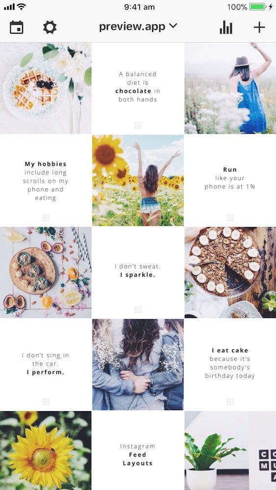
How to create a catchy Instagram banner
Instagram is a social network based on bright and beautiful visuals: photos, videos, banners. If you make publications with images and videos of high resolution, high quality, then it is much easier to achieve your goal: to collect a lot of likes and attract new subscribers.
At the same time, one should not remain aloof from new trends and trends. Today, Instagram offers new interesting features that are already actively used by many instabloggers. One of these features is the so-called instabanner, or mesh banner. nine0003
In fact, this is not just a picture, but a whole series of pictures that are published at the same time. Their number is usually 3, 6 or 9. This is due to the fact that all publications on the Instagram network are collected in a row of three.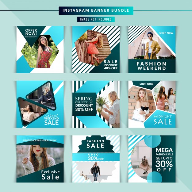
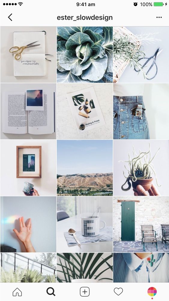
To make it clearer, let's give an example of how the Instagram page looks like for a regular user who does not use grid banners.
Opening it, we see the last 9 posts and we can scroll down to see older entries. nine0003
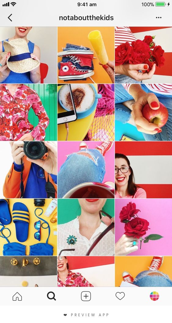
And this is what the page looks like when the owner used the grid banner for Instagram.
We see the same 9 pictures, but in total they add up to a beautiful picture.
Thus, a grid banner for Instagram is 3, 6 or 9 posts with pictures that are published at the same time and in total make up a beautiful photo or image.
Their main advantages are quite obvious:
Today, however, many people use such a design tool, but the trend is still gaining momentum.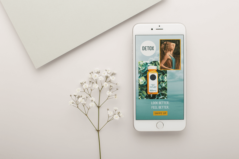 And if you start using this design tool, you will still have time to benefit from it in the form of new subscribers. nine0003
Using this kind of photo for all your posts, you can ensure that your page will acquire an exclusive look and will be noticeably different from the accounts of other users. However, in everything you need to observe the measure in order for this tool to benefit you.
To publish a beautiful banner ad on Instagram, you need to solve three problems.
1. Find an attractive high resolution image that matches your theme. nine0003
2. Cut it into a multiple of three, while maintaining quality.
3. Publish each part as a separate post, at the same time, so that they add up to the desired picture.
To do this, you can use paid or free photo stocks with good photos. Also (but less desirable) you can search for images of the desired subject through search engines and download them to your phone or computer. nine0003
Finally, you can take beautiful photos yourself if you have the right photography skills and professional equipment.
To make an Instagram banner, you need to use professional graphics software, such as Adobe Photoshop. If you have no experience with Photoshop, you can use the available free services to achieve the desired goal, for example:
You can also download iPhone applications that perform the same function:
All these services work on a simple principle: you upload your image to them, they cut it into the desired number of parts, and then you can save these parts to your device.
In order for your followers to immediately see a beautiful Instagram banner in its entirety, and not watch how it is created from parts picture by picture, the easiest way is to use delayed posting.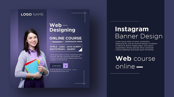 To do this, you need to prepare and upload all the necessary pictures to Instagram in advance, but at the same time specify the same publication time for each of them. As a rule, if delays are created when using this method, then no more than a minute.
If you want to create a banner for Instagram, it is extremely important not to mix up the order of the pictures. They follow each other in the order you can see in the picture below. This template can be used when publishing any banners. nine0003
To make sure you did everything right, it doesn't hurt to go to Instagram immediately after the banner is published and check that your picture is displayed correctly.
As you can see, it is not difficult to create an interesting post design. If they are of an advertising nature, then with the help of the same graphic programs you can put inscriptions about discounts, promotions, goods, contact details, links to your landing page. This will turn the instabanner into a full-fledged advertising tool. nine0003
Subscribe to our channel in Yandex.Zen!
Click "Subscribe to the channel" to read DigitalNews in the Yandex feed.
Have a question about "
"?
Aeroflot vs Victor the cat: epic fail or could it not be otherwise?Views: 16,108
Free tools from Click.ruViews: 26,045
Budget clicks in Yandex.DirectViews: 11,043
Yandex for business: connecting dialogs Dialogues is a new service for website developers, with which you can communicate with...
 Views: 11,151
Home » Instagram » How to work » Banner for Instagram: how to make it and where to place it?
nine0002Content
 1 Publication author
 Instagram banner - a mosaic composed of individual images, occupying mainly from 3 to 9 blocks on a personal page in the section with published materials. The idea to use such collages in social networks appeared with the advent of small businesses. Starting brands through banners notify potential customers about available promotions and discounts, talk about a product or service. nine0003
A little later, entrepreneurs were joined by creative bloggers, photographers and those who know how to attract an enthusiastic audience through a photograph collected piece by piece. But is it worth supporting the growing trend? Definitely! Banners are full of benefits:
The choice of a banner on Instagram directly depends on the context of the promoted profile. If publications are devoted to travel, then you can’t do without sights. Businessmen should talk about business and products. Bloggers are completely capable of sharing upcoming releases through a colorful mosaic, indicating the time and date of upcoming premieres.
Other areas will not be an exception. Without a banner, it is sometimes impossible to talk about food, fashion or entertainment, where each visual element must correctly emphasize the overall visual style. And one more thing: do not be afraid of experiments - even if competitors “in the workshop” do not try to innovate, no one bothers to become a pioneer and gather a new audience faster than others. nine0160
Before publishing a mosaic of images, it is important to immediately deal with two questions: "How to make a banner for Instagram" and "How to upload the received elements to the page." But it is better to present the answers in the form of an algorithm: